Richard Moran by Journal
Opinion by Richard Baird Posted 18 February 2016
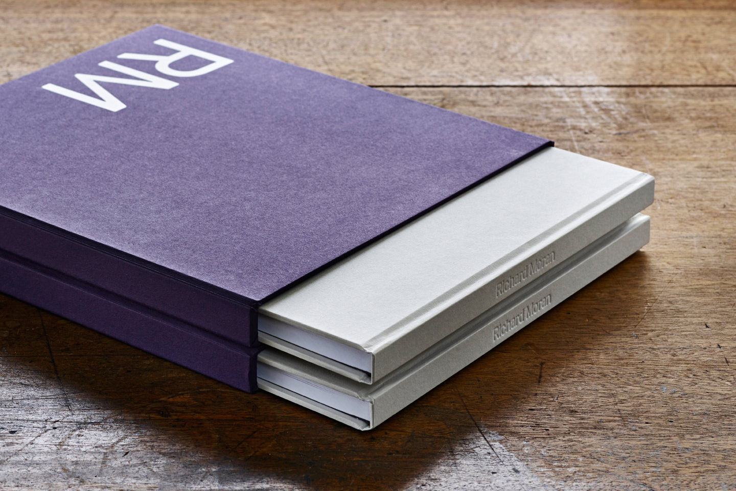
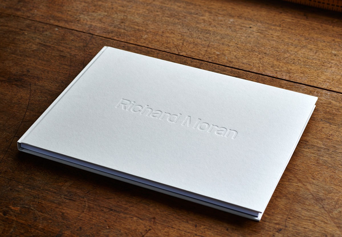
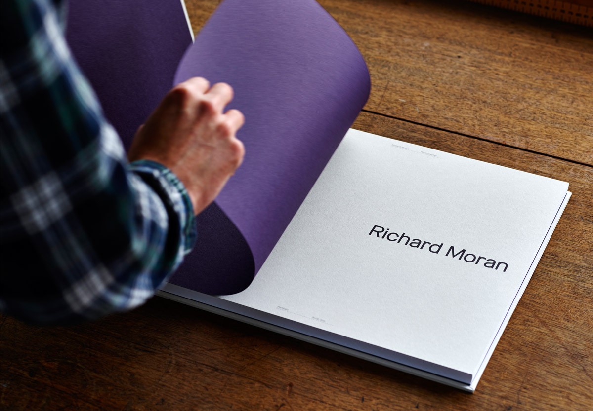
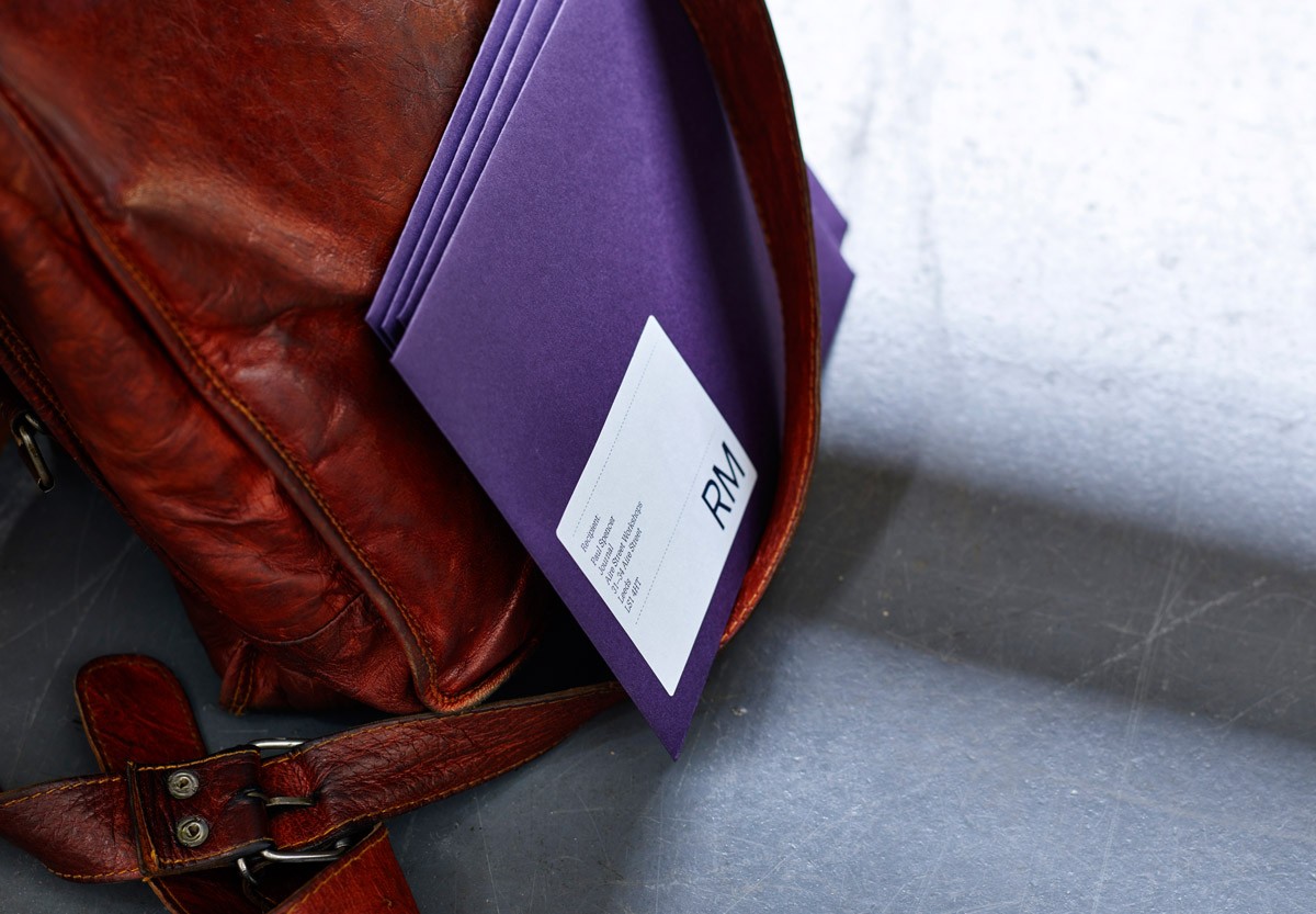
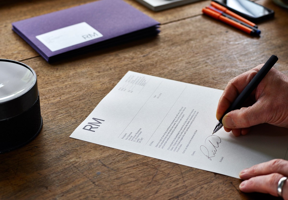
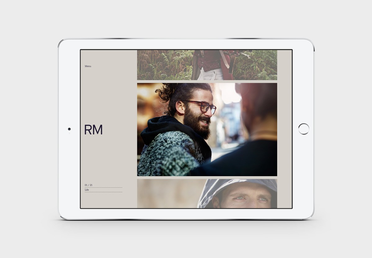
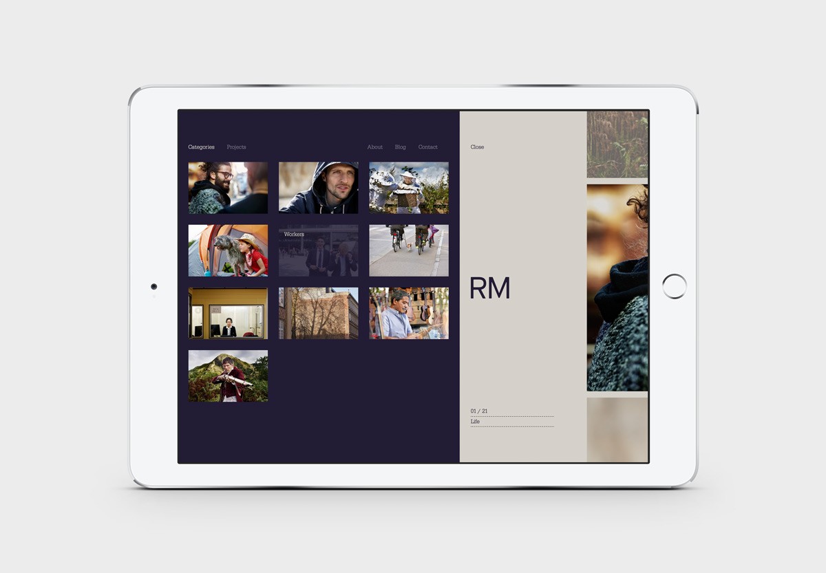
Richard Moran is a lifestyle and portrait photographer with over 25 years of experience. He has worked with international businesses such as GSK, Pizza Express and Grey Goose Vodka, and secured a reputation as a passionate, straight-talking professional with a meticulous attention to detail and a portfolio of high-quality and emotive work. With a desire to communicate this and with the intention of building on his success, Richard worked with Leeds based graphic design studio Journal to develop a new brand identity. This included portfolio, business cards and stationery, linked by a white and purple colour palette, plenty of material texture, custom logotype and high-quality print finish. Journal also designed and built a responsive website that gives Richard’s time-sensitive clients multiple ways to view his work.
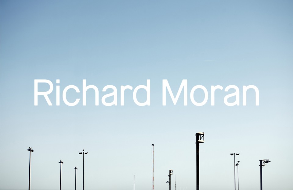
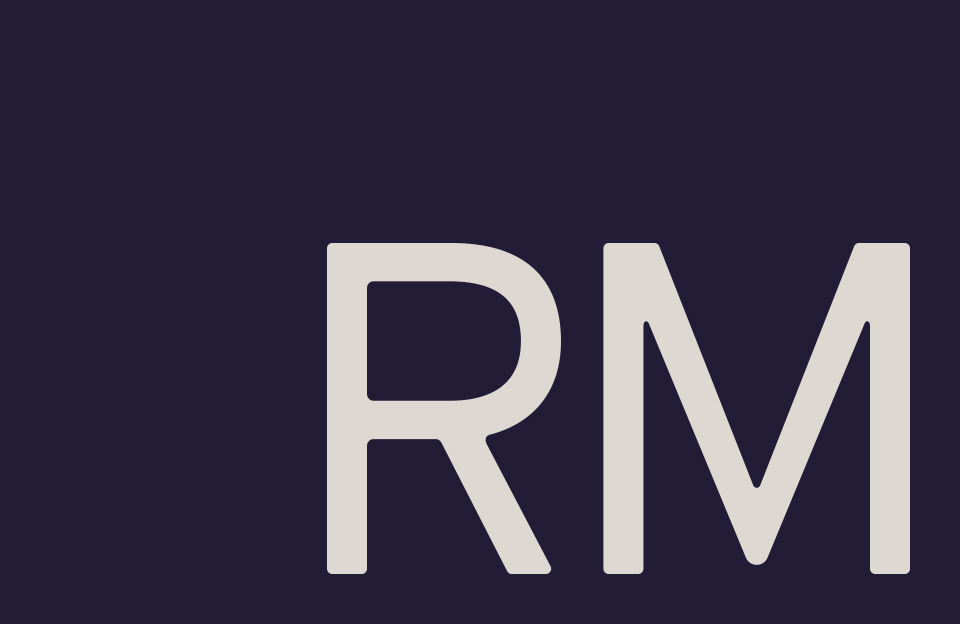
The logotype satisfies a personable, professional and contemporary communicative intention, and is clearly well-resolved. However, its mild-mannered and familiar forms do not really justify a custom build, particularly when there are many similar and good quality off the shelf products available—some which you can see reflected in the letters—that would afford Richard a bit more flexibility in the future.
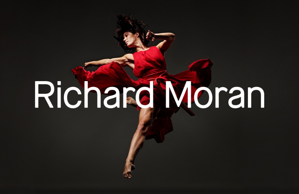
The logotype’s rounded corners, angles and monolinear weight takes various finishes well and stands out when placed over strong, detailed and colourful image.
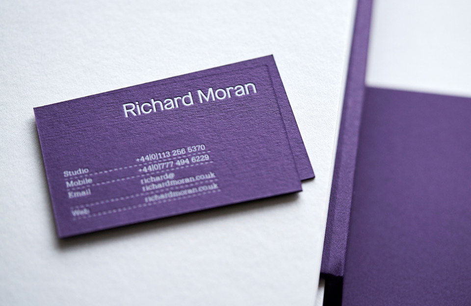
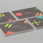
URW Typewriter introduces contrast and utility alongside the personable and more current qualities of the logotype. There is a touch of the international and journalistic about it—think telegrams and typewriters—but, alongside a dashed underline, appears a little busy across the business cards.
The RM monogram, while perhaps absent creative flourish, is clearly tied to logotype, impactful and thoroughly current in its implementation across business cards, in its size and as a white foil or ink across coloured board.
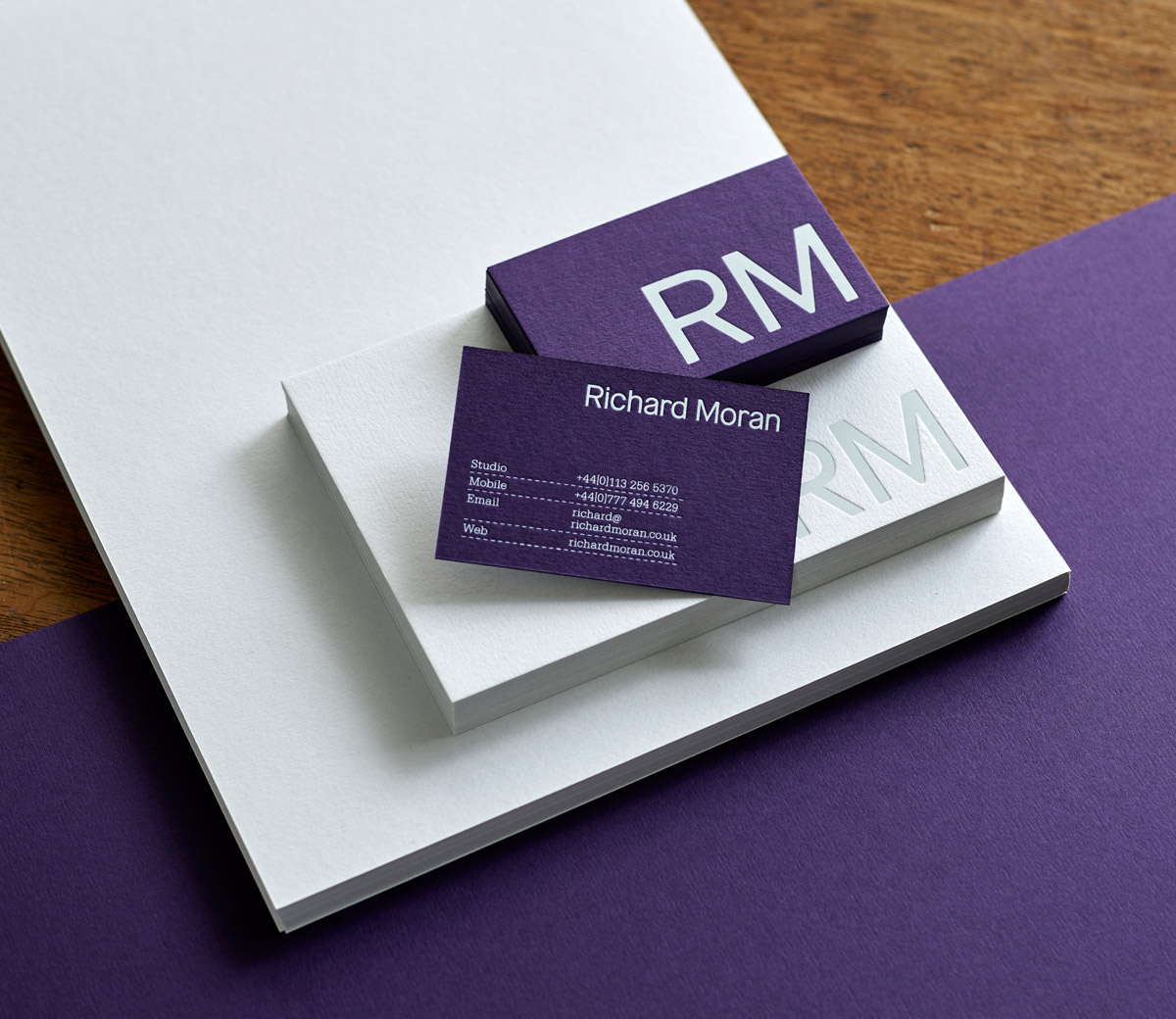
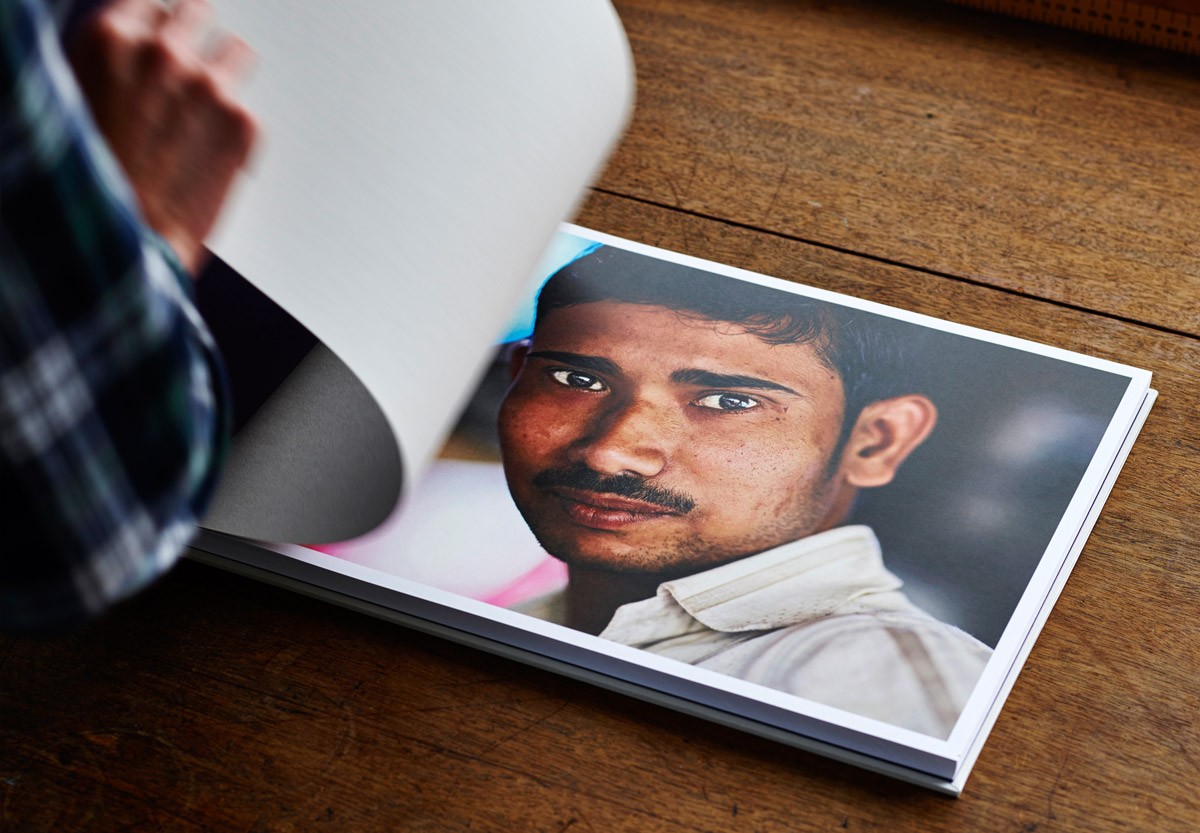
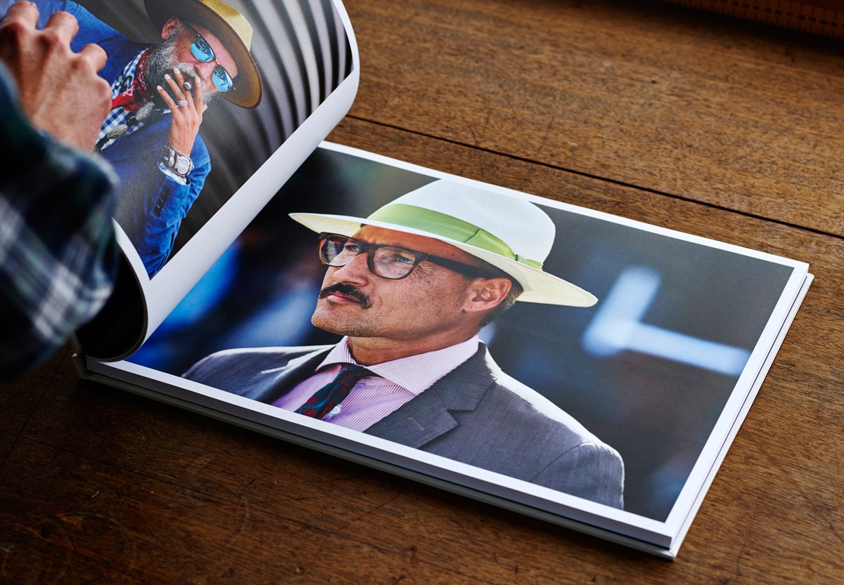
In print there is plenty of material texture and print finish to experience, a strong sense of identity in colour and in the implementation of type, particularly in size and proportion. The presentation of image is straightforward, absent distraction, and large enough to really deliver impact.
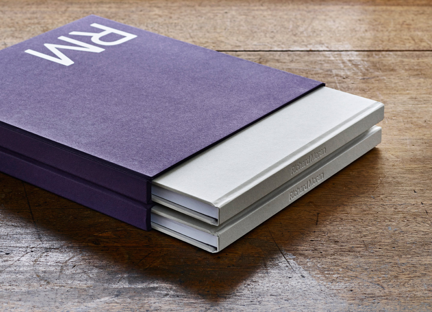
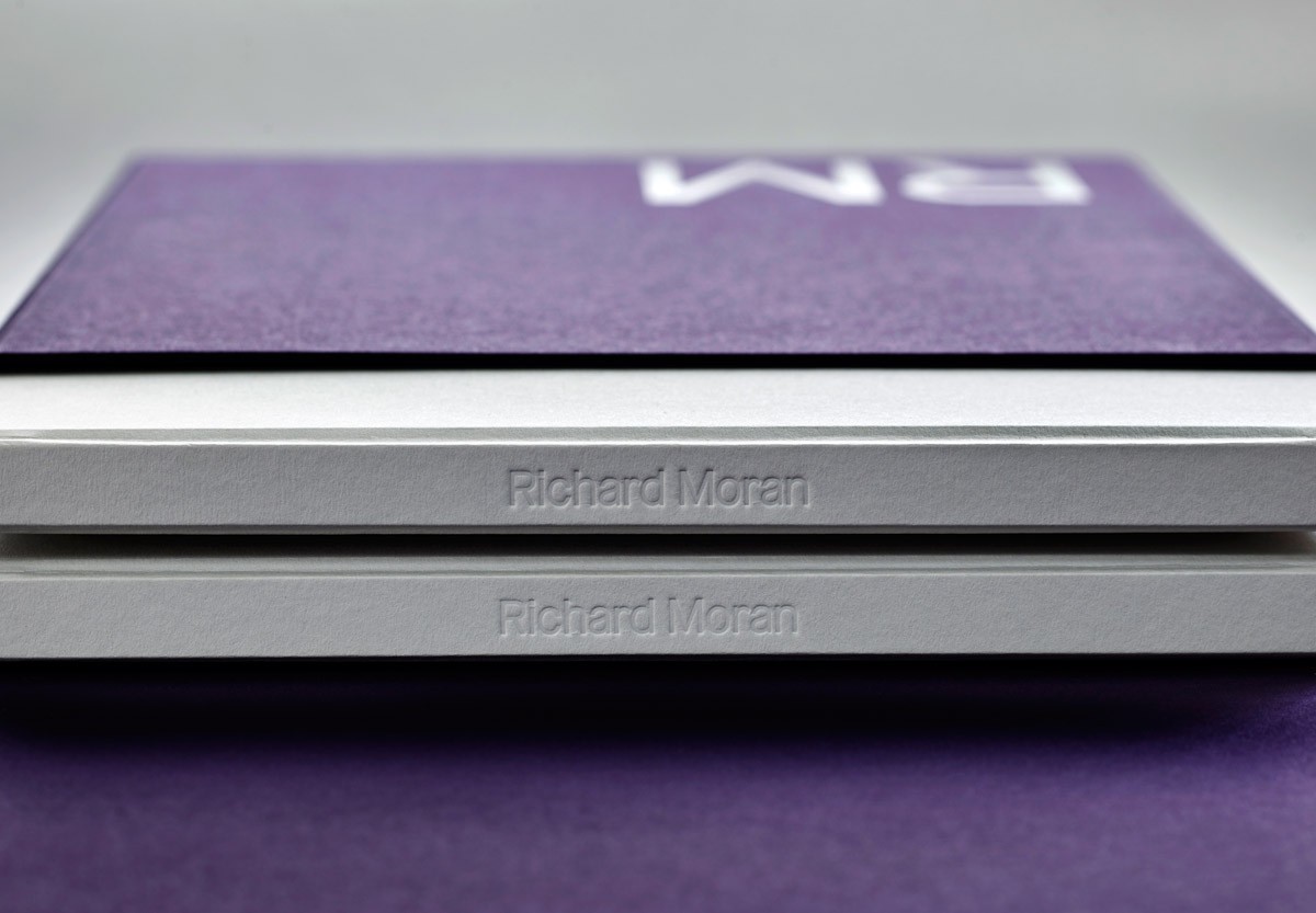
Although it feels less about concept and more about finish, this ties in well with the high-quality, professional and detail-driven nature of Richard’s work, and is suitably measured within the context of a portfolio of well-shot, communicative and compelling images.
Large areas of unprinted space and the presentation of image bring balance to an enthusiasm and current favour for dyed papers, uncoated and embossed surfaces, and screen printed or block foiled print finishes.
Richard’s visual identity is very well-polished with a continuity between print and digital experience, in type and structure, but perhaps less so in colour. Online, the deeper purple and khaki rather than white, feels a touch more conservative, but the splash page works just as well as the printed portfolio.
Design: Journal. Opinion: Richard Baird. Fonts Used: URW Typewriter.
