InsideSource by Mucho
Opinion by Richard Baird Posted 8 March 2016
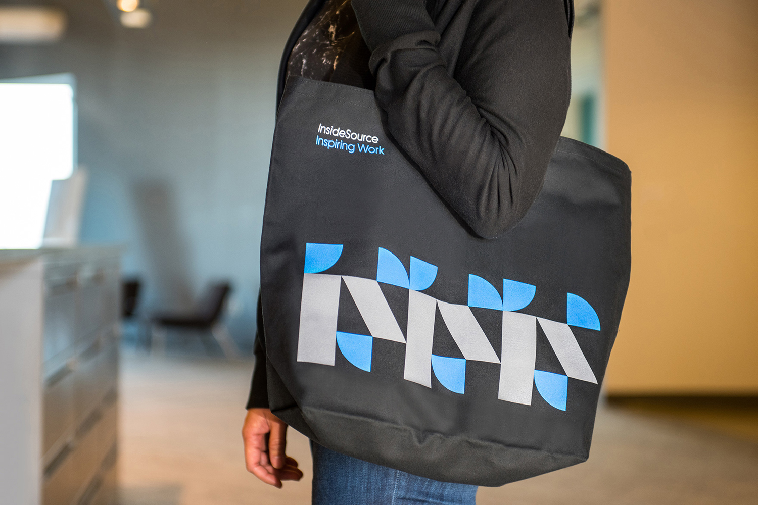
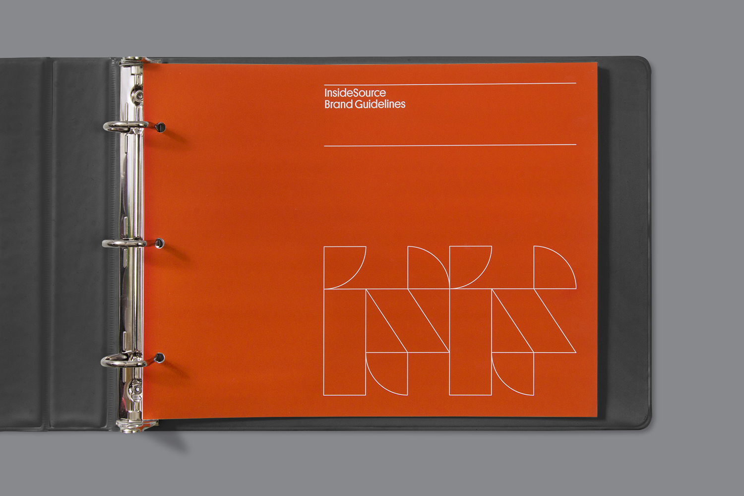
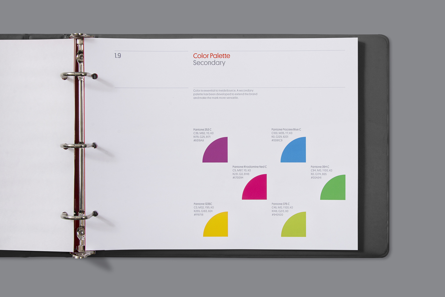
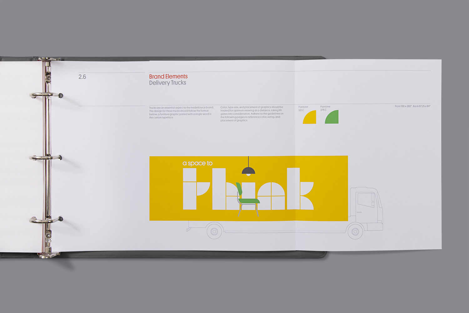
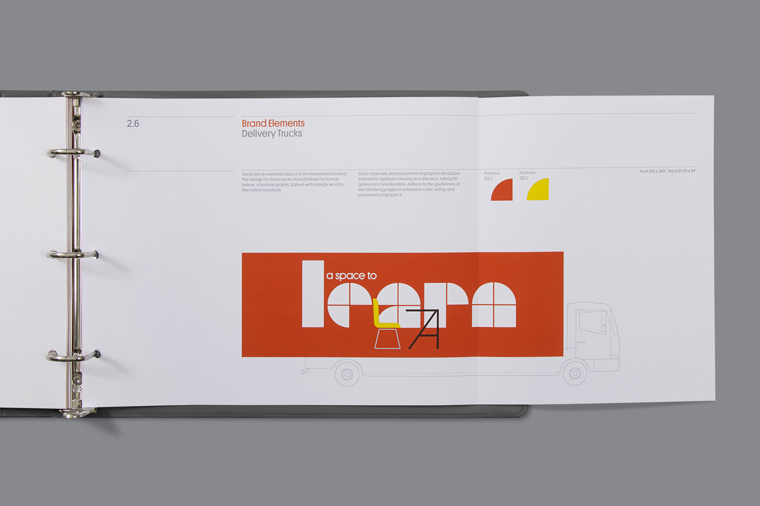
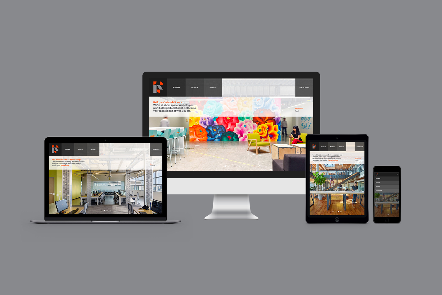
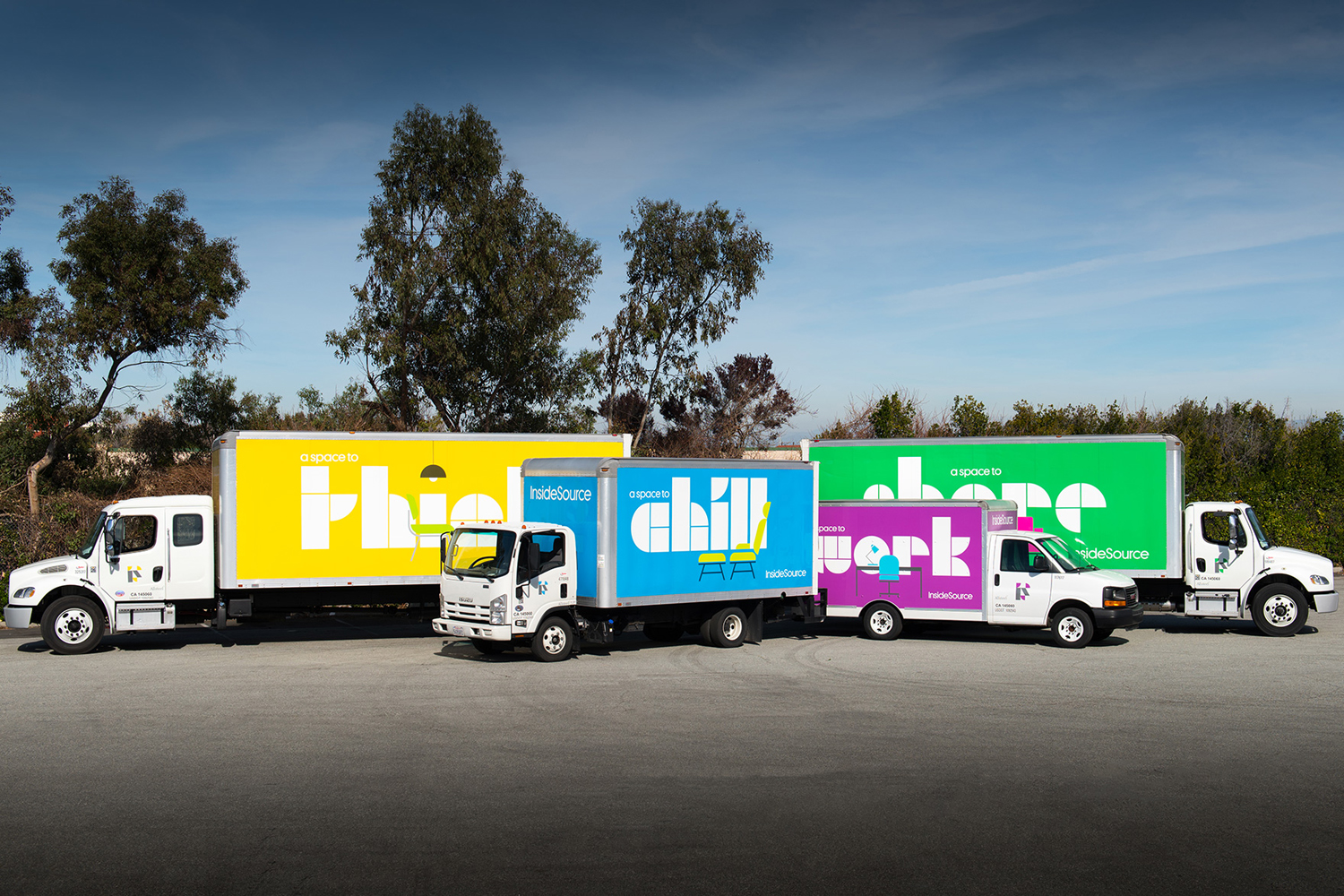
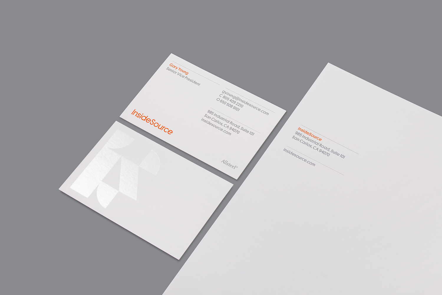
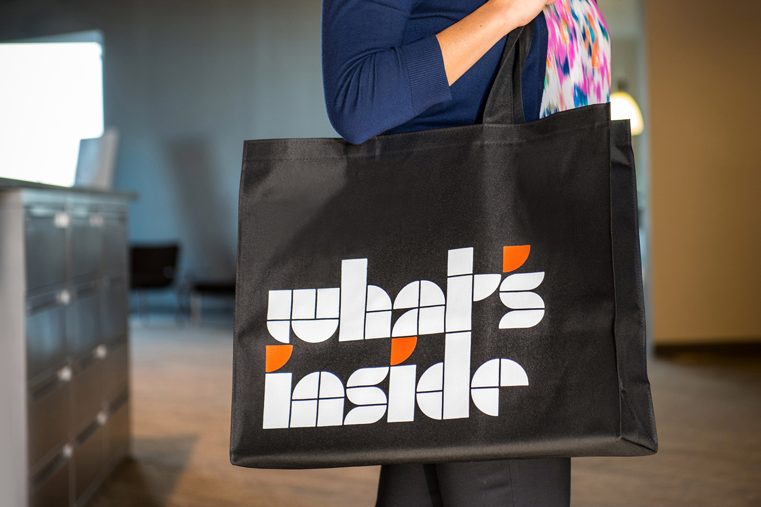
InsideSource is an American office space planning, design and installation business with 25 years experience and past clients that have included Facebook, Box, Shutterfly and Tango. InsideSource worked with graphic design studio Mucho to help them better express who they are and what they do through a new visual identity. This was achieved using a modular and custom type-based system that runs across tote bags, stationery, business cards, website and fleet.
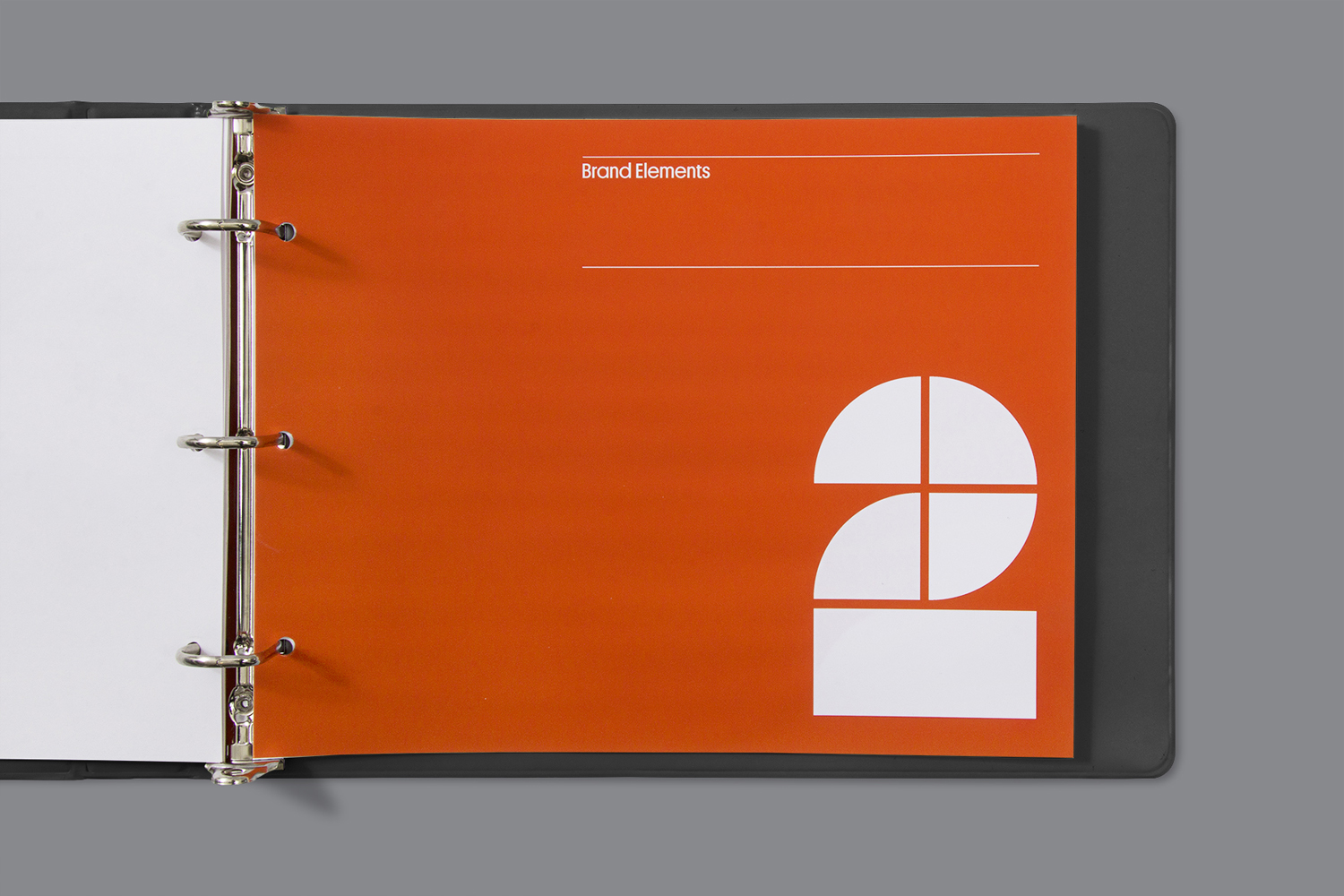
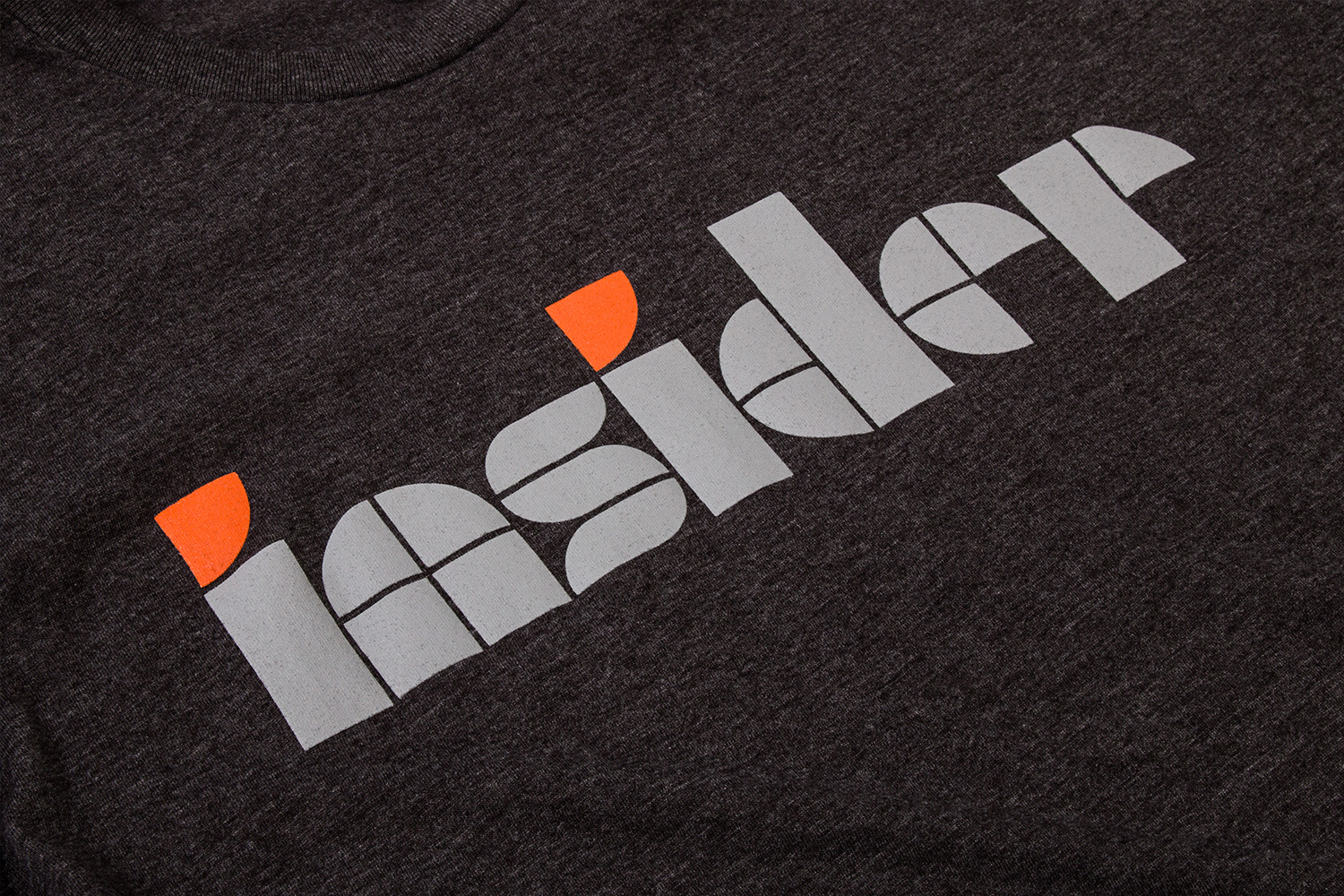
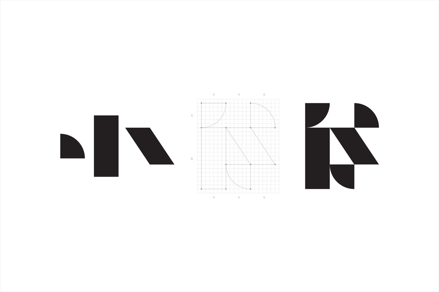
Mucho’s concept, a system wide use of geometric blocks and an observable grid system, takes its inspirations from architectural drawings and the furniture of contemporary office spaces. This forms the basis of a distinctive IS monogram, and is built out into a custom typeface and informs iconography.
Working with Reed Words, Mucho also developed the tagline “Inspiring Work” as well as messaging for the website, animation and trucks, and in collaboration with Bureau of Visual Affairs, worked on web design and development.
The modularity of the system and the reference to architectural drawings is certainly not an unusual approach to take, nor is the aesthetic unexpected, however, it feels well-suited to InsideSource.
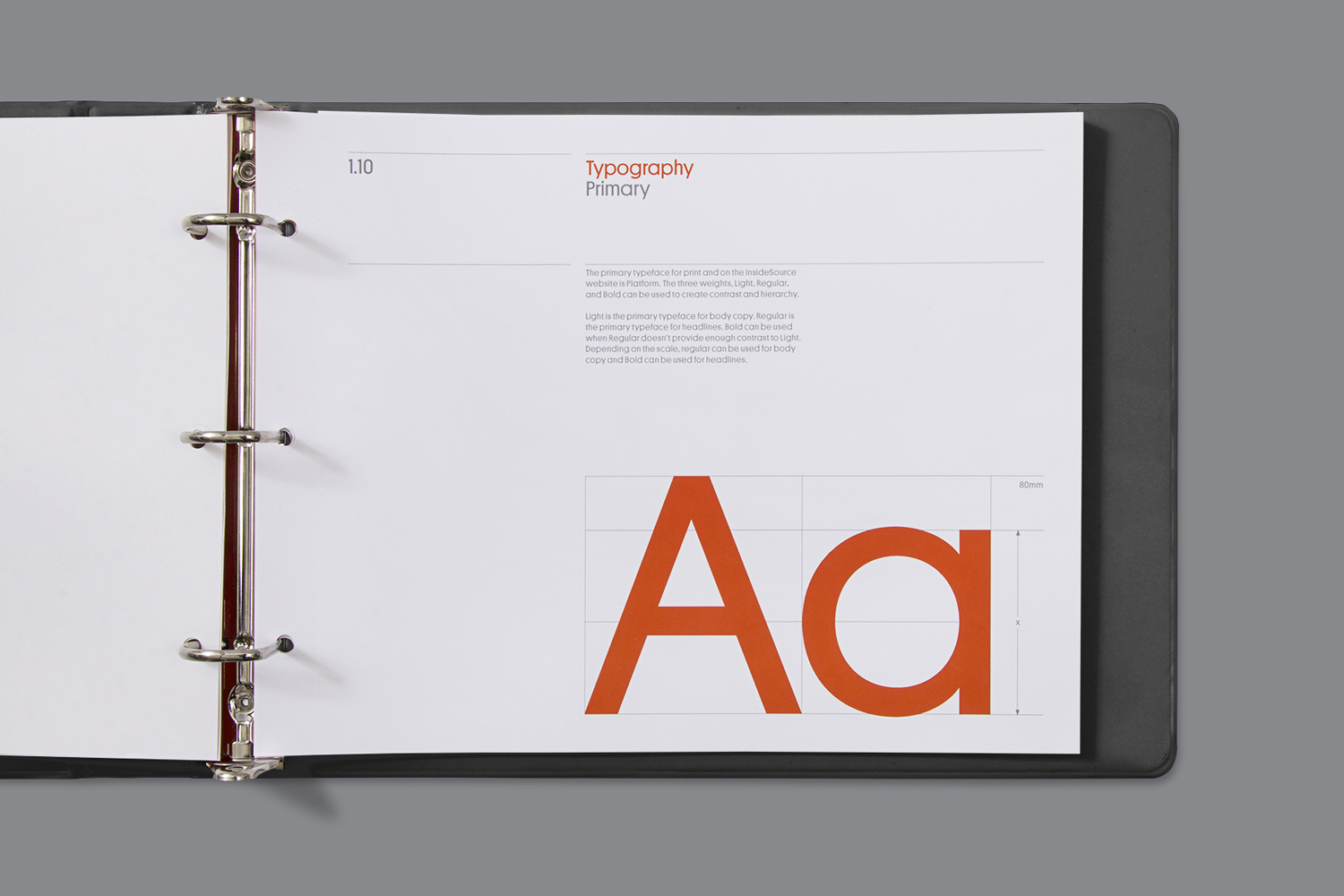
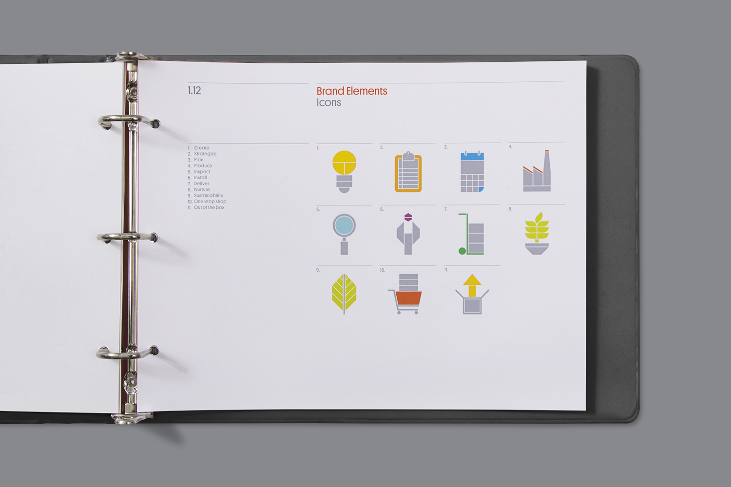
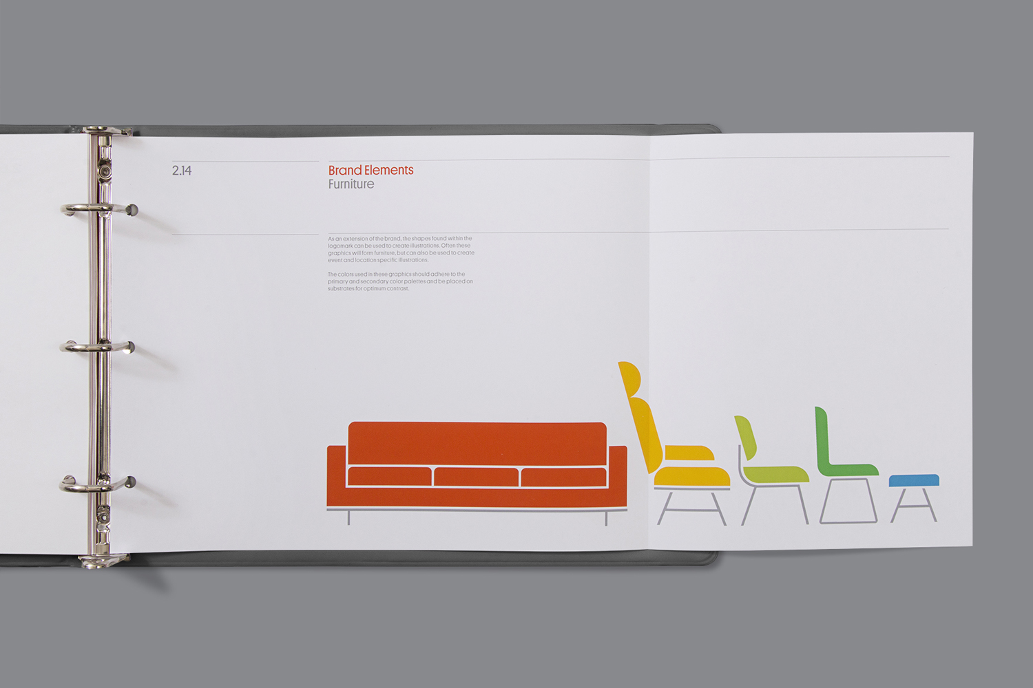
Although many of the basic shapes and the way that these have been used are familiar, Mucho have managed to draw out some interesting letter shapes (check out the W), build a rather neat IS monogram, and create a series of icons that, thankfully, avoid line art and secure distinction and continuity.
There is a nice tension between the reductive and practical qualities of geometric form, sans-serif type and grid structure, and the bright flourish of colour, the typographical quirks of Commercial Type’s Platform, language choice, and the sense of materiality in the use of a blind emboss and clear foil print finish.

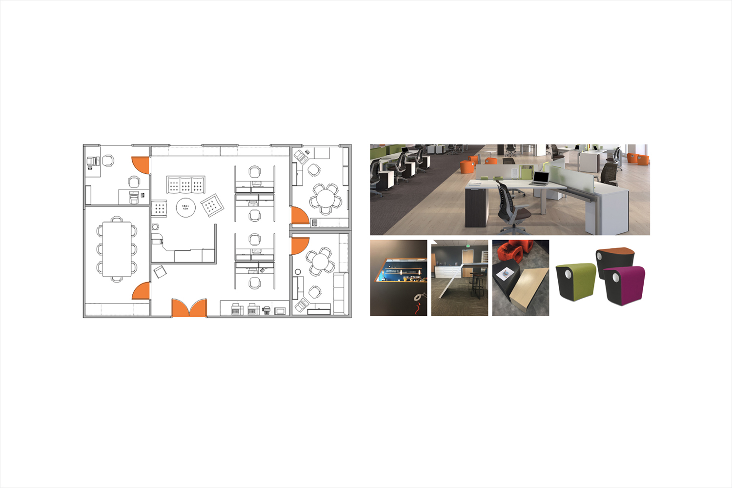
Above: Kilroy Realty by InsideSource.
The brand identity finds a comfortable meeting point between, and successfully expresses, the functionality and conviviality that proliferate InsideSource’s work, which is often characterised by a mix of light interiors, exposed utilities and architectural materials, and colourful furnishings.

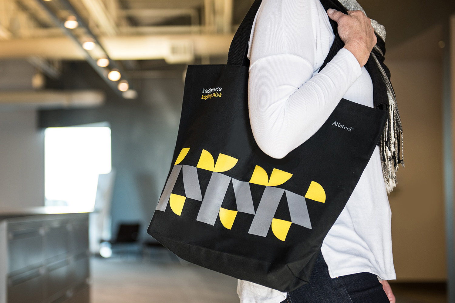
There is a very modernistic quality to the work that would not feel out-of-place in the corporate world of mid-twentieth century America. This feels particularly acute in the layout and binding of the brand guidelines. Although retrospective in some aspects it also feels rather current, and probably owes a lot to brand manual reprints. This gives it a strange but welcome sense of longevity, a relevant aesthetic impact, and a modern variation and interest in its implementation. More from Mucho on BP&O.
Design: Mucho. Copywriting: Reed Words. Website: Bureau of Visual Affairs. Opinion: Richard Baird. Fonts Used: Platform.
