Hegel Music Systems by Neue
Opinion by Richard Baird Posted 11 April 2016

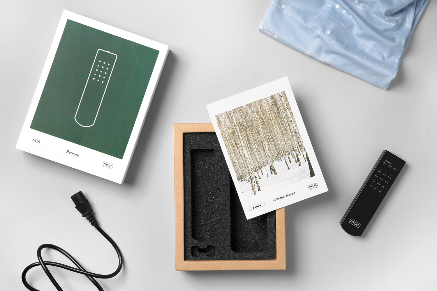
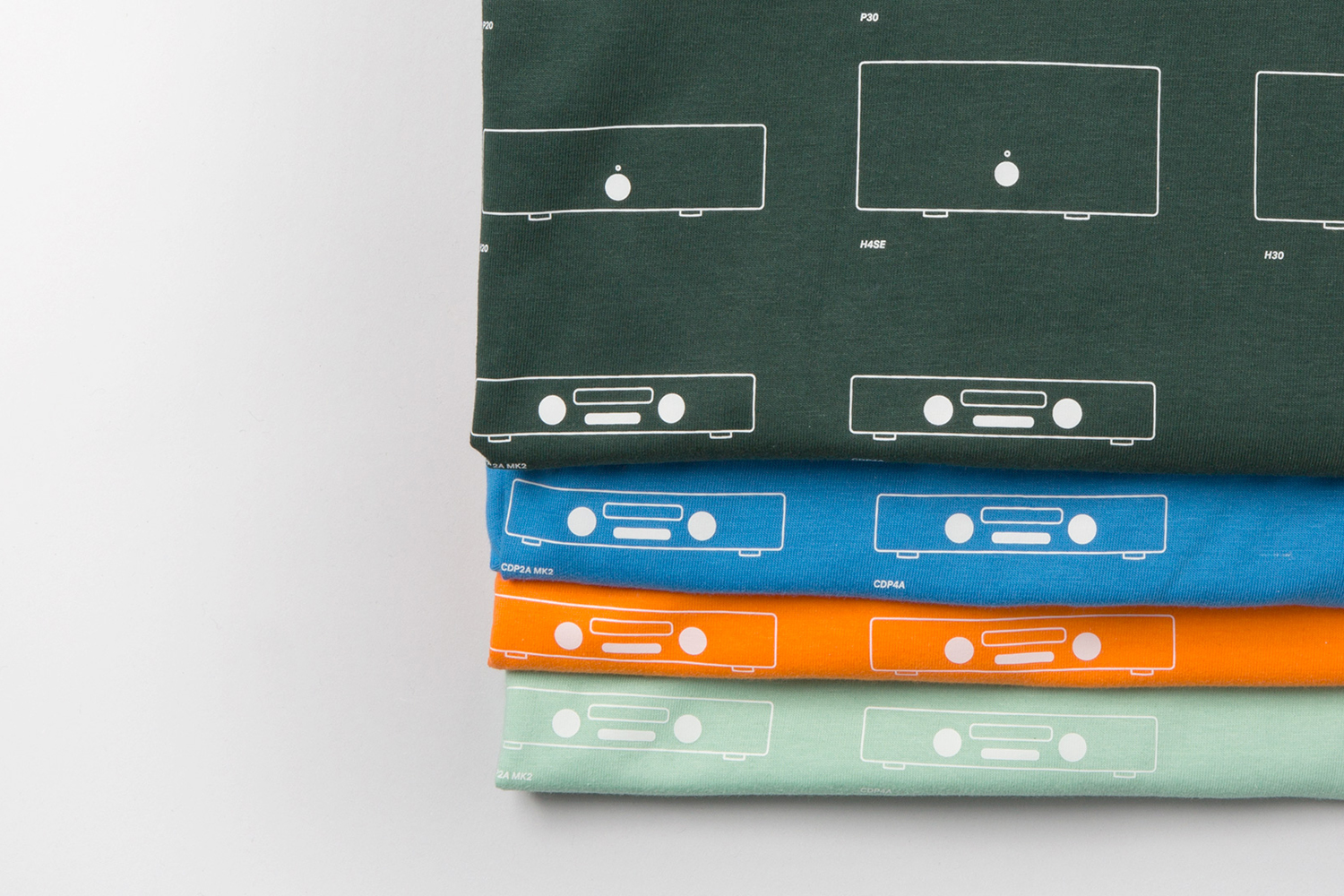
Hegel is a Norwegian amplifier, pre-amplifier and multi-media player business with a proprietary Error Correction System that limits harmonic distortion without compromising other parameters. Established in the early 1990’s, Hegel has grown to become a well-established supplier of high-end hi-fi products, nationally and internationally, and is committed to sound reproduction that adds nothing (or as little as possible). This is the foundation of their new packaging system, developed by Scandinavian graphic design studio Neue, and expressed through a concise set of assets. These include iconography, colour palette, material choice and imagery.
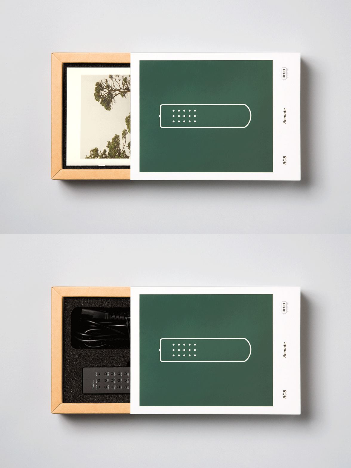
Neue’s direction is a great example of reductionism, with each choice grounded in a clear communicative intention whilst also being visually compelling and a fair reflection of the aesthetic of product, and philosophy of business. Although packaging is not designed to sell, it compliments and adds to overall experience and functions to quickly differentiate in a warehouse context when shipping.
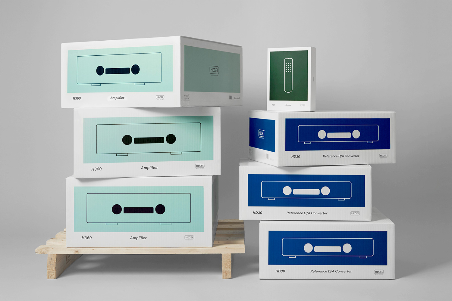
Neue finds a pleasant meeting point between utility and technology, characterised by the simple forms, fine lines and solid circles of the illustrations, and contemporary lifestyle in the choice of colour and use of plenty of white space. Form and colour establish a good continuity between print communication and packaging.
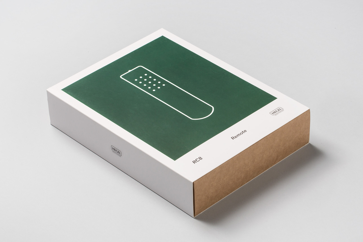
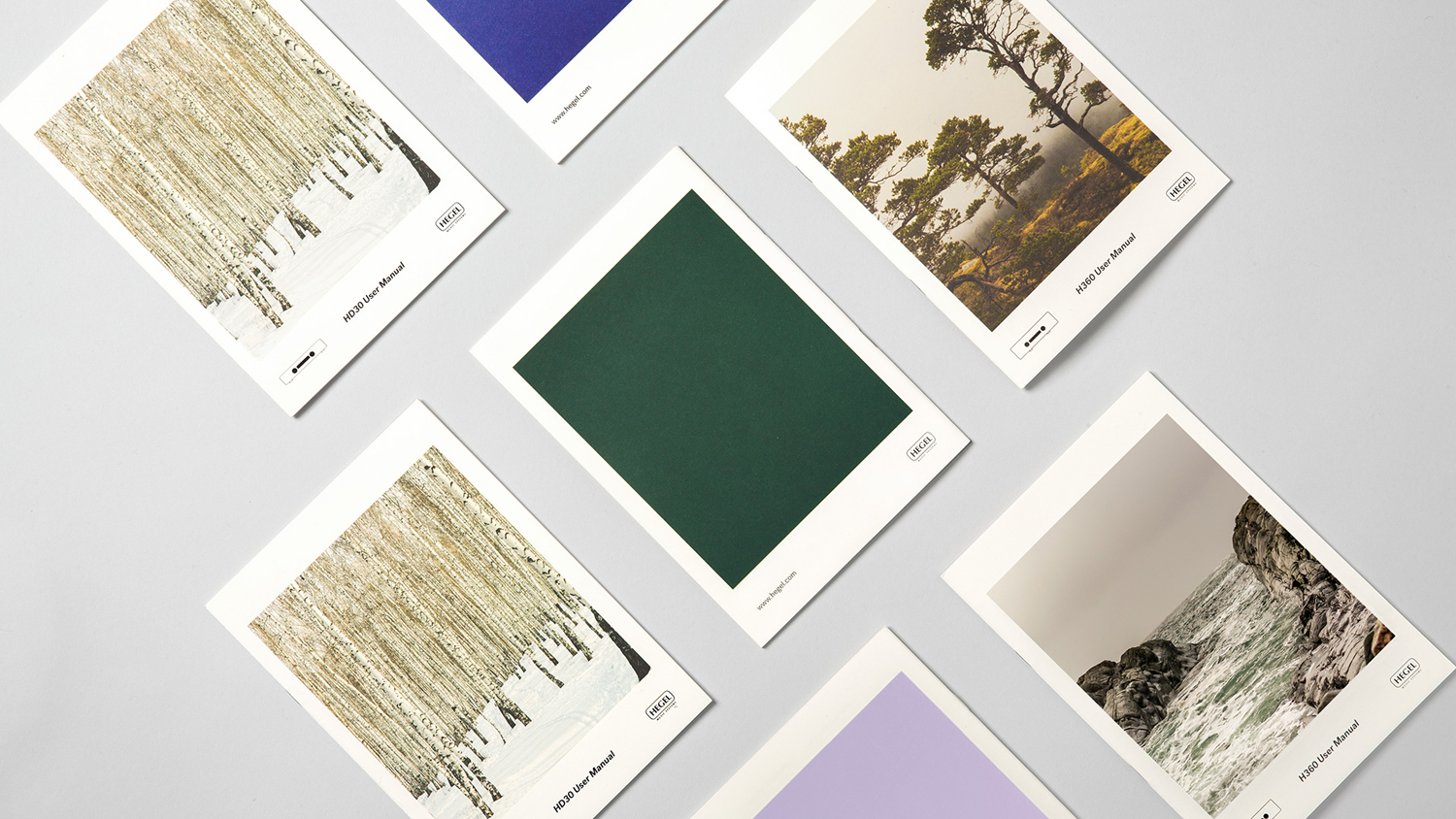
Natural untainted sound feels appropriately, effectively and viscerally conveyed through material selections that include uncoated and unbleached papers and boards, and some lovely outdoor Scandinavian imagery, which also work well to express a sense of place and origin of brand.
The use of photography is a particularly neat detail for a company exporting internationally, acknowledging a very current and broad appreciation for Scandinavian design, its clarity of purpose and the romantic qualities of its landscapes. It would be good to see these details and overall direction extend to Hegel’s website and logo, both of which appear a touch tired. More from Neue on BP&O.
Design: Neue. Opinion: Richard Baird.
