HEWN by Föda
Opinion by Richard Baird Posted 26 April 2016
HEWN is an American architectural woodworking shop, custom furniture fabrication and metalworking business with extensive facilities, a team of master-craftsmen, a national presence and local legacy. It also has a preference for native Texas and reclaimed woods.
HEWN worked with Austin based graphic design studio Föda to develop a new brand identity that would help ensure market share and longevity, and would lay the groundwork for future leadership transitions.
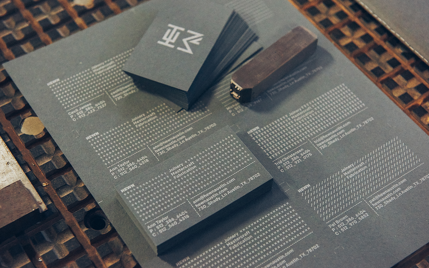
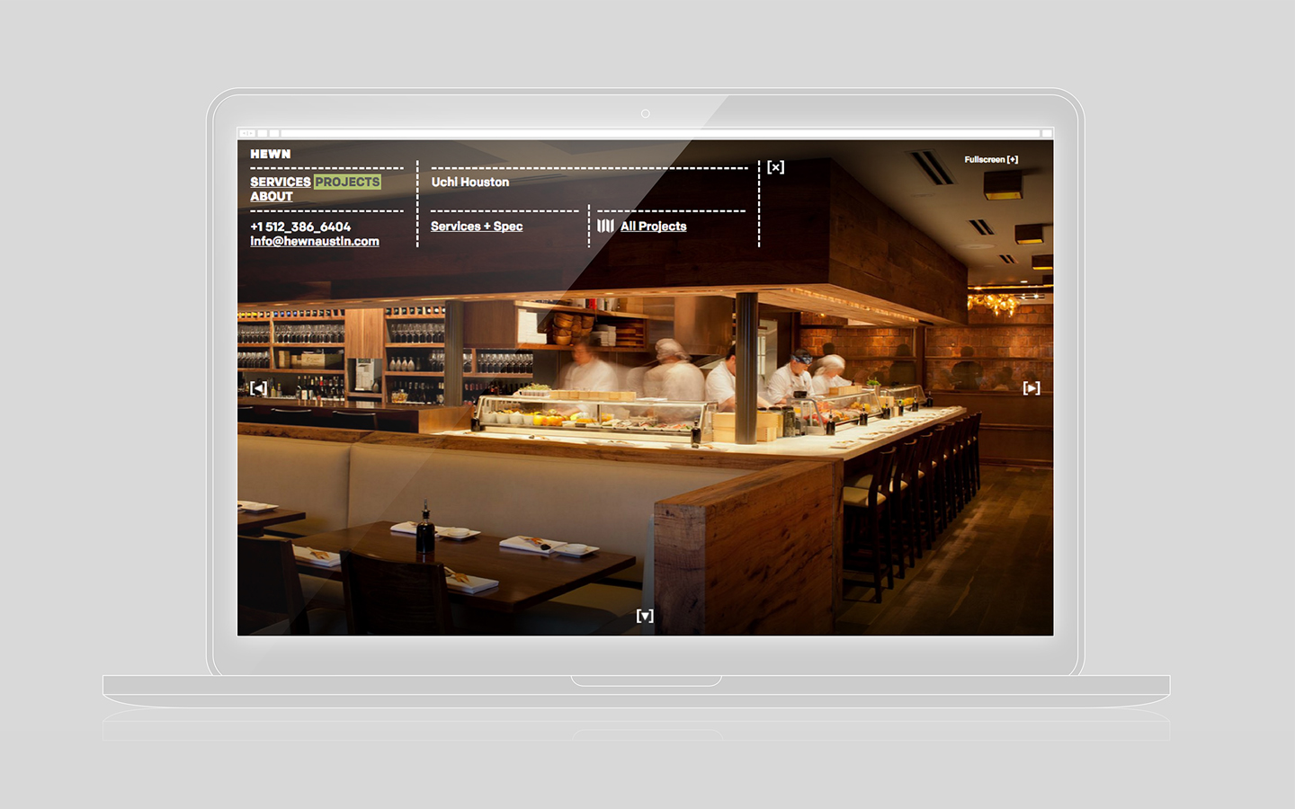
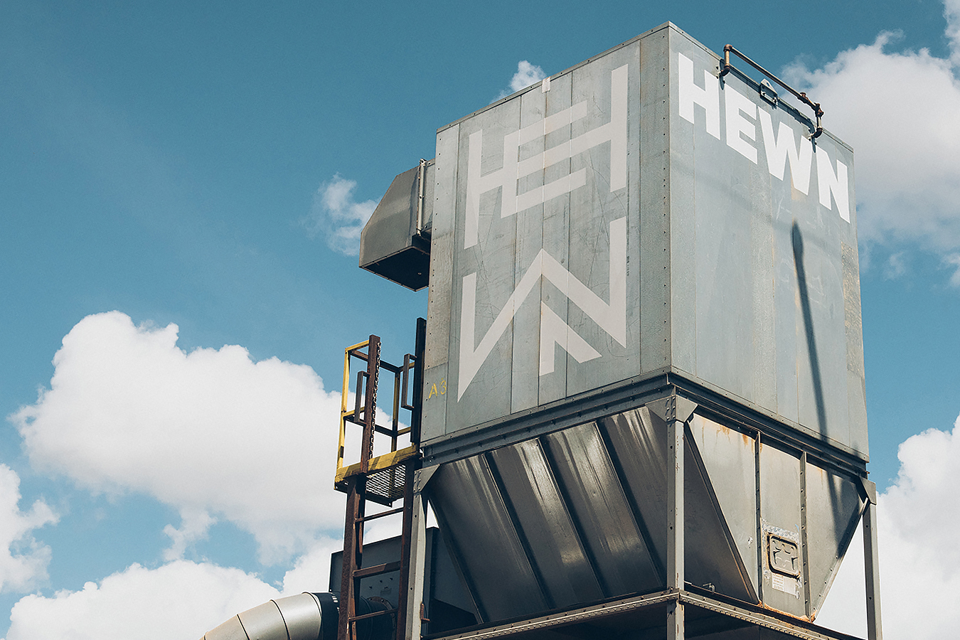
This began with strategy and naming, included logo and logotype design, and extended across signage, business cards, t-shirts and website, as well as van, garage door and hopper signage.
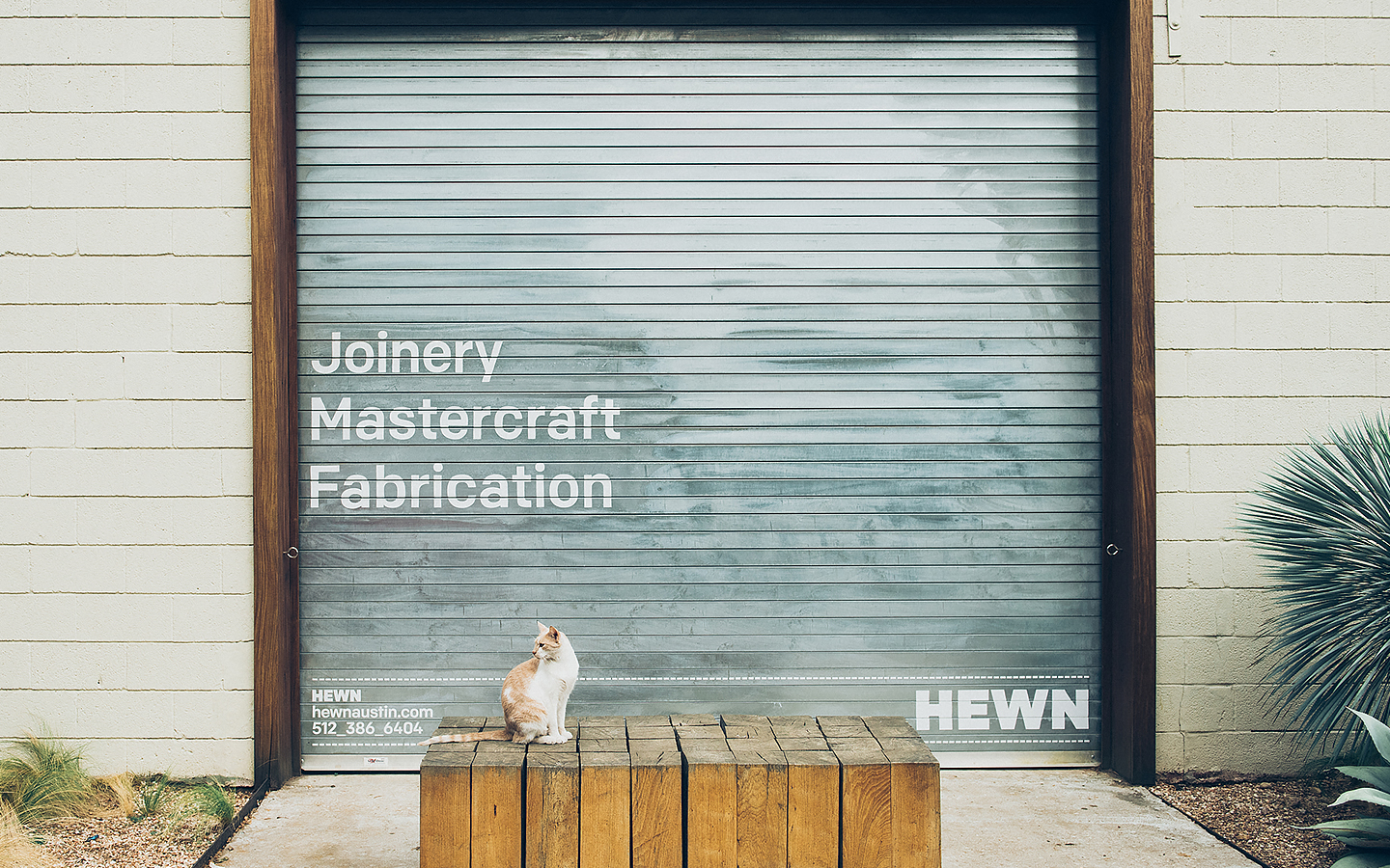
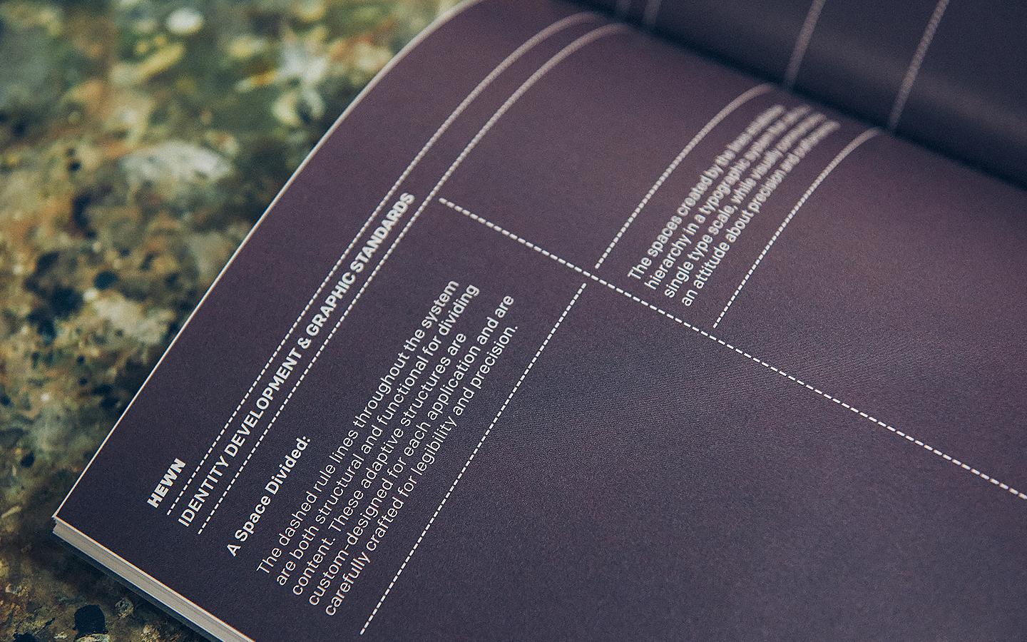
Technical expertise, material and structural robustness and a sense of craft are neatly and clearly weaved together and conveyed throughout HEWN’s new brand identity. These are effectively expressed in the extensive use of cross grids and dashed guides, a heavy uppercase sans-serif logotype, the shapes and build of the logo, and the choice of uncoated and mixed fibre materials, blind emboss and white ink print finishes.
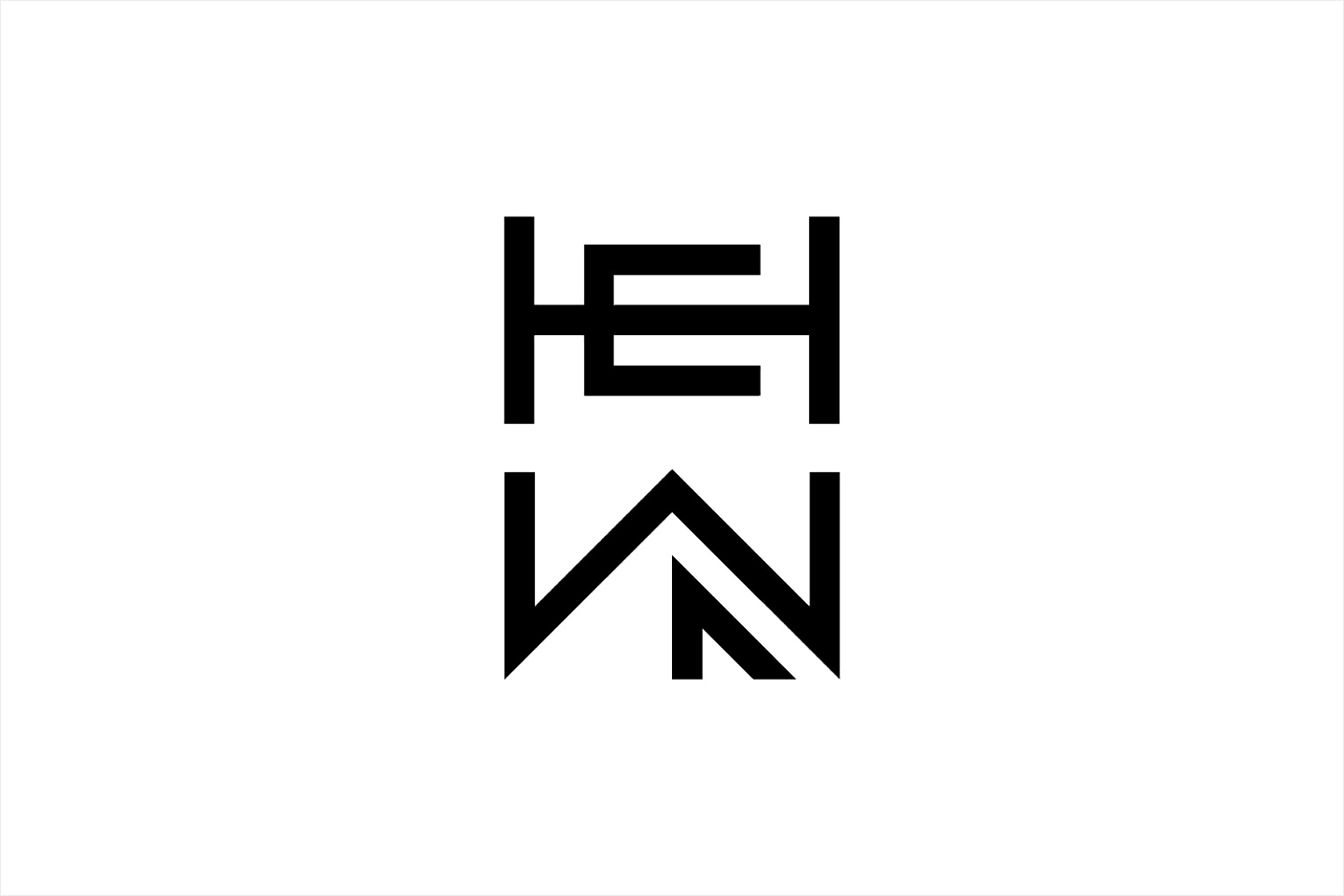
The logo is modern, distinctive and does a good job of playing with architecture in its height, space and forms, material joins in the union and harmony of letters, and structural integrity in the use of triangles and cross-beam. It does, however, slightly lean towards those qualities you might associate with Japanenes characters, which is at odds with the Austin based business.

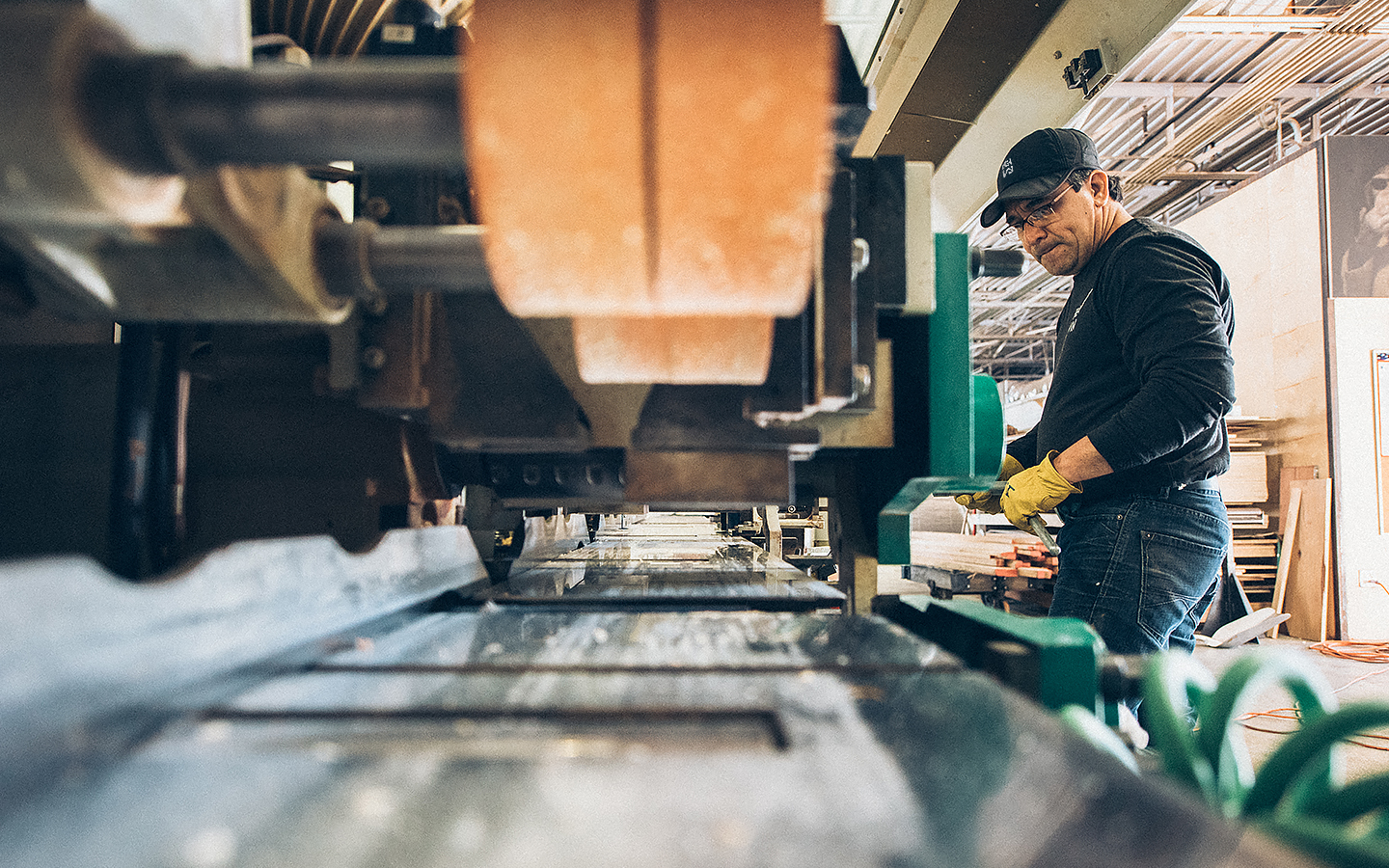
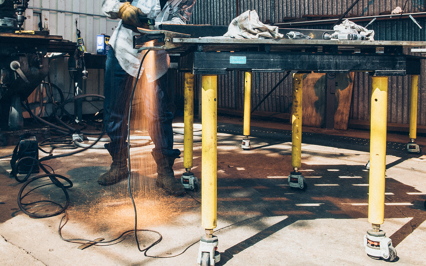
The logo’s monolinear, geometric and structural qualities are effectively utilised throughout, and complimented by, an industrial site of linear steel and wood frames and panelling. Highlights include the huge white decal across the steel hopper and a cast metal door detail that shares the same rustiness, wear and tear of the building.


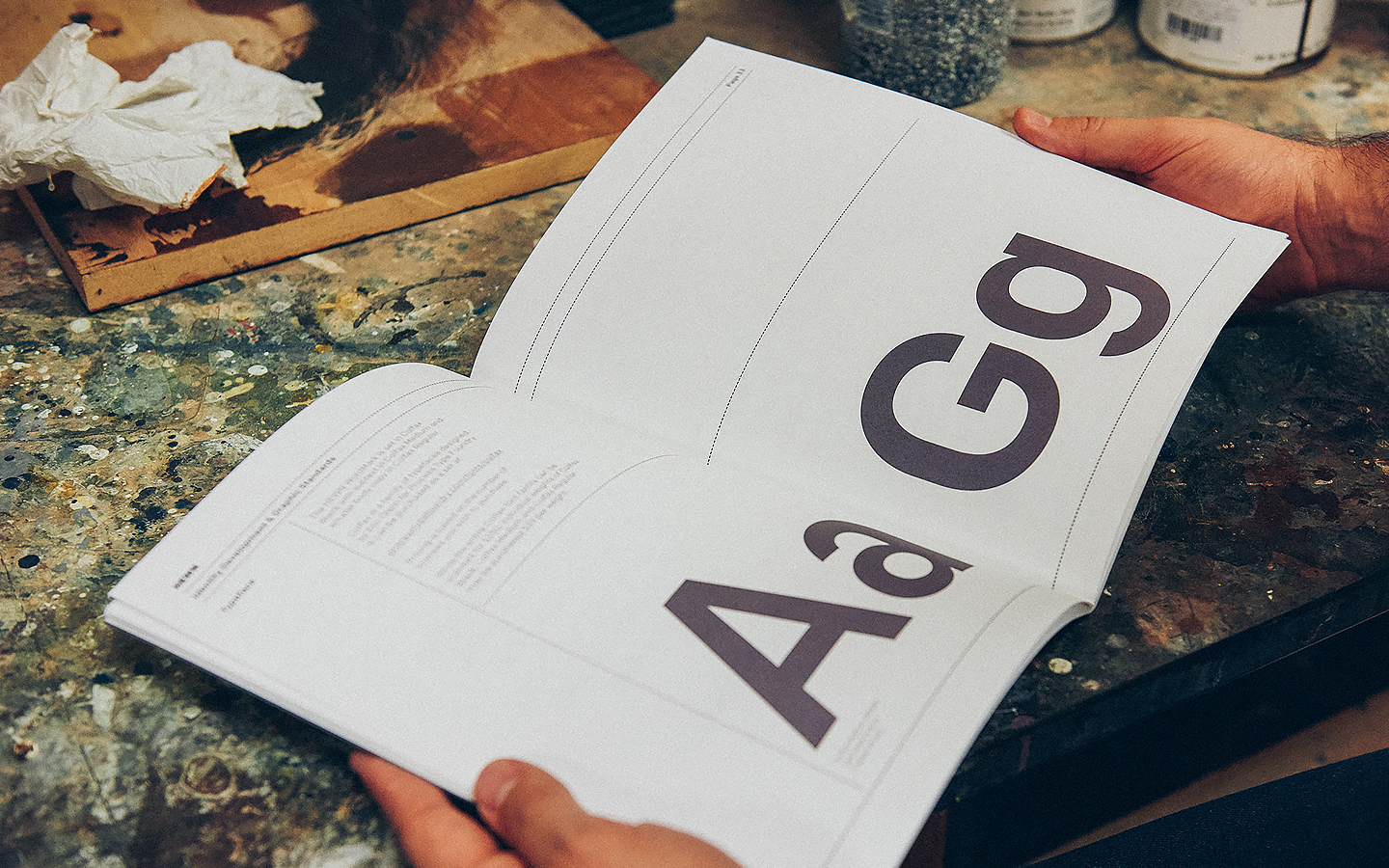
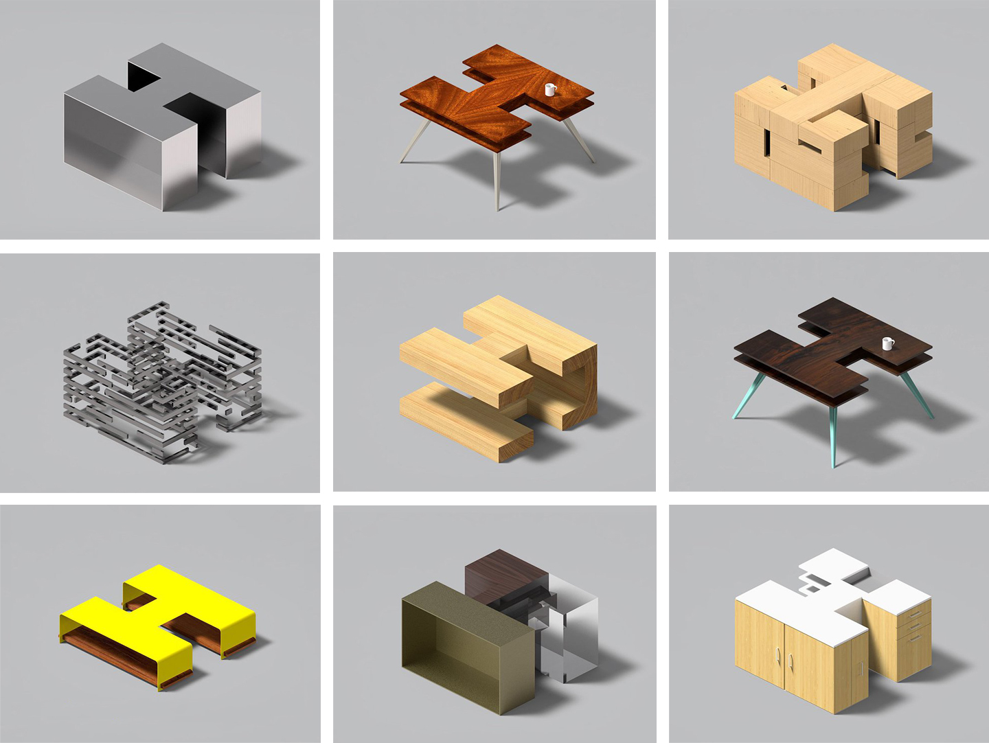
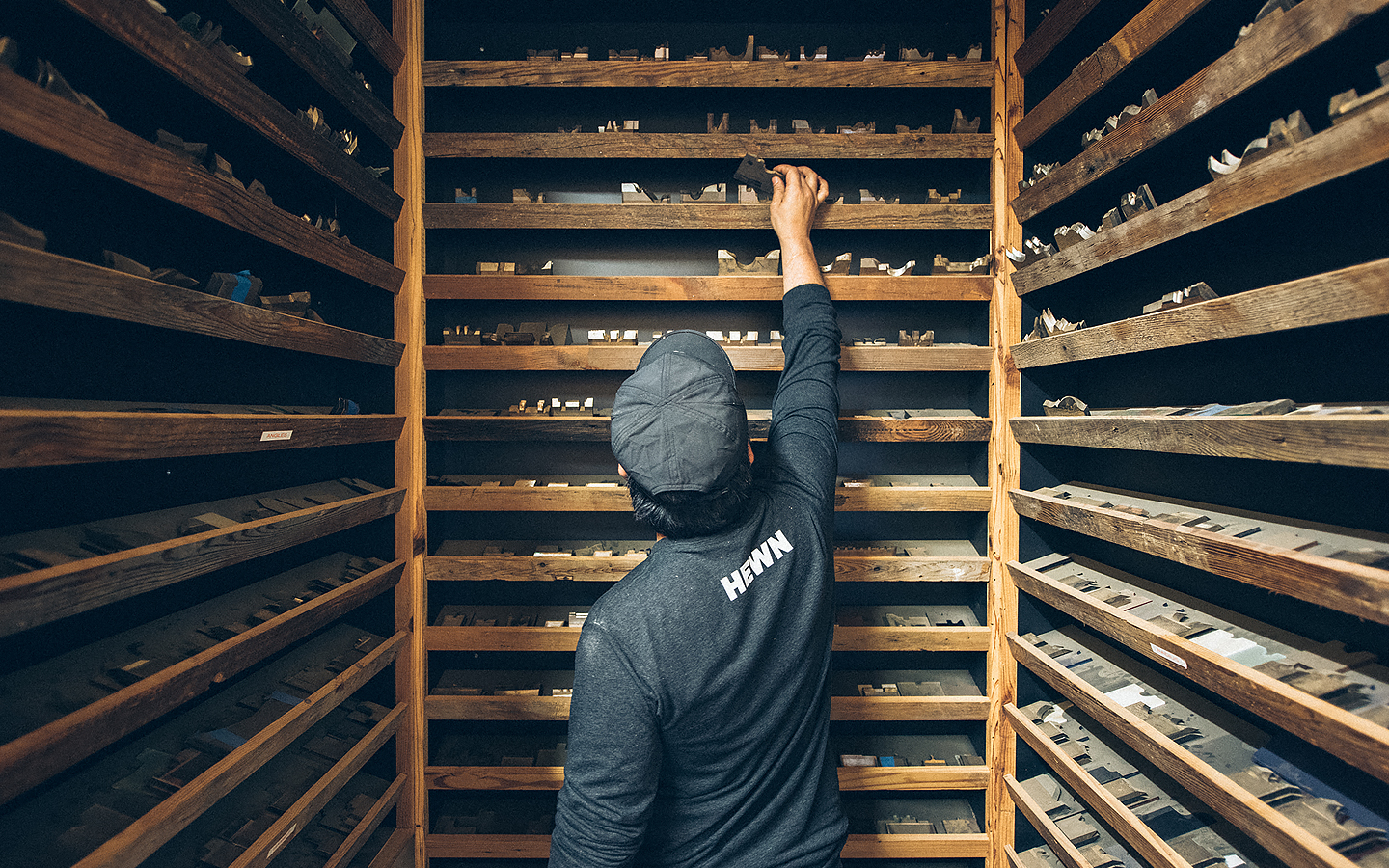
Other details of note include the rendering of the H in different materials and as furniture online, some lovely workshop photography, and the use of Process Type Foundry’s font family Colfax. This is described as being a refined oval sans serif of 20th century origin and 21st century sensibilities, which feels well-suited to HEWN’s traditional craft and contemporary relevance. It is a characterful choice that walks the line between individual personality yet practicality, an element of retrospection but with a clear modernity. More from Föda on BP&O.
Design: Föda. Opinion: Richard Baird. Fonts Used: Colfax.
