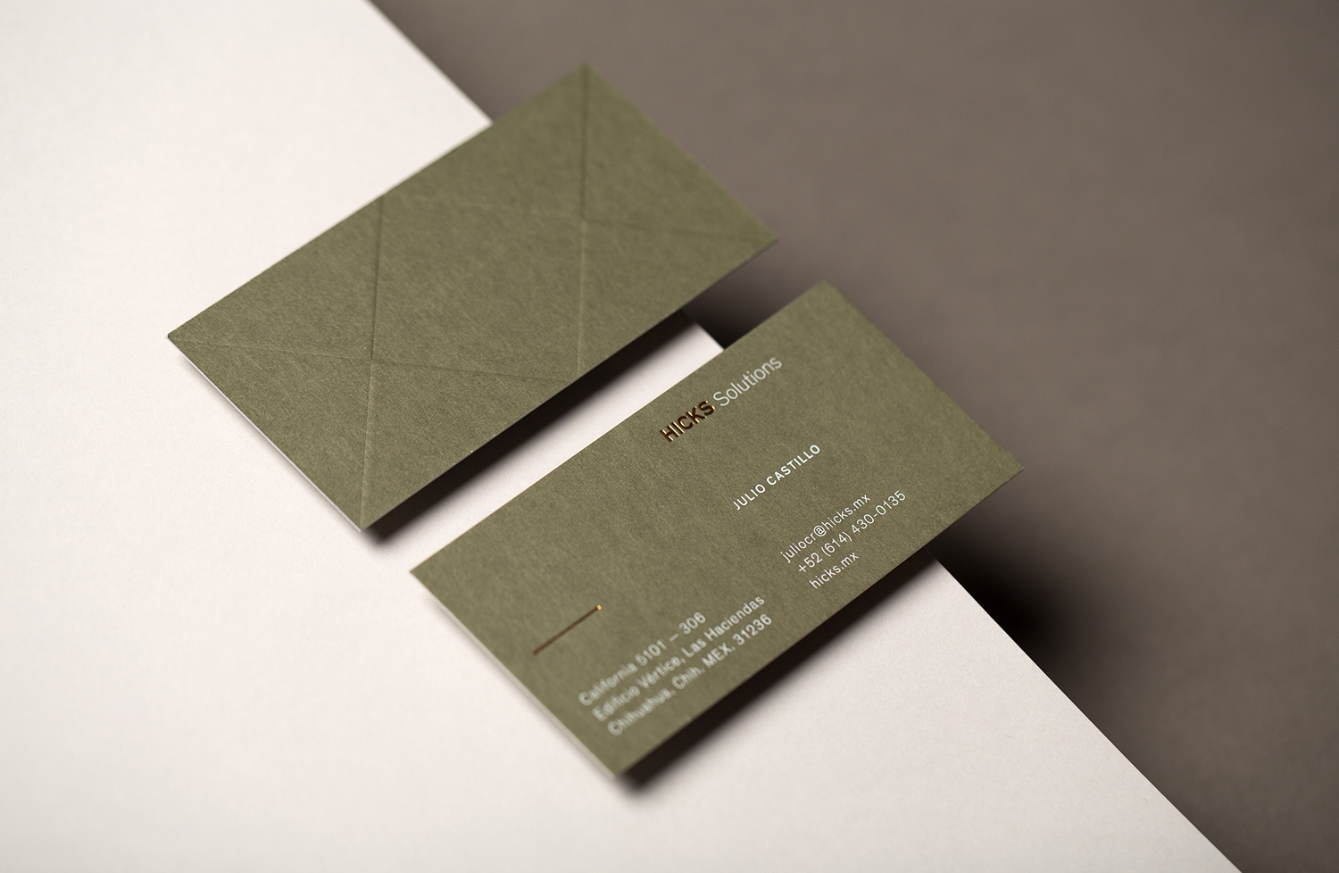
Hicks by Face
Opinion by Richard Baird Posted 5 July 2016

Hicks is described by Face, the graphic design studio behind its new visual identity, as a new-generation real estate group with big ambitions, and who are currently in the process of building a state-of the art mixed-use project with architect Fernando Romero in the Mexican city of Chihuahua.
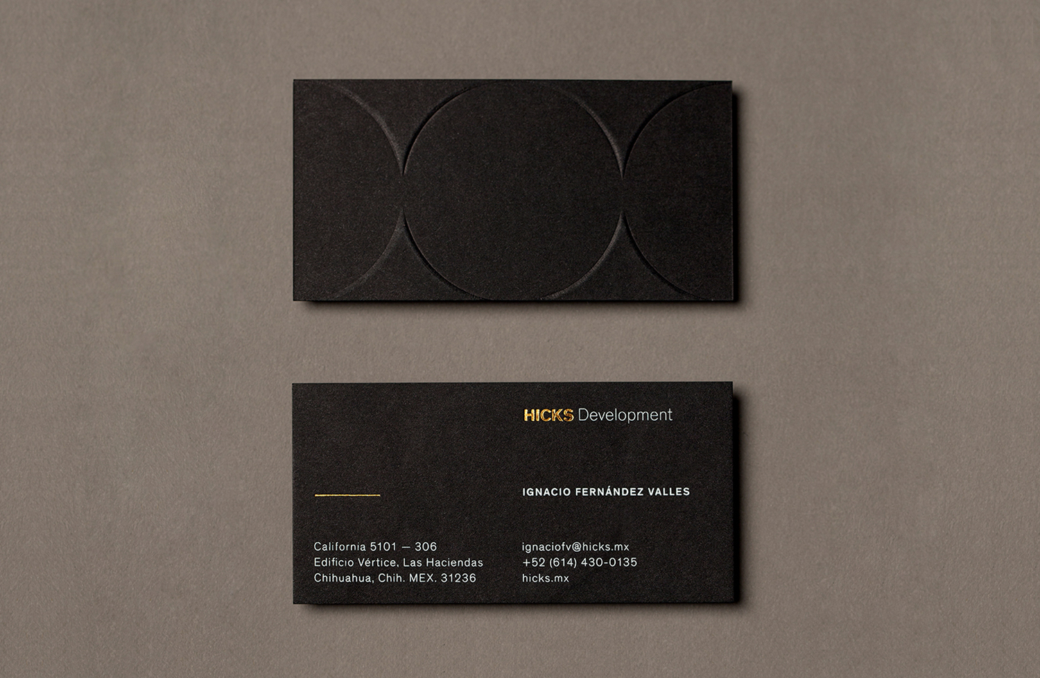
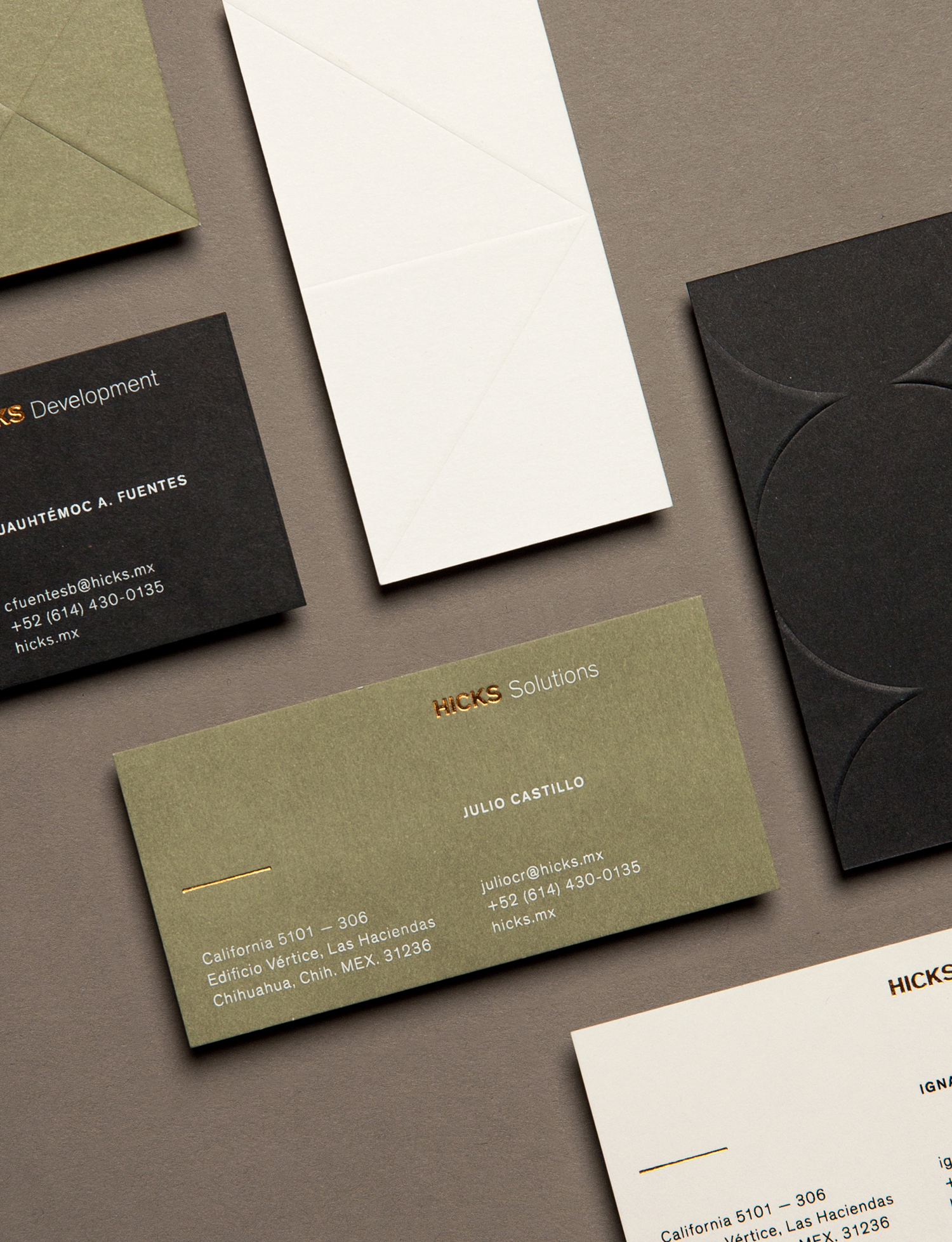
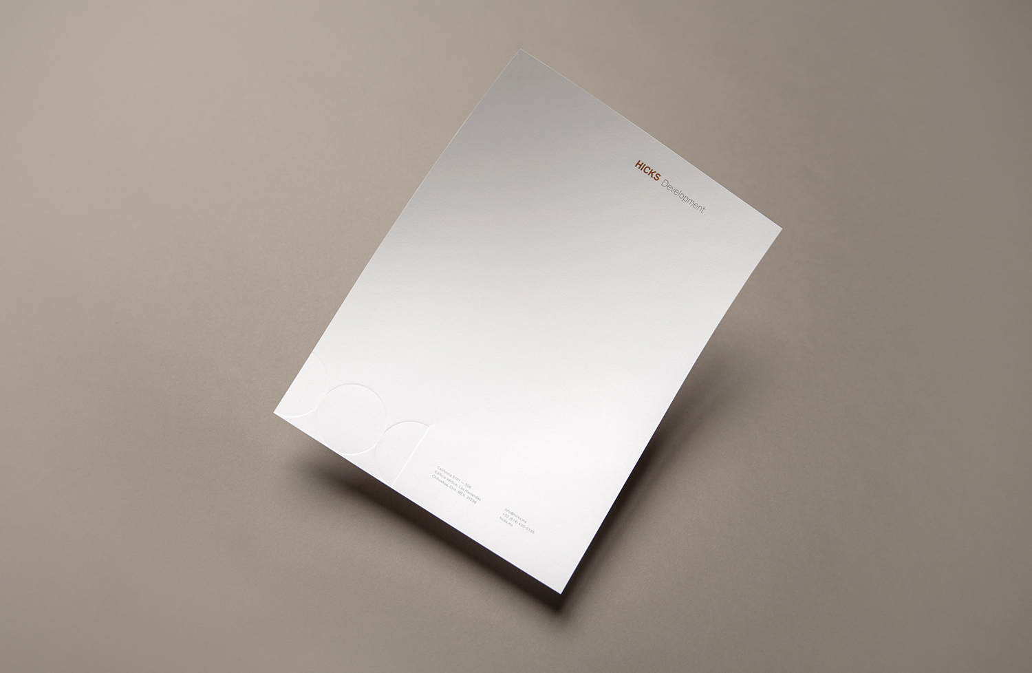
Face were commissioned to develop a brand identity system that would differentiate three speciality businesses; Hicks Capital, Hicks Development and Hicks Solutions, but would also have a commonality that reflected their collaborative approach to projects. Within this system, these companies are differentiated by colour and form but united by materiality, typography and layout across stationery and business cards.
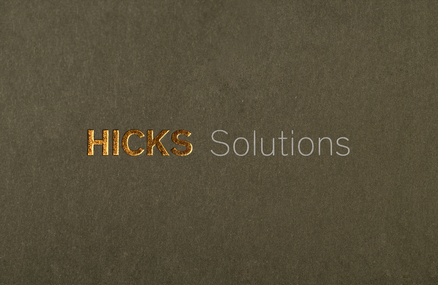
Face manage to strike a balance between individuality and continuity, satisfy the intention for Hicks to appear elegant and timeless, and convey the finesse and sharp vision shared by the three companies. This is achieved through a mix of typographical shape and weight, material quality and colour, the choice of print finish, and the way that these have been worked together alongside plenty of space.
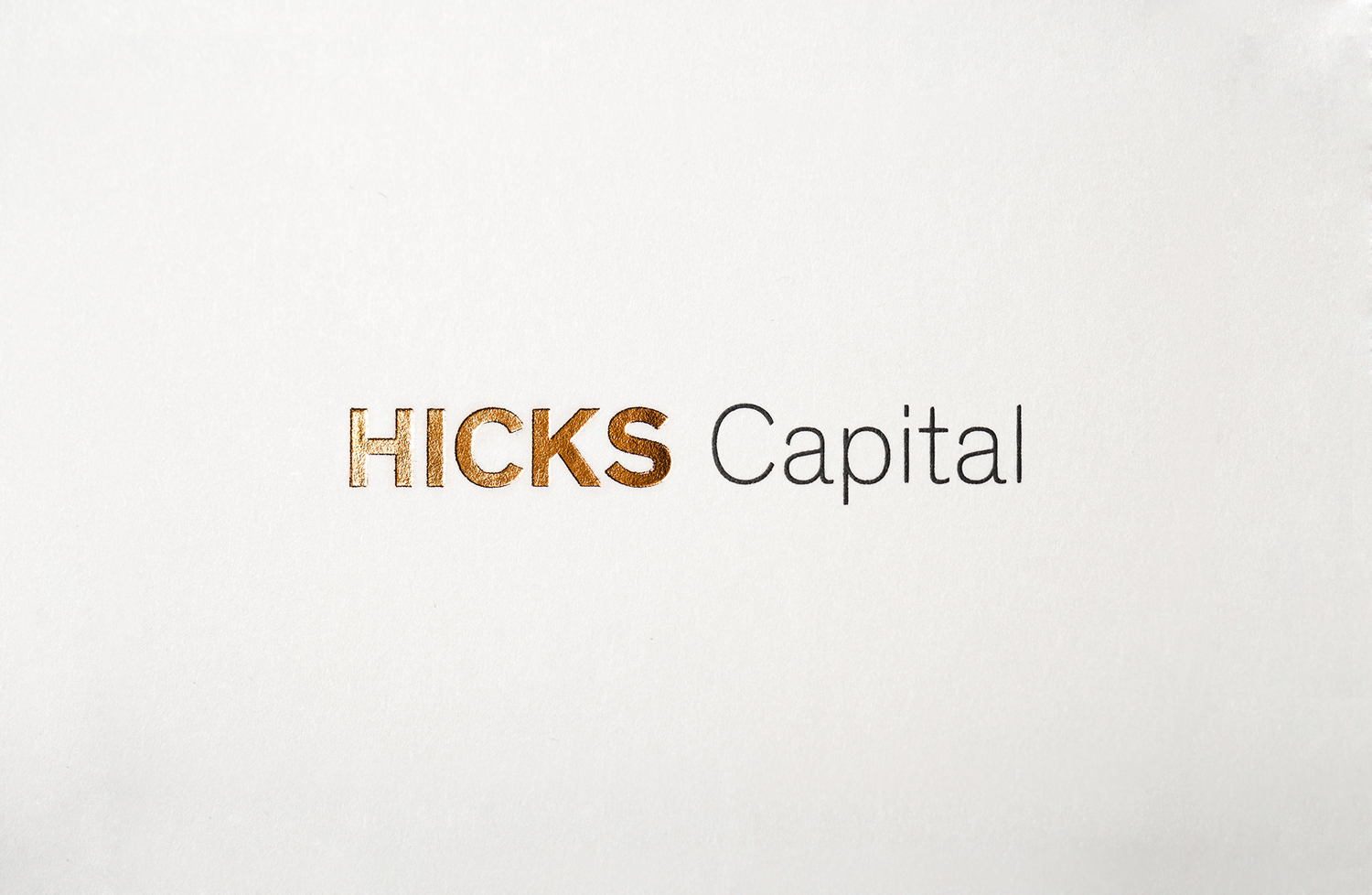
Hicks’ brand identity is not particularly company specific in its references, instead conveys some simple values and plays on some well-established and useful associations. These include the material quality of property developments and a general sense of value and finesse, touched upon in paper and finish, robust structures in the weight of boards and bold type, and an element of the innovative in the lines and shapes of a lighter sans-serif. Where these details unite the three, colour, geometric form and, probably more importantly their individual contexts, function to differentiate.
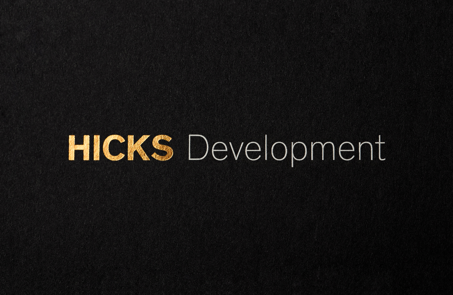
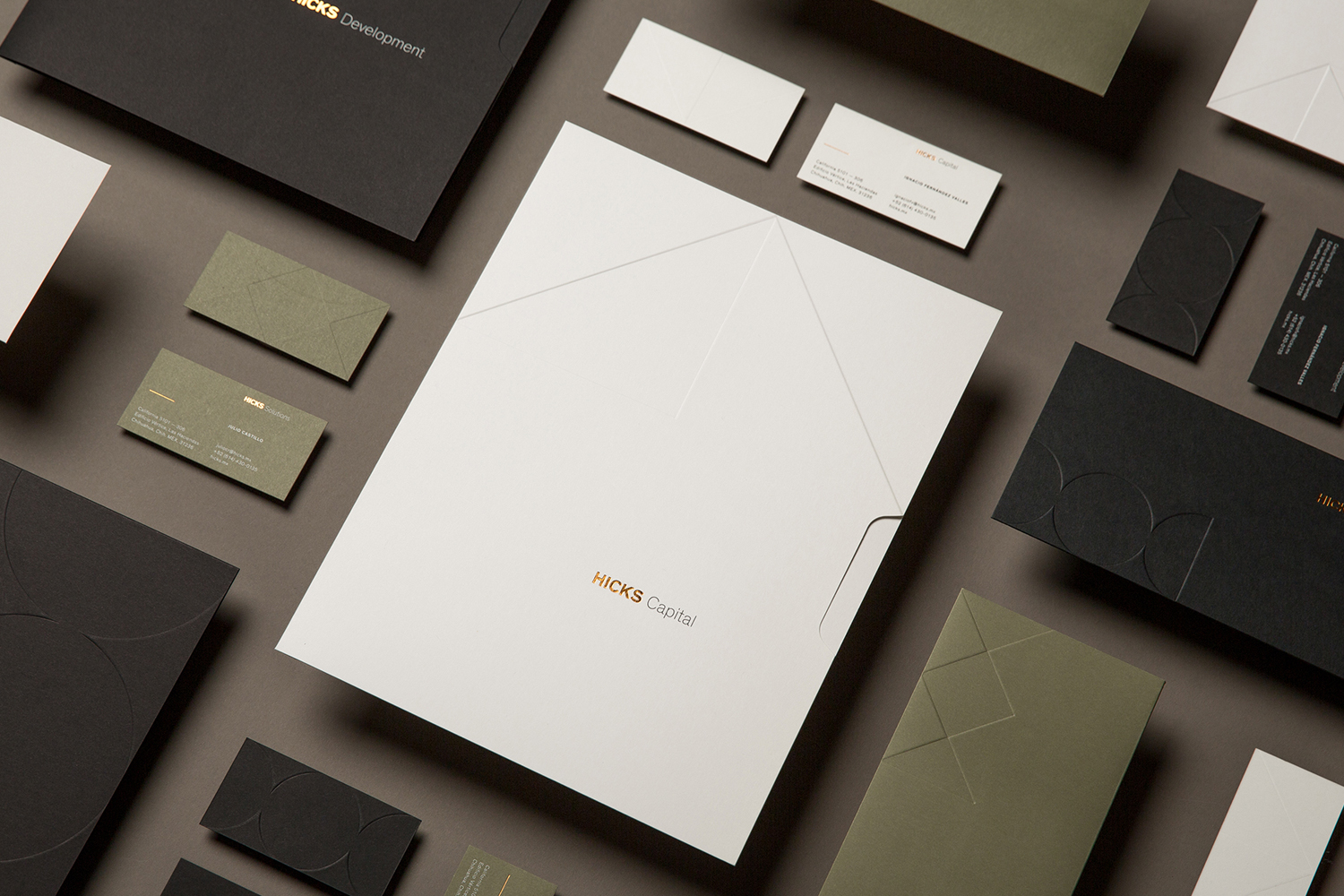
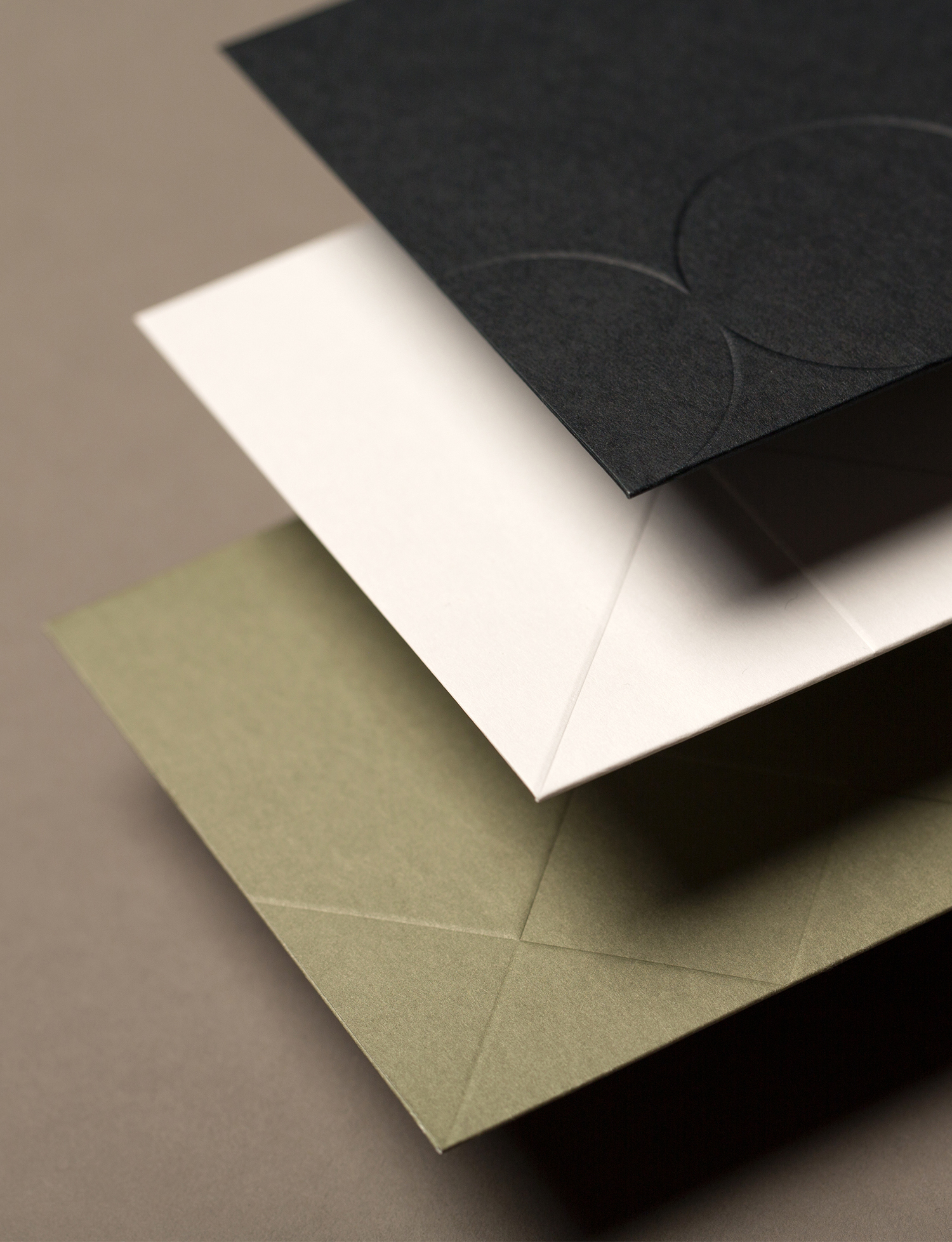
Although the embossed geometric forms are a pleasant detail, and feel for the most part grounded in a sense of materiality and modularity tied to the development of real estate, the work relies quite heavily on colour to differentiate.
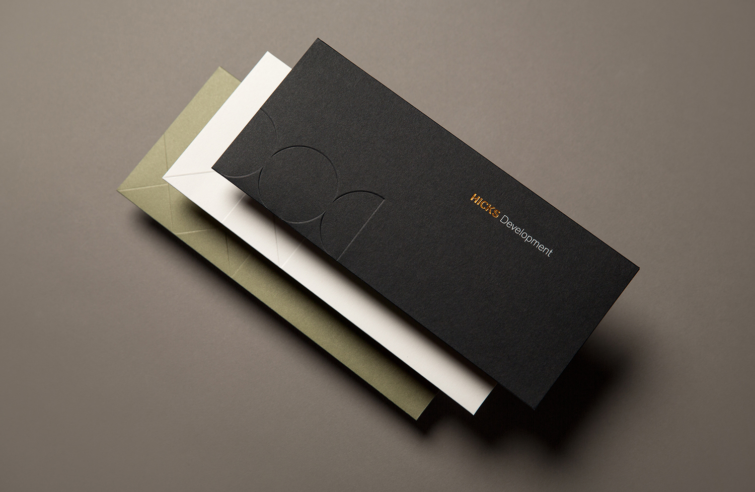
Dyed boards rather than ink keep quality high, and has a longevity where a straightforward full-bleed would wear along the edges. For those interested, Face used Neenah Paper’s Classic Crest and Classic Eggshell ranges, choosing Epic Black and Avalanche White, alongside a few other colours. Hicks Capital, with its white boards, leans more towards the conventions of corporate finance, Hicks Solutions feels far more earthy, rather than techie, and Hicks Development favours black, an architectural favourite.
Colour choices, when placed together are a particularly highlight, which is rather fitting as Hicks gains it real strength from the collaborative effort of all three companies. These all share the same url so it will be interesting to see how this will play out online. More from Face on BP&O.
Design: Face. Opinion: Richard Baird. Fonts Used: Theinhardt. Papers: Crest Classic.
