Paley by Mucca
Opinion by Richard Baird Posted 15 July 2016
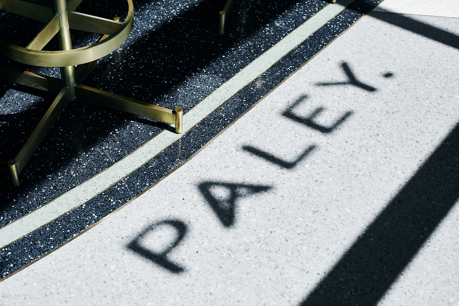
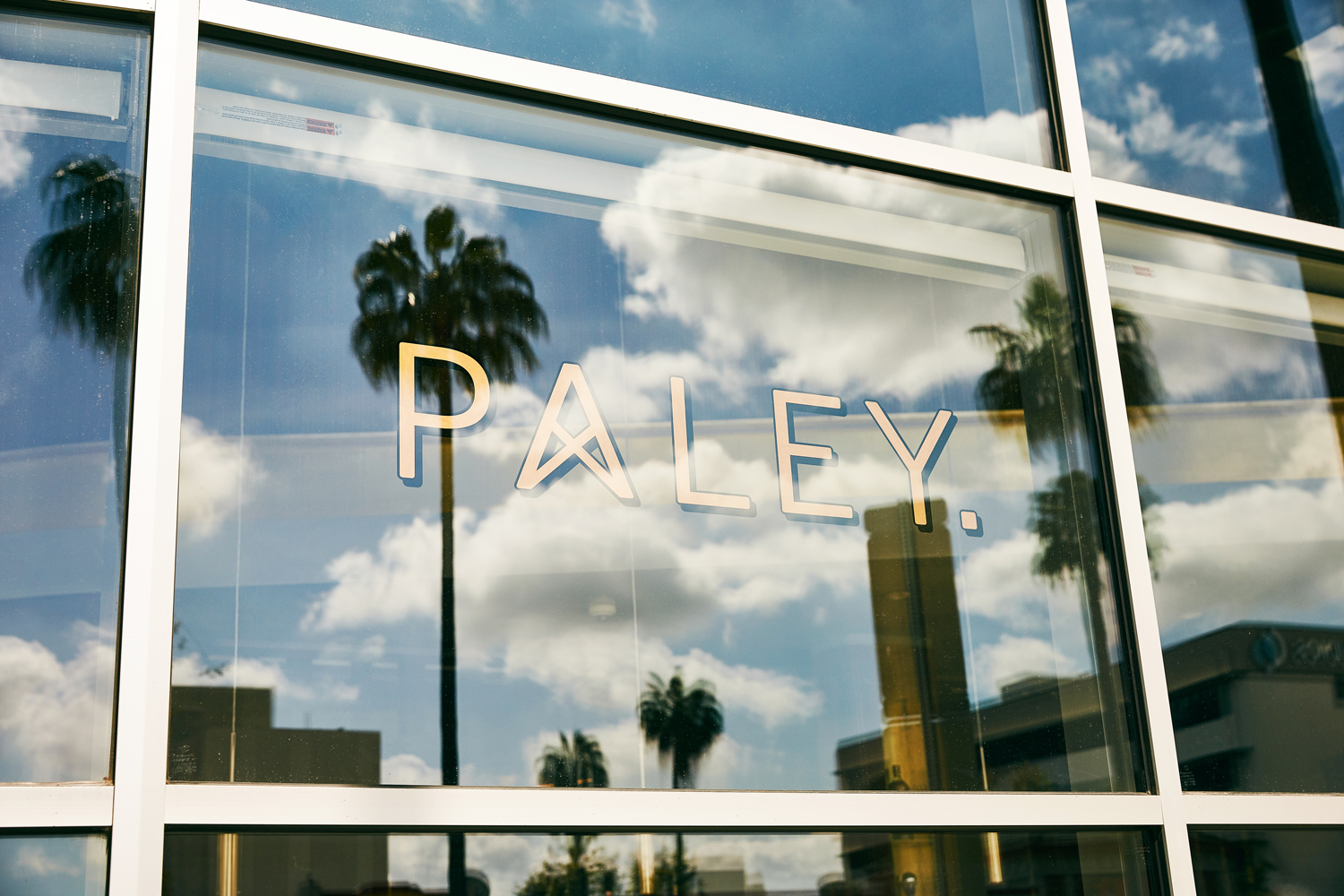
Paley is a restaurant located in Columbia Square, Los Angeles, the former headquarters of CBS and its pioneering chief: William S. Paley, from which the restaurant draws its name. Paley features a distinctive interior, designed by Bishop Pass, of mid-century detailing that recalls Hollywood’s heyday, which comes through in the mix of wood panelling, gilded surfaces, and period-style furniture, fixture and fittings.
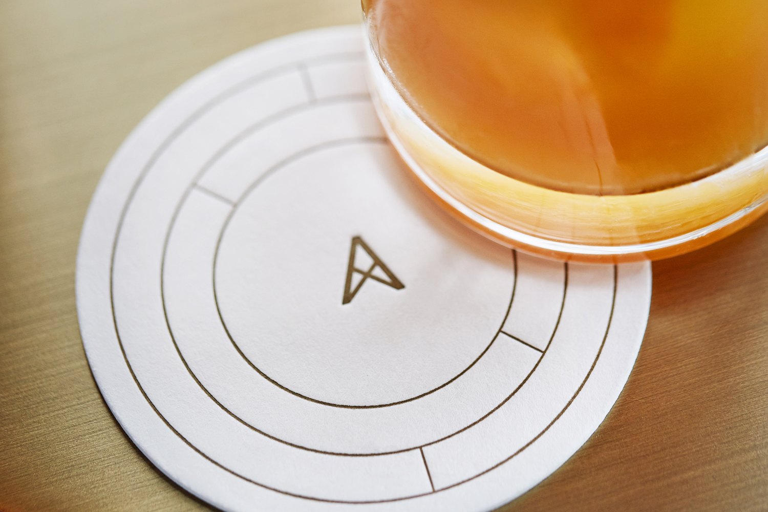
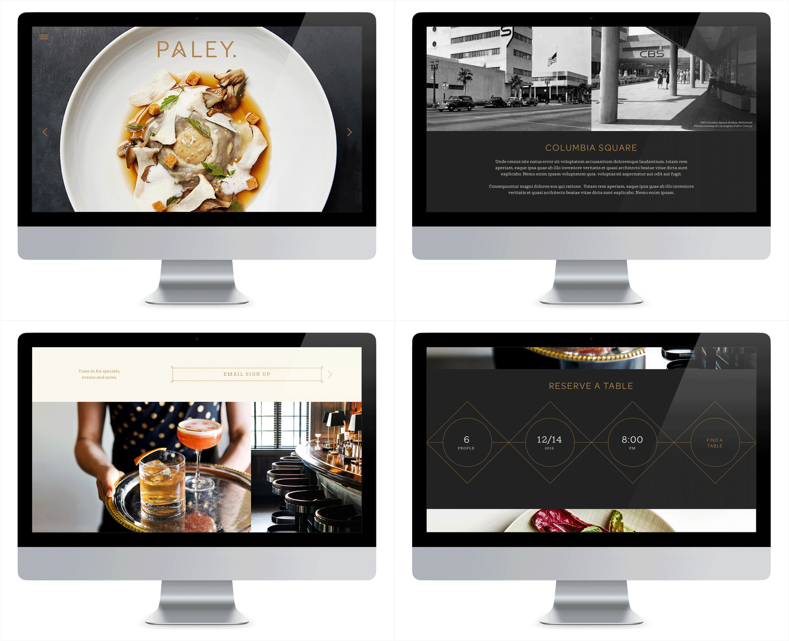
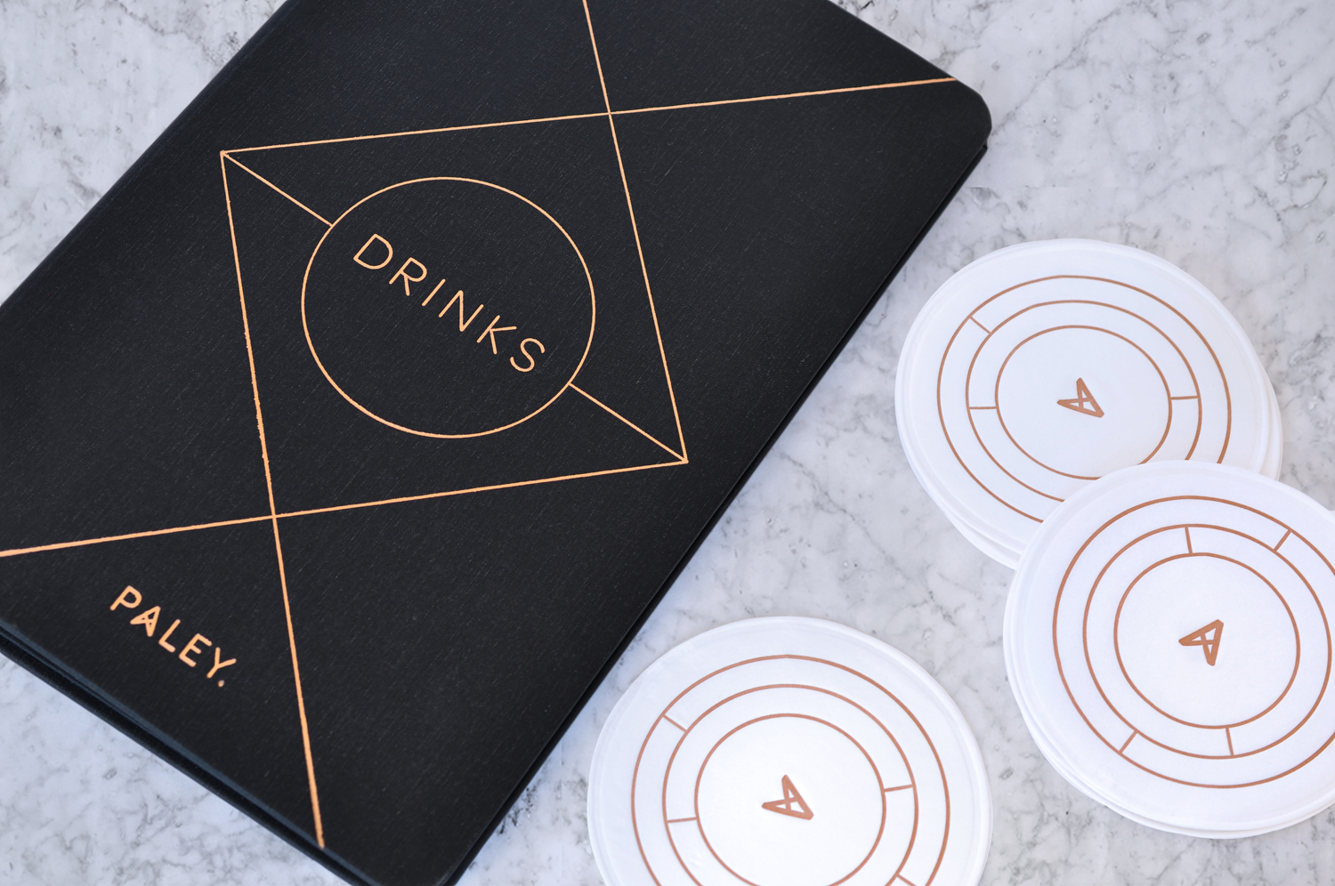
Paley’s brand identity, created by New York-based graphic design studio Mucca and extending across menus, wine lists, business cards, coasters and website, plays with the building’s broadcast history and shares a commonality with interior through geometric form and pattern, a contrast of type and high-quality material choices and print finishes.
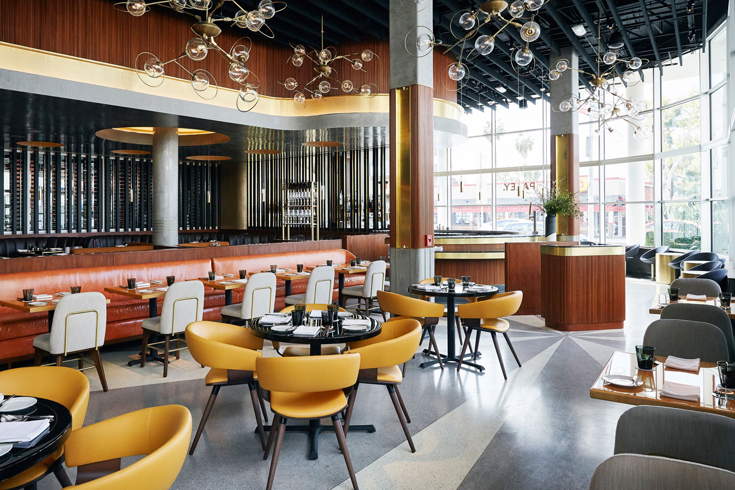
Mucca’s work for Paley does a good job of finding a balance between the utility and technicality of the former broadcasting house its resides in and the high-quality material details of the restaurant experience it has become. It finds a commonality between the forms that often characterised mid-century interiors and their furnishings with the forms and structures associated in broadcasting. Be that the copper of gilded surfaces and the copper wires of cable-tv, or the shapes of mid-century furniture and the lattice structures of broadcasting towers. This gives identity a sense of place, alongside a more conventional but appropriate reflection of interior and expression of quality and glamour.
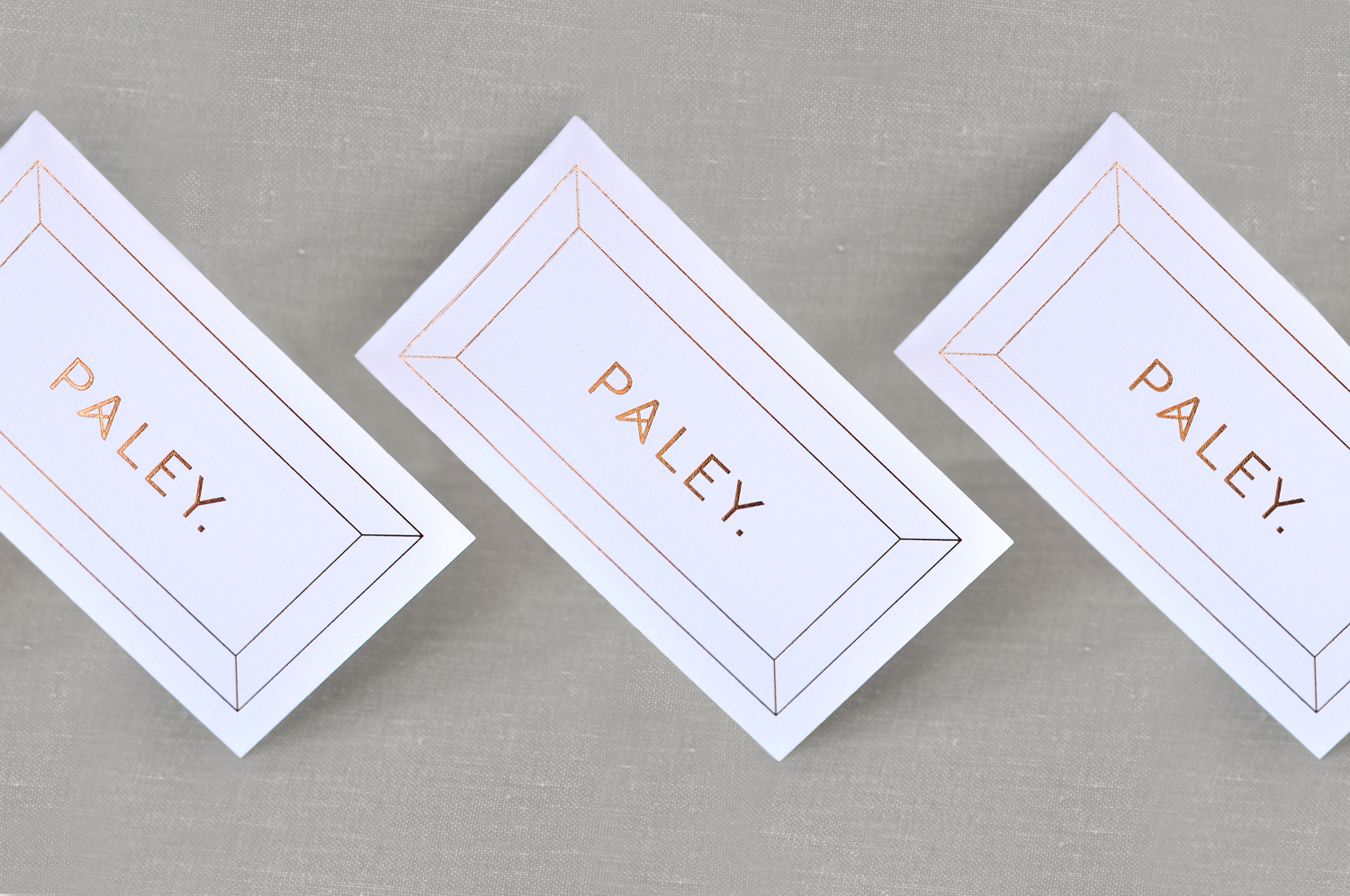
This mix of utility and period flourish also extends to type choice. Shift, inspired by American slab-serifs from the late 19th century, sits alongside the more reductive and simplistic forms of Omnes Pro, a sans-serif described as robust and no-nonesense by Darden Studio.


Interior is reflected in both the graphic expression of identity, in form, some fine line weights and typographical shapes, but also its materiality, a mix of high-quality uncoated papers and boards, the texture of menu covers, the weight of substrates and a copper block foil and ink print finish.
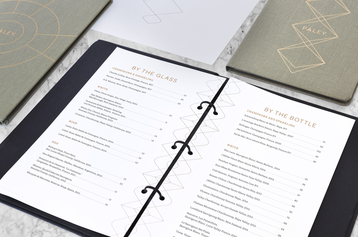
The real highlight, aside from what is a impressive interior, is the use of lattice work of broadcasting towers and the radial elements of period test patterns across menus and coasters. The connection is subtle, sure to elicit an aha moment, but really shines in the way that it manages to draw together the former use of the space, set a period quality through form and line weight, and delivers a compelling but simple aesthetic treatment.
Design: Mucca. Opinion: Richard Baird. Fonts: Omnes Pro & Shift.
