BIFAN 2016 by Studio fnt
Opinion by Richard Baird Posted 19 September 2016
Bucheon International Fantastic Film Festival (BIFAN) is an eleven day event that takes place each year in a number of locations throughout the South Korean city of Bucheon, a satellite city of Seoul. It celebrates world cinema; specifically those dealing with the themes of love, fantasy and adventure, plays host to international, Asian and national premieres, and includes, alongside the 320 films from 49 countries, a variety of performances, concerts and art and design exhibitions that draw their inspiration from the films being screened.
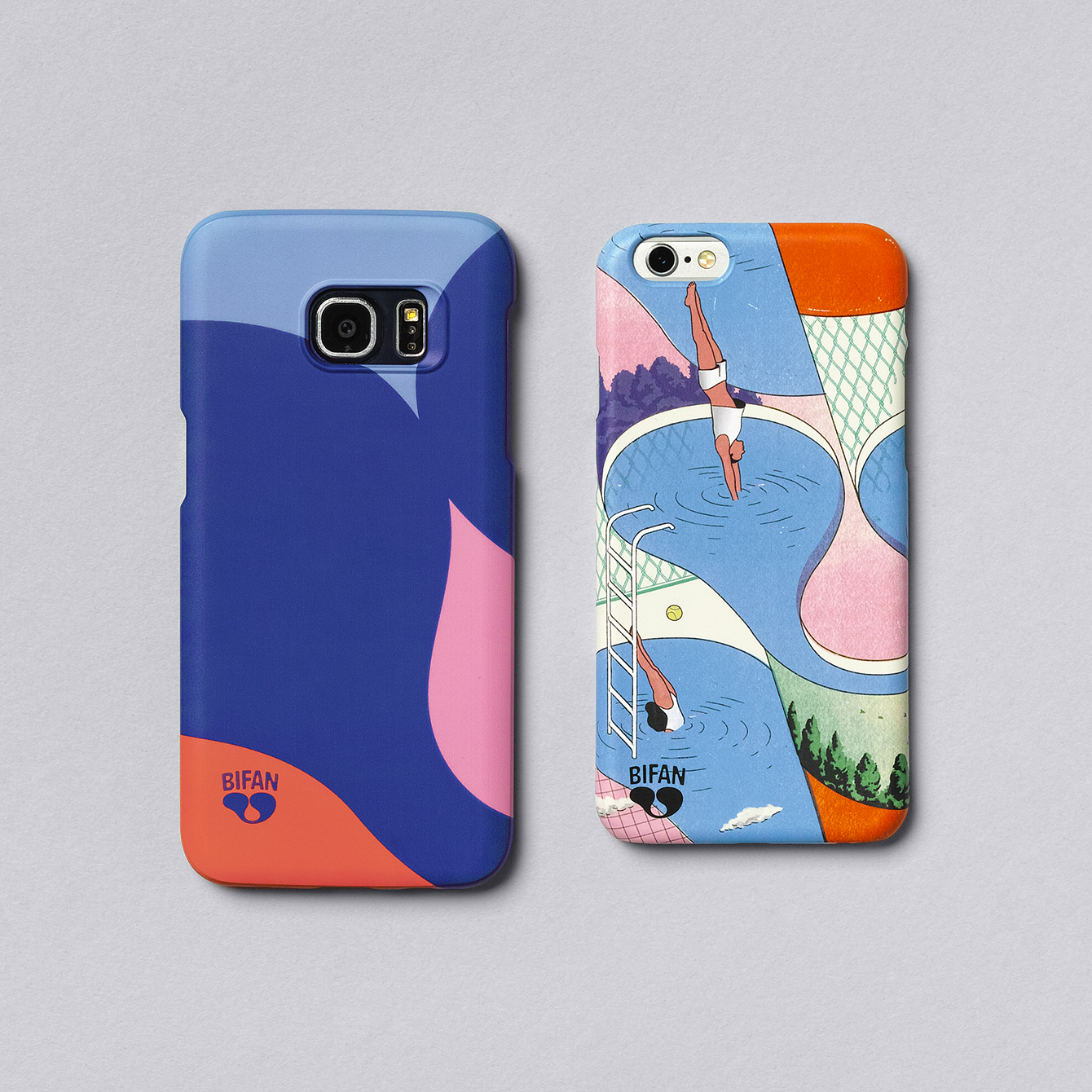
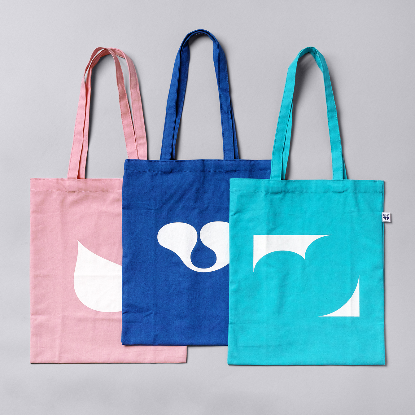
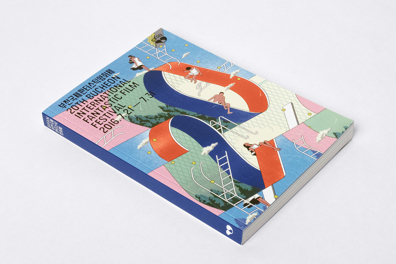
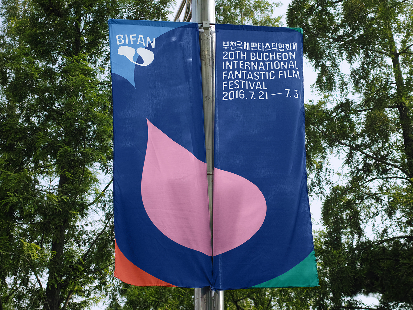
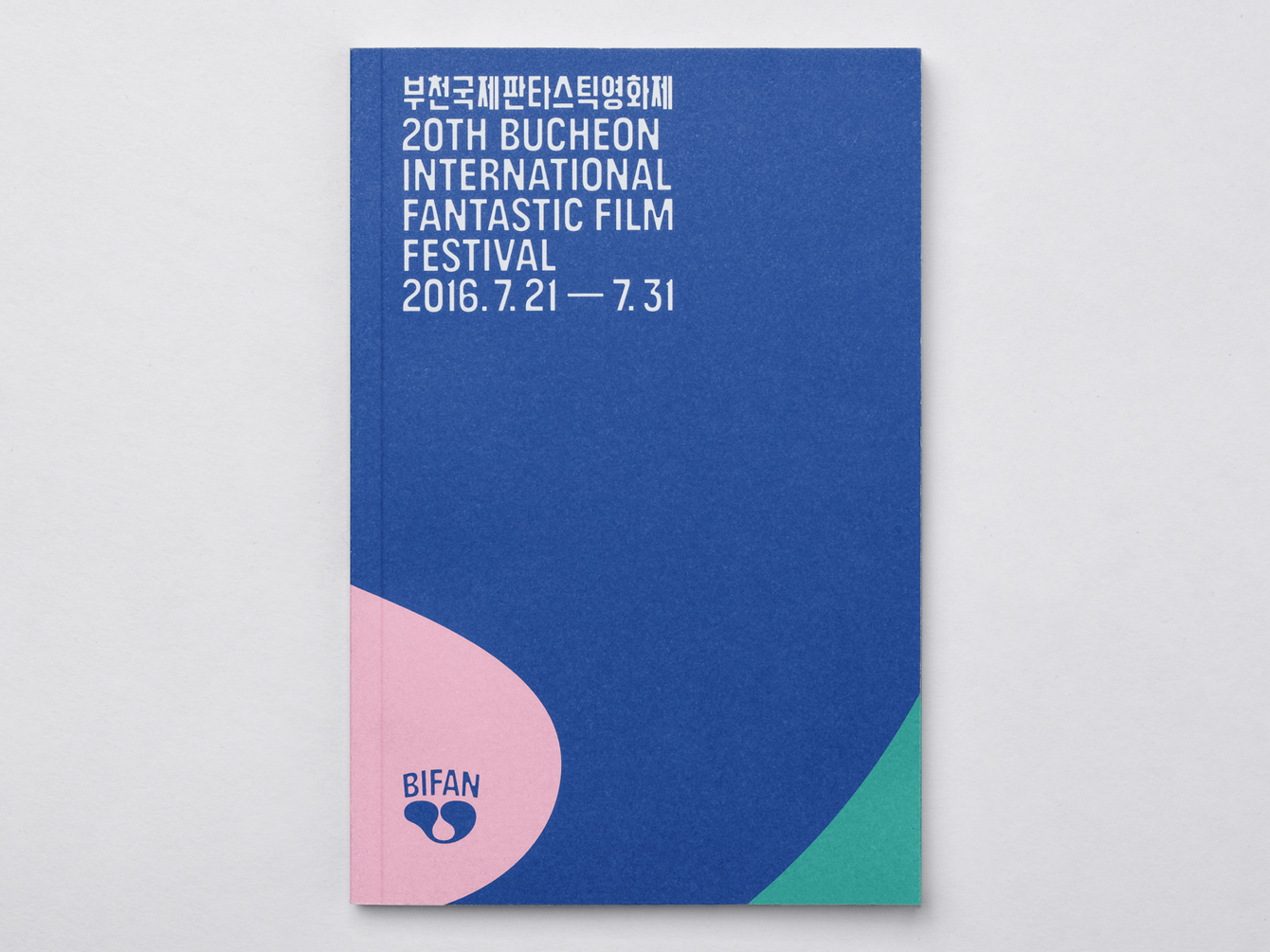
BIFAN 2016 is the largest festival to date, and features a revised brand identity, designed by Studio fnt. This reaches across a plethora of printed materials that include posters, banners, tote bags, merchandise, tickets, signage and a catalogue to promote its 20th anniversary.
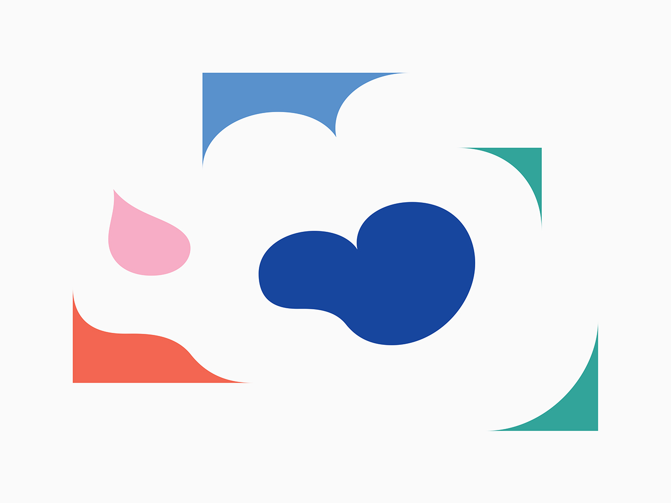
These are linked a by a new logo, the “Cell Of Fantasy”, that hints at the expansion of BIFAN’s fantastic imagination, and implies a close connection with opposing visual cues, such as yin and yang, in order to stimulate the eyes and the creativeness of the audience. This is paired with a graphic system of shapes and illustration that intend to express the energy, adventure and imagination of an event unlike any other.
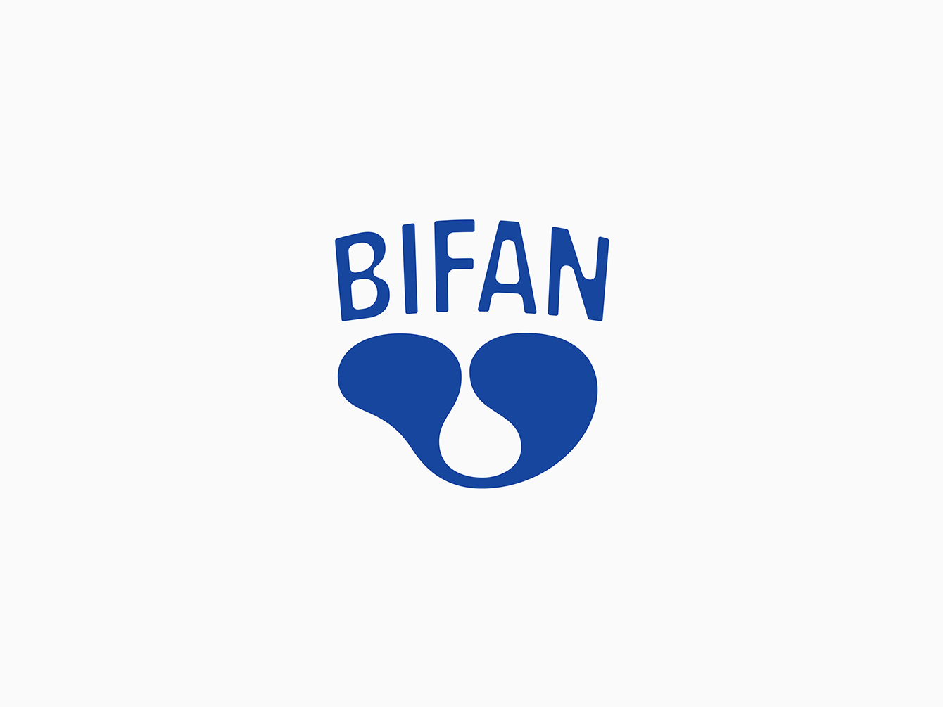
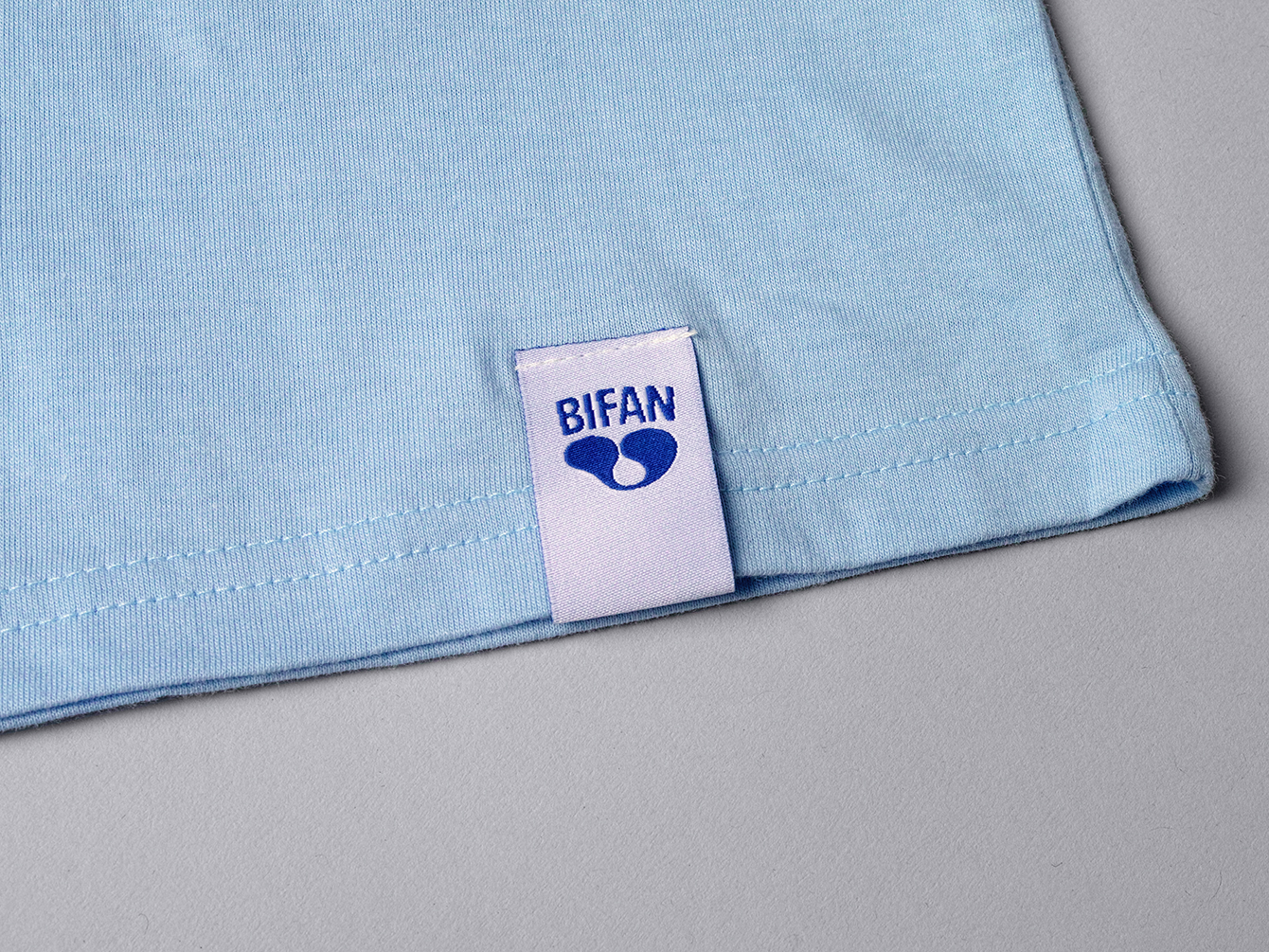
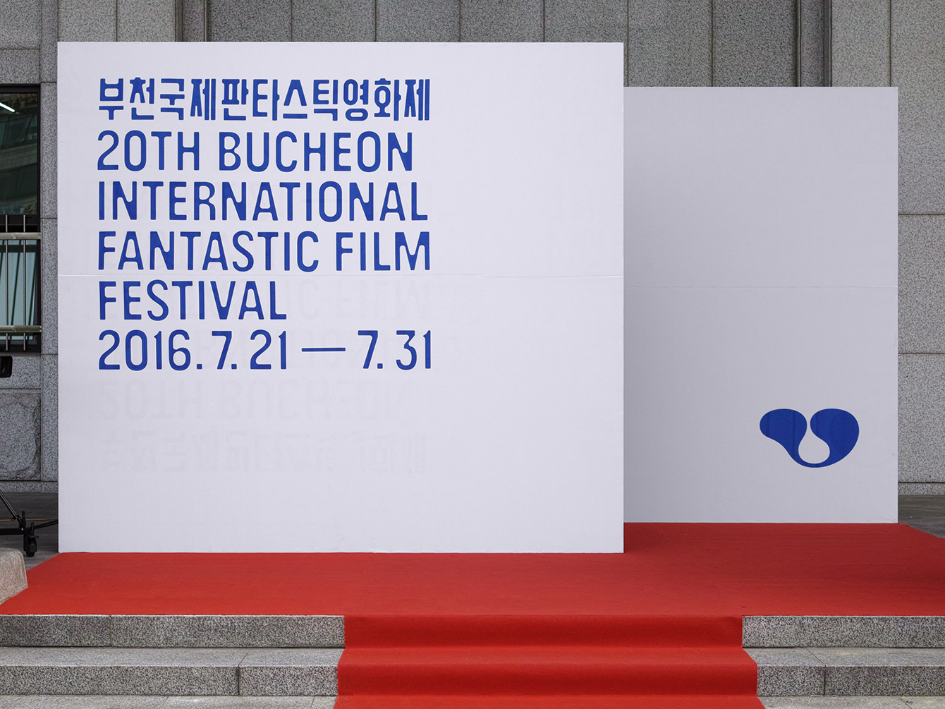
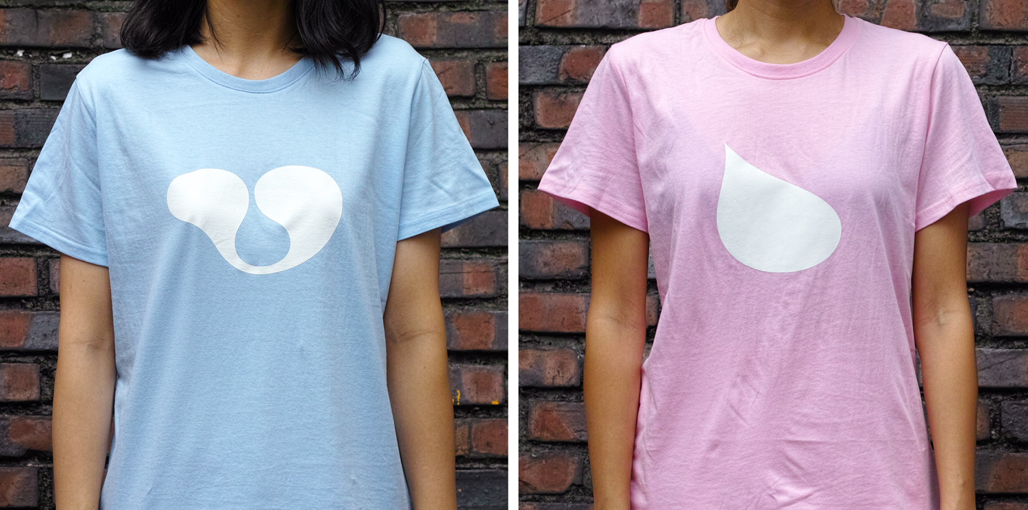
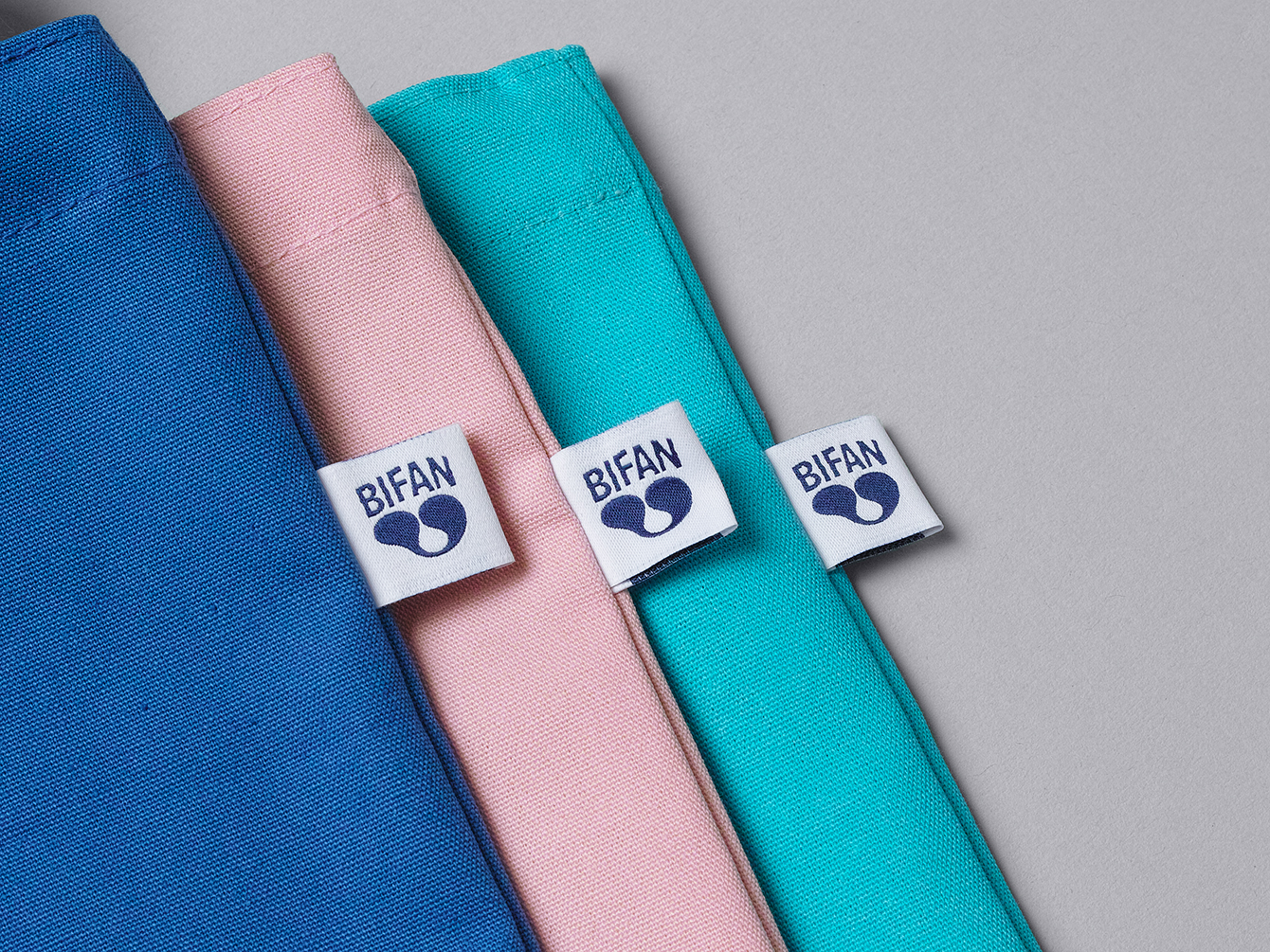
The logo makes for a memorable and identifiable mark, more so for its unusual organic quality rather than its conceptual and rather abstract foundations. As an isolated form it comfortably plays with positive and negative space, a sense of direction and, in its abstraction, benefits from the interplay between shape and the associations a viewer brings to it (be that the suspension of the gelatinous, alien flora or something else). In this way it feels appropriate for a festival of imagination and functions well, alongside colour, to brand merchandise such as t-shirts and tote bags.
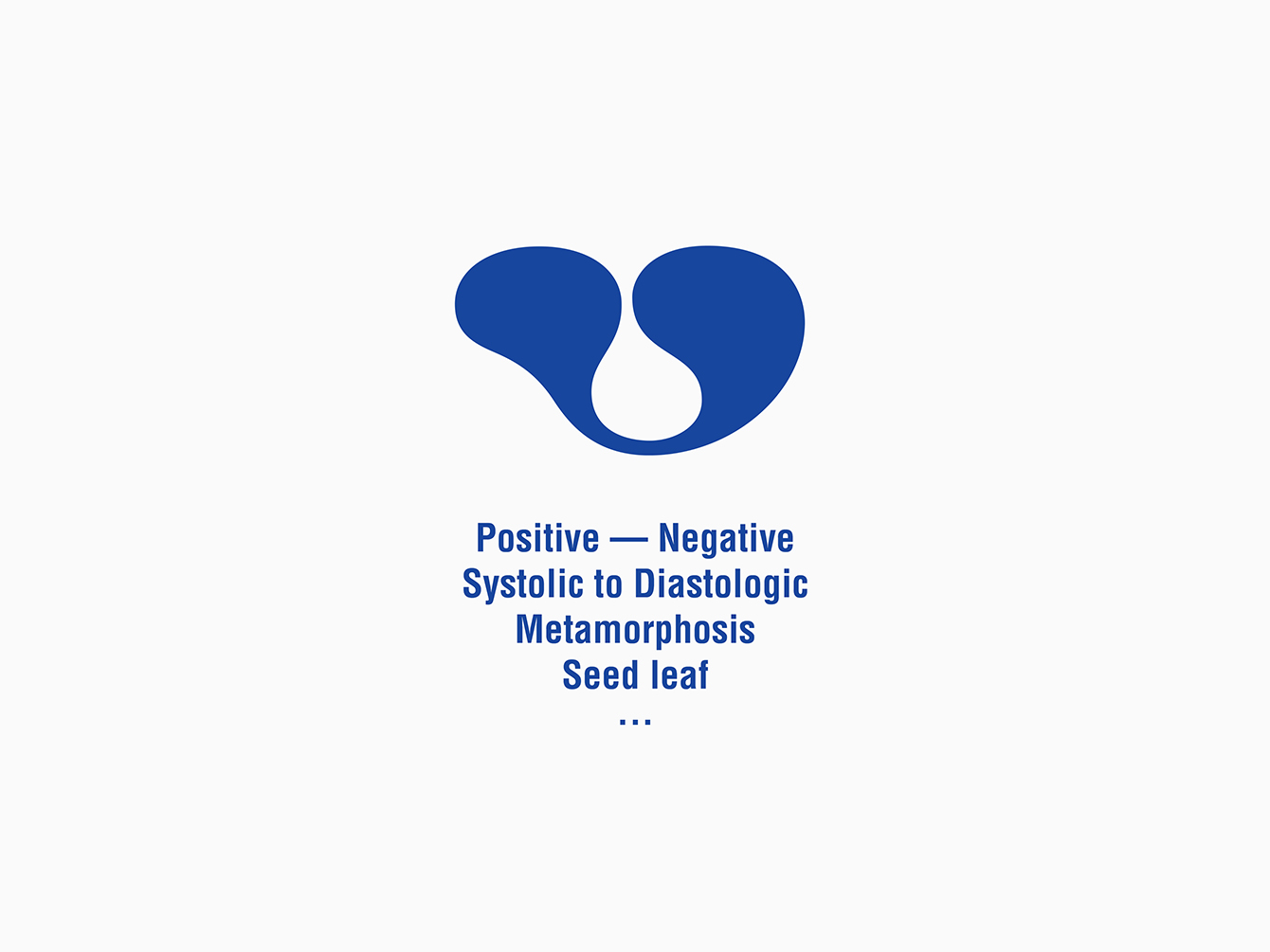
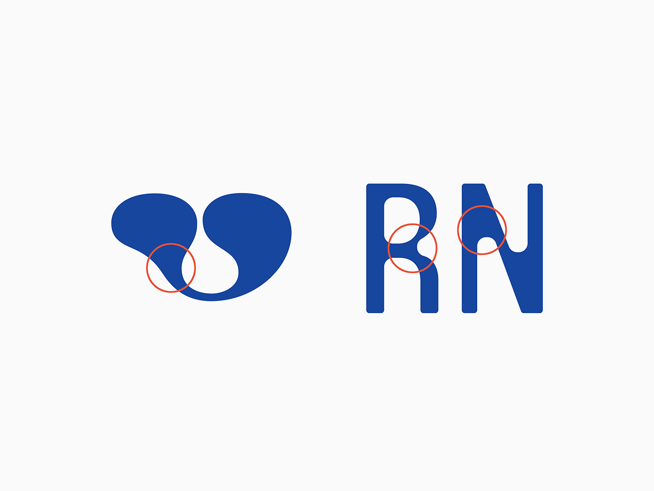
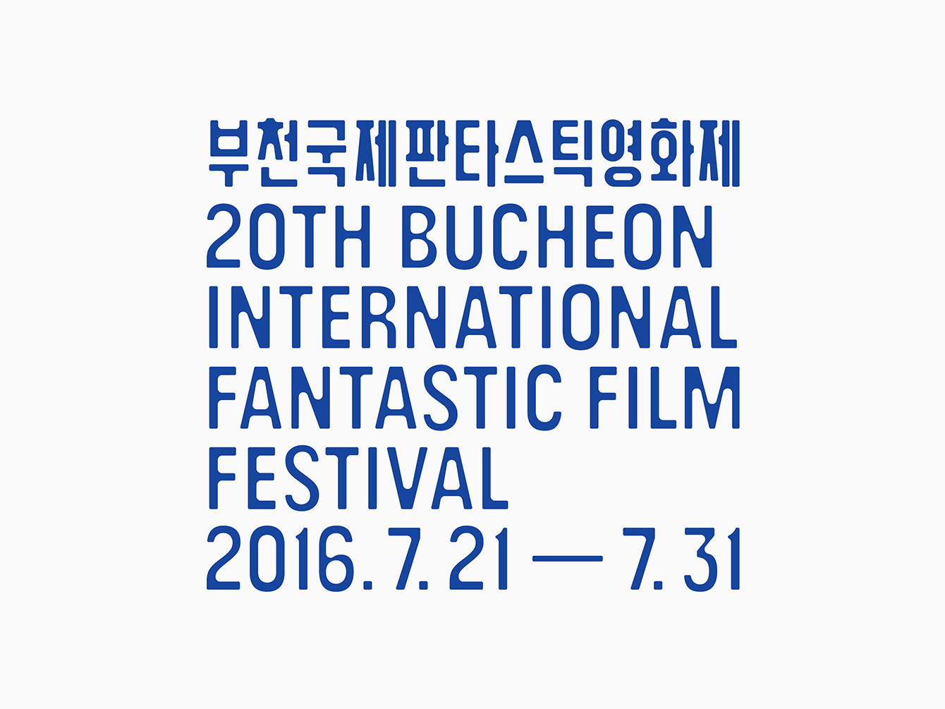
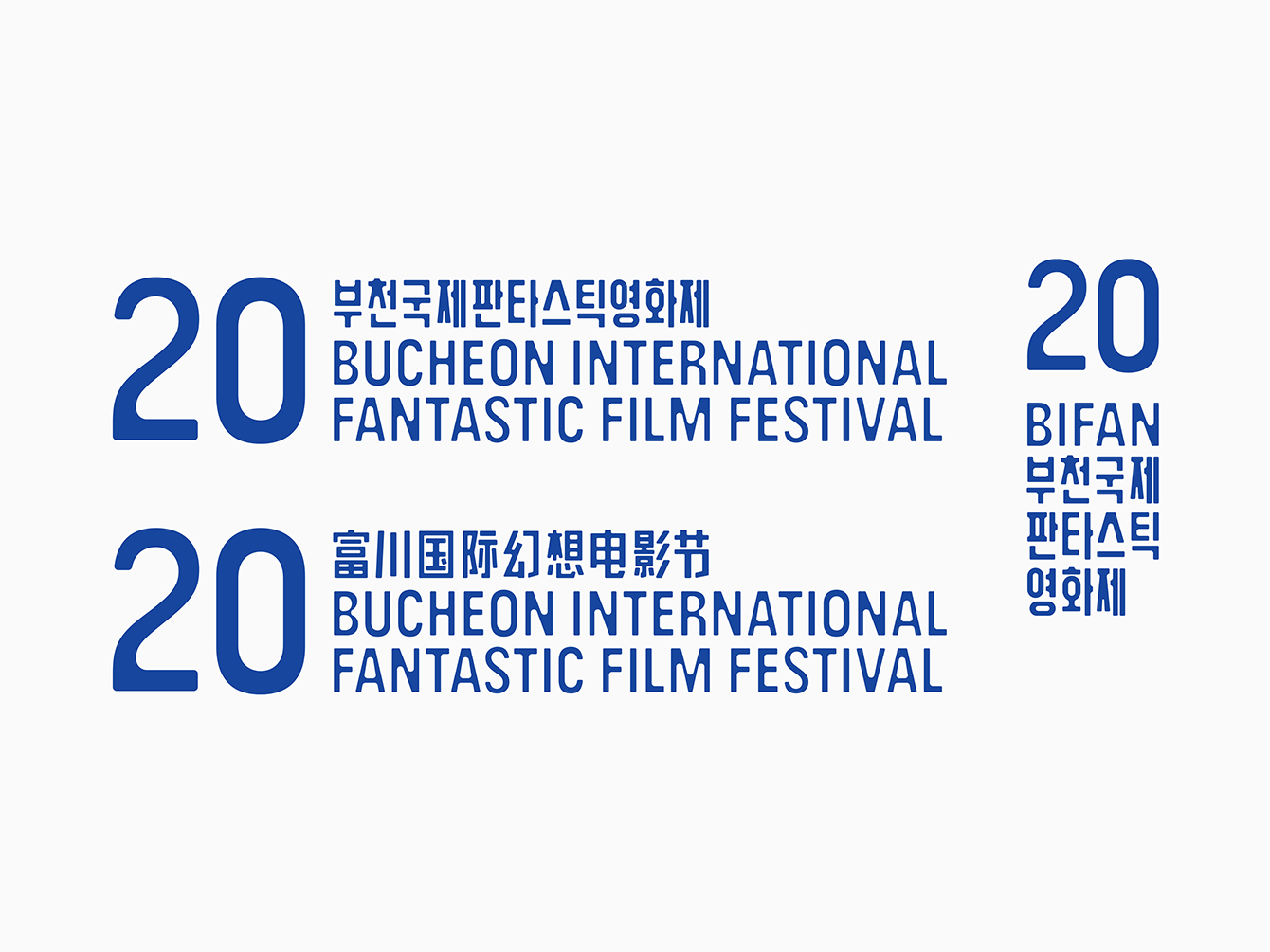
A custom typeface, which begins as a fairly conventional uppercase and condensed sans-serif, draws on the curves of the logo, and introduces these into corners and intersections, establishing a continuity between the two in a way that also works well across Korean, Chinese and Latin characters. These changes lend an idiosyncratic quality to familiar type structures, emphasise negative space and adds a sense of opposition, much like logo. This begins to look more interesting when languages are brought together and type is stacked in a couple of different ways.
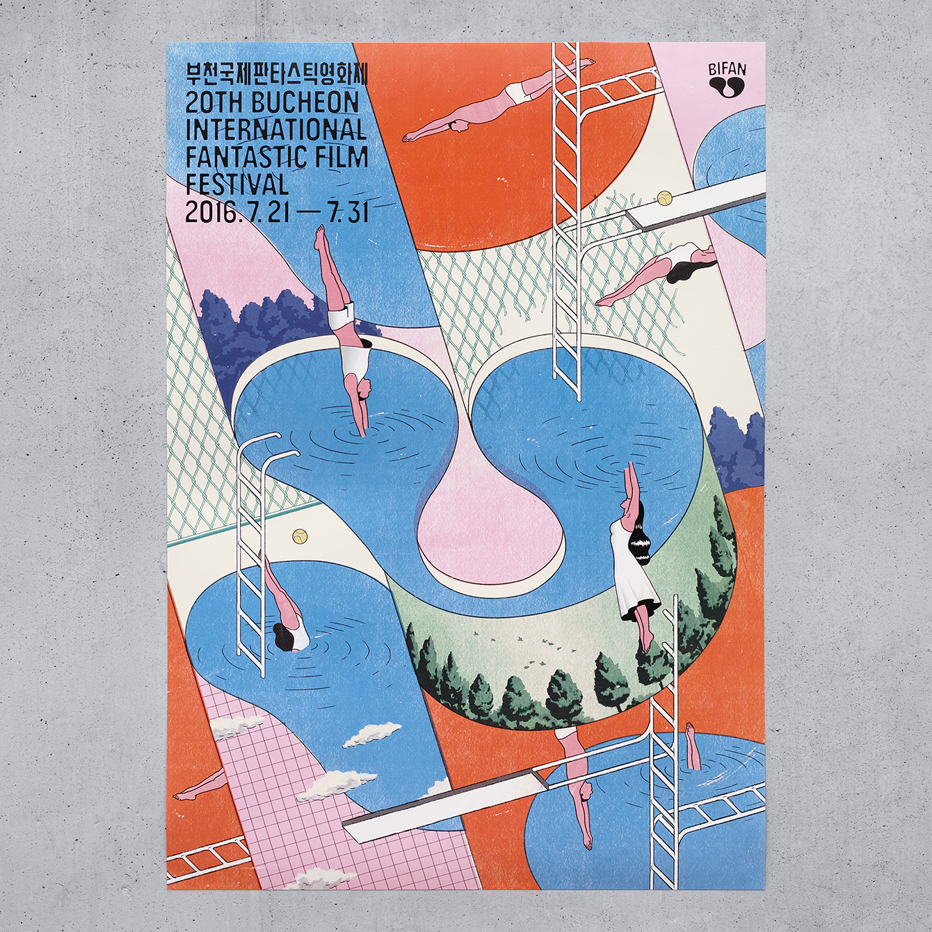
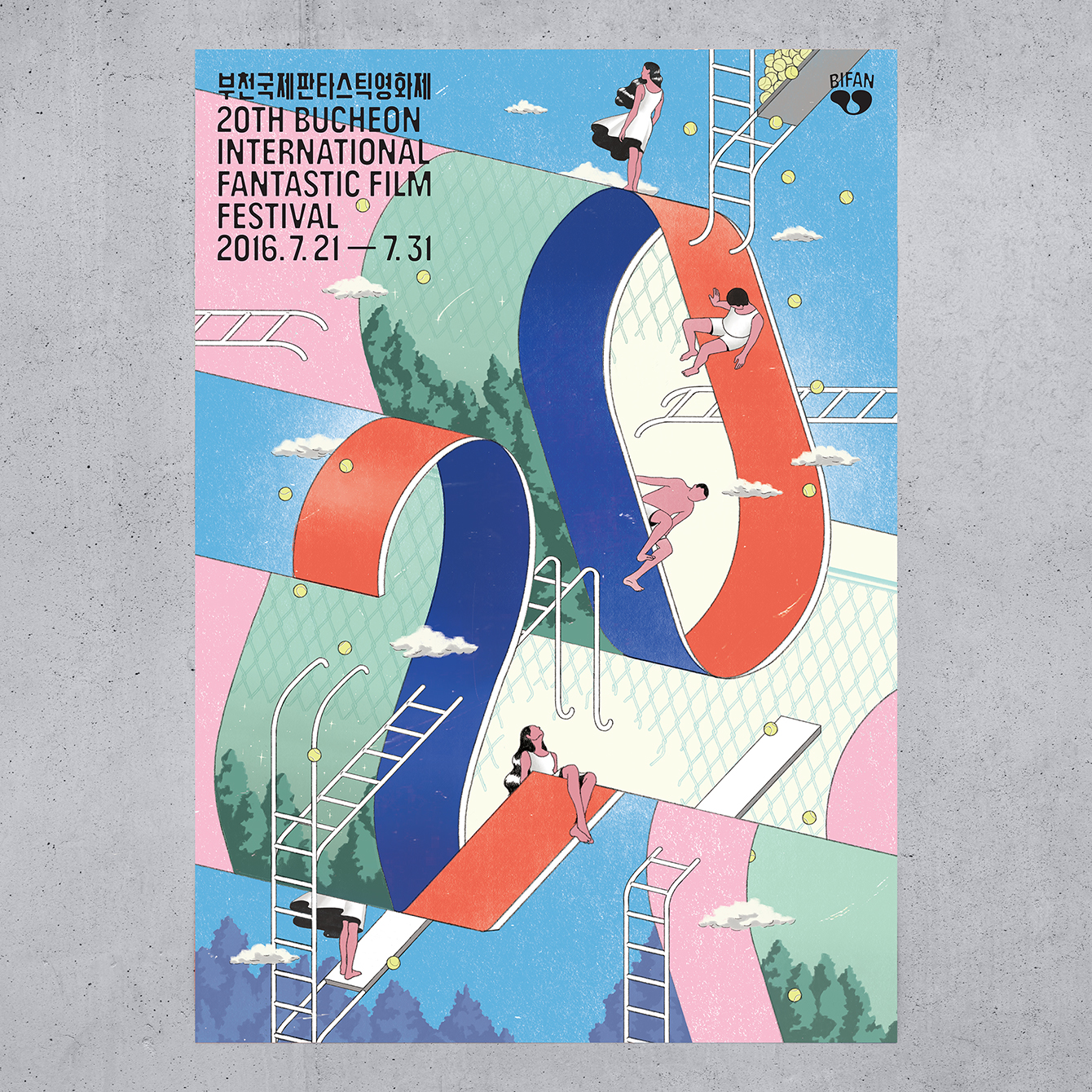
The illustrations, drawn by of Jeeook Choi, call to mind the impossible shapes, structures and scenes of M.C. Escher, and bring a visual richness to the simplicity of logo, a form central to these, without feeling overly logo-centric. These are distinctive and unusual in their content, appear dynamic in their composition and use of diagonal lines, and, like the logo, play with opposition in the use of organic images such as trees and people, geometric shape and structure, a modern colour combination and a slightly retrospective surrealist style. Illustrations are clearly linked by colour and their impossible dimensionality but also by a subtle narrative component and what might be construed as a sense of place.
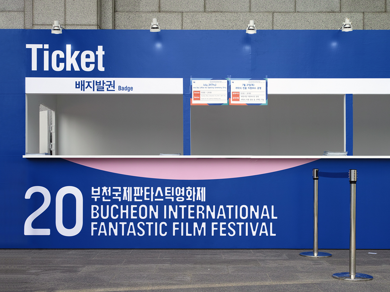
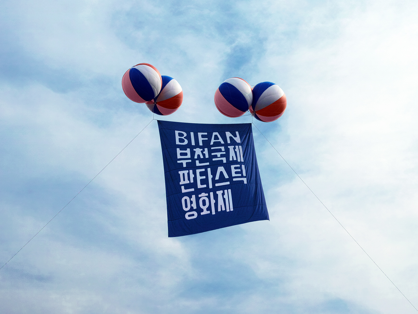
Custom type stands up well small across tickets and as headings within the catalogue, but also blown up large as signage, both white on blue, and blue on white, whilst retaining its identifiably and idiosyncratic qualities.
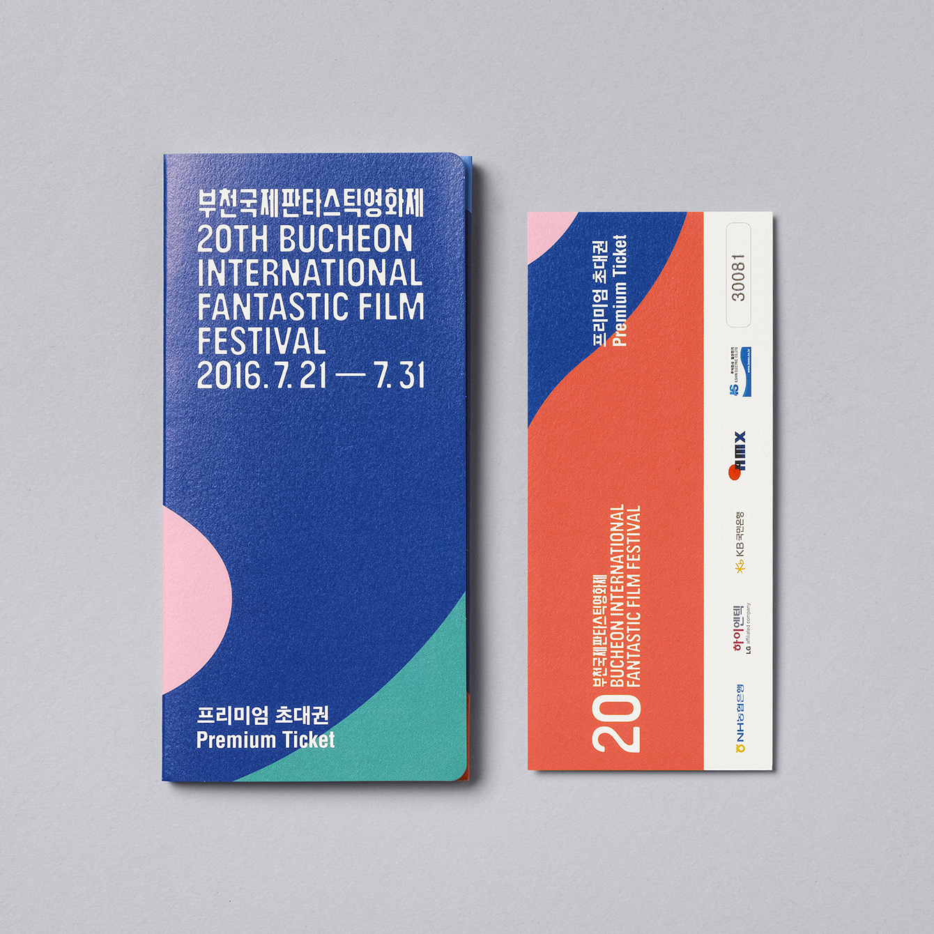
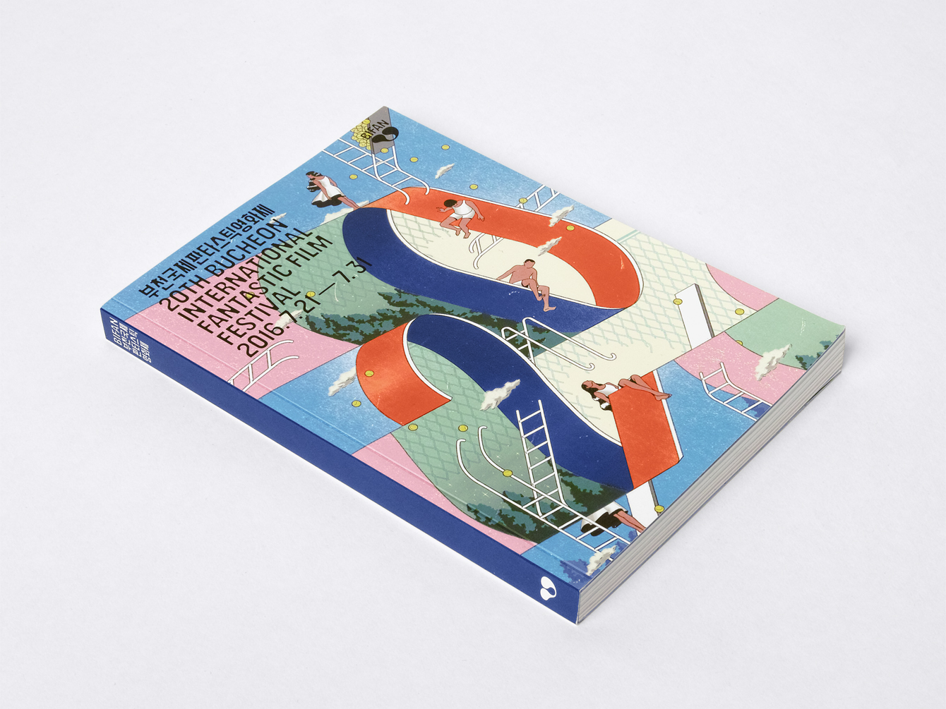
In print bilingual content is well-structured. Although type is tight and small this is in service of moments of space. Colour works well to punctuate the catalogue, dividing content and introducing crops of the logo, again, whilst avoiding the overly logo-centric. There is a good balance of type and image, the wide cinematic qualities of screen grabs and the tighter crops of profile images, as well as white space and pages of colour. A strong grid-based structure is in opposition to the curves of the logo, which links back to the concept of opposing visual cues.
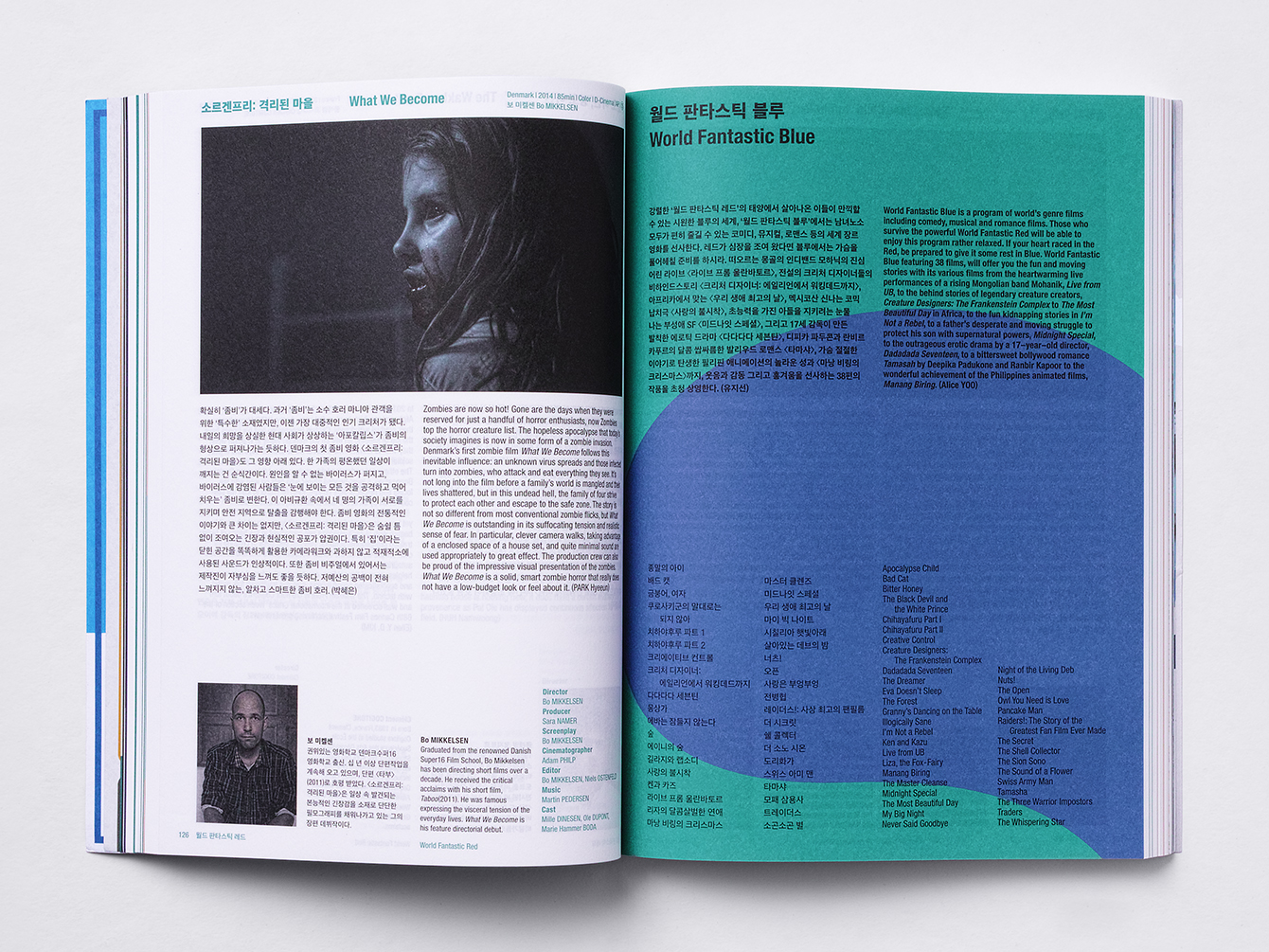
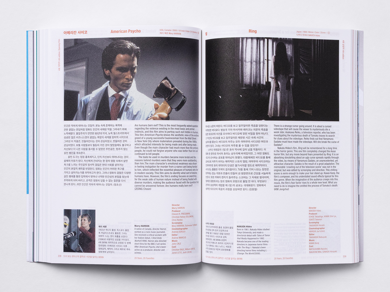
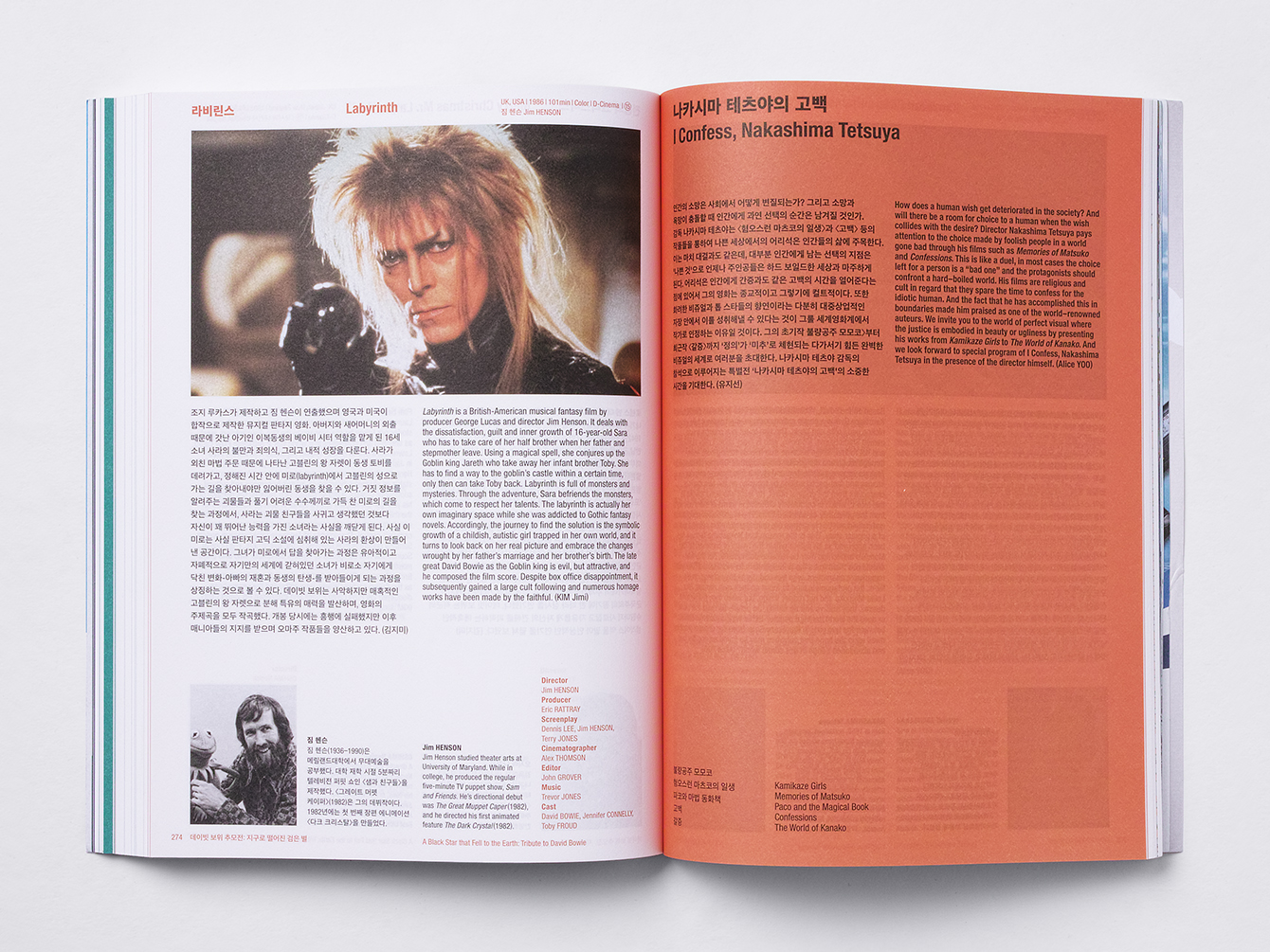
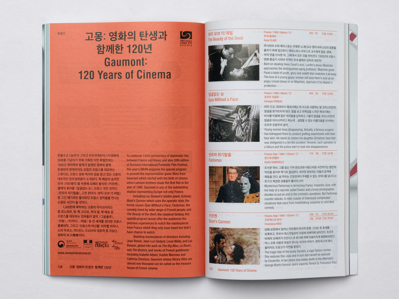
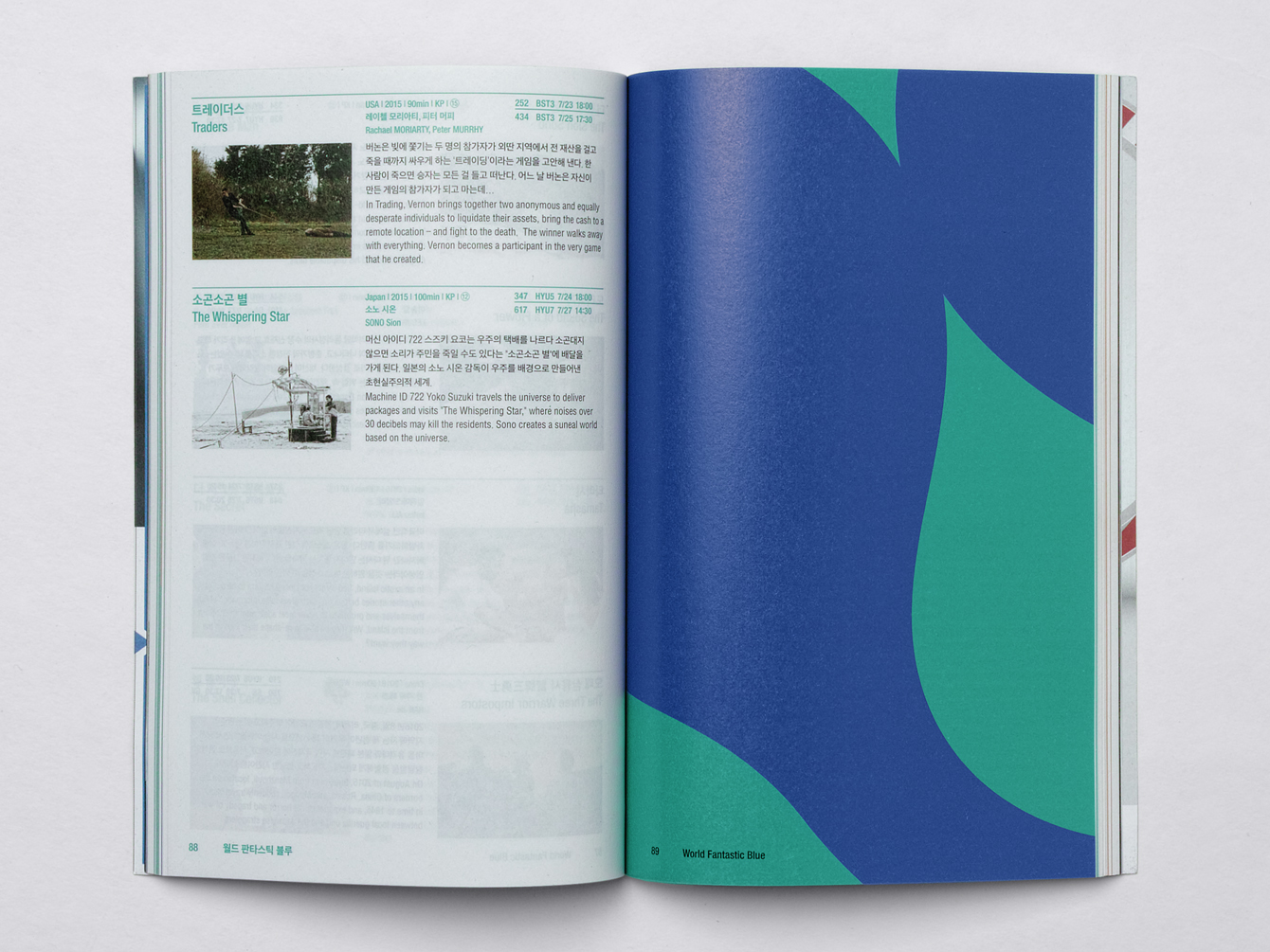
The result is broad but cohesive, with a good aesthetic continuity between type, mark and illustration, helped by colour and more subtly in concept. The opposing forces that underpin mark, emerge elsewhere; in the structure of printed materials and the organic construction of logo, the precise lines of type and the hand drawn qualities of illustration.
Illustration builds out a rich and interesting visual expression. Its fantastical component, as it relates to the event, is nuanced but present in the impossible structures contained within it. Identity benefits form an abundance of curves and organic shape, where often there is a preference of the uniform, the geometric and something of the modernist. You can see the strength of these shapes also play out across some of BIFAN’s related events and initiatives such as NAFF, The Network of Asian Fantastic Films and BIG, the BIFAN Industry Gathering, also designed by Studio fnt. More from Studio fnt on BP&O.
Design: Studio fnt. Illustration: Jeeook Choi. Opinion: Richard Baird.
Follow BP&O:
Twitter
Feedly
Facebook
Instagram
