Sentralen by Metric Design
Opinion by Richard Baird Posted 26 September 2016
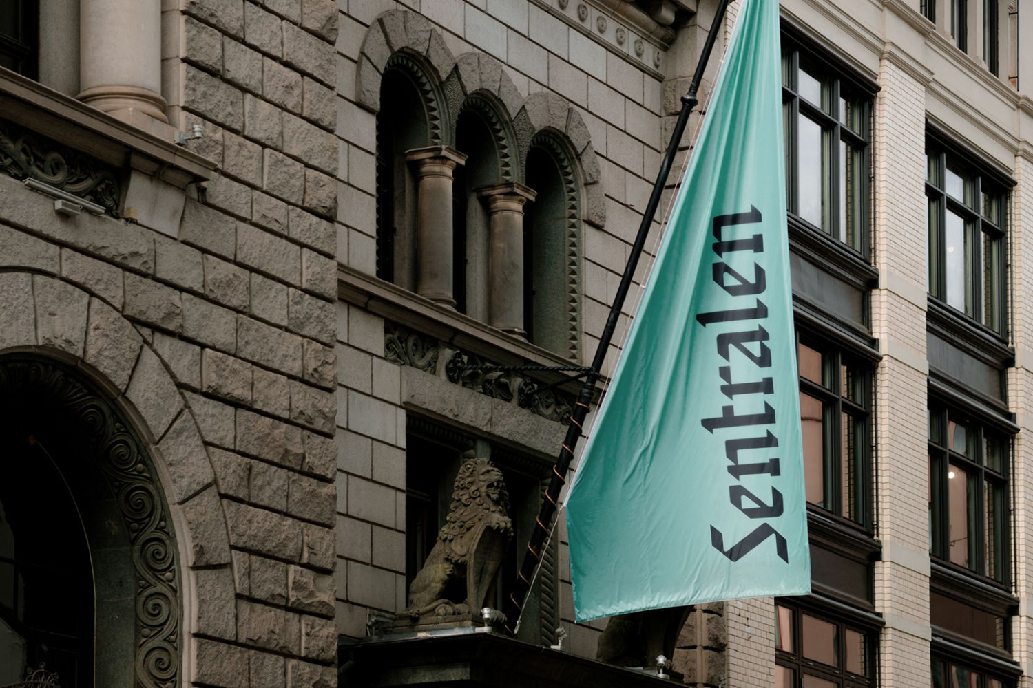
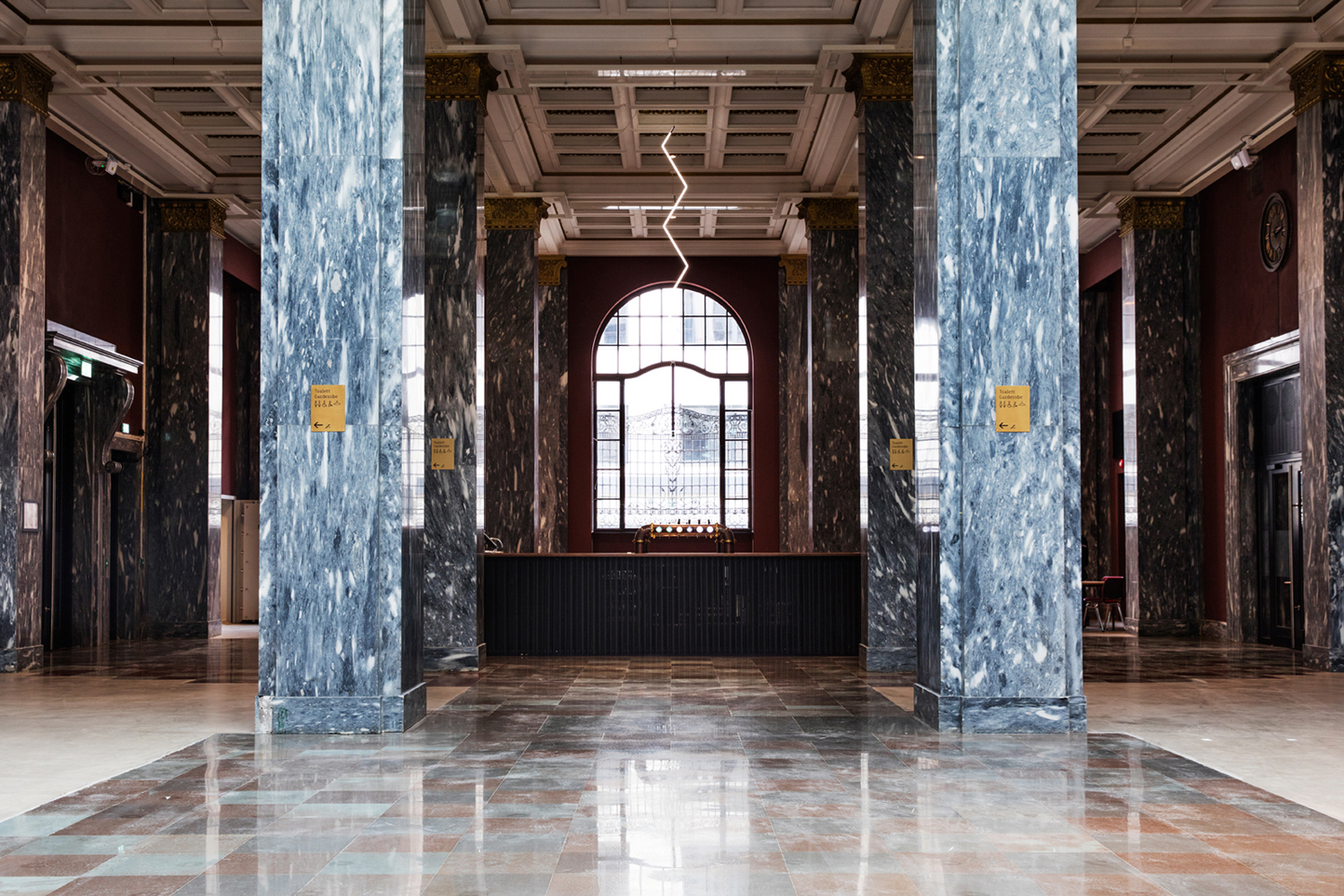
The former building of Norway’s first savings bank, which began as a social initiative to serve the working class people of Oslo, now houses Sentralen, a mixed-use cultural centre. Sentralen continues in the traditions of the bank, functioning as a hub for innovators concerned with and looking to address present day societal issues.
The centre houses over 350 tenants working in cultural production, while also accommodating business needs through small meeting spaces and venues for conferences. It also intends to bring the neighbourhood to life with activities throughout the week in one of its six performing arts venues, a classic cocktail bar and restaurant with a menu of contemporary Norwegian dishes.
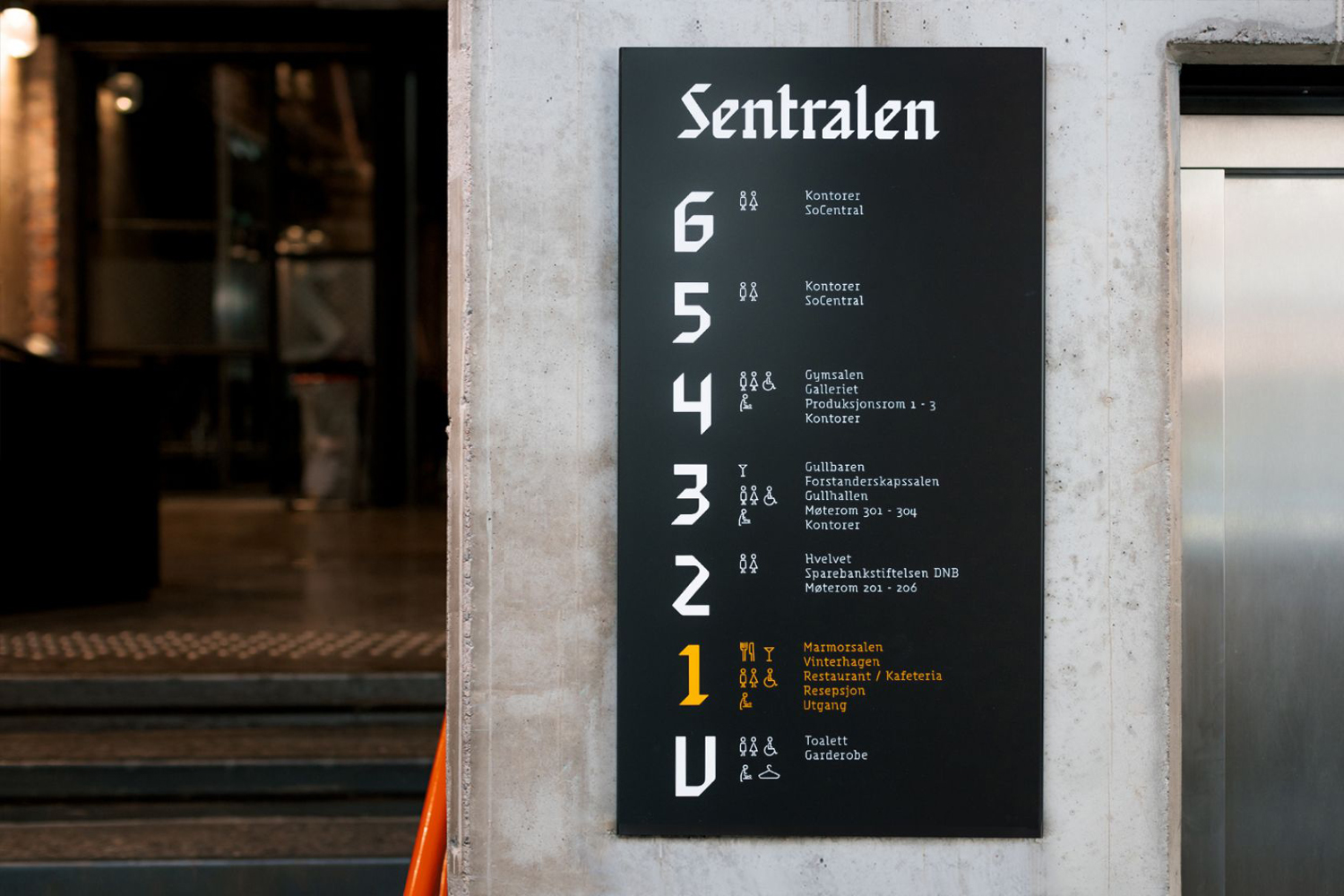
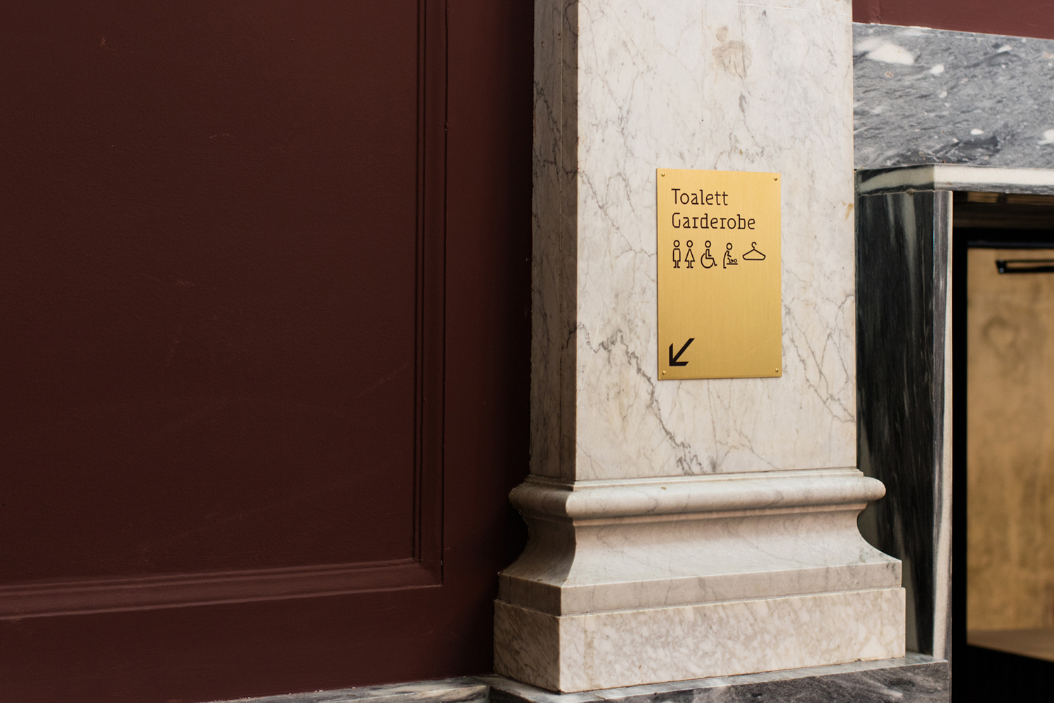
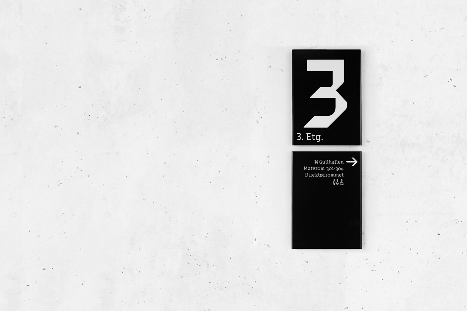
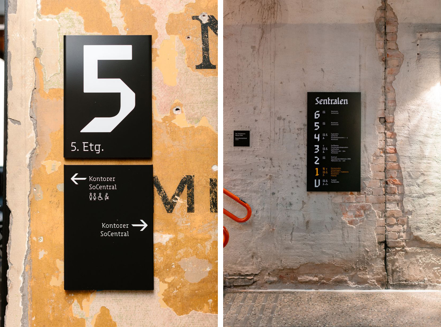
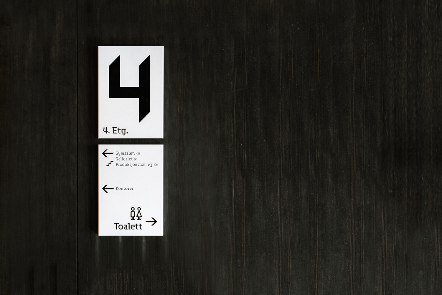
Scandinavian studio Metric Design was responsible for the visual identity design of Sentralen (main entity), Sentralen UNG (youth) and Sentralen Restaurant (plus bar & cafeteria), as was well as way-finding program and website which connects guests with all there is to experience at the centre. While a comprehensive project, this article focuses on visual identity and way-finding components, and was kindly written by New York-based Canadian freelance designer, writer and educator Josh Nychuk.
I love visual identities that are informed by a blend of the historical and contemporary and characterized by subtle idiosyncrasy. Whether this is achieved through a unique combination of retail type treatment or the design of a custom face, they share an attitude that is relatable on a personal level. This quality appeals to my innate typographic taste, and is why I chose to investigate the visual identity for Sentralen.
Language is our primary method of communication, and typography brings another layer of meaning to our words through the visual and historical function of letterforms. What I love most about Sentralen’s visual identity is the attitude and subtle nuances that come through in the type, but also that visual identity is largely type-centric. This quality is important in providing a contextual way to identify with Sentralen as place where people come to meet, discuss, express and share ideas, while also functioning as counterpoint to the building’s architecture and mixed-use, through its mashup of styles.
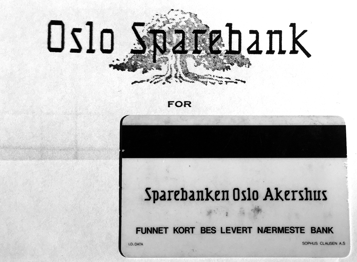
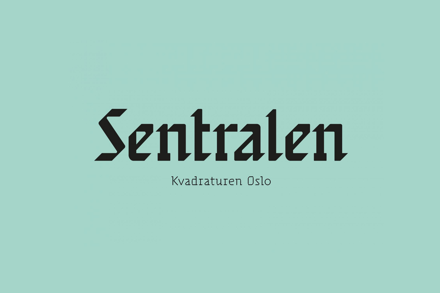
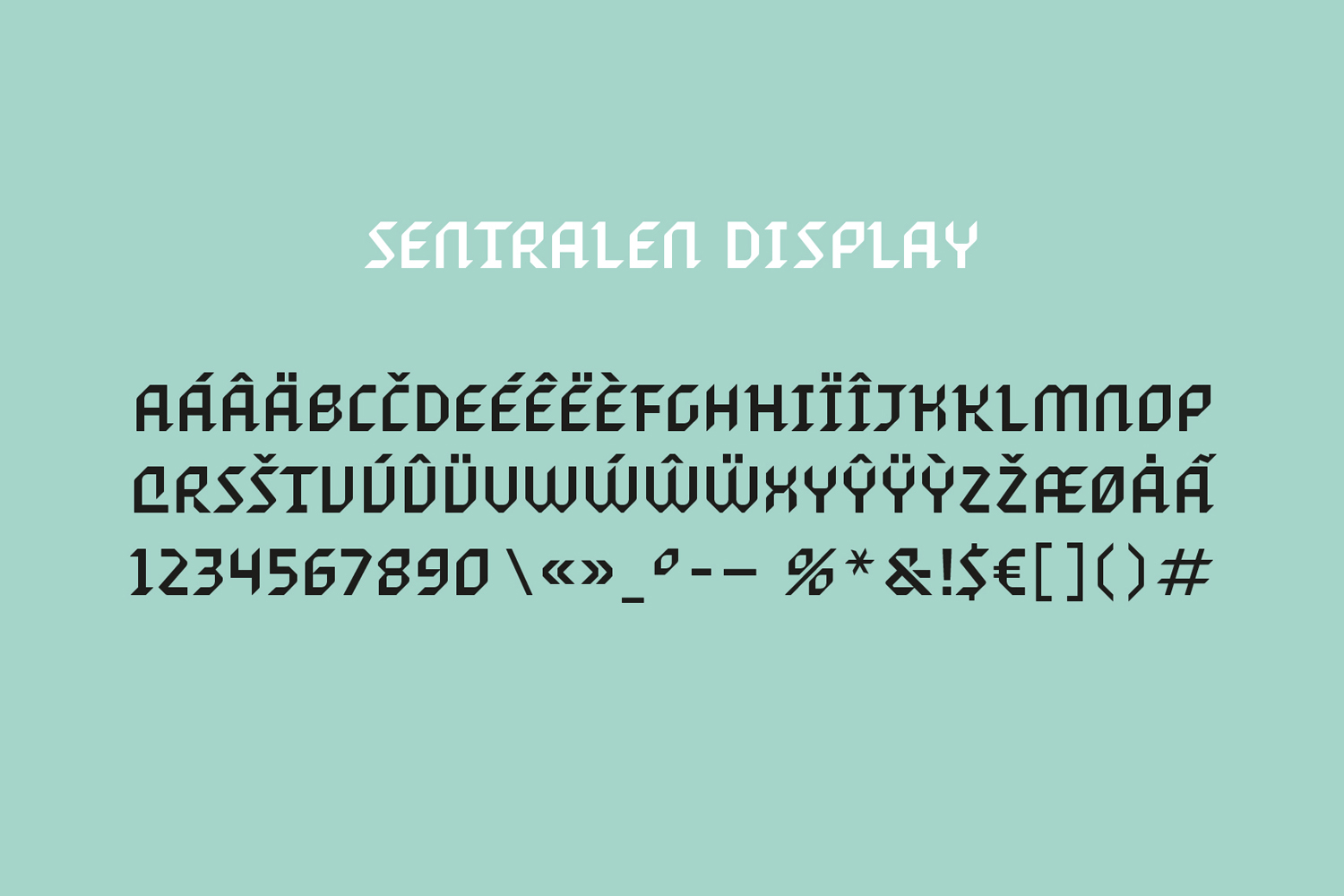
Metric Design developed Sentralen’s logotype, a display typeface and three text styles, derived from Oslo Sparebank’s original logotype (circa late 1920s early 1930) and corporate stationery drawn from historical references, with Ellmer Stefan responsible for turning concept and design into a useable font family.
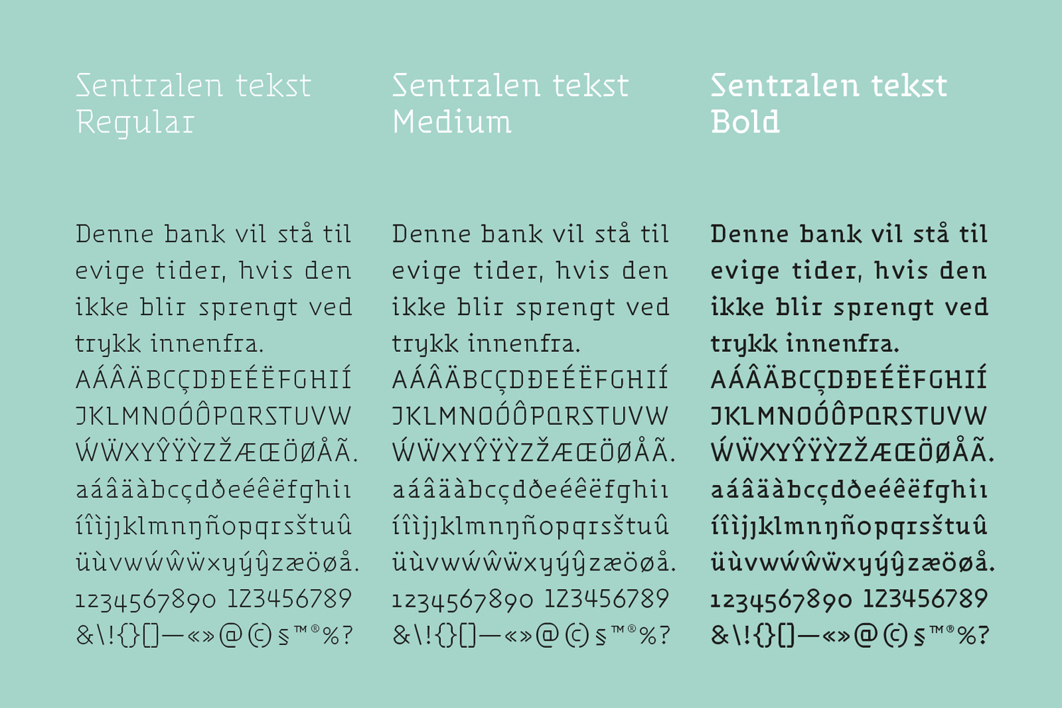
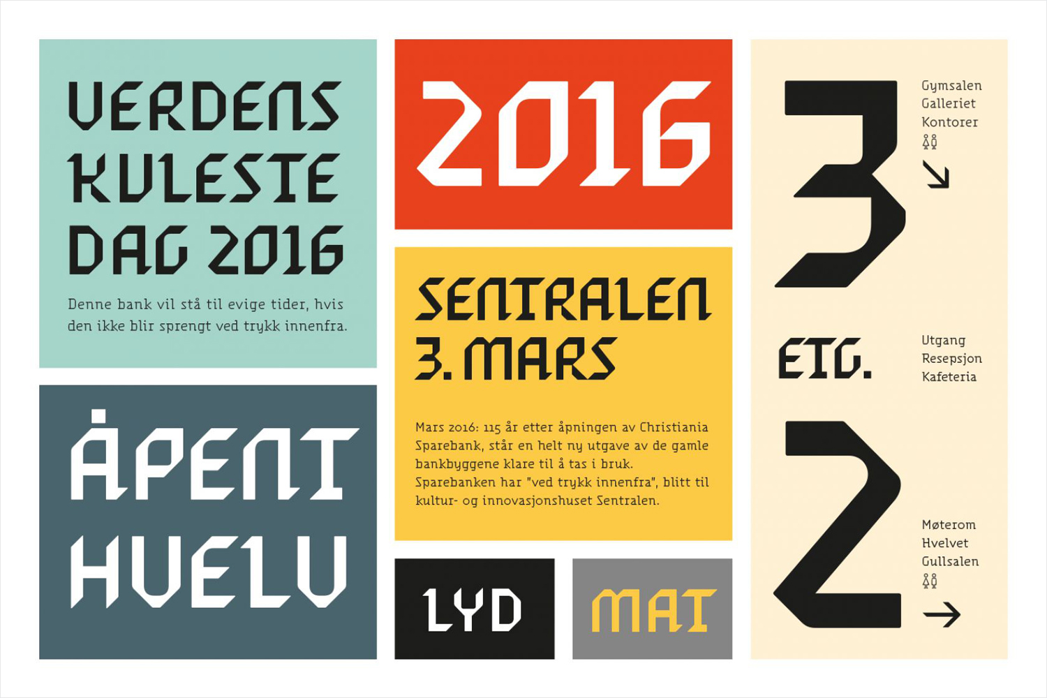
The type wears an interesting combination of character traits marked by the preferences and tastes of different eras. Probably most visible are the pen-informed angular shapes in the letterforms, which are unmistakably of Blackletter origins. Blackletter scripts once flourished throughout Europe and functioned as a counterpoint to Gothic architecture. A similar counterpoint of type and architecture can be found in Sentralen, as the way-finding system links the historical with the contemporary through juxtaposition.
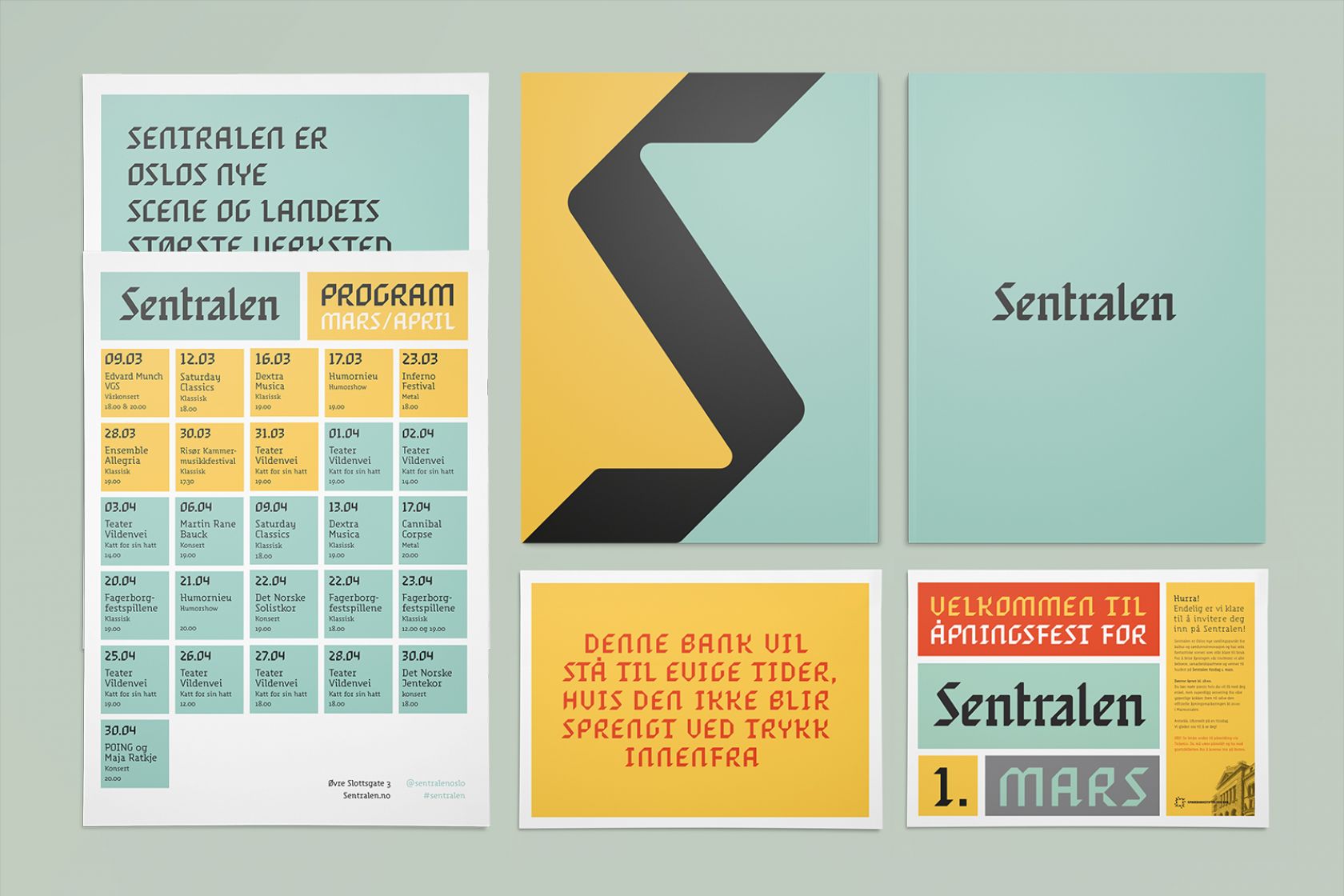
The building’s mix of architectural styles—Neoclassical and Romantic—both compliment and contrast the origins of type. Romantic architecture often evoked past styles such as Gothic, complementing the Blackletter origins, while Gothic Revival (the period in which it would have occurred) was a response in contrast to the Neoclassical styles prevalent of the time. The type dances gracefully across the backdrop of differing architectural styles, smoothly over the newer uninterrupted surfaces, and embraces the imperfection of the decaying walls (as seen towards the end of this article) with its peculiar charm.
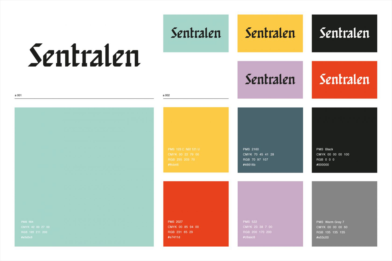
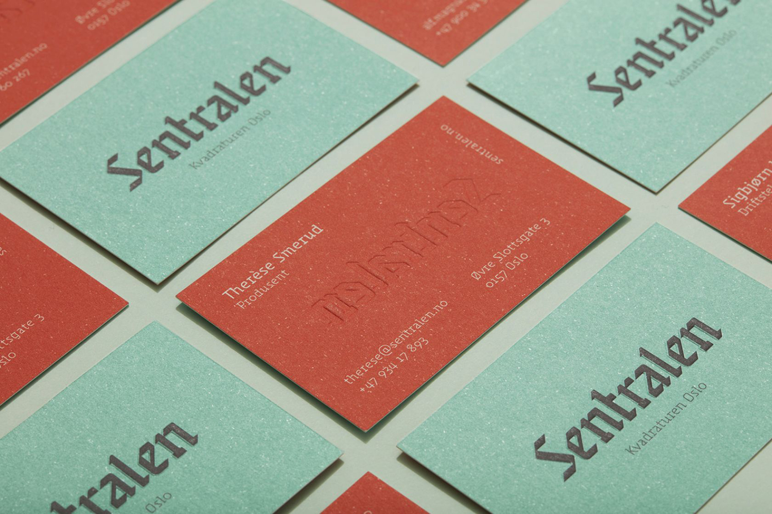
A playful mix of historical and modern qualities take hold in Sentralen’s text styles when you consider its modernist geometry, occasional slab-serifs and overall inverted contrast. I believe it is this combination of features that give Sentralen’s voice a beautiful idiosyncratic charm. Metric Design reimagined Blackletter script, and delighted us with a friendly revival.
The typography is anchored through the use of grid and color system—applied sparingly throughout—giving Sentralen’s voice an air of confidence by expressing what it needs to, with as few words as possible. The identity system is an excellent example of twenty-first century mixed expressions and a contextually applied solution. The amalgamation of modern and historical influences reflect both the mixed architectural styles of Sentralen, and most importantly its multidisciplinary purpose. More from Metric Design on BP&O.
Design: Metric Design. Type: Metric Design & Ellmer Stefan. Photos: Thomas Ekström. Opinion: Josh Nychuk.
