Designed in Oslo
Ambassaden by Bleed
Designed by Finnish-American architect Eero Saarinen, the Ambassaden’s angular modernist stature holds a striking presence in the heart of Oslo. When it opened in 1959, it functioned as the US embassy until its closure in the early 2000s. Fast-forward to today – the building has been reopened and its programming altered. It now operates as a multi-functional space that includes...

Tessas Eplegård by Olssøn Barbieri
One of the many brilliant things about the world of branding is that to work in it, write about it, or just take an interest in it forces you to learn something about pretty much everything. Maybe that’s how LEGO might actually be a better investment than gold; or that Murray’s Parmigiano Reggiano cheese pairs well with a nice New...
Chelan Beauty by Olssøn Barbieri
Olssøn Barbieri certainly seems to be on form this year: we recently reviewed the Oslo-based multi-disciplinary design studio’s work for Stereoscope coffee, and now, we’re delving into its smart designs for Chelan Beauty. Marrying clarity, functionality and a decent smattering of the unexpected, the surprises land early with this one: Chelan Beauty isn’t actually a ‘beauty brand’ – as in...
Stereoscope by Olssøn Barbieri
Oslo-based multi-disciplinary design studio Olssøn Barbieri has created the brand identity for Los Angeles-based speciality coffee roastery Stereoscope, working across its packaging design and printed materials with a typography-led approach that celebrates tactility. According to Olssøn Barbieri, Stereoscope is underpinned by a philosophy that sees coffee as a living organism rather than a commodity, and which takes its responsibility to...
Future Circular Collider by Bleed
After the scientific successes of CERN’s Large Hadron Collider (and its blessed failure to create any world-destroying black holes), the research organisation has an even greater need for speed. The team of scientists over in Geneva has been illuminating the nature of our universe since 2009: accelerating and smashing particles together, then snatching glimpses of their tiny collisions. Their appetite...
Pursue Hard Seltzer by OlssønBarbieri
New products, new markets and new consumer groups generate new aesthetics – or, at least, you would hope so. Too often, style migrates from one category to another, or the identity of a sub-culture (visually speaking), is exploited in a commercial context. This is where ‘authenticity’ emerges, to support genuine origin credentials, or to mask the appropriation with narrative context....
Den Norske Filmskolen by Neue
Den Norske Filmskolen (The Norwegian Film School) provides a broad range of practical film courses taught by a full-time teaching staff and guest lecturers and instructors with active careers in the national and international film industries. It is the only one of its kind in Norway, developed as a separate department at Lillehammer University College in 1997 and now part of Inland Norway University of...
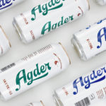
Agder Bryggeri by Frank
Agder Bryggeri is a well-regarded and historical name amongst breweries throughout Norway. It was first established in 1900 but was closed down in 1904 due to operational problems. Recently, the brewery has been resurrected as part of Norsk Bryggerier’s commitment to local beer brands, and is now sold throughout the Agder counties of southern Norway. As part of this resurrection...
Talor&Jørgen Coffee by Bielke & Yang
Talor&Jørgen is a Norwegian speciality coffee roastery and coffee subscription service that delivers small boxes of freshly roasted beans, sourced from across the globe, to subscribers based on their drinking habits rather than to a schedule. Product naming focuses on bringing to the forefront flavour notes rather than bean provenance, variety and preparation (although this is online and on pack) with the intention of making...
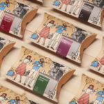
Talor&Jørgen Coffee by Bielke & Yang
Talor&Jørgen is a Norwegian speciality coffee roastery and coffee subscription service delivering small boxes of freshly roasted beans, sourced from across the globe, to subscribers based on their drinking habits rather than to a schedule. Product naming focuses on bringing to the forefront flavour notes rather than bean provenance, variety and preparation (although this is online and on pack) with the intention of making speciality coffee...
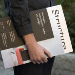
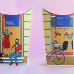
Norwegian Structure by Bielke & Yang
Structure is an exhibition of Norwegian contemporary crafts and design that began its European journey at Milan Design Week in April 2017 and is currently being held at Norwegische Botschaft in Berlin until April 2017. The exhibition features the work of 26 designers and studios, and covers a variety of products and prototypes; from furniture to lighting, to ceramics, textiles and home accessories....
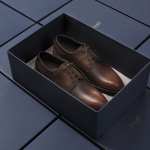
Faust by Snøhetta
Faust is a high-end shoemaker with its first signature store located in Oslo’s Barcode area. The shop is a small but impressive space consisting of five concrete niches and large carved wooden doors. Faust worked with Scandinavian studio Snøhetta to create both interior and brand identity. This was based around the The legend of Faust from the Renaissance, its basis for many literary, artistic, cinematic and musical...