OpenView by Pentagram
Opinion by Richard Baird Posted 6 October 2016

OpenView is a Boston-based business dedicated to investing in and helping to grow what are described as expansion-stage companies that are working in the software development sector. OpenView has a unique hands-on approach, and worked with Pentagram’s Natasha Jen to express this through positioning, tone of voice and visual identity design. This included custom typography, stationery, business cards, website and interior graphics.

OpenView not only provide investment but are hands-on, acting as mentors to help with customer and talent acquisition and growth. This is reflected throughout identity in the meeting of the industrial and utilitarian nature of type, its custom drawing, and a cheerful and personable colour palette.


Pentagram leverage some familiar associations, and lays down a clear and fairly universal visual language, but manages to work in some pleasant and more customised details.
OpenView Stencil, a monolinear sans-serif, benefits from a few different cuts through letterforms, tying it to “Openview’s pragmatic spirit, vitality and no-nonsense attitude with a utilitarian quality rooted in its methodology”. Diagonal, horizontal and vertical breaks through letters provide variety and a touch of motion to common geometric forms. Details are nuanced but intention is clear, with some nice shapes and cuts in a couple of the symbols as well.

Although it is difficult to avoid the ubiquity and often misappropriation of stencilling, its associations and communicative value remain fairly well intact. Within the context of over-polished, graphically conservative identities used by VC branding to convey ideas of tech and finance, it is likely to stand out, particularly in its oversized implementation in print. It is tempting to cite stylistically more distinctive stencilled typefaces, but it is worth bearing in mind industry, and the need for continuity between other weights without cuts.


“Language inspired by the expansion process has been leveraged to clearly convey the firm’s relationship with their portfolio companies and audiences. The designers developed brand architecture that uses action verbs to name the company’s various groups and brand channels: OpenView Invest for the investment team, OpenView Grow for the expansion team, and OpenView Learn for thought leadership platforms.” – Pentagram


Like type, colour plays with some familiar associations, drawing on tech and industry, yet manages to draw something distinctive from these in their full-page coverage in print and in the edge painting of business cards. Online this is appropriately dialled down, calling out navigation and further insight, while wordmark, headings and body secure continuity.

It is good to see iconography side step the monolinear. Although this would form a very literal connection with type, it would be at the expense of visual interest, differentiation and effective communication, and fall into what is becoming something of a tired tech trope. There is, however, a geometry to these that do link them to type, and the approach to people is unusual.

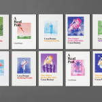
In application, visual identity plays with proportion. Wordmark and monogram stand up well large, with the other uncut weights functioning well at smaller sizes. Colour has been reproduced well, although there is always the propensity for ink to wear around the edges when set over white board, and the contrast of the white OV knocked out of colour is impactful, and gets a bit more character out of some utilitarian forms. Uncoated boards and embossing appear as small material touches that avoid undermining the utility of type and in service of the more personal

Although strategy and its visual expression is straightforward, the tension between bright colour and the utility of type establishes something interesting, particularly within the VC and tech sector. It is reassuring in the familiarity and communicative clarity of assets, and the continuity of type, but distinctive in the way these have been implemented and adapt to print and digital environments. Make sure you check out Pentagram’s project page to see how identity exists within OpenView’s office space. More from Pentagram on BP&O.
Design: Pentagram. Partner in Charge: Natasha Jen. Designers: Janghyun Han & Jenny Hung. Opinion: Richard Baird.