Emma Magnusson Arkitektur by Lundgren+Lindqvist
Opinion by Richard Baird Posted 15 November 2016

Emma Magnusson is an architect working from the Swedish city of Gothenburg primarily on private commissions and occasionally with larger corporate clients. These have included Benify and Warner Music. Scandinavian graphic design studio Lundgren+Lindqvist recently worked with Emma to craft a new visual identity. Drawing on some architectural staples such as space and materiality, and working in the systematic and the playful, Lundgren+Lindqvist’s identity work for Emma intends to visually articulate the personable but professional approach she takes to her work. The project included monogram and stationery design, business cards, bespoke stationery boxes and website.

Emma Magnusson’s work on the O/O Brewing pop-up bar, a collaboration with Lundgren+Lindqvist, is one of utility and play. This can be seen in the use of light untreated woods, exposed casks, modular steel tables and stencil cut, heated treated signage alongside brightly painted wood shapes, egg shells and flowers. This mix of architectural utility, materiality and moments of play is also reflected, albeit in a more reductive way, within Emma’s new visual identity.


The Em.Ma. monogram is well set, is neat in its first name shorthand of Emma Magnusson and somewhat playful in its expanding and contracting implementation in print. Alongside its framing of space and typesetting in Brown; a friendly if a little on-trend monolinear geometric typeface, feels rooted in a concept that looks to work together the architectural and the personable.
Bespoke stationery boxes, designed in various sizes by Lundgren+Lindqvist and made by Flodstrands Bokbinderi; one of Sweden’s few remaining bookbinders, offers, in conjunction with an uncoated G.F. Smith board, something in the way of the material and handcrafted alongside the visual economy of type and ink.

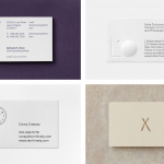
The use of grids and guides, the bisecting of business cards, and the framing of space with monogram is clear in its architectural expression and universality. Space, structure and system are all clearly touched upon but with a frugality tempered only by the warmer qualities of type. It is austere but precise with different combinations of type and line offer something in the way of visual variation and a very subtle sense of play.


Letterhead format introduces something a little more detailed in its mixing of justification and centre-aligned text, and the mirrored structure of information. Although an unusual approach, there is a pleasant balance to this that builds on the two-part nature of monogram.

The website, due to launch in spring 2017, mimics the large format sheets of a printed portfolio with layers of images framed by white. This quality continues in the switching from vertical to horizontal navigation between project overview and project insight. Where brand identity is reductive, project photography adds bands of colour in preview, and texture and detail in full view.

It is a project easily over-looked if it was limited to just stationery, however, measured within the context of Emma’s work and personable approach, the way her portfolio will be presented online, and the crafting of bespoke stationery boxes, the project, although visually and conceptually simple, and leaning on some architectural conventions, appears thoughtful and restrained. More work by Lundgren+Lindqvist on BP&O.
Design: Lundgren+Lindqvist. Opinion: Richard Baird. Fonts Used: Brown.