Roster Bar & Restaurant by Bond
Opinion by Richard Baird Posted 15 December 2016
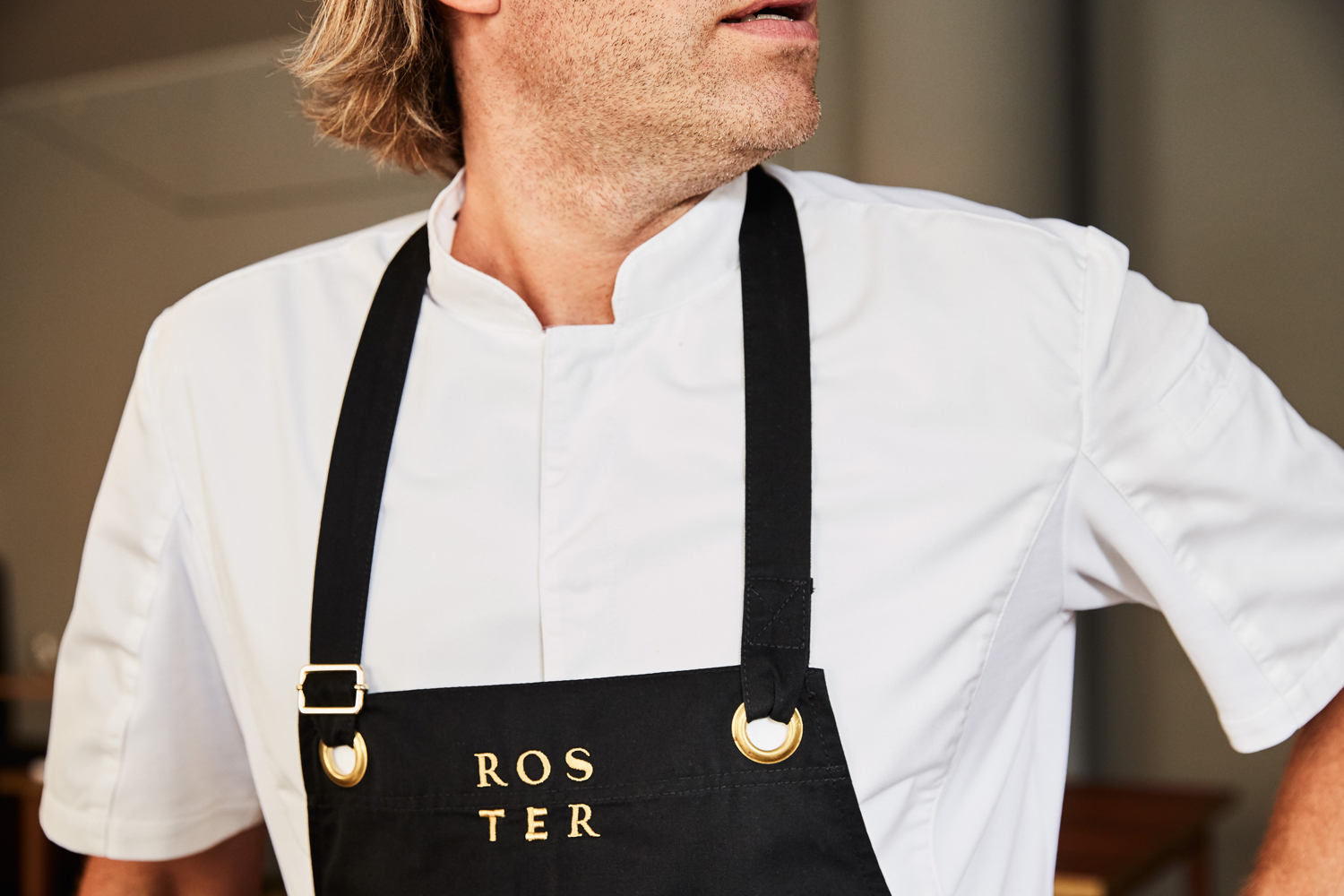
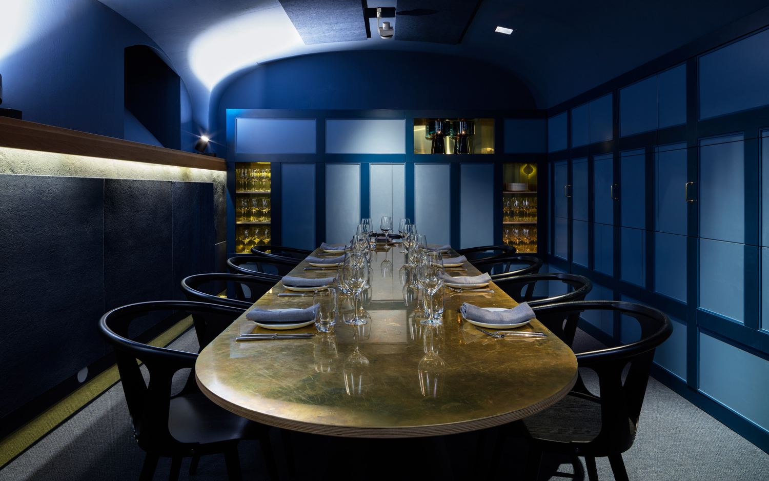
Roster is a bar and restaurant on the corner of Pohjoisesplanadi and Unioninkatu in the Tori Quarters of Helsinki. It features an impressive interior made up of custom furniture with a vintage twist, raw and refined materials and hand-picked design objects. Although sophisticated in its design, Roster is a casual rather than formal dinning experience.
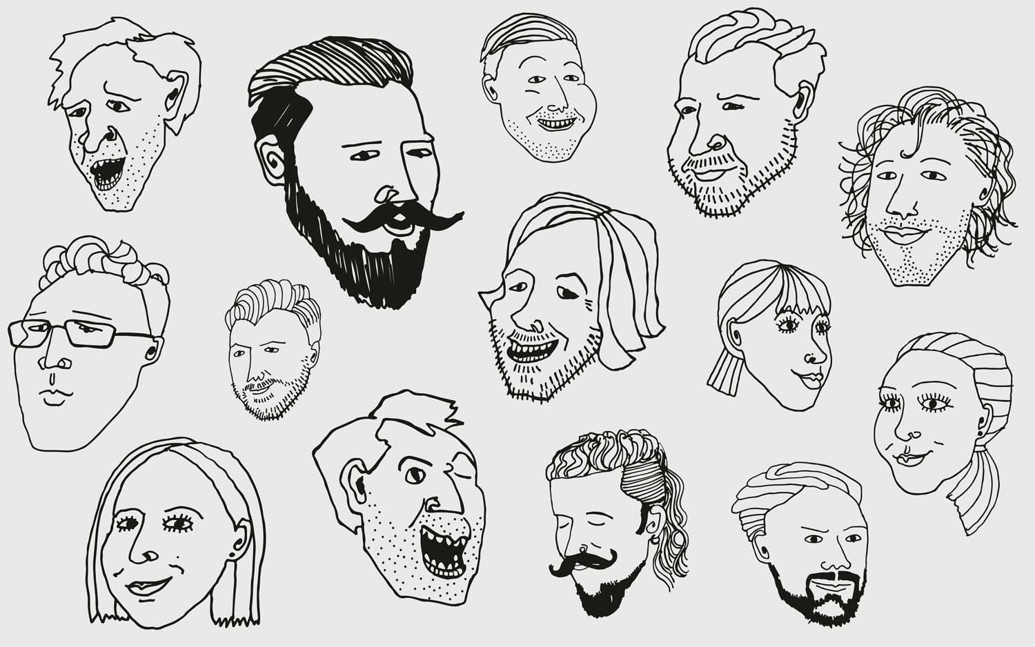
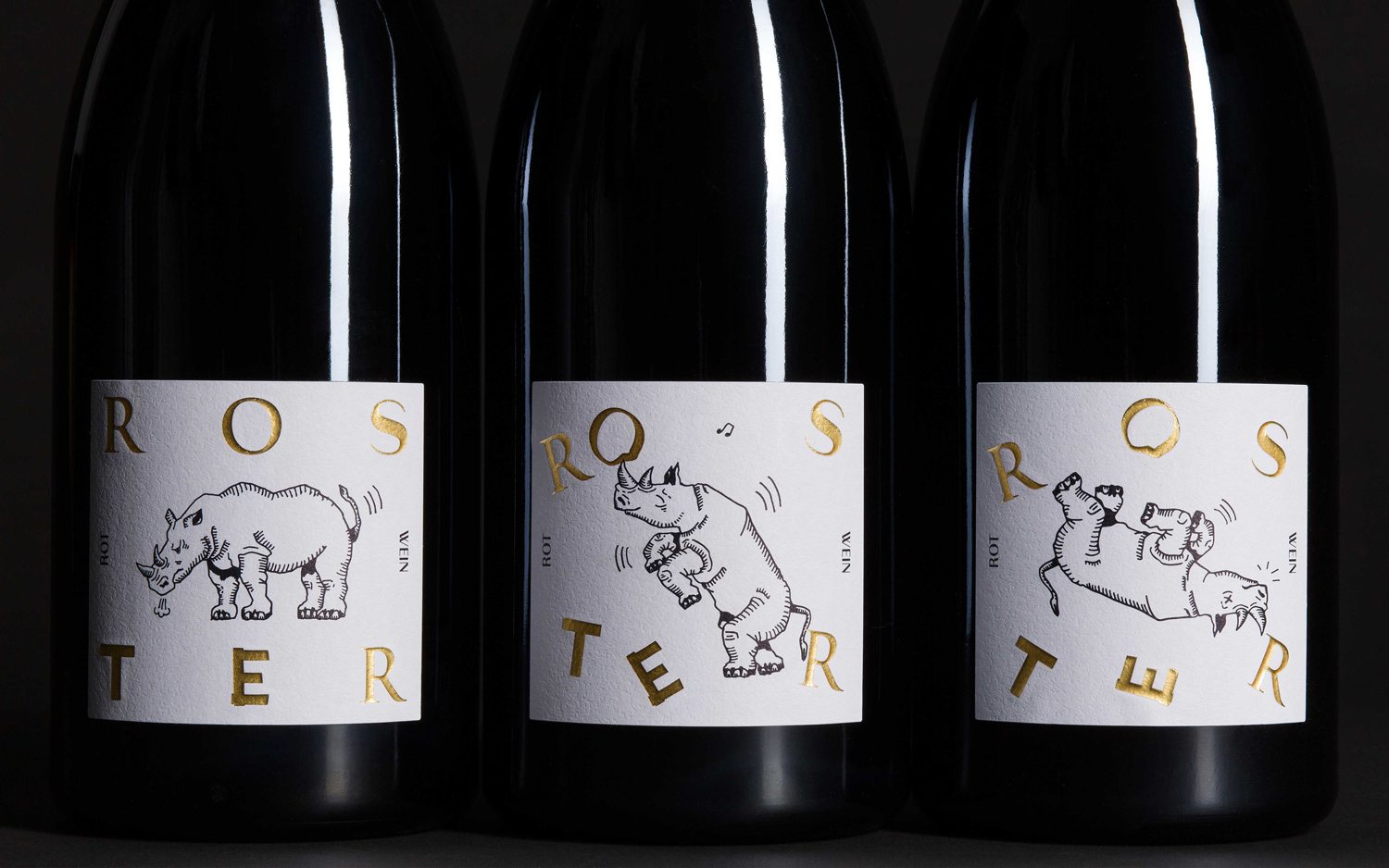
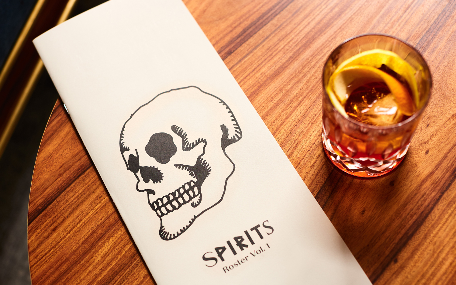
The eclectic but cohesive style that proliferates interior, its high-quality food but with a more informal service, and the brisk and humorous character of Roster’s two founders informed the development of the restaurant’s brand identity. This is characterised by typographical contrast and a series of tattoo-inspired illustrations created by graphic design studio Bond. This links a variety of printed assets that included business cards and menus, as well as uniforms, awnings and wine labels.
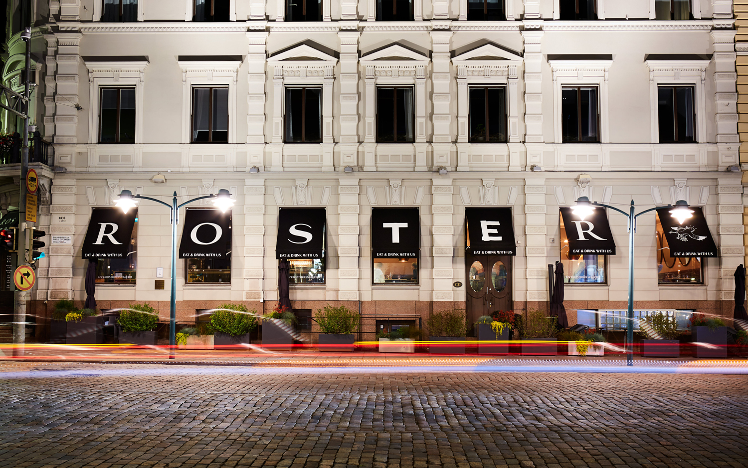
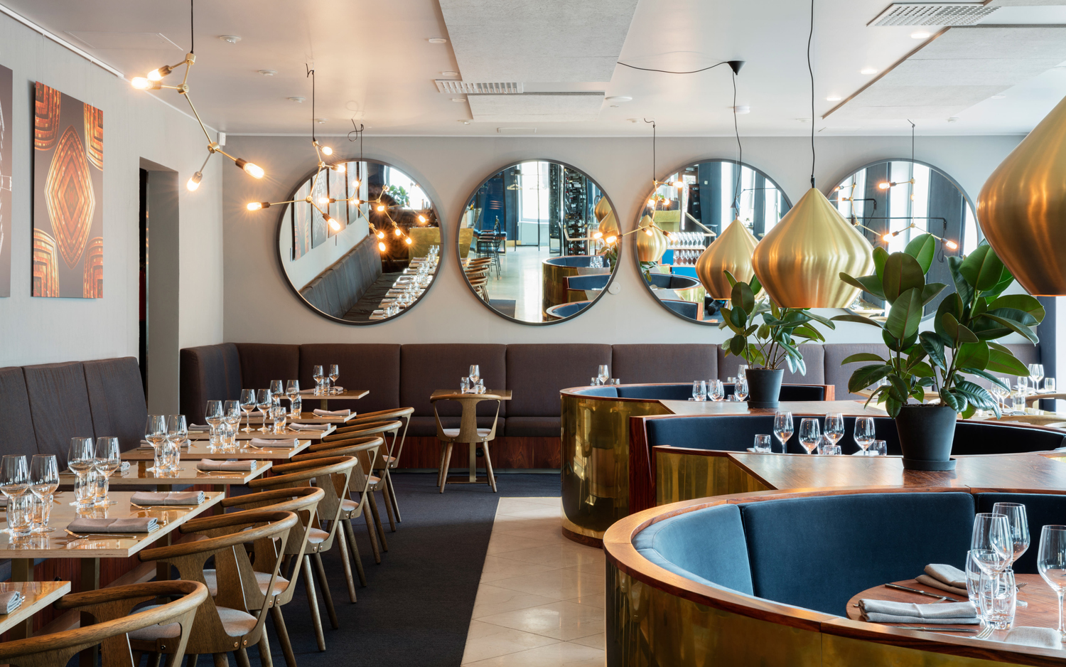
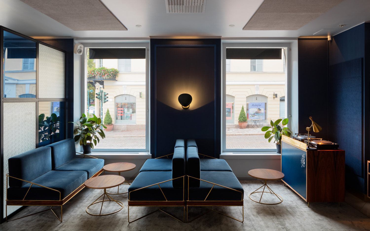
Roster has a lovely interior design, also created by Bond, with plenty of material, form and colour contrast, yet a pleasant continuity throughout. There is a neat juxtaposition of delicate metal work and large upholstered shapes, wood and metal surfaces, fine detailing and statement pieces. Lighting, colour and space moves between the dark and cozy and the light and spacious. It is thoroughly contemporary but with an almost period elegance in materials and finish. Brand identity manages to draw this out through typographical juxtaposition, whilst working in some of the character of Roster’s founders and service in the use of illustration and staff photography.
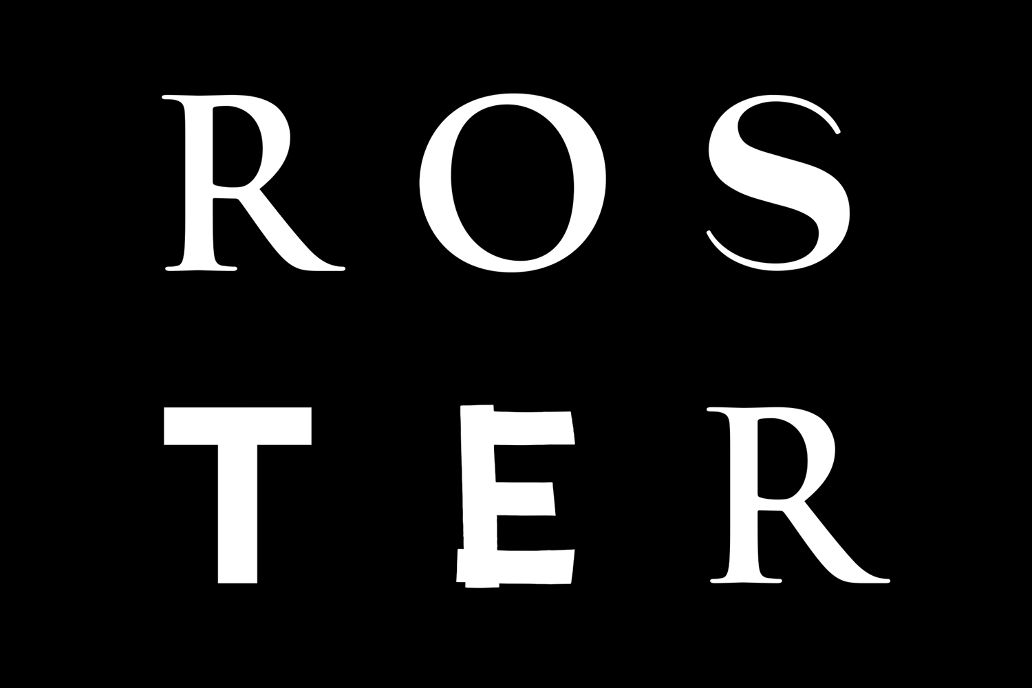
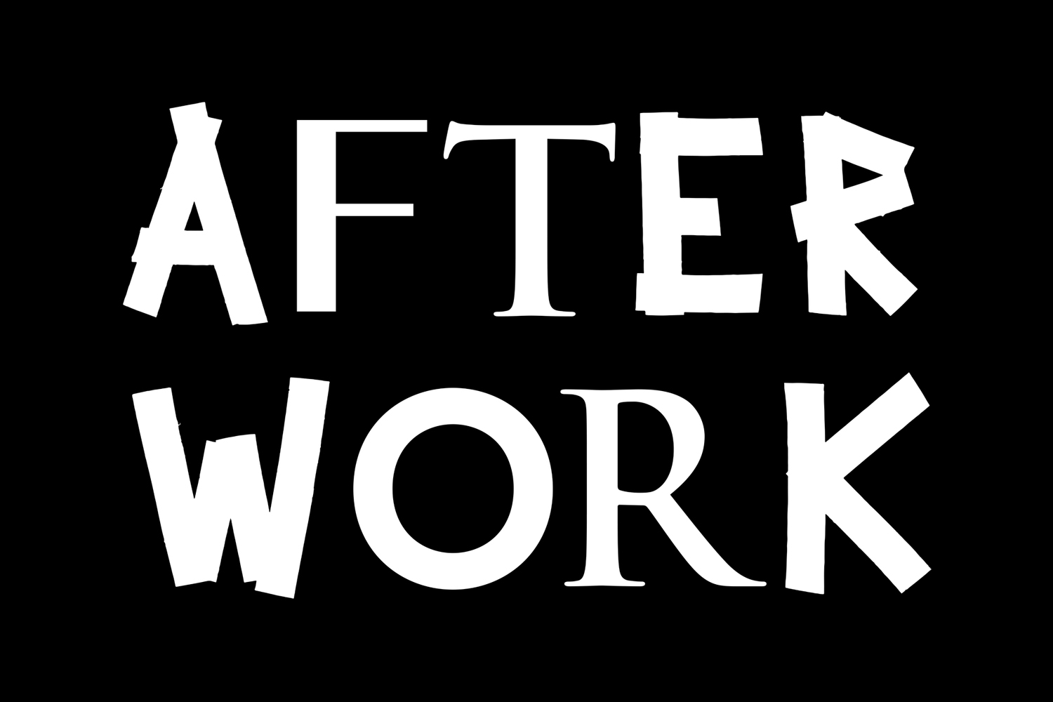
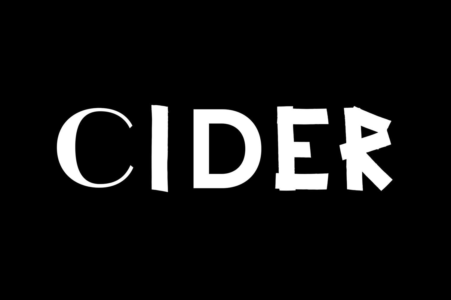
There four choices at work, that together, pretty much cover Roster’s restaurant and bar experience. La Pontaise alongside L10 from Or Type mixes a calligraphic elegance with a modern restraint and simplicity of form, and a custom typeface of irregular strokes and rough edges, in conjunction with an old style serif plays with of what might be considered the formality of the past and a very current informal attitude to dining.
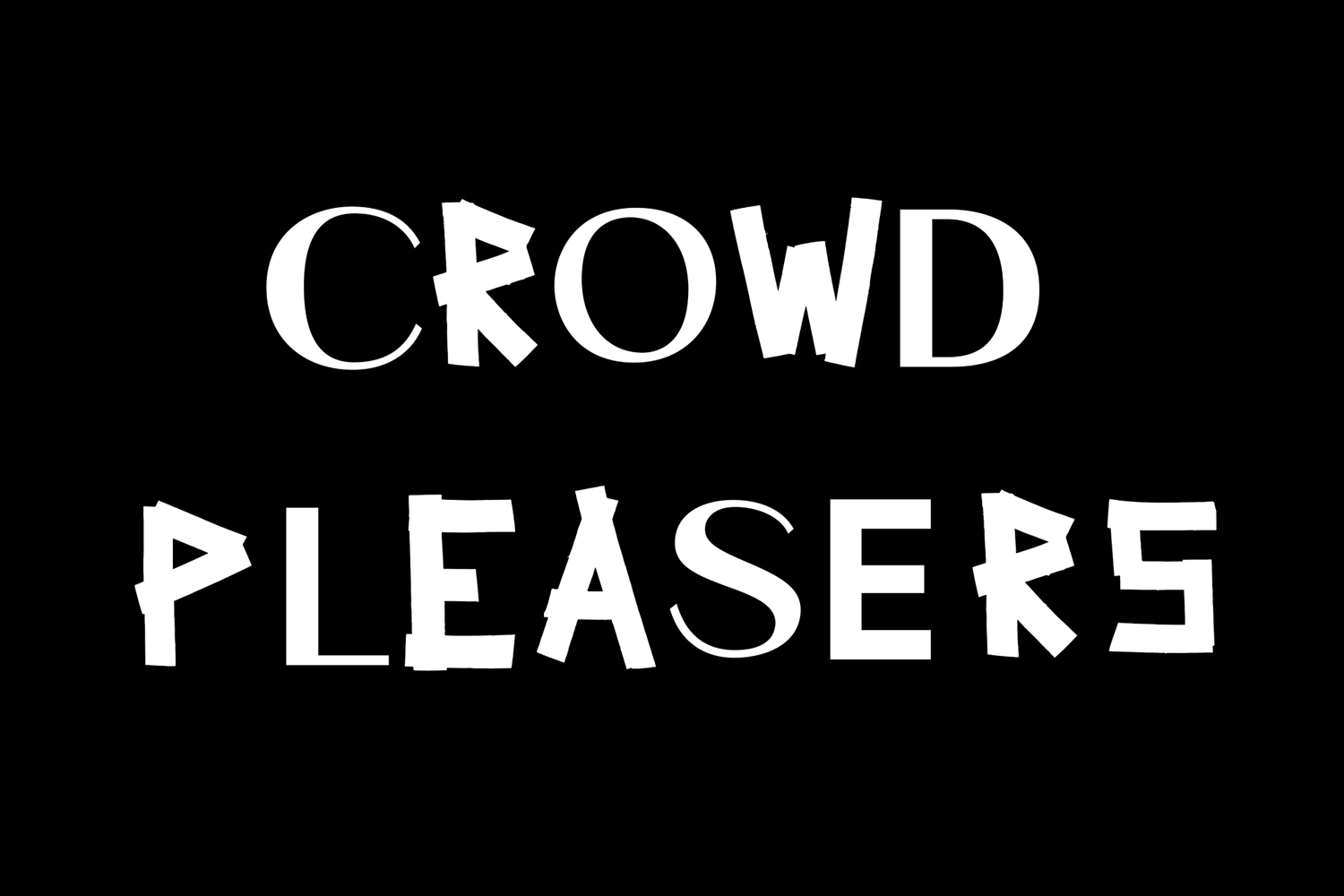
The contrasting of type is far from unusual. It is frequently used to provide both visual interest and communicative breadth to a piece of work. Check out Glasfurd & Walker’s work for Earls.67, an acute mash-up which plays with past and present. What you see less often, and even less successfully, is the compounding of four within single words. It is incredibly difficult to pull off, but here, and for the most part, it works. Kerning conventions give way to an optical balance, with consideration given to weight and shape. Differences, and the communicative intention that underpins these, are evident and contribute to a greater whole.
The interior design is full of character, however, outside of this, in the form of campaigns, signage, posters, any other visual tool, brand identity manages to work together and express, not only the material quality of bar & restaurant but also some of its ambience and character.
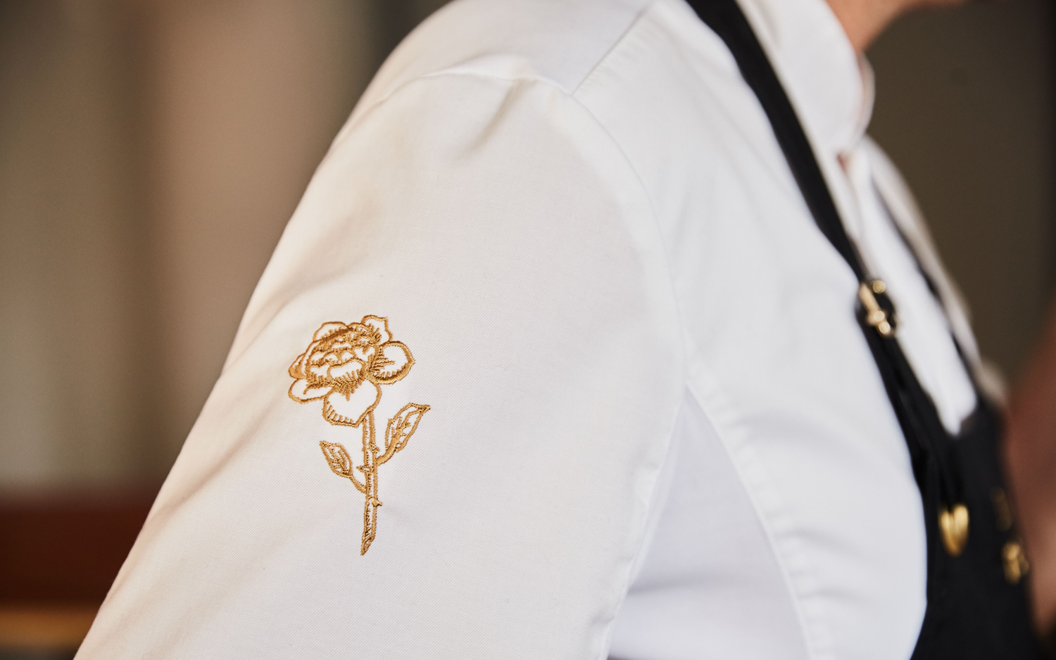
The character of custom type also plays out in the drawing of tattoo-inspired illustration that run across print and website. Again, it is a familiar visual tool, effectively leveraging association, but in a way that contributes another well-intended expression to a broader experience without either getting lost or dominating. The way that these manage to move between the simple black ink of menus, simple images punctuating the website and the more high quality gold embroidery of uniforms is a particular highlight, and really captures the essence of the restaurant.
Online highlights include the dynamic changing letterforms of logotype, the personable way in which staff photography has been art directed, the illustrated staff heads and imagery, and the way that these more convivial elements have been worked together alongside the rich detail of more fine dining dish photography. Much like interior, and as distilled down into type, website is made up of a few different ideas, neatly resolved.
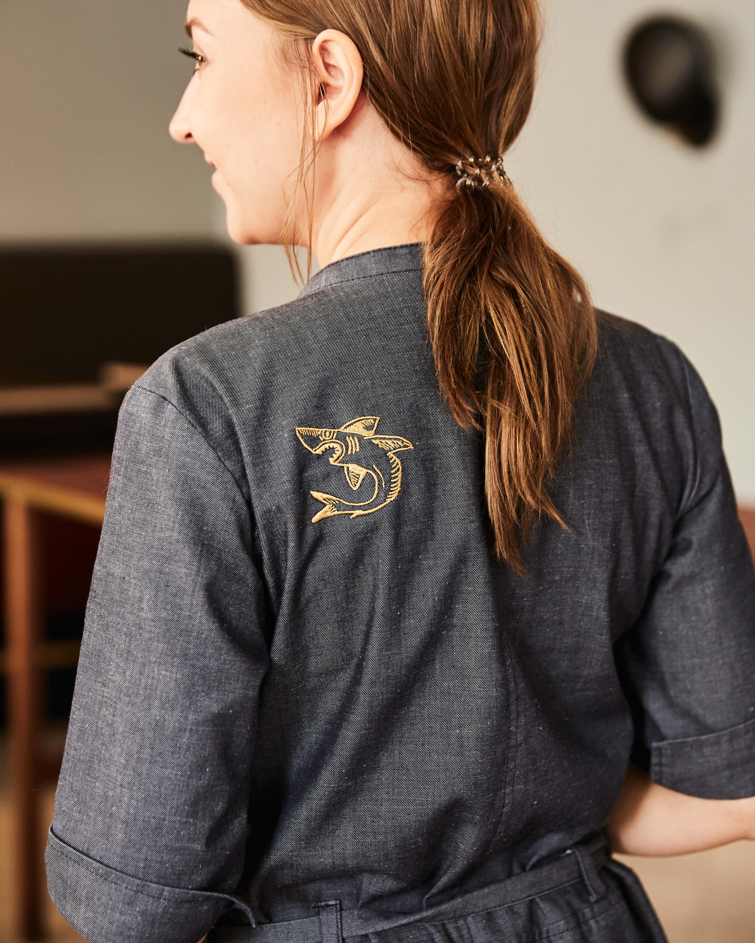
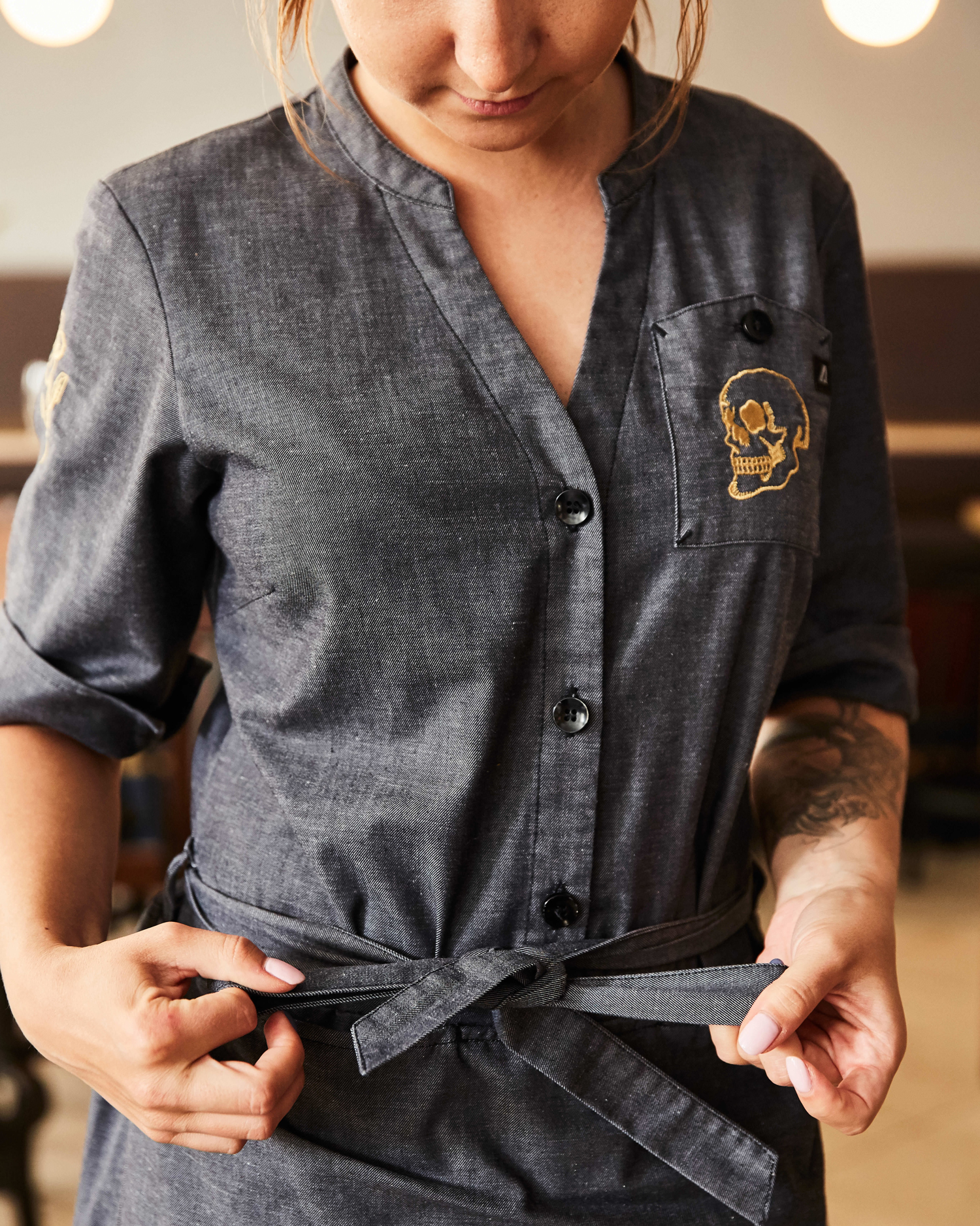
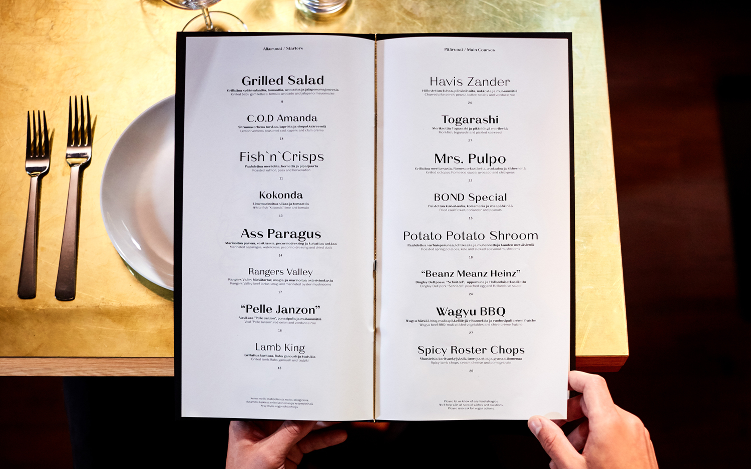
For the most part, the juxtaposition of type works well, particularly when worked together within single words and within logotype. Across menu, where font is used to pull out specific dishes, it feels a touch more haphazard, far less resolved. Weight and size may well intend to direct the eye to some preferable house specials, but visually it looks awkward, and looses some of the personality and attitude established elsewhere.
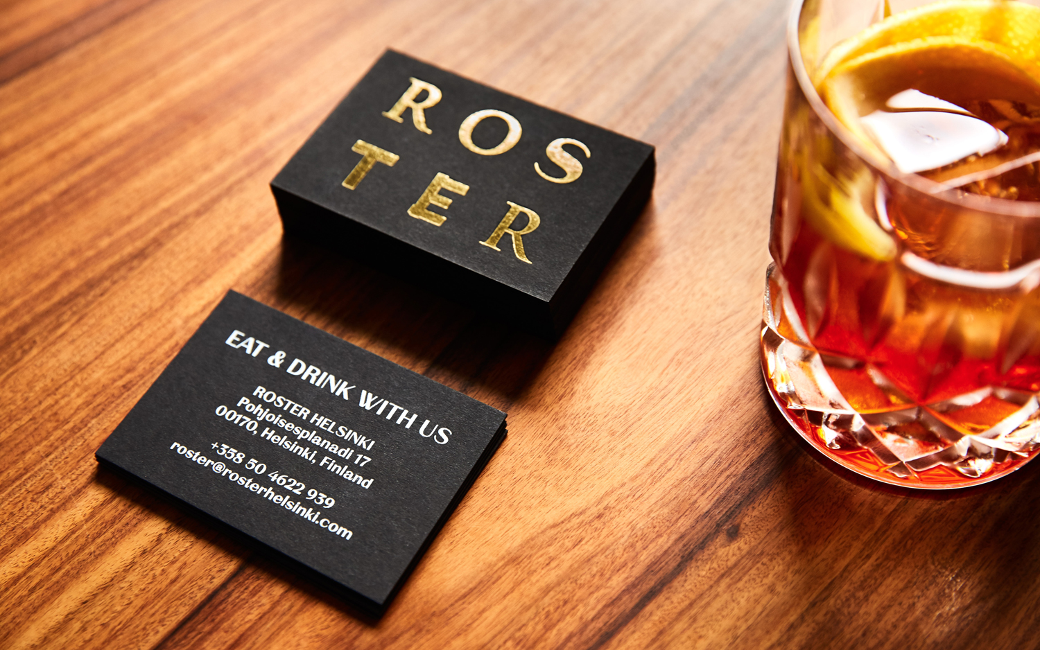
BP&O regularly writes about, within the context of restaurants, cafes and bars, the idea of brand identity as either distilling down and expressing, in a fairly straightforward manner, experience, or contributing to it with new visual elements. Bond’s work for Roster does a bit of both, it captures and conveys some of the material and menu, in type and print finish, but also adds a distinctive an unexpected quality on top through image, informed by the less tangible, and the way this is then worked into interior through print and uniforms. More work by Bond on BP&O.
Design: Bond. Opinion: Richard Baird. Fonts Used: L10 & La Pontaise.
