The Best of BP&O — December 2016
Opinion by Richard Baird Posted 30 December 2016
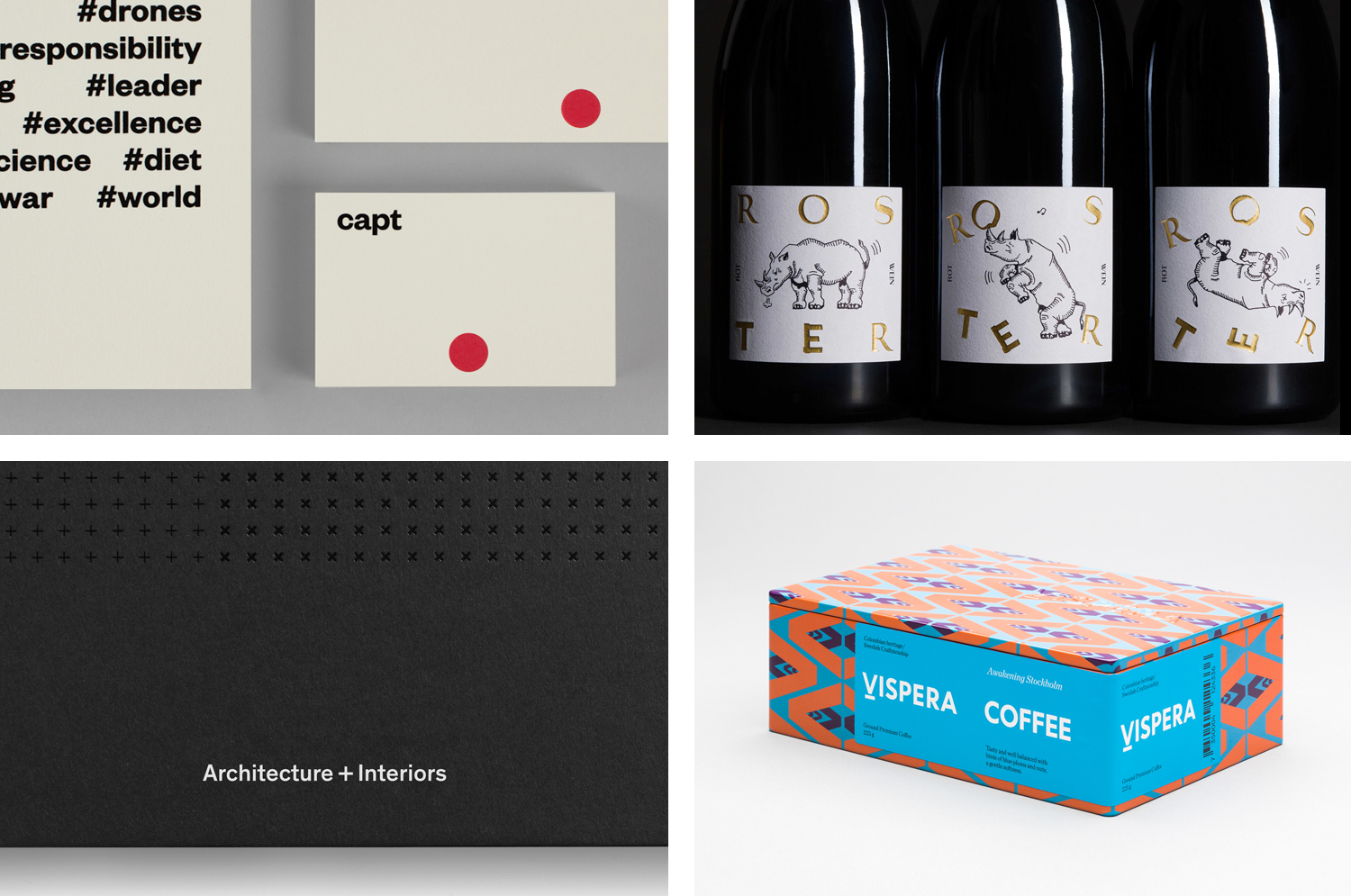
December’s highlights included Parallax Design’s work for Penley Estate, Bedow’s print work for Erik Penser Bank, and Bond’s brand identity and packaging for jewellery designer Tilly Sveaas. However, there were five projects that stood out, and have made it into BP&O’s Best Of Series.
This feature brings together some of the most unusual / distinctive projects published on BP&O each month for another opportunity to be seen and shared. These typically balance a strong concept with a compelling aesthetic and clear communicative intention that appropriately plays with form, colour, type and layout, as well as material, texture, image and print finish.
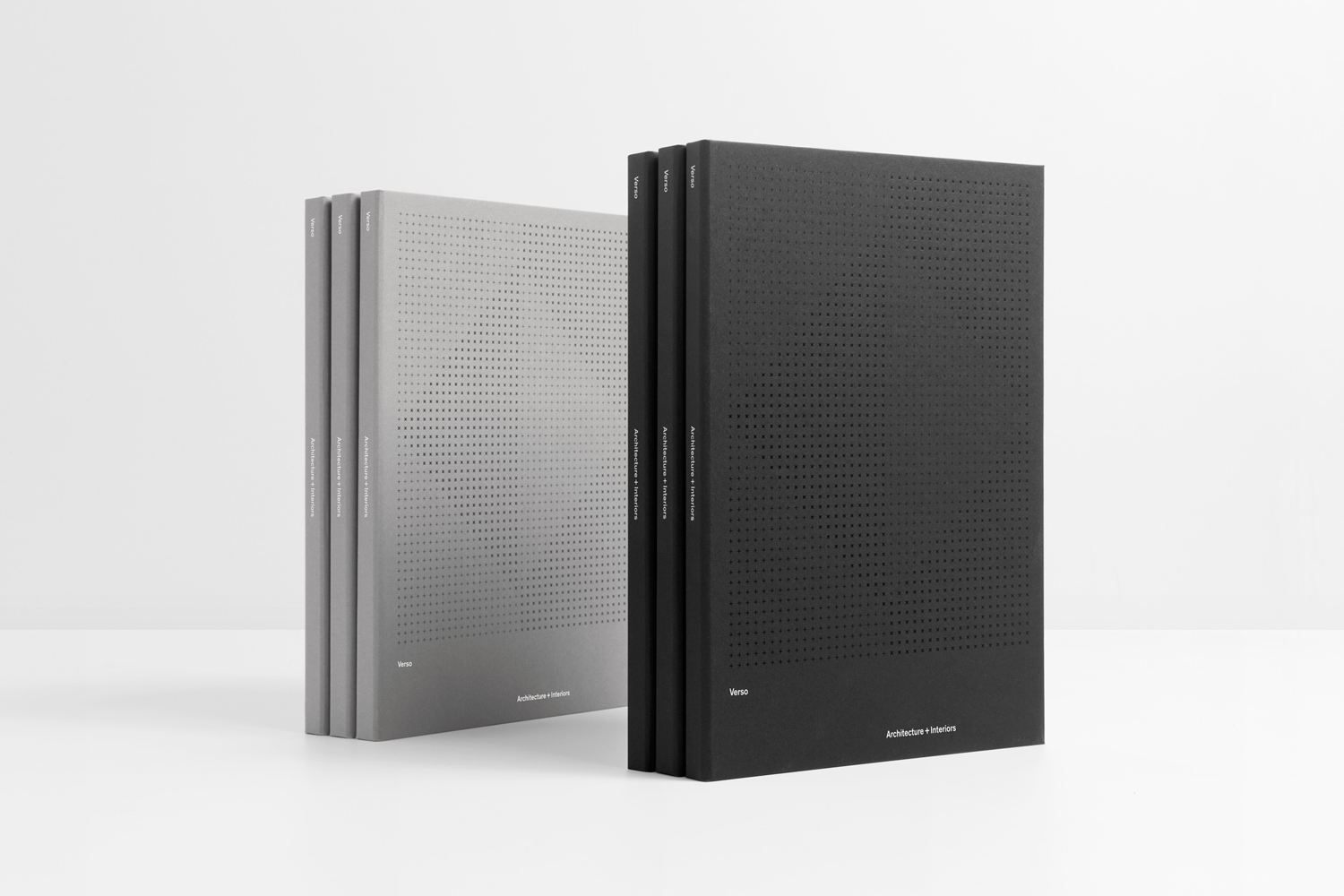
Verso Architecture+Interiors by Studio South, New Zealand
Verso is a small Auckland-based architecture and interiors business working within the residential and commercial sectors. Drawing on the oppositional nature of name and using a mix of simple typographical form, high-quality materials and print finish Studio South developed a new visual identity for Verso that is described as being both sophisticated and playful, whilst effectively working in some universal architectural principles. This links a variety of printed assets that included stationery, business cards, notepad and signage, with website soon to launch.
See more of this project here
Capt by Bunch, United Kingdom
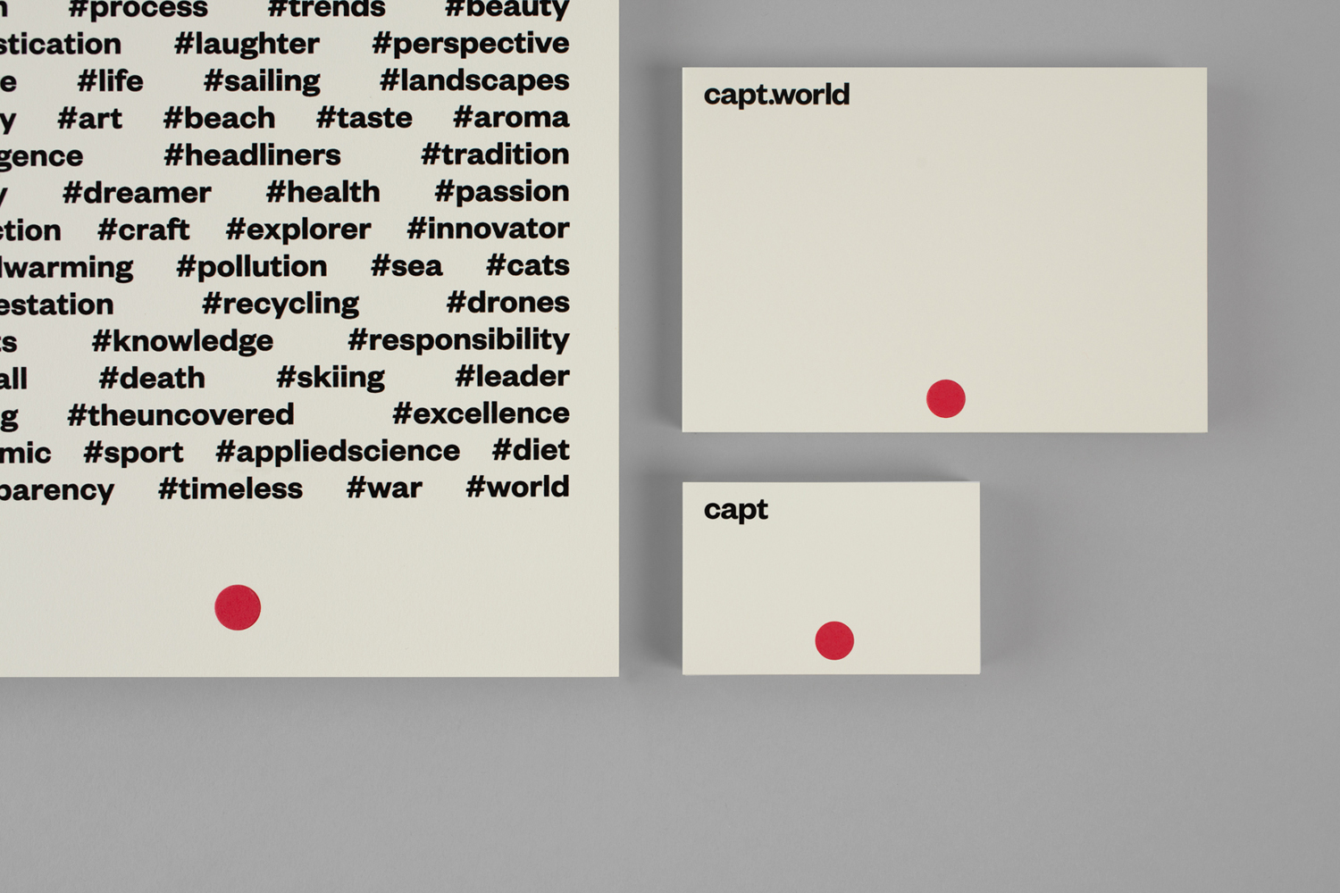
Capt is a San Francisco-based start-up that connects creators wanting to monetize their videos with brands looking for new content and talent. The platform is made up of an app that allows creators to shoot, upload and license their videos, and a website that acts as a market place for buyers. This website also serves as a place to connect creatives with those who want to develop specific video content, as a tool to push assignments to qualified Capt creators by location and creator level, and provide access to and licenses for both global and hyperlocal video content.
Bunch worked with Capt on developing brand identity, mobile app and website. This takes the universal visual language of mobile recording and the lexicon of social media, and draws these into a simple but effective visual expression. This links folders, headed paper, business cards and branded hoodie, and runs across app and website.
See more of this project here
East Sydney Early Learning Centre by Toko, Australia
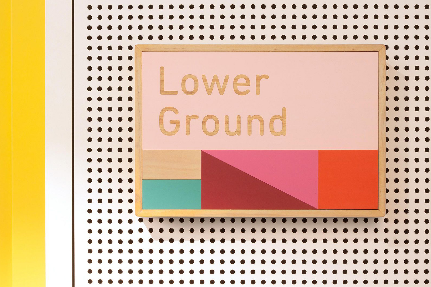
East Sydney Early Learning & Community Centre is a state of the art space located on Bourke Street. It provides childcare places for parents living or working in the inner city suburbs of Sydney. The centre, designed by ABA Architects, features five play rooms set over three levels, indoor playground on each floor and an open-air play area on the top floor. The space also includes a distinctive signage and wayfinding system, developed by Australian graphic design studio Toko, inspired by children’s building blocks.
See more of this project here
Víspera Coffee by Stockholm Design Lab, Sweden
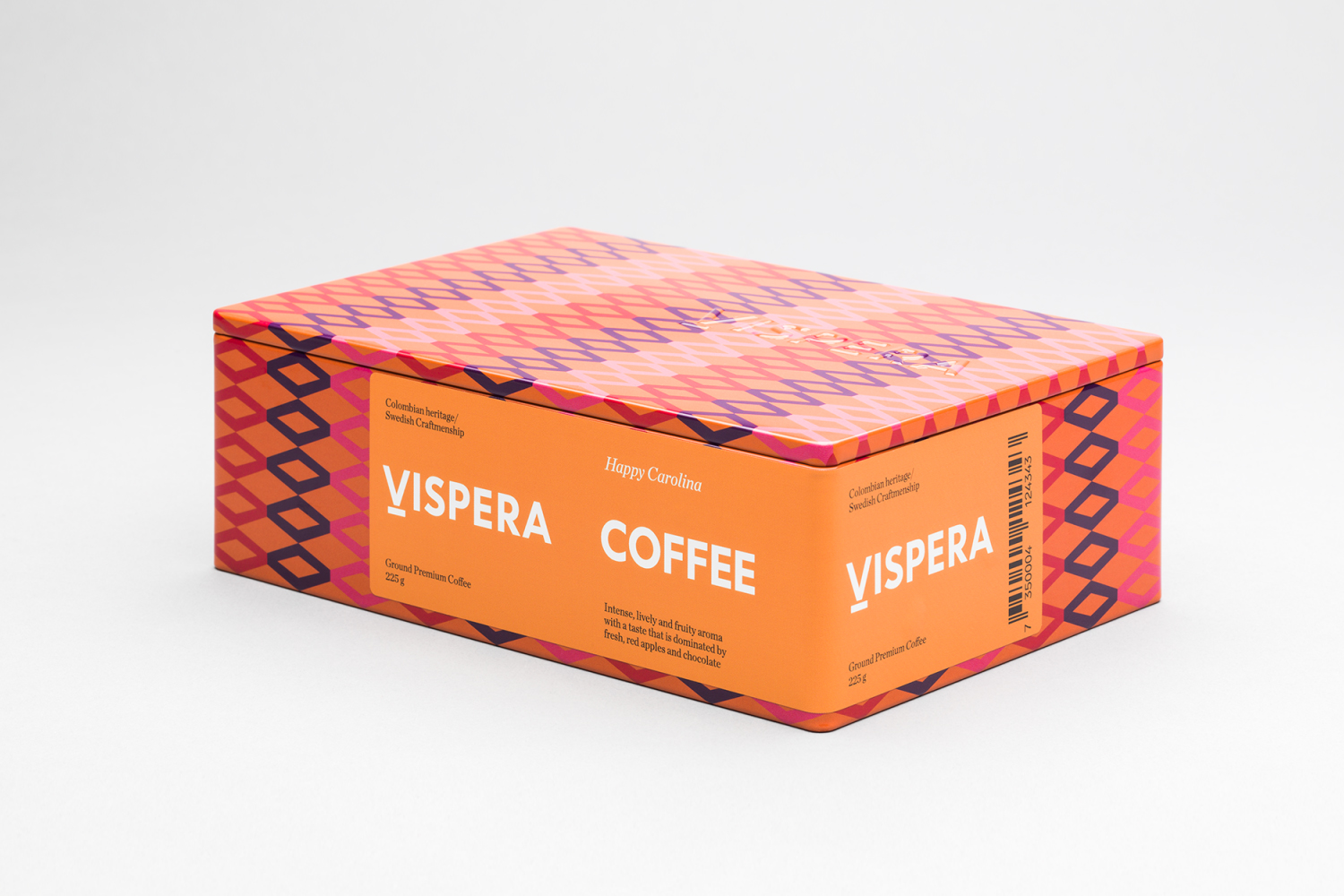
Víspera is premium coffee brand that intends to bring together the best of two worlds, a blend of 100% Arabica coffee beans sourced from the high altitude plantations of Colombia and a Swedish eye for quality and craftsmanship in its roasting. This meeting is visually articulated through type contrast, colour and pattern across Víspera’s packaging, developed by Stockholm Design Lab.
See more of this project here
Roster Bar & Restaurant by Bond, Finland
Roster is a bar and restaurant on the corner of Pohjoisesplanadi and Unioninkatu in the Tori Quarters of Helsinki. It features an impressive interior made up of custom furniture with a vintage twist, raw and refined materials and hand-picked design objects. Although sophisticated in its design, Roster is a casual rather than formal dinning experience.
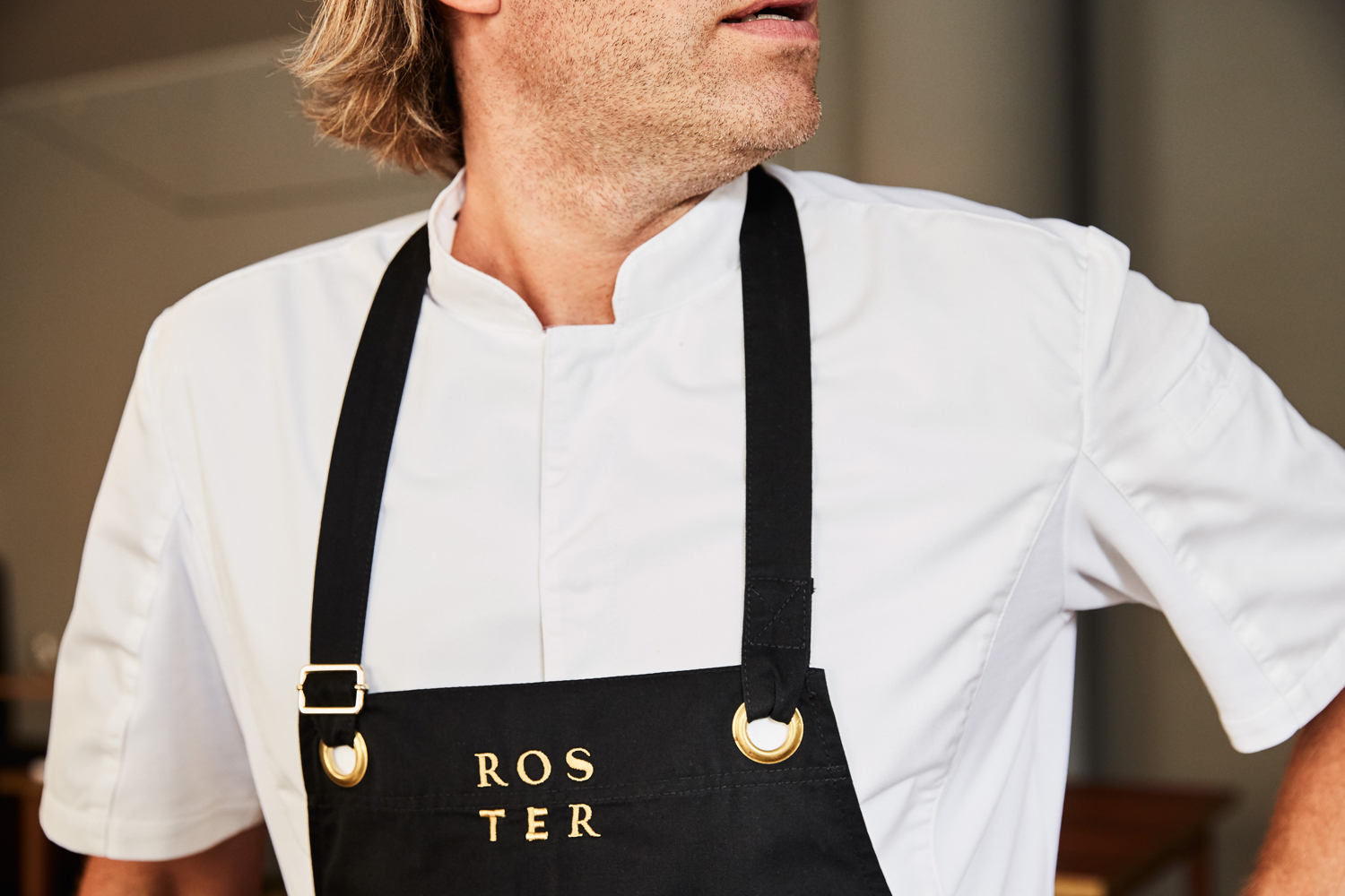
The eclectic but cohesive style that proliferates interior, its high-quality food but with a more informal service, and the brisk and humorous character of Roster’s two founders informed the development of the restaurant’s brand identity. This is characterised by typographical contrast and a series of tattoo-inspired illustrations created by graphic design studio Bond. This links a variety of printed assets that included business cards and menus, as well as uniforms and awnings.
See more of this project here

