Qoñi by Leo Burnett
Opinion by Richard Baird Posted 6 January 2017
Qoñi is a small artisan community in the Peruvian city of Puno creating hand knitted socks, scarves, gloves and shawls from alpaca fleece. With a desire to present itself as a modern fashion brand and with the intention of entering the international market, Qoñi worked with Toronto-based graphic design studio Leo Burnett to develop a new visual identity; from naming to wordmark, brand story to lookbook, and extending to promotional material and retail tags.
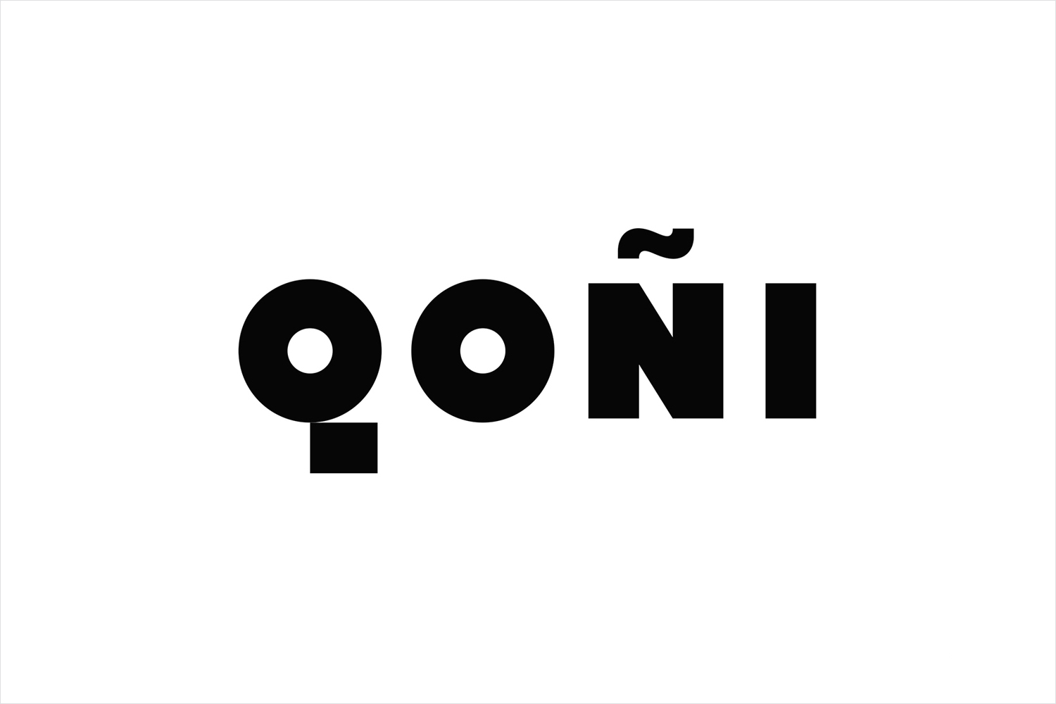
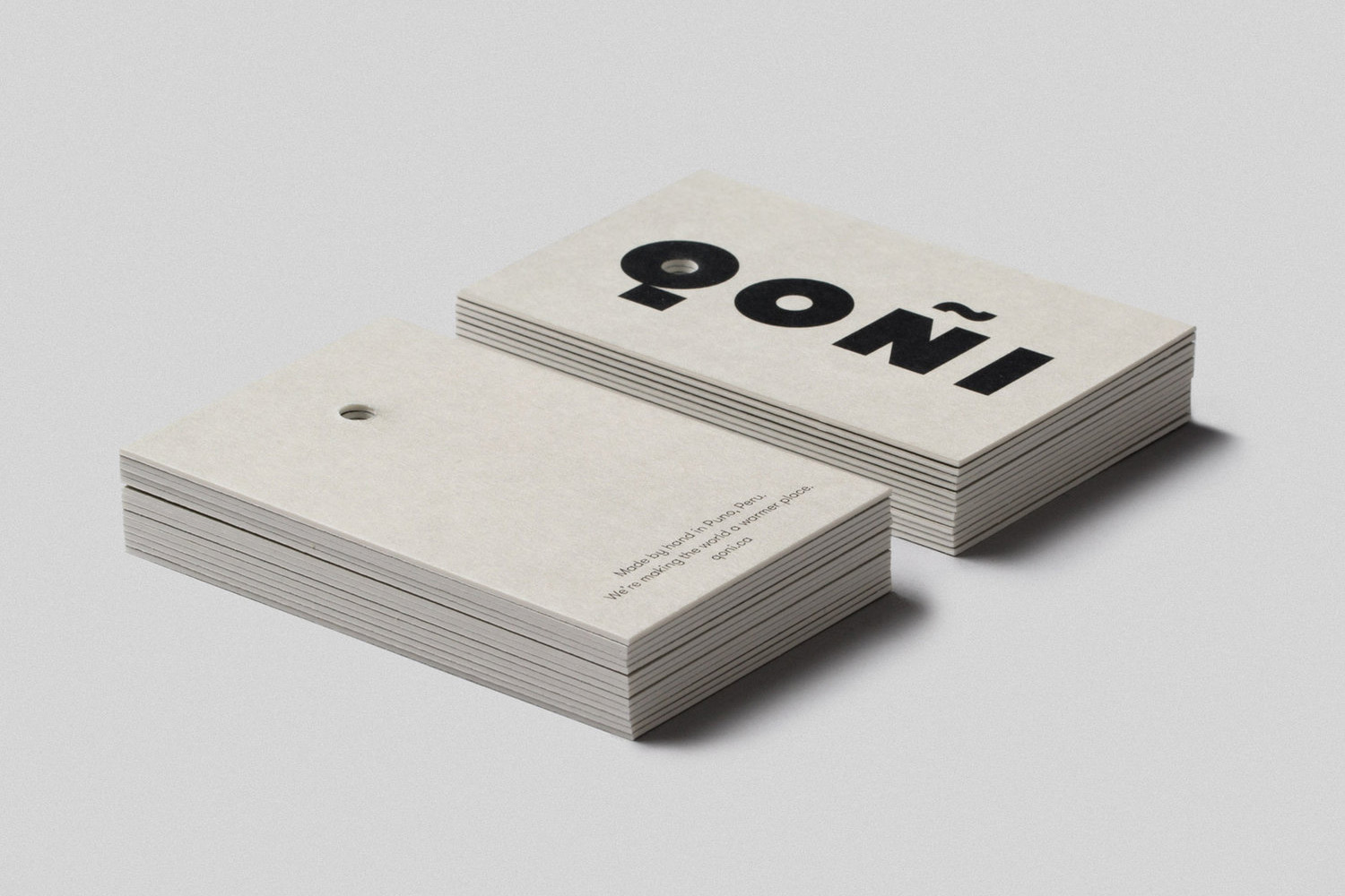
It is a small project but with a few neat ideas. Wordmark, where often you might see a lightness of line and a typographical flourish, is a satisfying and striking mix of bold weight and geometric shape. This is clearly rooted in the volume and usefulness of Qoñi’s products, expresses something of a personable quality, and is a neat visual articulation of name, a regional word for warmth. The line below the Q and virgulilla above the N provides a pleasant sense of balance as well as visual interest, as does the circles of the QO and the straight lines of ÑI.
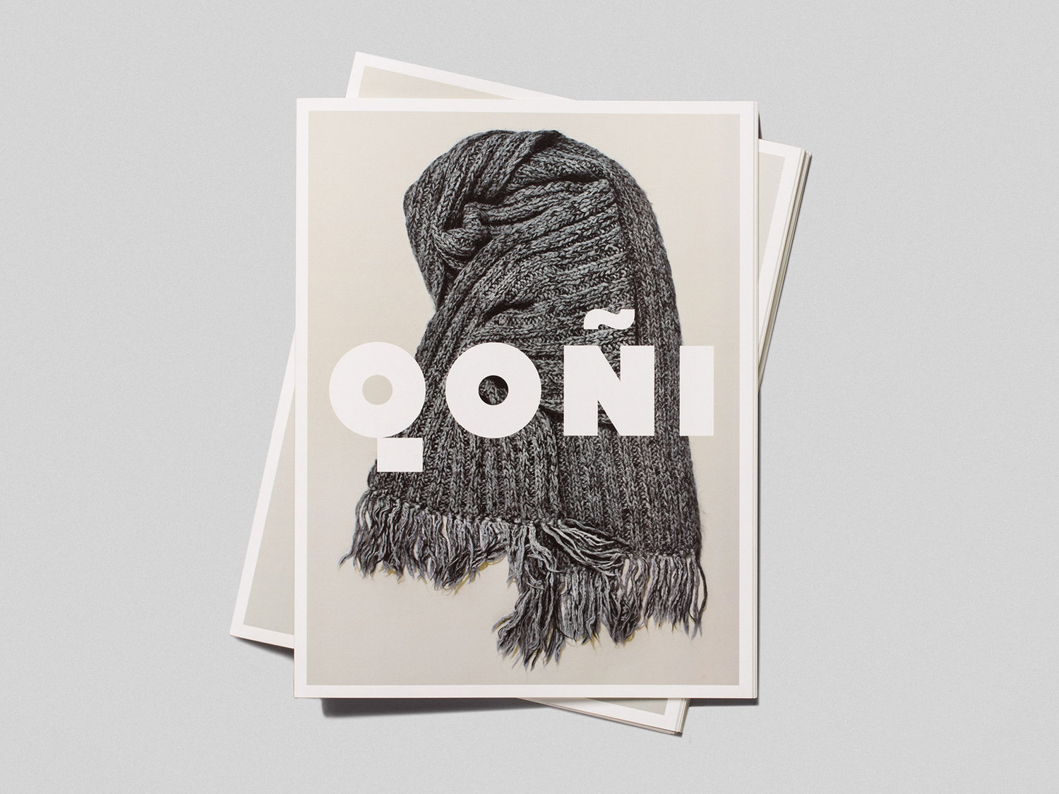
Wordmark also functions to draw out the material detail and natural colours of Qoñi’s range through contrast whilst also sharing a sense of volume. This combination of type and image, contrast and commonality is a highlight, particularly in the proportionality of the two across the cover of the lookbook.
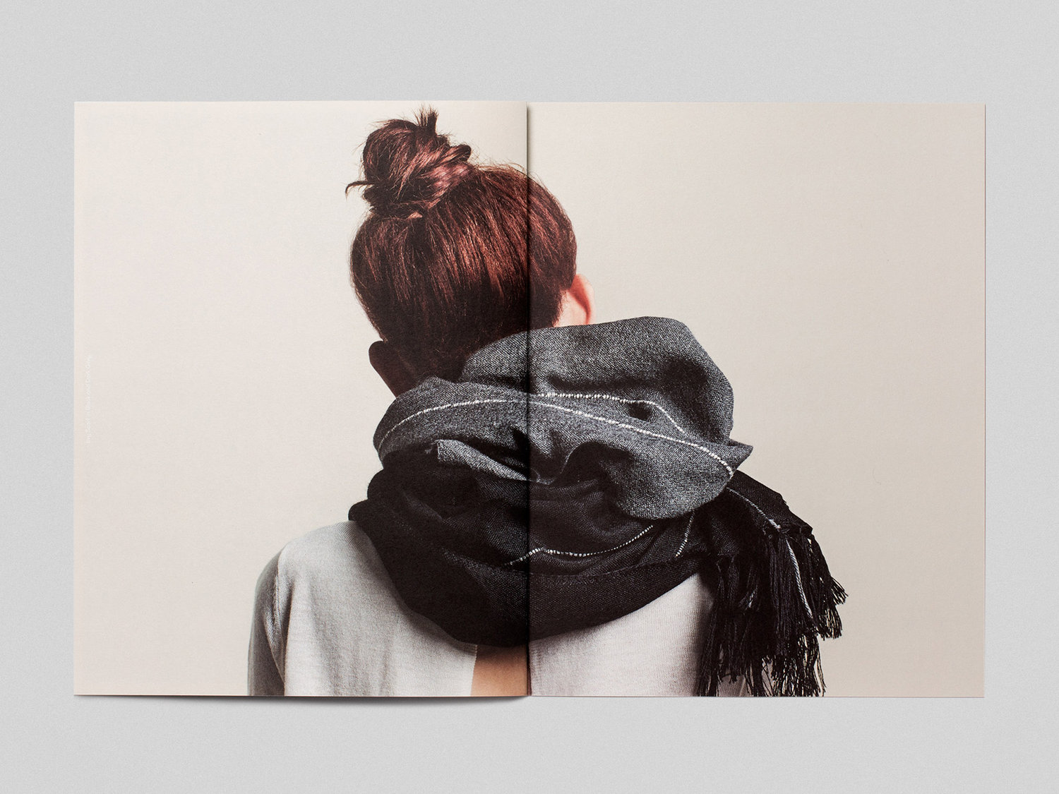
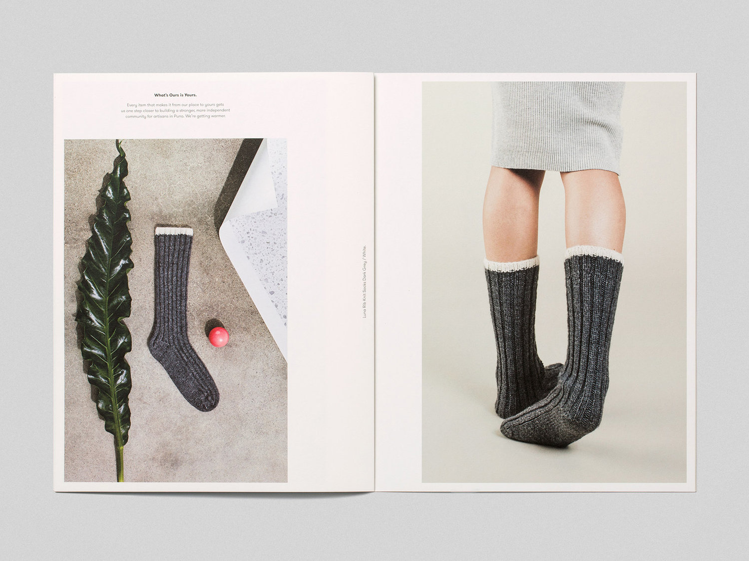
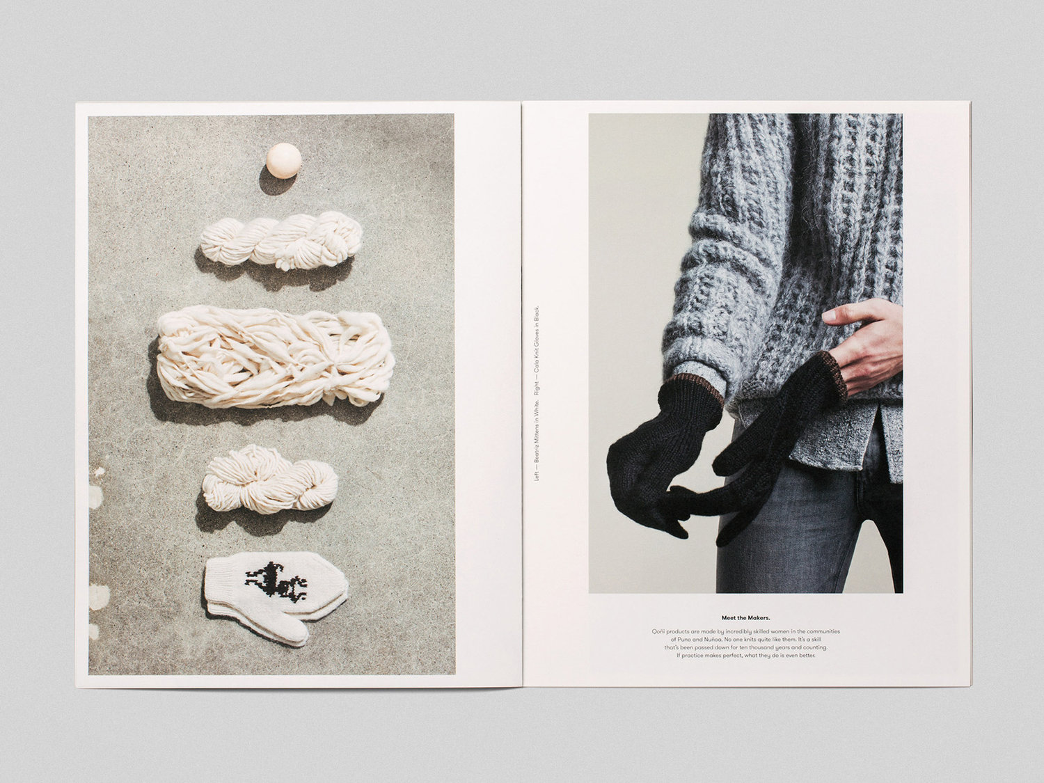
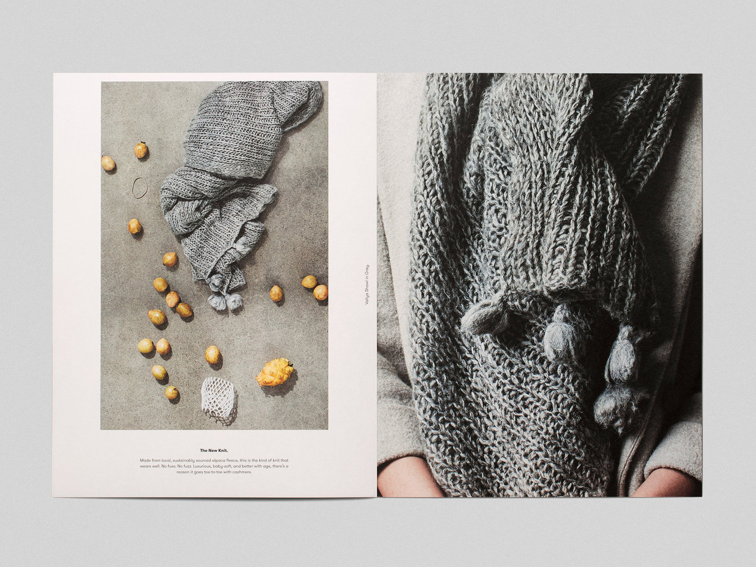
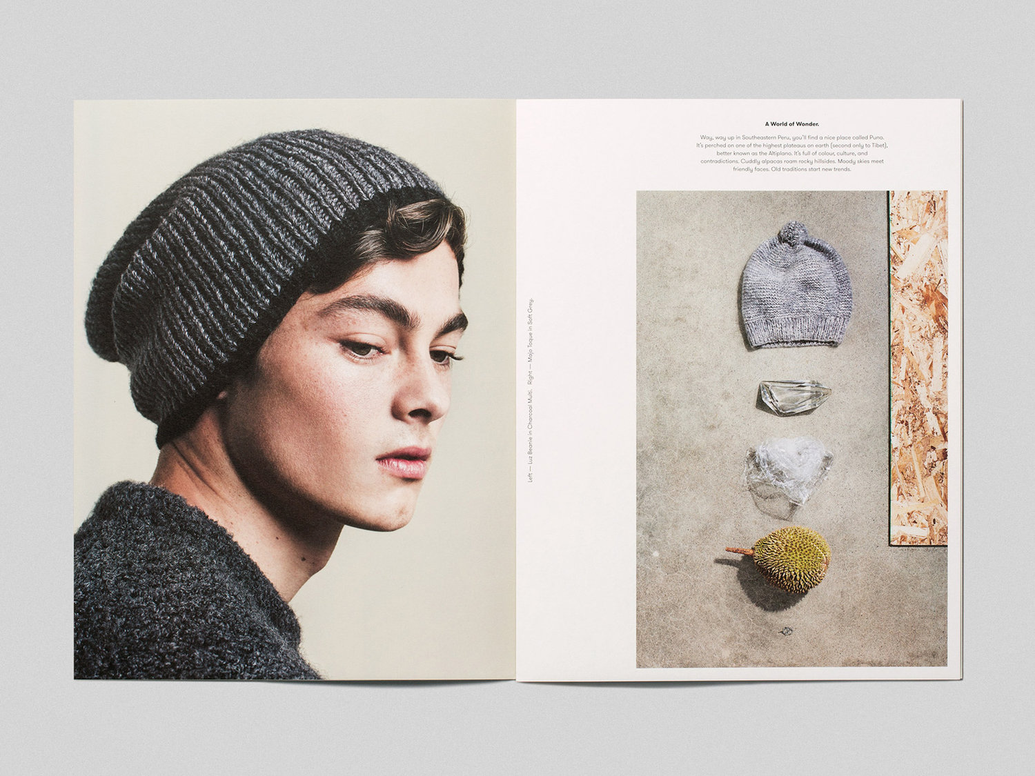
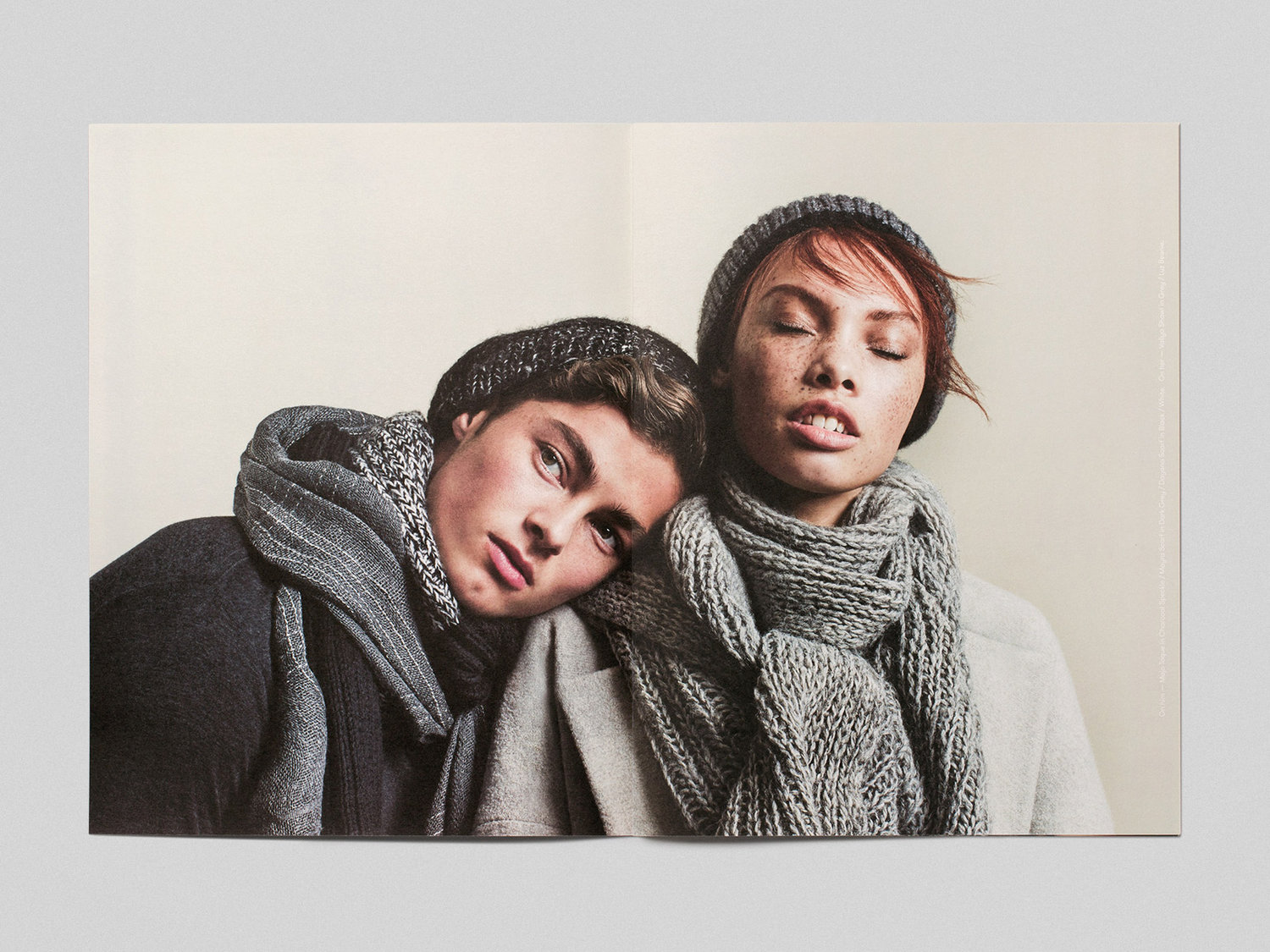
The lookbook manages to find a comfortable balance between modern fashion conventions and those of a smaller boutique brand in art direction, choice of models, their dressing, and the borders and layout of print. Back of head and leg shots offer something in the way of the more unconventional, but useful within the context of accessories such as scarves and socks.
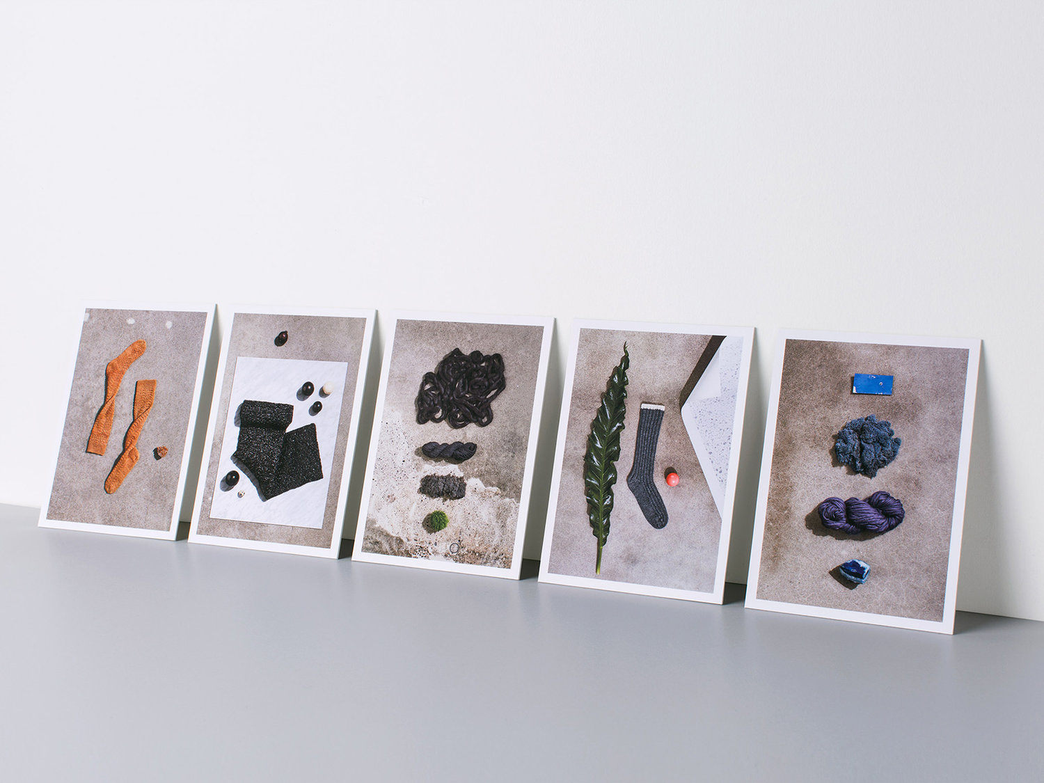
Art direction also works well to emphasis volume and convey warmth. Backgrounds are earthy and warmer than a conventional white, complimenting product colour and drawing out detail.
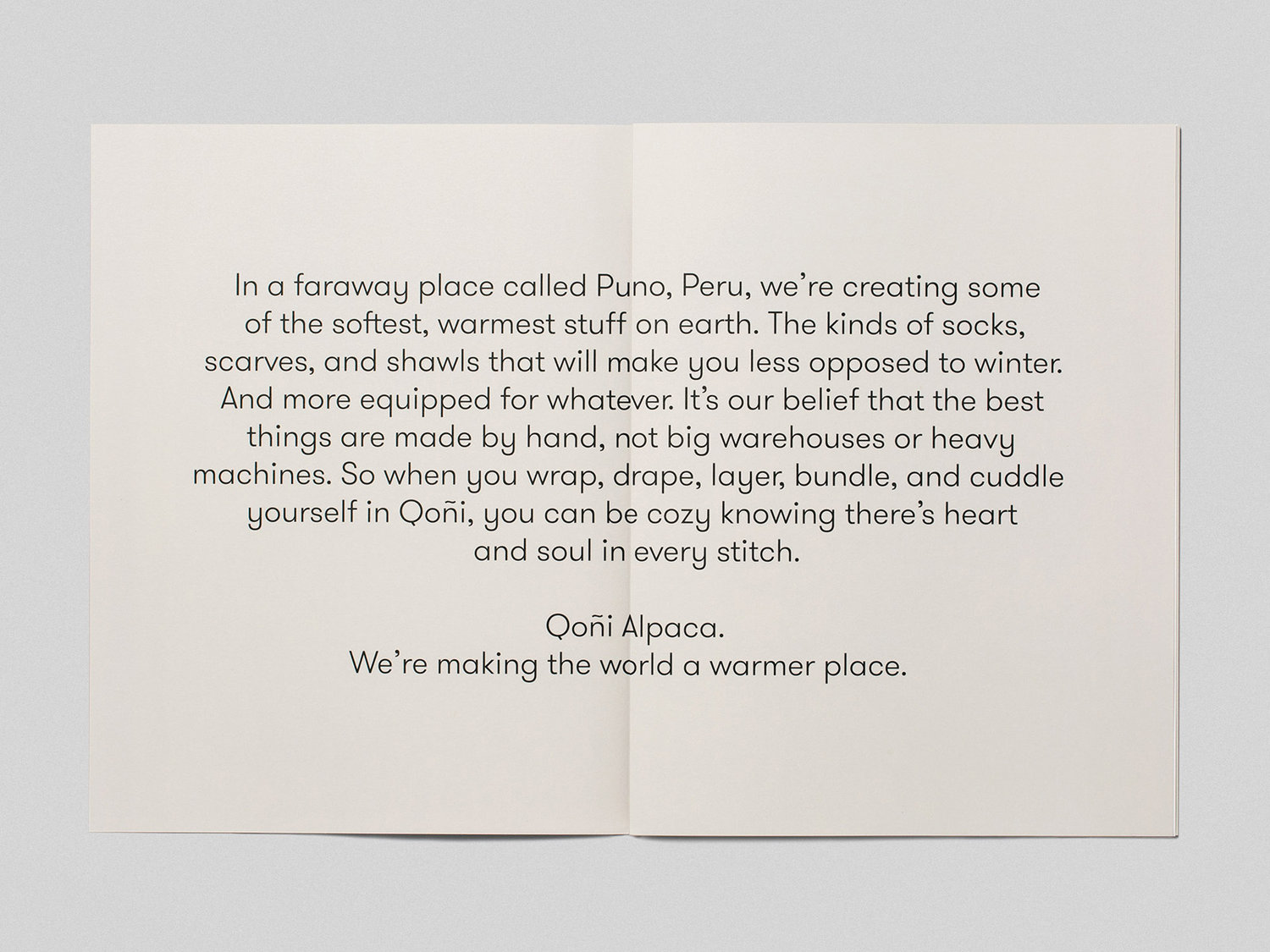
Grilli Type’s GT Walsheim, its weight and typesetting, makes a clear connection with wordmark through form, and although lighter in its lines, has a warmth and contemporary character, with the counter of the Q feeling particularly relevant in its volume. The ideas that inform type and art direction continue through to language choice (wrap, drape, layer and bundle) while storytelling works in provenance and conjures up a sense of the cozy.
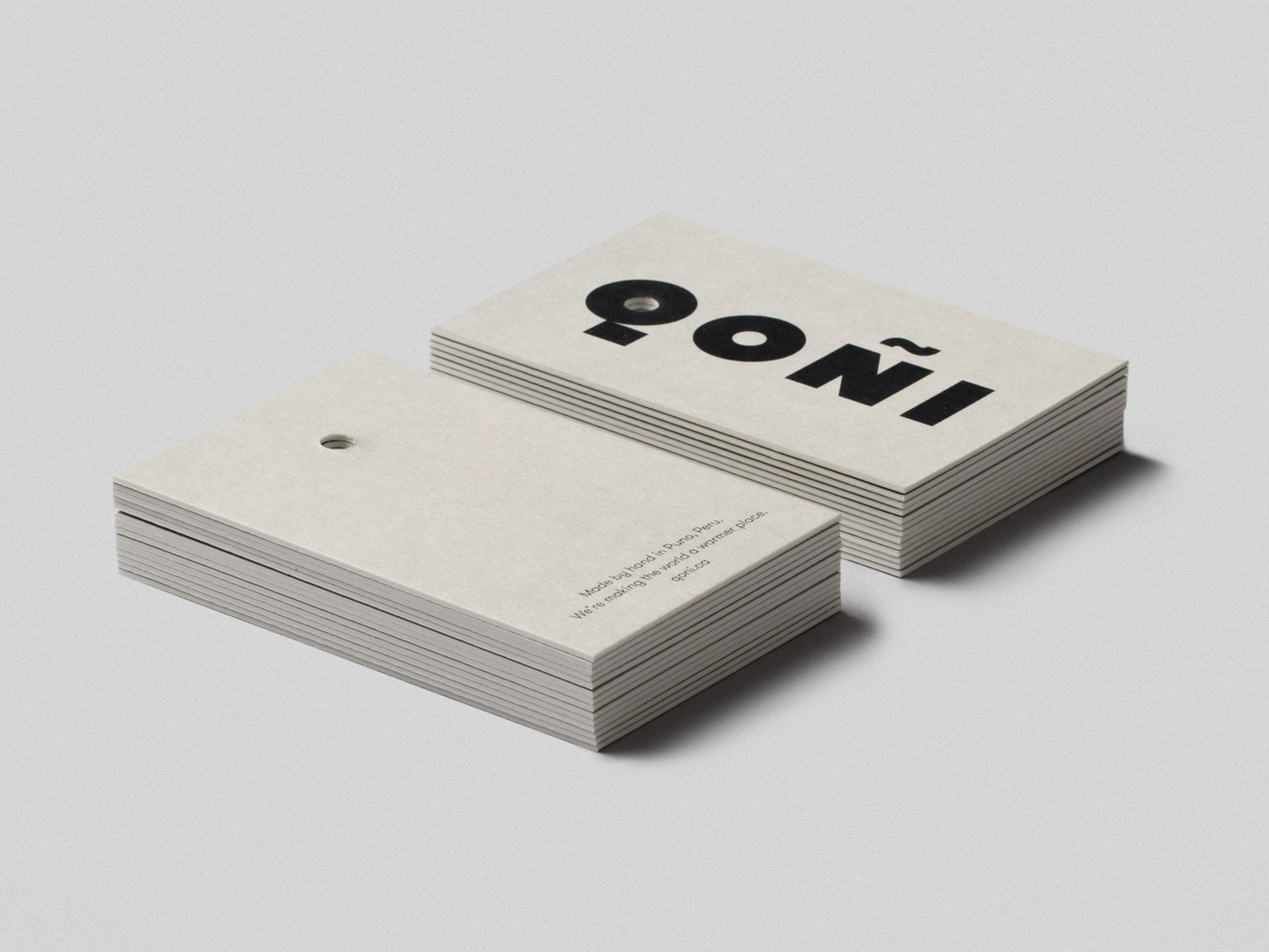
Other neat details include a robust uncoated and unbleached board tag, which balances some of the qualities of the wordmark with the material nature of garments, the slightly more playful flourish of dyed tag string, the way these loop through the O of the wordmark and the unexpected composition and dressing of product images.
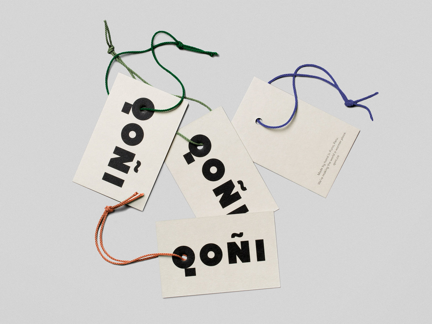
Language, image, lettershape and material work well together to convey a sense of origin, craft and the cozy. It is not extensive, but precise and thoughtful. It recognises and leverages some fashion conventions, but brings a bit of distinction and warmth to this.
Design: Leo Burnett. Opinion: Richard Baird. Fonts Used: GT Walsheim.
