From Toronto
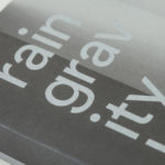
Rain, Gravity, Heat, Cold by Blok
Superkül is a Canadian architecture studio with a diverse portfolio of understated boldness, subtlety and spacial richness, rooted in a process that intends to find the essence of each project and remain true to this throughout design and development. To celebrate the studio’s first ten years Superkül worked with Blok to create Rain, Gravity, Heat, Cold, a book that would serve as a collection of...
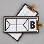
The Broadview Hotel by Blok
The Broadview Hotel is located within one of Toronto’s most recognisable architectural landmarks. This was built in 1891 by a wealthy businessman who recognised the strategic importance of the East End as the city was expanding. It has been home to a business centre, acted as a political and social hub, and used as a hotel, boarding room and more recently, a...
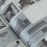
Superkül: Rain, Gravity, Heat, Cold by Blok
Superkül is an Canadian architectural studio with a portfolio described as having an understated boldness, subtlety and spacial richness, and a process that intends to find the essence of each project and remain true to this throughout design and development. Superkül has won many awards and is considered one of Canada’s most progressive architecture firms. To celebrate the studio’s first ten years...

Hurly Burly by Midday
Hurly Burly brings the bold flavour and natural health benefits of naturally fermented foods to the United Kingdom. Its first range of products will be a variety of raw organic coleslaws. Flavours include Jalapeño & Oregano, Lemon & Ginger and Turmeric & Cumin. Name, brand identity and packaging design, developed by London-based design studio Midday, intends to bring to the forefront...
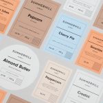
Summerhill Market by Blok
Summerhill Market is a family-run business, managed by the third generation, with premises on Toronto’s Summerhill Avenue and a smaller location—a floral boutique—on Mt. Pleasant Rd. The store has 200 employees, a butchers, bakery and deli, a BBQ in the summer and offers a variety of catering services. Summerhill Market is admired for its high quality products, and its ability—since 1954—to consistently redefine what...

Superkül by Blok
Superkül is an Canadian architectural firm with a portfolio that is described as having an understated boldness, subtlety and spacial richness, and a process that intends to find the essence of each project and remain true to this throughout design and development. Superkül has won many awards and is considered one of Canada’s most progressive architecture firms. To celebrate their first...

Printed by Somerset by Leo Burnett
Somerset is described as being Canada’s top printer, known for its precision, attention to detail and ability to pull off complex jobs. Alongside reproduction services, Somerset, a family-run business, also provides extensive print finishing services. Inspired by this, the stacked paper of the press, and with the intention of engaging a new generation of designers, Toronto based studio Leo Burnett developed a new brand identity...

Qoñi by Leo Burnett
Qoñi is a small artisan community in the Peruvian city of Puno creating hand knitted socks, scarves, gloves and shawls from alpaca fleece. With a desire to present itself as a modern fashion brand and with the intention of entering the international market, Qoñi worked with Toronto-based graphic design studio Leo Burnett to develop a new visual identity; from naming to wordmark, brand story to lookbook, and...
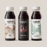
Hatch Cold Brew Coffee by Tung
Toronto-based Hatch is a coffee roaster producing ready-to-drink cold brew coffee from high quality natural ingredients using a craft-oriented twice-filtered manufacturing process and a unique bottling technology to seal in fresh flavour. Hatch intends to bring cold brew coffee from a niche but growing market into the mainstream and worked with Canadian graphic design studio Tung to help them achieve this through brand identity and packaging....

The Playlist Co. by Blok
The Playlist Co. is a Canadian business providing music management and consulting services, AV construction, live music and playlists for a wide range of spaces and events, nationally and internationally. They are renowned for their encyclopaedic knowledge of music, and have collaborated with a some of Canada’s top hospitality brands, as well as local bars such as Buca, Canoe and Bar Raval. The Playlist Co....
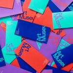
Art Museum by Underline Studio
Art Museum unites the Justina M. Barnicke Gallery and the University of Toronto Art Centre as one new institution dedicated to exhibition and education. It is one of the largest gallery spaces for the visual arts in Toronto and is housed within an iconic gothic-style building. The museum worked with Canadian graphic design studio Underline to develop a new visual identity system that...
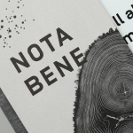
Nota Bene by Blok
Nota Bene is a restaurant, located on Toronto’s Queen Street West, with a menu made from locally-sourced and seasonal ingredients. It was opened by chef David Lee and business partners Yannick Bigourdan and Franco Prevedello in 2008, and was awarded “Best New Restaurant” by Toronto Life and enRoute Magazine soon after. To coincide with the restaurant’s 2016 relaunch—which saw David Lee take...