Caldo Coffee by 25ah
Opinion by Richard Baird Posted 12 January 2017
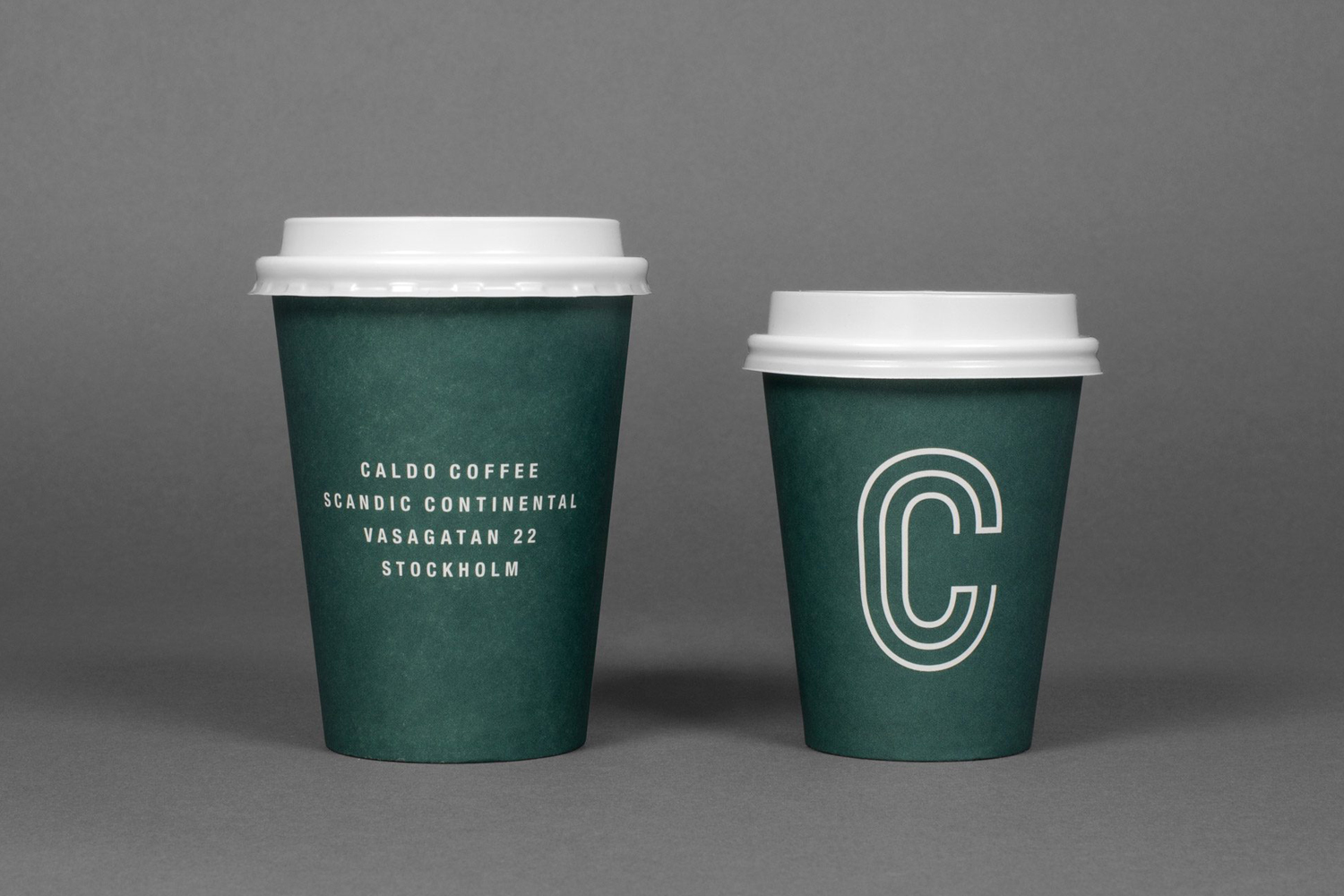
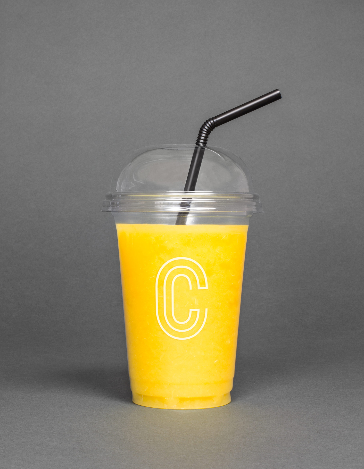
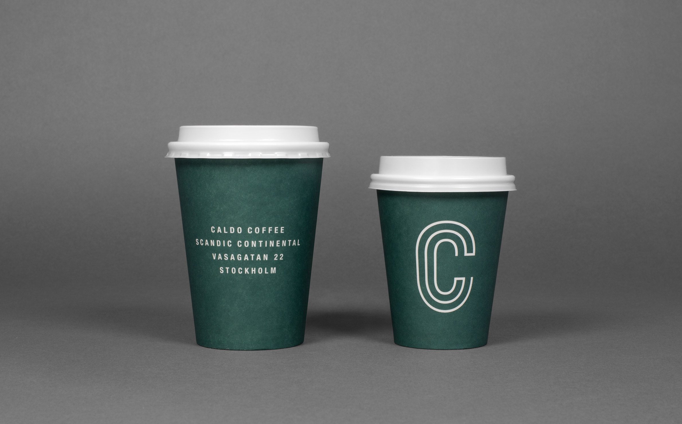
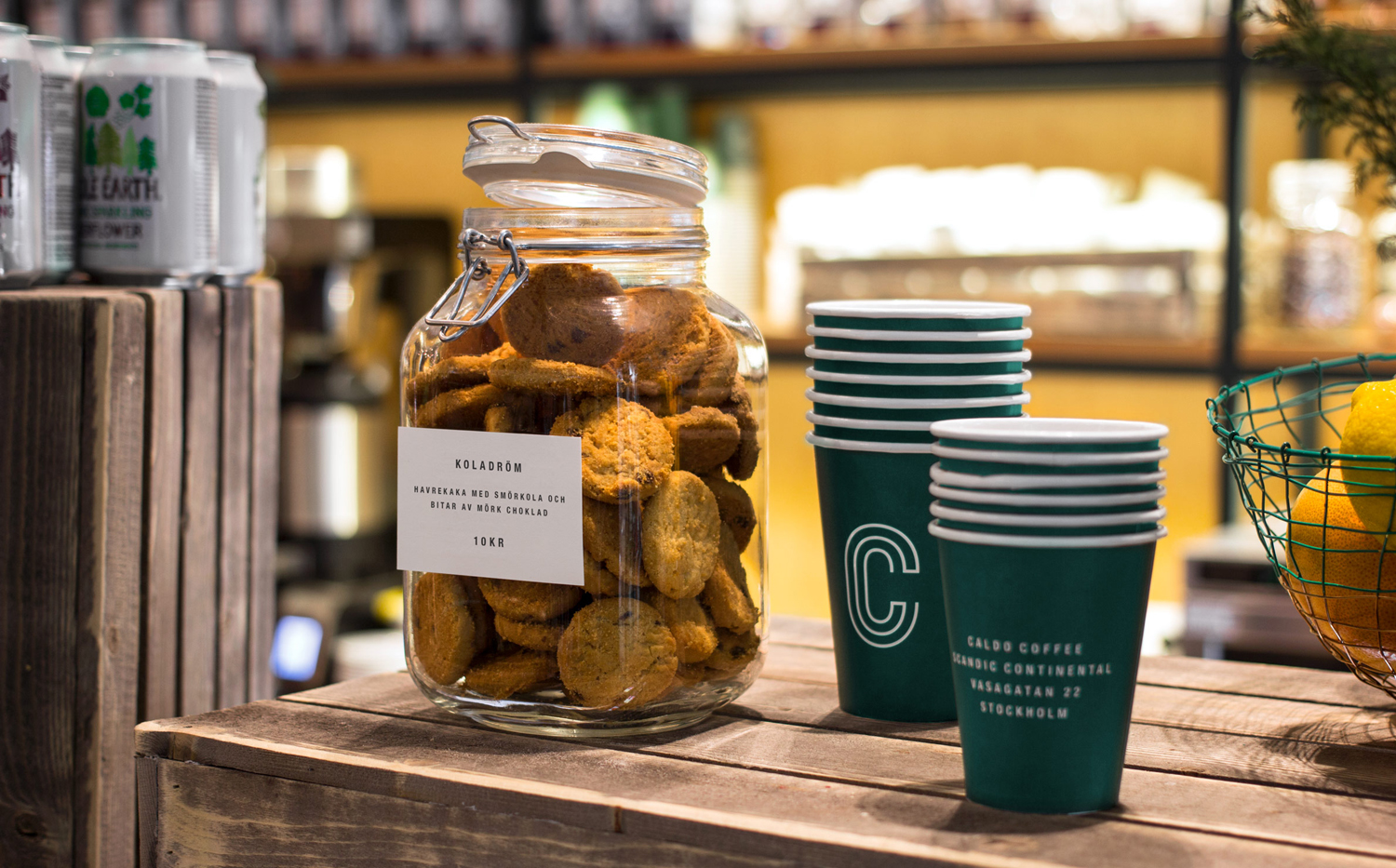
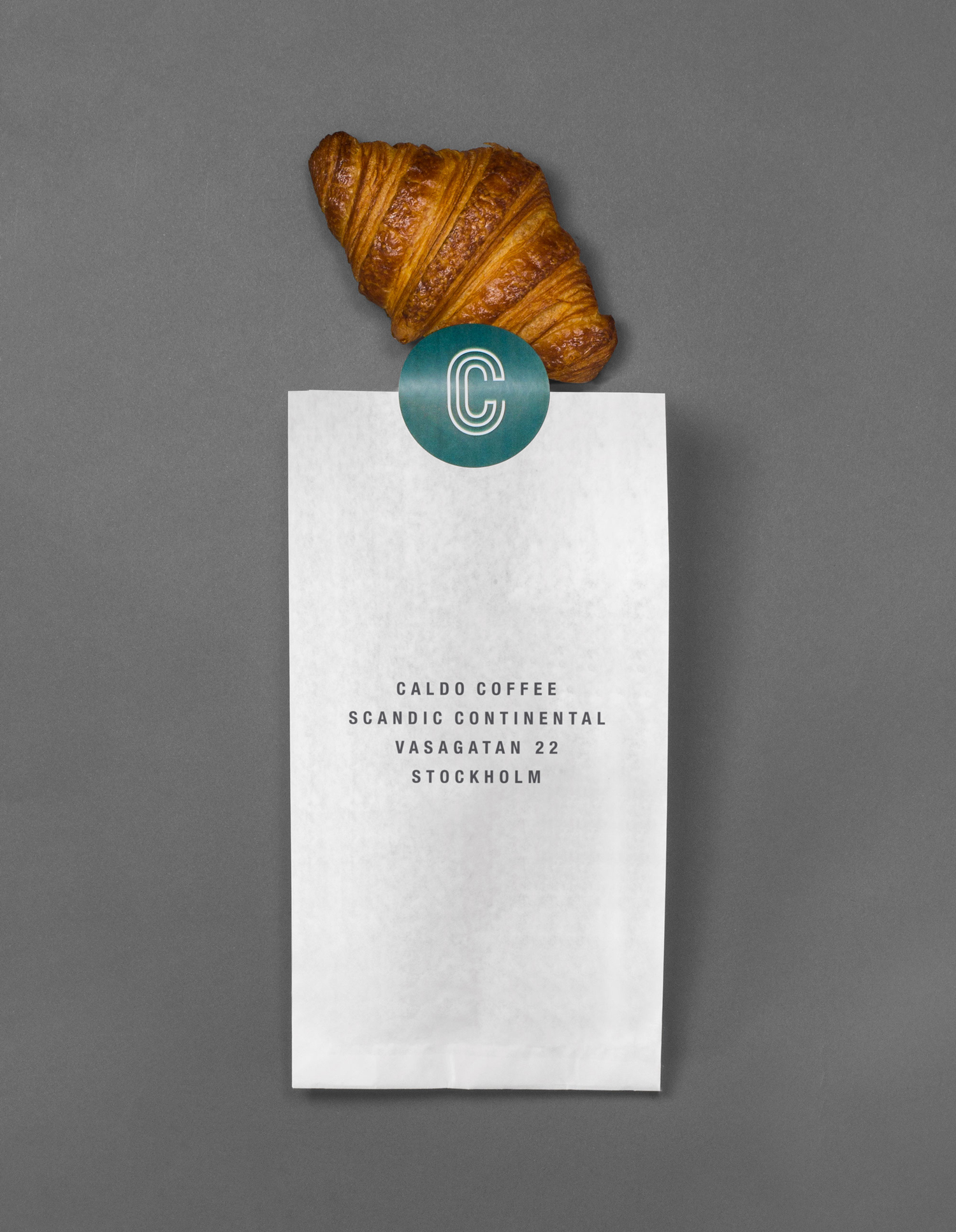
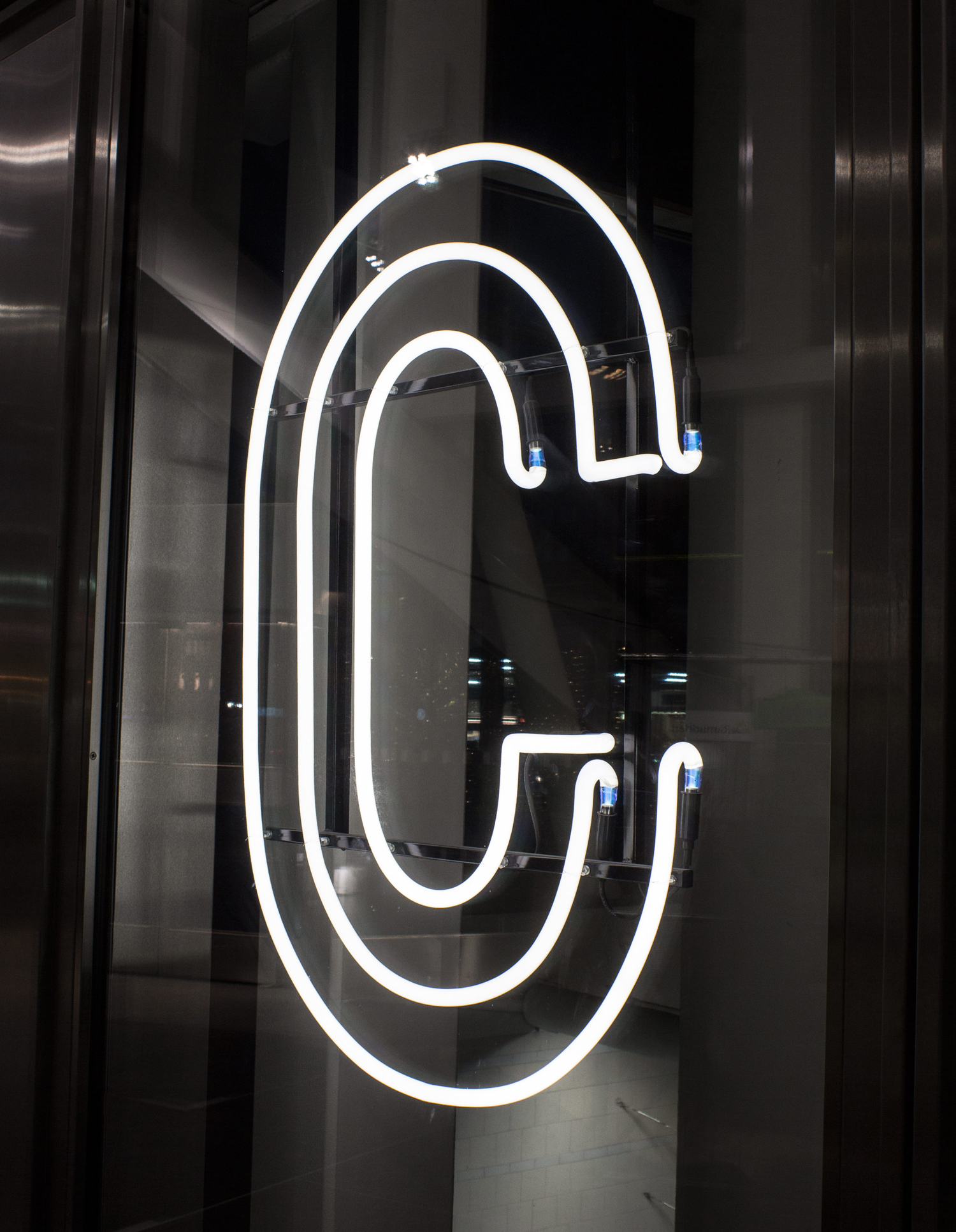
Caldo Coffee is a café serving organic coffee and fresh salads, sandwiches and pastries from its location in the Scandic Continental, a hotel in the centre of Stockholm. It features a distinctive and modern interior design of light wood, tall shelves and a long wood panelled and marble topped counter. It also includes a large custom-built menu board, neon signage and a brand identity created by Swedish graphic design studio 25ah. This links a variety of printed assets such as coffee cups, price tags and takeaway packaging.
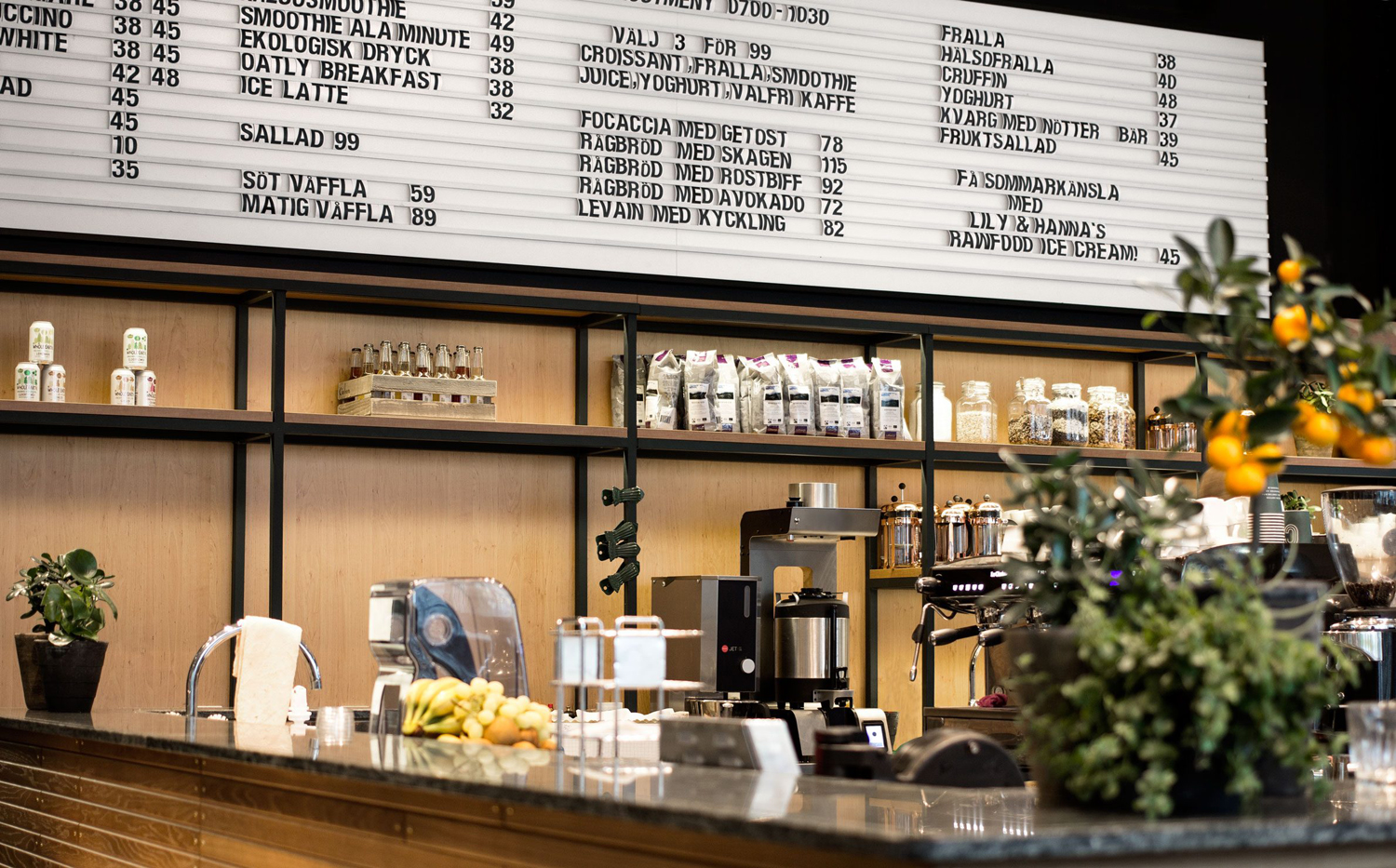
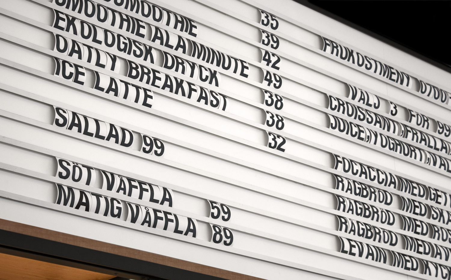
The custom-built menu board is the real highlight. It has a sense of displacement and juxtaposition that lends a polished and current interior design an unexpected and slightly more downtown urban utility, which is said to have been inspired by the cafe’s location.
The rows of the menu board share a pleasant commonality with a long wood panelled coffee bar, while its proportionality, dominating in its size and length, functions as a distinctive and memorable feature. This makes its way, although rather suitably, into print by way of type and typesetting.

The logo functions, in conjunction with its size in print and a lovely green, to be identifiable. The simplicity of its form, the continuous lines that draw a double C and monolinear weight is well-suited to neon signage. It is evident that neon, much like the prominent menu board, was a key component of interior concept, a reflection of the urban location, and went on to influence logo.
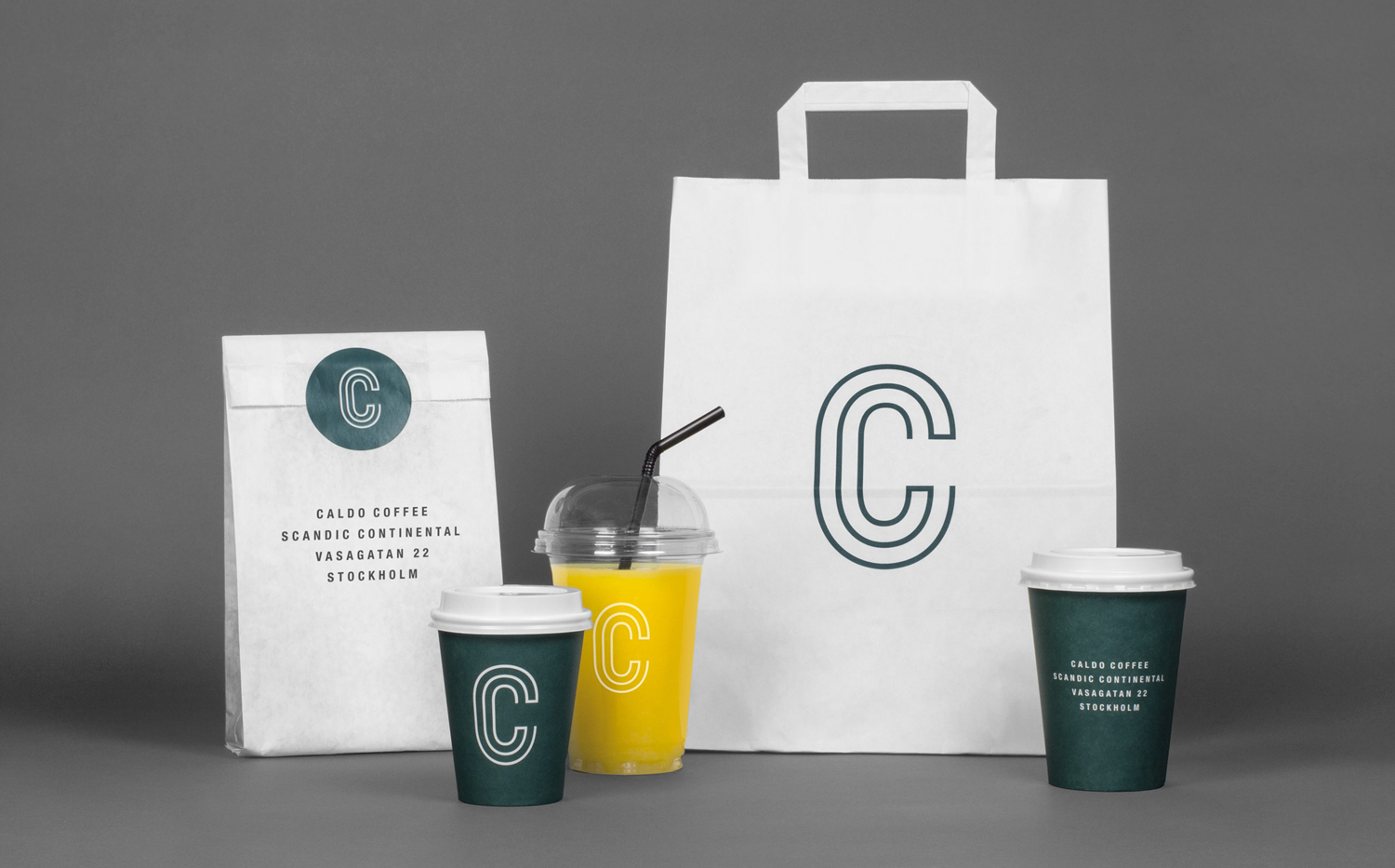
Visual identity in print is straightforward in the mix of printed bags, cups and stickers. There is, however, even in its simplicity, a continuity between this packaging and the menu board in the condensed, uppercase san-serif letterforms and plenty of white. It is very suitable, and could have perhaps been more prominent in its connection to interior, in the same way logo does through neon. More from 25ah on BP&O.
Design: 25AH. Opinion: Richard Baird. Fonts Used: Helvetica Condensed Bold.
