On Rye by Pentagram
Opinion by Richard Baird Posted 18 January 2017

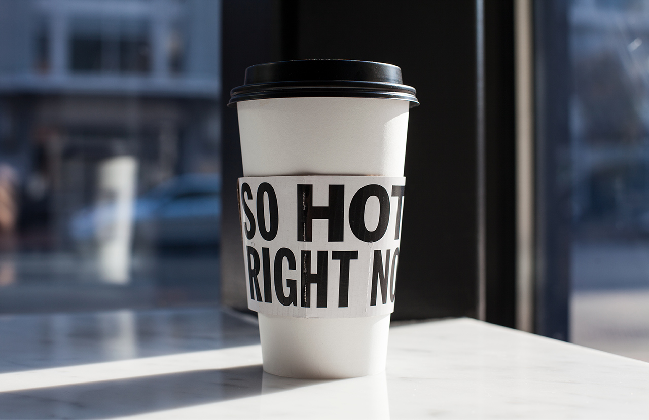
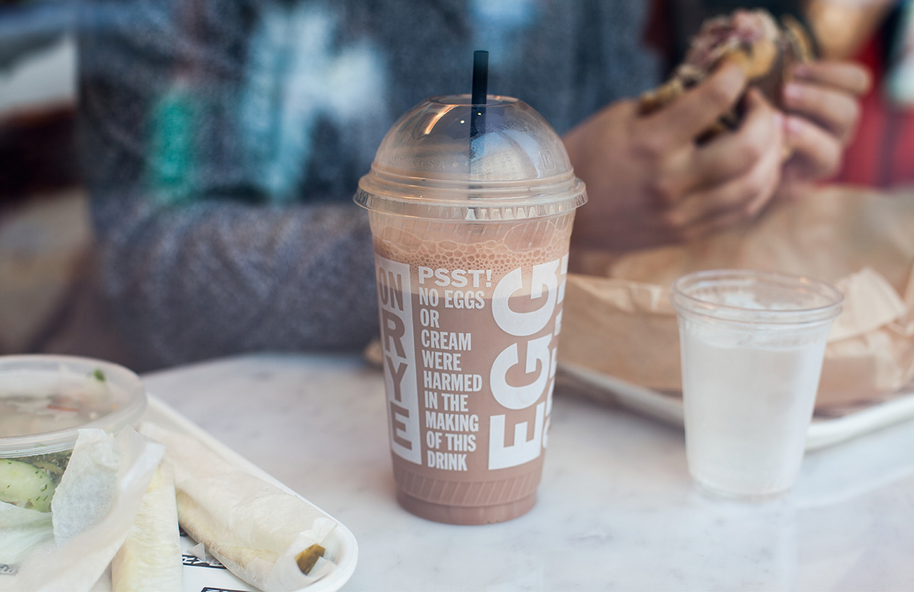
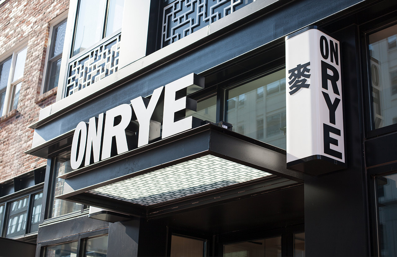
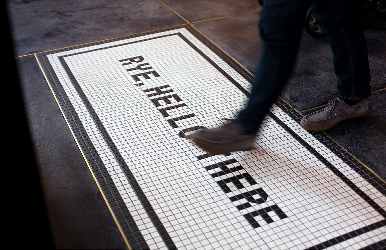
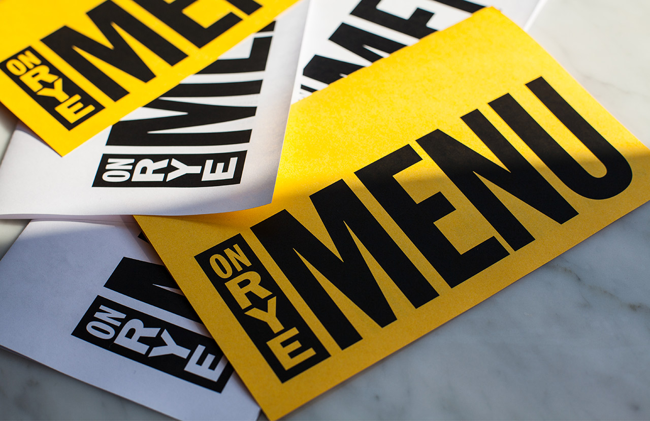
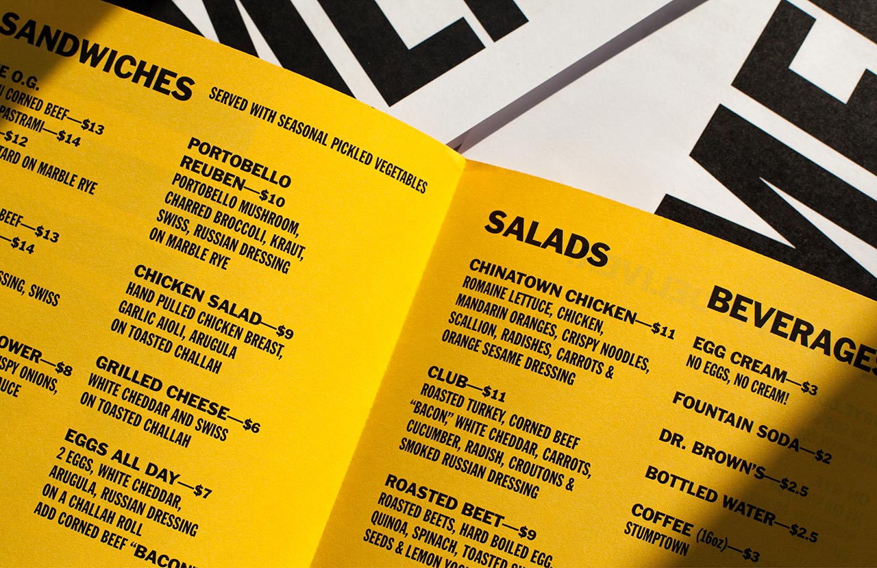
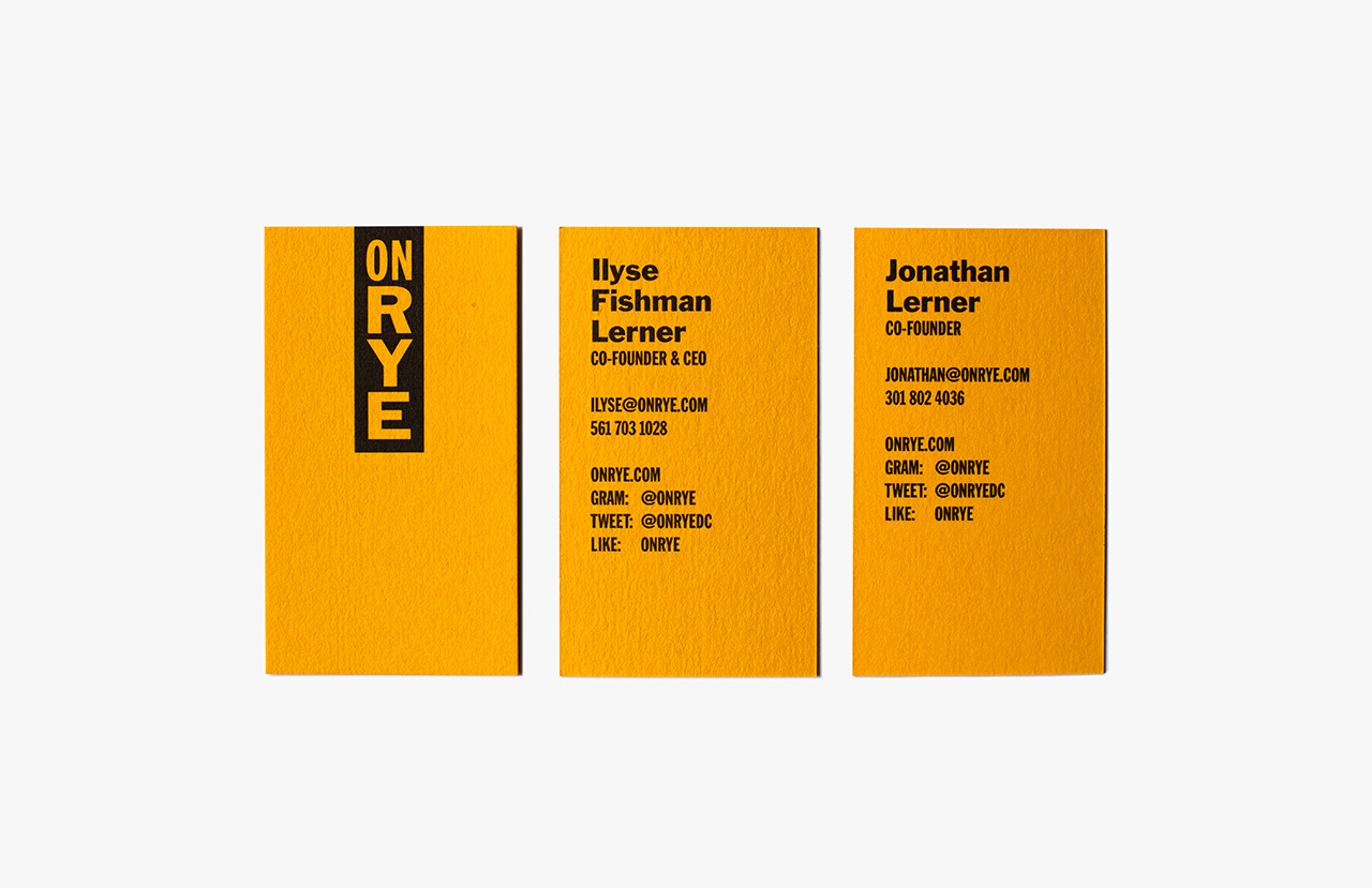
On Rye is a fast-casual sandwich shop, with a space in the US capital of Washington DC, inspired by the Jewish deli. It has a menu of unexpected recipes that dial down the salt and bumps up the veggies, uses natural and wholesome ingredients, and gives traditional dishes a modern twist. On Rye has an interior that brings a contemporary finesse to retrospective detailing and features a brand identity designed by Pentagram partner Michael Bierut and his team. Brand identity functions on a few different levels. It works as an expression of On Rye’s wholesome menu, honours the origins of the Jewish deli in the US and adds to interior using contrast, in the weight and shape of type, the brightness of colour and the playful qualities of photography within a space of material detail and traditional fixtures and fittings. The project included business cards, menus, wall-coverings, signage and website.
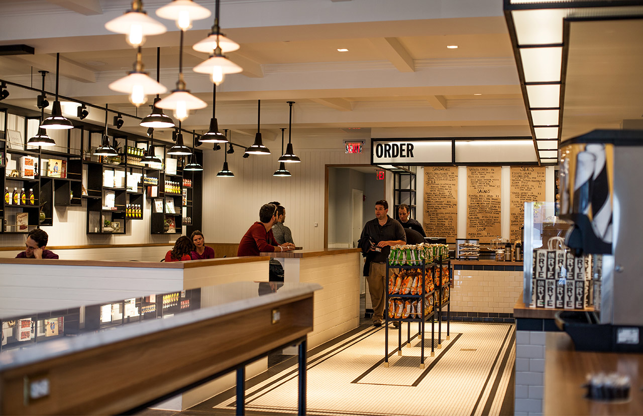
While interior goes all in for the retrospective deli cues, one that is incredibly well-finished and with an authenticity you get from a serious commitment to detail, Pentagram’s brand identity works in something of a modern urban spirit that taps into the origins of the Jewish deli in America. On Rye is a great name, it speaks of the alternative, health conscious and calls to mind something of the wholesome and hearty. This is emphasised by visual identity through a contrast of simple but bold typographical form and colourful food photography.
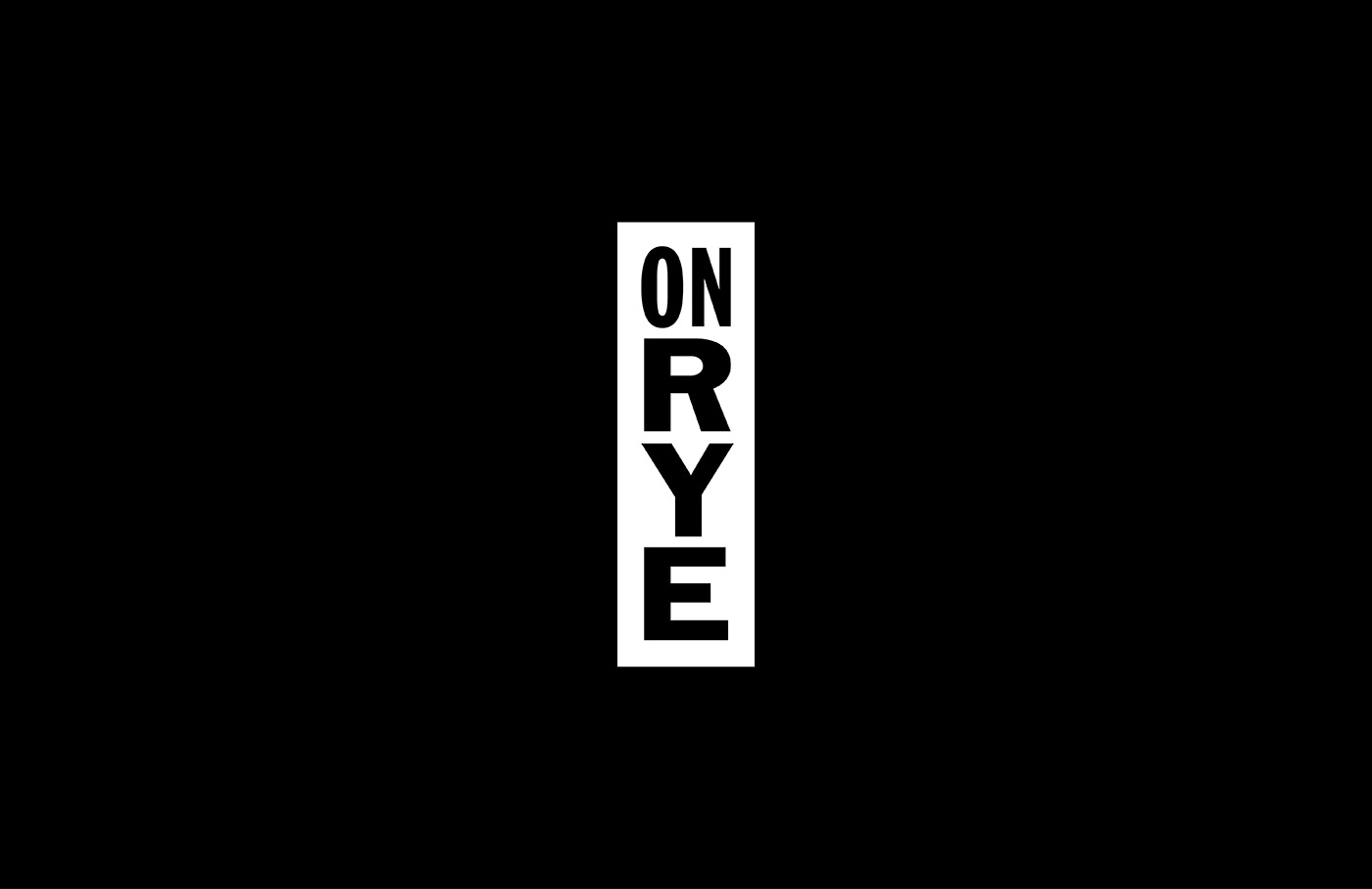
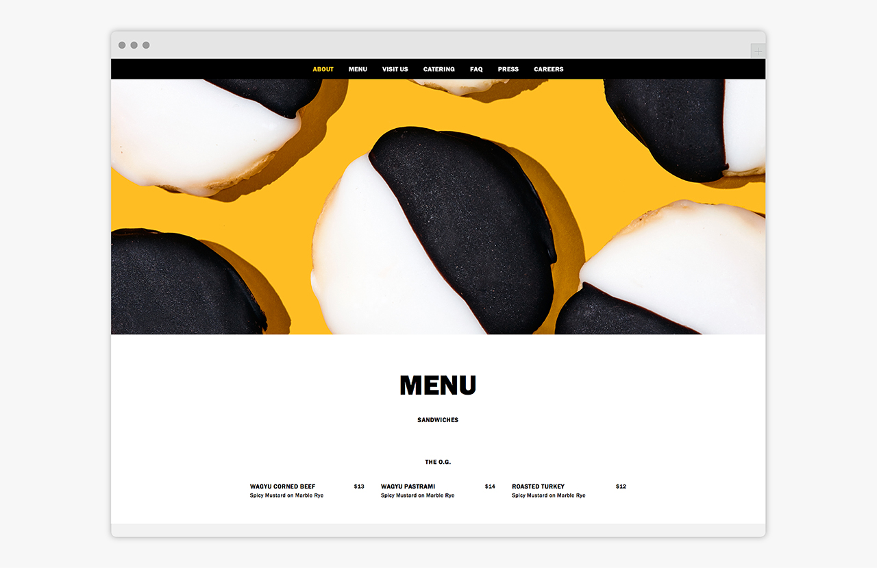
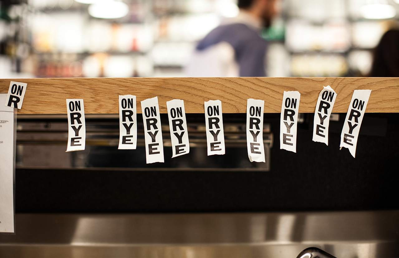
Wordmark is compact and impactful, drawing a distinction from the familiar forms of Franklin Gothic through the juxtaposition of Extra Condensed and Regular, and the use of both horizontal and vertical arrangement. The robust letterforms are elevated in their implementation as signage, with a very physical prominence in depth, size and proportion. These choices find a really lovely balance between hearty and wholesome food and a modern urban attitude. Wordmark and related typographical expressions, and a colour palette of black, white and a bright yellow which runs across printed materials, punctuate, but do not overwhelm, an interior of traditional material detail and furnishing.
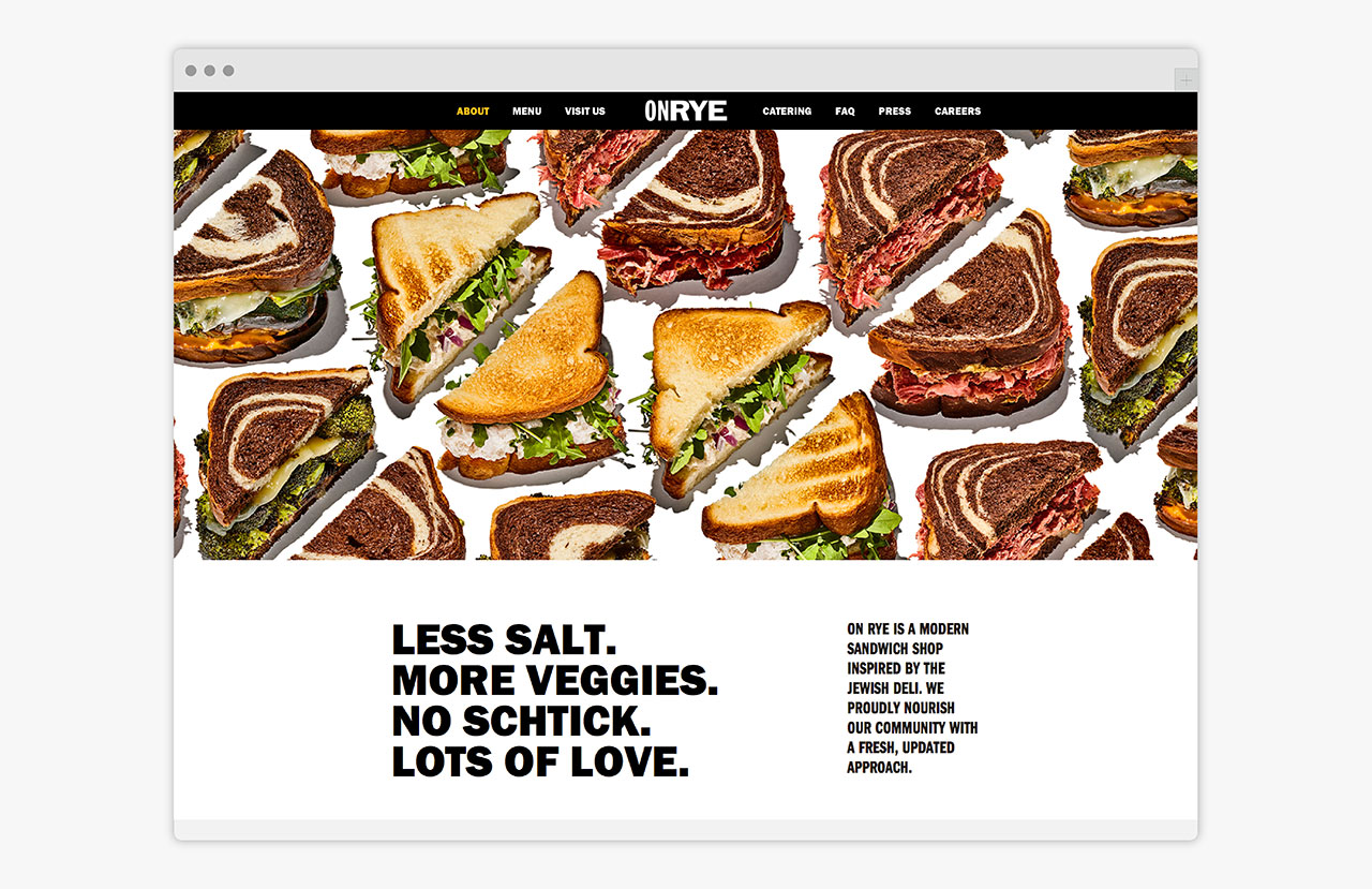
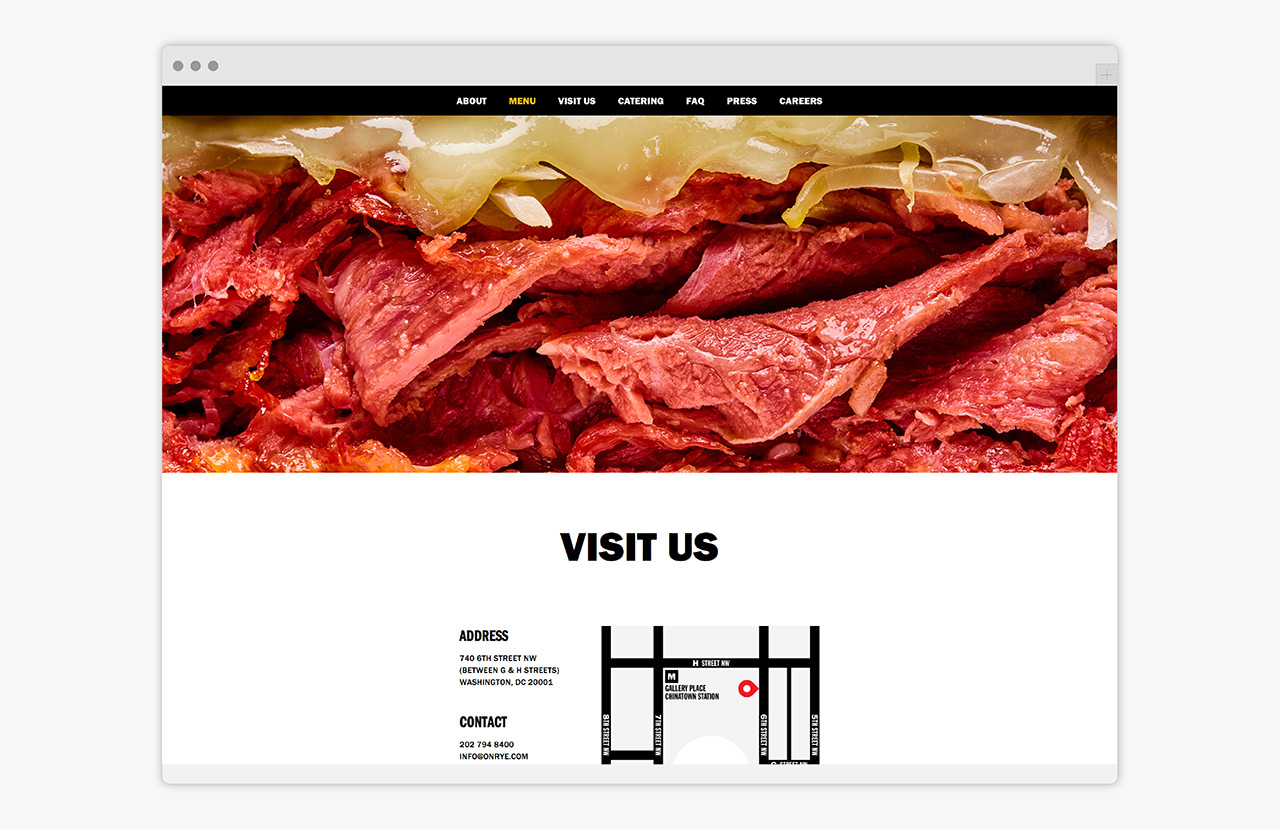
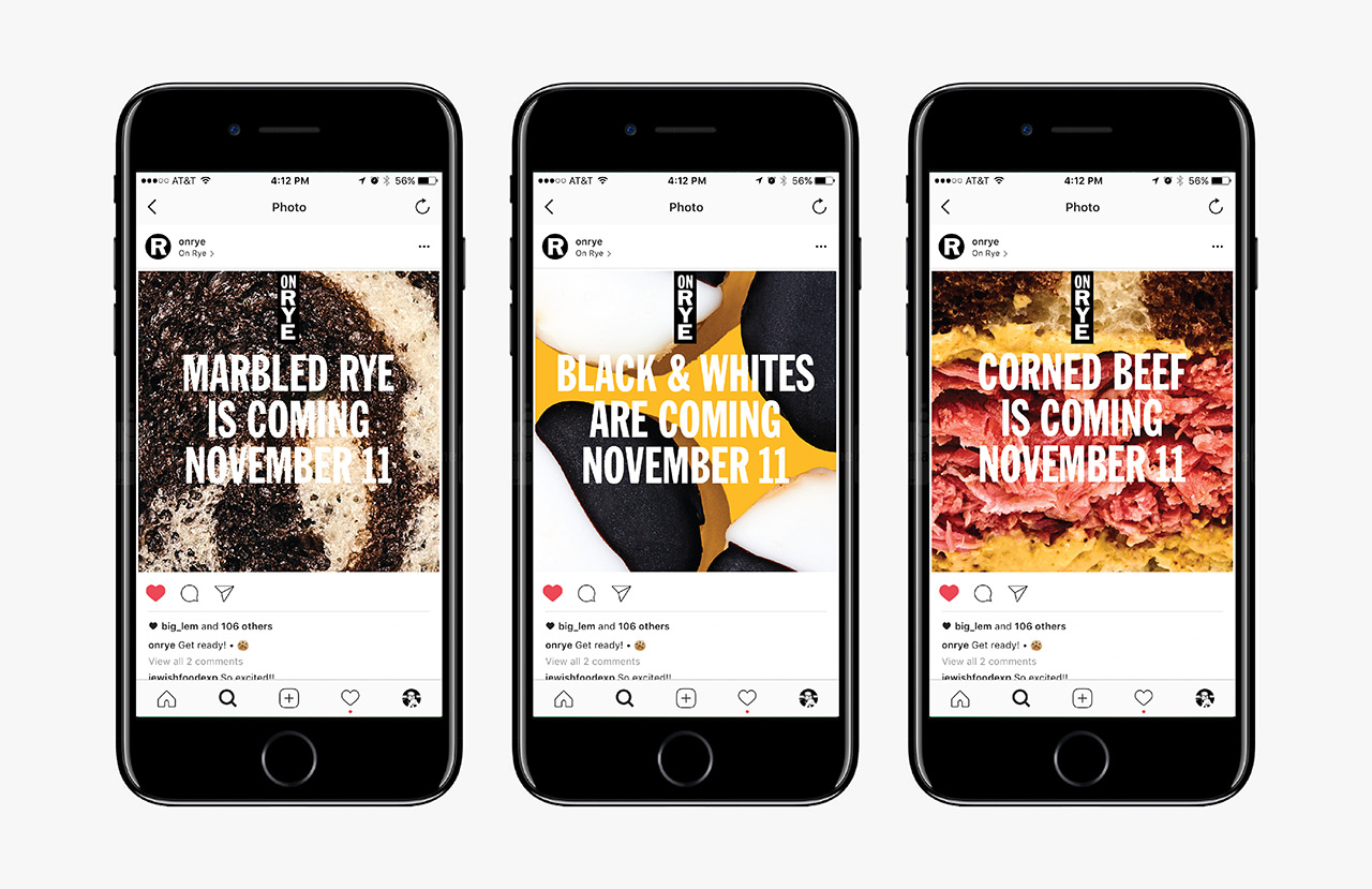
Where typesetting manages to draw distinction from familiar typographical form, photography feels distinctive and original from the outset, and is the real highlight, making the most of the colours and texture of On Rye’s sandwiches. It does a fantastic job of communicating difference and positioning, making the most of the darker colour of rye bread, and saying something of the deli’s unusual recipes effectively in the marbling of this with white bread.
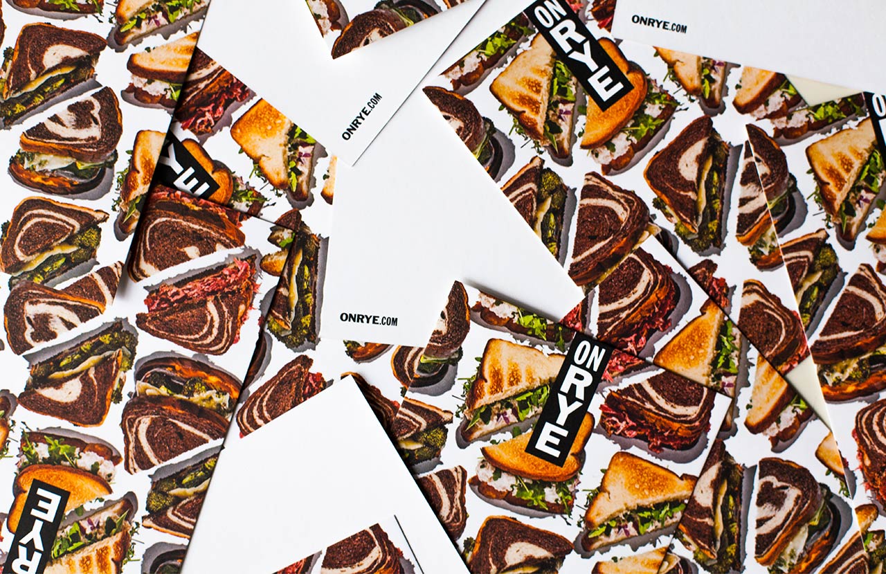
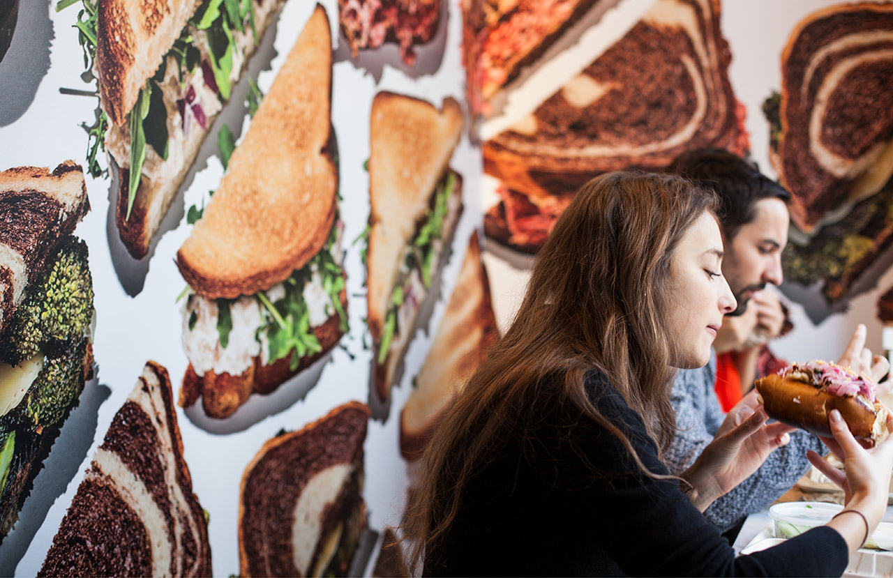


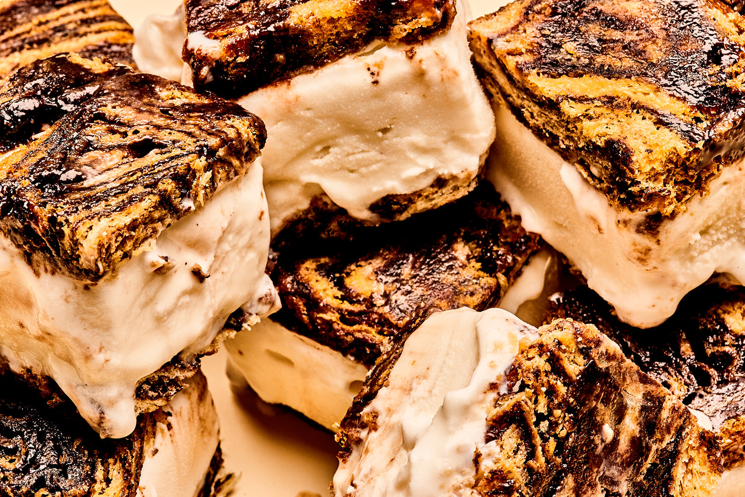
There is lovely contrast between an urban typographical simplicity and robustness, natural colour, detail and character of Bobby Doherty’s photography, and the more traditional flourishes of interior design. These function to differentiate, communicate and set tone, and feel well-balanced within the context of interior design. Website, absent the material detail of interior, works in plenty of white space, elevating type and image.
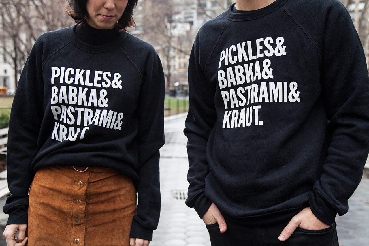
Typographical form, the approach to signage, and colour palette, in conjunction with interior, and a playful welcoming approach to copywriting, do a really lovely job of referencing NYC, the origins of the Jewish deli, but never feels too blunt or heavy handed, benefitting from a moderation and balance within either an online or in store context. More work by Pentagram on BP&O.
Design: Pentagram. Food Photography: Bobby Doherty. Signage: HapstakDemetriou. Opinion: Richard Baird. Fonts Used: Franklin Gothic.
