Lorod by Pentagram’s Natasha Jen
Opinion by Richard Baird Posted 24 January 2017
Lorod is an American fashion label that redefines timeless basics with modern, modular construction, distinctive fabrics and vintage-inspired chic. The designers at LOROD experiment with production methods to give each garment a quirky, personal and one-of-a-kind quality, and utilise new distribution tools to produce collections within the U.S.
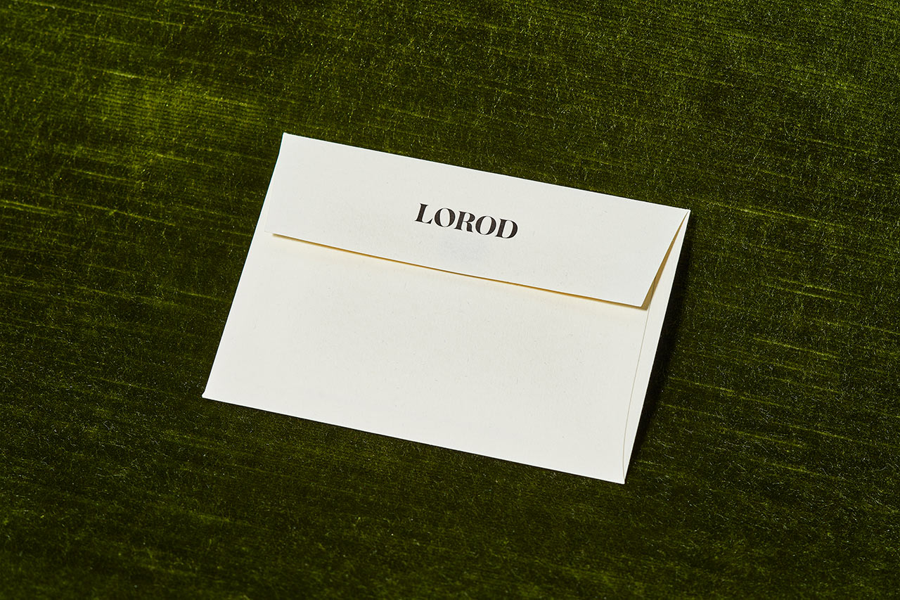
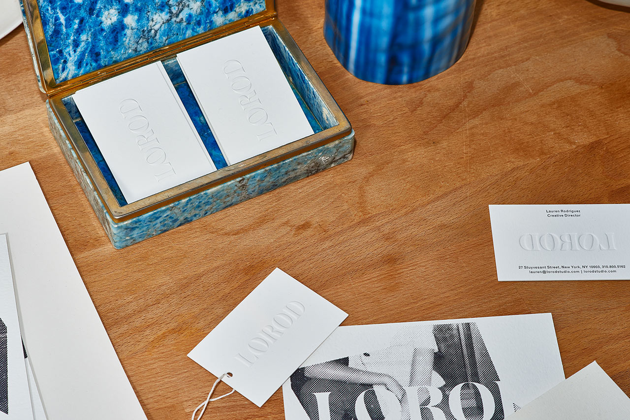
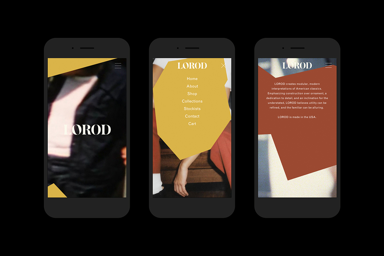
This intersection of the classic and contemporary, refined craftsmanship, a utilitarian functionality and quirky personality informed Lorod’s brand identity, designed by Pentagram partner Natasha Jen and her team. This is expressed in the combination of wordmark, colour and form, in messaging and art direction, and the way that these are used across tags, business cards and website.
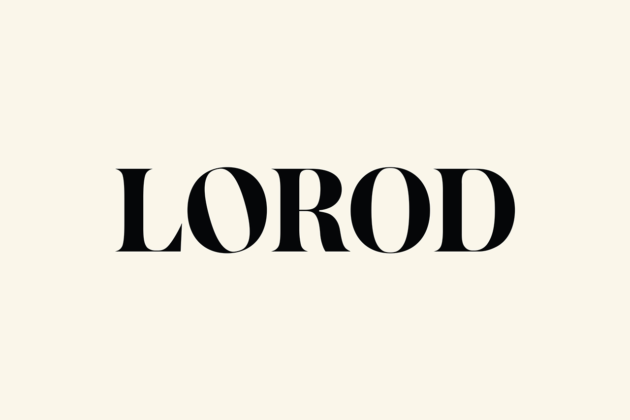
Approach is not unusual, the intersection of the classic and the contemporary, the utilitarian and handcrafted is something that frequently crops up, is the foundation for many of today’s branding efforts, intending to capture something of a romanticised past but with a modern eye for craft, quality and distinctiveness. How this is interpreted and expressed, the extent to which this is rooted in a genuine intention, and the way that this is then cut with something of the more individual often determines the real value of such an approach.
Lorod feels like a good example of this. With each message clearly defined and expressed by individual components, effectively worked together to form an identity that is visually interesting, and communicatively well-founded. As you would imagine, contrast plays a large role. This is perhaps most acutely seen in the use of colour, image and form.
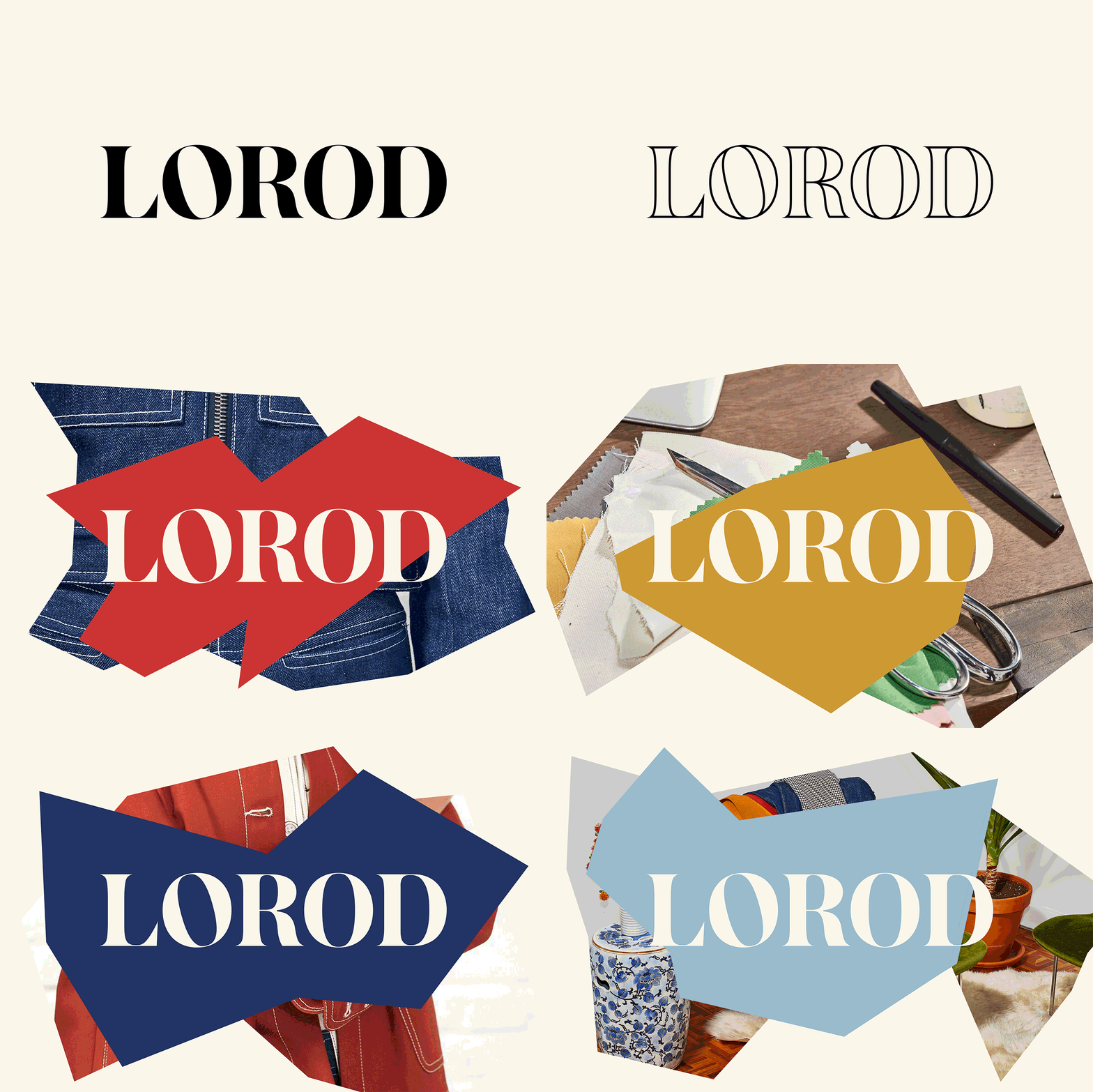
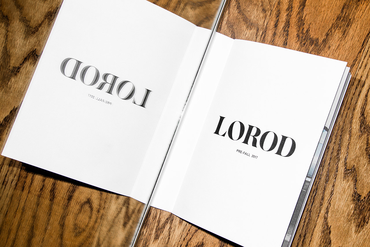
Wordmark is characterised by and leverages the vintage chic of sharp and pronounced serifs, a high contrast, and refined letters of Commercial Type’s Austin. It is well-spaced, compact and benefits from a balance intrinsic to name. In opposition, irregular shapes absent curves, drawing on alternative pattern-making techniques, feel distinctly more recent, creatively uninhibited and expressive in their communicative intention. Difference, both conceptually and aesthetically, is pronounced and elevated further by a contrast in the use of colour, and in solid forms and those that contain imagery.
The chic, vintage and 70s associations of type, rather than the more traditionalist, and forms rooted in modern process over more conventional garment patterns, and the impact that comes from their combination, lend the work an aesthetic distinction whilst making the most of period associations to deliver communicative clarity.
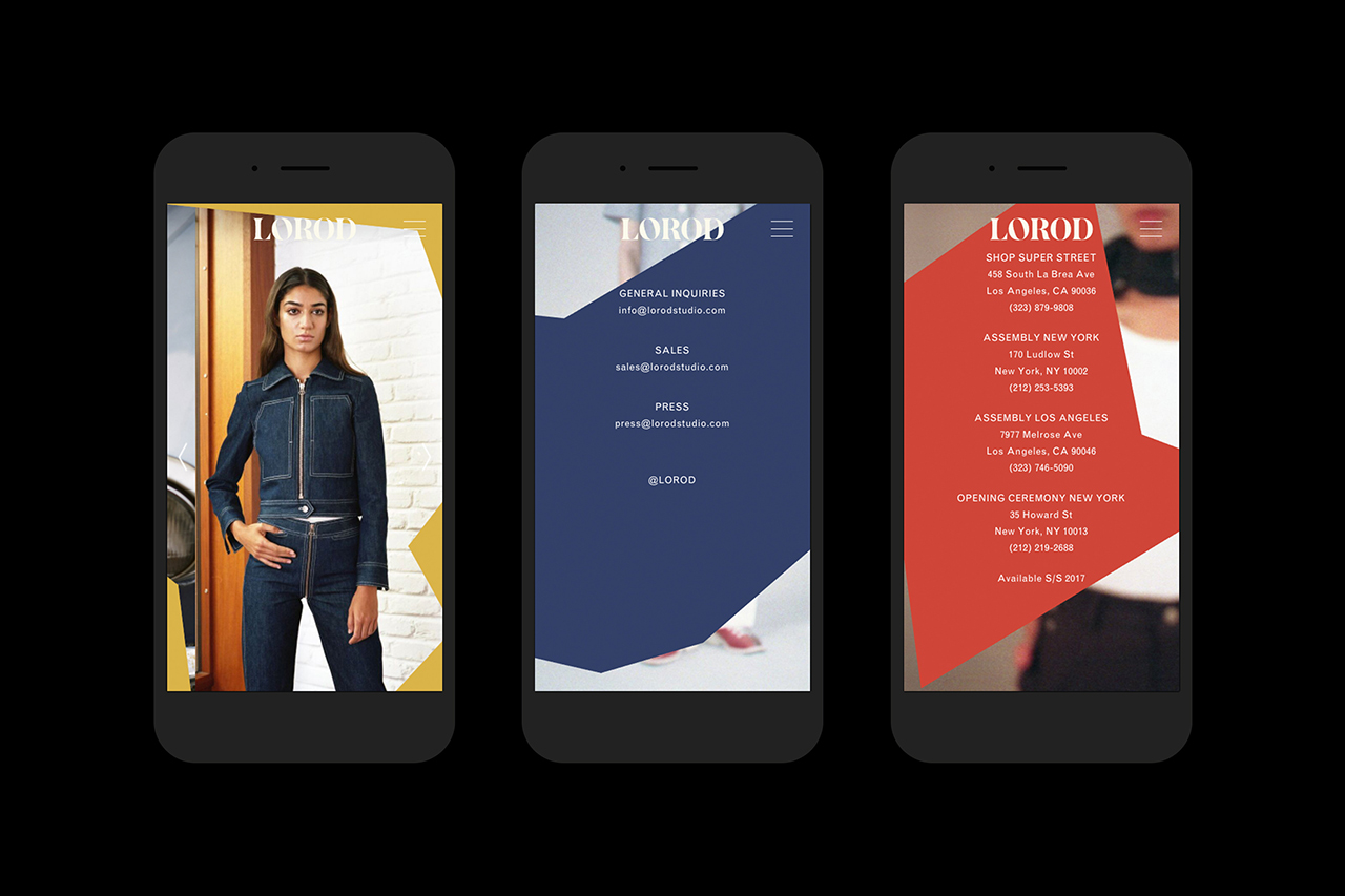
Solid and a outline versions of wordmark, solid shapes and those that contain a variety of material, garment and process images or those that frame content online, as well as a broad colour palette with a modern and retrospective quality, provide plenty of variation yet remain largely cohesive.
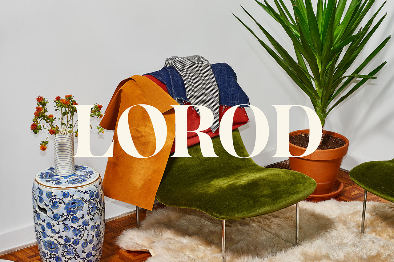
The LO pairing, the tilting of the O (described as a nod to the unexpected details in Lorod’s garments), and shapes of the L calls to mind Love, the iconic pop art image by American artist Robert Indiana from 1964. Whether a subtle yet intentional appropriation or an accident, it fits in well with concept, and particularly, in conjunction with some of the period props of the photography online.
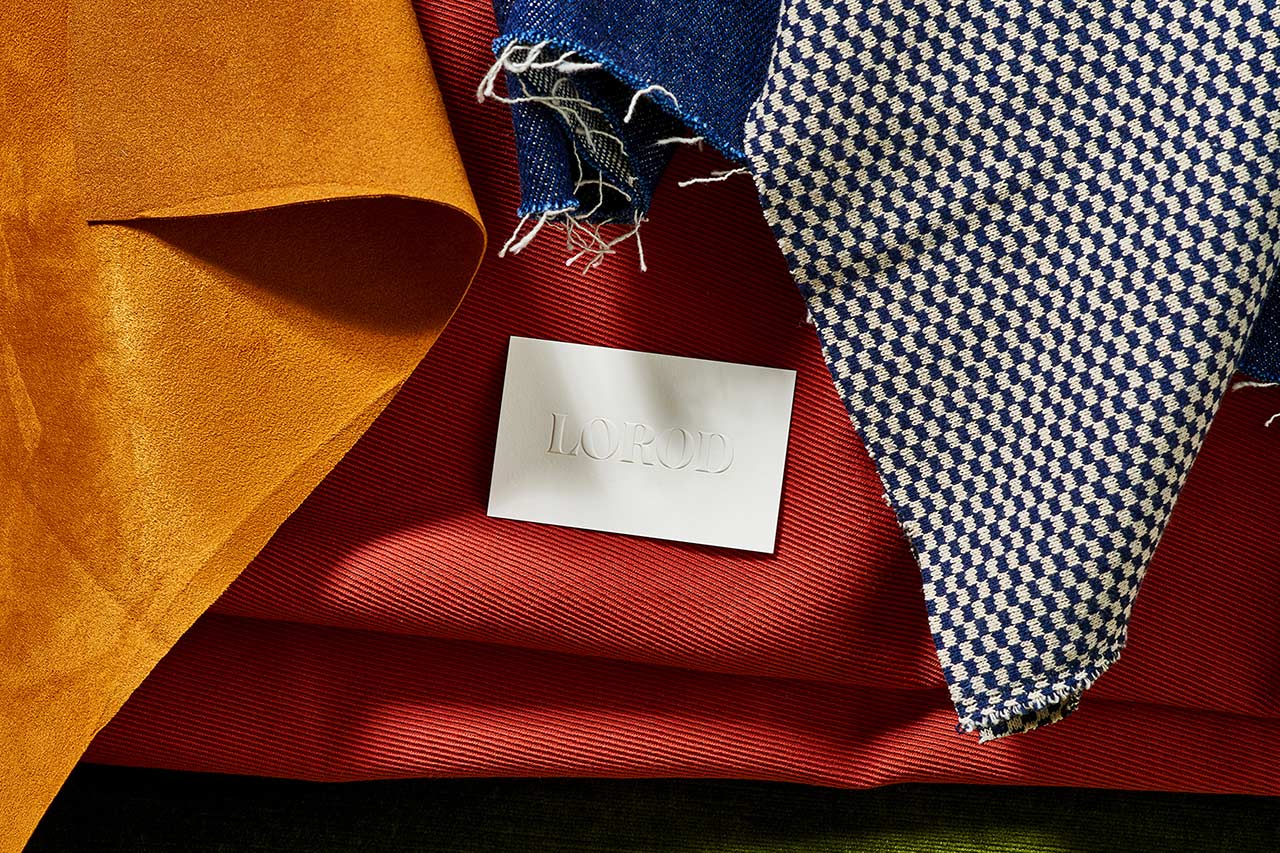
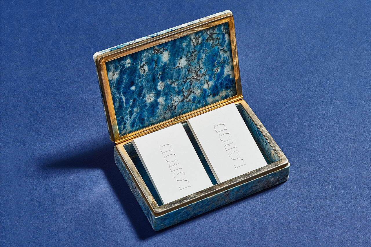
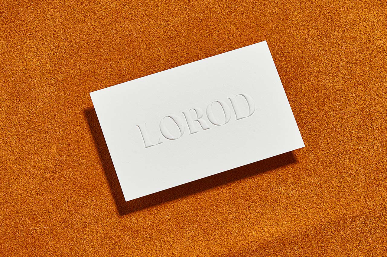
The implementation of wordmark feels refined and well-resolved, particularly across business cards, tags and inside label; which make a clear connection between the graphic and the material through blind emboss, laser cut and stitched finishes. Photography does a good job of working in a lot more detail, capturing the finer qualities of garments, and playing with retrospection and modernity in the use of filters, the occasional halftone, vintage props and an urban utility in the choice of locations.

Website also plays with contrast. Although modular and responsive in its build and structure, it is punctuated by the irregular shapes, either as containers for image and video, or overlaid to frame text. Occasionally proportionality feels off on desktop, with large shapes holding small type. This a surprise as this is managed quite well across material items with a lovely dominant word mark in conjunction with the subtlty of its colour and finish.
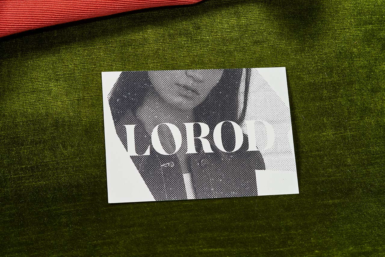
The documentation of the project is unusual in its presentation. Where often you see a favour for simple backgrounds that do not distract from printed pieces, here there is an emphasises on expressing concept in the juxtaposition of finished brand assets and the rawness of uncut materials, in the contrast of colour and texture. It is difficult not to get a sense of the “dressing up” of visually simple assets, however, it ultimately works well as a visual shorthand, a quirk distillation of concept, reinforced and expanded upon by project insight. More work by Pentagram on BP&O.
Design: Pentagram. Partner in Charge: Natasha Jen. Website Development: Big De Creative. Opinion: Richard Baird. Fonts Used: Austin Bold (Customised).
