Raumindex by Moodley
Opinion by Richard Baird Posted 13 February 2017
Raumindex is an Austrian design, development and project management studio established in 2005 that creates integrated interior and exterior retail environments for national and international clients. Its philosophy is rooted in the shaping and arrangement of form, space and content to create functional and flexible environments to add value and elicit feelings.
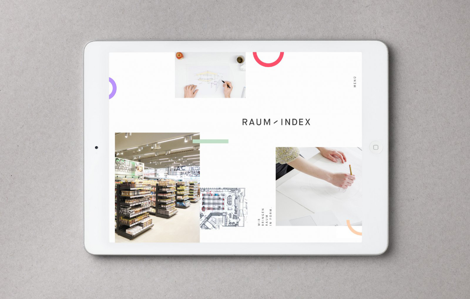
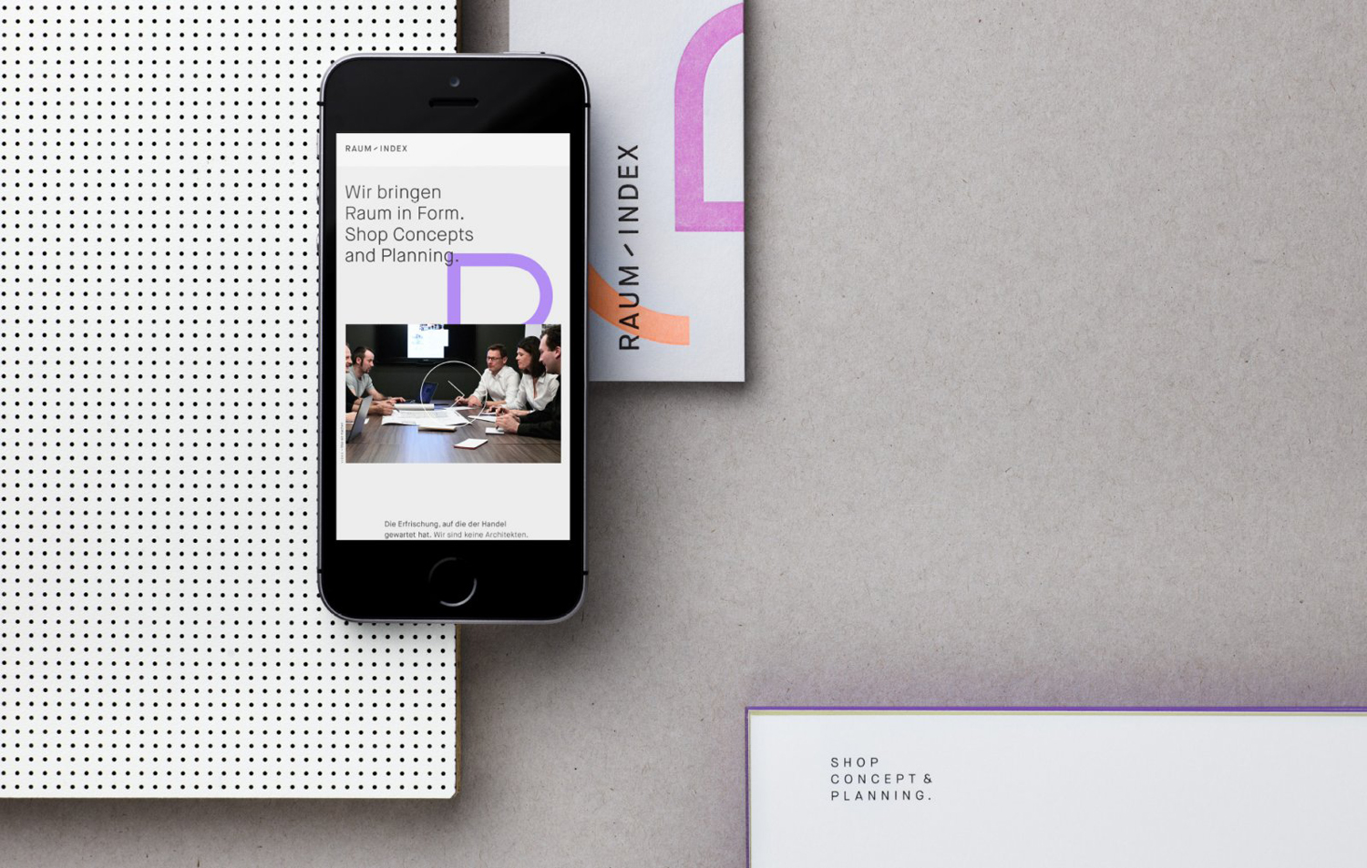
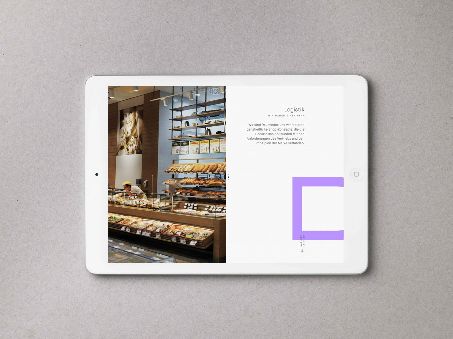
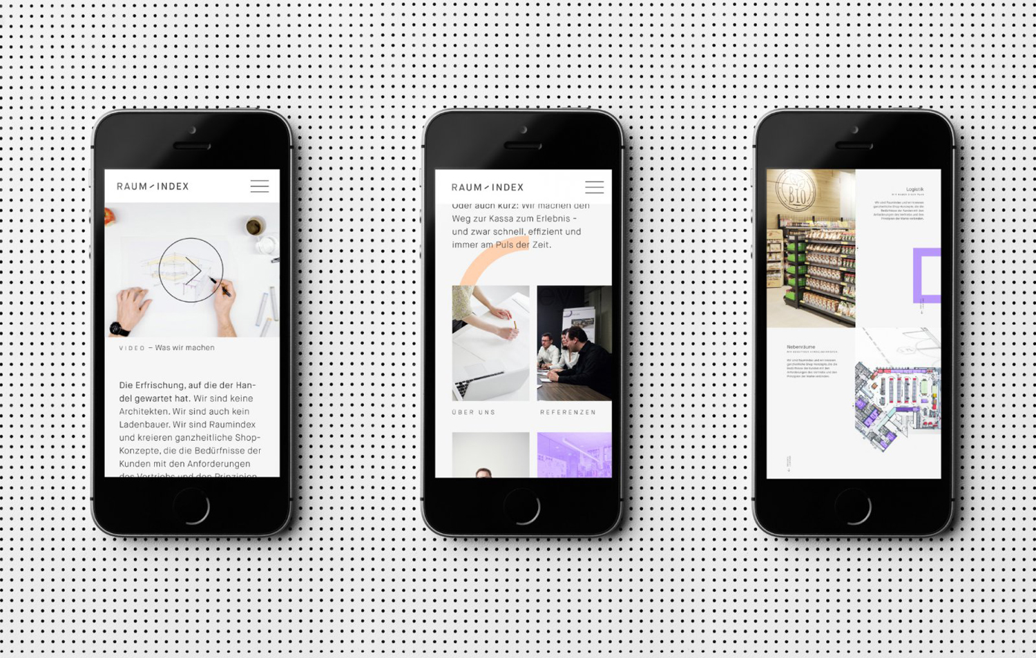
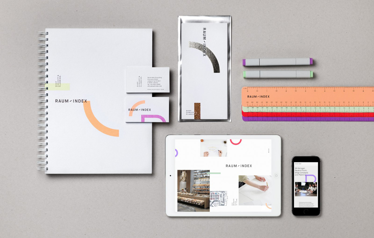
With a desire to appear more accessible, and with the intention of conveying a little more about the nature of the studio, one made up of a young team with surprising ideas, the studio worked with graphic design studio Moodley to create a cohesive and expressive new brand identity that lived up to the company’s abilities and portfolio. This extends across business cards, stationery and soon to launch website.
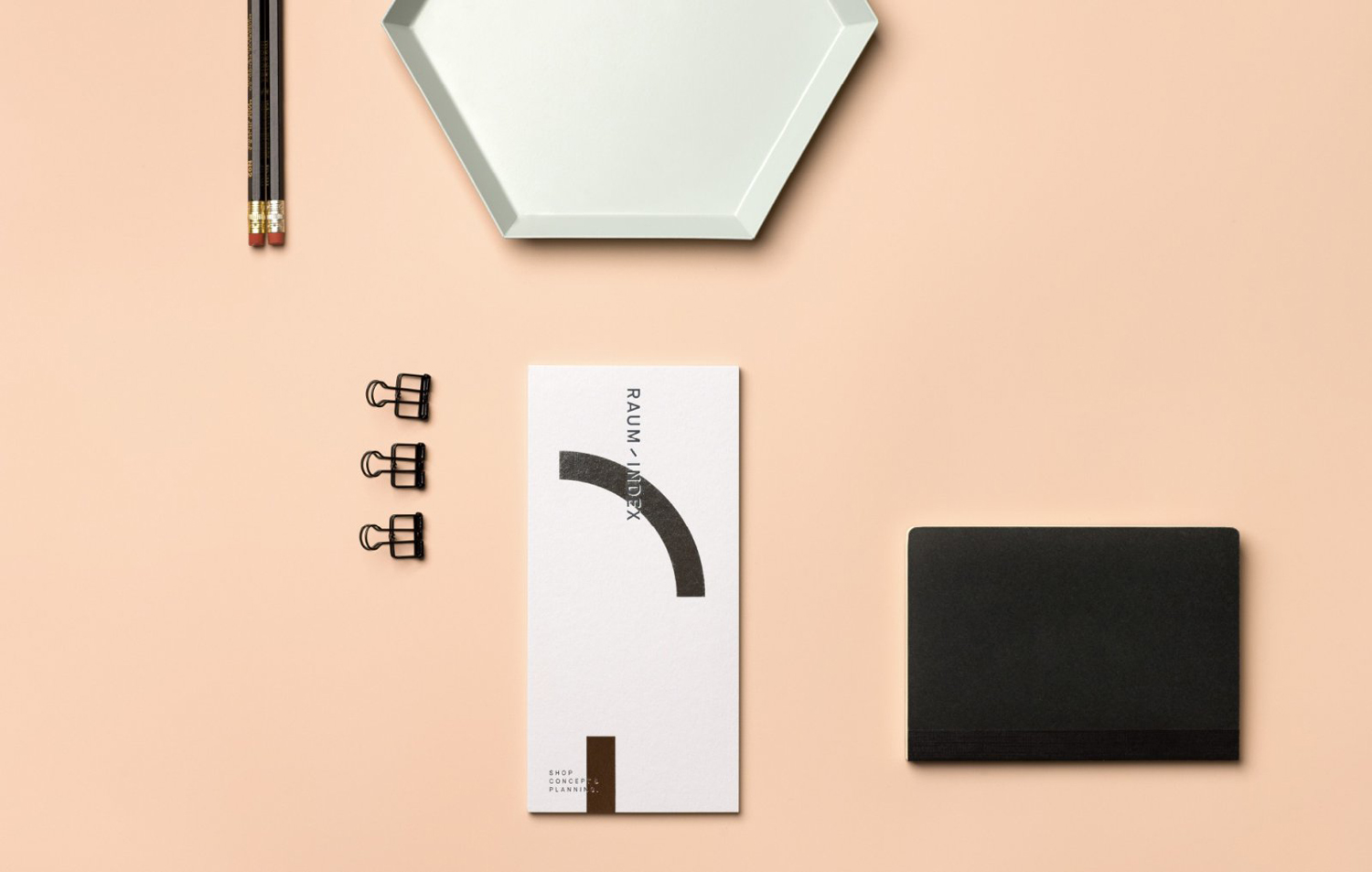
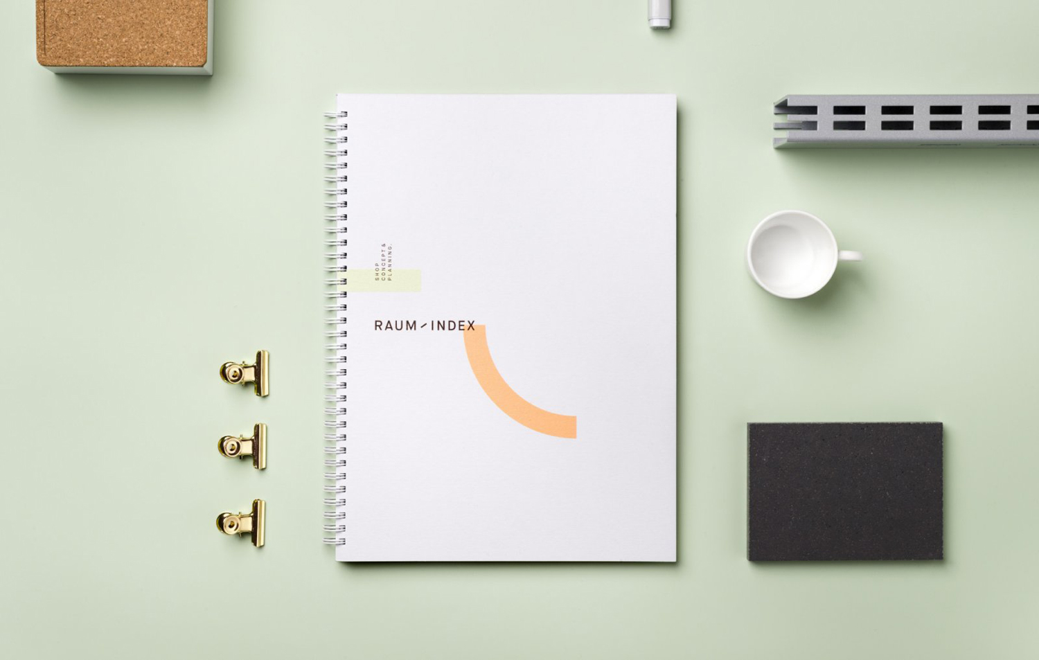
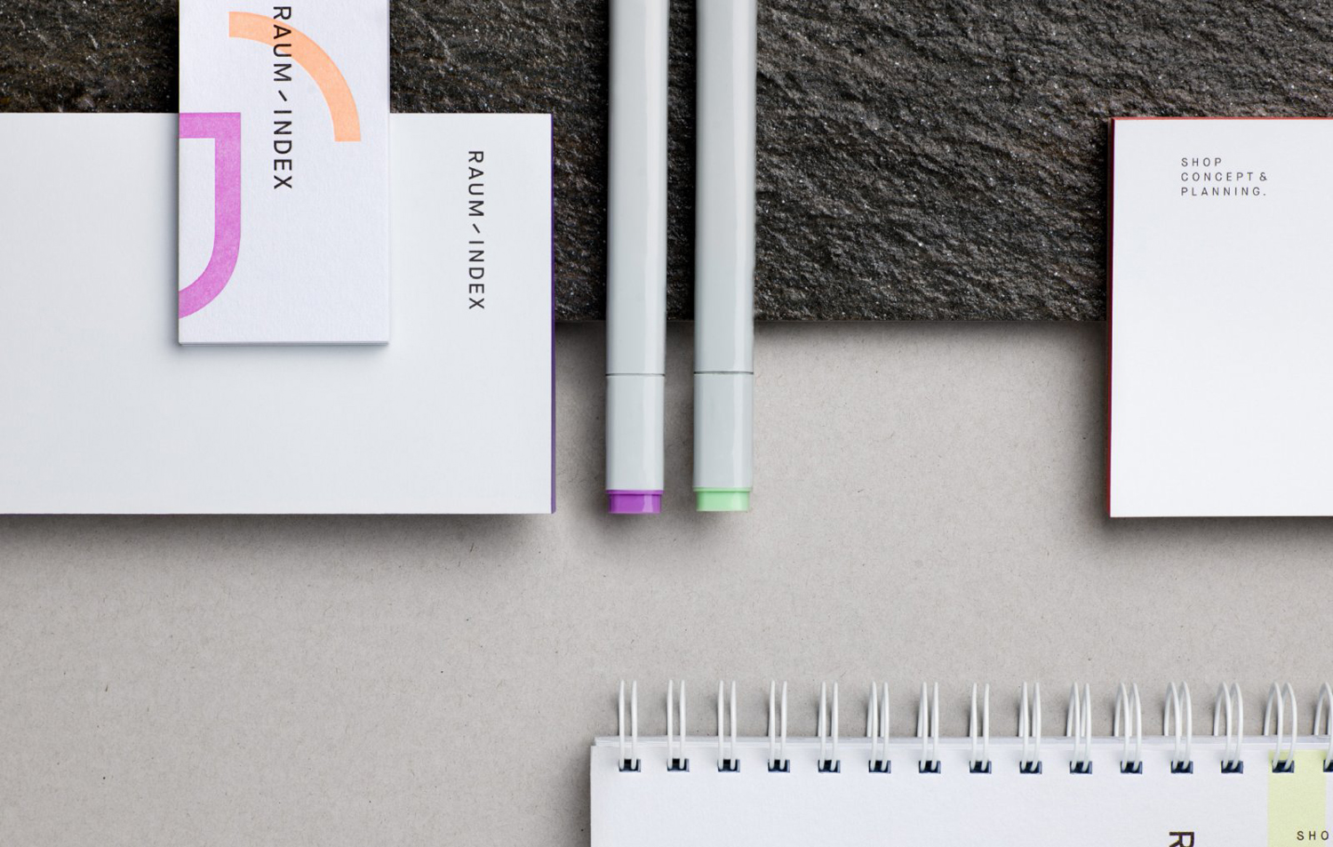
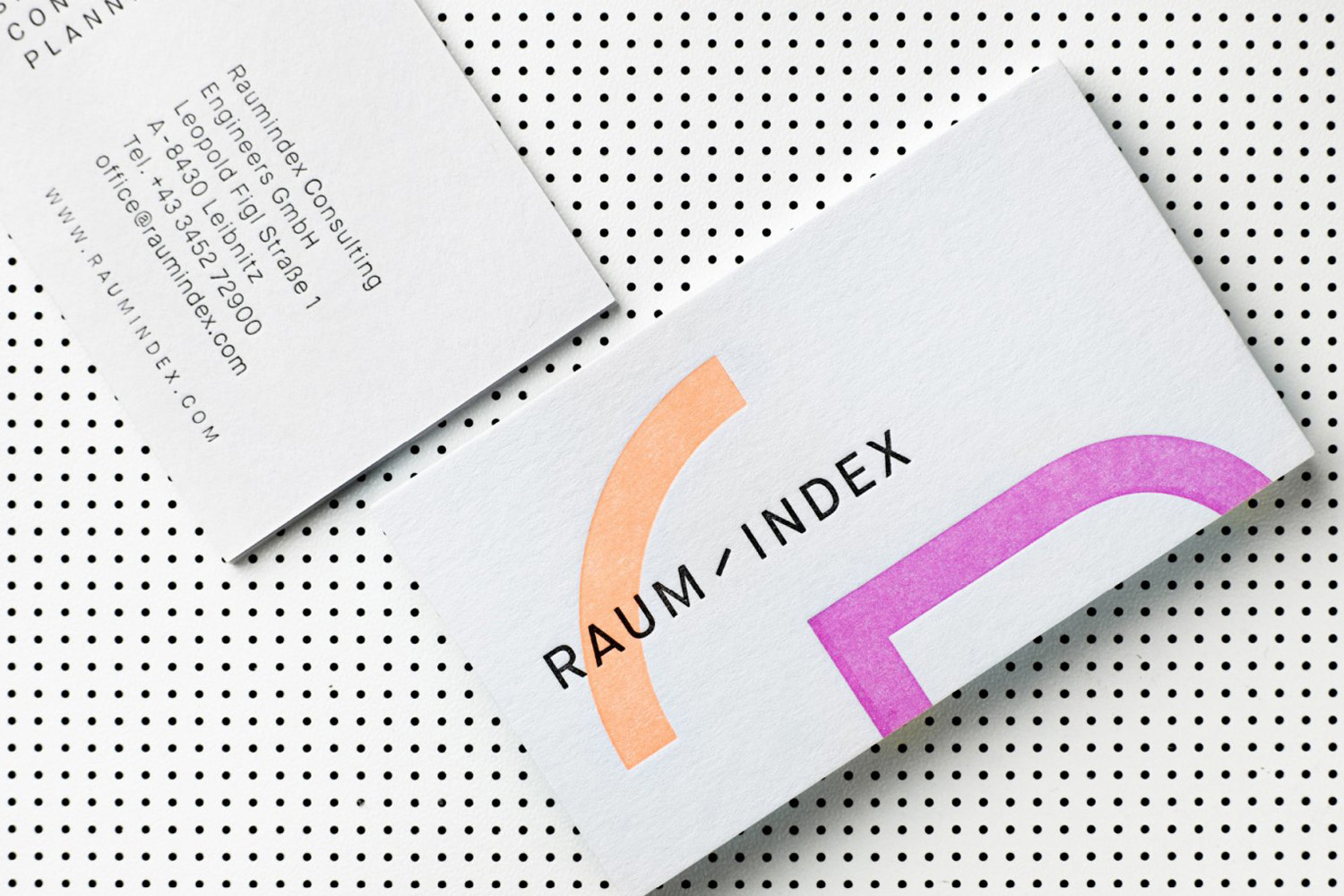
Moodley find a good balance between youthful expression, the surprising and some clear architectural staples in the meeting of colour form and type, layout and space. Geometric shape, drawn from floor plans and the tools of the trade, is a fairly familiar but universal architectural shorthand, one that reads well to both national and international clients. However, unexpected colour, the oversized and cropped nature of form and their arrangement, continuity and layering both in print and online, works in an element of play whilst avoiding the childish, and begins to draw something more distinctive and cohesive from the ubiquitous.
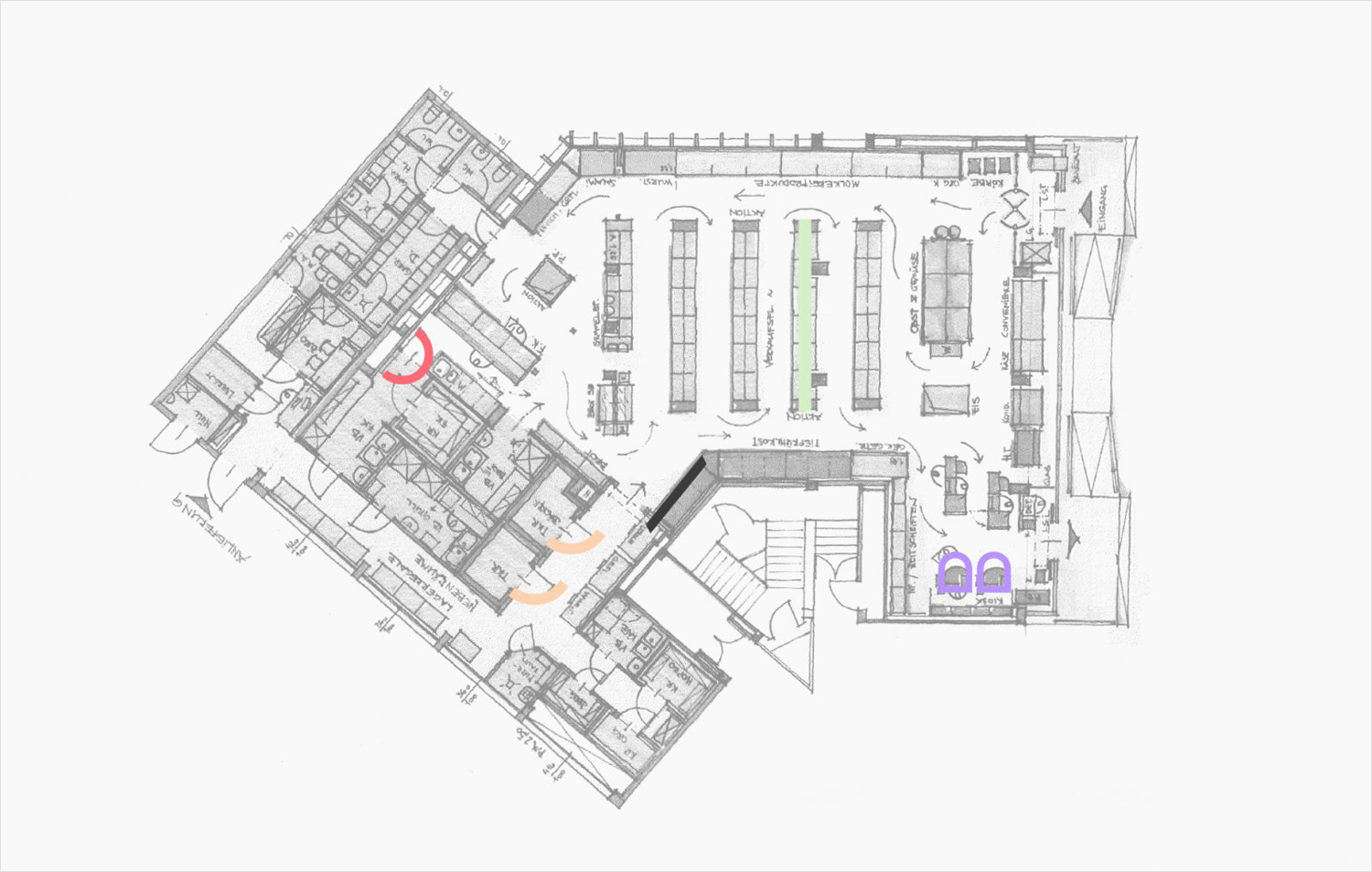
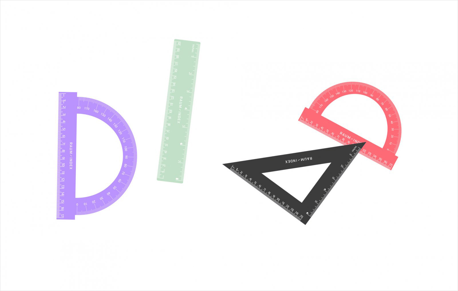
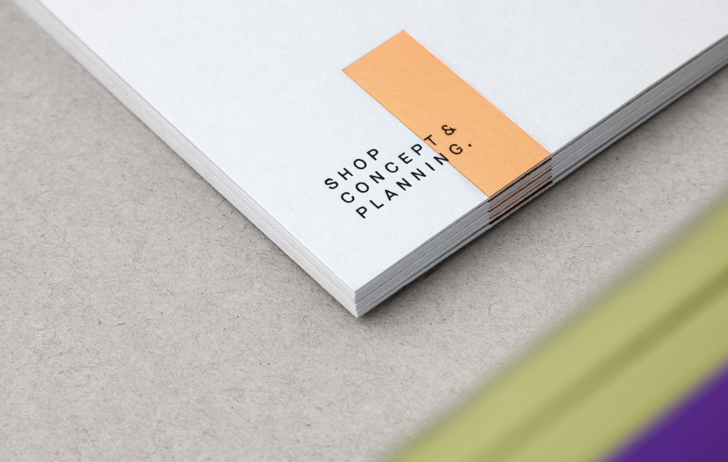
Although there is a good use of form, one that effectively touches upon the intentions and philosophies mentioned in the first paragraph, it is colour that is perhaps the most interesting, successfully reproducing the tints and irregular coverage of highlighter ink across uncoated paper. Much like form, it draws on the tools of the trade but manages to establish something distinctive and relevant from this, particularly in the use of layering which also extends to image, form and type online. The use of a copper and silver blocks foils broadens communicative intention whilst remaining cohesive, adding an architectural materiality, and leveraging something of the high quality.
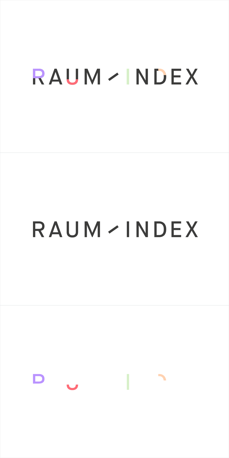
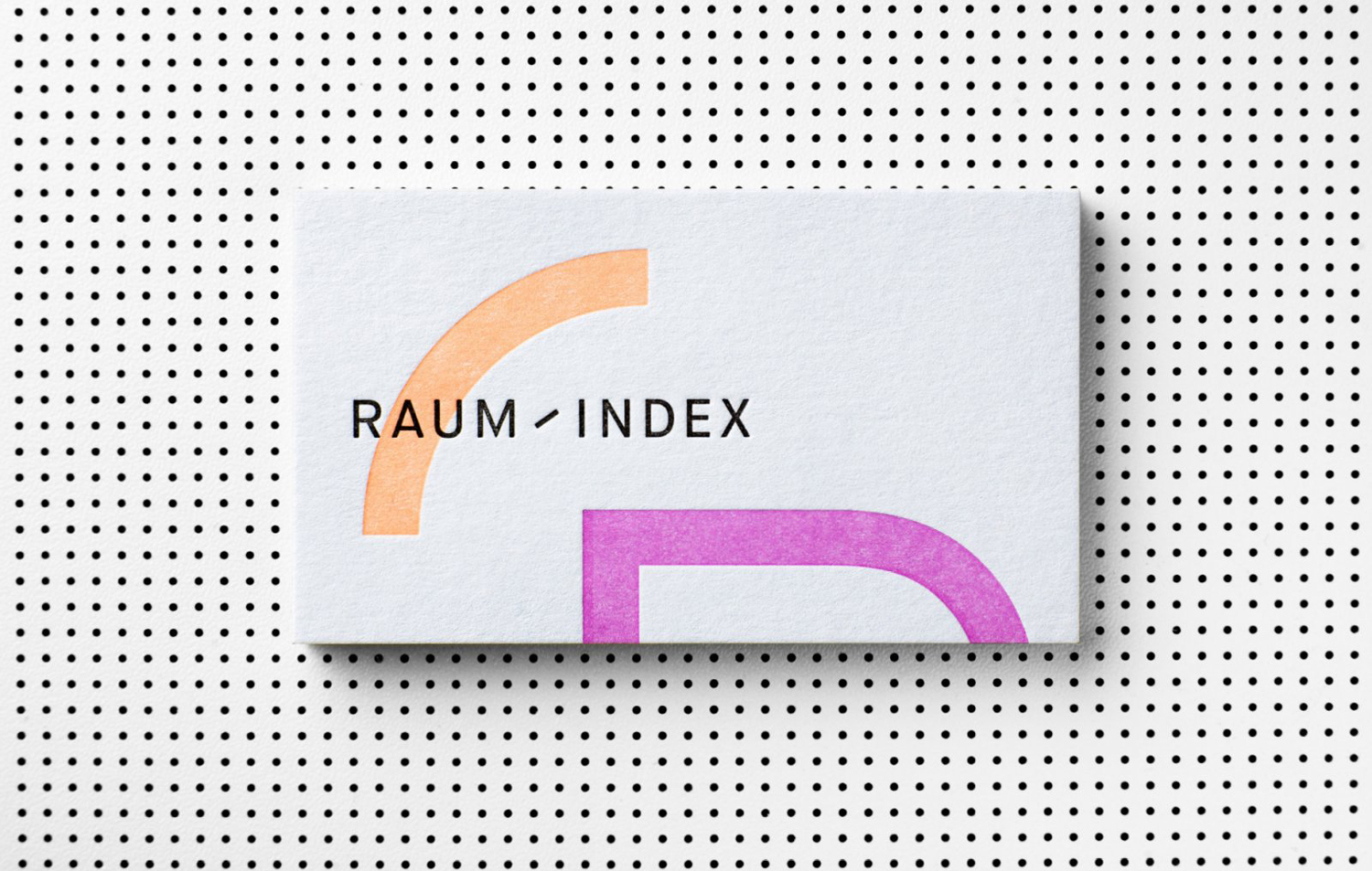
Logotype feels unmistakably modern in its uppercase, monolonear and sans-serif lettershapes. And while the choice is more technical and formal, working in some good contrast, it does share a commonality with those more playful forms and provides a counterpoint and emphasis. This counterpoint, reassuring in its restraint, continues in the layout of stationery, which play with the horizontal and vertical, a sense of structure in the stacking and aligning of type and image, and the use of plenty of white space. Website, as documented here but yet to launch, similarly appears to balance creative play and a technical insight in the arrangement and layering of type, image and coloured form, and the architectural in the interaction of space and content. More work by Moodley on BP&O.
Design: Moodley. Opinion: Richard Baird. Fonts Used: Maison Neue.
