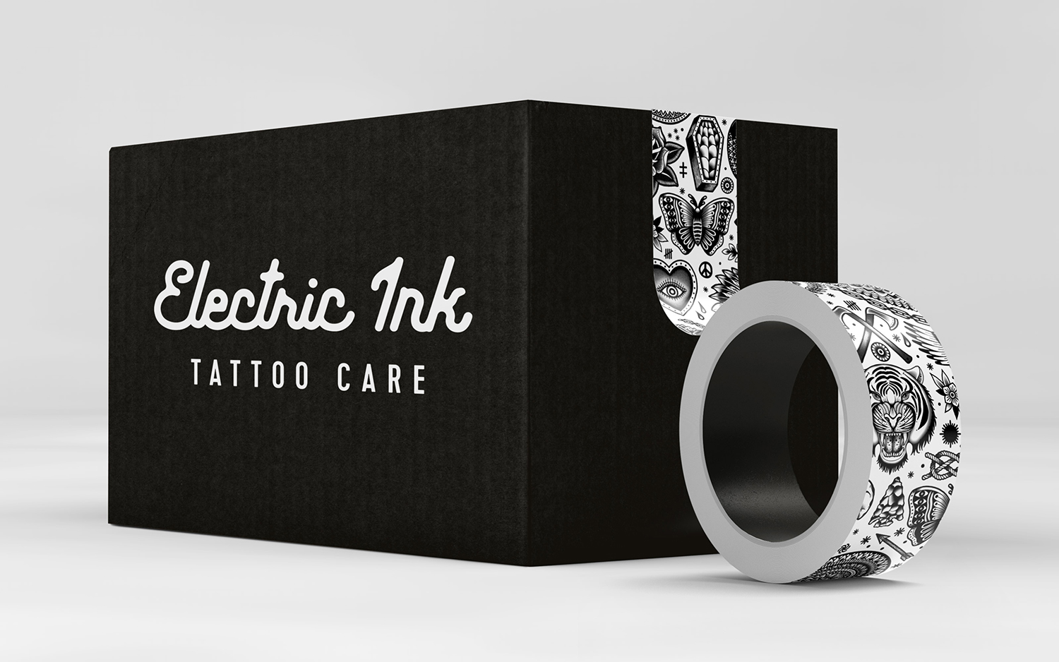
Electric Ink by Robot Food
Opinion by Richard Baird Posted 8 March 2017
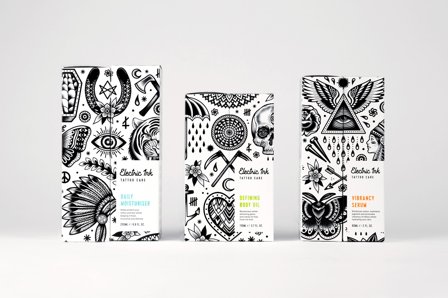
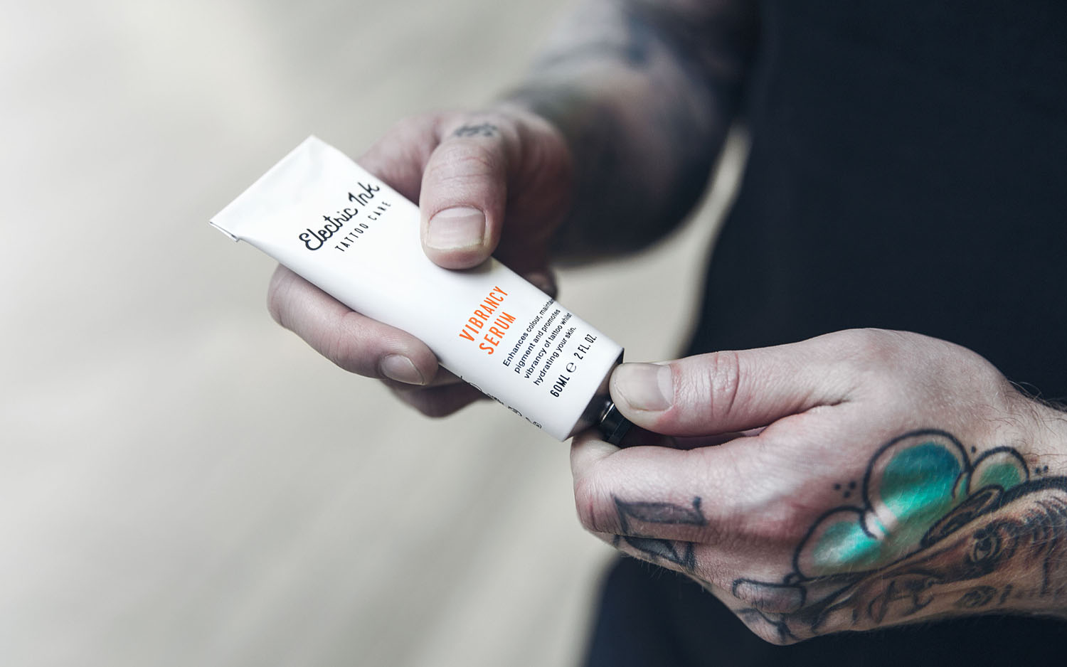
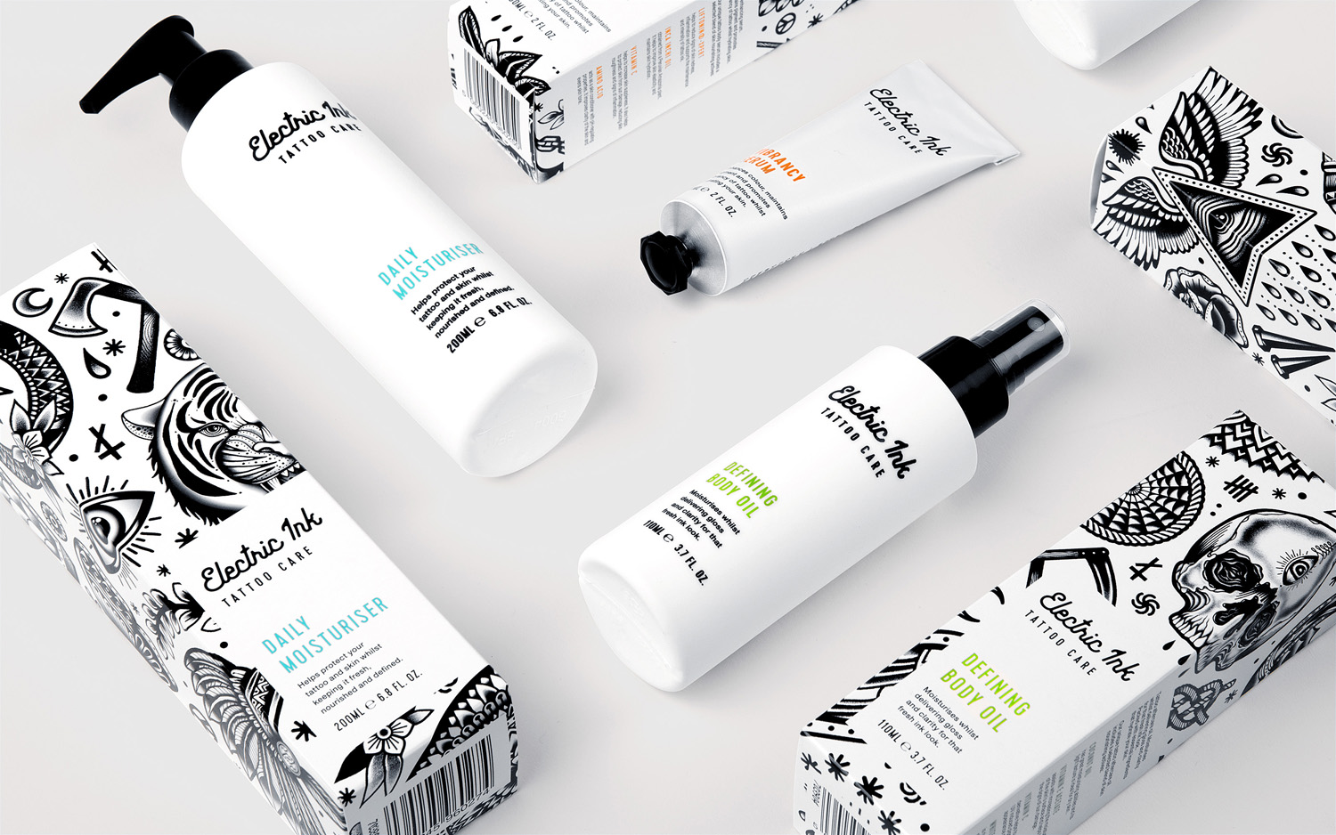
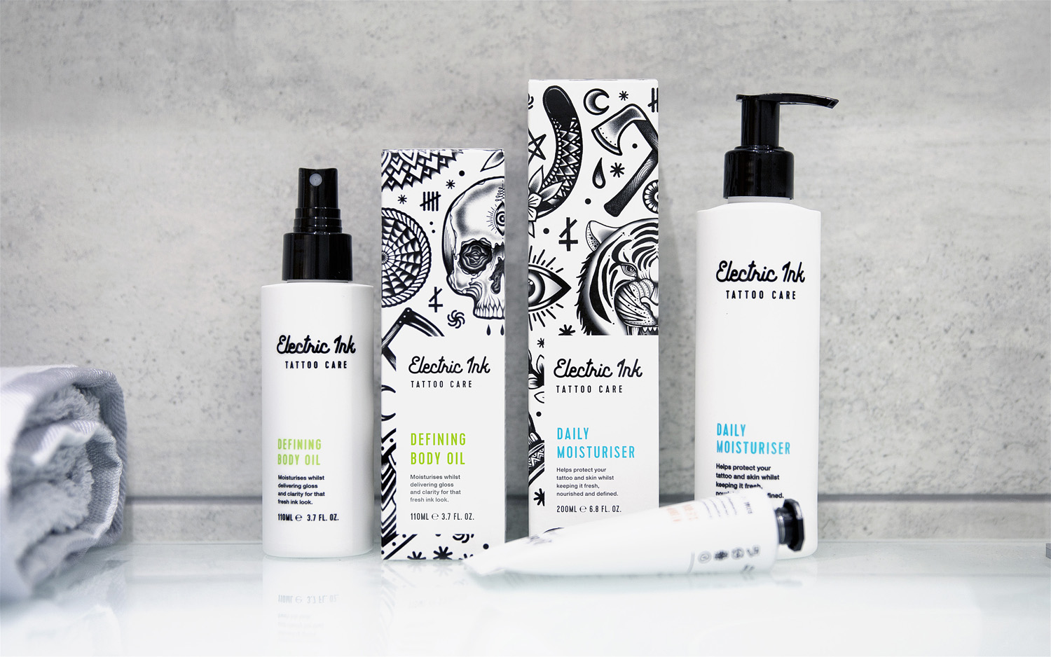
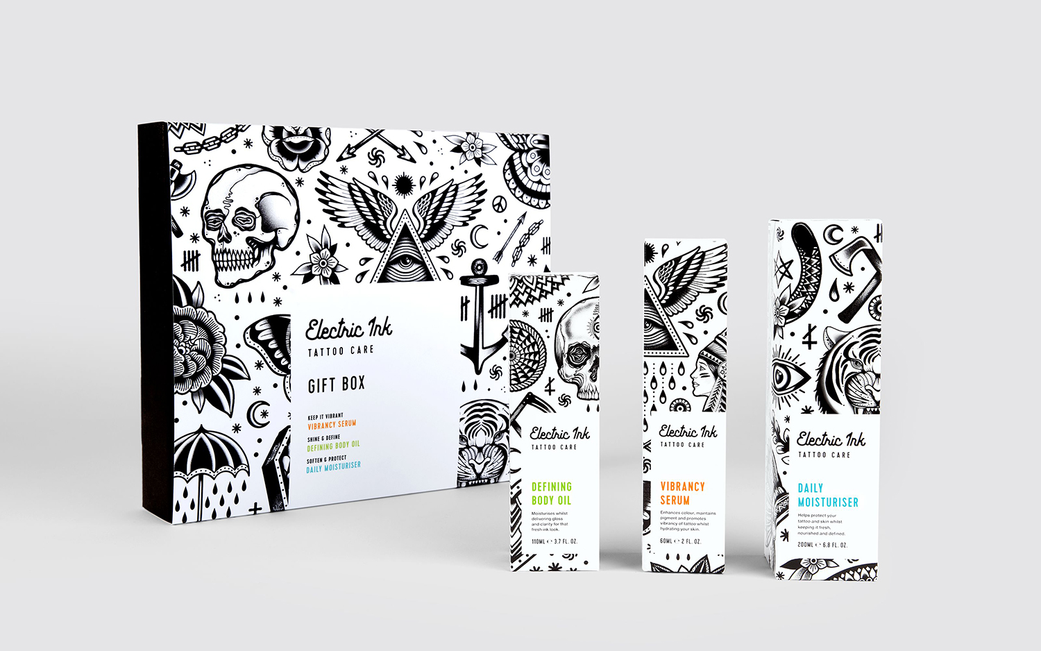
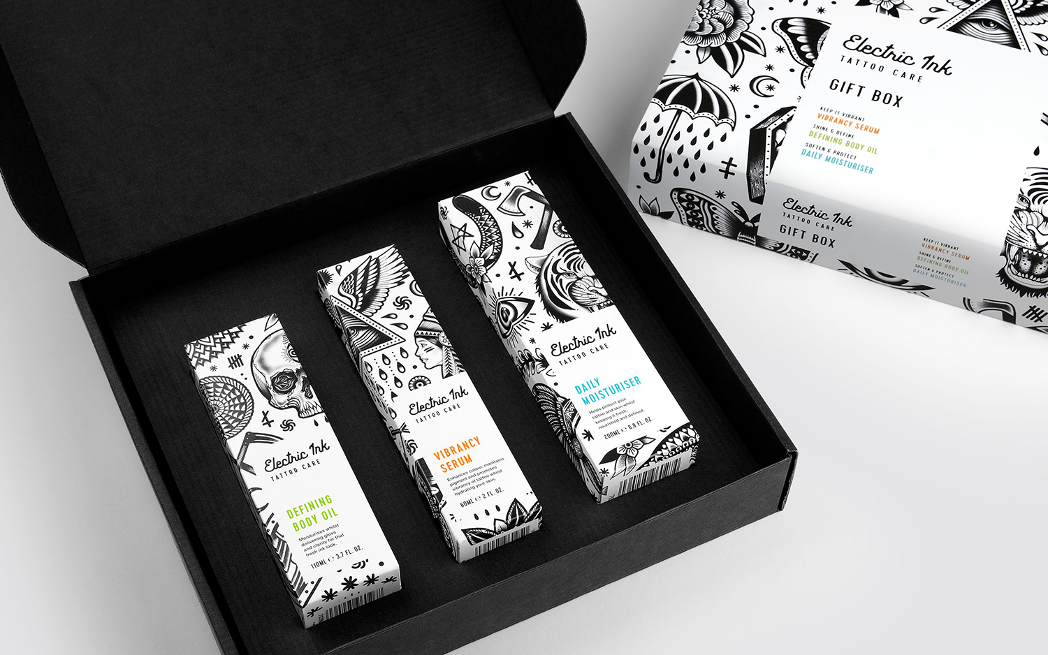
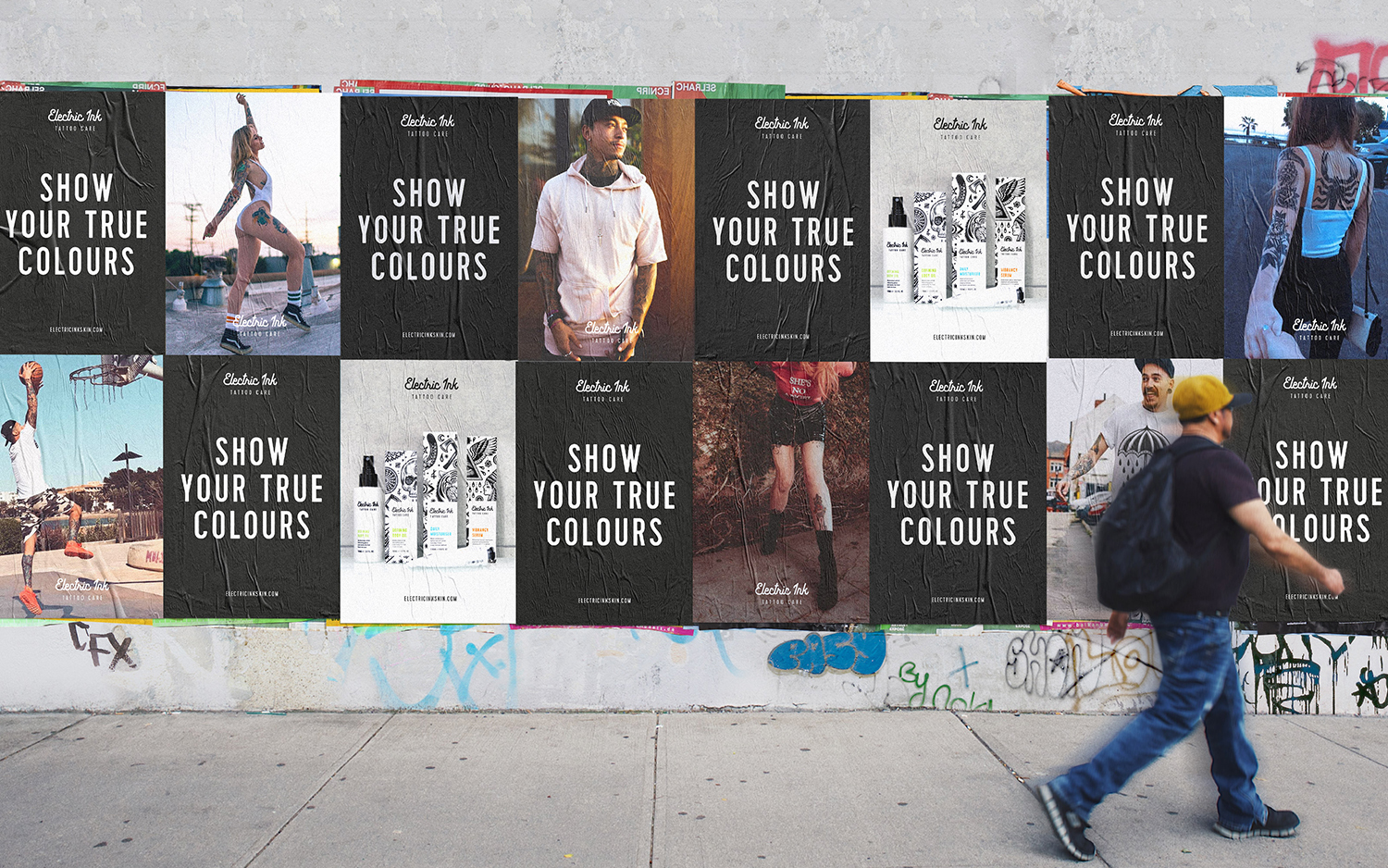
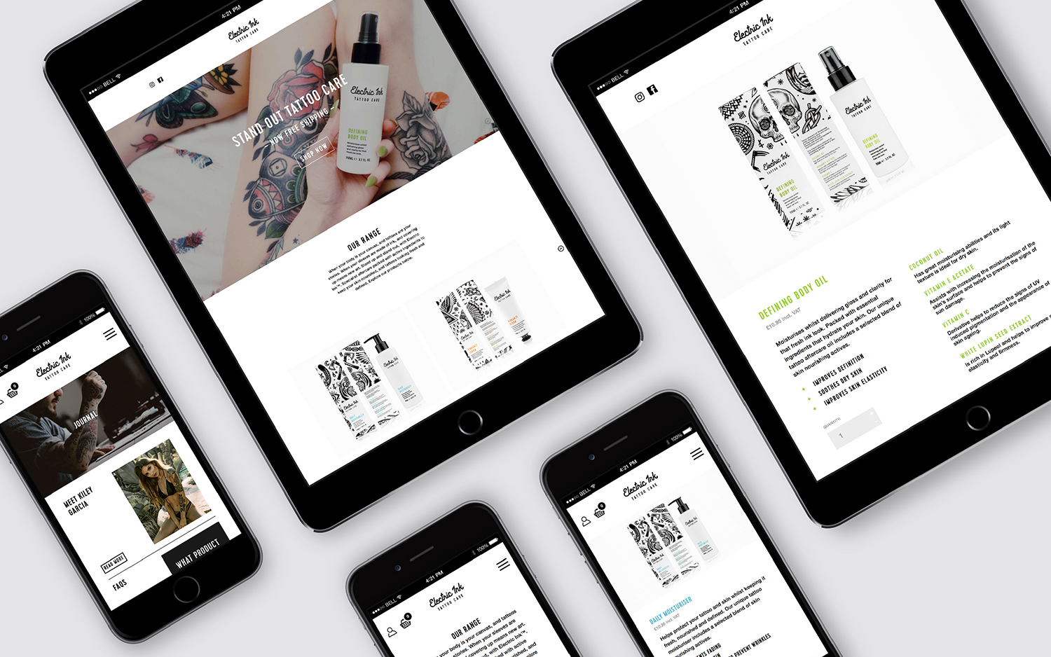
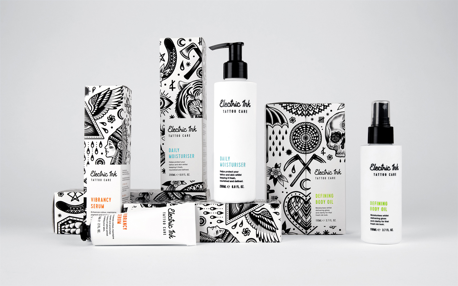
With the rise in the popularity of tattoos and the lack of credible long-term care products, Leeds-based design studio Robot Food formulated, branded and packaged Electric Ink, a tattoo care range for the mainstream market. The range includes a serum that enhances colour, an oil that delivers a freshly-inked look, and a daily moisturiser. Each feature distinctive packaging design that draws on and honours the counter-cultural tradition of tattooing and acknowledges its move into the mainstream. Electric Ink launched in 2017 and is throughout the United Kingdom from Superdrug, selected tattoo and barber shops, as well as fashion retailers.
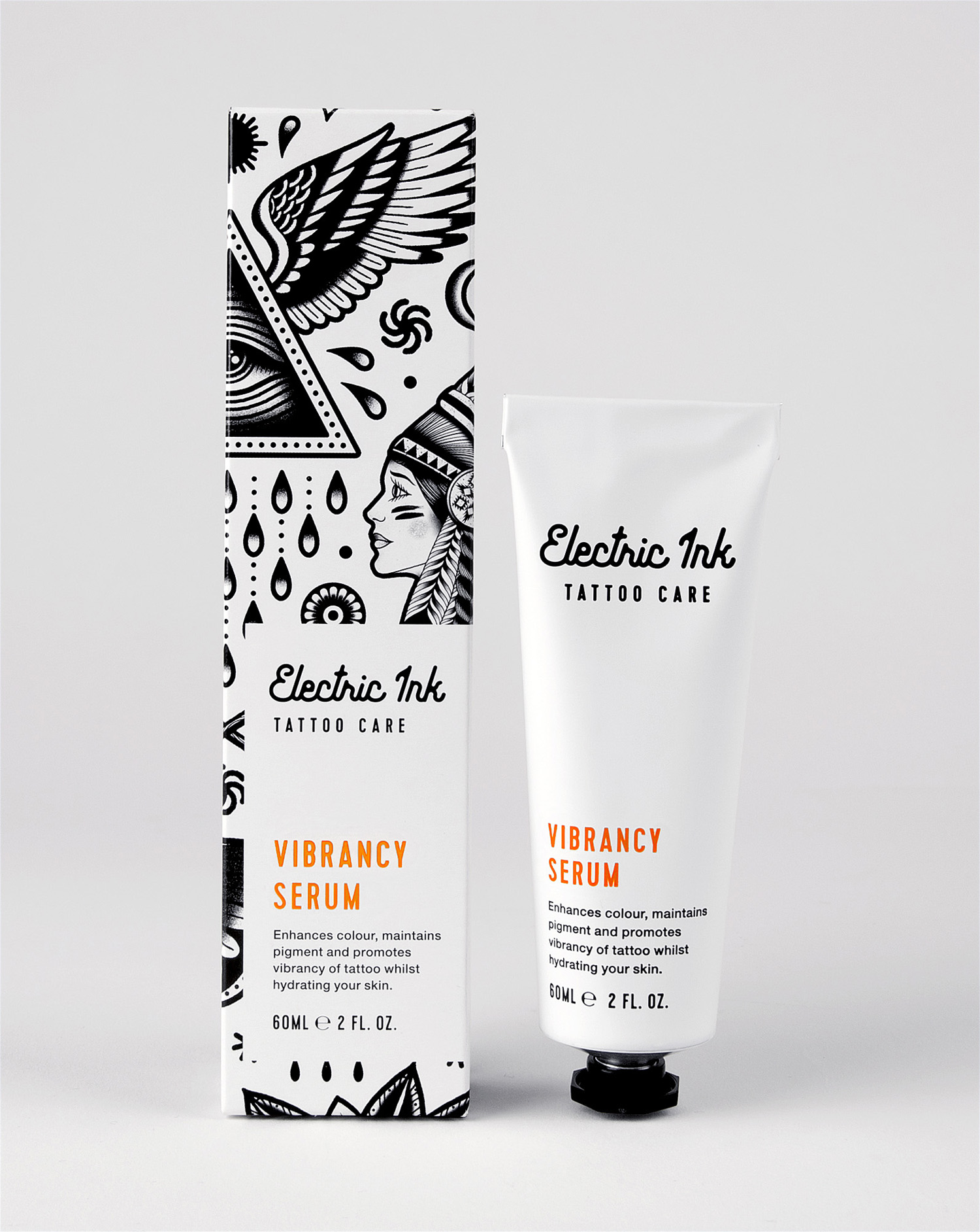
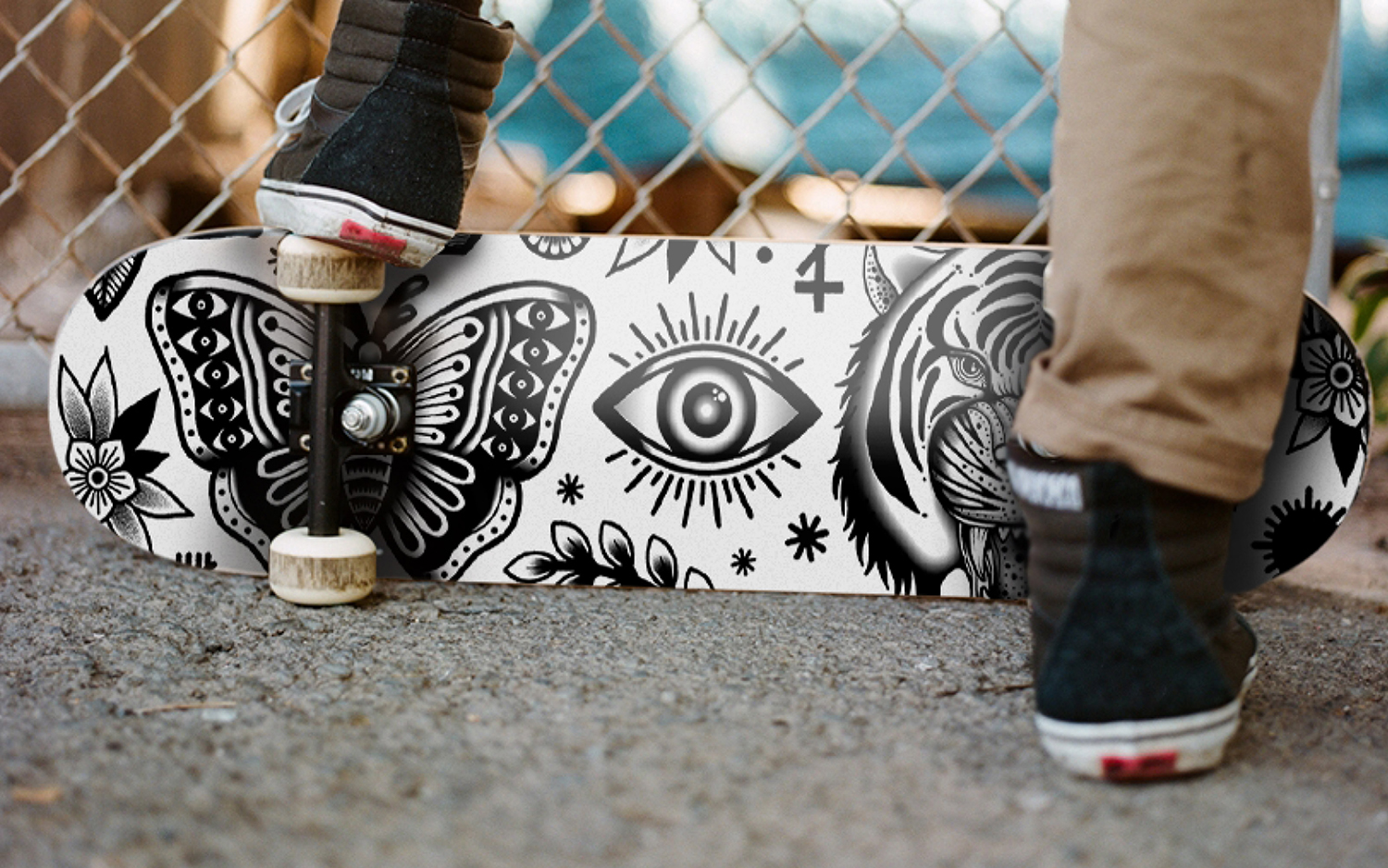
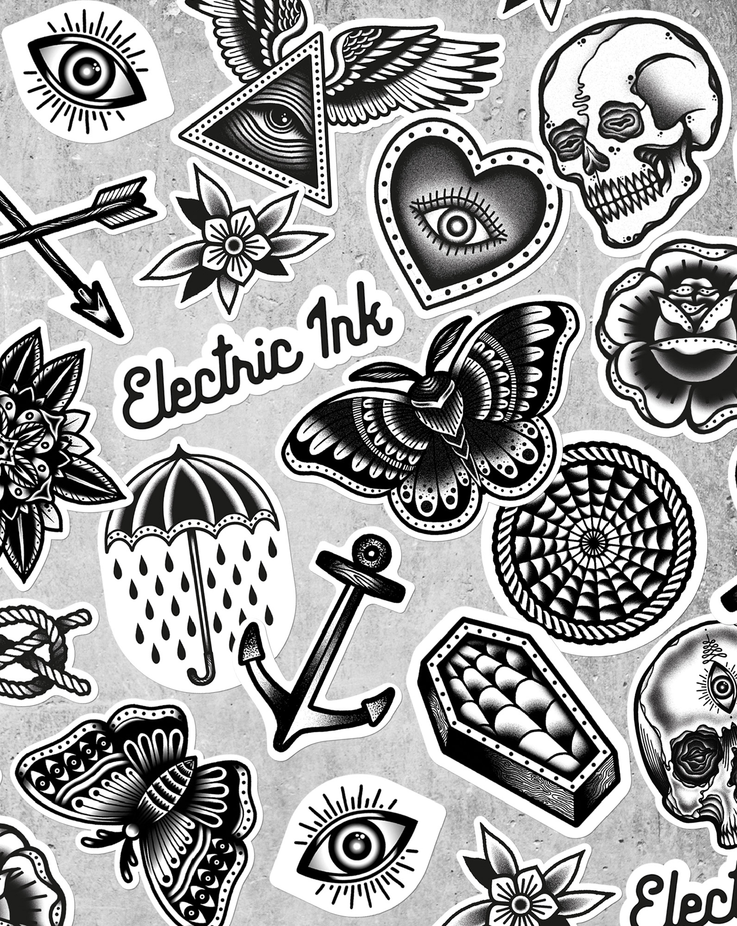
Working with Tom Gilmour, an illustrator who specialises in hand-drawn black and white illustration, tattoo imagery and flash sheets, Robot Food created packaging that draws distinctive and strong initial impact from the familiar and universal visual language of tattooing, and follows this with plenty of detail up close.
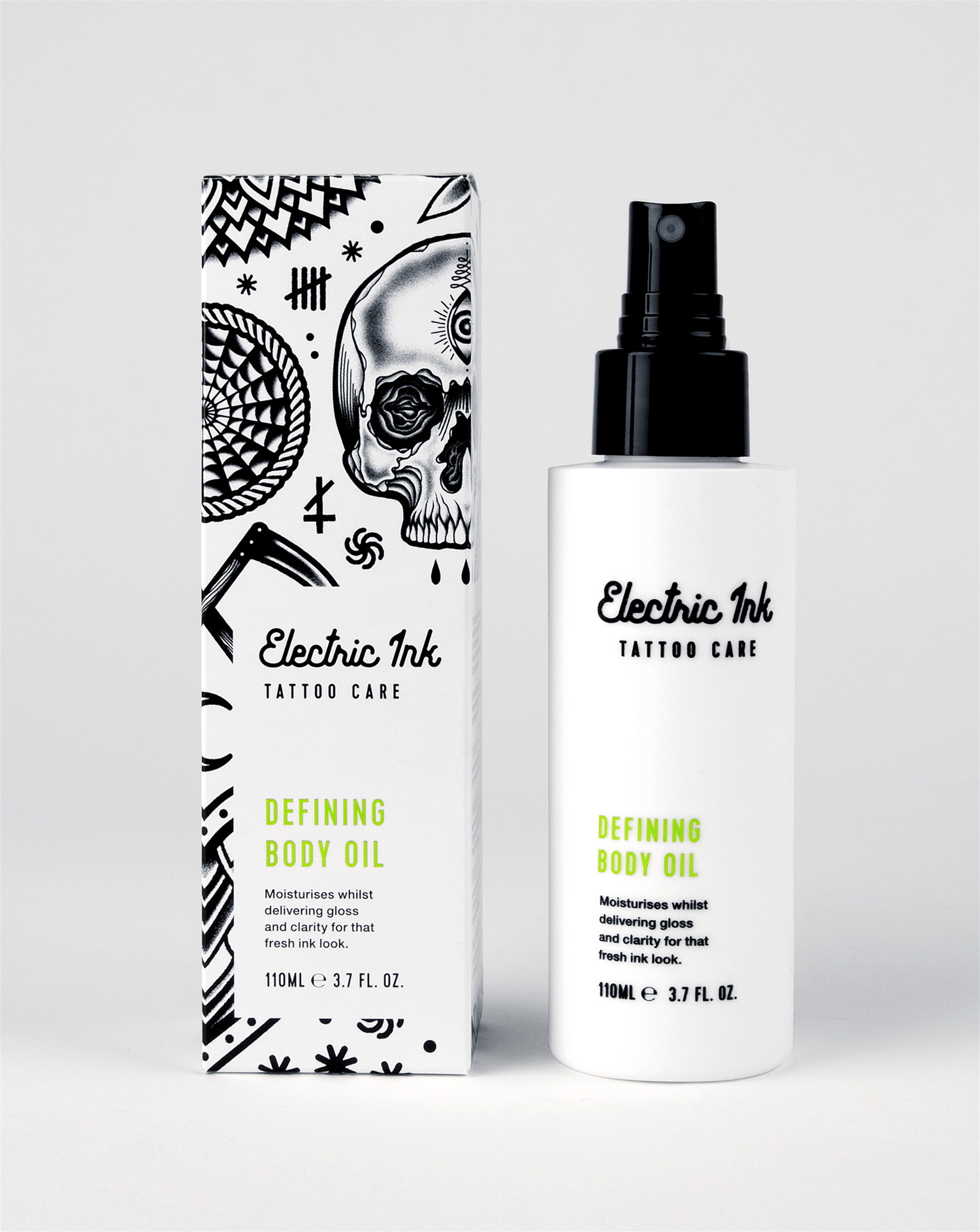
Illustration effectively moves between the simple and iconographic to the the finely detailed and illustrative, from off-the-shelf flash sheet imagery to the more unusual, from the current and mainstream to the counter-cultural roots of tattooing. Although there is a visual breadth in the mix of shading, fine and heavy lines, solid fills and space, large image and smaller symbols, there is also a sense of continuity in their single black ink, arrangement, weighting and flow.
These are worked together well with a good eye for space and shape, simplicity and detail, for the most part appearing as modern interpretations of traditional tattoo art, and, through the quality of their rendering, work to communicate credibility of brand and quality of product.
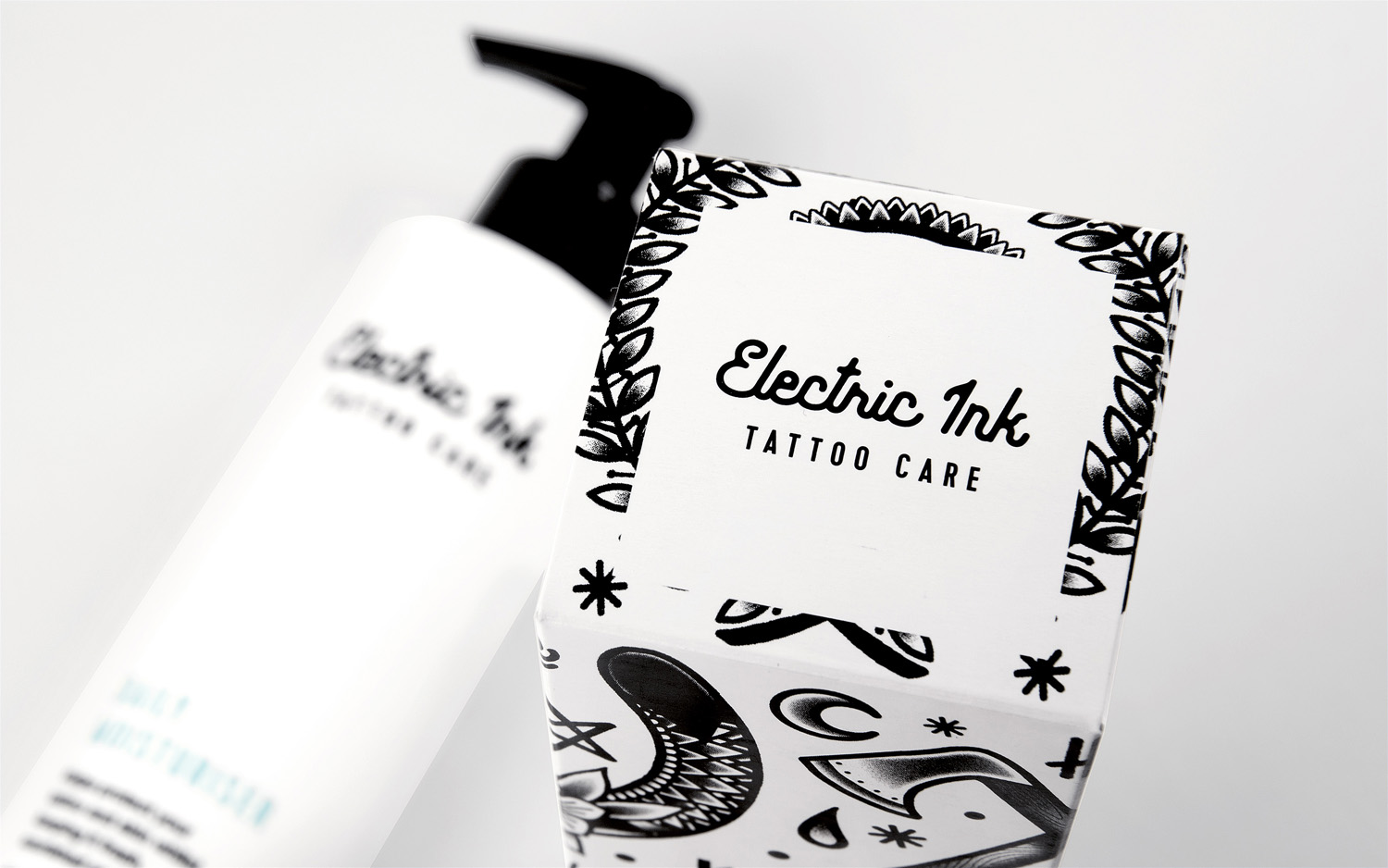
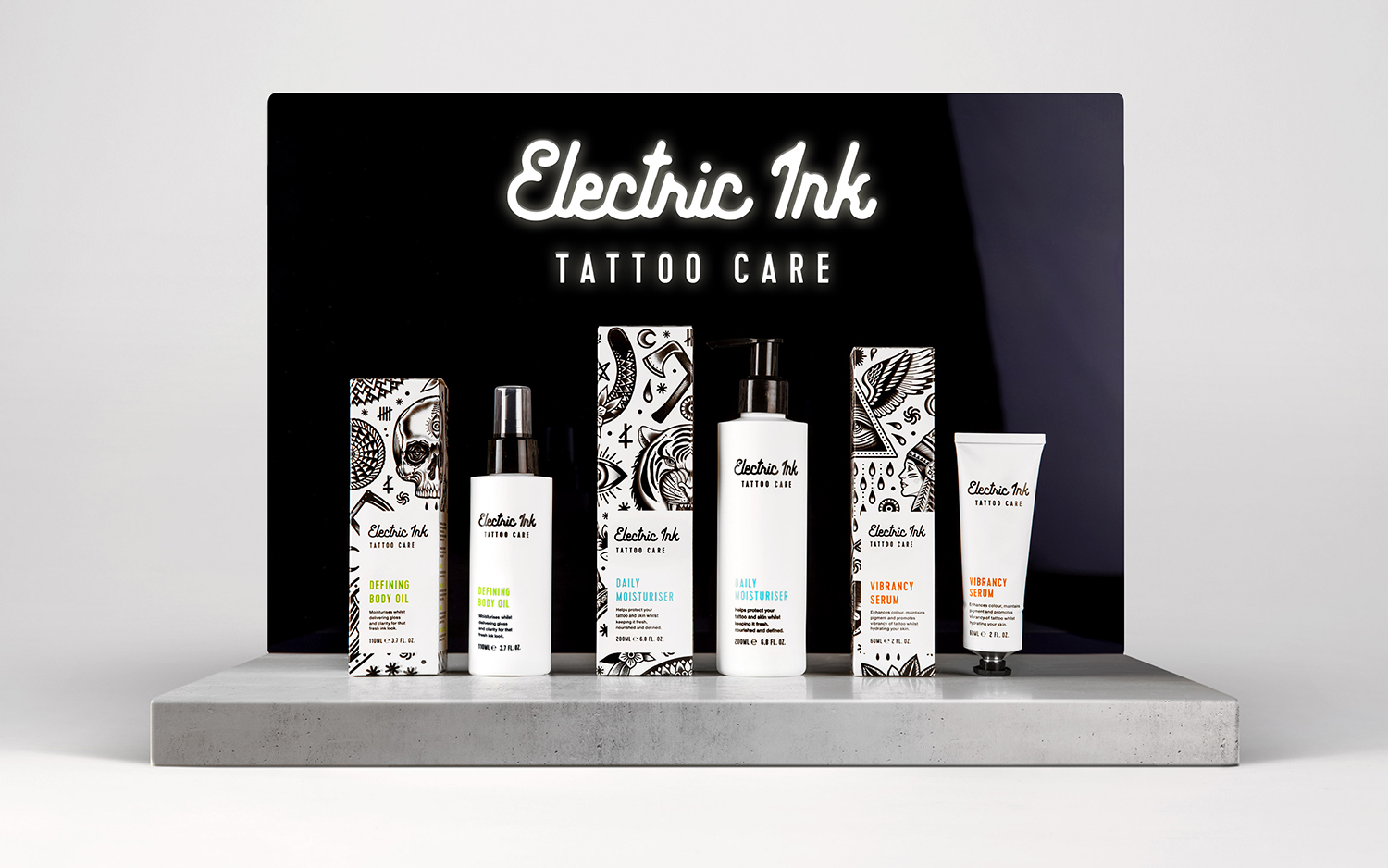
Logotype is nicely drawn. It has a personable quality which resonates well with the individual nature of tattoos and the artistry of their creation and implementation. Although predominantly monolinear, the counter of the e and the junctions of the r, i and k capture something of the slight ink bleed. The looser lines of logotype alongside precise image provide visual contrast yet have a conceptual commonality.
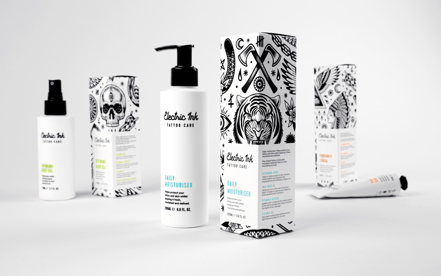
Out of box, packaging is far simpler, leaning more towards cosmeceuticals and premium haircare, leveraging an association with a clinical effectiveness and working as an appropriate counter to the mainstream stylistic quality of the boxes. Logotype holds up well within the context of plenty of space, with a strong aesthetic character grounded in concept, and the condensed characters of Cervo find balance between providing typographical contrast, visual breadth and functionality across slim structures.
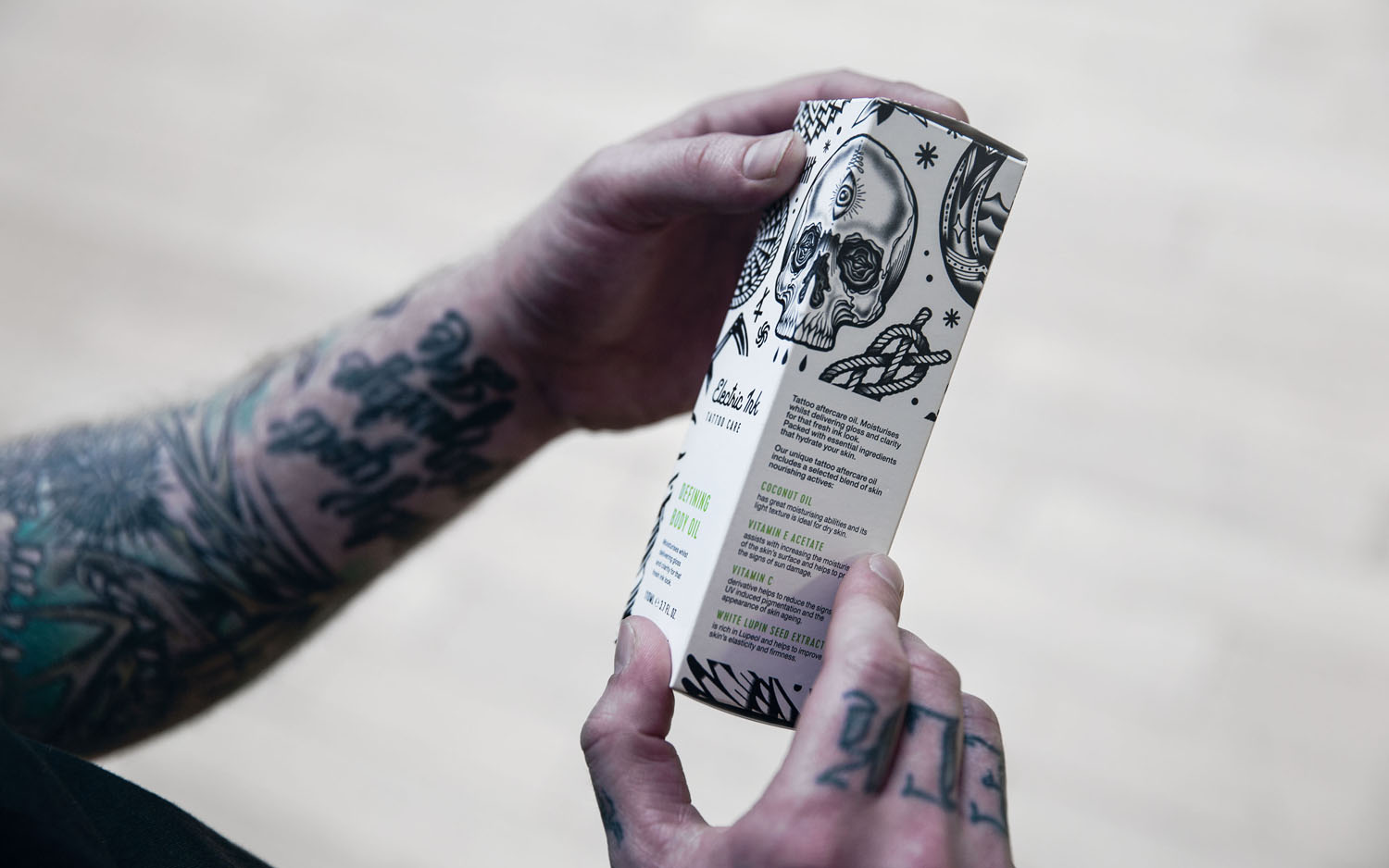
Tattoo culture is diverse. It covers images that are deeply personal, laboured over and highly crafted, to those that are off the flash sheet and a spontaneous decision. Electric Ink is a mainstream product, and as such, favours imagery that exists in a comfortable middle ground, one that avoids any specific sub-cultures, be those that are a little edgier or lean towards what might be described as trite. There is a sense of quality, an understanding of the breadth of the market and leverages the familiar whilst also managing to appear distinctive and clear in its communicative intention, particularly when given its context within the skincare market.
Design: Robot Food. Illustration: Tom Gilmour. Opinion: Richard Baird. Fonts Used: Cervo & Helvetica Neue.
