Lundén Architecture Company by Tsto
Opinion by Richard Baird Posted 20 March 2017

Lundén Architecture Company is a Helsinki-based design studio developing innovative structures, infrastructures and spaces. The studio, through their knowledge of strategic development, experimental building technology and urban design, drawn from their collaborations with experts from different fields, offer proposals that affect the future of the built environment. Projects have included a new school and community complex that inspires learning during the day and functions as a meeting place, workshop area and community space during the evening, and an infrastructure proposal that reconsider airport terminal systems for Finland’s air transportation network.
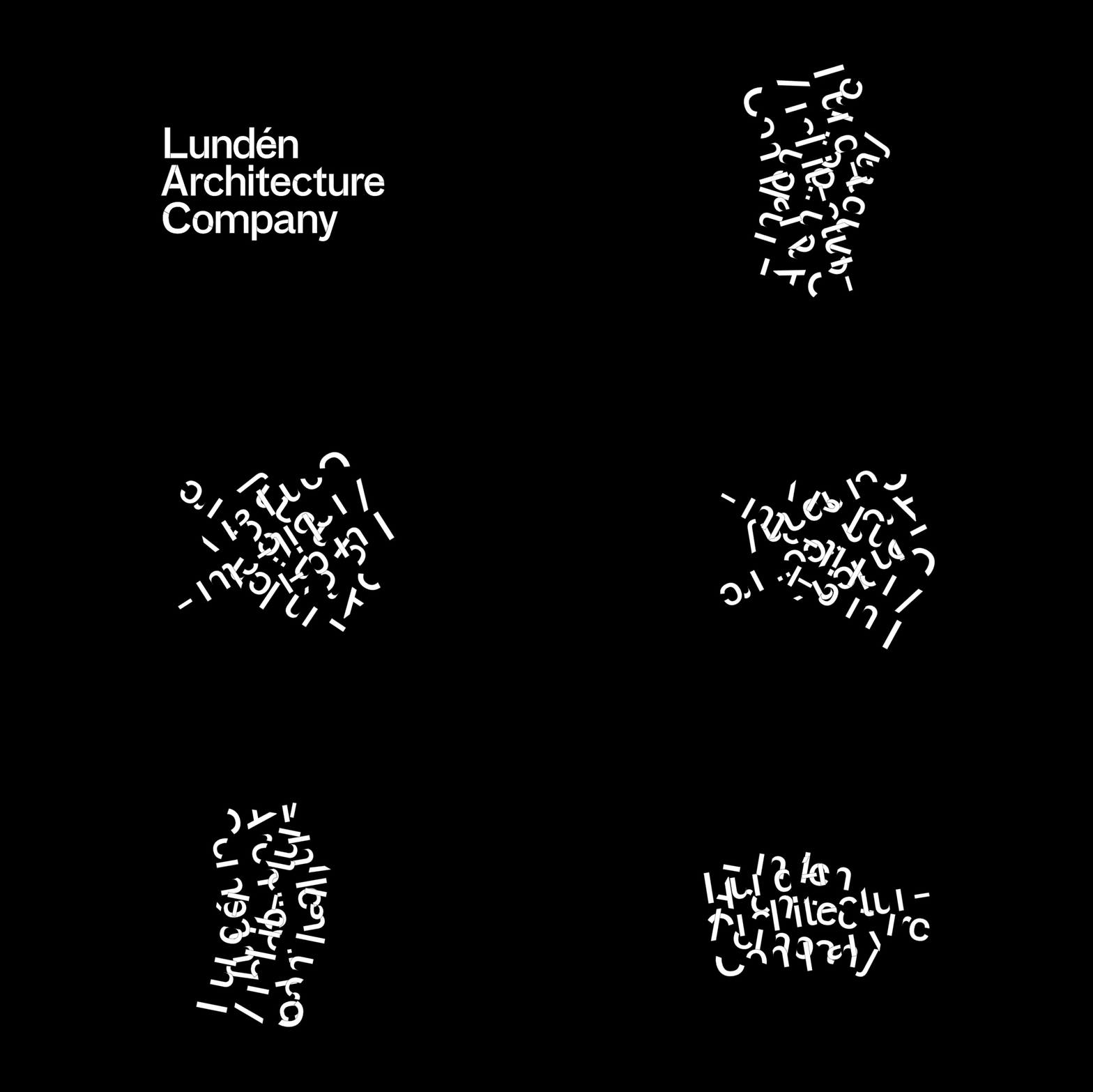
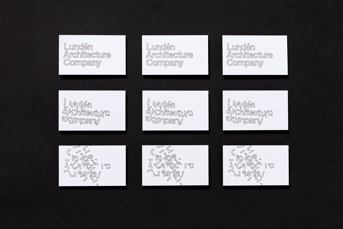
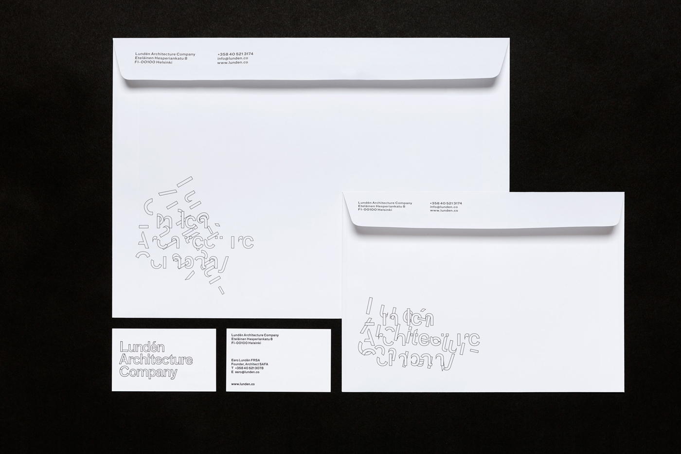
Lundén Architecture Company’s brand identity, developed by Finnish graphic design studio Tsto, is based around a logotype that acknowledges the fragility of structure and the notion that its deterioration begins as soon as it is completed. This is expressed through the breaking apart and reassembly of logotype. This runs across business cards and stationery in a static but transitory state, and in motion online.

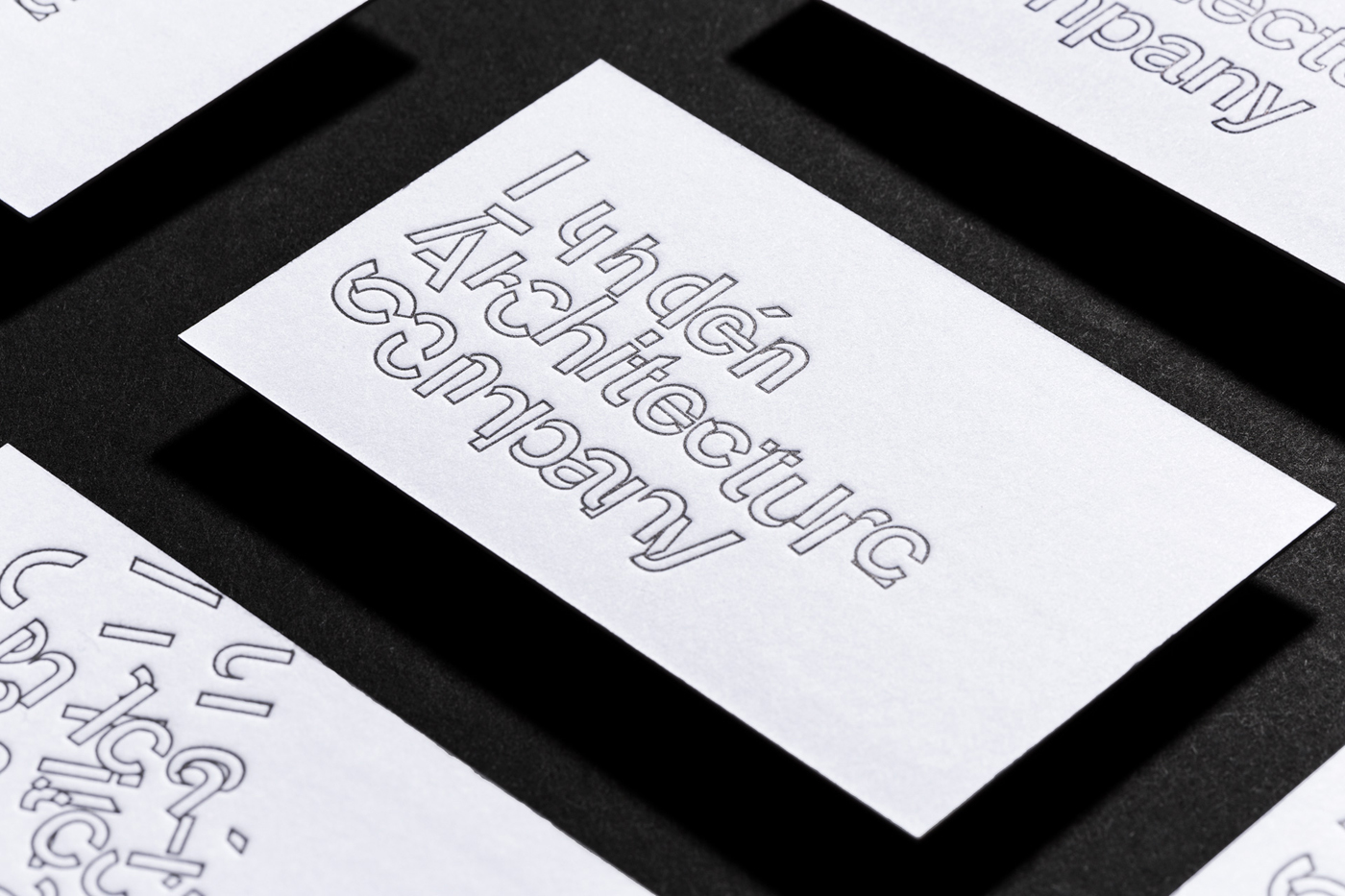
Tsto’s approach, much like Lundén Architecture Company’s own work, challenges perceptions and expectations. Where you expect the robust, you have the delicate (in the form of fine outlines), when you expect the steadfast you have the dynamic, and where you think you should see the structured, there is the deconstructed.
As reassuring as the robust maybe in architecture, it is refreshing to see the transitional and fragile represented, an often overlooked component of space and structure. This feels fitting within the context of a studio trying to evolve complex systems and rethink the role of building and its influence on the local environment.
Its strength lies, not only in its unusual aesthetic qualities and typographical origins (inspired by a typeface used prominently by the Bauhaus), but also in the way that it develops the visual vernacular away from convention, whilst pairing it with some of the more reassuring architectural cues, be that in colour (black and white), materiality (uncoated board and debossed surface), the modular nature of type and a more conventional fill alongside outlines.

The dynamic qualities of animation are translated well into print. These neatly move from the conventional, which features the familiar breaks of something you might associate with stencils and industry, modular panels and utility, through to the completely deconstructed and thoroughly unusual. These are linked by a cyclical path, which perhaps works as an allusion to time and renewal.

Just as the animated logotype has a cyclical and transitional quality, website, typographically, similarly plays with different moments. Instead of motion, the use of FF Bau, a grotesk with its roots in 19th century modernist Germany and making a connection to logotype, and the transitional serif Arnhem, feel like bookends, an expression of changing requirements and stylistic sensitivities, and the co-existance and interdependence of old and new within the built environment. Logotype is neat, but this brings a bit more breadth to concept and character to website, alongside compelling image and plenty of insight. More work by Tsto on BP&O.
Design: Tsto. Opinion: Richard Baird. Fonts Used: FF Bau & Arnhem.


