Orson Burger Kitchen by Anagrama
Opinion by Richard Baird Posted 23 March 2017
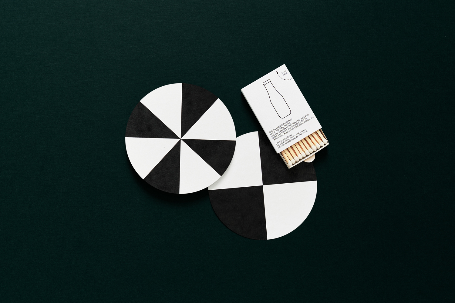
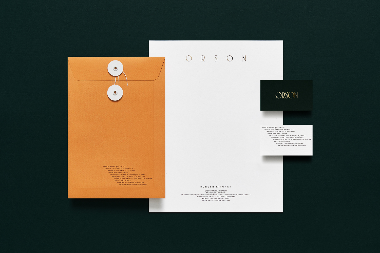
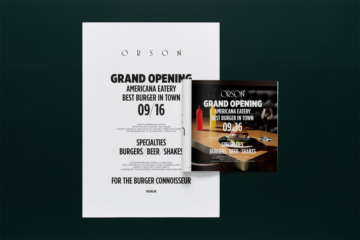
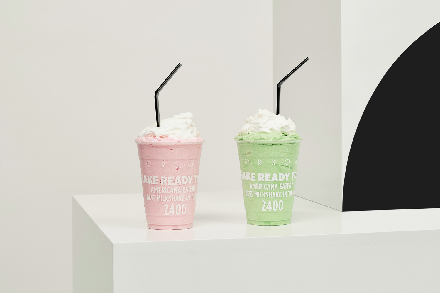
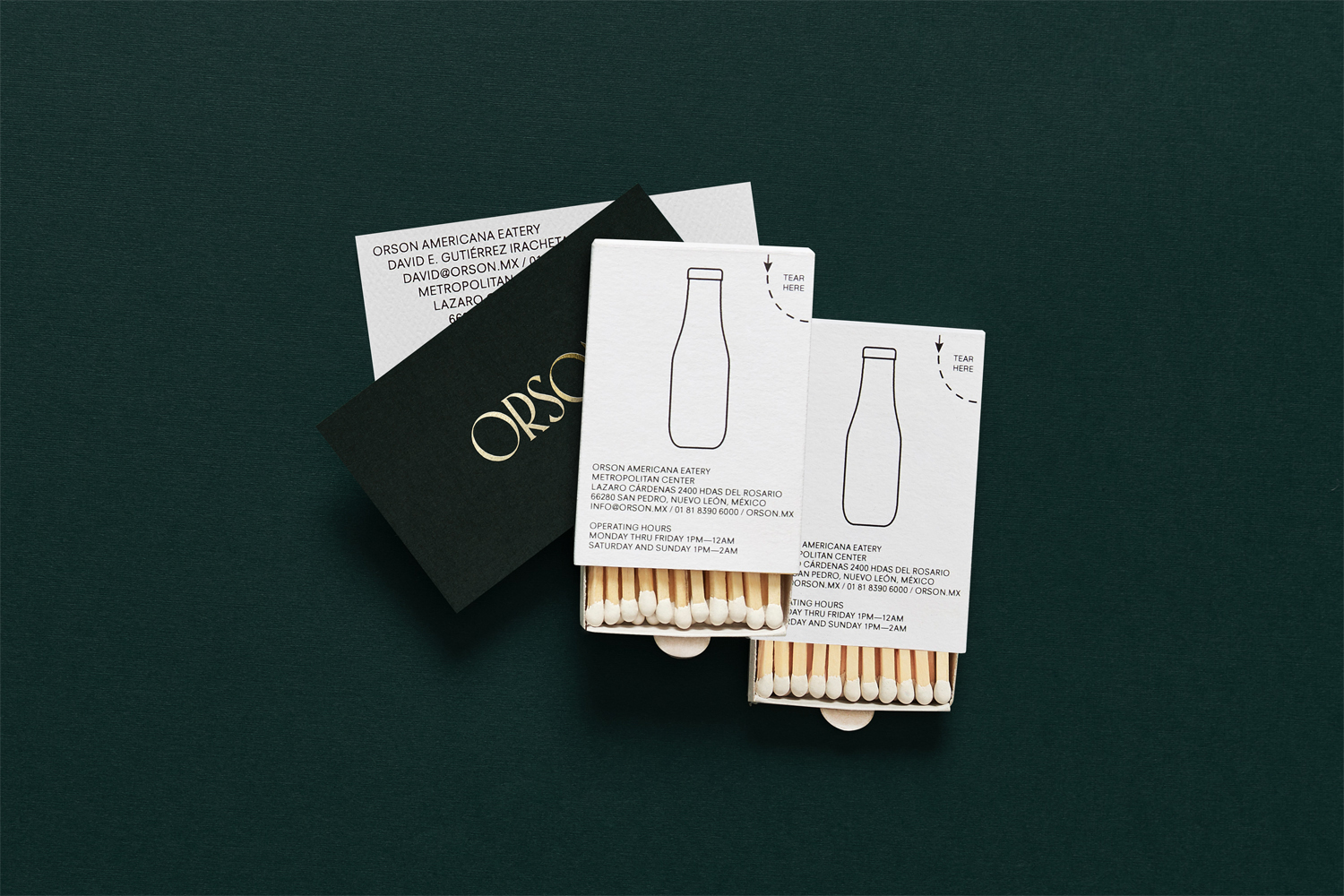
Taking inspiration from the work of artist Edward Hopper, and the style of the American diners of the 1920s and 1930s, Mexican design studio Anagrama developed an interior and visual identity design for Orson, a restaurant in the city of San Pedro pairing burgers with a wide selection of wines and milkshakes. The project, alongside a distinctive interior design of material detail, contrasting colour and form, also included menus, packaging, business cards, and beer mats.
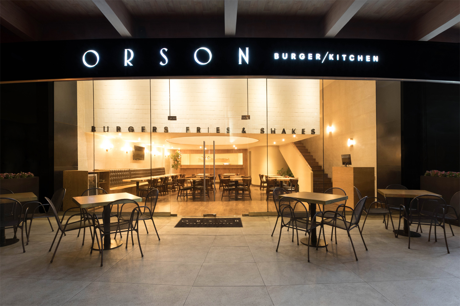
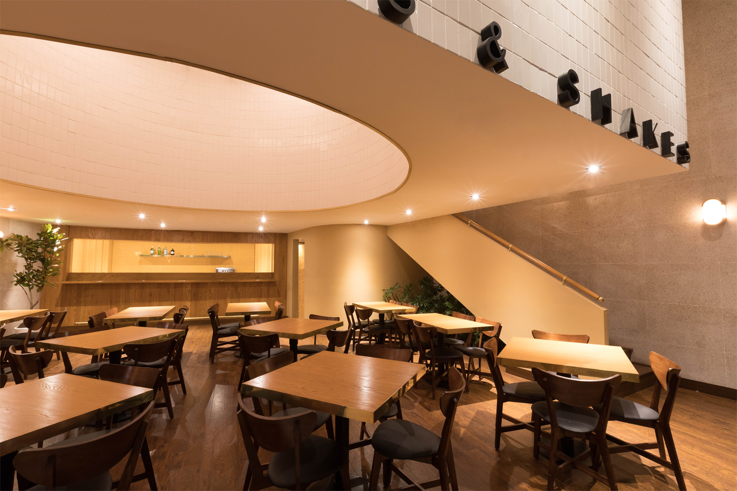
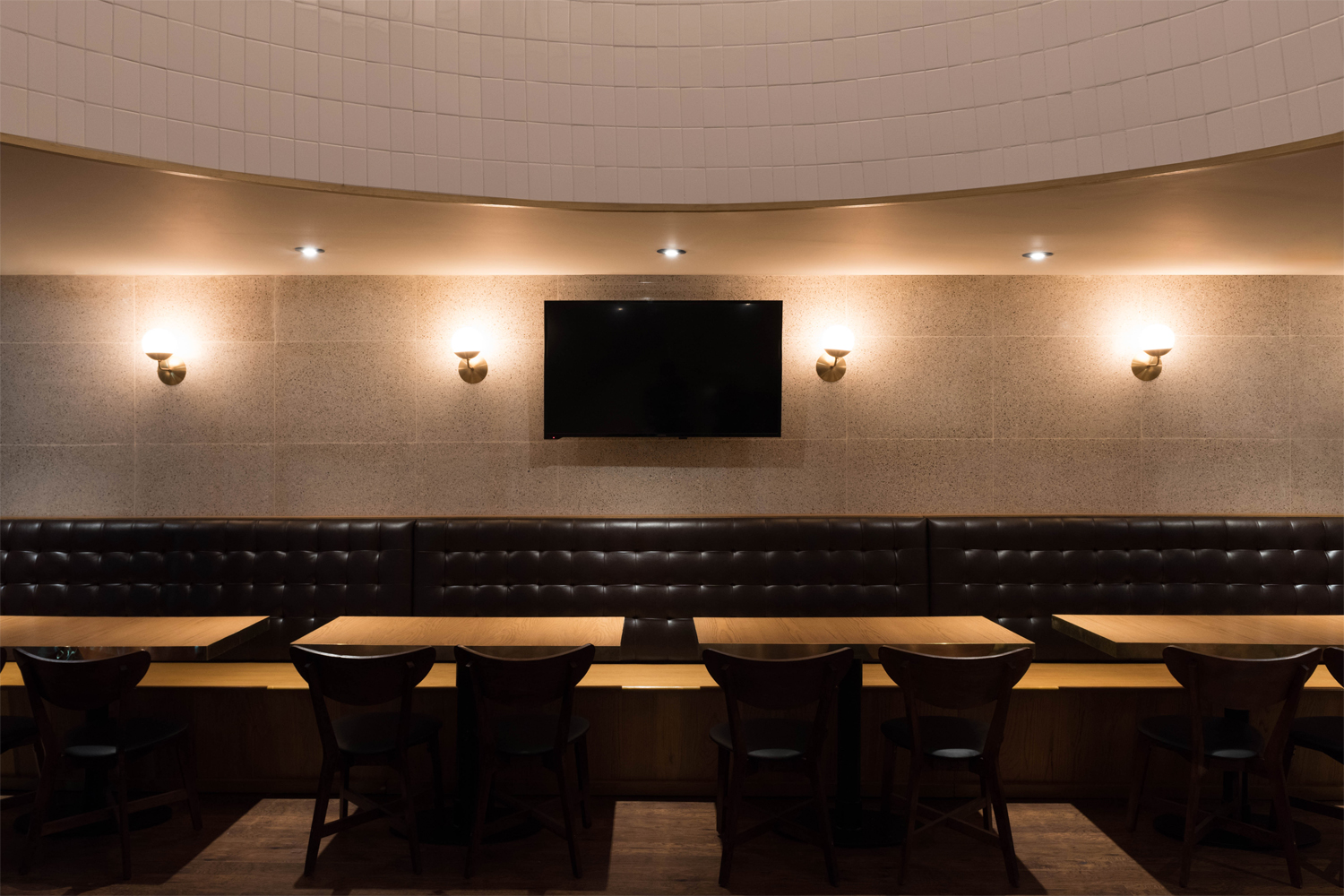
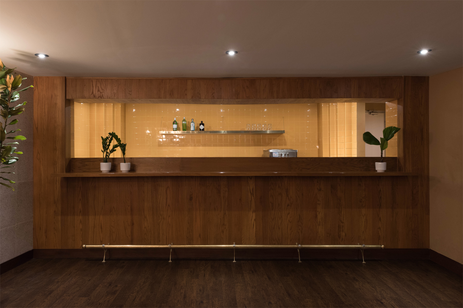
Anagrama’s interior design for Orson successfully channels some of the contrasting colours of Hopper’s work, his favour for open spaces, sparsity and the linear. It is distinctive in its juxtaposition of large geometric forms and high quality material details and finishes. Period influences can be seen in the long pinned leather bench, brass finishes, wood and tiled surfaces. Highlights include, alongside some lovely stone surfaces and classic light fixtures, a large cylindrical skylight, the recurrence of squares as tables and tiles, and the slim rectangular window of the bar.
If you are familiar with the urban side of Edward Hopper’s work you can see the correlation, and this works well within the context of a burger bar, which also intends to make a connection with the American diners of the past.
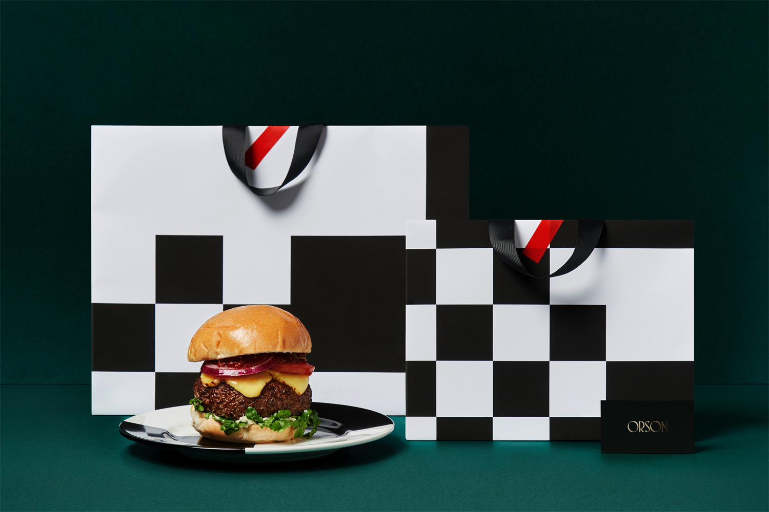
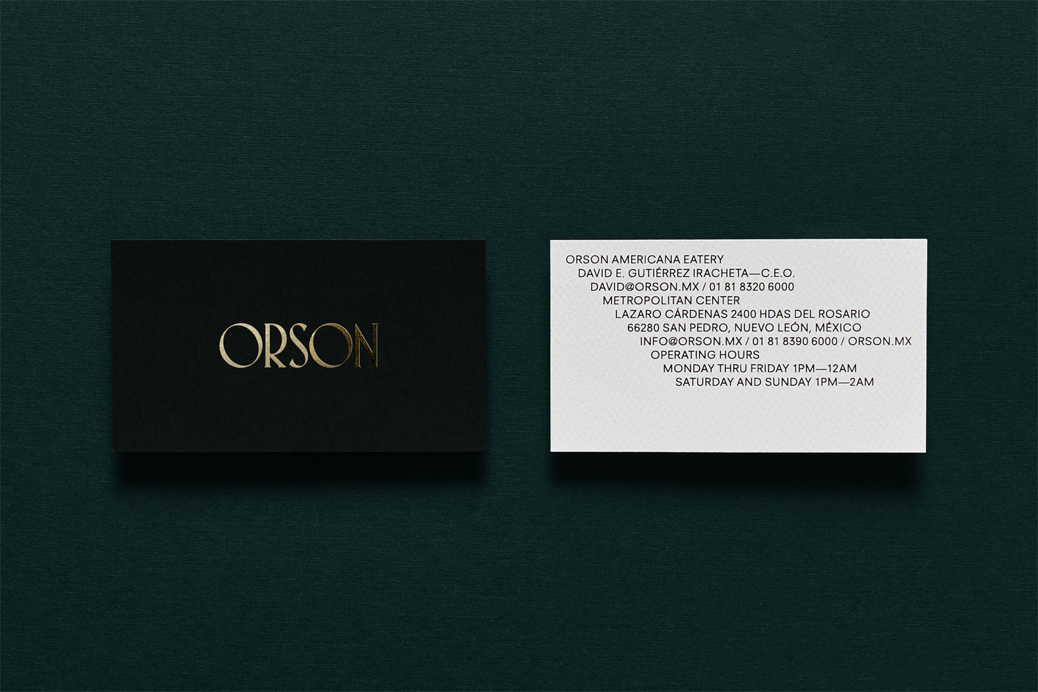
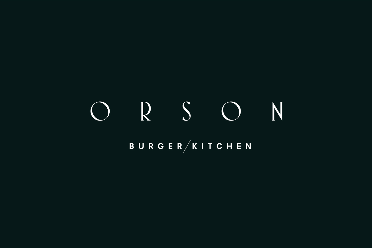
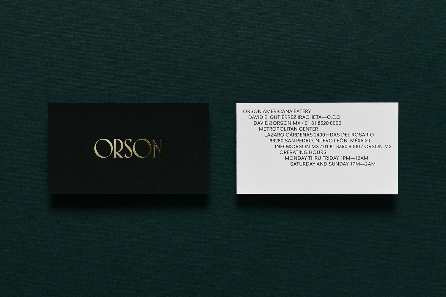
These period details and allusions continue through to brand identity, within the calligraphic strokes of the logotype, the contrast of glossy gold foil, uncoated black and embossed white material of business cards, in the white and black geometric shapes of beer mats and bags, and in the bold, condensed, sans-serif of print communications.
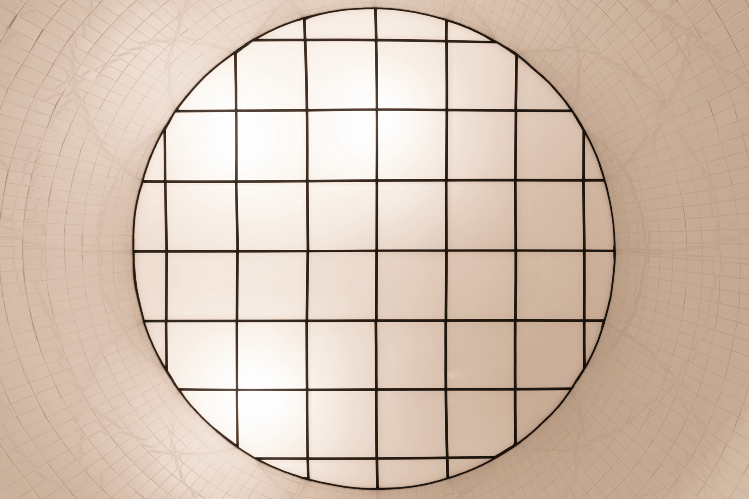
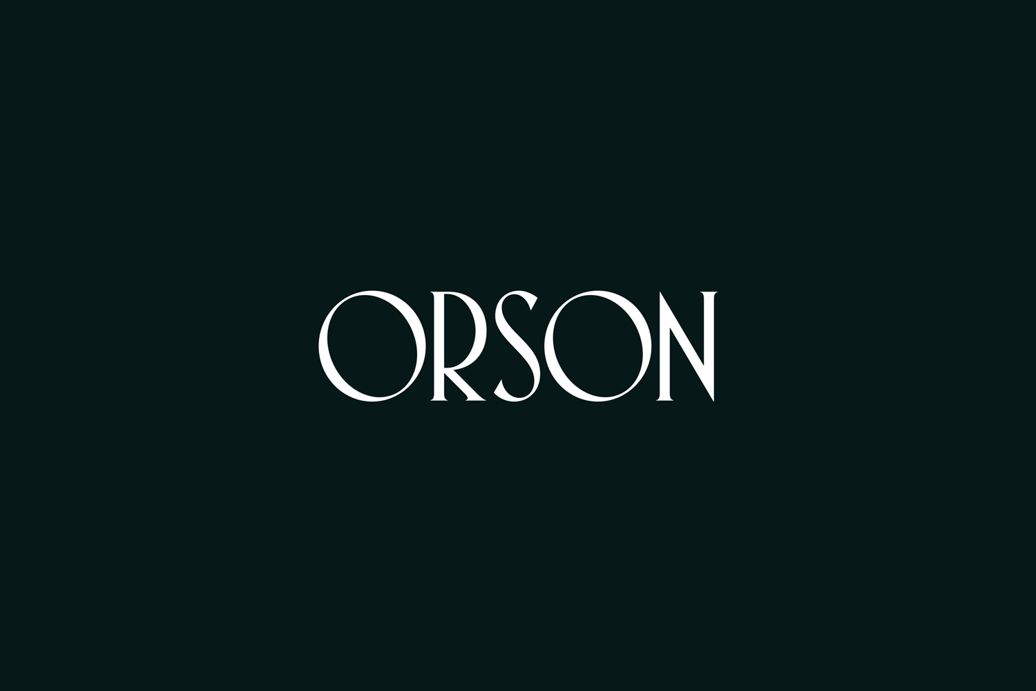
The expanding and contracting logotype, making reference to the Art Deco movement in lettershape, and calling to mind the titles of black and white period film in its variable stroke widths, draws on the linear, period qualities and the large circular detail of interior design, while its mix of the slim and full also manages to work in an element of contrast, an recurring theme.
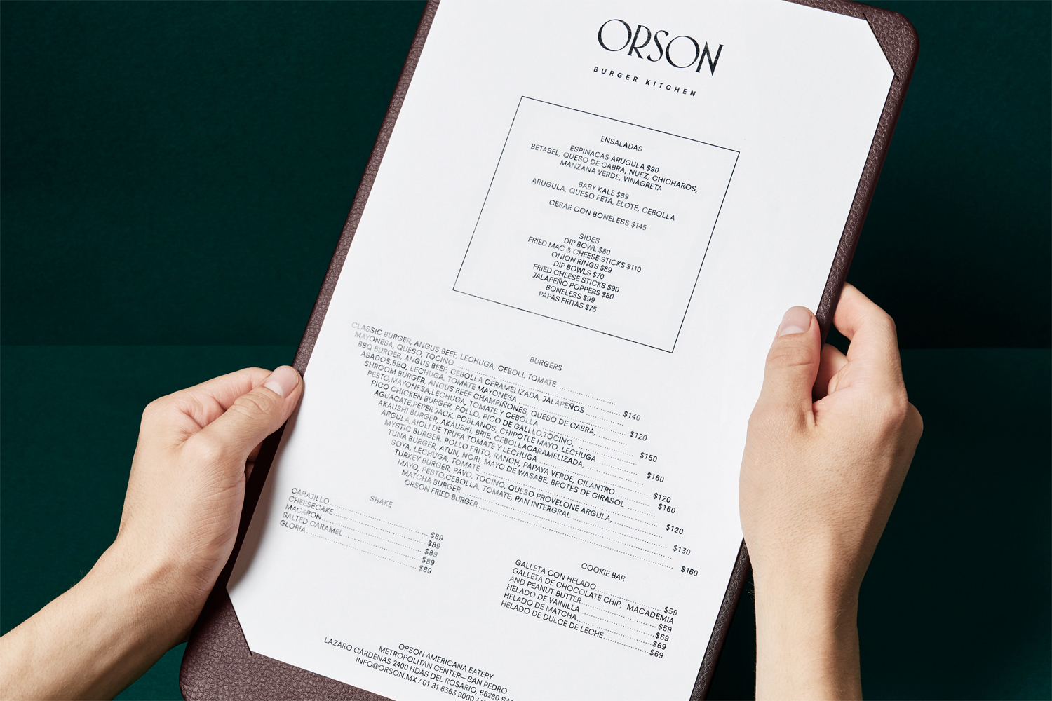
Where interior design features an abundance of high quality organic material and geometric structural detail, identity appears as an effective and memorable distillation of this. Particular highlights of visual identity include the typesetting of menu and its backboard, which mirrors some of the restaurant’s interior architectural details. This can be seen in the stepping of the burger list, the outline of the ensaladas, the pairing of shakes and cookies, and leather finish.
This continuity of interior design and visual identity is both subtle, as seen in the shapes of the logotype and the allusion to Edward Hopper in interior, and more explicit, in the bold chequered graphic of bags and their reference to the American diner. More work by Anagrama on BP&O.
Design: Anagrama. Opinion: Richard Baird.
