Disrepute by Two Times Elliott
Opinion by Richard Baird Posted 24 April 2017
Disrepute is a members-only bar, located in London’s Soho, described by Two Times Elliott, the design studio behind its brand identity, as having a heritage of “establishment and scandal”. The bar features a rich interior design of high quality material detail that elegantly plays with shape, pattern and symmetry, solid colour and texture, the geometric and the organic. There is an element of period theatricality, yet a contemporary eye for unique character, comfort and continuity throughout.
Two Times Elliott’s brand identity takes these qualities and focuses them into a quieter but distinct brand identity expression that favours commonality and, taking inspiration from Soho’s “most notorious eras of concealed communications and discrete symbols”, layers this with a narrative component that calls to light the loves, intimacy and people of the venue’s past, alongside a historical notoriety, one of secrecy, seduction and the clandestine.
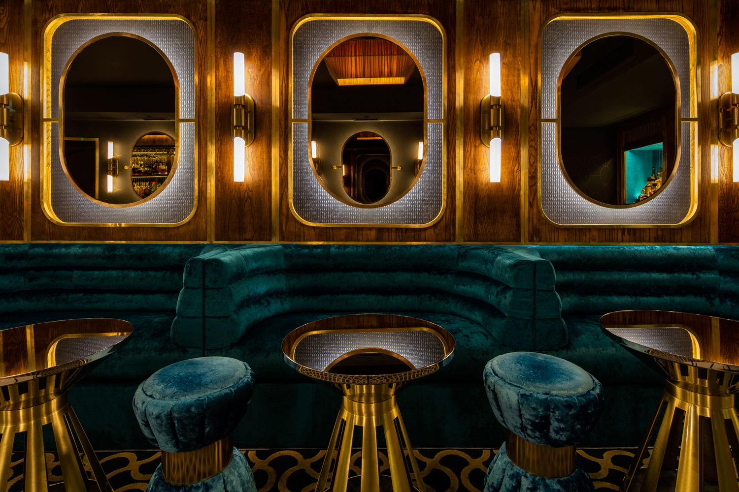
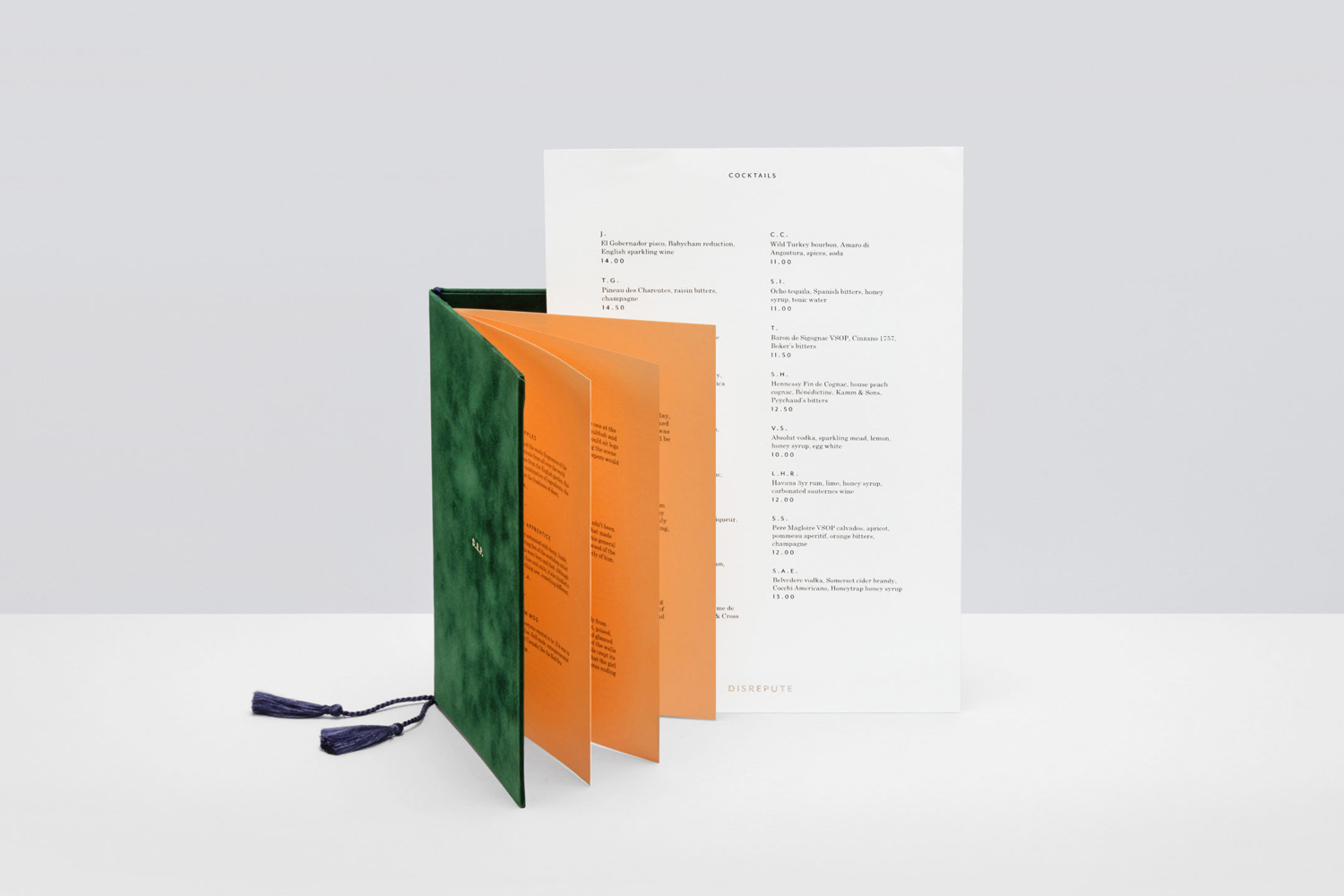
Interior design, the history of the building and its location are the defining qualities of Disrepute. There is plenty to draw on. Two Times Elliott appropriately distil these down into a simpler, systematic combination of elements; the graphic, the material and story. These are used to link assets that include business cards, visitors cards, postcards and coasters, menus and signage, and bring further depth to a strong stylistic experience. Interior is thoroughly rich in detail. In form, colour and texture, moments of commonality and contrast. Two Times Elliott effectively channels these.
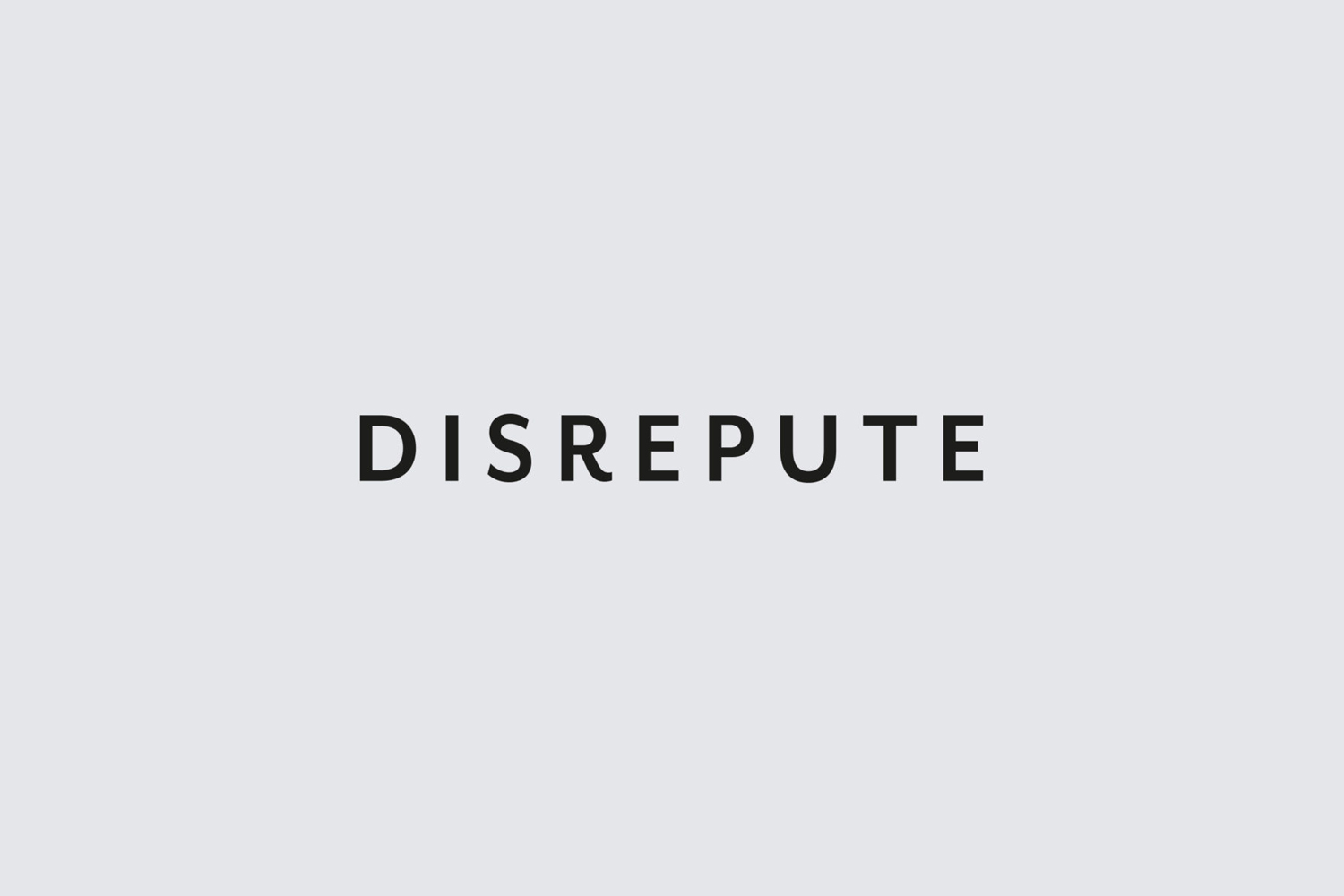
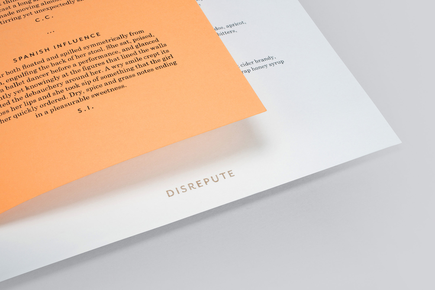
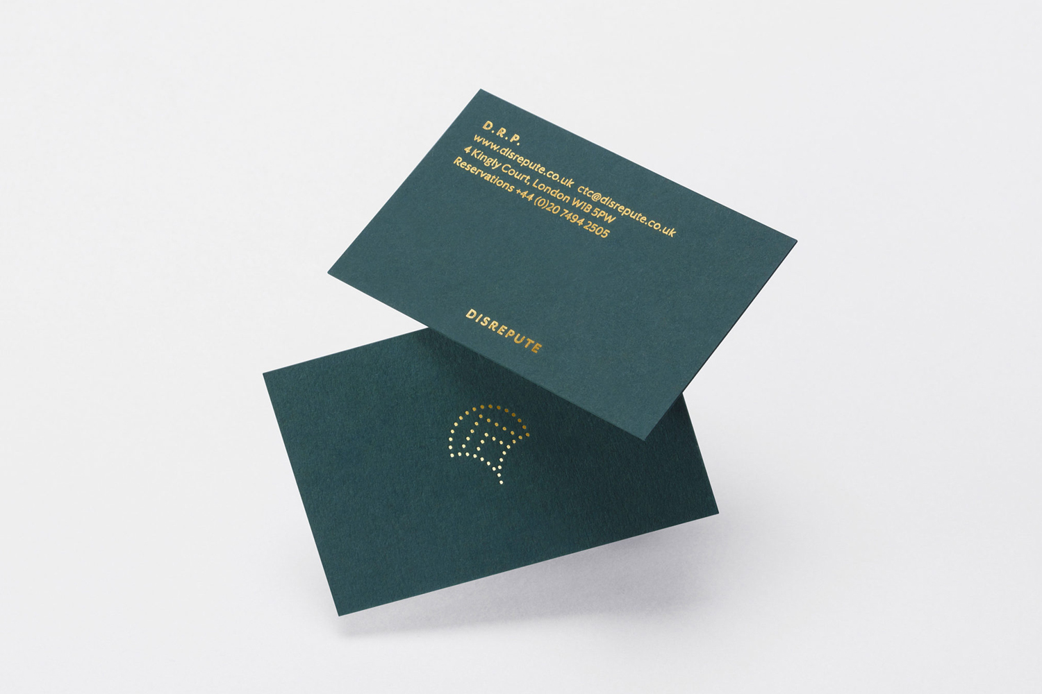
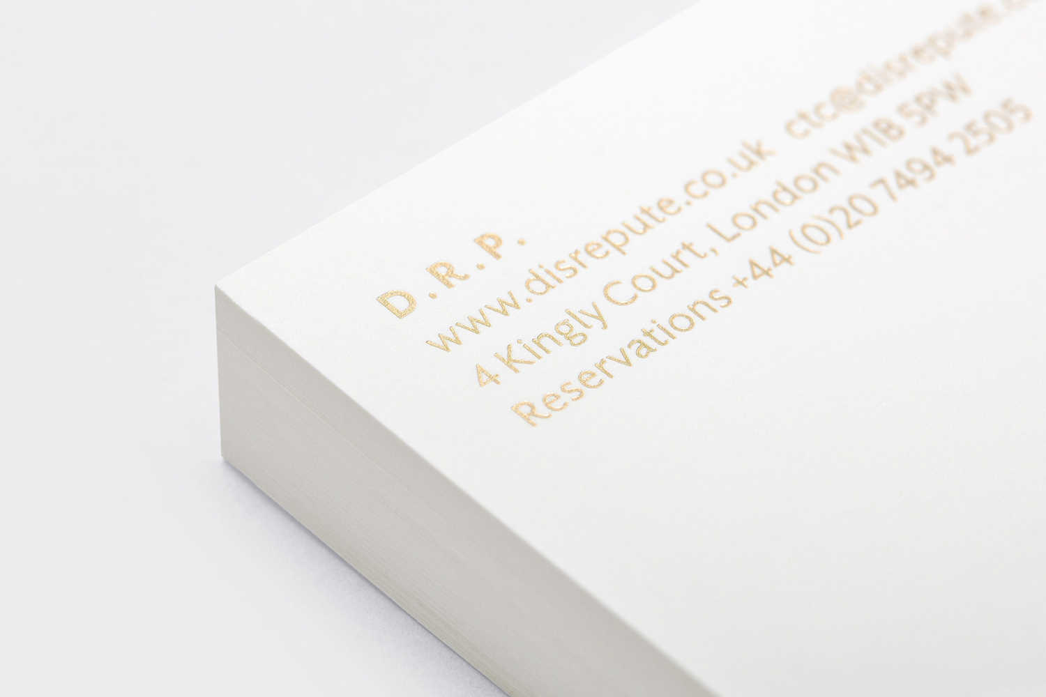
Graphic expression is kept to a minimum. Type choice, typesetting and proportionality in print is, in opposition to interior, restrained, yet shares something in common with telegrams, rooted in the concept of discrete communications, and the wayfinding of the London Underground that gives it a sense of place. The cyclical nature of design, and the progressive qualities of type, means that this also has something of a current quality, and works in an element of interior material detail, in particular the metallic, with the flourish of a gold block foil.
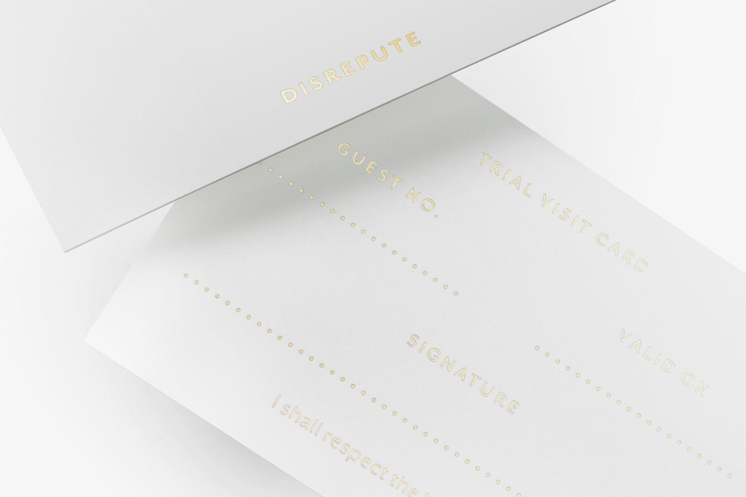

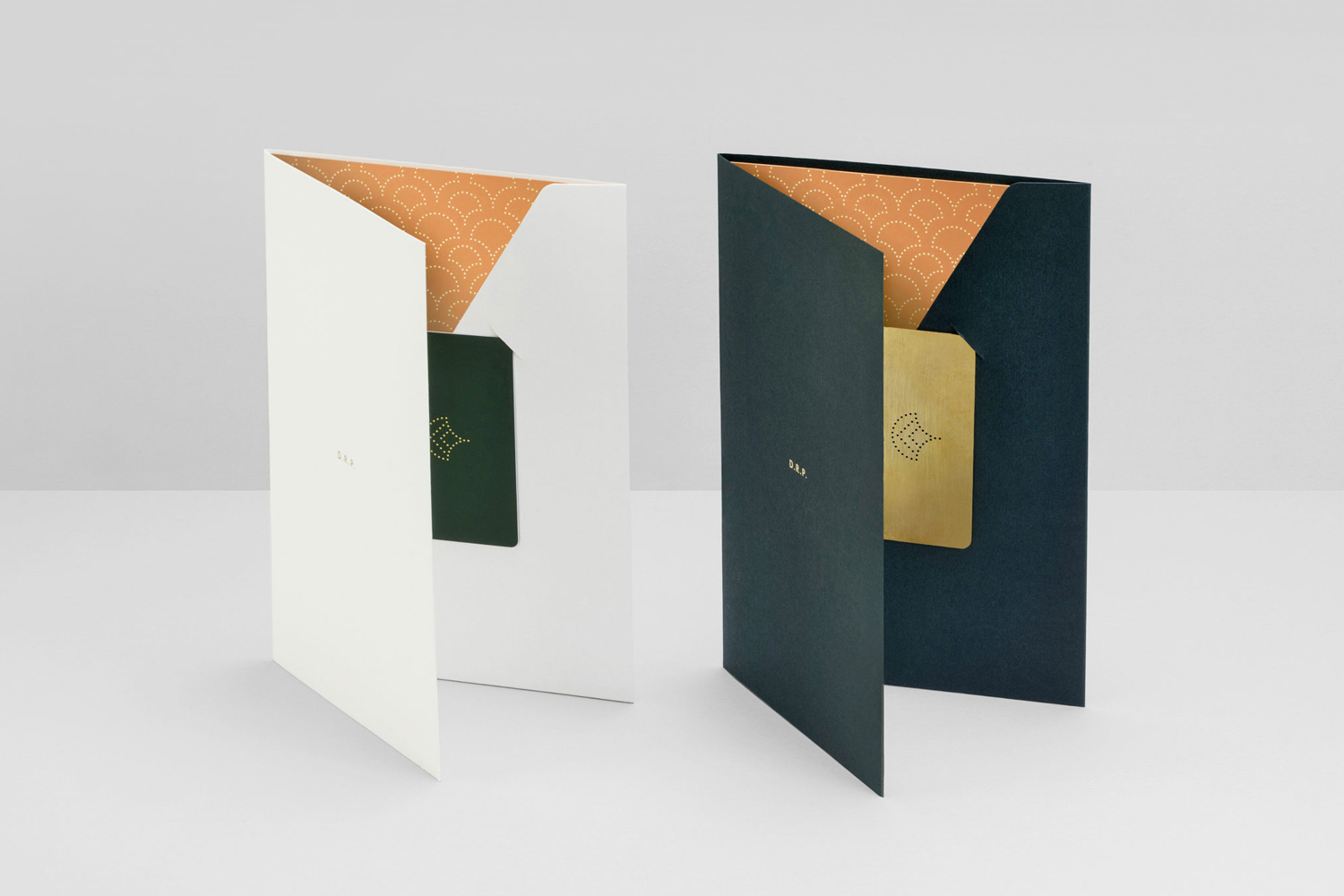
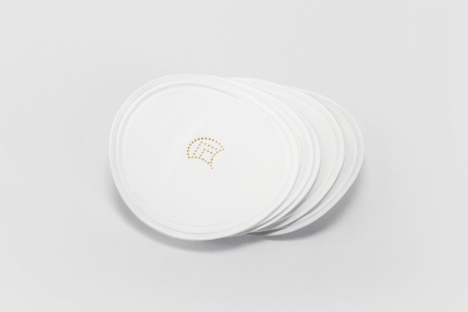
The shape of logo and its composition of circles finds an interesting balance of what looks like the punch cards and “coding” of early computing and code breaking and period pattern, particularly within the context of a concept built around concealed communications and discrete symbols.
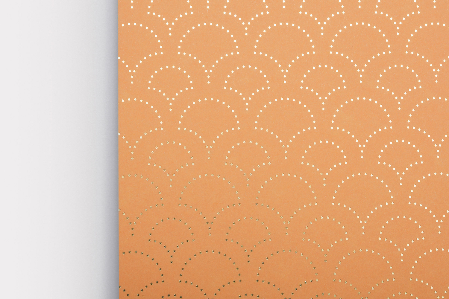
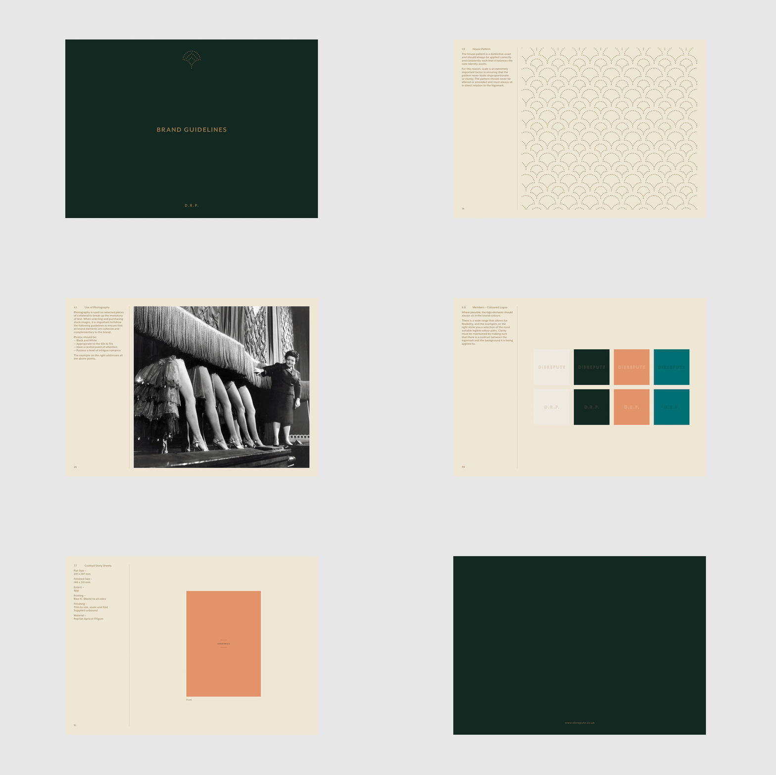
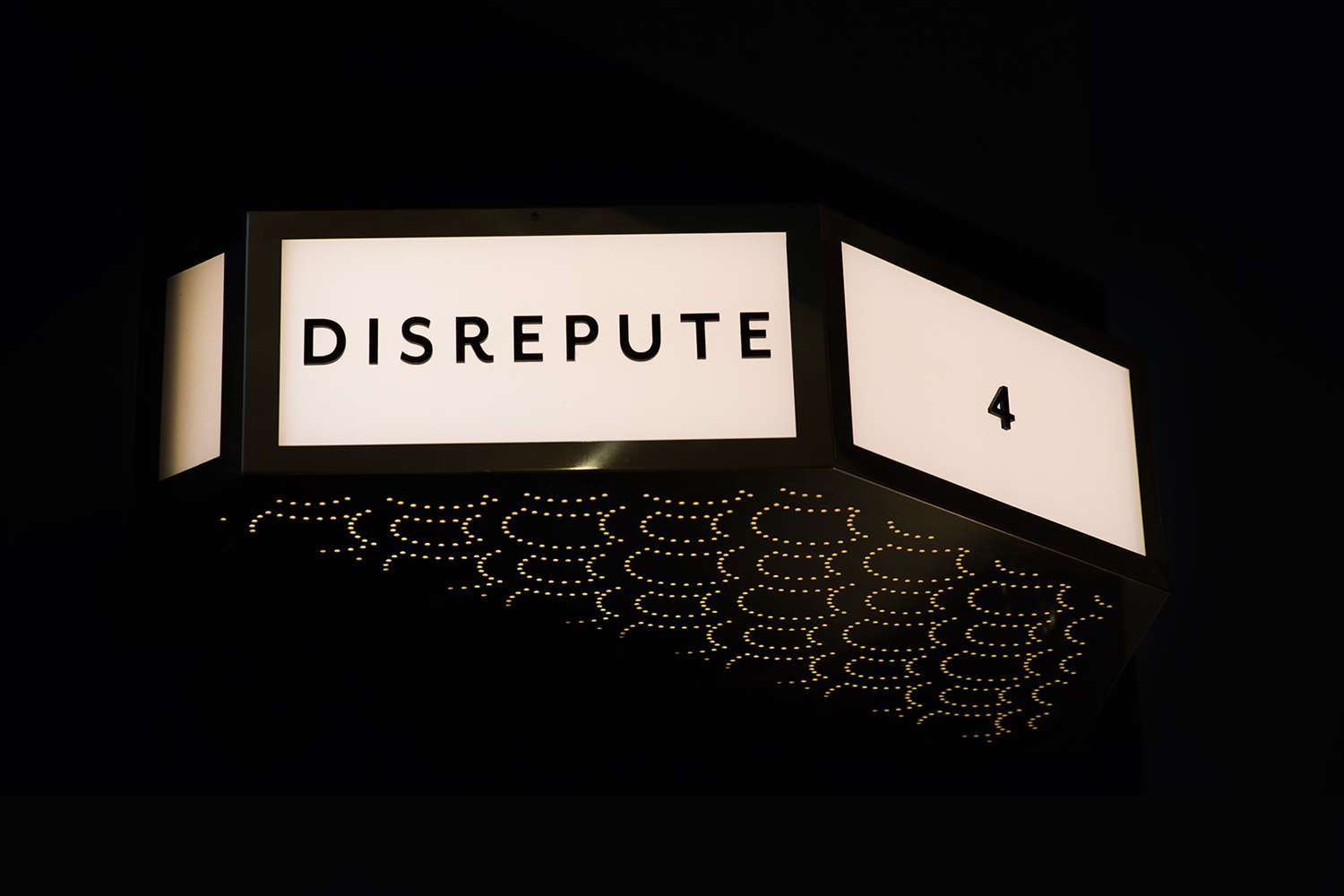
Logo works to make a literal connection between interior as pattern and printed assets, and also used to divide and link content. While being rooted in a concept, it also has a pleasant stylistic quality. Its arched and angular paths can been seem running throughout interior, in the alcoves, wallpaper and furniture.
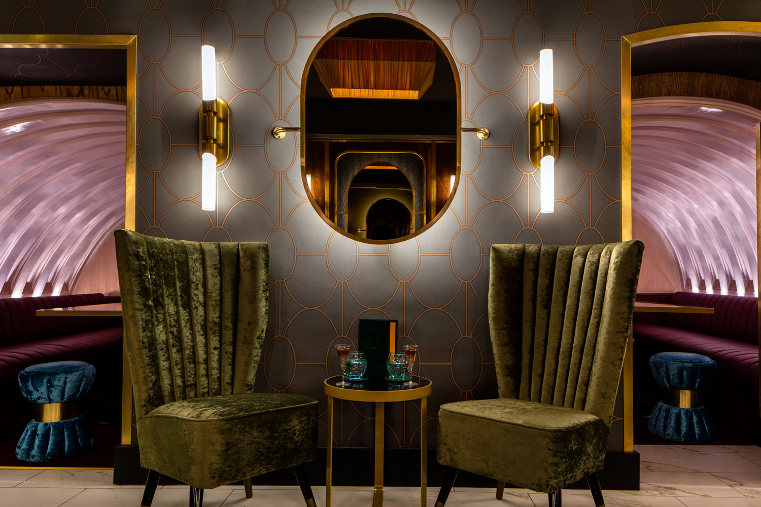
Where pattern functions to make a direct connection between interior and printed assets, so does the material qualities of brand identity. Apricot paper, green suede cover and uncoated card, and a gold block foil reference some of the qualities of furniture and finishes. There is continuity here. But in its reduction and use of space, also offers a moment of pause.
There is an abundance of colour and texture to take from interior. A temptation to be oppositional, to use contrast, to add rather than distill down, however, the green and orange find a balance between commonality and difference, simplicity and a distinction that would also work outside of interior.
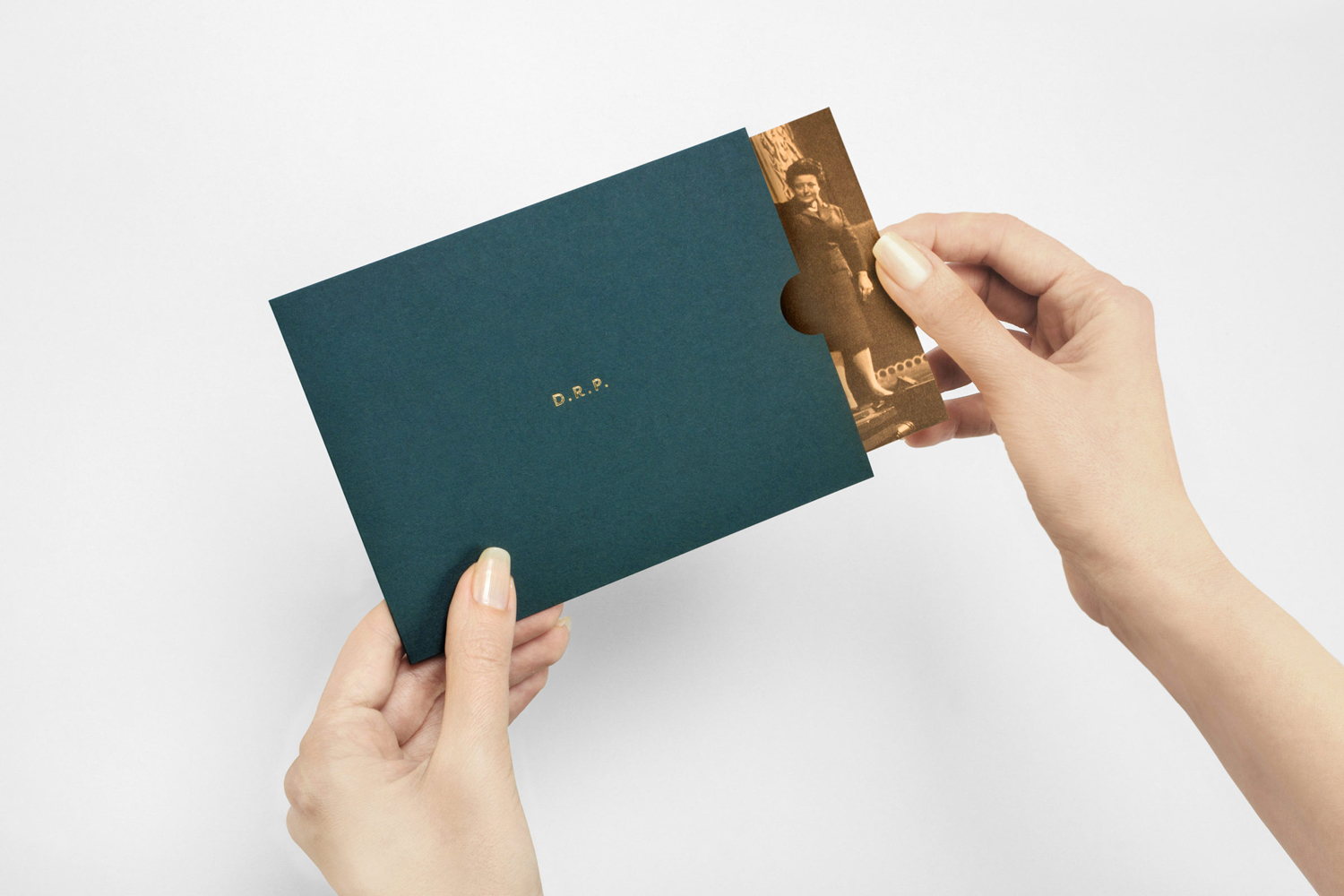
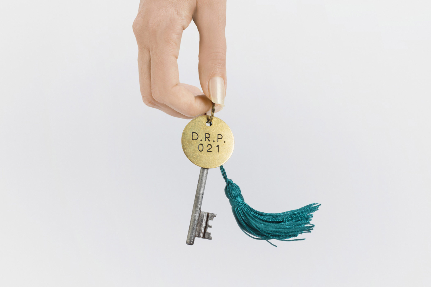
Other highlights include the pairing of serif Century Schoolbook and sans-serif Mr Eaves, a simple but effective articulation of time passing, the theme of hidden identity in the recurring detail of initials, and codewords as part of the online sign-up process.
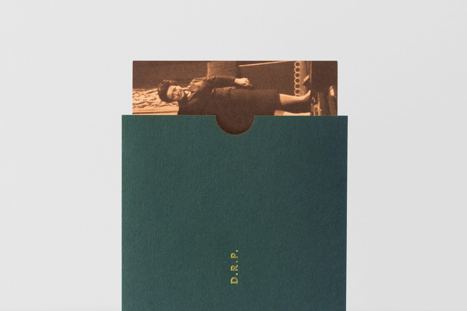
The mix of simple typographical expression, and the combination of form, colour and finish, manage to channel the stylistic qualities of Disrepute, and touch upon some of its period influences and location in a way that is contemporary, without undermining character and intention. However, it is underlying concept that really lends weight to much of these choices, and the way this plays out as a story component through copy and image.
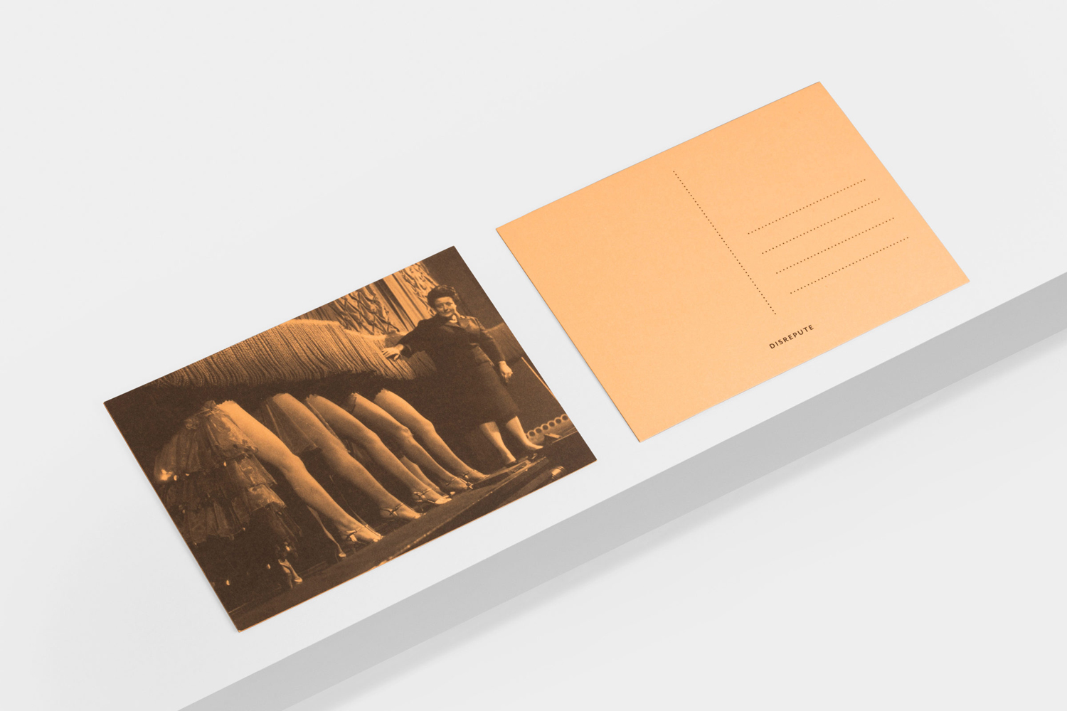
Two Times Elliott layer brand identity and interior design, with an interesting historical context, heightening and romanticising, in a way that is very much in line with the exuberant qualities of interior. Notes left behind suggest backstories of past love, intimacy and people. These are used alongside fragments of letters sent between John Profumo, his wife Valerie Hobson and mistress Christine Keeler, and images of period entertainment. It never feels like a gimmick, these components have more in common with an exhibition, and add justifiable visual detail. Two Times Elliott uses the word “snippets” to describe these, and this feels like a good description. It is hard to really capture these in portfolio shots, peppered in across different assets, but it is there, and there to be explored further in phase two.
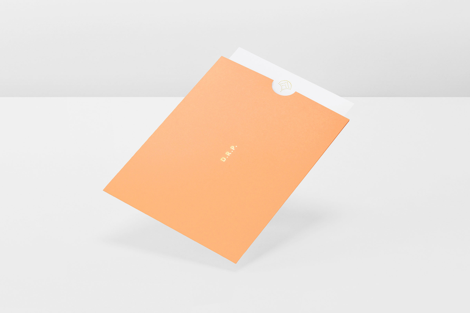
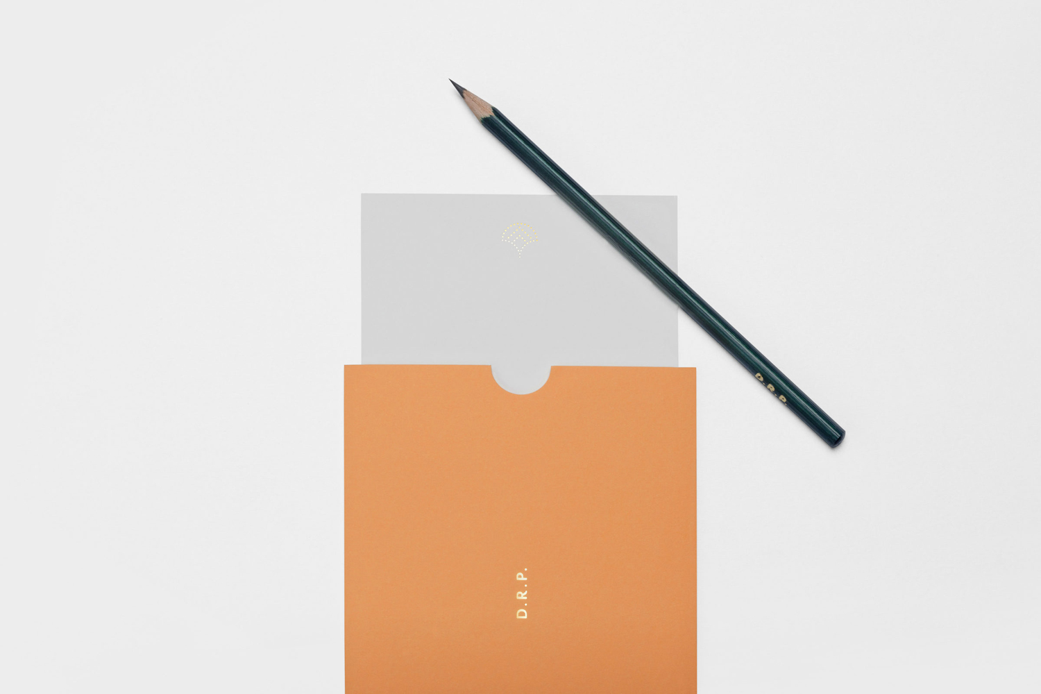
There are some lovely colour and material combinations. Where interior is is rich and opulent brand identity is approriately paired down. Although there is clear commonality, choices feel restrained in the right way, breathing space amongst a lavishness. It is pleasant to see the graphic make its way into interior as illuminated patterns, and drawing on much of the interior’s detailing and furnishing. Identity satisfies a desire for continuity but also adds to experience with a storytelling element, building out the tone and period qualities of interior, articulating the hidden history of venue, and effectively moving between the literal and impressionistic. More work by Two Times Elliott on BP&O.
Design. Two Times Elliott. Opinion: Richard Baird. Fonts: Mr Eaves & Century Schoolbook.
