Rocket by Here Design
Opinion by Richard Baird Posted 28 April 2017

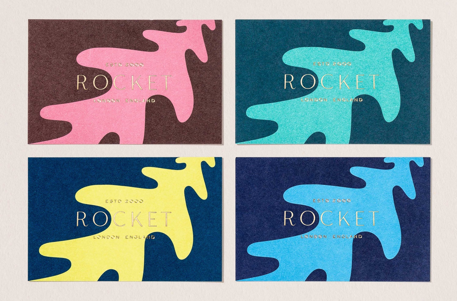
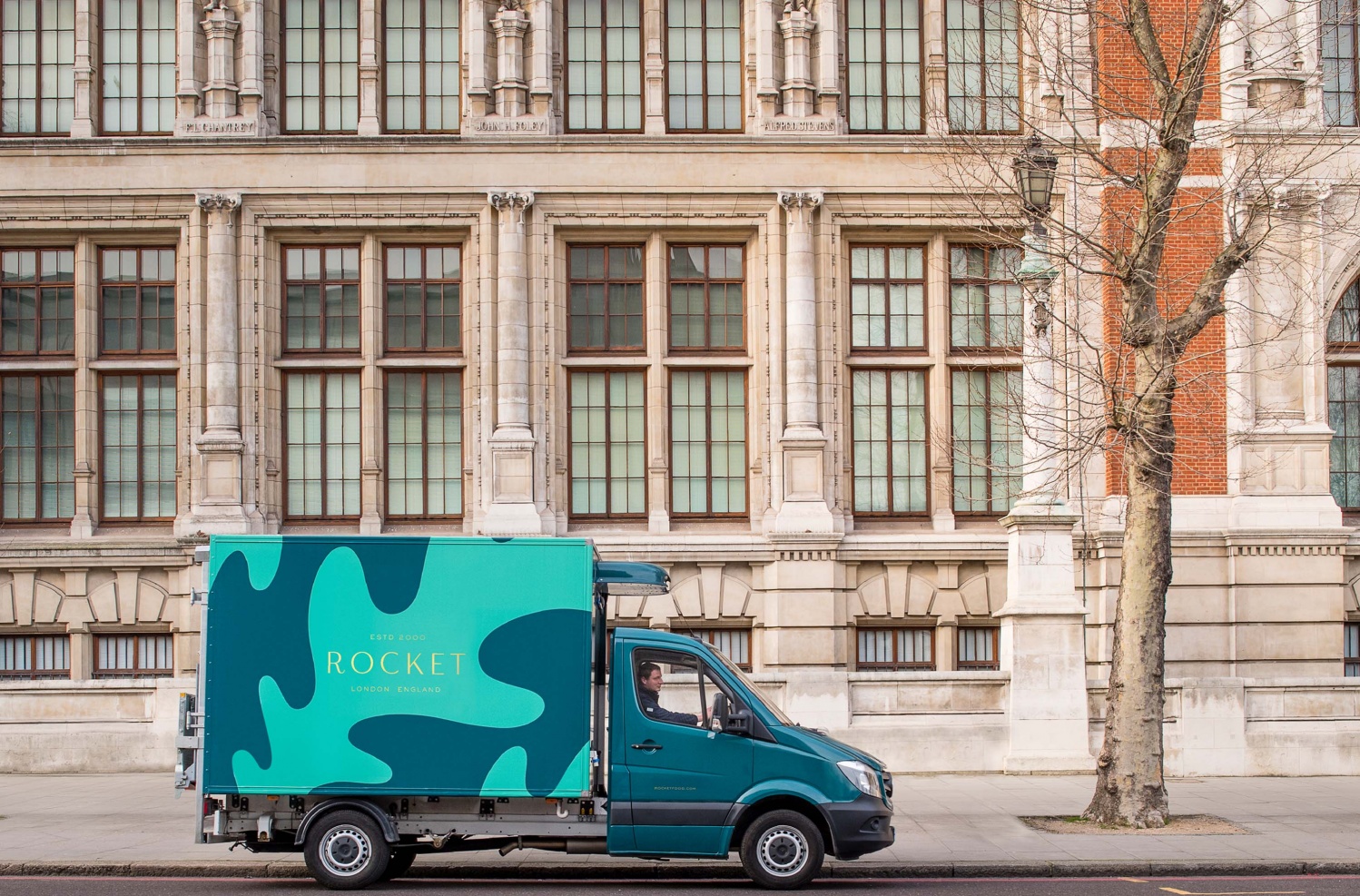
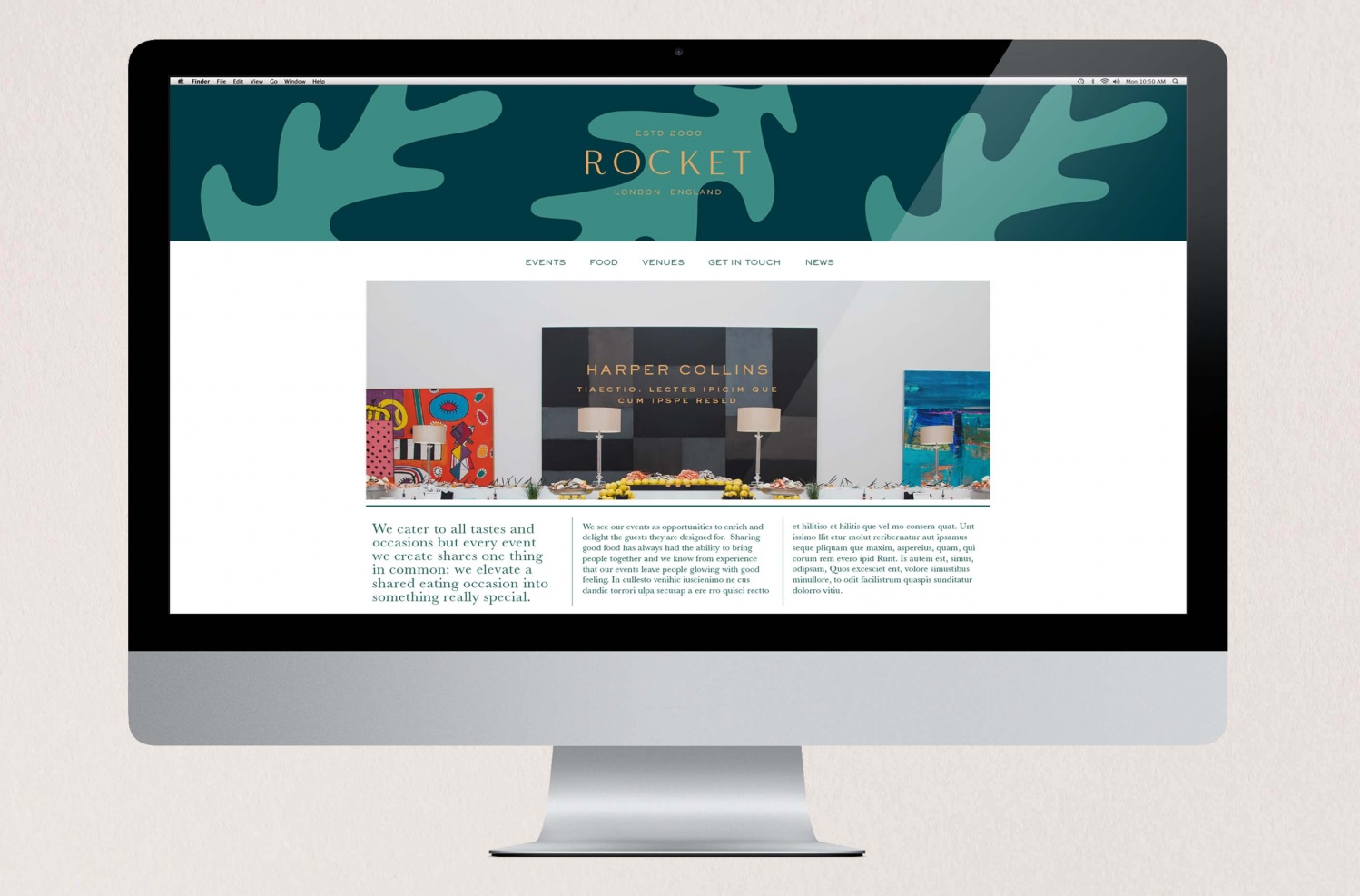
Rocket began in 2000 as a small family-run catering company, implementing other people’s plans, and has grown to become a multifaceted enterprise with its own ideas, creating culinary worlds in partnership with some of the country’s most prestigious institutions and brands. Rocket worked with London-based Here Design to express this bold new position throughout its brand identity, in logo design, and across its stationery, business cards, print communications, van livery and website.
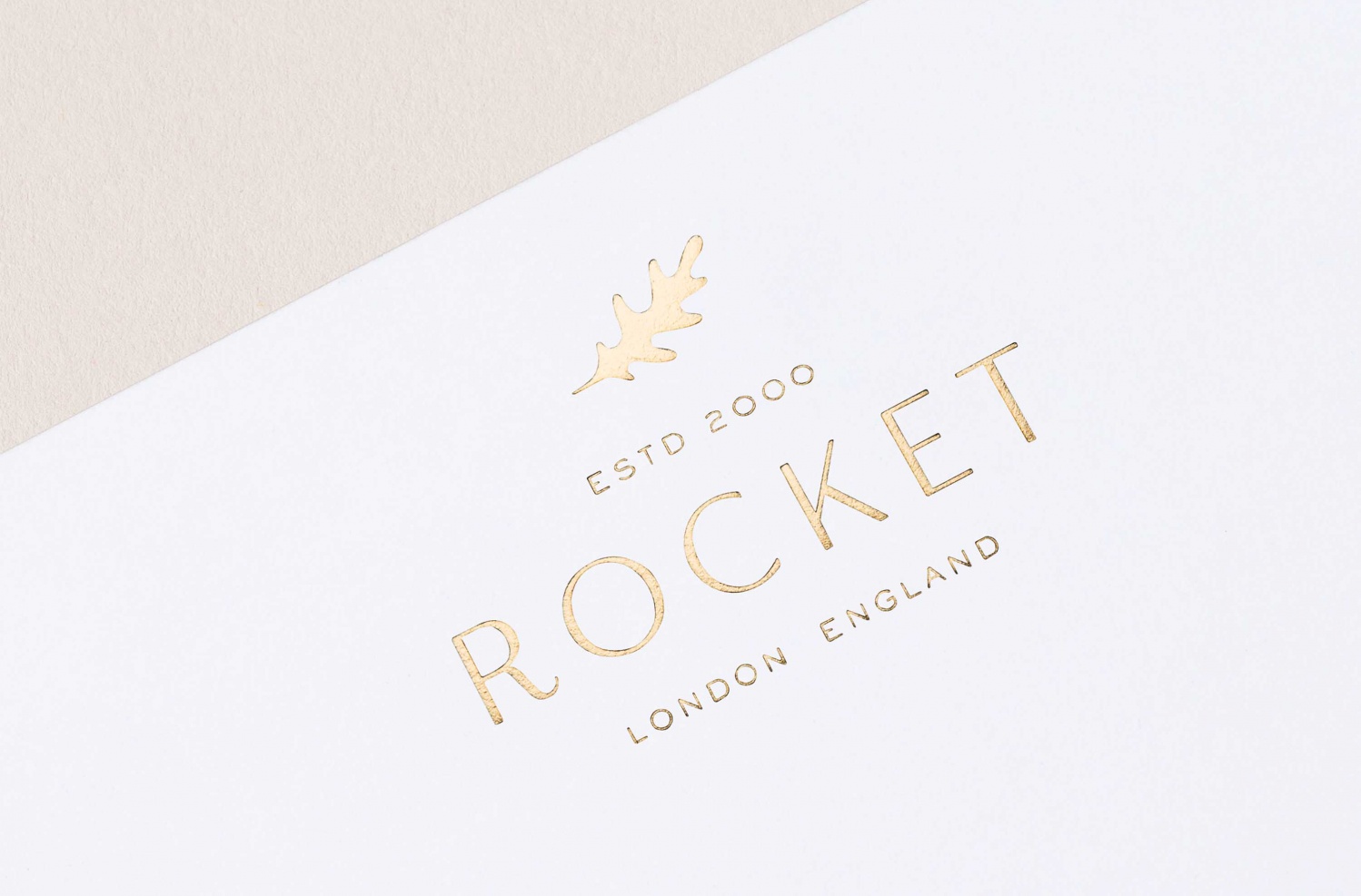
Strategically its fairly straightforward, the business grew and diversified, moving into design and planning alongside implementation, and its brand identity got left behind. The solution, and visual articulation of this move, is equally straightforward but effective. It finds a neat and discernible balance between bold, distinctive and creative expression, in the use of spot colour and form, and an eye for finer detail, in the choice of type, light lines and gold finish.
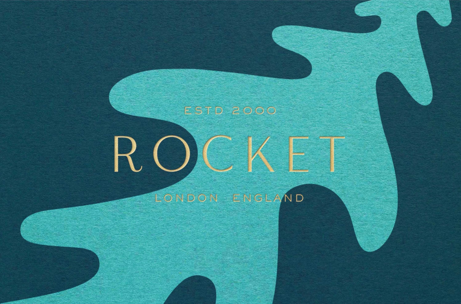
The rocket imagery makes for a bold and memorable motif, in conjunction with some striking colour choices that emphasis a modern and creative business. The delicate shape of a salad leaf and the oversized nature of its implementation plays well to the dual meaning of name, and positioning of business, although logotype does occasionally get lost, tempered slightly by the shine of a gold block foil.
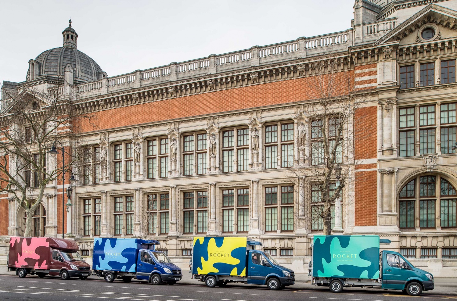
Here Design describe the pattern as “rocket leaf camouflage”. There is a playful irony here, as this is anything but hidden, standing out from the urban environment, yet is interesting in the context of a convoy of vehicles.
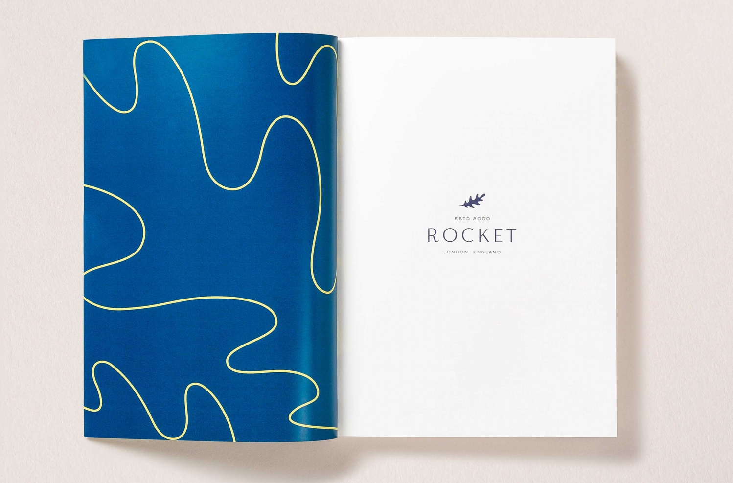
Outlines of rocket leaf, and an independent logotype, full page pattern and, in contrast, plenty of space, brings variation, and moves between the loud and confident, and the more conservative, with the leaf a form of continuity.
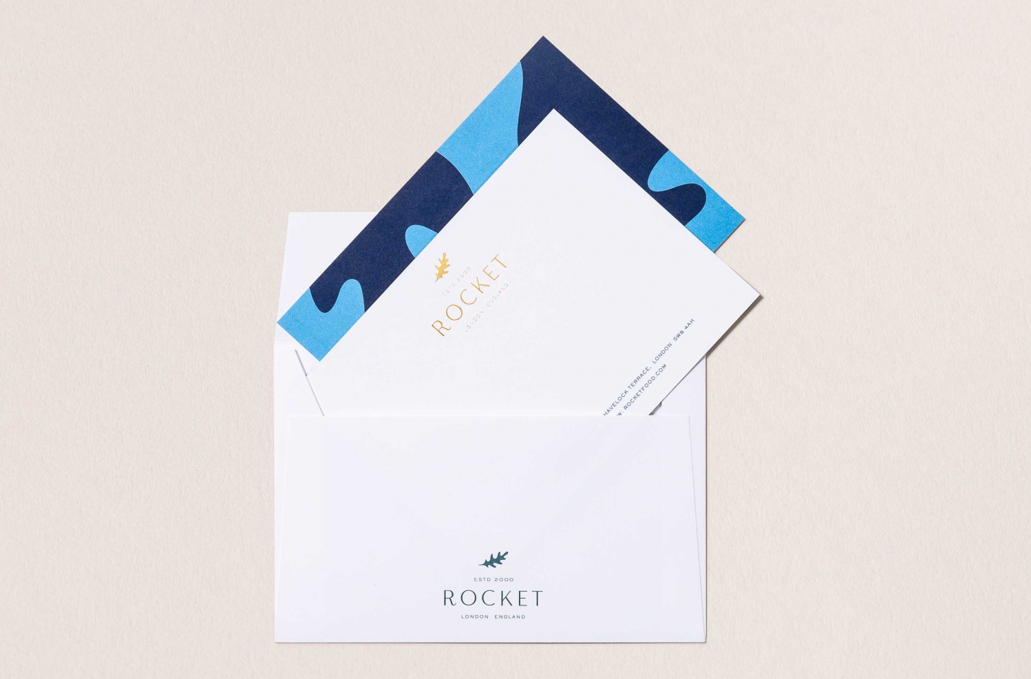
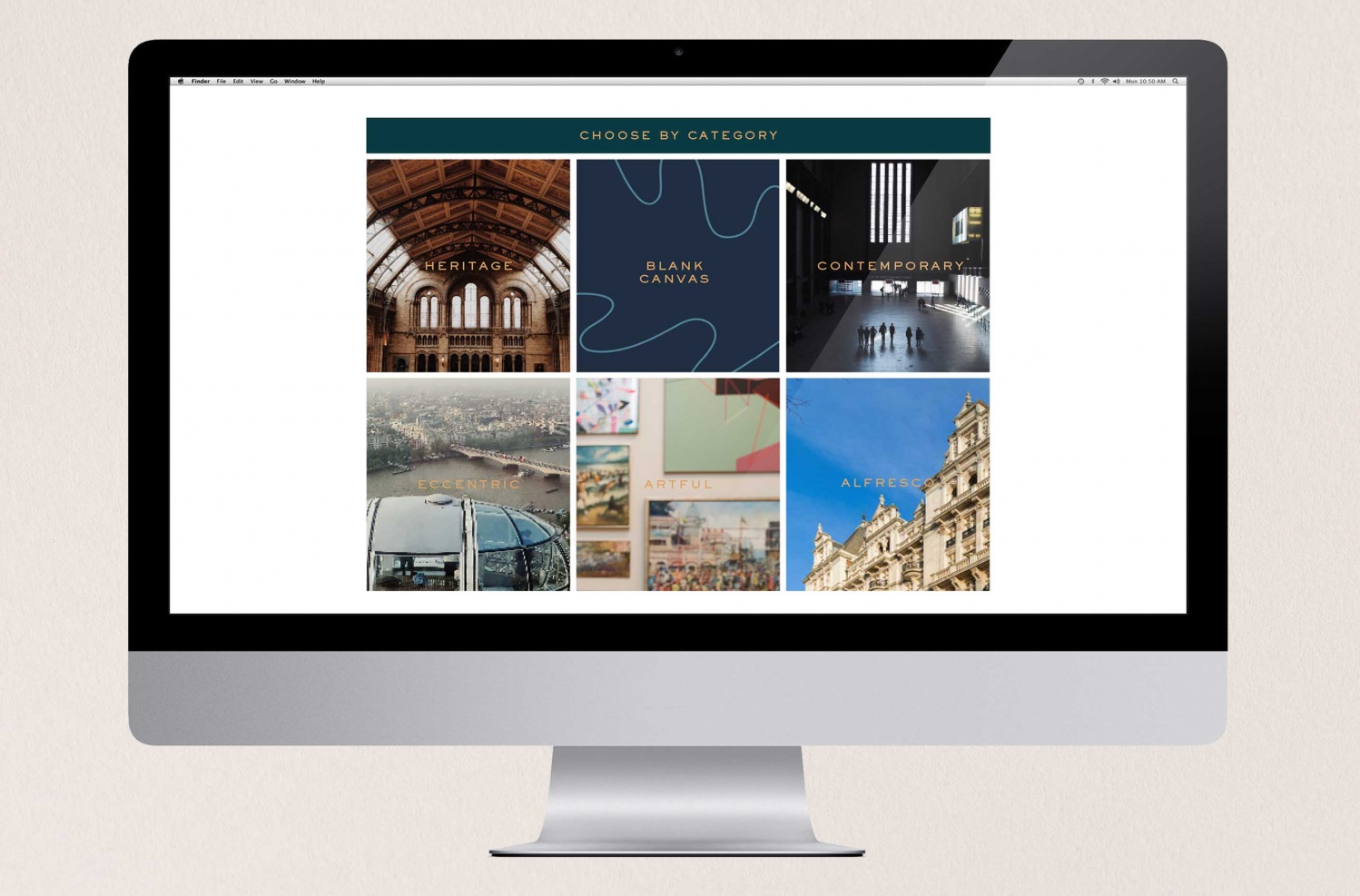
In print, the approach effectively leverages a contrast of colour, form and visual weight, immediate impact and detail up close. It is confident and modern in its expression, and touches upon something that suggest a growing legacy within the industry. Online, some of this is lost. Website feels a touch busy. There are a lot of sections on the front page. The progressive quality of pattern gives way to a structure and general site design that feels far more conservative but there is the occasional rollover that brings colour and rocket right back in. More work by Here Design on BP&O.
Design: Here Design. Opinion: Richard Baird.
