Chaos by Socio Design
Opinion by Richard Baird Posted 24 May 2017
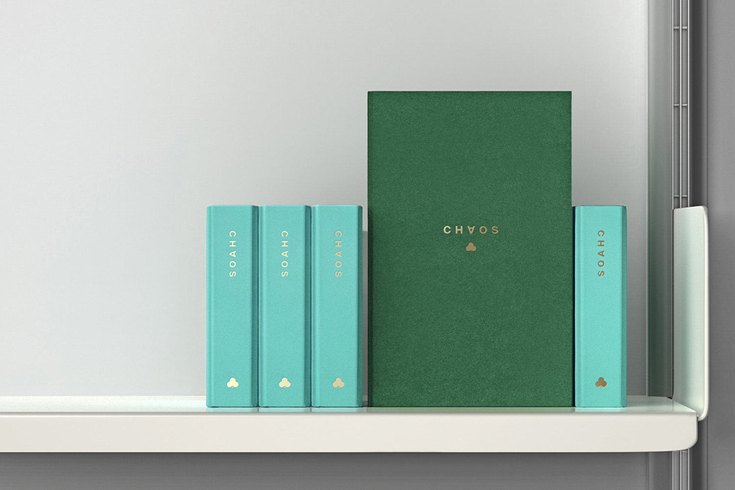
Inspired by fashion’s current fascination with customisation, technology and a “sense of light-hearted fun”, creative duo and stylists Charlotte Stockdale and Katie Lyall created Chaos, a new UK luxury lifestyle brand producing limited edition and personalised tech and travel accessories.
Through form and finish, materiality and graphic design, Chaos products, which include phone cases and charms, zips and luggage tags, express the brand’s take on practicality and stylistic desirability, the meeting of technology and fashion, utility and individuality. These are high quality, with a price tag to match (between £76-214), and a favourite with actors Cara Delevingne and Margot Robbie.
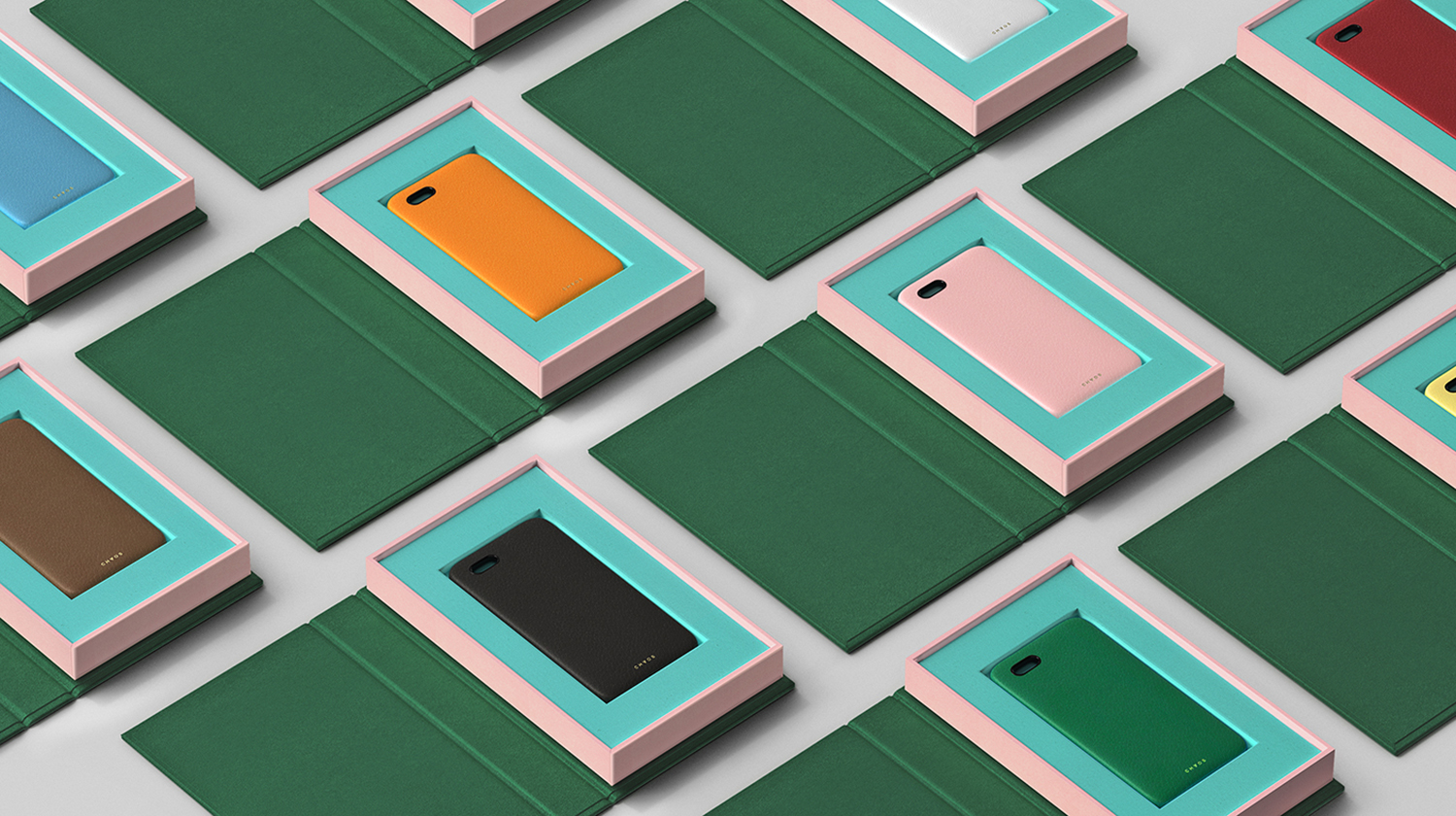
London-based studio Socio Design were commissioned by the team at Chaos to develop a packaging design for their collection of deerskin phone cases and luggage tags, gold-plated charms and zips. Using contrasting colour and high quality production detailing, and playing with a tension between the modern and traditional, the digital world and the analogue, these reflect the brand’s playful and “anarchic” approach, and commitment to challenging contemporary luxury standards.
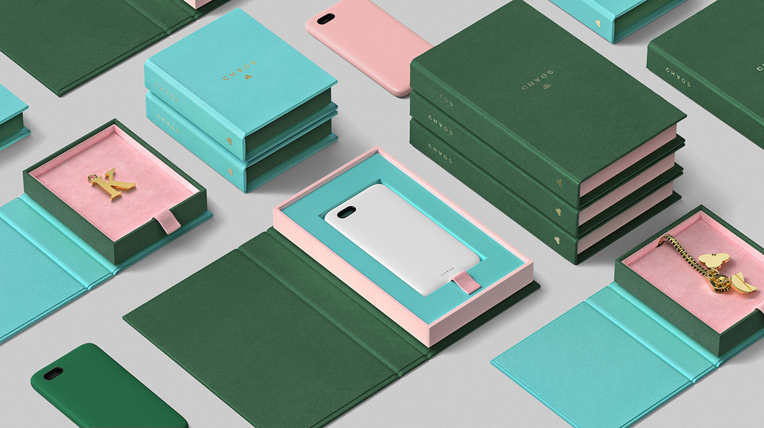
Although Socio Design were not involved in establishing brand identity, it is worth taking a quick look at logotype and retail space. The flipped A, and what looks like a club motif, are small but neat visual gestures. A simple mix of the unconventional and quirky, and either the lucky, playful or risky, depending on association, rendered with a modern restraint.
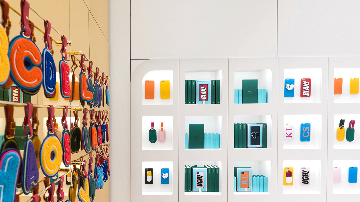
This flipped A also plays out within concession, designed by Studiofibre (photographed by Pantling Studio), as display cases, which lend a very small footprint a strong initial impact. Whether intentional or not, the concession’s blend of functional cabinet and typographical quirk feels rooted in brand, one of functionality and play.
This similarly extends to the palette, which effectively uses white to emphasis cheerful product colour, use of image and type, and pairs this with the impact, convention but universal luxury cues of matt and polished gold surfaces.
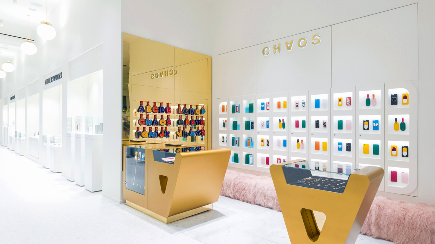
The small footprint of retail space also informed Socio Design’s packaging work, which satisfies three key objectives. To convey value. To take into account the limited display space, and to articulate something of the personality of brand and its products.
This is done quite literally through material weight, texture and finish, and more conceptually in the hiding of “valuables” in a structural design that takes the form of a book. In the way packaging can then be stacked and displayed. And in the choice of colour, colour pairings and a gold block foil print finish.
There is a continuity of concept across the range, yet a difference in size and colour that functions to divide. Books are presented on shelves with one open to display variation with a good use of space around products. A pleasant mix of surface texture and material thickness, a craft that keeps joins and folds neat, and a fabric tag that lifts but also doubles as bookmark, makes sure a simple concept is executed with a precision and quality.
The pairing of G.F Smith Colorplan papers work for the most part, appearing current, distinctive and tactile, however, there are a couple of product colours that do not quite sit as well as others within the context of packaging.
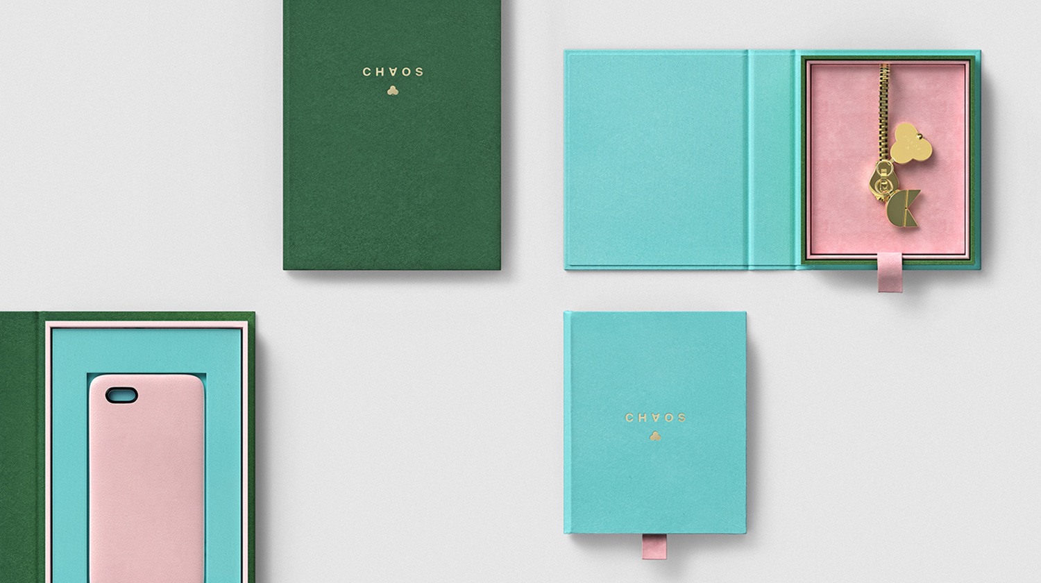
There is a stylistic and conceptual value in the unexpected meeting of the analogue (books) and the digital (phone cases and online customisation) that speaks to the anarchic positioning of brand. It makes a connection between the material craft of books and the tactile qualities of product, and also feels fitting as some of the products have a strong, if a little awkward, letter-centric component to them.
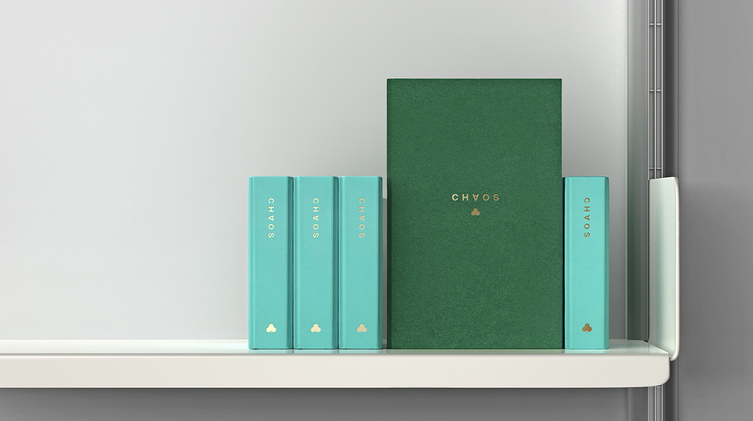
These are expensive items, yet packaging avoids leaning heavily into conventional luxury tropes. Instead favouring a simple and discernible concept, delivered with a clear material quality, with perhaps a residual value in secondary use.
Although the book idea is not unheard-of, its value, and the reason for its feature here, is in the meeting of display constraints and display impact, in concept (hidden valuables), the way it builds out brand identity, works as an expression of brand style and quality. More work by Socio Design on BP&O.
Design: Socio Design. Opinion: Richard Baird. Papers: Colorplan Turquoise, Forest Green & Candy Pink.
