The Broadview Hotel by Blok
Opinion by Richard Baird Posted 29 August 2017
The Broadview Hotel is located within one of Toronto’s most recognisable architectural landmarks. This was built in 1891 by a wealthy businessman who recognised the strategic importance of the East End as the city was expanding. It has been home to a business centre, acted as a political and social hub, and used as a hotel, boarding room and more recently, a strip club.
The building, over the last two years, has undergone extensive restoration and renovation, and now features a distinctive glass structure and new floor on the roof. This was done with great consideration for the original architectural details. Interior design, created by DesignAgency is inspired by the local community and is infused with a contemporary yet old-world grace. The hotel is made up of public spaces and 58 private bedrooms. These are peppered with what is described as a witty eclecticism that pays homage to the building’s past, with certain rooms featuring the original brass poles from the strip club. These homages are set alongside modern finishes and amenities.
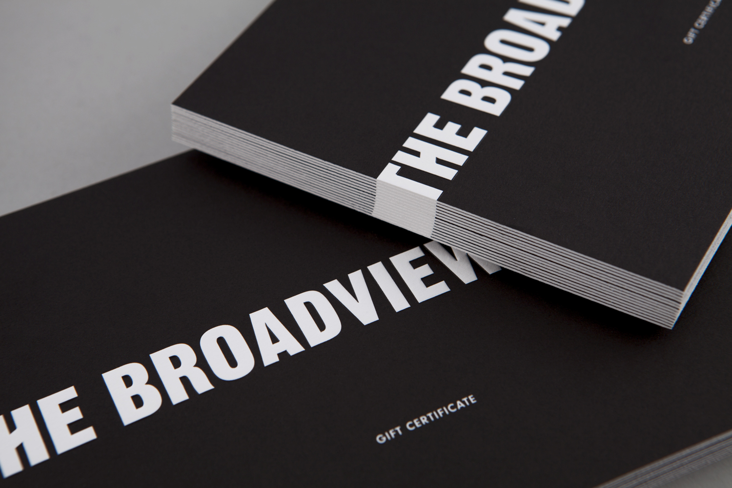
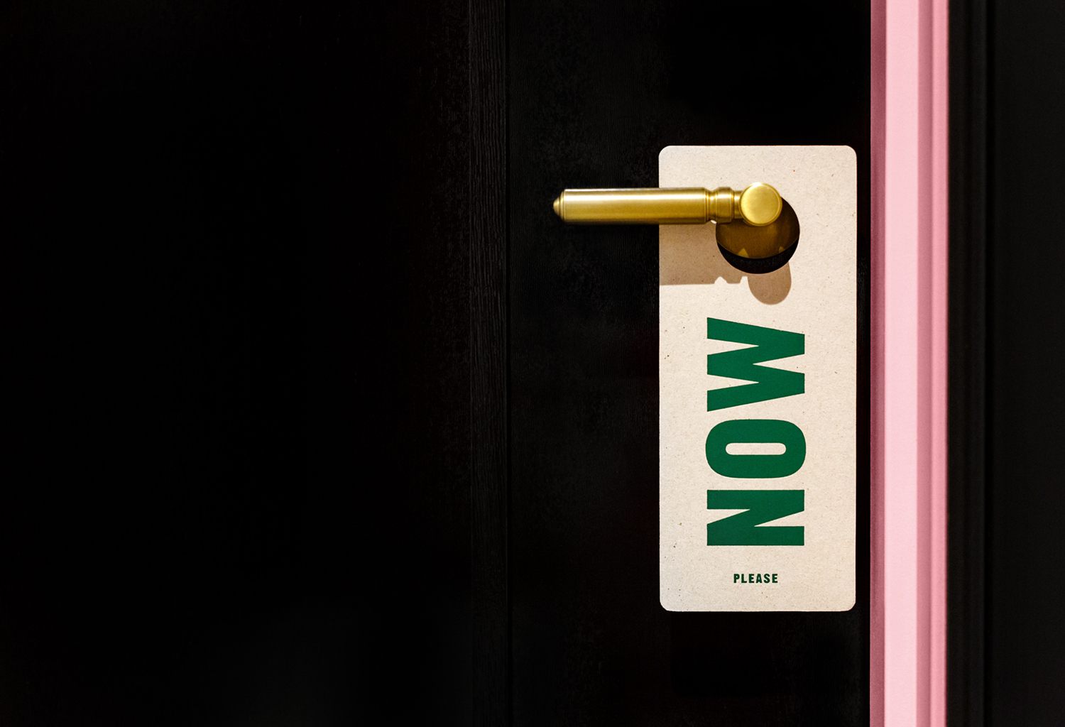
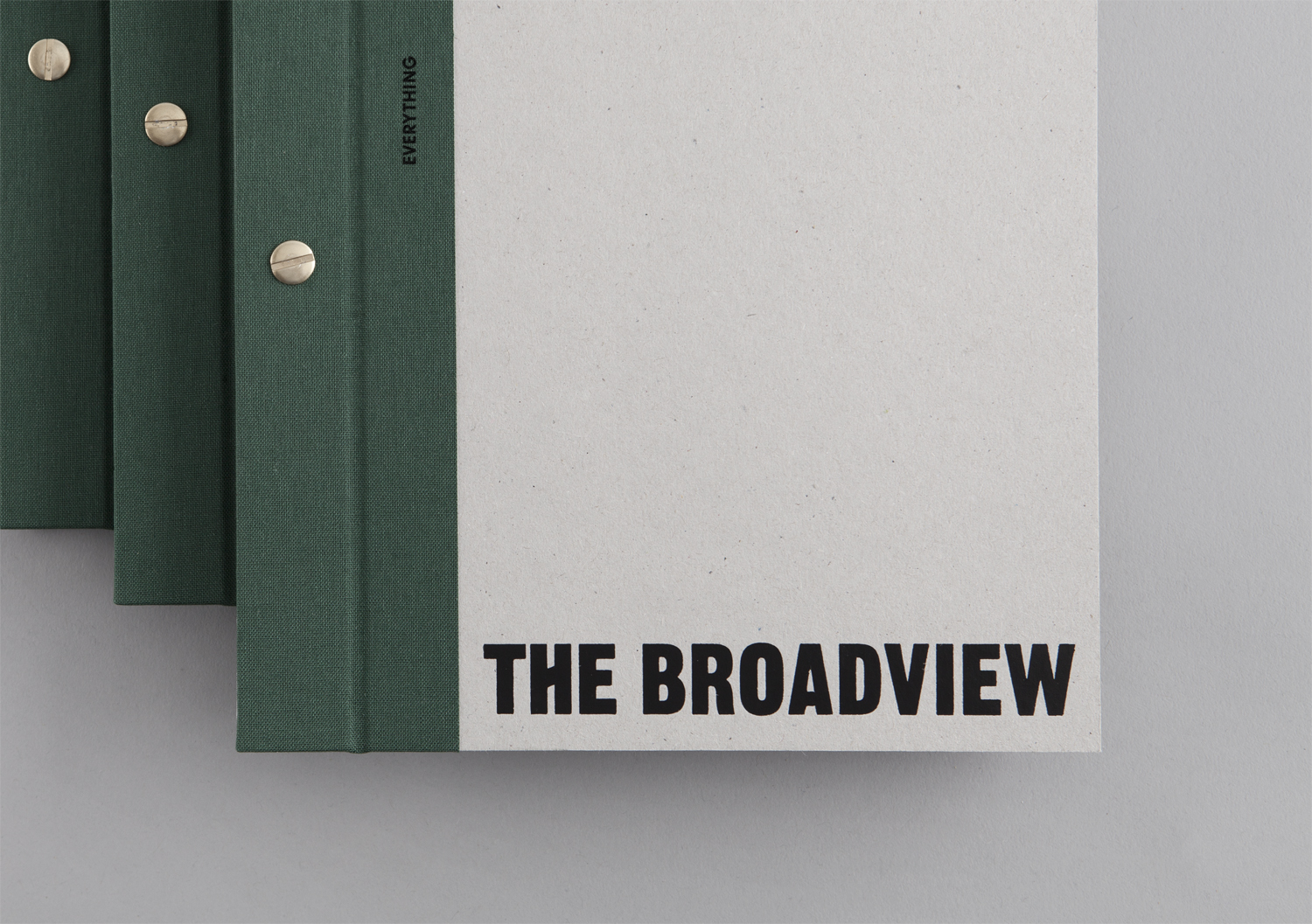
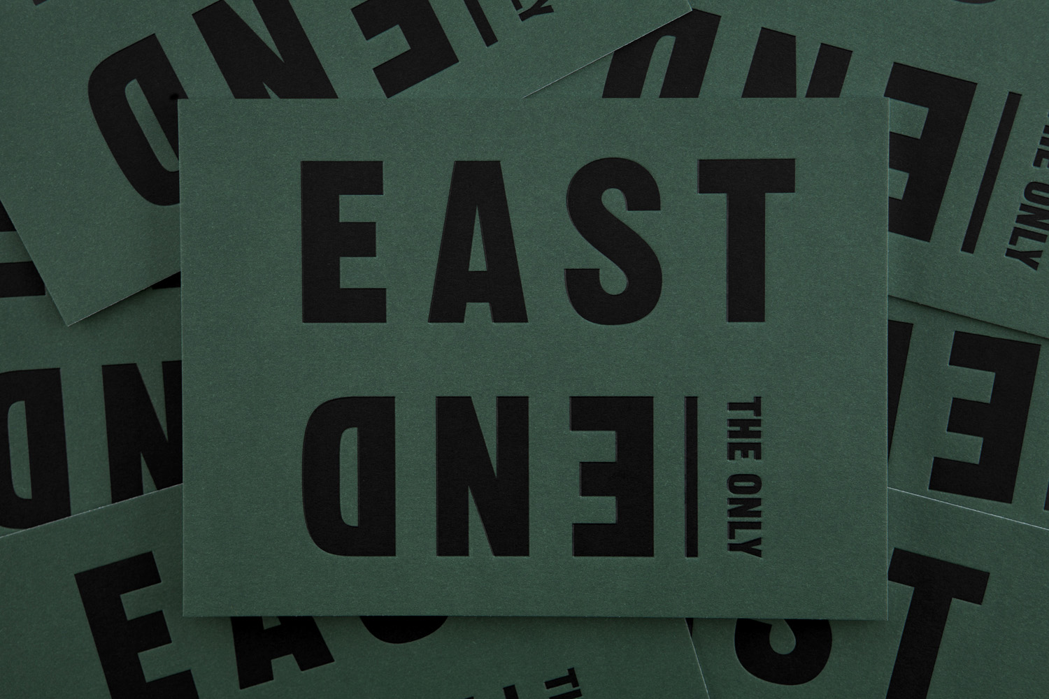
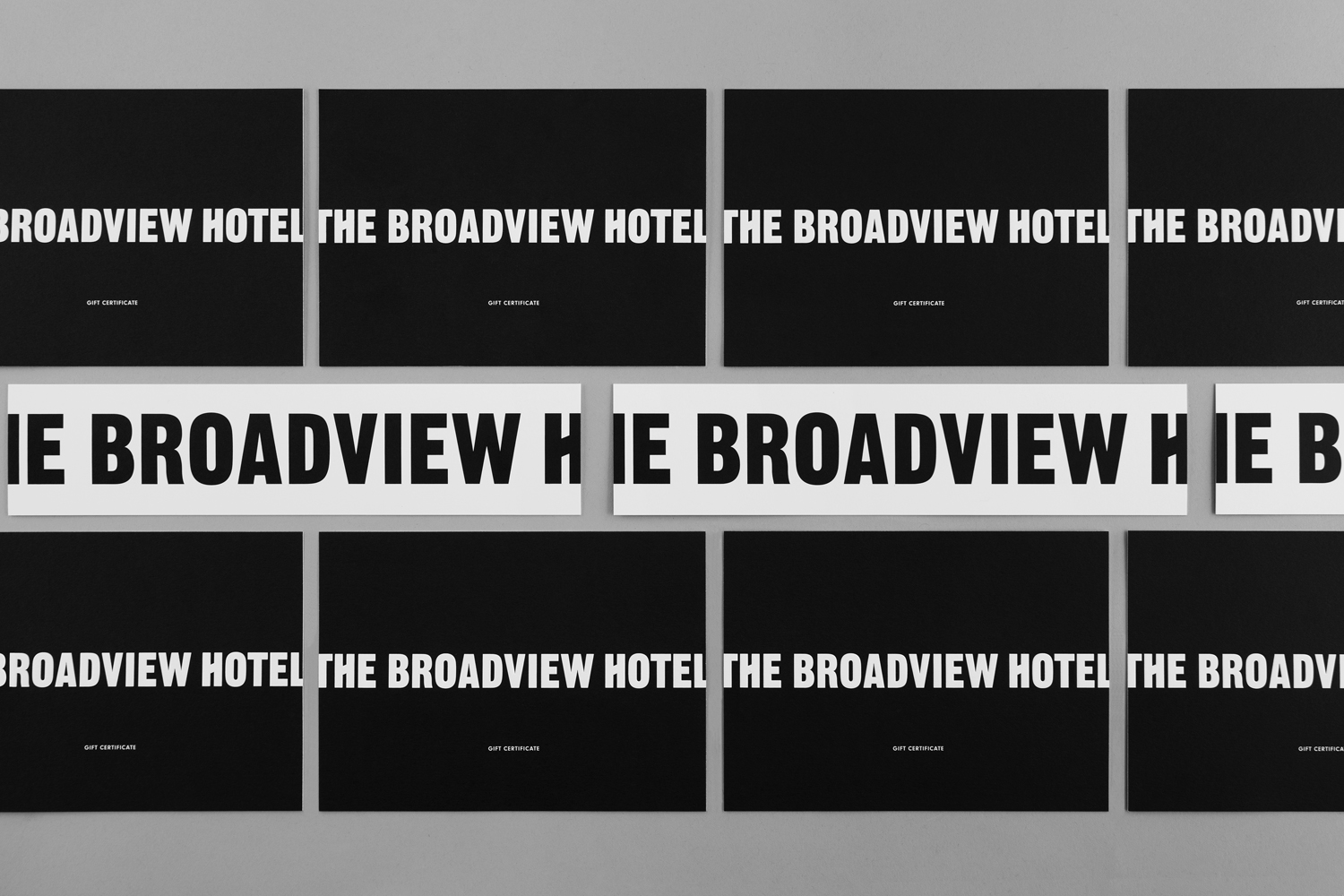
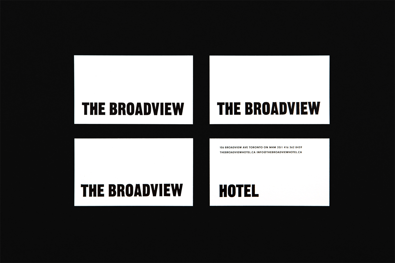
Canadian graphic design studio Blok worked with the hotel to develop a visual identity that would embrace and express the building’s contemporary new voice, possess a similar wit and attitude, and finally acknowledge and celebrate the hotel’s East End roots. This is achieved in the contrast and collision of image and type, emphasised by a simple colour palette, and in the variety of secondary typefaces. This run across and links a plethora of printed assets. These included business cards, menus and coasters as documents here, but also wayfinding and signage.
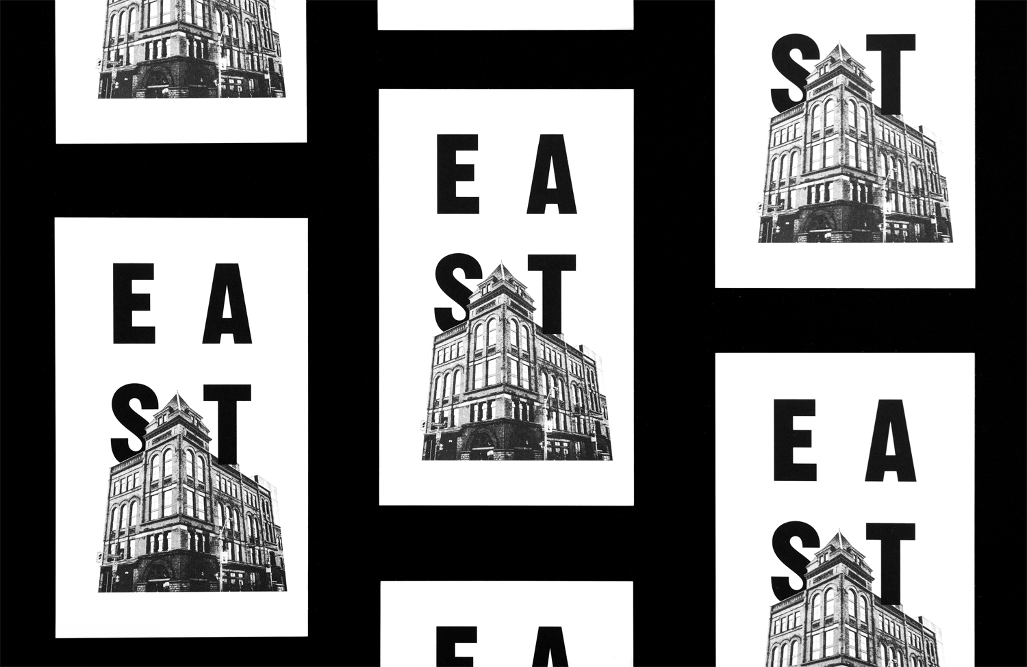
There is an interesting interplay here between historical building and modern renovation, the formerly working class East End and its current gentrification, and past uses that include the political and the more salacious. The dichotomy inherent to the building’s story is expressed by its new visual identity, literally in the intersection of type and image, in the equality given to and interchangeable nature of hotel name, East End location and the year of the hotel’s completion, and more subtly in materiality and in the variety of typefaces.
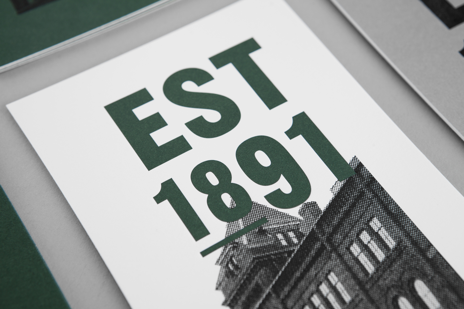
The hotel has an interesting history and its Richardsonian Romanesque-style exterior lives up to this in its grandeur and prominence amongst a changing and increasingly modernised neighbourhood. To place its image at the heart of visual identity makes a lot of sense, as it is memorable and distinctive, likely elevated by experiencing it first-hand. Its implementation as a grainy halftone photograph, as if scanned from a newspaper, emphasises its historical importance and continued legacy.
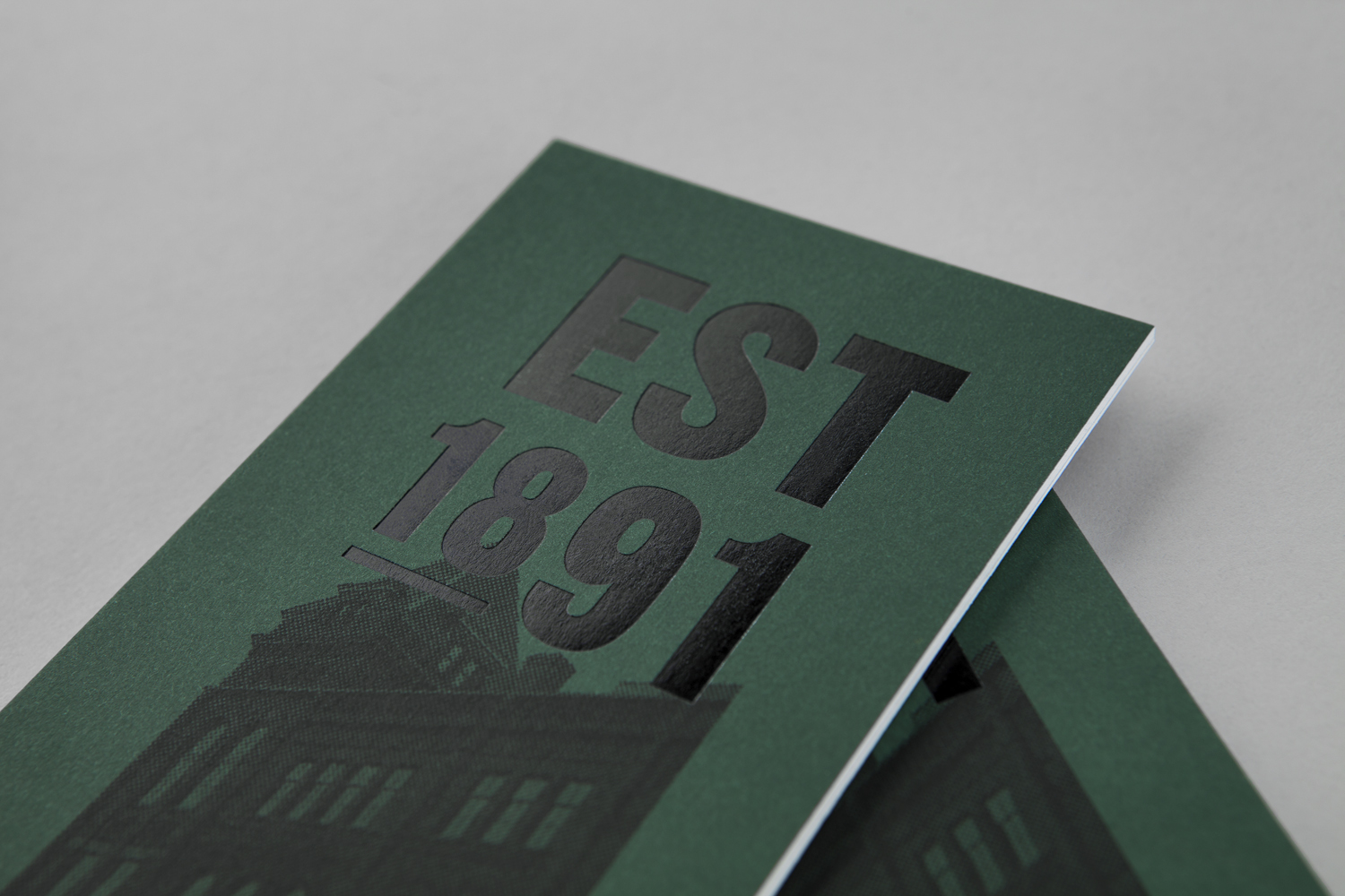
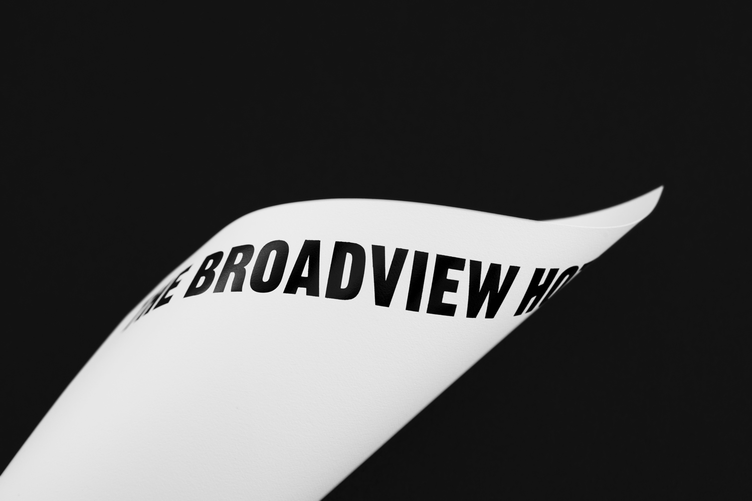
Visual identity clearly plays with legacy in the literal and abrupt intersection of modern type and historical image. The character of typeface is largely in its use and not necessarily in its forms, which are reductive, yet share something of the longevity and stature of structure in its weighty and condensed forms, and in its proportionality in print. By placing type over and behind image Blok draw out a variety that also plays with a sense of scale. The gloss of a block foil print finish and the matt surface of uncoated boards function well to define the two beyond just shape and detail.

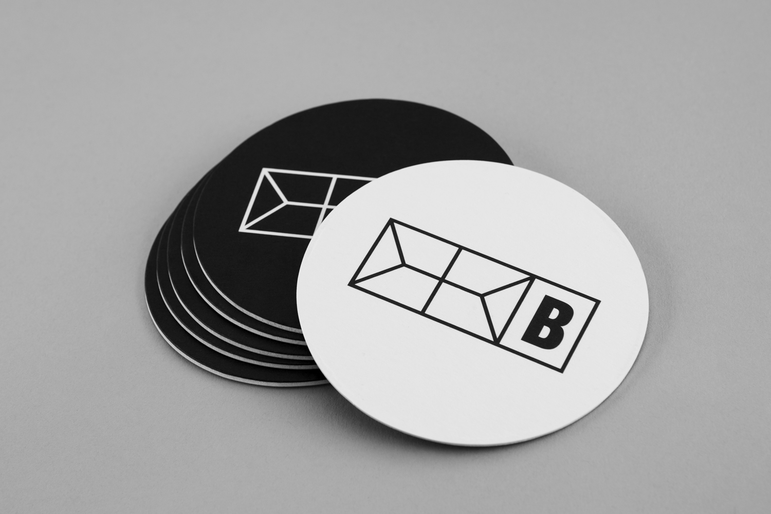
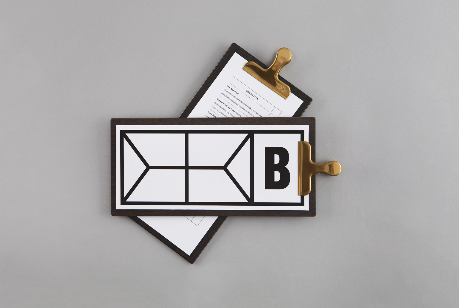
Outside of the prominent intersection of type and image there are few smaller details that draw on the modern renovation of a historical building. The geometric motif (above) appears to take its cues from the steel frame and glass structure of the hotel’s new floor, a significant departure from the Richardsonian Romanesque style, and a new and memorable feature of the hotel’s exterior.
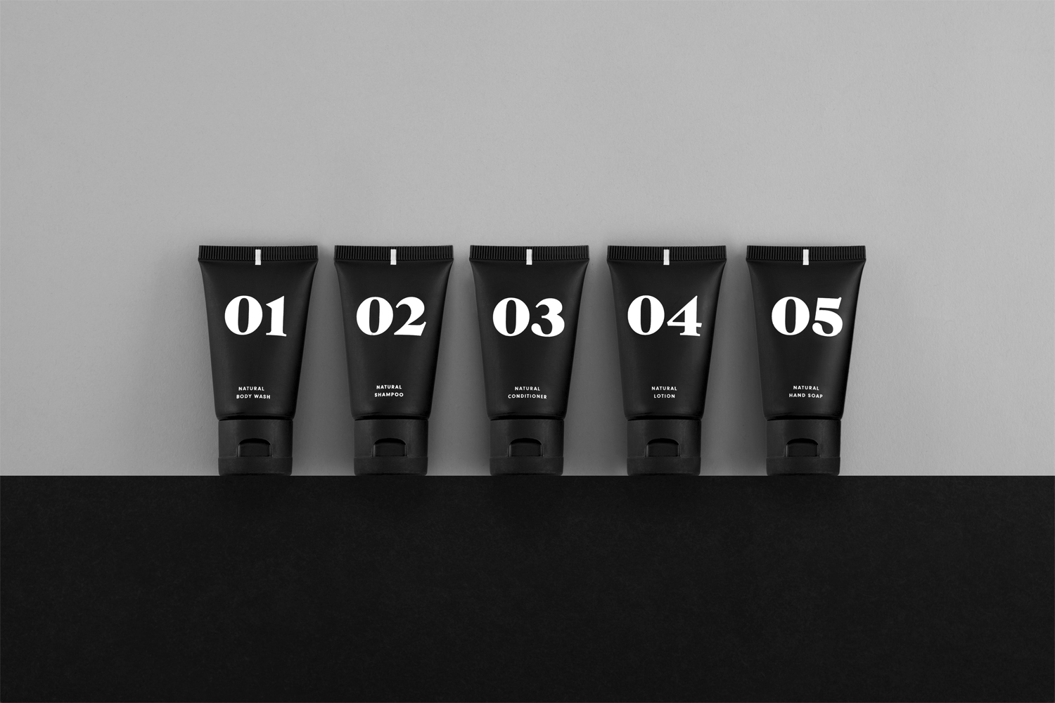
A variety of typefaces, dotted across branded products, coasters, stickers and menus share something in common with the “witty eclecticism” of individual rooms. Without the context of the hotel, and the experience of its interior design, there is the potential for these to appear random and ungoverned, but colour, arrangement and context helps to sustain a visual continuity where concept might be harder to grasp.
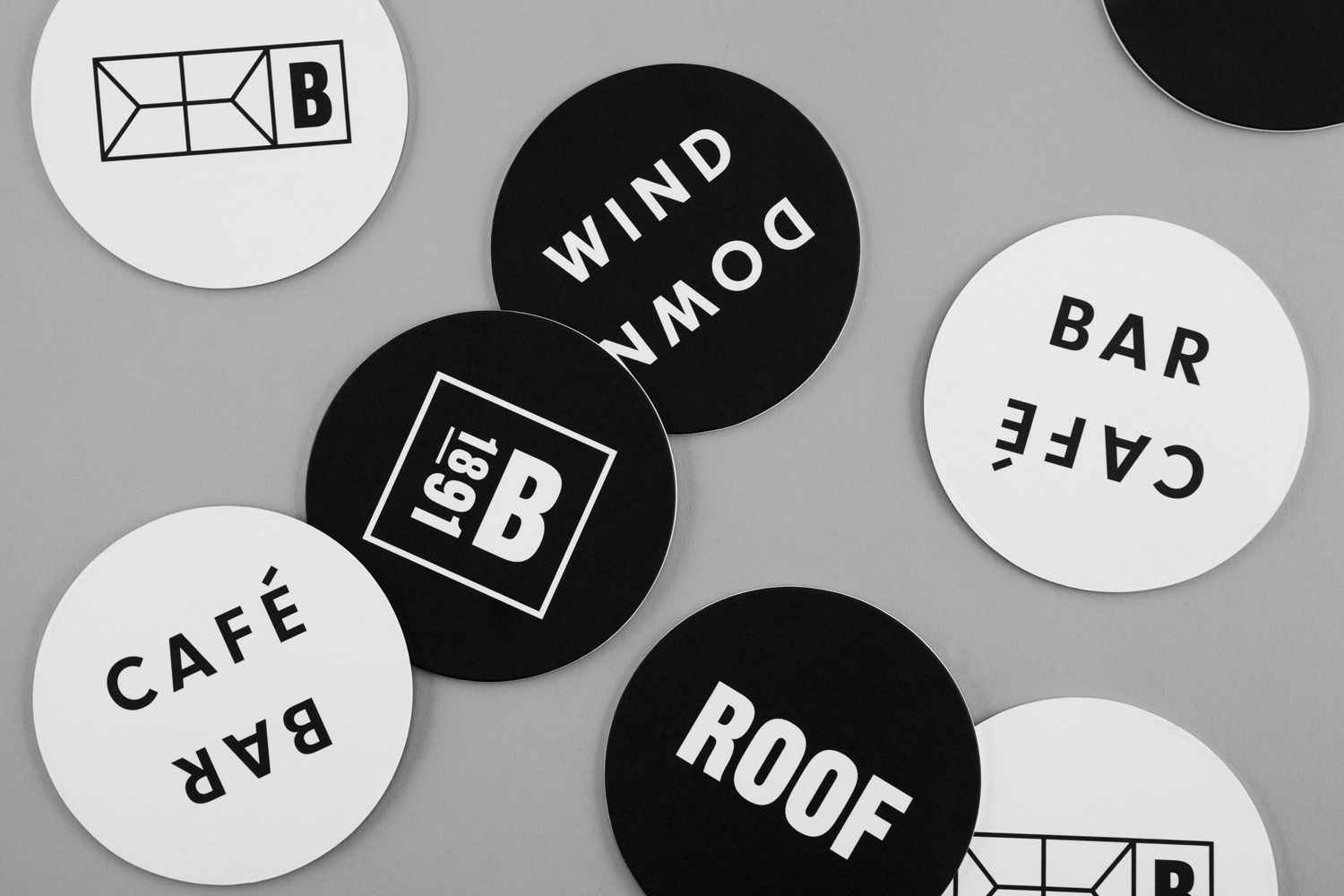
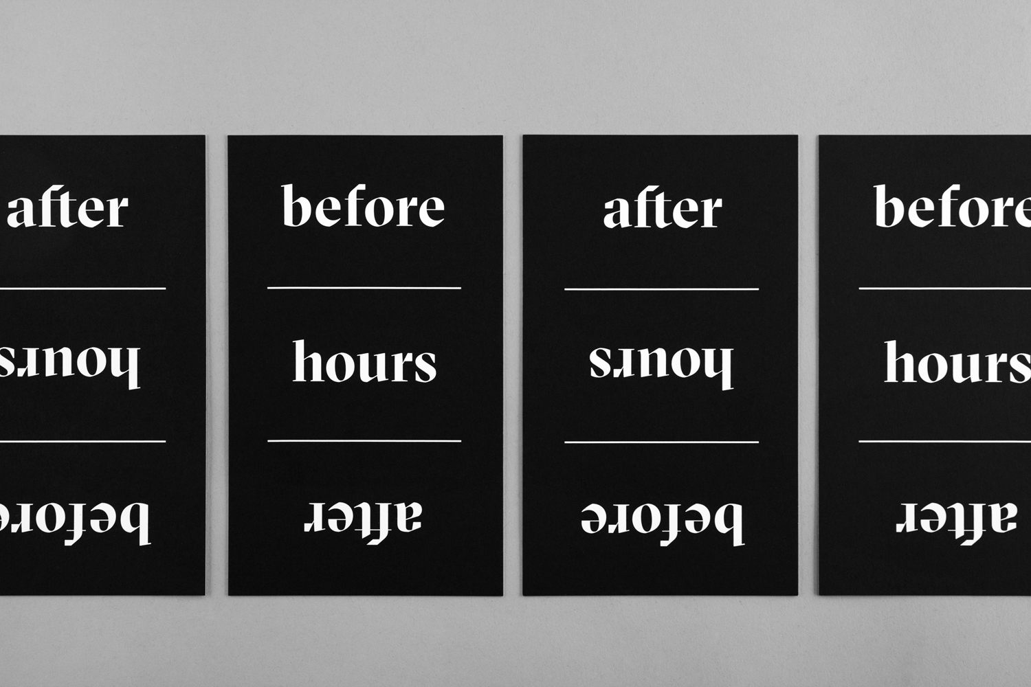
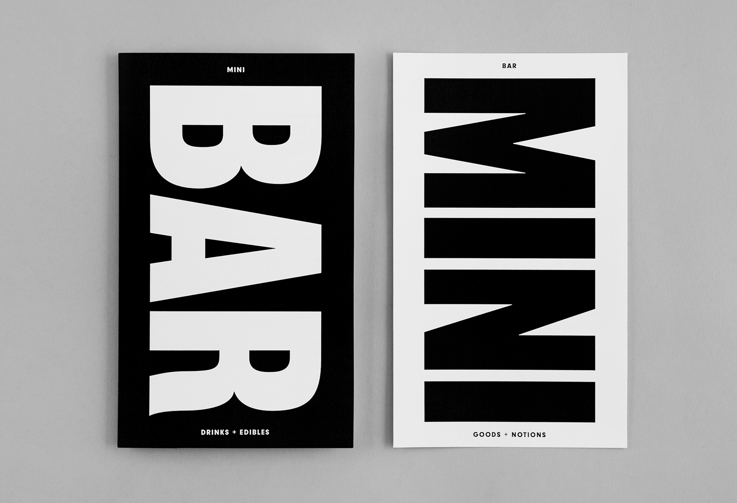
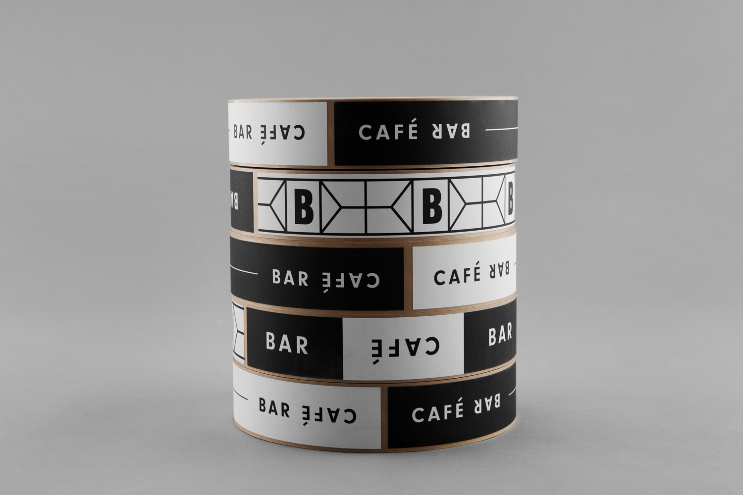
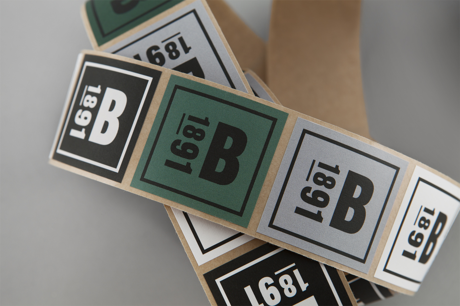
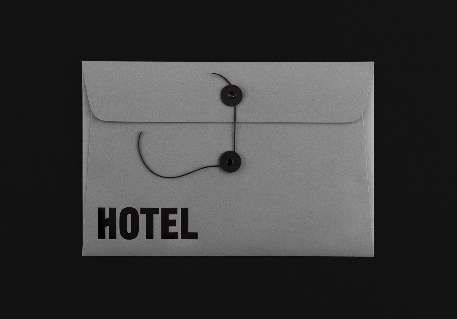
Colour similarly explores past and present in its mix of black and white, pine green and a concrete grey, and in the use of dyed uncoated boards, embossing, and black block foil print finish.
Although the work is built from just a few key components, it has an impact and immediacy both conceptually and stylistically. The variety of typefaces, although difficult to get a sense of how these may resonate absent other contexts such as signage, offers a layer of thoughtful and well-intentioned detail that ties in with interior concept. More work by Blok on BP&O.
Design: Blok. Opinion: Richard Baird. Fonts: Gothic 13, Neuzeit Grotesk T OT, GT Sectra Display & Grouch.
