Real Review by OK-RM
Opinion by Richard Baird Posted 25 September 2017
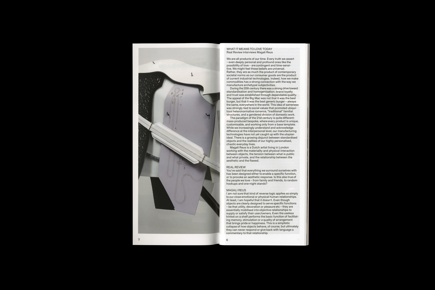
Real Review is an award-winning quarterly magazine that pursues what it means to live today through analysis, evaluation and enquiry. It is a collaboration between London-based design studio OK-RM and editor Jack Self, the founder of architectural practice and cultural institute Real. Real Review offers wide ranging comment on a variety of topics, is presented in a compact format and mixes dense text, image and moments of space with the intention of being an efficient, economical and readable format.
Real Review is curious in its breadth, in the subjects it tackles and the range of opinion, yet there is a continuity in the confidence and authority of contributors, and in the approach to its material structure and graphic design.
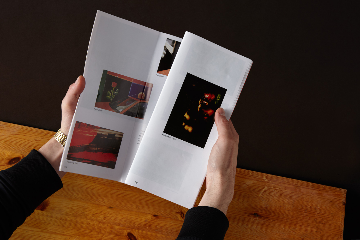
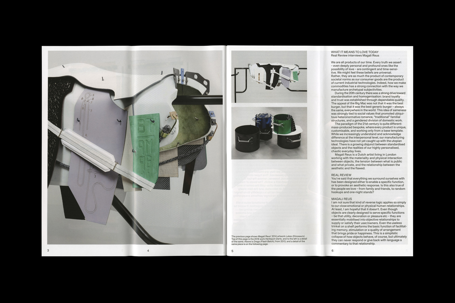
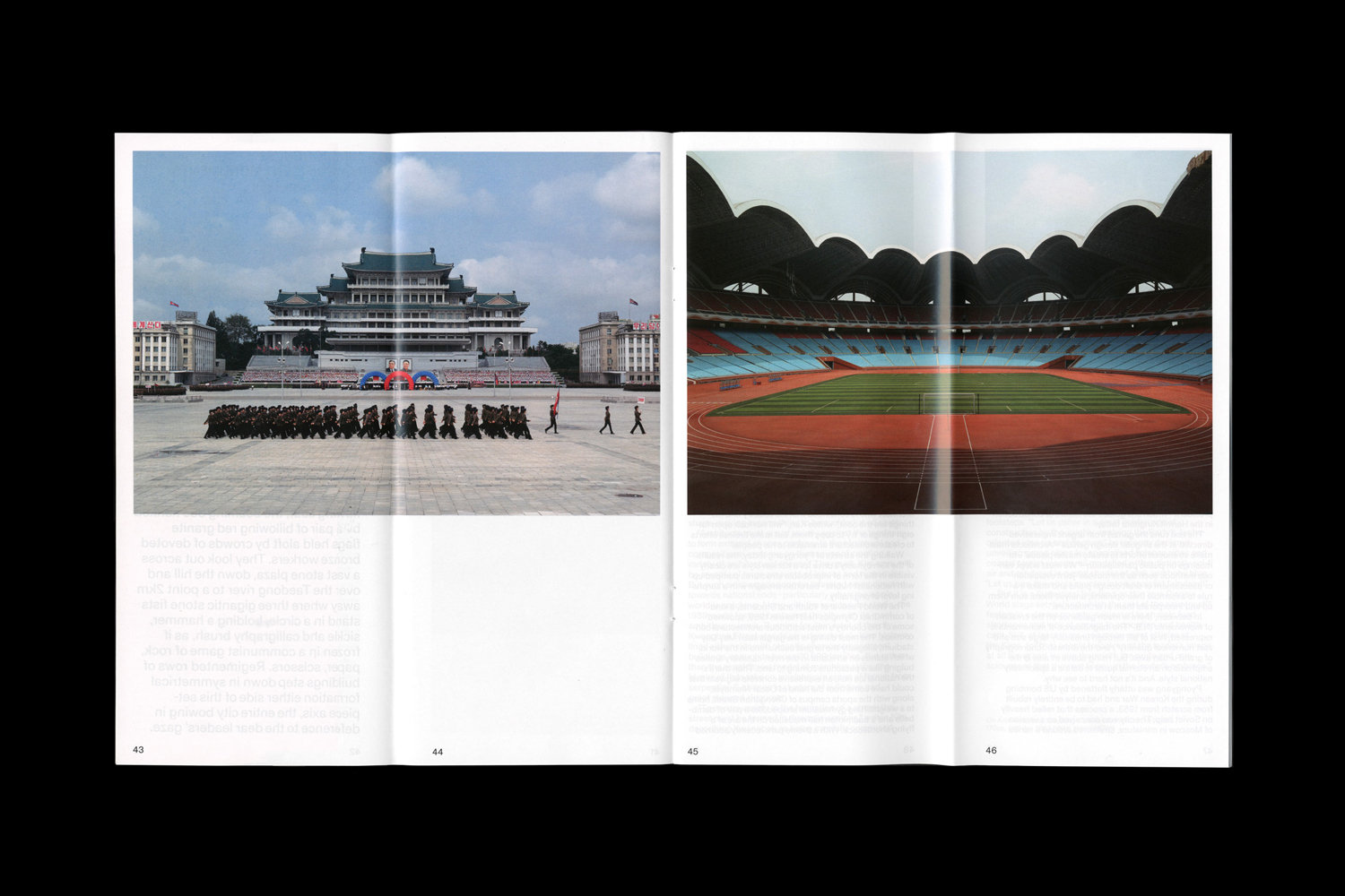
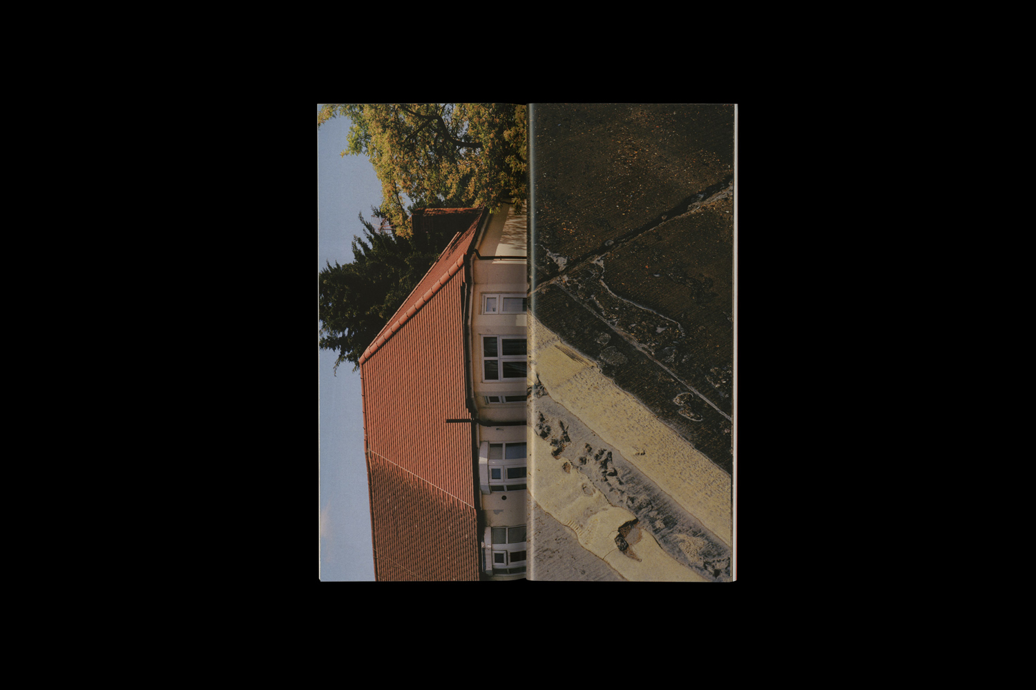
Real Review’s format takes its cues from the observation that magazines frequently end up folded in half by the reader, and responds to the architect working across quadruple page rather than double page spreads.
As Real Review is an effort to analyse the present by reaching deep into the past, then making propositions about the future, the use of creasing typically associated with newspapers feels appropriate. It draws a newness and innovative quality from the commonplace. It recognises there is beauty in techniques that endure and manage to find fresh contexts.
This gives Real Review a useful compactness ideal for travelling, and an interesting material quality in its folds and low gloss uncoated paper that is robust and utilitarian. This holds a varied but systematic approach to layout.
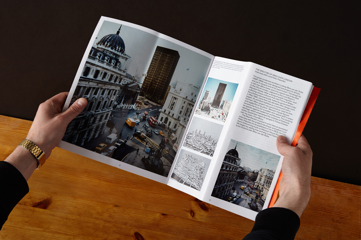
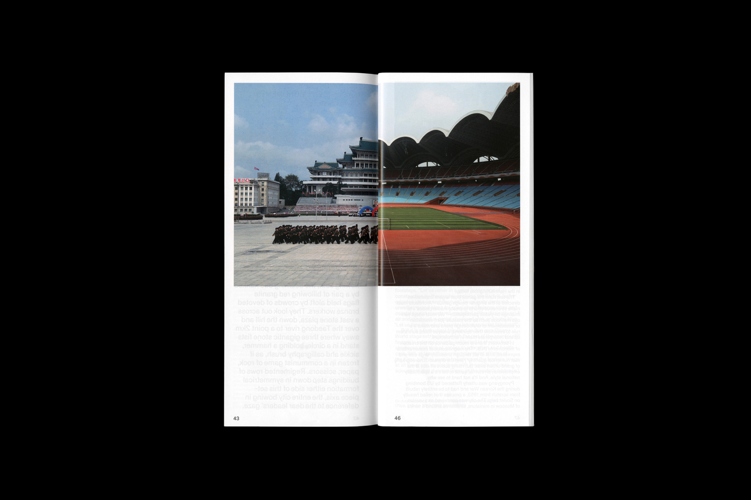
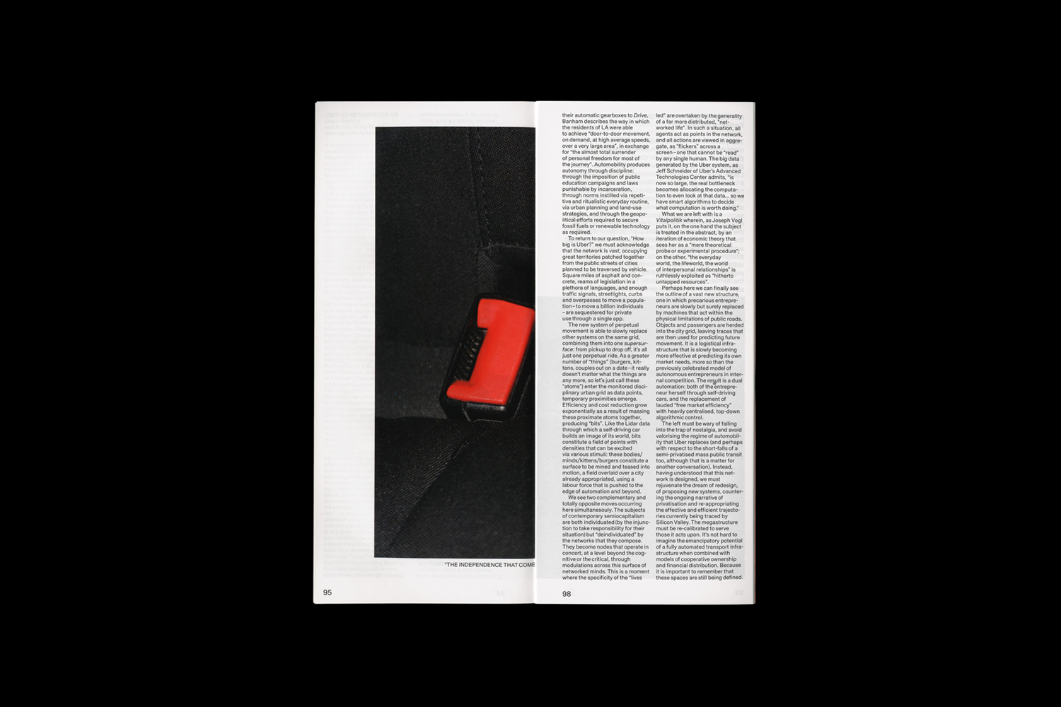
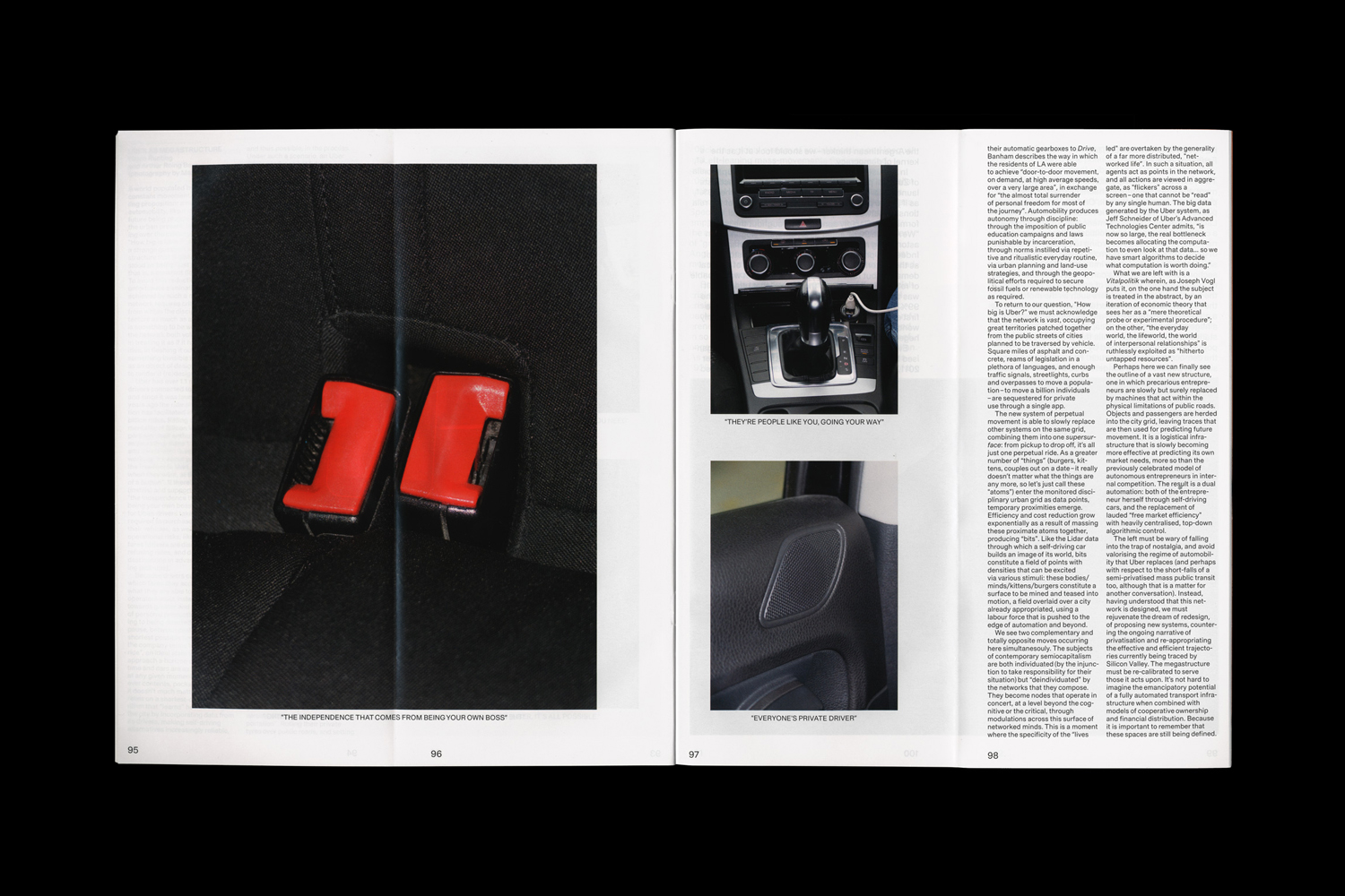
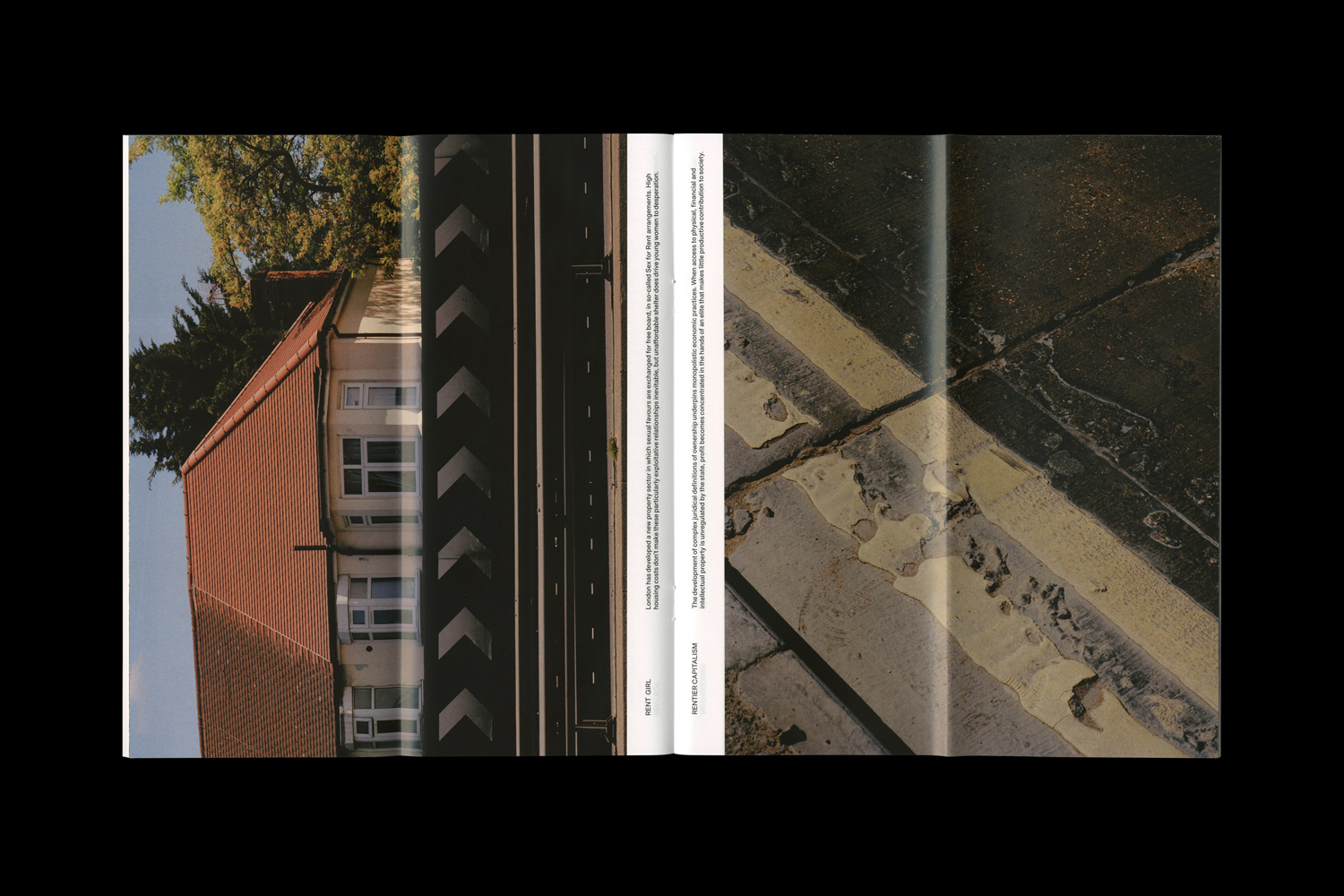
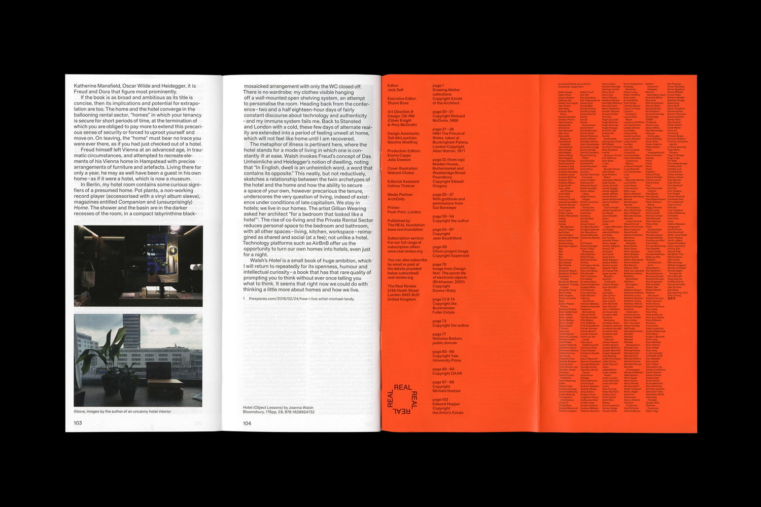
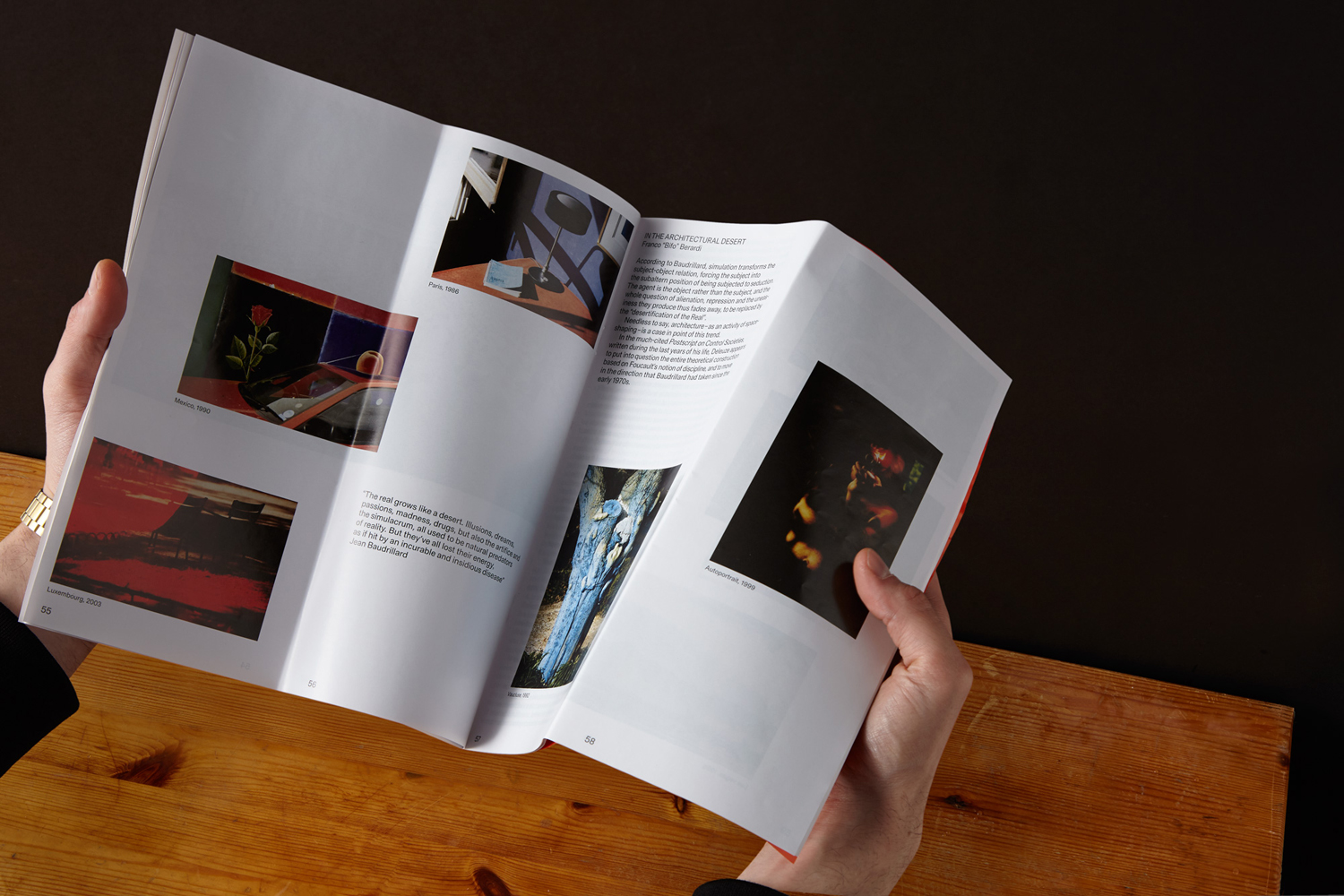
There are underlying guides, yet each article has a distinctiveness in its layout. Image; in size, proportion, orientation and relationship to other images, space and blocks of text feel responsive to the thoughts and ideas being expressed. Image augments text, both in its literal content but also in its arrangement on or across pages.
Highlights include moments of commonality between the formatting of text and placement of image. How, through folds, images intersect or blank pages intersect portions of image to play with perception, forming unexpected relationships or drawing the eye to small details within a larger picture.
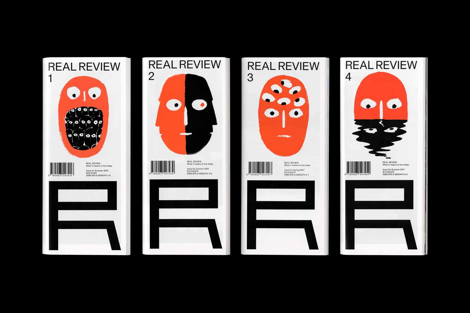
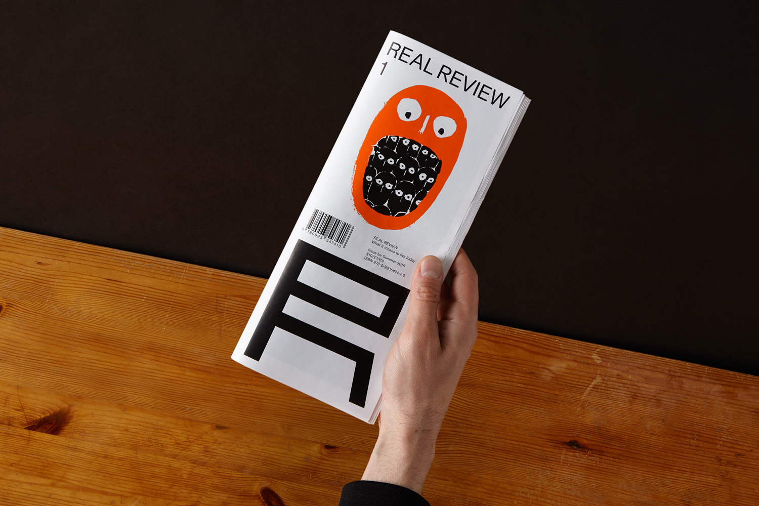
Real Review’s cover is immediate and memorable. It confidently juxtaposes loose illustration by Nishant Choksi with structural type, drawn from an alphabet created by British typographer and graphic designer Edward Wright who was involved, mid 20th century, in architectural lettering and signage. This is intelligent in its mix of the very human–the mind (head), a sense of insight (eyes) and creative exploration (style)–and our relationship with the built environment. This is effectively augmented by the choice of a paper, format and a bright orange spot colour and black ink. There is a pleasant continuity, variety and niche personality to the covers that feels well-suited to content and audience.
Design: OK-RM. Illustration: Nishant Choksi. Opinion: Richard Baird. Paper: Thinstar 60gsm. Print: Push Print.
