Sakki by Bond
Opinion by Richard Baird Posted 26 September 2017

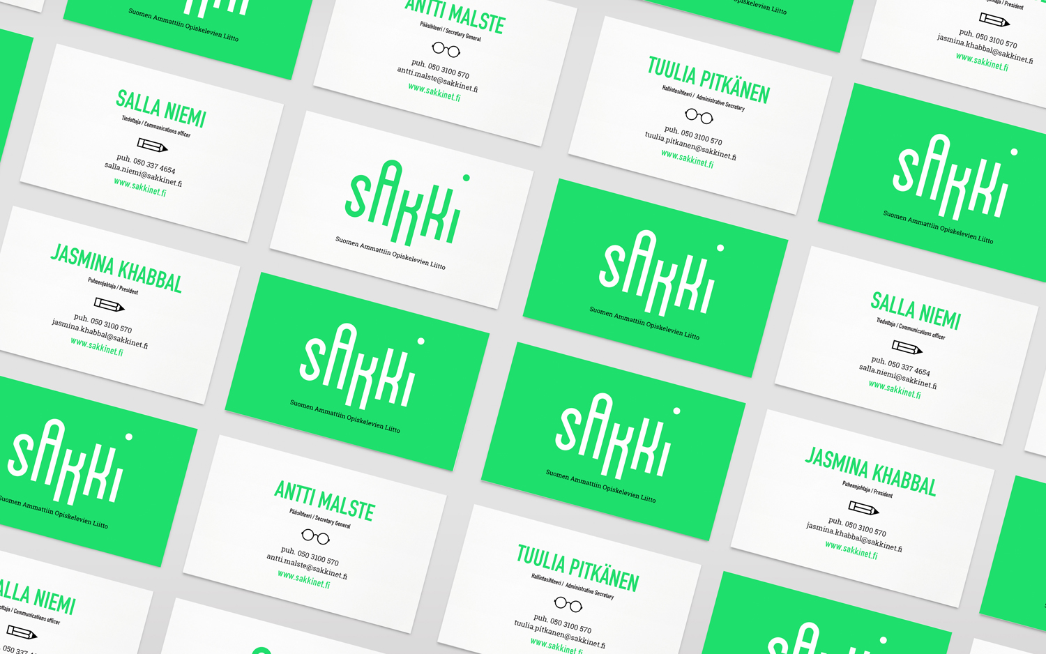
Sakki is Finland’s national union of vocational students. It is made up of 15-20 year olds from a variety of nations, and offers support, tackles student issues, and engages in activism. Scandinavian graphic design studio Bond worked with the union to design and develop a mobile-first experience, and a visual identity made up of tilt-responsive iconography, a bright, simple and modern colour palette and quirky logotype.
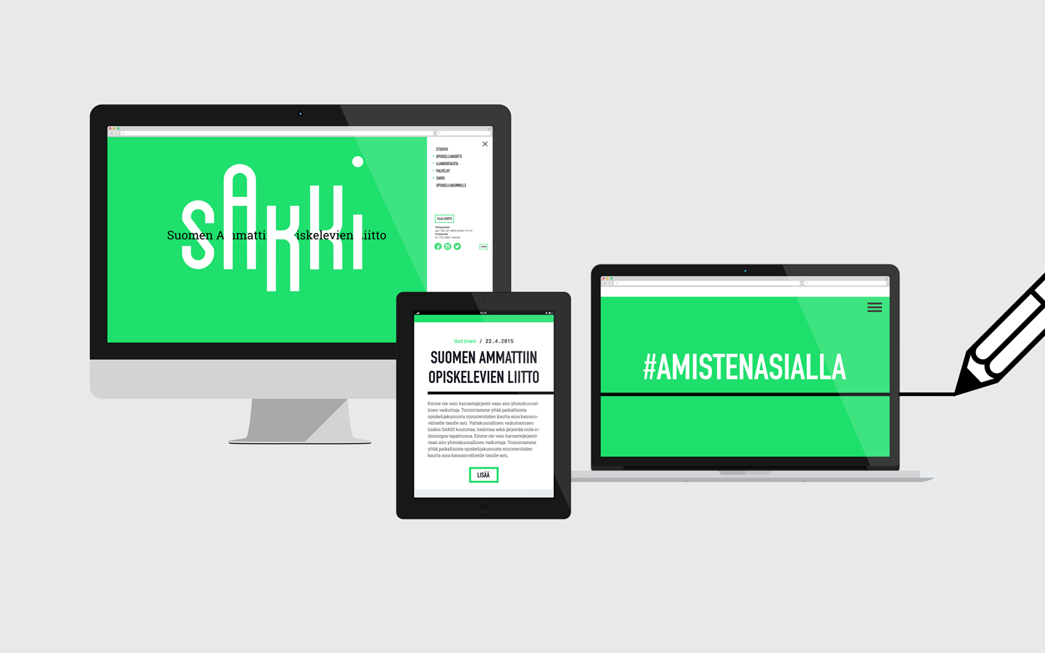
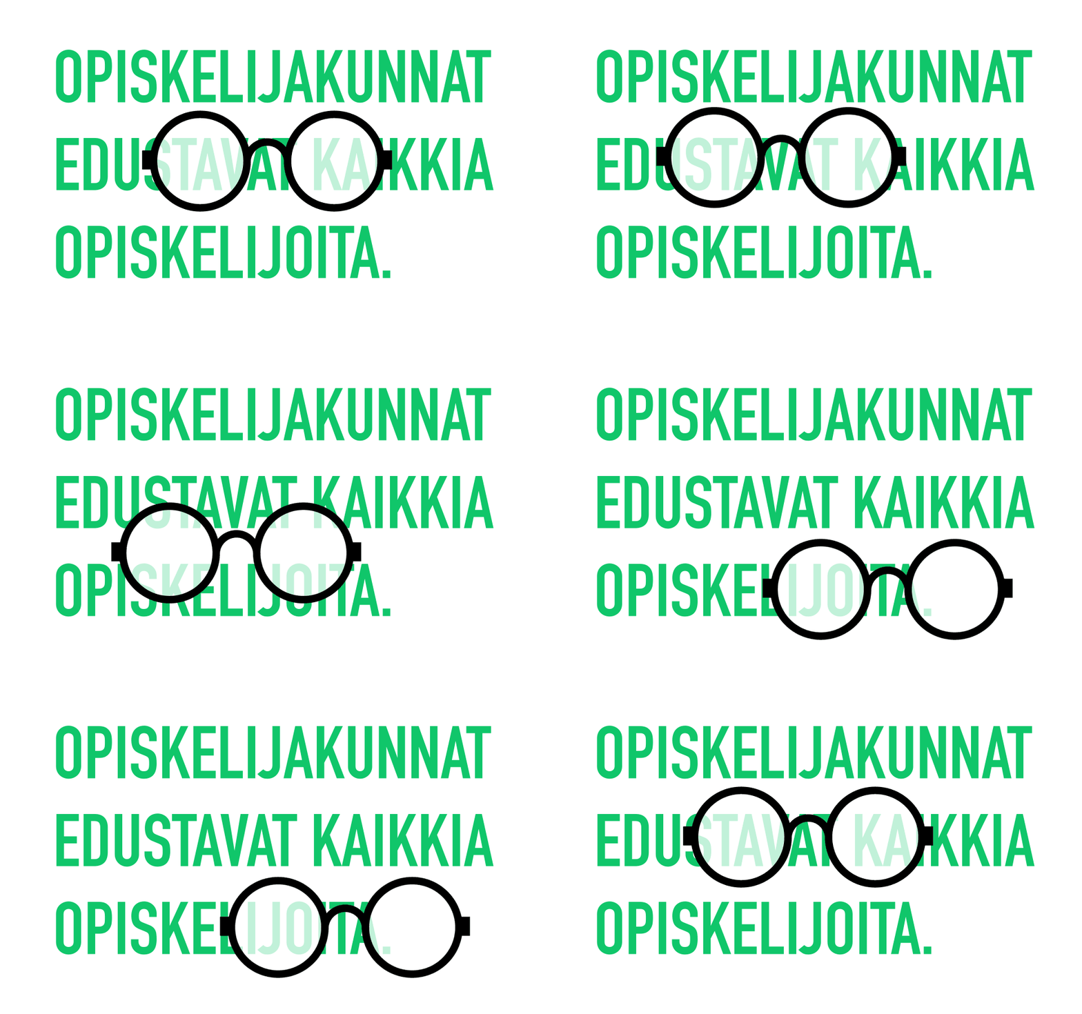
With a desire to engage with a young demographic, time was given to designing a mobile-first experience and allowing this priority to inform visual identity. The can be seen initially in the condensed forms and proportions on-screen of a quirky logotype and in the bright RGB background, but also in a series of icons that respond to the tilt of a mobile phone. This offers something in the way of a small playful and unexpected detail, that paired with colour and type, is cheerful and modern.
Alongside visual identity and site redesign, content was revised and its structure clarified to make the website more user-friendly and help Sakki to implement several language versions of their info-page to engage with international members.
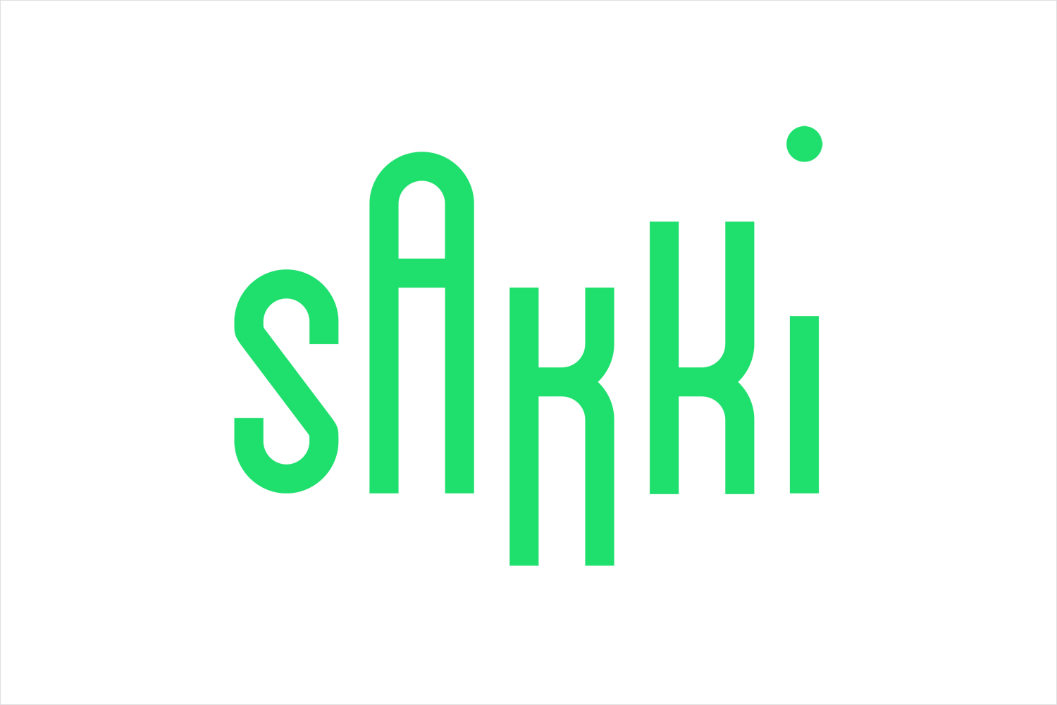
Logotype is a curious mix of uncomfortable geometry and the disruptive qualities of uneven height, but a commonality of shape, line weight and structure. It is, conventionally speaking, awkward, yet has character. It slots neatly within the context of a tall mobile screen and has a dynamic nature in a static form inline with the motion of iconography. It is difficult to really like or dislike, but easier to recognise that it is eye-catching, distinctive and the product of a context-driven idea.
Secondary typeface DIN Condensed establishes a continuity with logotype, although with a more formal but equally loud nature, while a slab serif delivers contrast and content differentiation.

Iconography is current in its shapes and line weight, however, its responsive qualities on mobile elevate these, infusing them with something more distinctive, playful and communicative. These share the mono-linearity of type and bring to life the various sections of the website with a bunch of different icons and motions to discover. More work by Bond on BP&O.
Design: Bond. Opinion: Richard Baird. Fonts Used: Roboto Slab & DIN.
