Helio by Bedow
Opinion by Richard Baird Posted 5 October 2017

Helio is a flexible co-working space and meeting venue with 8 different locations in and around the Swedish capital of Stockholm. It is made up of spaces with large desks for groups, small quiet areas for individuals, private meeting rooms and places to mix. These share an interior design language of modern utility and high quality handcrafted surfaces, upholstery and finishes. Helio membership is diverse, with people from many different industries and backgrounds.
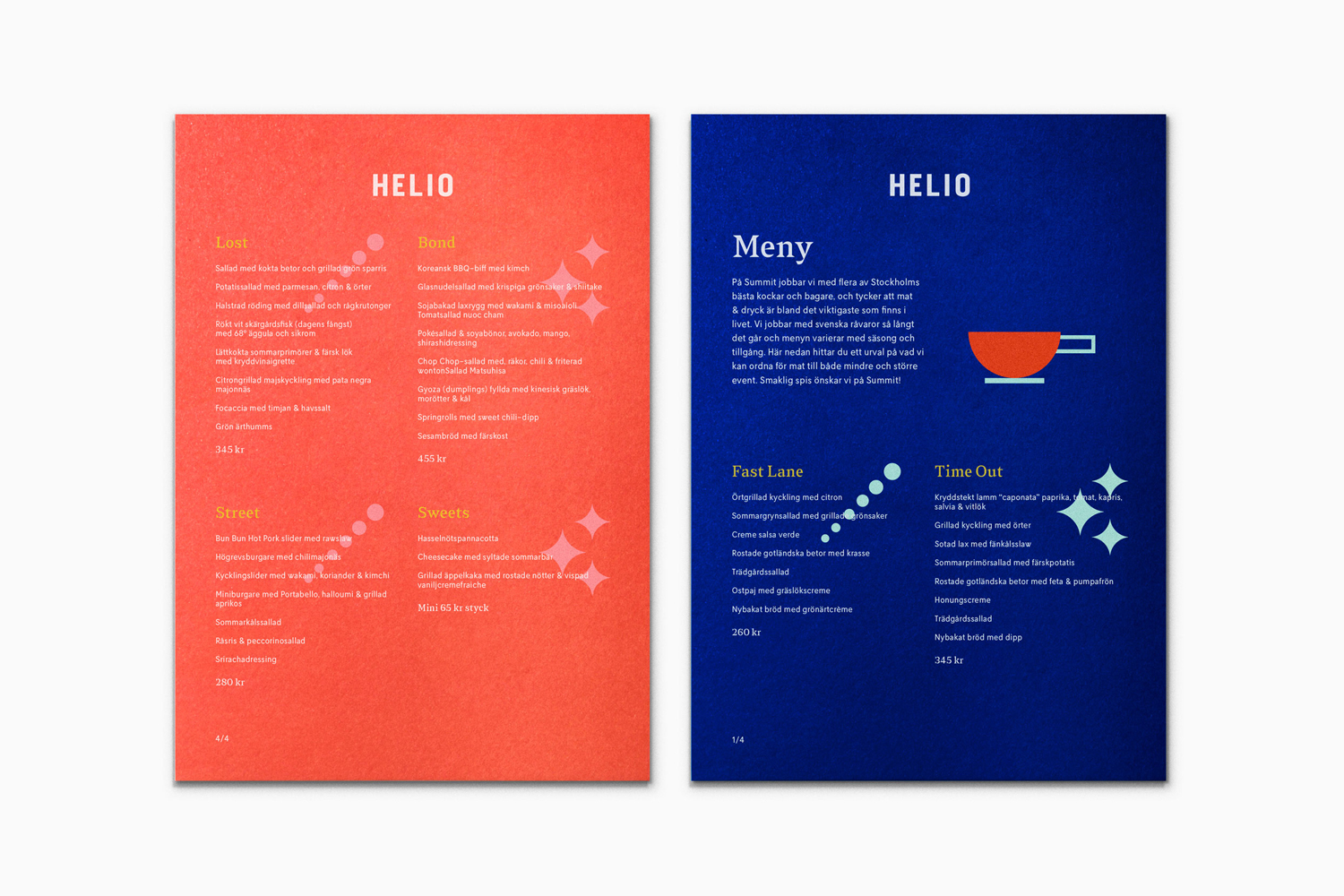
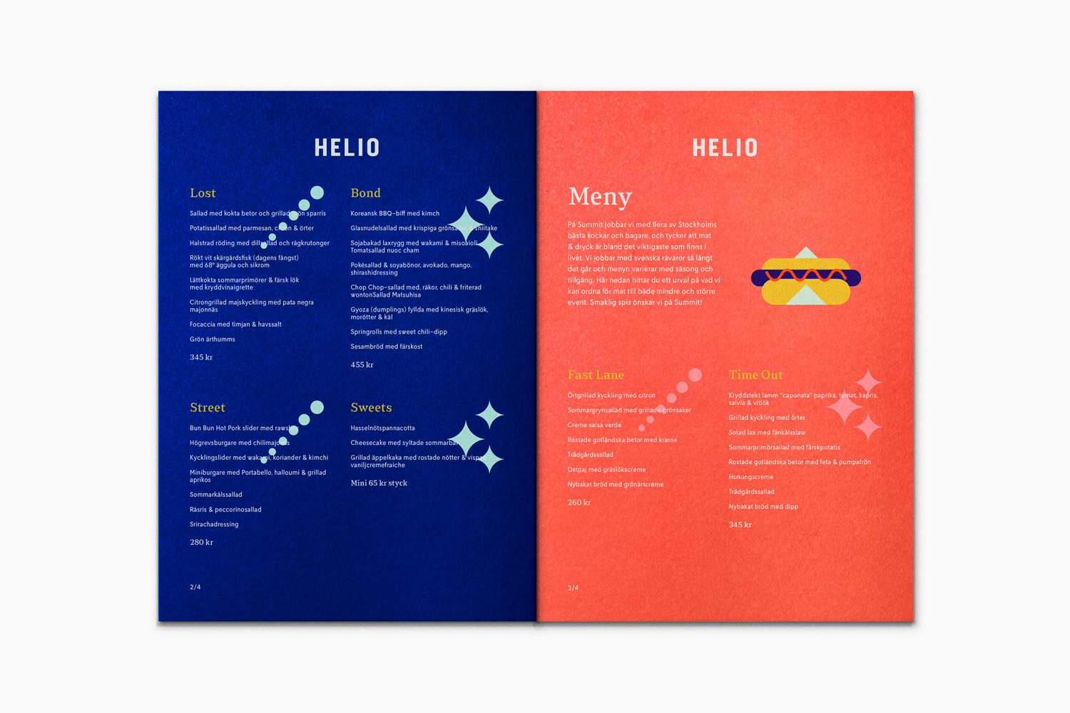
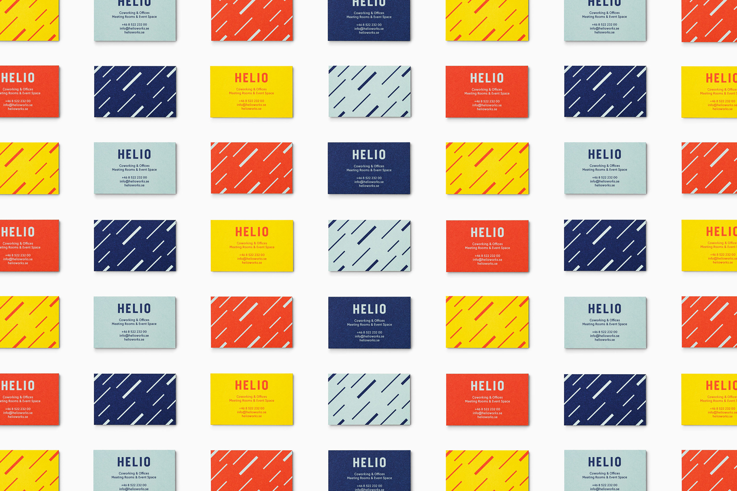
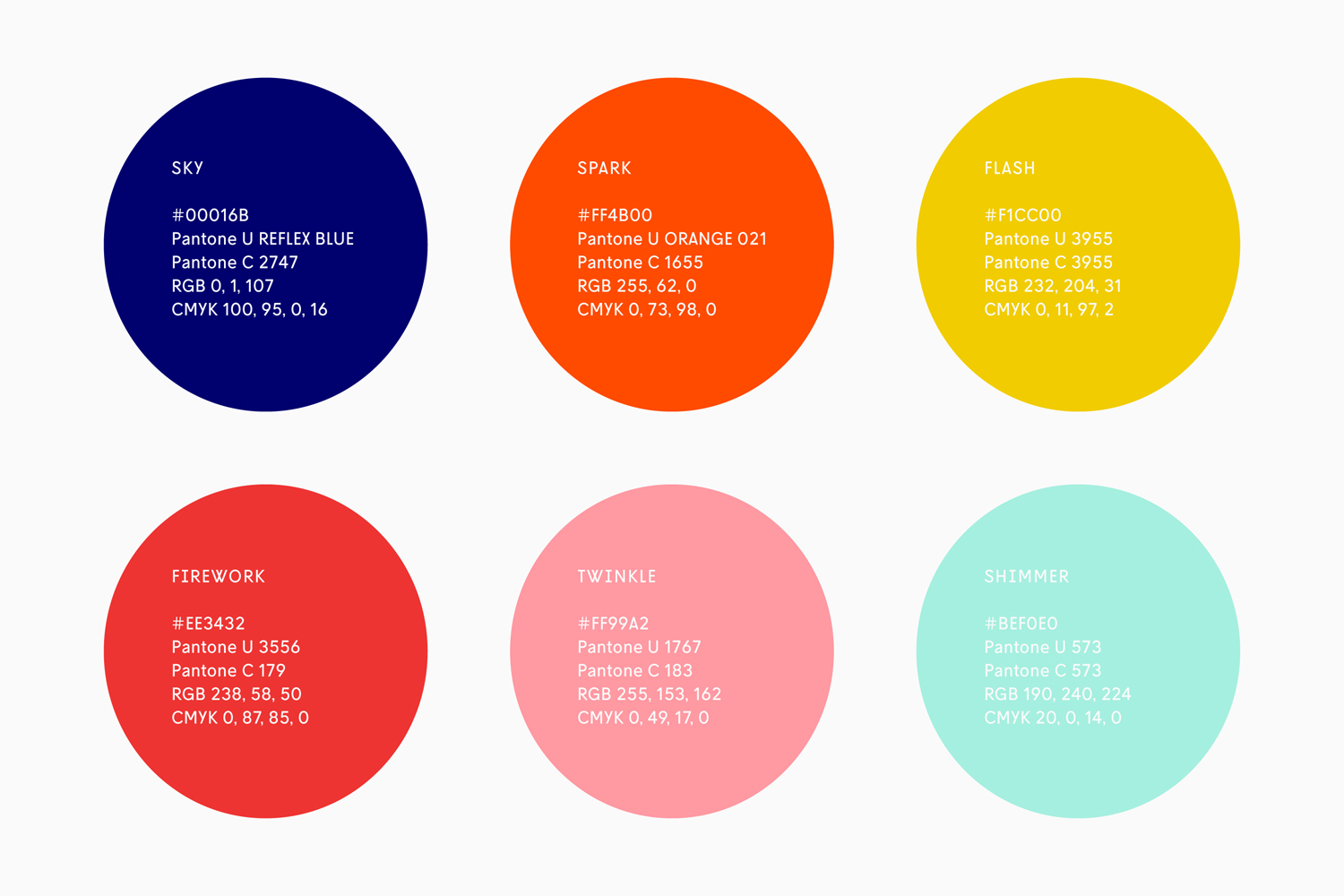
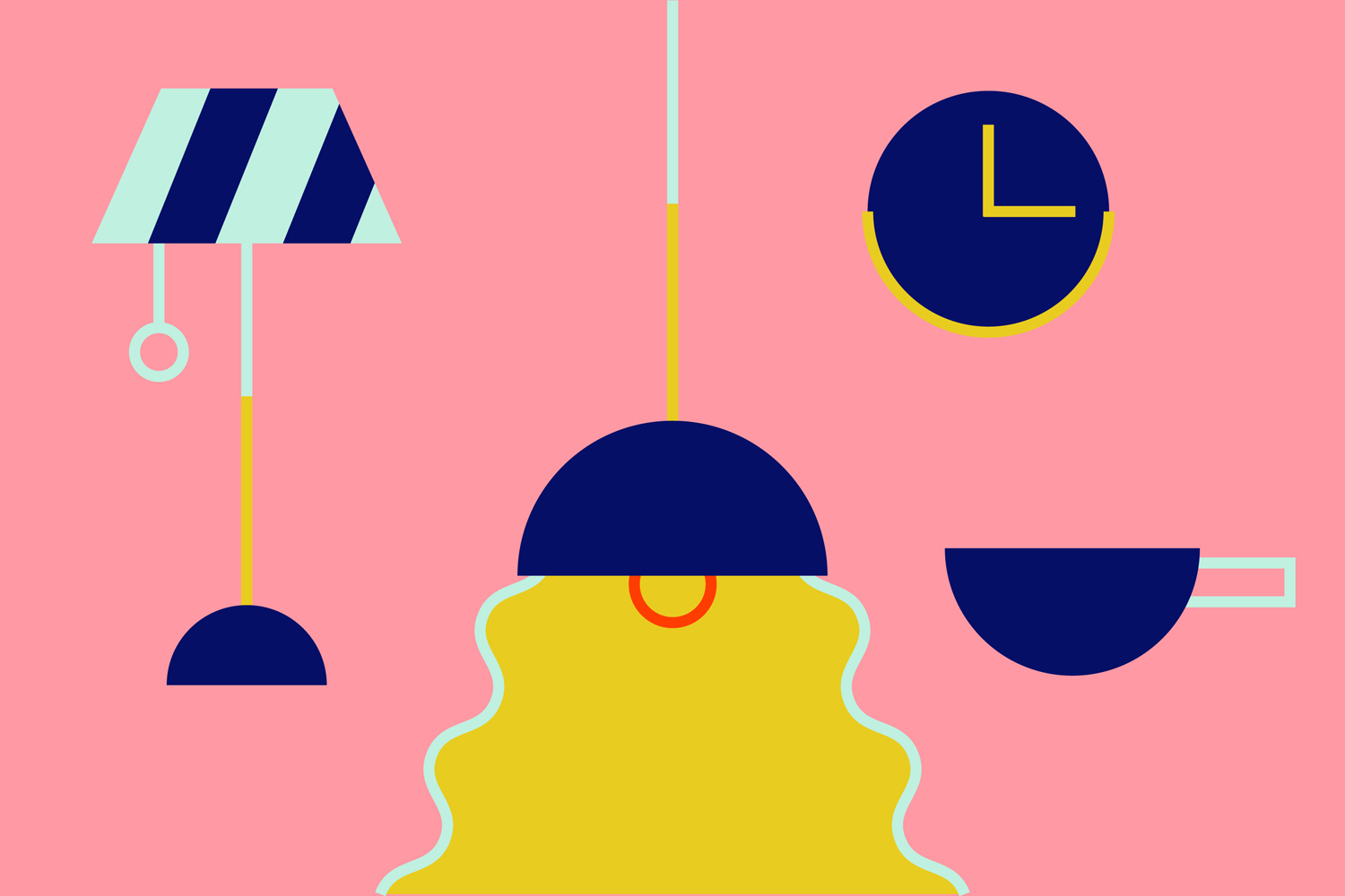
Based around the concept of the creative spark, “ignited when people from different fields work together”, Scandinavian design studio Bedow developed an energetic and playful visual identity that finds a commonality of form with interior, but introduces, in a considered and moderated way, a cheerful personality through bright colour, illustration and pattern. This links menus, posters, notebooks, stationery and business cards.

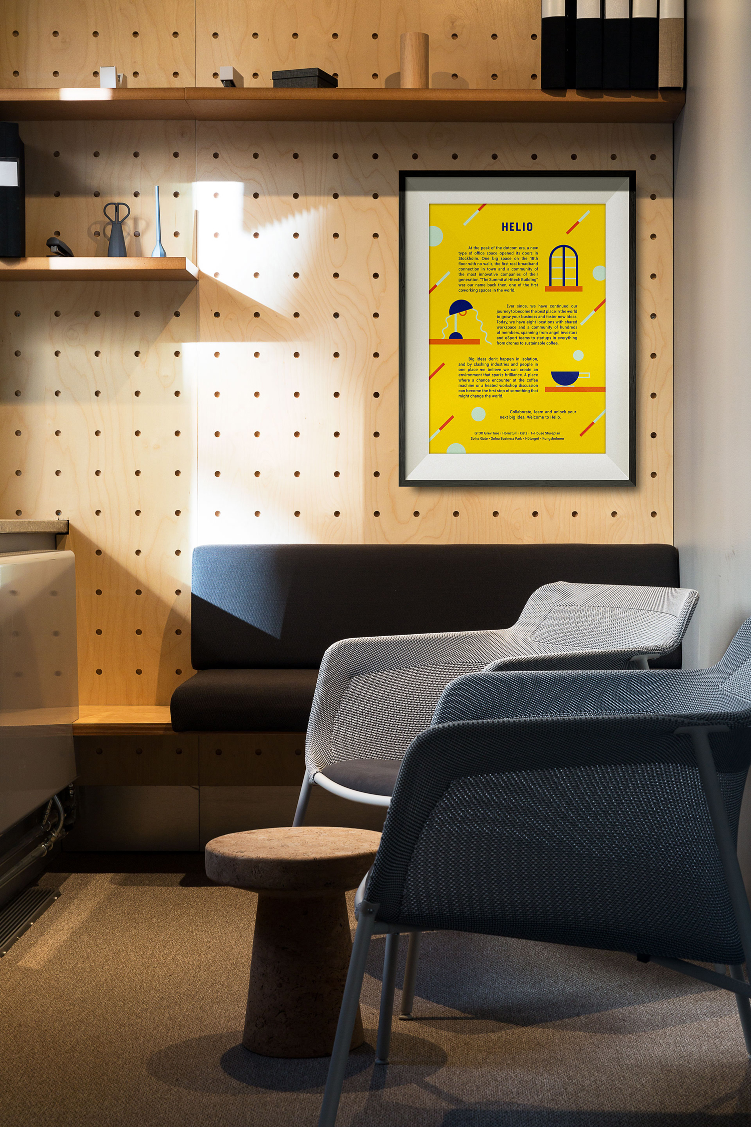
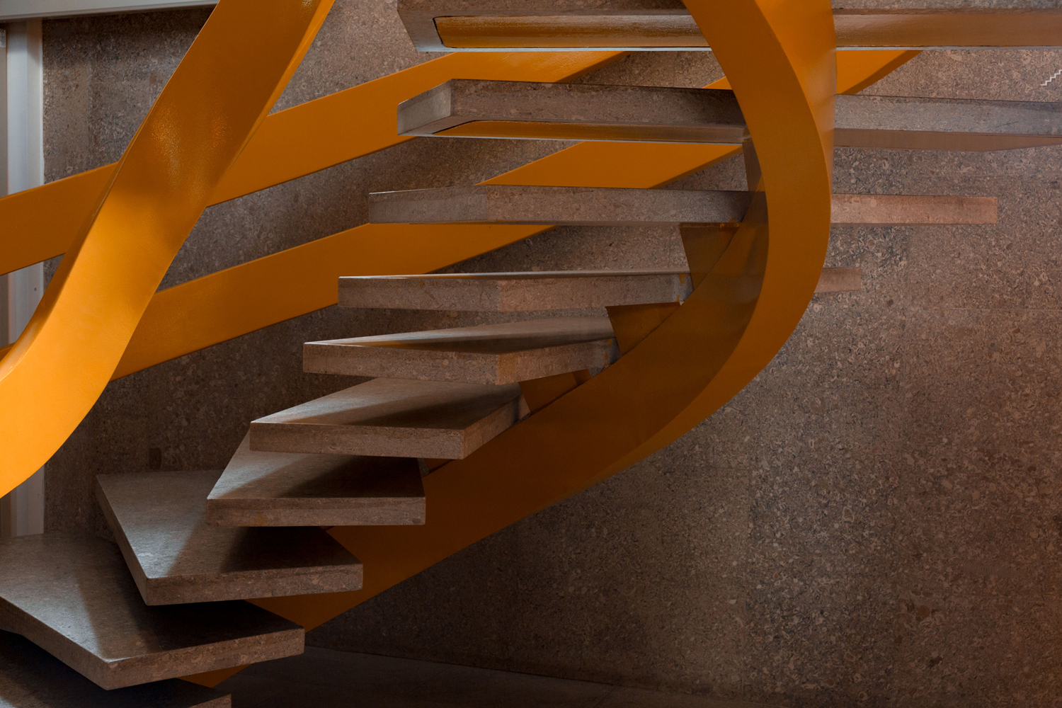
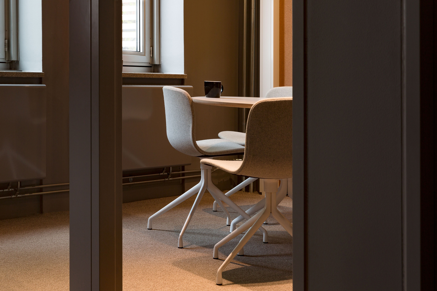
An initial disparity between space and visual identity is immediate. Perhaps unintentionally accentuated in the way Bedow have documented the project, with only one shot showing how the two co-exisit. It is not, however, difficult to imagine pattern and colour of cafe menus, posters and other printed collateral effectively punctuating space and infusing it with a distinctive and cheerful attitude whilst avoiding the overbearing.
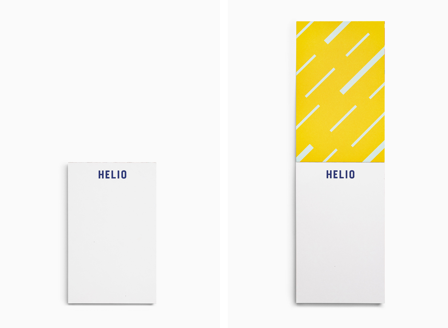
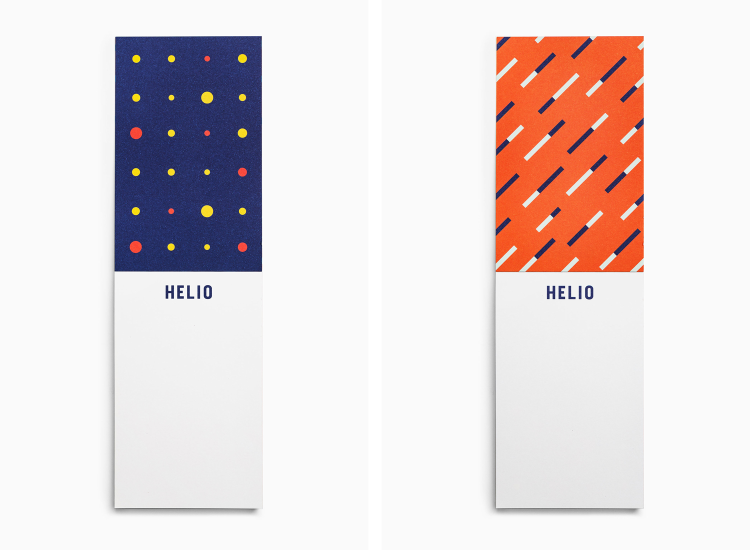
When visual identity is seen together, as documented here, rather than dispersed through space, the extensive use of colour, pattern and illustration appears occasionally overwhelming yet, when considered within the context of natural materials, neutral colours, simple forms and a variety of textures, it begins to make a lot more sense.
Although conceptually familiar, the capturing and conveyance of the spirit inherent to modern creative hubs establishes a universal, relatable and intelligible foundation. You can see this energy, creativity and collaborative spirit clearly expressed through the intersection and contrast of colour and pattern, in literal and inferred motion. These individual components work well together, with plenty of variation to keep it interesting, clear of repetition whilst remaining cohesive.
Beyond the initial impression emerge some pleasant commonalities, satisfying and subtle correlations, largely in shape, between interior and visual identity. These can be seen in the lines across the business cards and the floating steps and yellow frame of the staircase, in the peg board walls and a pattern of circles, and the activity of space and motion graphics.
There is a Scandinavian restraint to interior, in its colours, textures, forms and materiality. A quietness, utility and comfort. Colour of visual identity subverts this. So the result is an interesting interplay between expectation, a sense of Nordic place, appropriate for international teams and individuals, and a second layer that is in some ways in opposition, a loudness, vibrancy and motion in line with a creative hub. This is where it really succeeds, where the universally bright and cheerful is contextual and sophisticated.
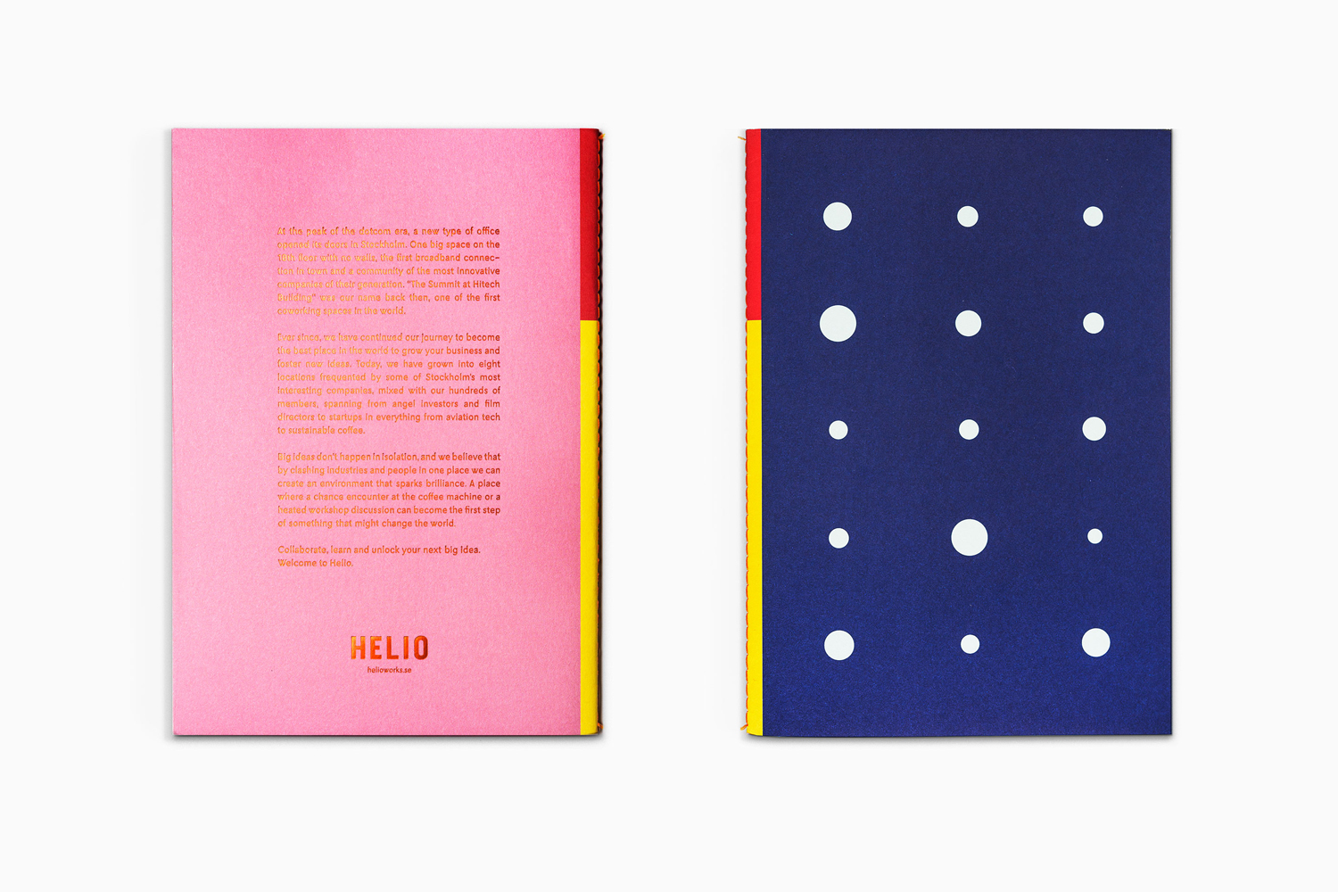
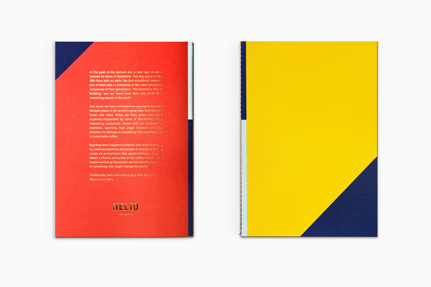
The relationship between interior and pattern also extends to interior and print. This appears in the openly crafted quality of exposed stitching across menus and brochures, in the use of uncoated papers and boards, and in the finishing and contrast of a metallic copper block foil.
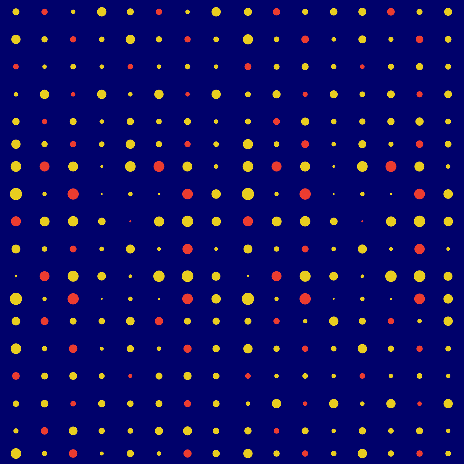
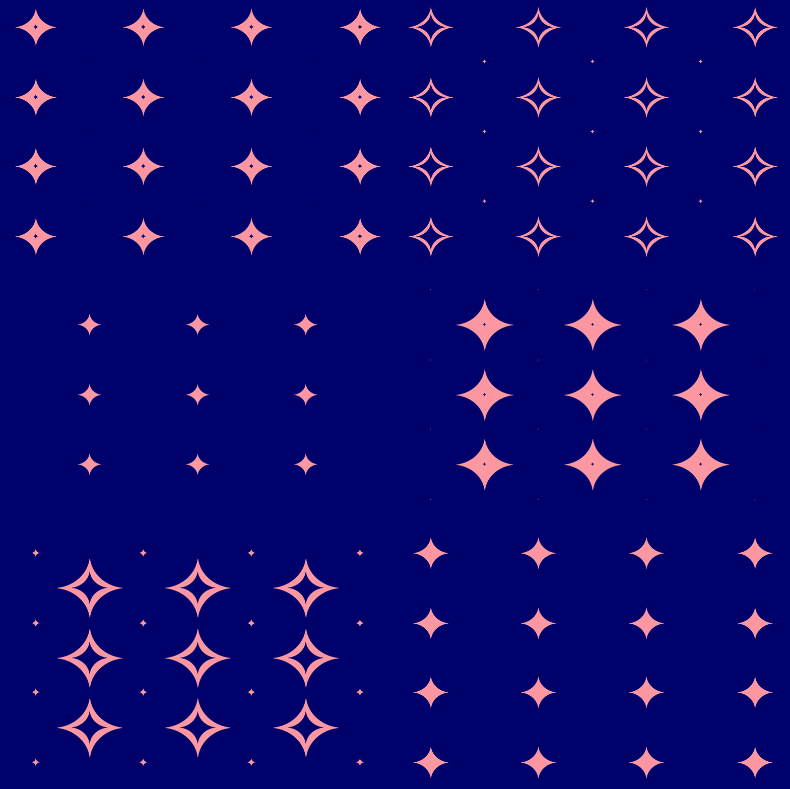
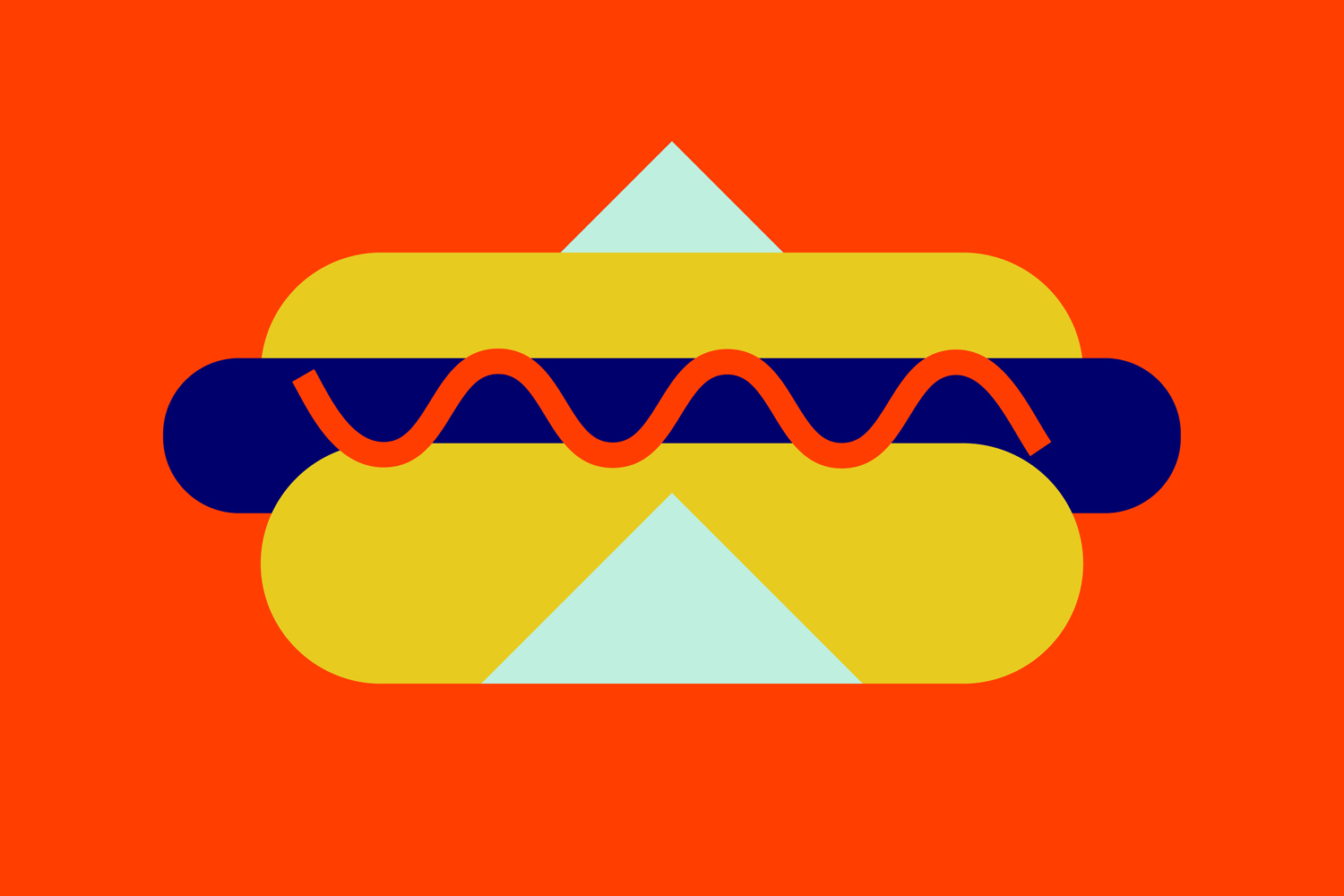
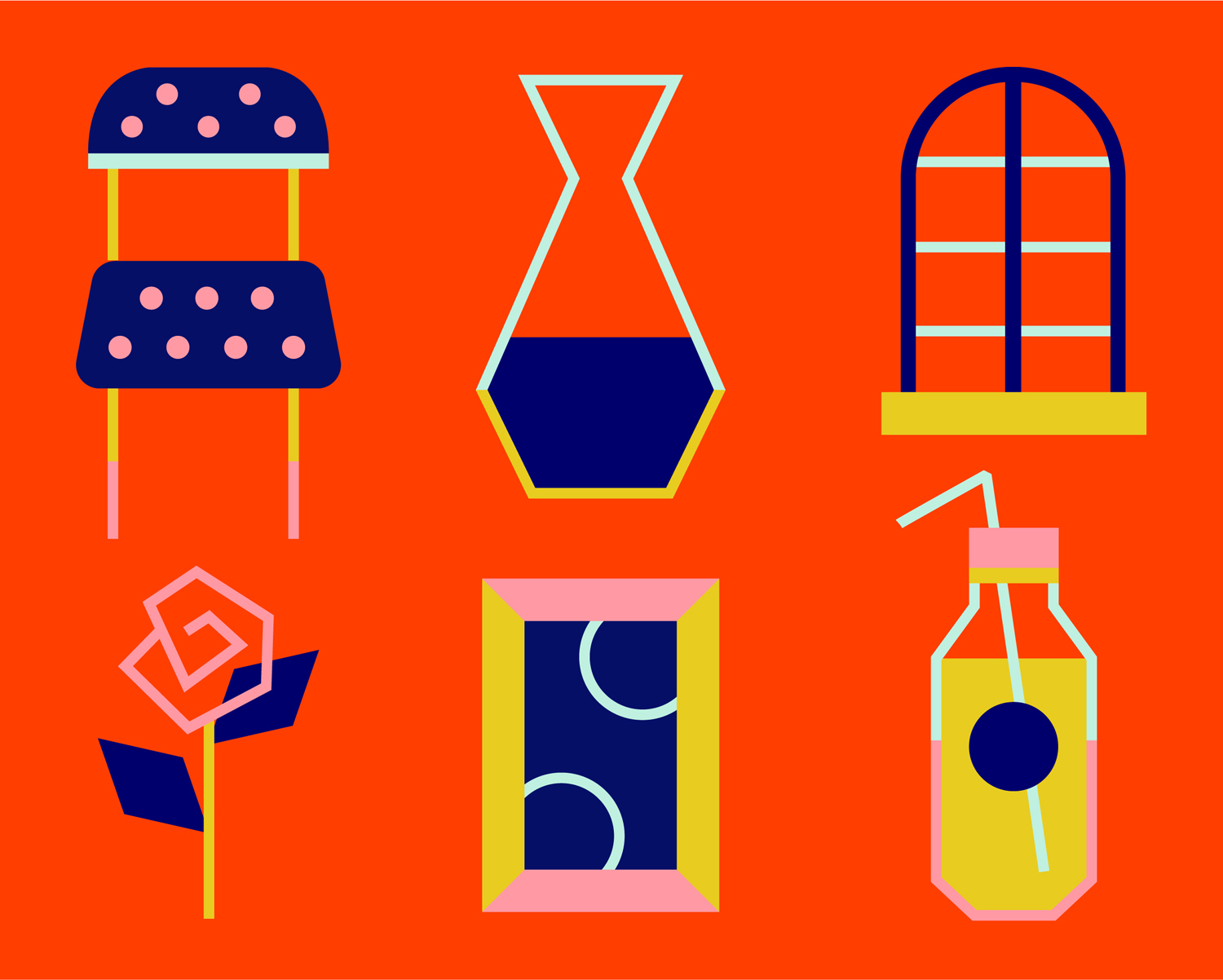
Patterns appear dynamic, both in their static and animated forms with plenty of variety. Check out Bedow’s website to see more. Illustration is similarly playful and distinctive, neatly avoiding the childish in the balance of detail and geometric abstraction, which also forms a connection with pattern. Although large here, illustration across posters are well-balanced alongside blocks of text and solid colour.
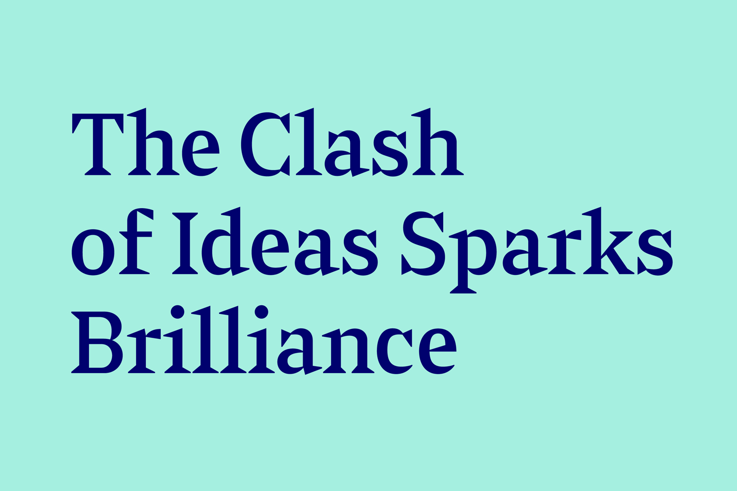
Type plays with a loud yet simple uppercase logotype and the modern and quirky characters of L10 which together are in line with colour, pattern and illustration. Sabre introduces a useful contrast and distinction between information, in shape, tone and association. This feels like it is informed by the high quality made nature of interior, and is well-integrated into the system using colour, proportion and its triangular serifs. More work by Bedow on BP&O.
Design: Bedow. Opinion: Richard Baird. Fonts: Sabre & L10.
