Raw Wine by The Counter Press
Opinion by Richard Baird Posted 6 October 2017

Raw Wine is an international two-day wine fair that takes place in the cities of LA, London, Berlin and New York. It was founded by Deborah Lambert and Isabelle Legeron MW, France’s only female master of wine, and provides an opportunity for growers, makers and buyers to get together. Raw Wine is also a celebration of the best organic, biodynamic and natural wines from around the world, produced with the lowest intervention possible. It brings to light, for a new audience, the enduring traditions of wine making, and pushes back against increasing industrialisation, additive use and the shortcuts that come with larger volumes.
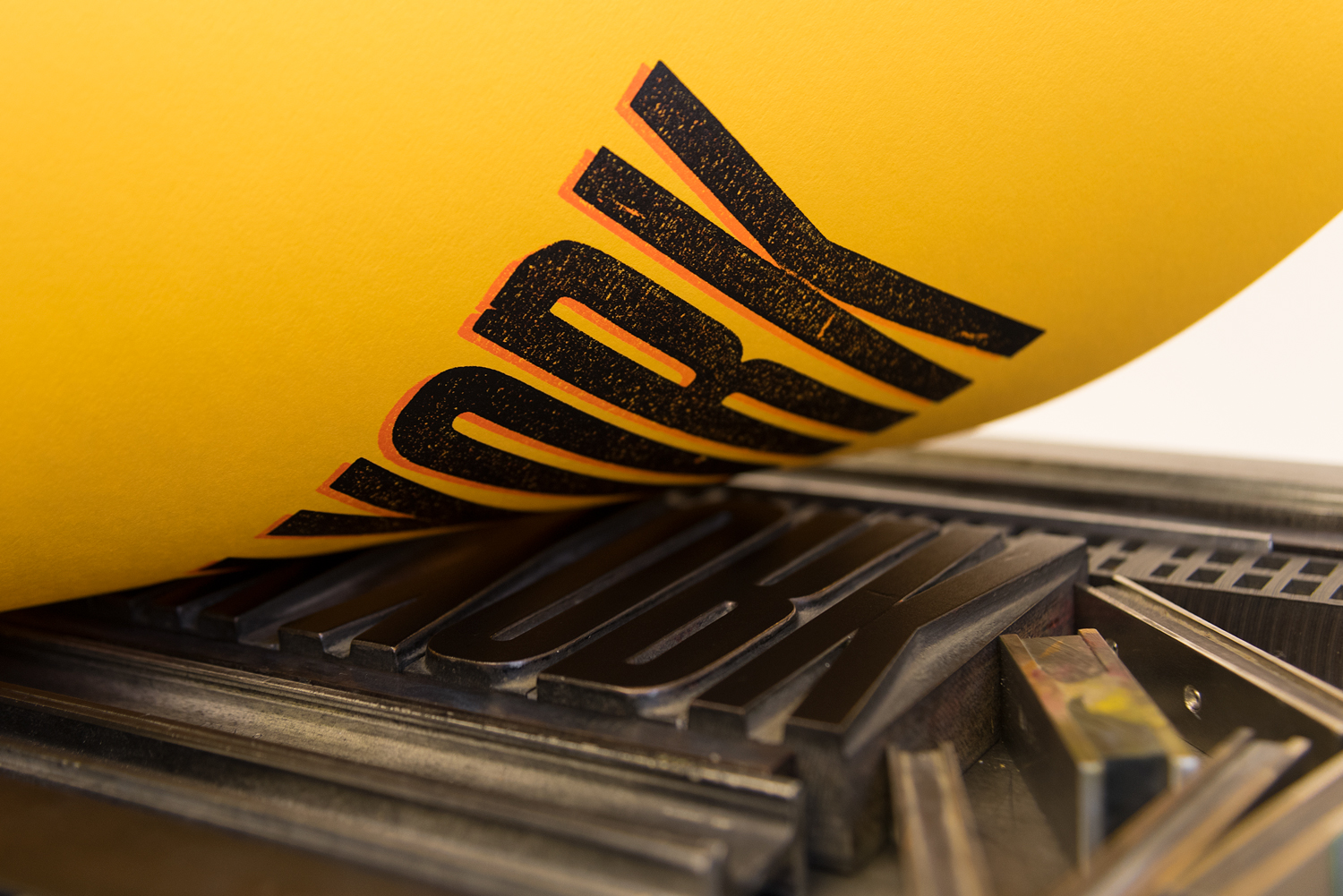
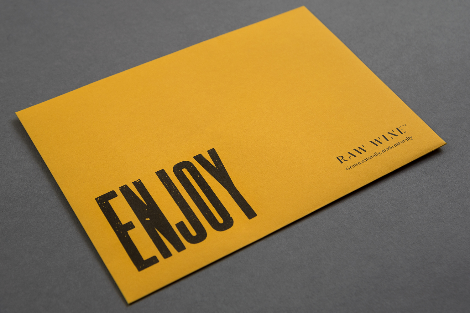
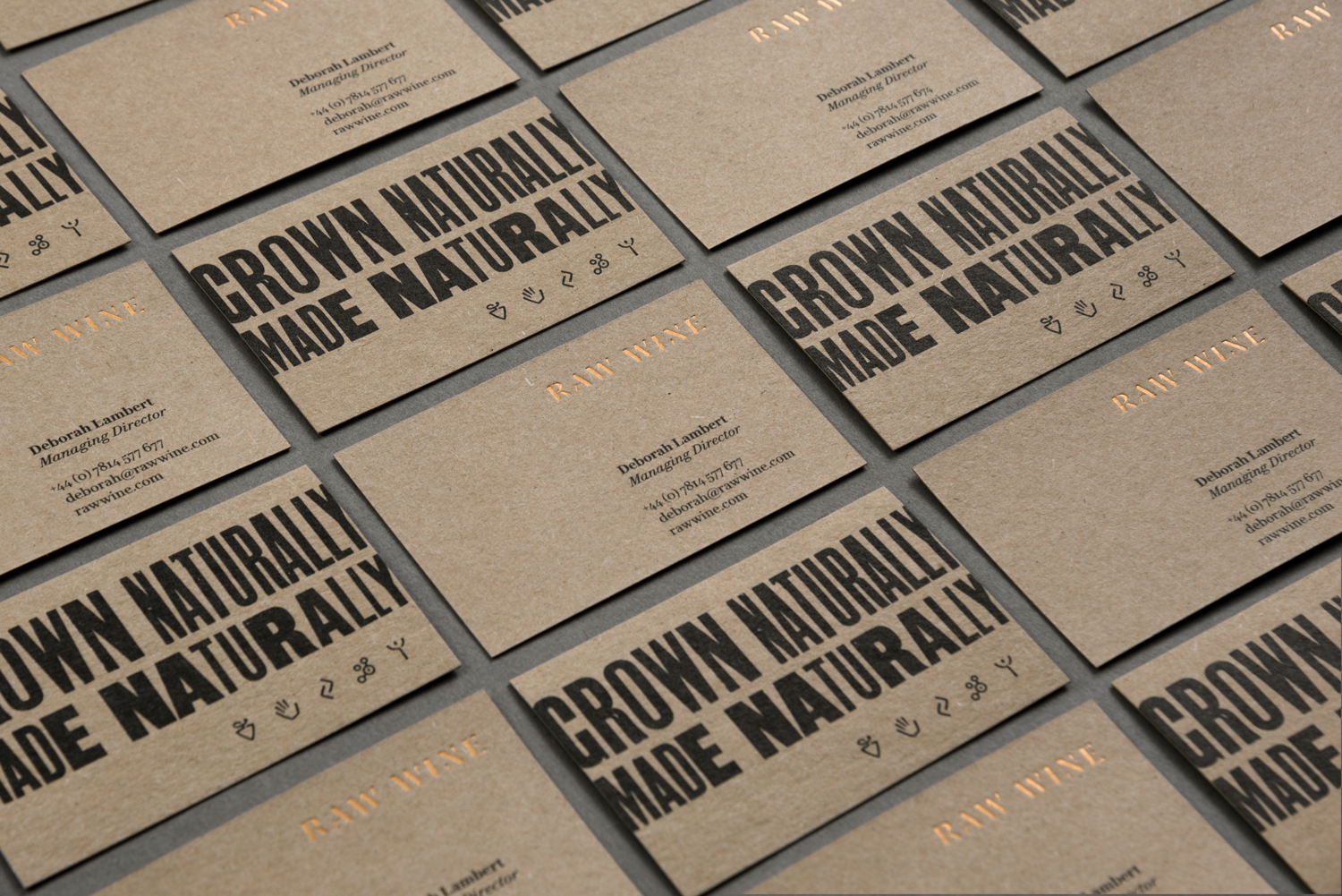
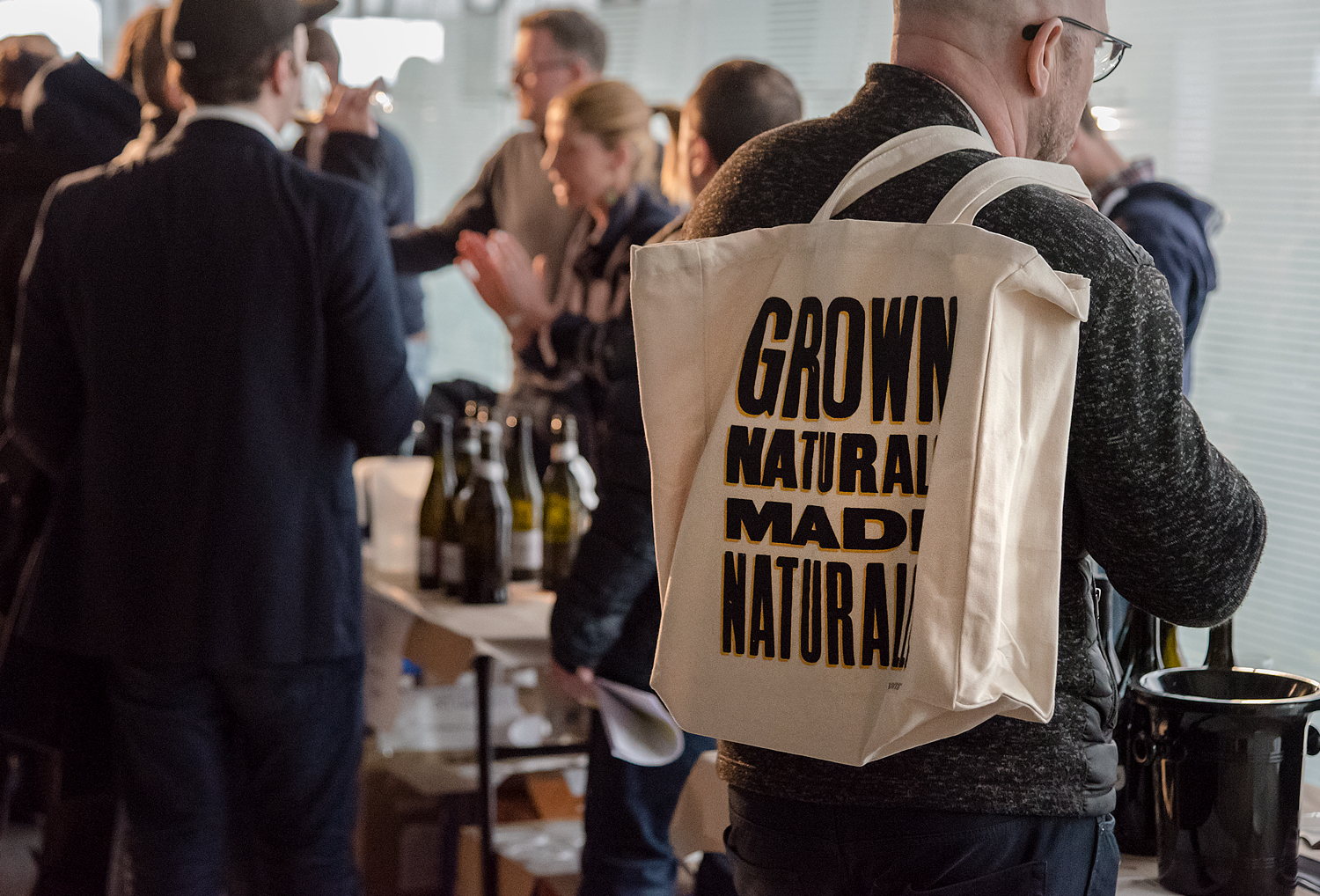
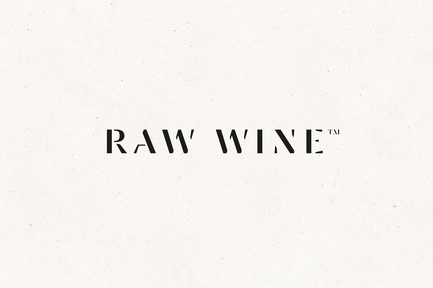
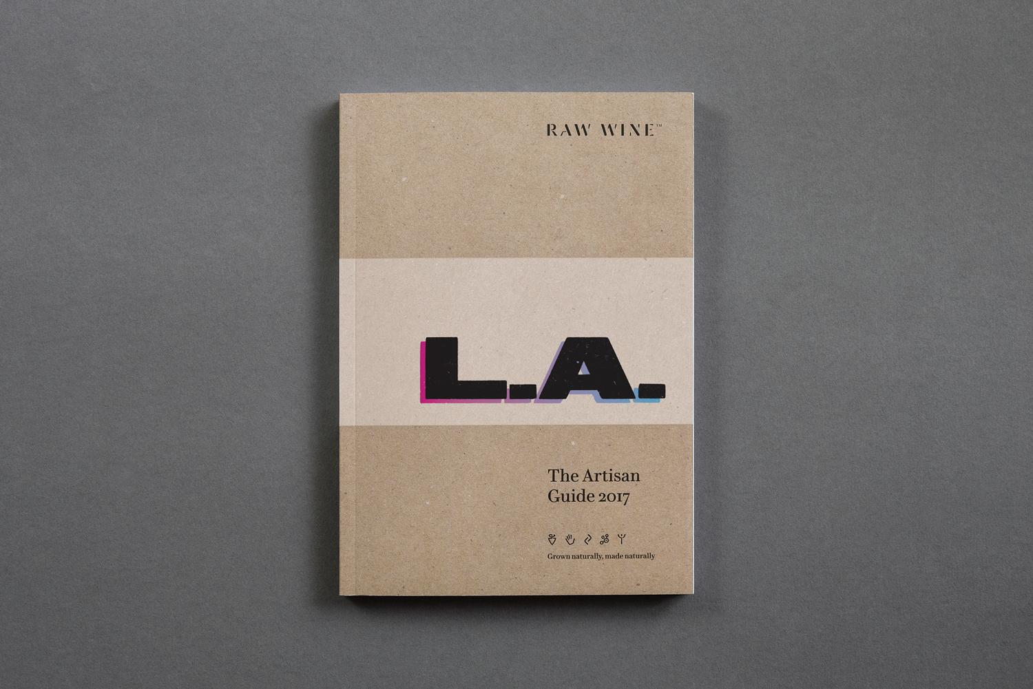
London-based studio and workshop The Counter Press, working in collaboration with brand consultant Dan Rowe, created a new visual identity for Raw Wine that captures the character and nuance of wine, the individuality of those that make up the artisan community, expresses a connection with natural low intervention wine production, and intends to engage a new audience. This is achieved in the idiosyncrasies of wood type and the extensive use of letterpress, alongside a bespoke logotype, modern iconography and unbleached substrates. These link business cards, catalogues, signage, glassware, tote bags, posters and soon to launch website.
The Counter Press is a unique design studio and letterpress workshop hybrid. Although their work is not always driven and defined by this analogue enthusiasm—they often work on large jobs printed offsite and digitally—this expertise has been well-utilised on a number of their smaller projects. Each finds a distinctive and compelling balance between strategic design and distinctive material result. Raw Wine is another lovely example.
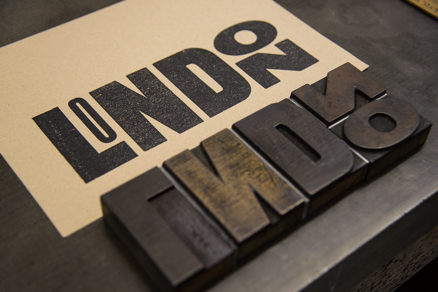
There is a pleasant correlation between wine production and the traditions of letterpress. Both are founded on the processes of informed selection, experimentation and refinement, and have an individuality, nuance and variety to their results.
Papers and boards speak clearly of a connection to nature, of low intervention and the organic in their uncoated and unbleached states. The choice of wood type and its typesetting capture the character of wine and producers, and the craft and process of letterpress makes the most of enduring personal and hands-on associations.
There can often be a digital shortcut taken in achieving a similar stylistic outcome, yet it could be argued that there is a perceptible difference, even to the untrained eye in the finer texture, rather than digital approximation, of ink from wood being applied to, running over and moving through an uncoated substrate.
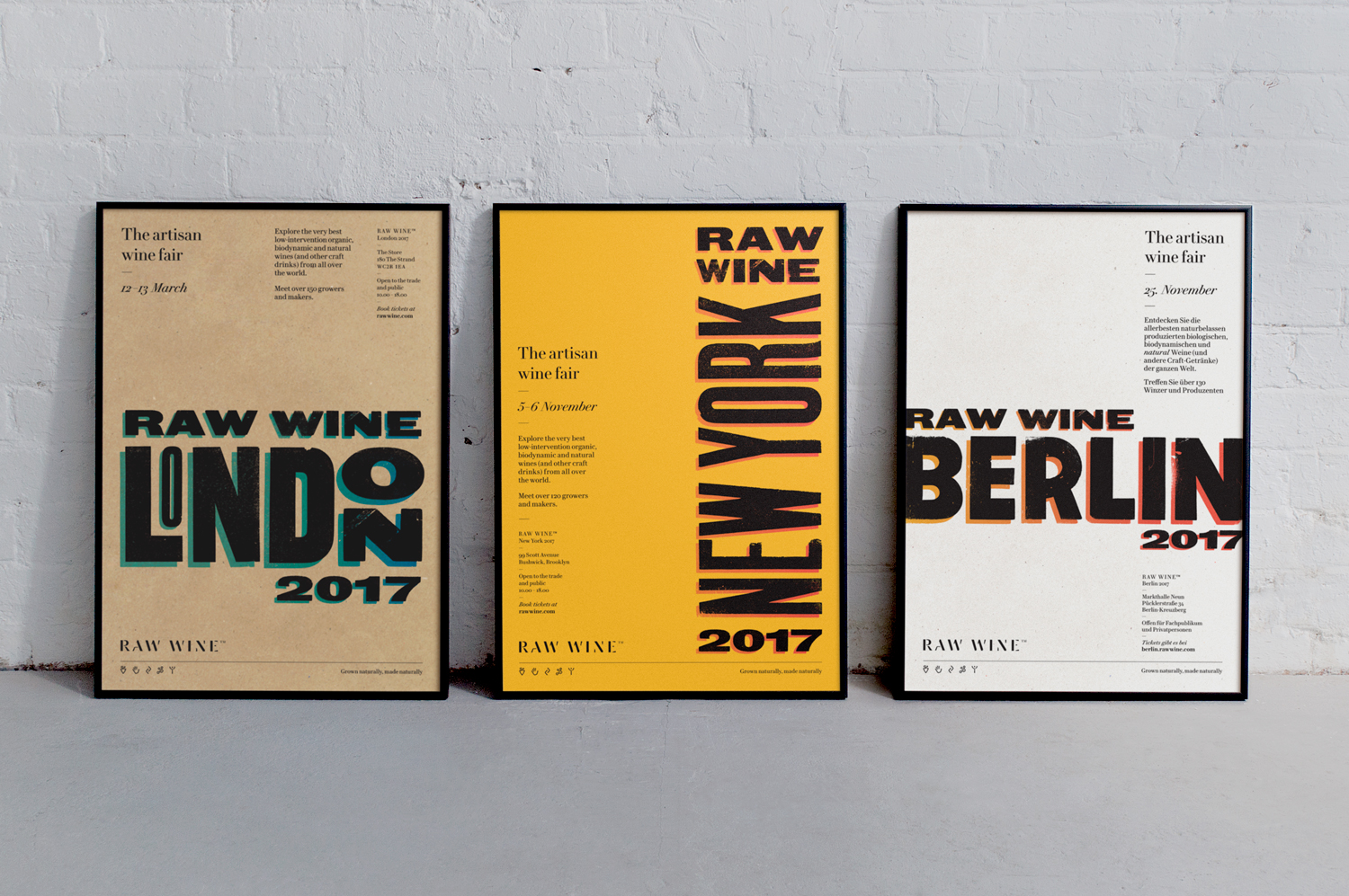
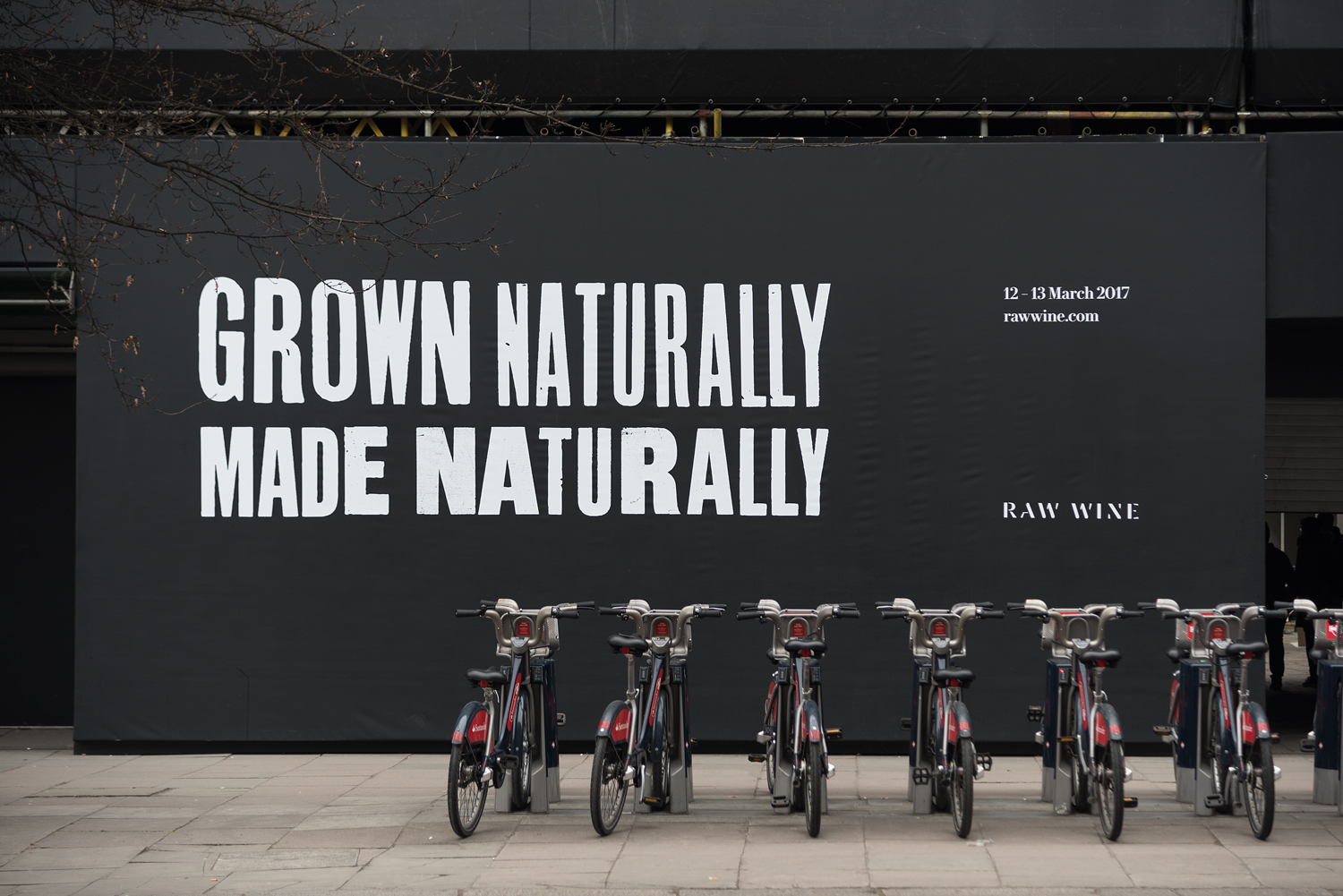
Each city has a unique typographical expression. Although there is perhaps a skyline-like quality to NYC and a historical quality to the stacked letters of London, it might have been nice to have given these more of a discernible local flavour. They are, however, certainly distinctive and eye-catching in the arrangement of letters, and share a layering of different inks to give a sense of depth. Other neat techniques include the modulating character widths and weights of “Grown Naturally, Made Naturally”.
Posters are a real highlight. There is a satisfying variety in paper colour and typesetting, with a good use of orientation and arrangement, and solid blocks of ink and areas of space to derive impact from a distance and detail up close.
The results really benefit from The Counter Press’ extensive archive. It facilitates a play and experimentation that feels well-suited to the nuance of wine, both its bold and nuanced flavour profiles, but also the diverse personalities of the industry. It will be interesting to see how well this translates online.
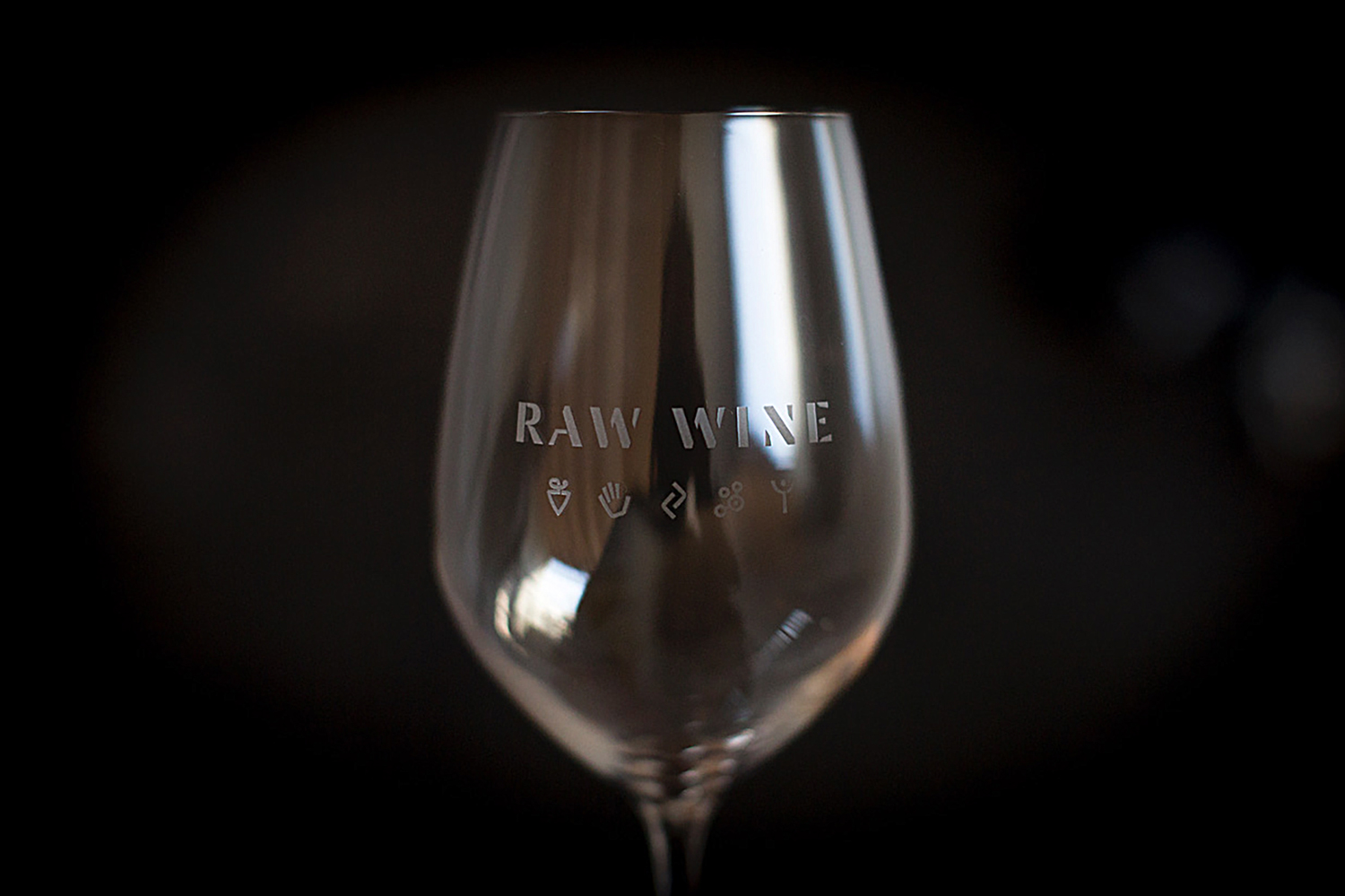
Although wood type dominates, there are a couple of other neat details that introduce visual contrast but a thematic continuity. This includes a custom logotype that draws on the stencilling of wine barrels. Copper block foiling that drives home a sense of quality and legacy in a different way from the wood type but familiar to wine labelling. And a suite of custom icons, which represent the five fundamental principles of Raw Wine, working in a more current component.
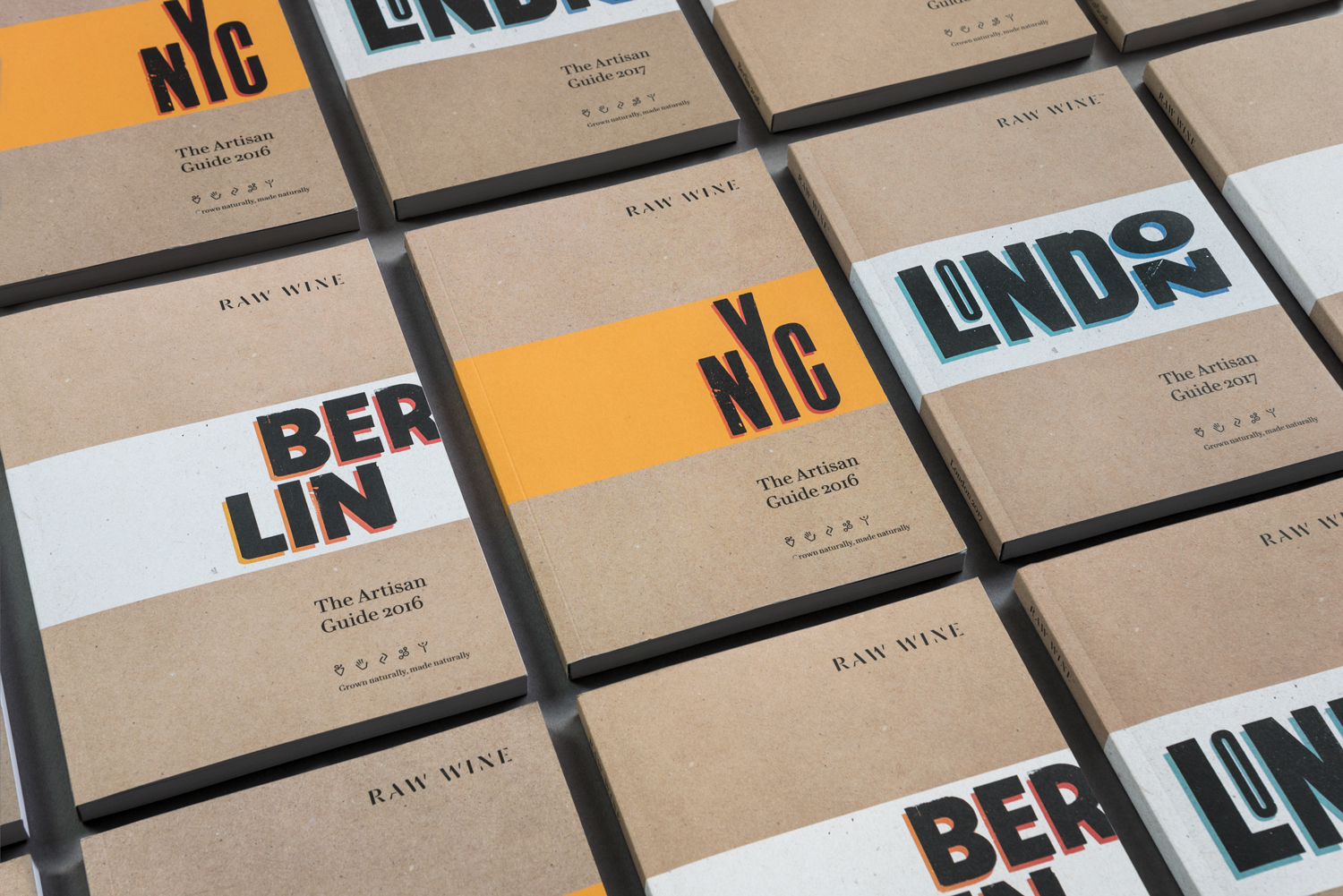
Wood type, its typesetting and orientation is effectively used to punctuate pages of The Artisan Guide. It divides content clearly and has a communicative immediacy and stylistic character. There is also a pleasant textural commonality in the mixed-fibre flecks of paper and the irregular coverage of ink.
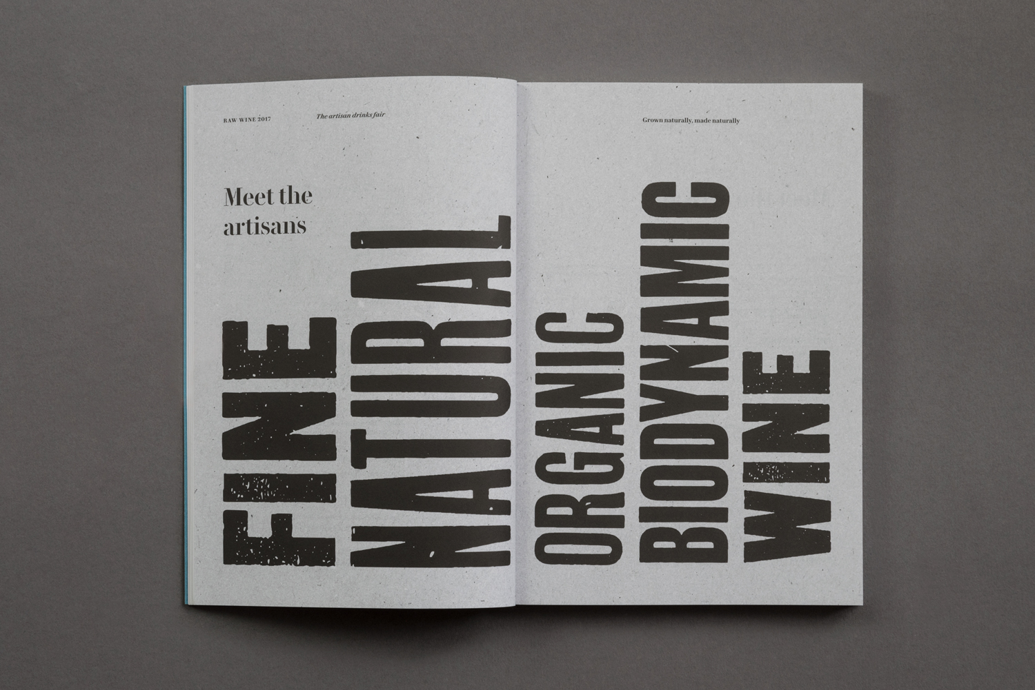
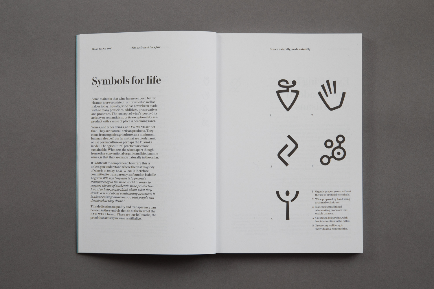
The print process and finish is crafted and personable, while the visual language is intelligible and universal, making the most of a persistent graphic lexicon (kraft paper, copper foil and letterpress). Yet it also manages to find communicative value through a contextual commonality with wine production, and secures a stylistic distinction and character through The Counter Press’ unique experience and extensive archive of wood type. More from The Counter Press on BP&O.
Design: The Counter Press. Opinion: Richard Baird.
