Loyal Coffee by Mast
Opinion by Richard Baird Posted 20 October 2017
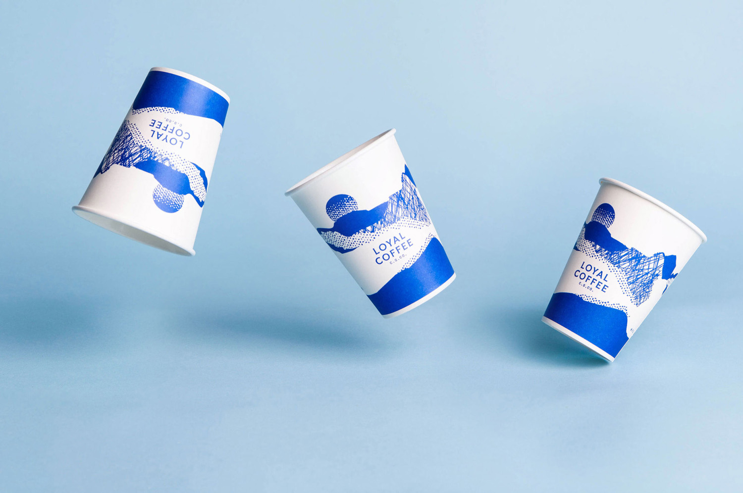
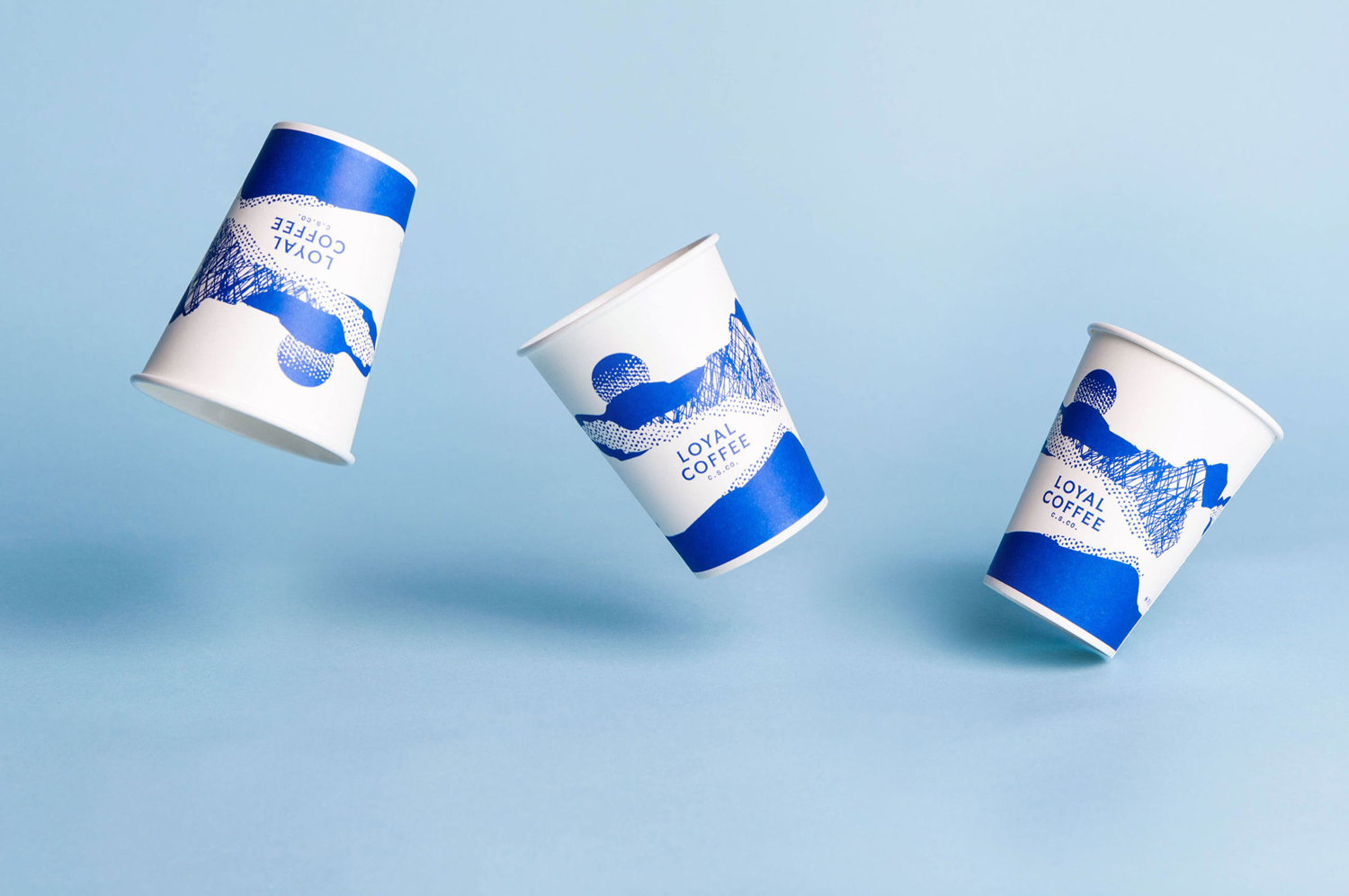
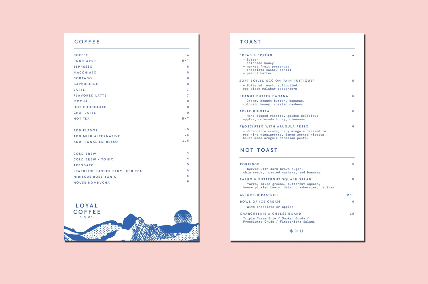
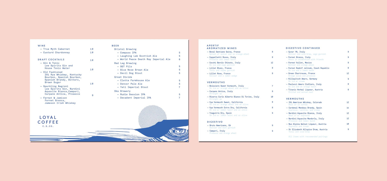
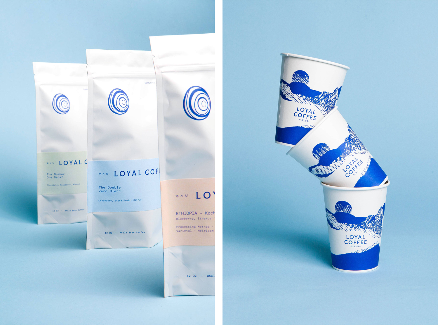
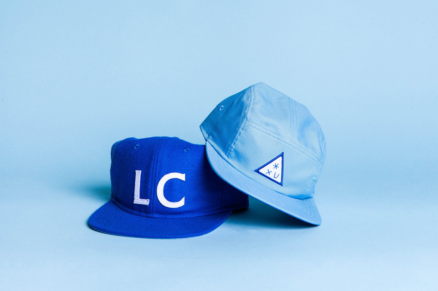
Loyal Coffee is a barista-owned and operated specialty coffee shop located in Colorado Springs. It features a high ceiling, exposed beams and concrete surfaces, natural material detail such as tree trunk stools, and crafted finishes that include a mosaic floor, carved wood panel and what looks like a ghost sign. Drawing on this, the surrounding landscape, and the loyal bond that the six founders share, design studio Mast created a visual identity for Loyal Coffee. This is built around landscape references, the crafted details but geometric foundations of custom typography, and a modernity in colour and in the assembly of individual graphic elements online and in print across coffee cups, packaging, merchandise, menus.
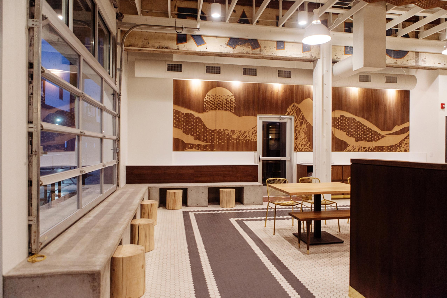
Loyal Coffee’s interior features a distinctive balance between the surrounding natural area and built environment, in colour, form, texture, material and furnishing. Highlights include the log stools set right next to cast concrete surfaces, and the I beam running into the laid stone tiles of a hexagonal mosaic floor. This direct intersection, something that feels very fitting for Colarado Springs, a place where the transition from city to mountainous landscape is quite abrupt, is also expressed throughout visual identity.
There are a few nice ideas at play here, with highlights being custom typeface, illustration, colour palette and the sense of place. Colony Serif, finds an interesting correlation between the geometric forms of the city, and the small wood carved-like addition of serifs. Secondary type, a monospaced sans-serif, works in a layer of industriousness and utility, something that crops up often in coffee roasting visual vernacular, and sits well within the context of warehouse space.
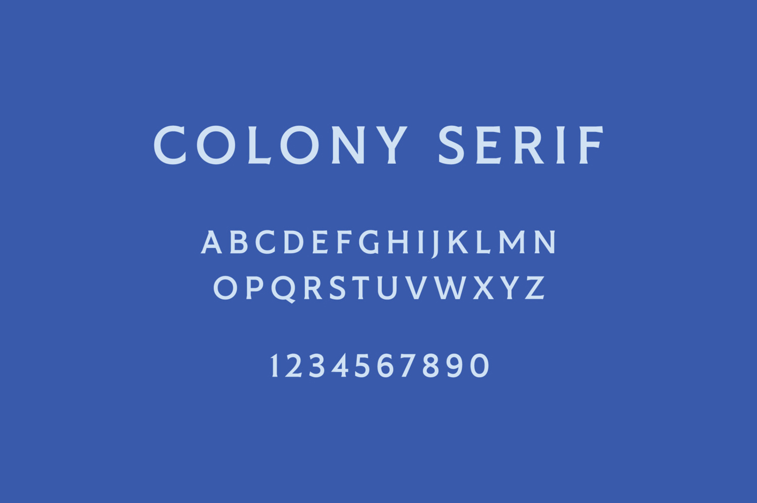

Hidden references include the naming of the typeface, a nod to an early name considered for the coffee shop, a three icon cypher, and the six rings of the logo, an allusion to the six founders. Stylistically, and the ideas likely discerned by patrons, is the balance between terrain and tree rings, but interpreted with a modern vector precision. This continues through to illustration which gives the work a strong sense of place and individual character.
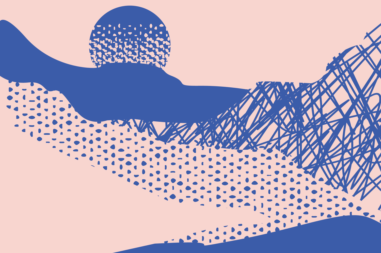
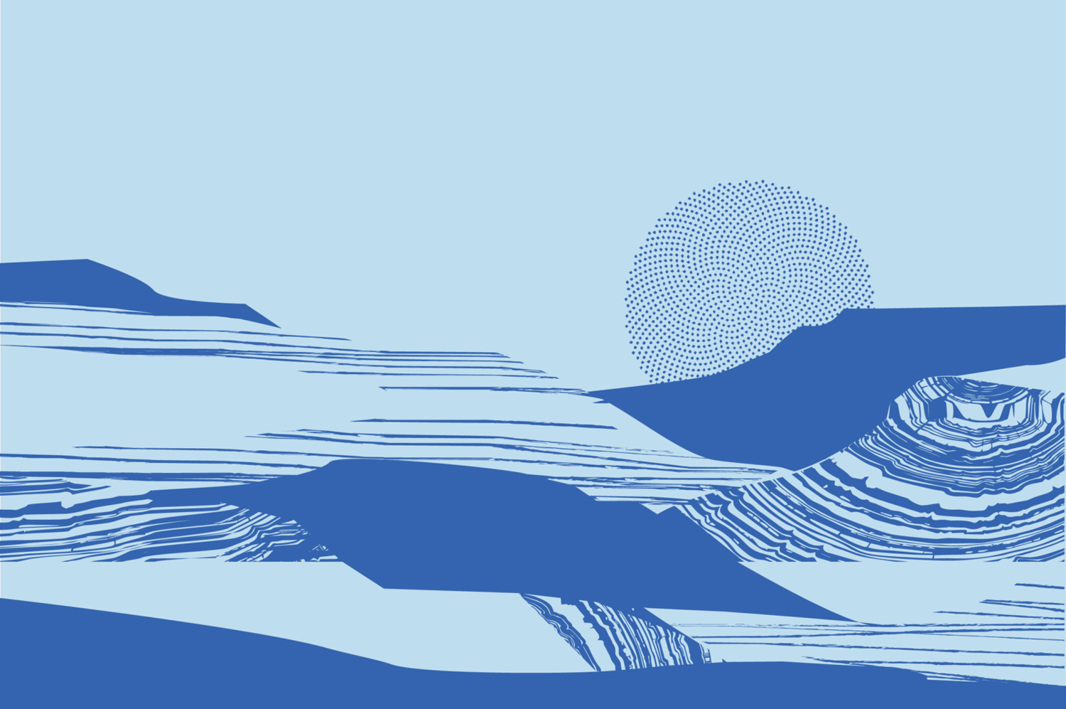
Illustrations appear distinctive in the intersection of the terrain and substrates that surround Colorado Springs. There are two panels, both channel the mountainous surroundings, however, the first (above) calls to mind something more of an artistic expression in dramatic lines and half-tone like pattern, in line with creative culture and coffee craft, and the second (below) playing with tree rings and subcutaneous layers of rock. There is a pleasant contrast of simple forms and detail textures, fine lines and solid fills that deliver a mix of impact from a distance and detail up close. Where space is earthy, colour palette introduces an element of the eye-catching and modern.
It is also worth noting the build of the website. Telegraph Creative have done a fantastic job implementing the work of Mast. The continuity is clear and the stylistic quality maintained with a good eye for space, solid colour and photography. It is nice to see custom type used well, paired with something disparate but communicatively well-intentioned, and illustration being left out in favour of space and blocks of solid colour. More work by Mast on BP&O.
Design: Mast. Website: Telegraph Creative. Opinion: Richard Baird.
