Maisonette by Lotta Nieminen Studio
Opinion by Richard Baird Posted 30 October 2017
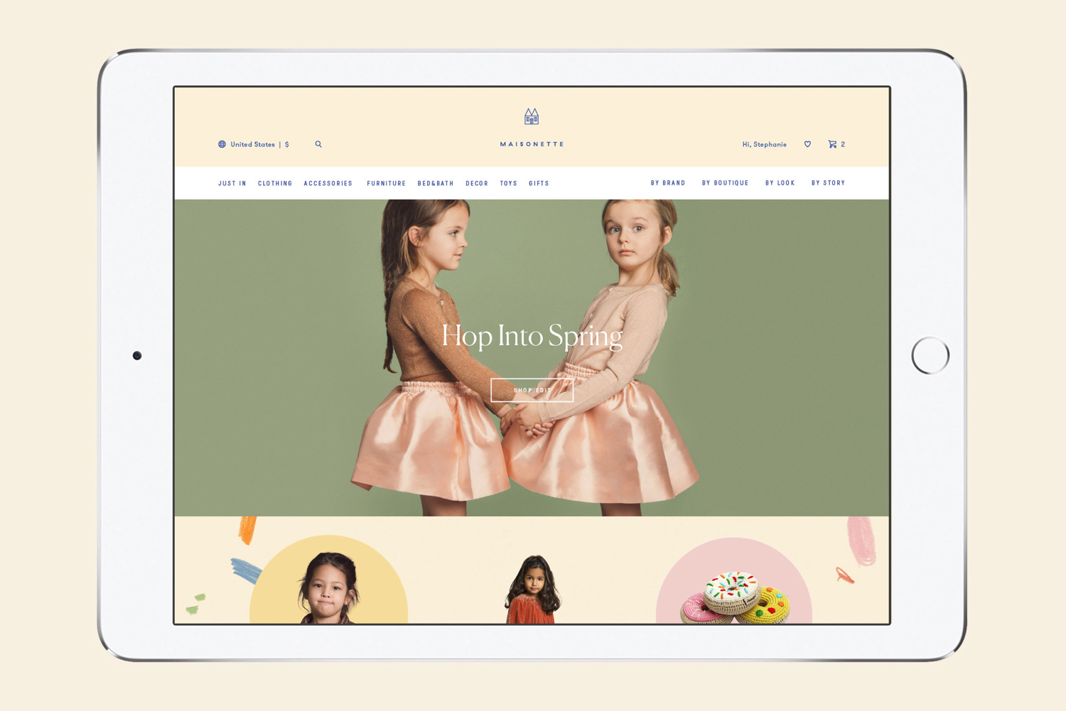
Maisonette is an American online retailer of luxury children’s brands, founded by former Vogue co-workers Sylvana Durrett and Luisana Mendoza Roccia. The retailer carries a carefully selected yet extensive catalogue of clothing, homeware, gifts and accessories that mixes local up-and-coming brands with those that are well-established and international.
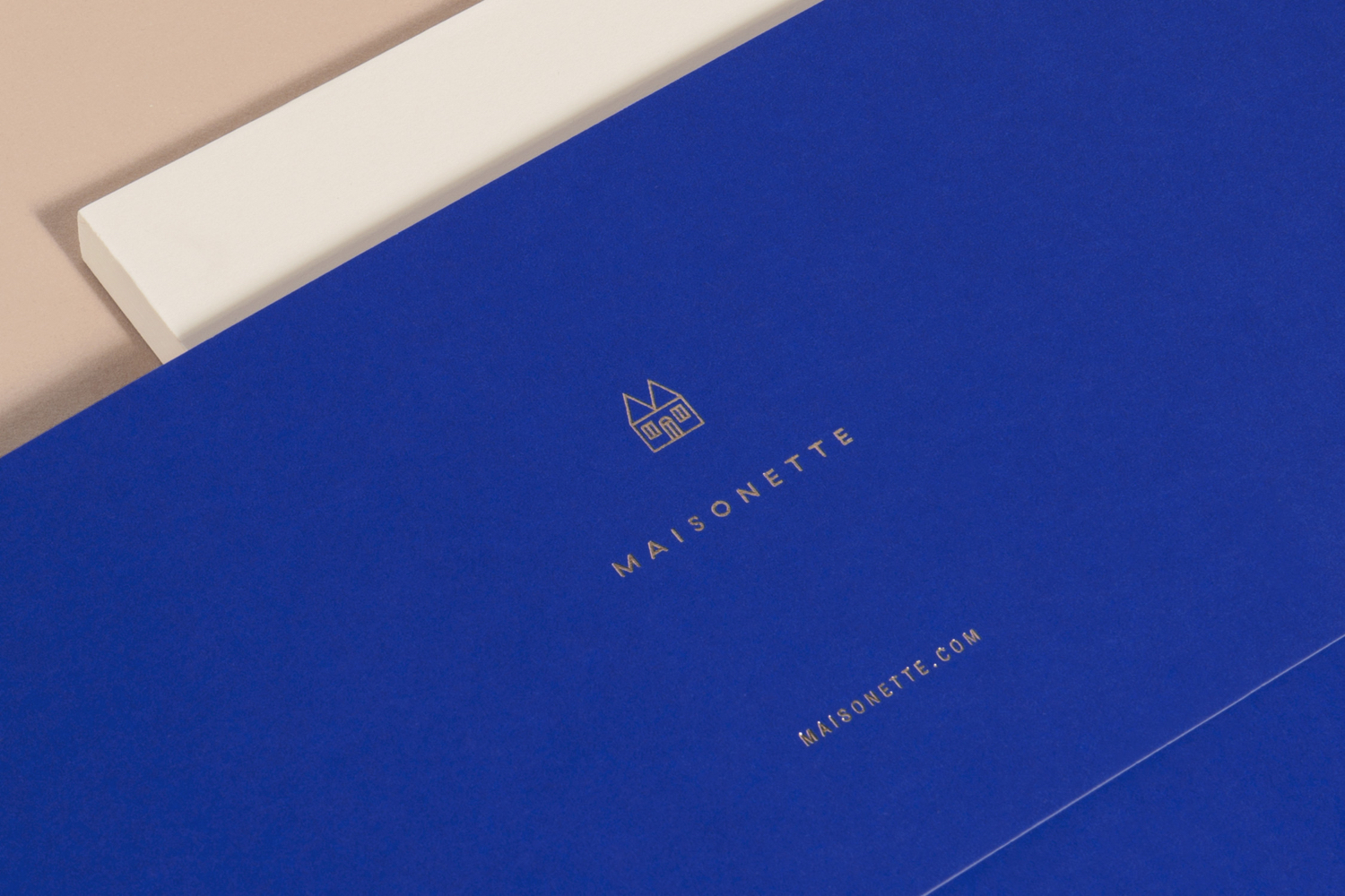
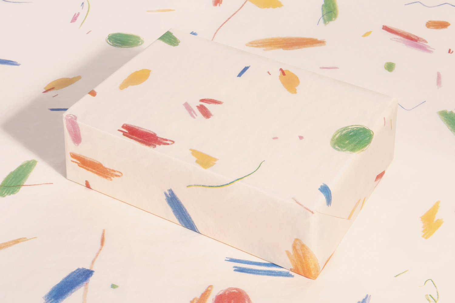
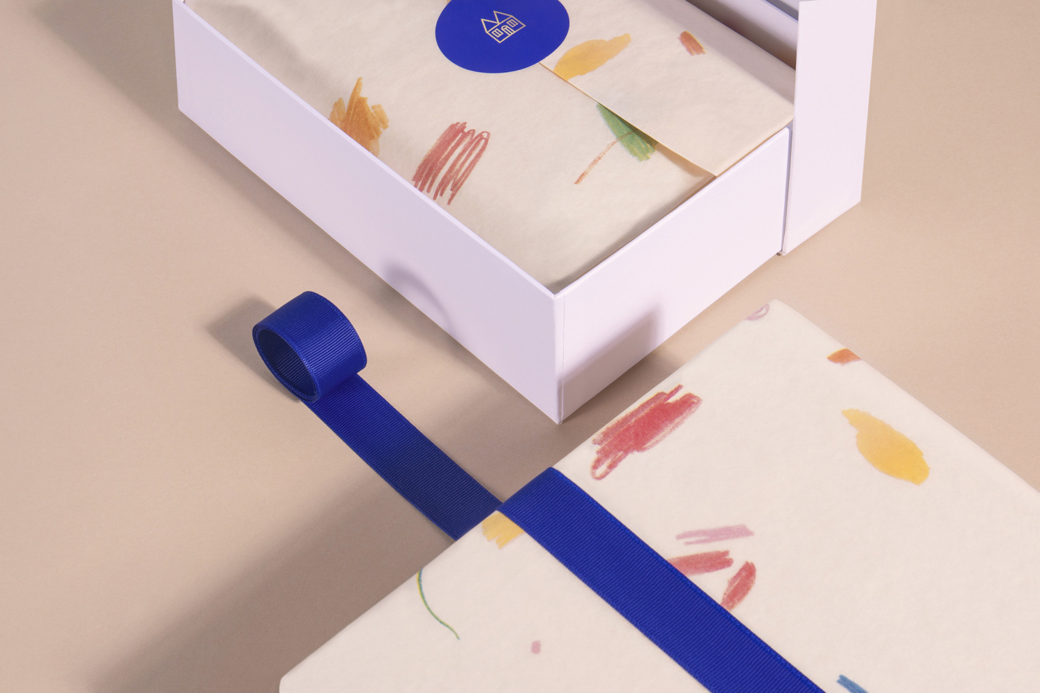
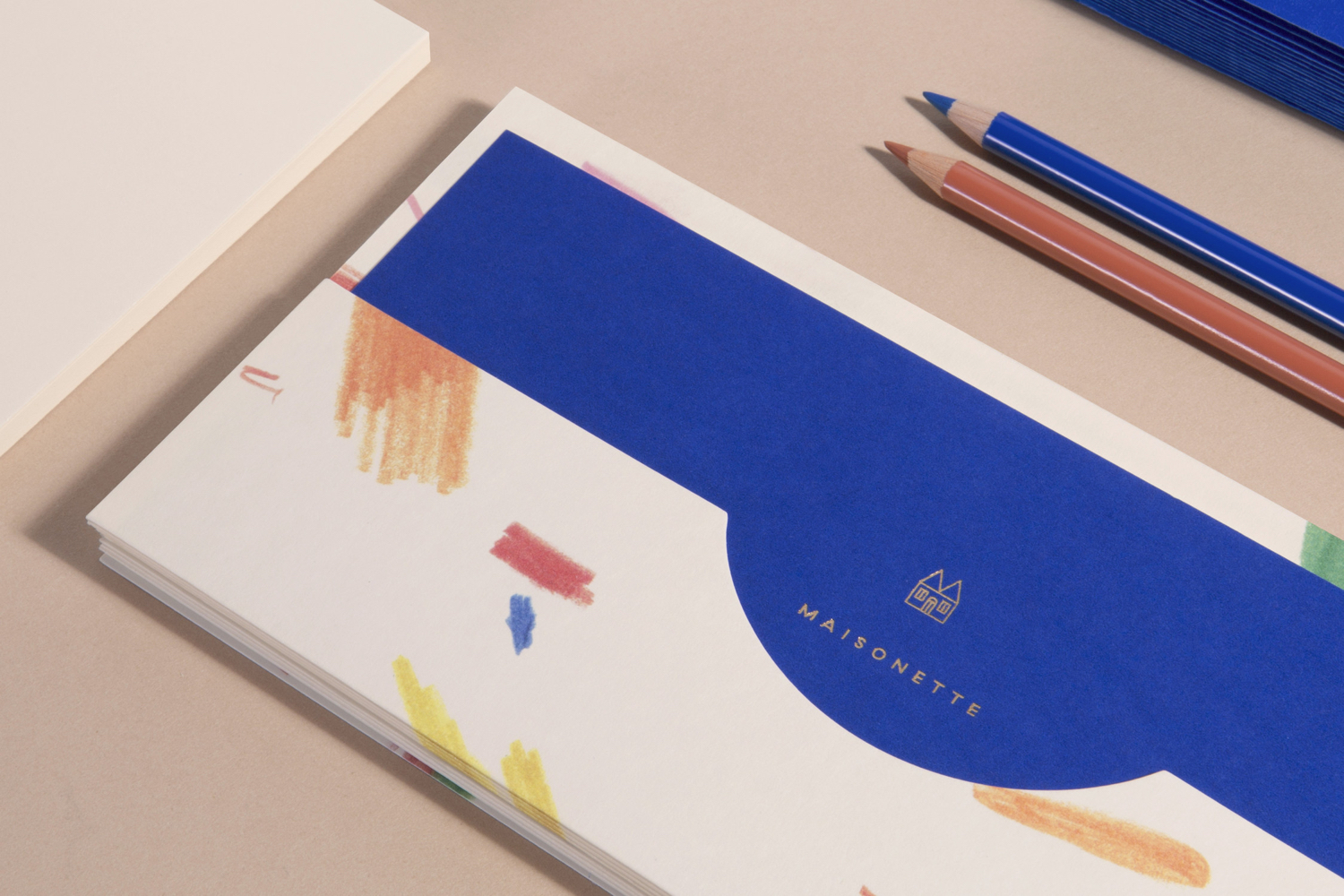
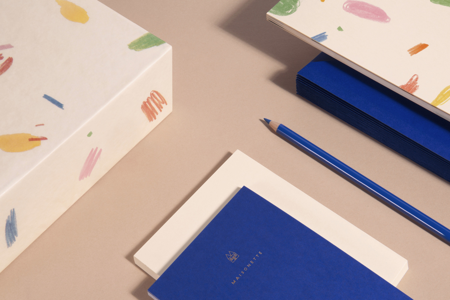
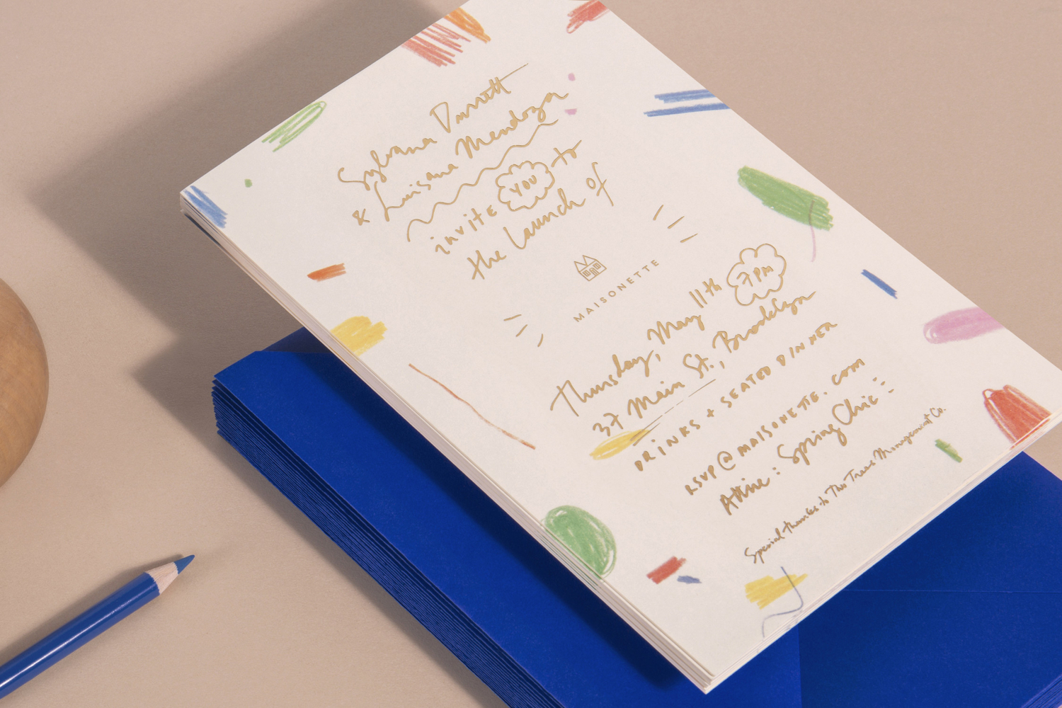
Maisonette’s visual identity, designed by New York based Lotta Nieminen Studio, intends to balance and juxtapose a sense of play and a modern sophistication though scribbles and their arrangement and colour, a simple outline logo, similar logotype and a gold block foil finish. These link a variety of assets that include swing tags, stationery, business cards, packaging and website.
This is one of a number of recently documented projects designed over the last few years and uploaded to the Lotta Nieminen Studio website last week. Also check out Rent The Runway, and Cienne.
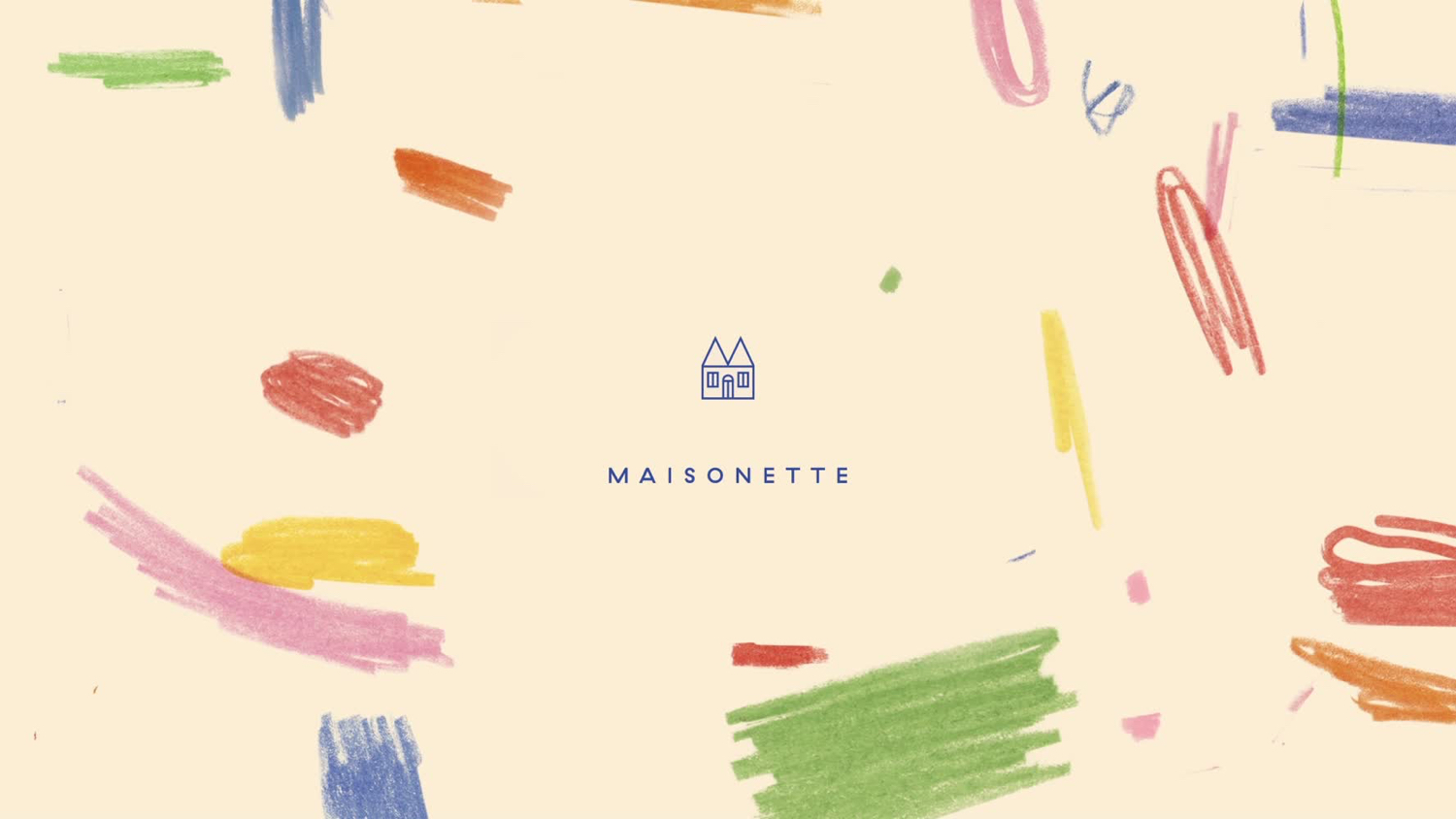
Lotta Nieminen Studio’s approach is strategically straightforward and conceptually intelligible. They help Maisonette establish a sense of quality without leaning on luxury material or graphic conventions or excess, aside from the occasional block foil, through the artful arrangement and balance of scribbles, the use of space and solid blocks of colour.
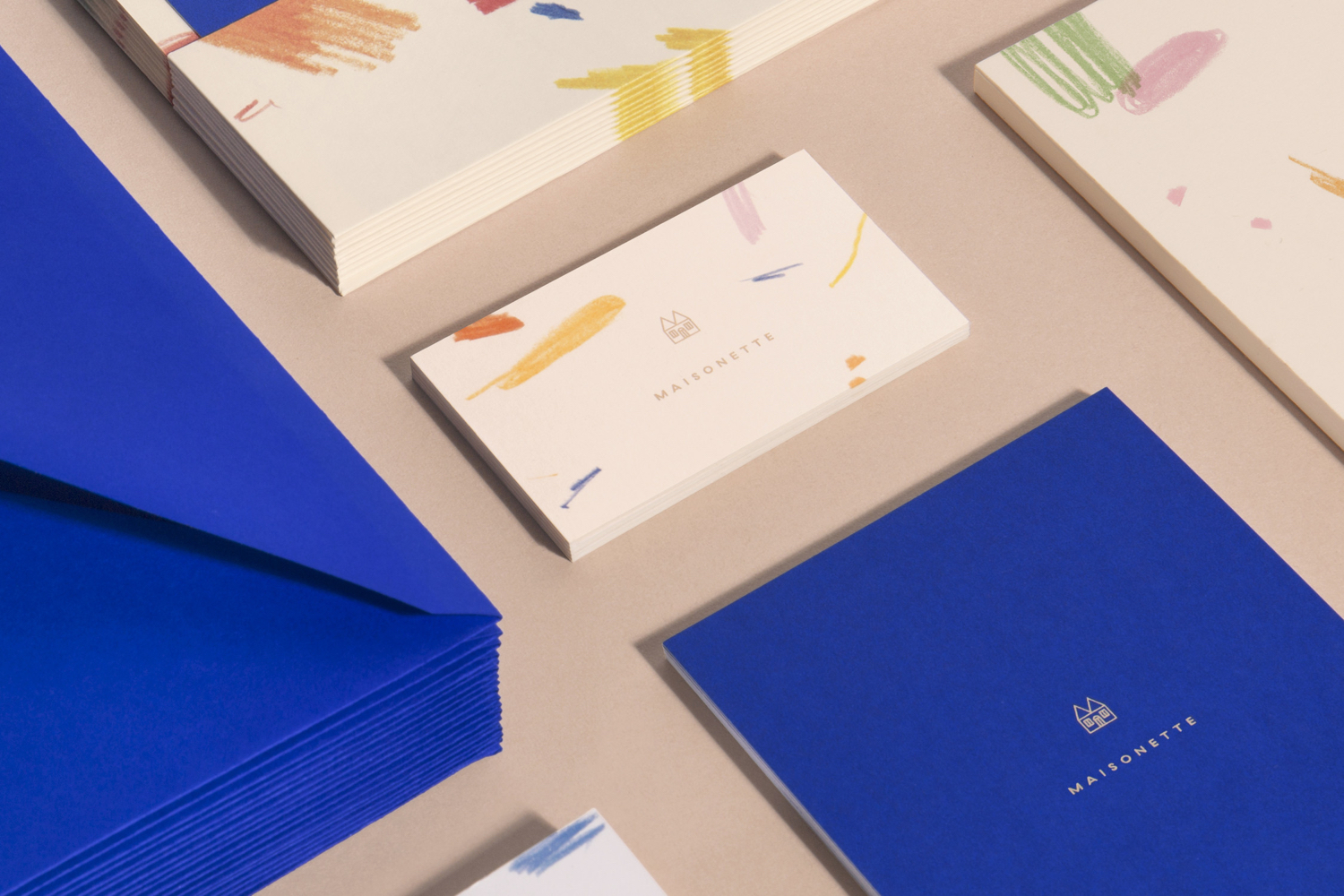
There are occasions, particularly across the business cards, where the considered and formal is challenged by the spontaneous and irregular. This juxtaposition is where the work draws its character and communicative value, tapping into a personal and universal experience. It would be hard for a parent, from whatever background, not to connect with this simple graphic expression in some capacity.
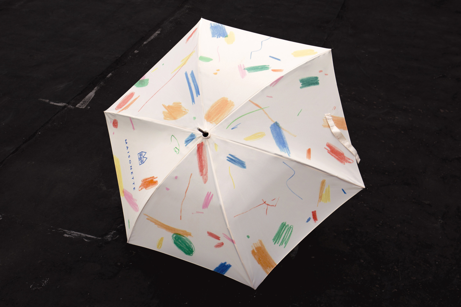
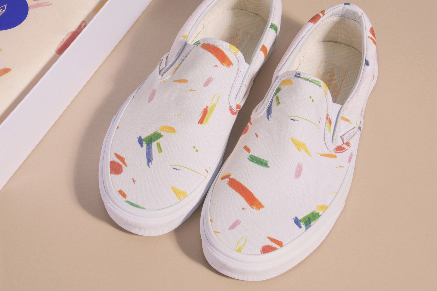
Stylistically the scribbles, in their colour, texture, sense of direction and weighting establish a continuity and variety across printed pieces. There is not an obvious repetition. These scribbles often appear responsive to context, rather than being cropped from a larger single panel illustration. There is an authenticity to these in their drawing and a quality in their reproduction that plays with childish gestures and something of art in the use of the entire canvas, and are made the most of across umbrellas and vans.
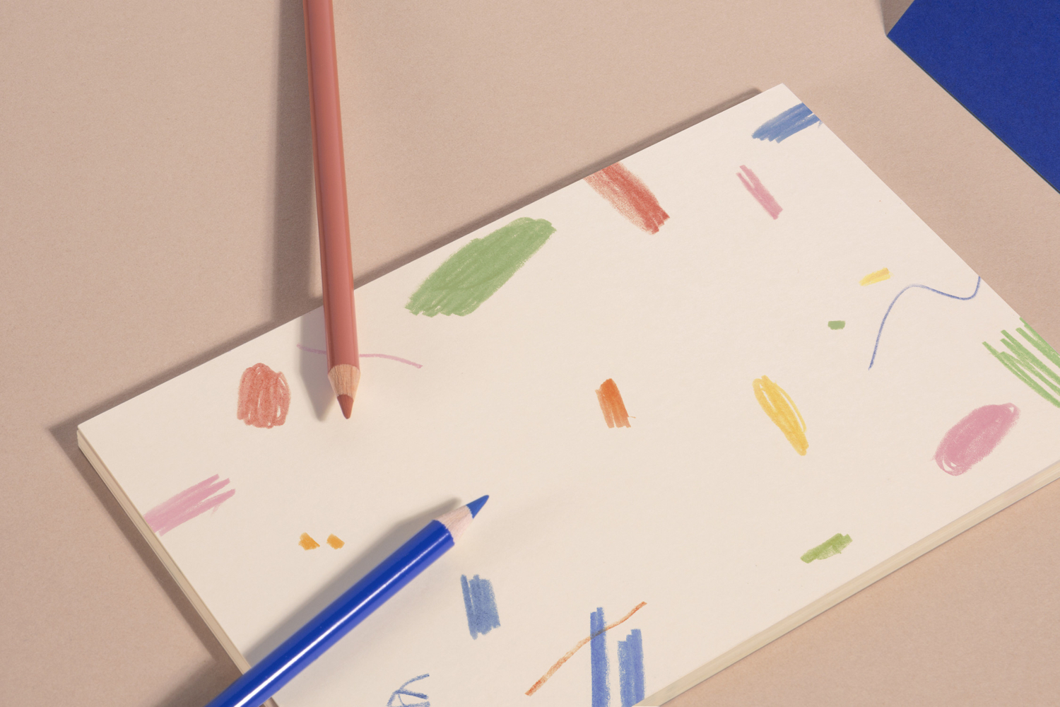
The logo, and its similarly weighted logotype, although applied rather small, act as a visual anchor where scribbles feel dynamic and disordered. The monolinear and geometric continuity of logo–a simple play on the name and the letter and M–and the lines and shapes of GT Walsheim–favour the modern, with a useful contrast between graphic, typographic and iconographic assets. This contrast also plays out in colour, in the mixing of a vivid blue, a more neutral skin tone and the long-serving and perceived value of a gold block foil.
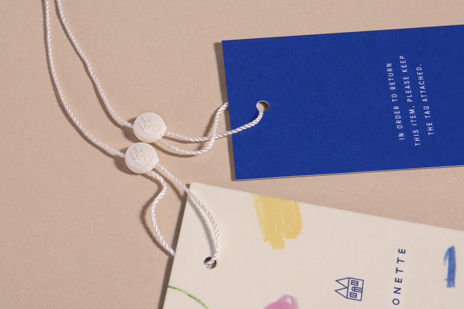
Other interesting details include the serif flourishes of Commercial Type’s Canela, which introduces a familiar sense of craft and quality. The drawing of the door of the logo which calls to mind rubber-topped pencils, tying in nicely to the scribbles. The welcoming qualities associated with a home motif. And the gold block foiling of a handwritten invitation, a clear meeting of the personable and the high quality. The lines and proportions of logo, its distinctive M roof, casement windows and door serve as a useful and identifiable marque within the constrained contexts of social media avatars, and is simple enough to be cast into plastic swing tag ties.

There have been plenty of versions of this concept, and a significant breadth in the quality of their execution and implementation. Taking something as spontaneous and rudimentary such as the scribbles of a child, and wrangling these into something cohesive and high-end whilst maintaining an authenticity, and drawing something recognisable and distinctive from the universal, takes skill and sensitivity. Colour and arrangement, a contrast of the irregular scribbles and the uniform lines of logo and logotype, a juxtaposition of solid blocks of colour and the variable texture of crayons all play their part, and feel well-balanced, while the use of the gold across the invitations is a really neat convergence of intimacy and luxury. More work by Lotta Nieminen Studio on BP&O.
Design: Lotta Nieminen Studio. Website: Praesens. Opinion: Richard Baird. Fonts Used: GT Walsheim, GT Pressura & Canela.
