Architects Accreditation Council of Australia by Toko
Opinion by Richard Baird Posted 27 November 2017

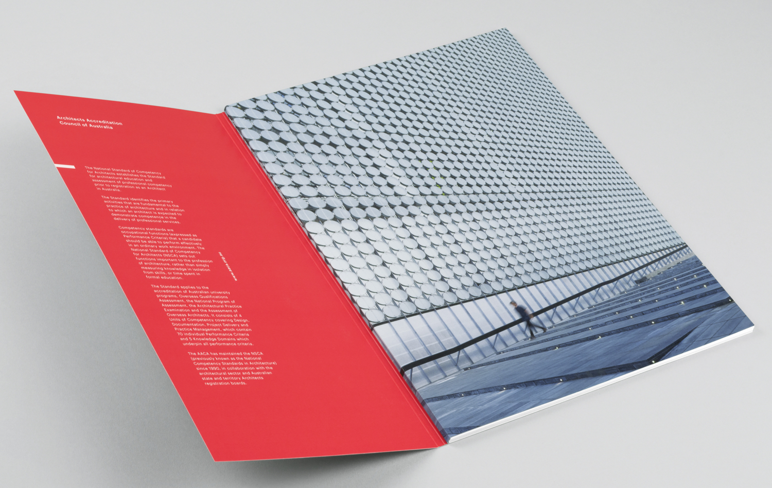
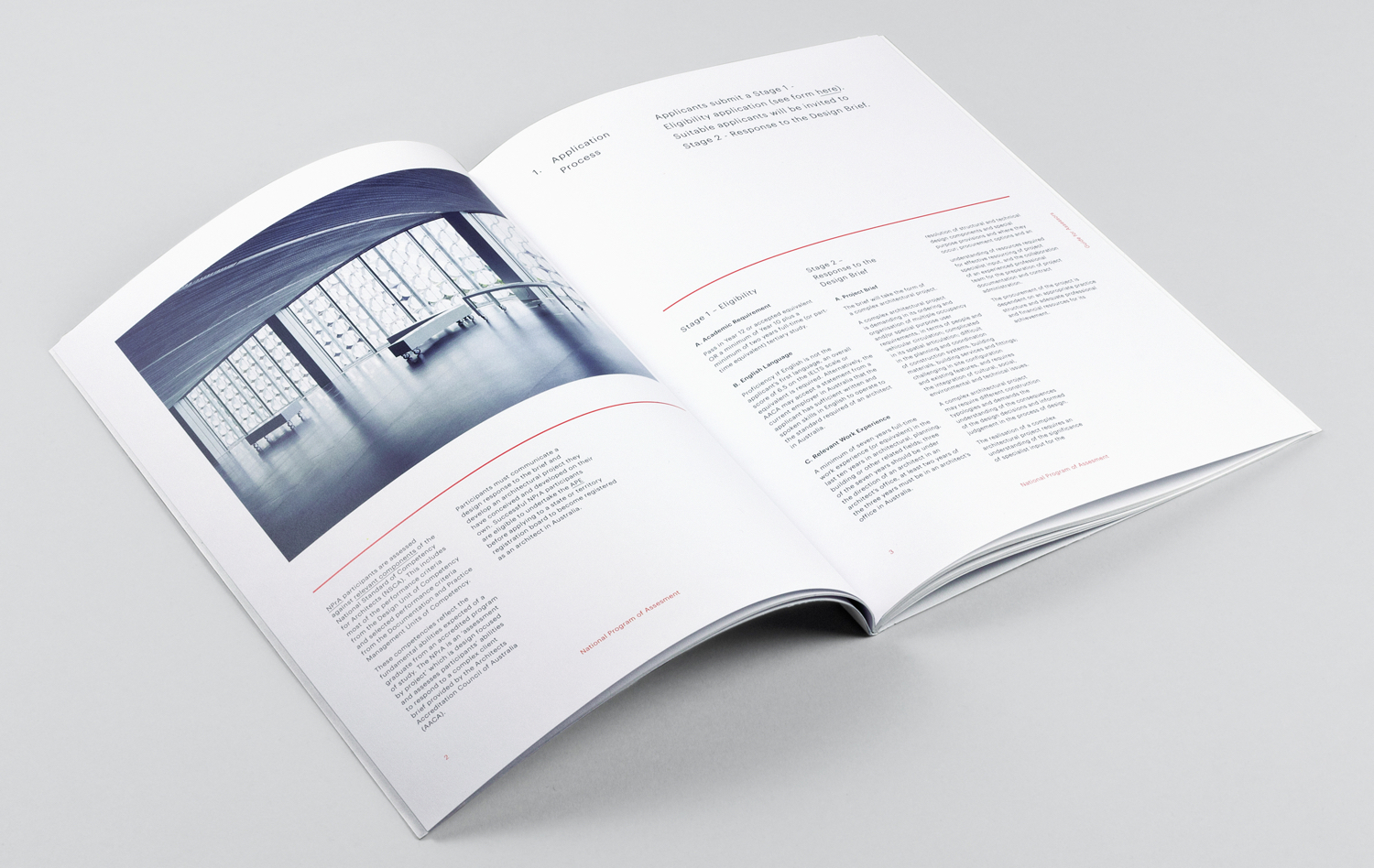
Architects Accreditation Council of Australia (AACA) is the national voice for architect registration boards around Australia. The council runs the Architectural Practice Examination, assess overseas qualifications, collates data on the profession throughout the country, facilitates international mutual recognition agreements and provides alternative pathways to registration for local practitioners and architects from overseas. The AACA worked with Sydney-based studio Toko to clarify the complexity of their existing application system, and develop a new graphic identity. This links, alongside a variety of forms and guides, stationery, business cards, compliment slips and signage.
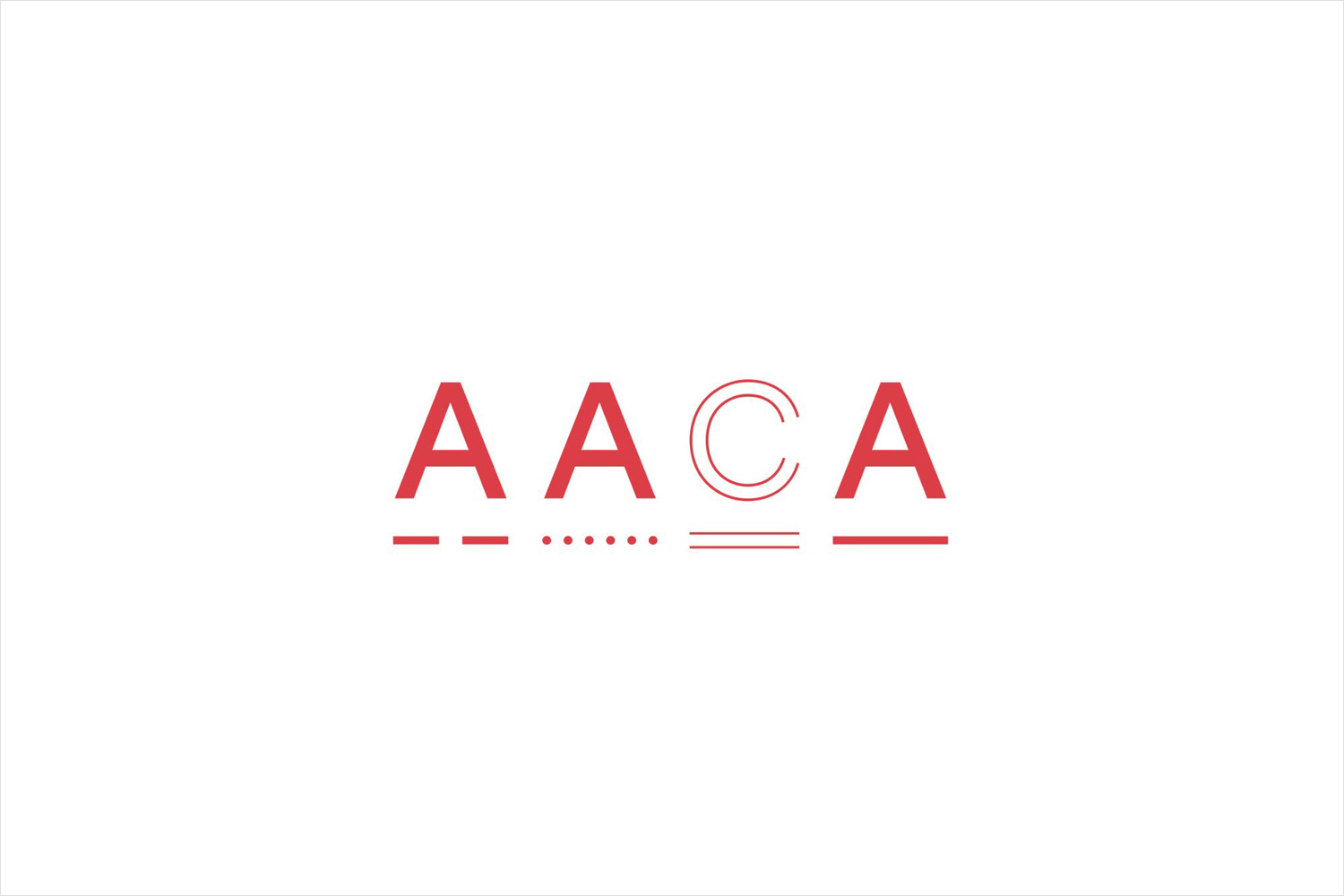
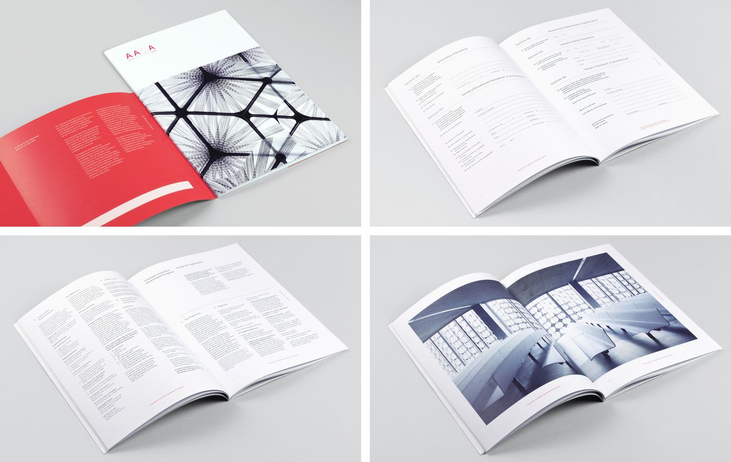
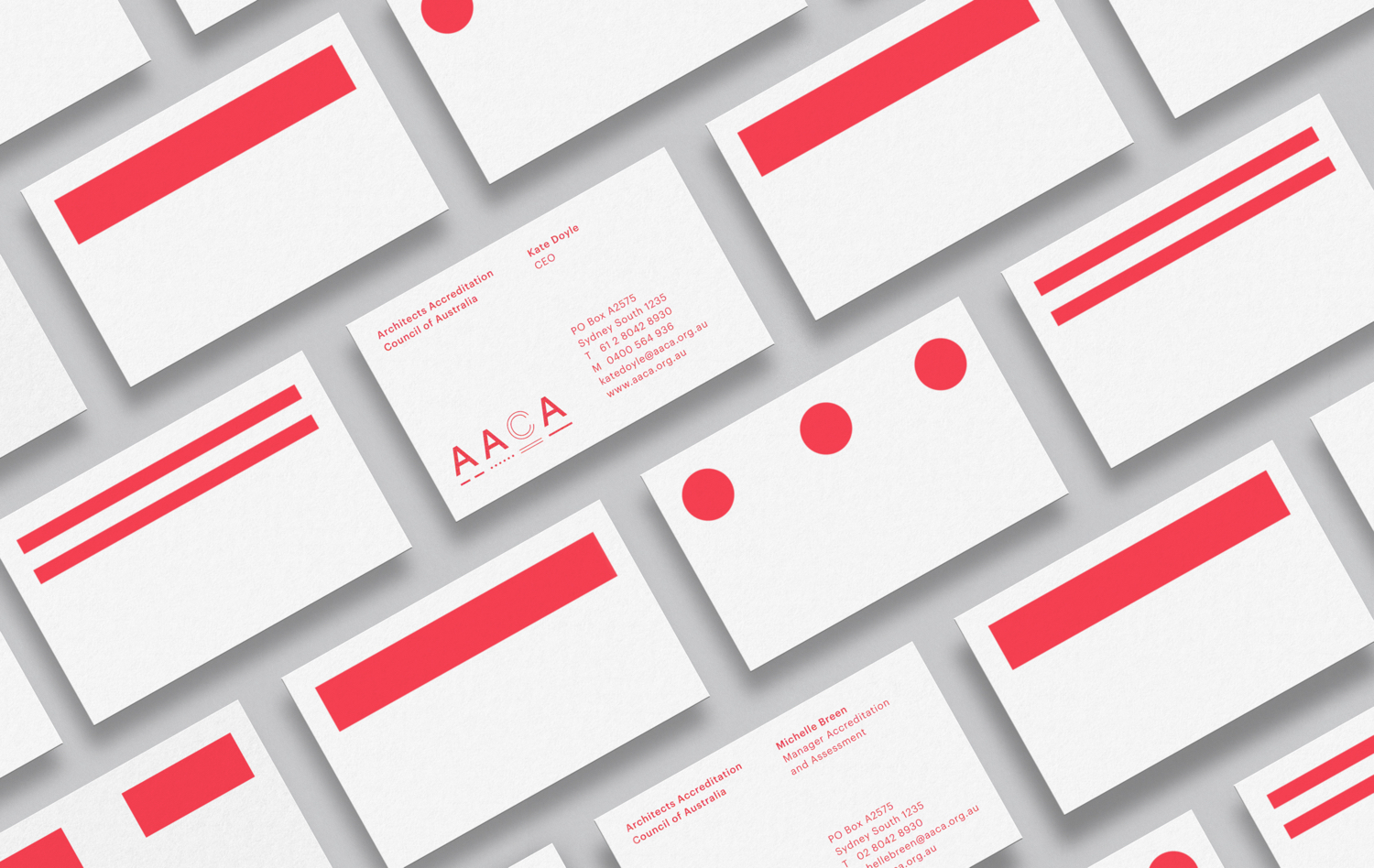
Toko’s graphic identity for the AACA derives its bold stylistic qualities from the quiet and functional visual language of forms and application systems. Lines, dots, dashes and parallel lines help to divide, alongside colour, various forms, guides and documentation, and establish a distinctive expression across business cards and stationery. Together, these find a neat balance between the functional component of application forms, something of the architectural—both the technical and the structural—and the various paths (or tracks) to accreditation. These lend the work an interesting conceptual component.

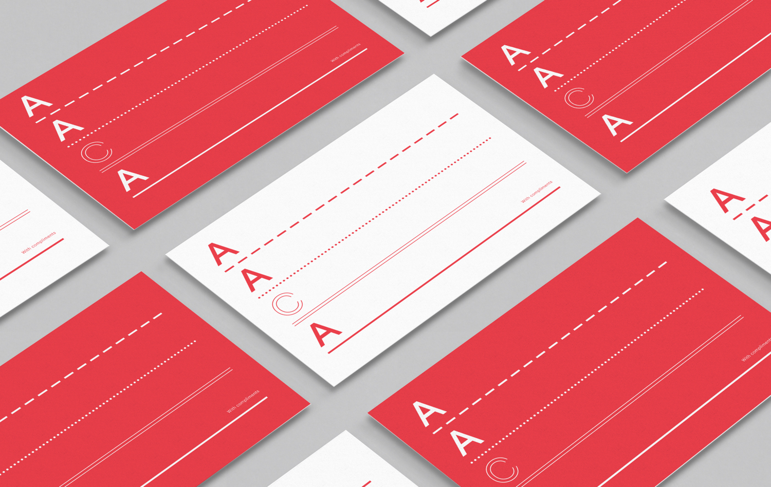
It is a simple approach that draws its value from the intersection of a few relevant and intelligible ideas, their singular stylistic resolution and impact in implementation. Shape, colour and flow, grounded in the basic functionality of dividing and easily guiding people through complex forms, has been used effectively to secure recognition and continuity across a variety of printed assets.
There is a natural crossover into the architectural, in the arrangement and form inherent to the lettershapes of logo, particularly in the repetition of the As and difference of the C, as well as the framing of space with type, and in the technical associations of different line types.
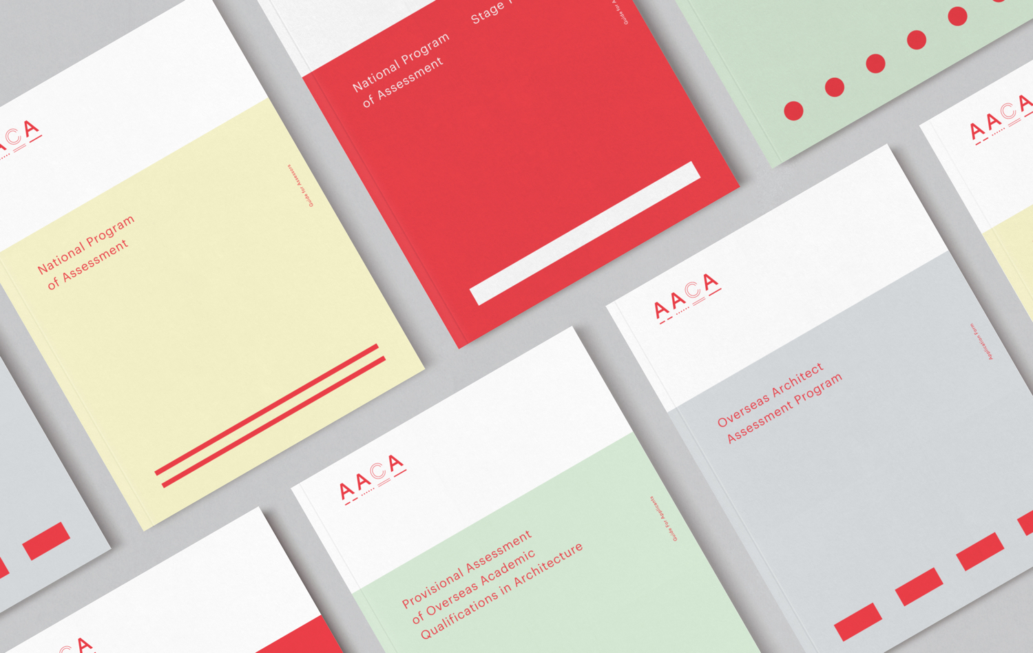
The paths, scaled up and in conjunction with a bright red are striking, and alongside a pastel colour palette associated with forms, work well to divide a variety of application documents. Business cards make the most of the dots, lines and dashes, enlarging these far beyond their original practical intentions to secure graphic impact whilst maintaining a clear continuity and relationship to documents, but also architecture, the theme of paths and form filling.
Unfortunately, the AACA website remains somewhat conventional, with logo dropped into the header. The design of the forms and documents (viewed online), while the foundation of a memorable graphic identity, still take a rather expected course.
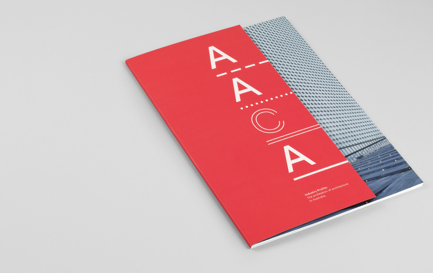
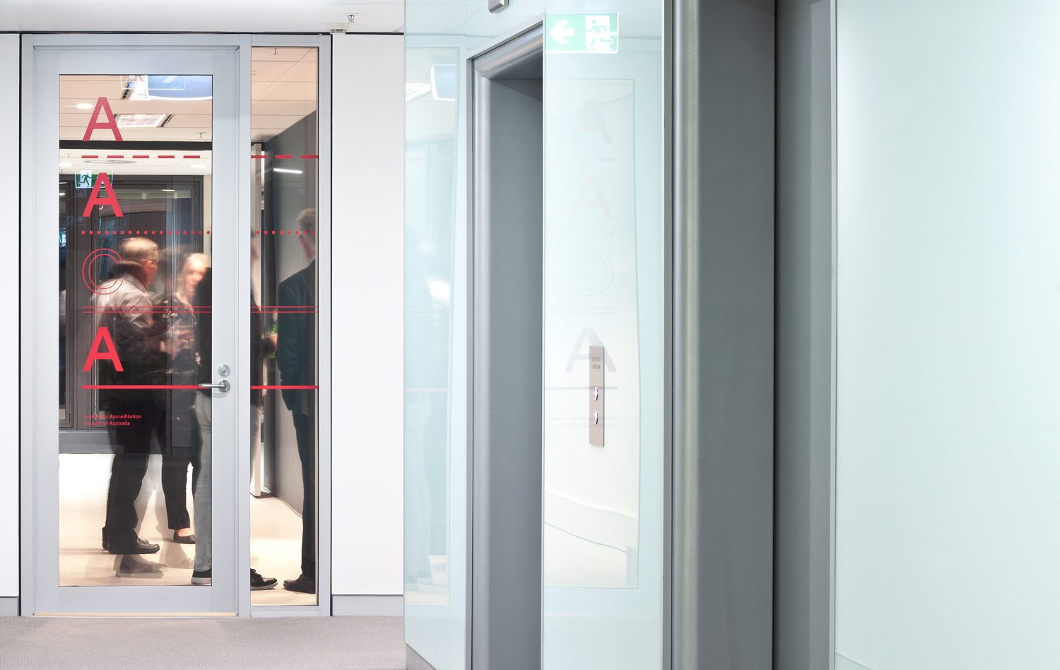
Other neat details include the cropped cover of the Industry Profile document which, through juxtaposition, makes a connection between the build of logo and architecture. This continues on the inside cover in arrangement and typesetting. The vertically stacked letters of the logo, and the horizontal extension of the lines across contexts such as the door, display a contextual flexibility which could easily branch out into spacial as well as form-based wayfinding. More work by Toko on BP&O.
Design: Toko. Opinion: Richard Baird.
