Whitlam Place by Studio Hi Ho
Opinion by Richard Baird Posted 30 November 2017
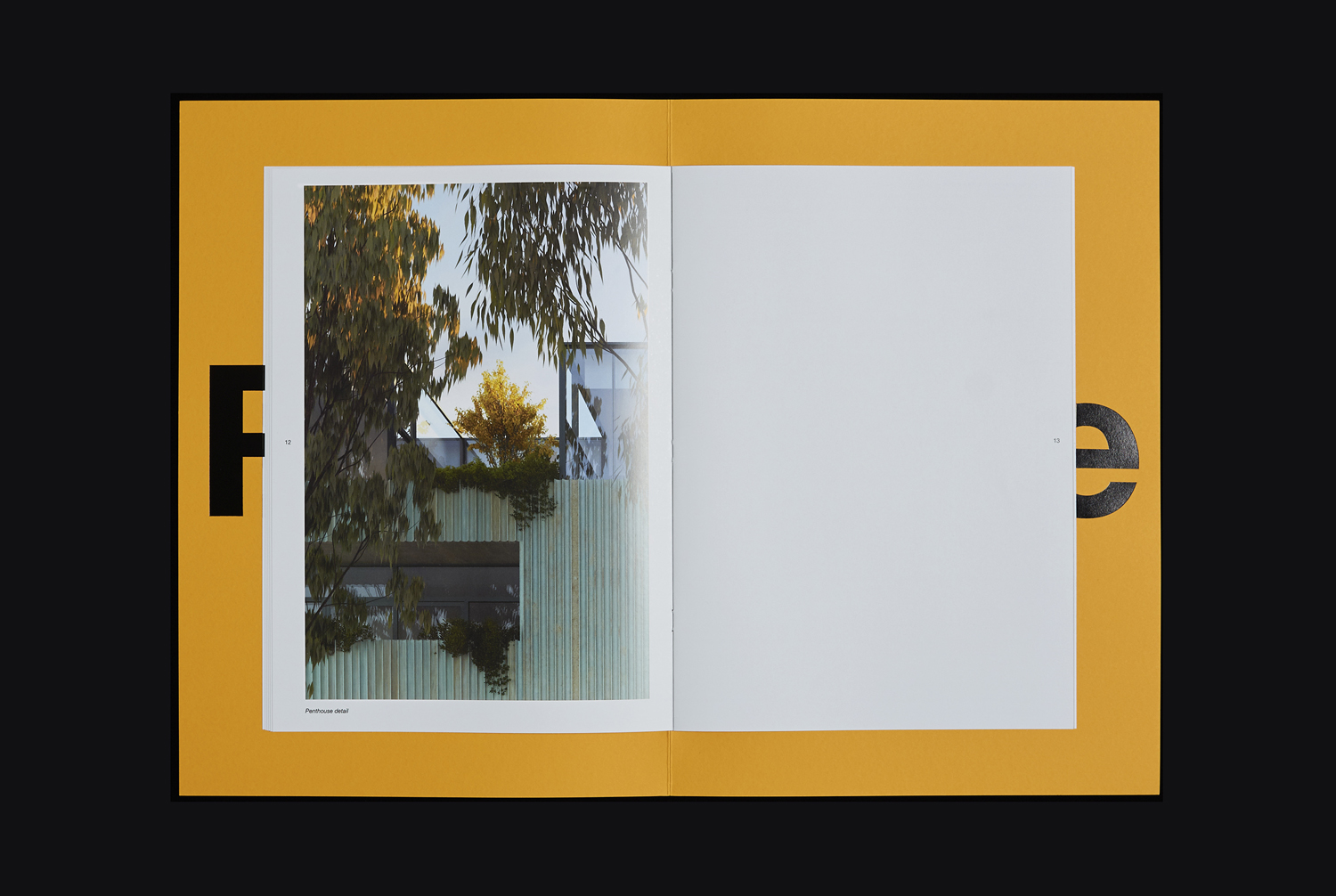
Whitlam Place is a collection of eleven residencies located in Fitzroy, Melbourne, developed by Milieu Properties and completed this year. The residencies are described as being ideally positioned within a leafy pocket of the city’s most vibrant cultural precinct, and feature views of the adjacent Whitlam Place gardens, Fitzroy Town Hall and city skyline. the residencies were designed to engage with the historic surroundings through the texture of their oxidized exterior and the use of oversized glass panels.
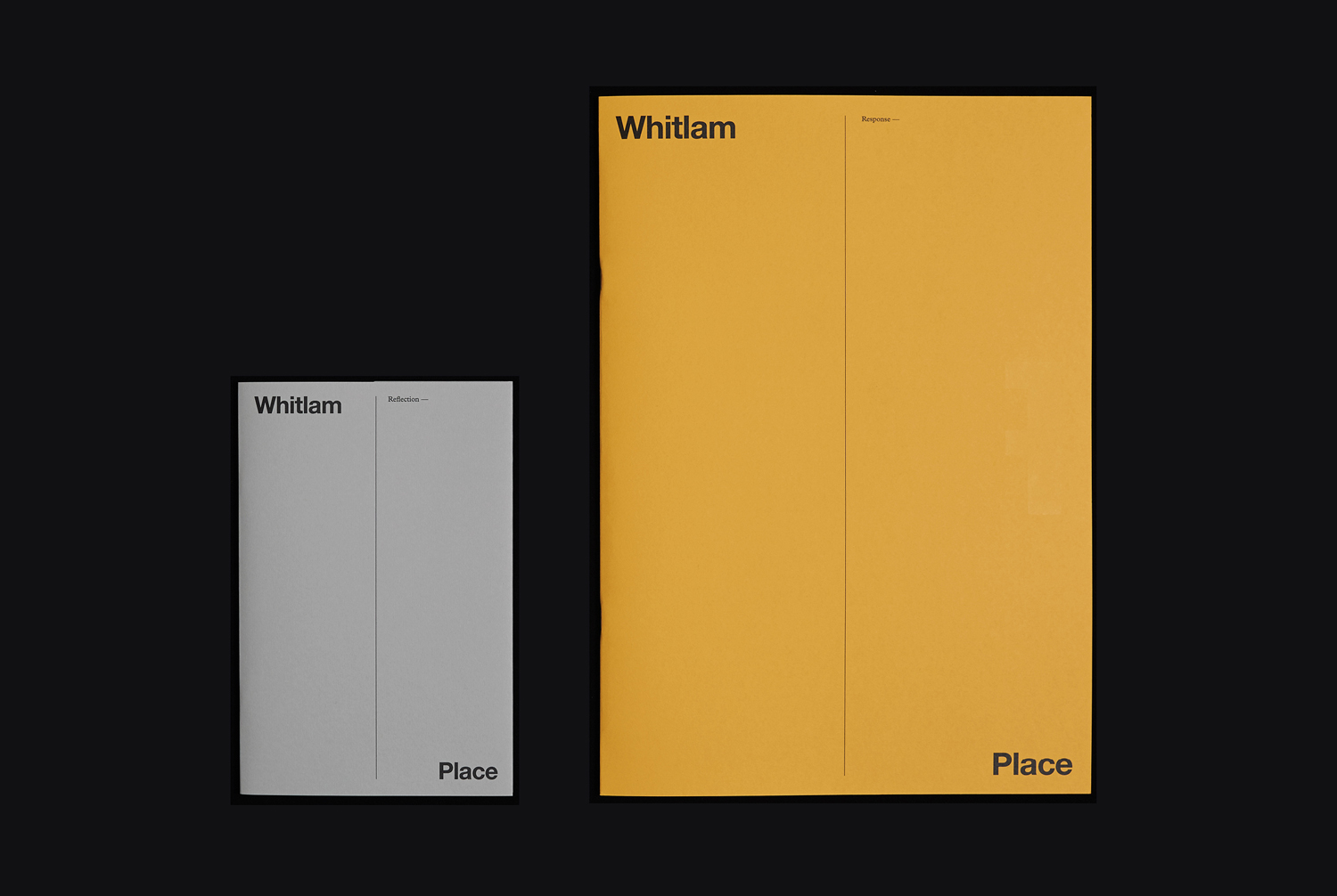
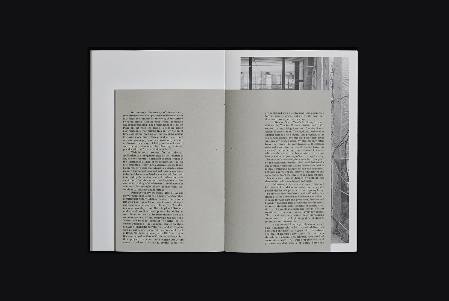
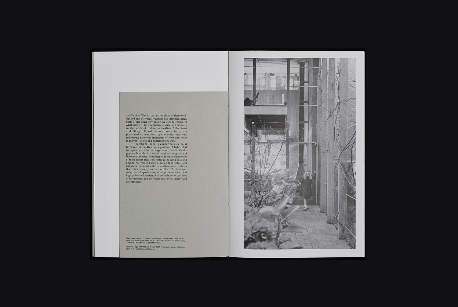
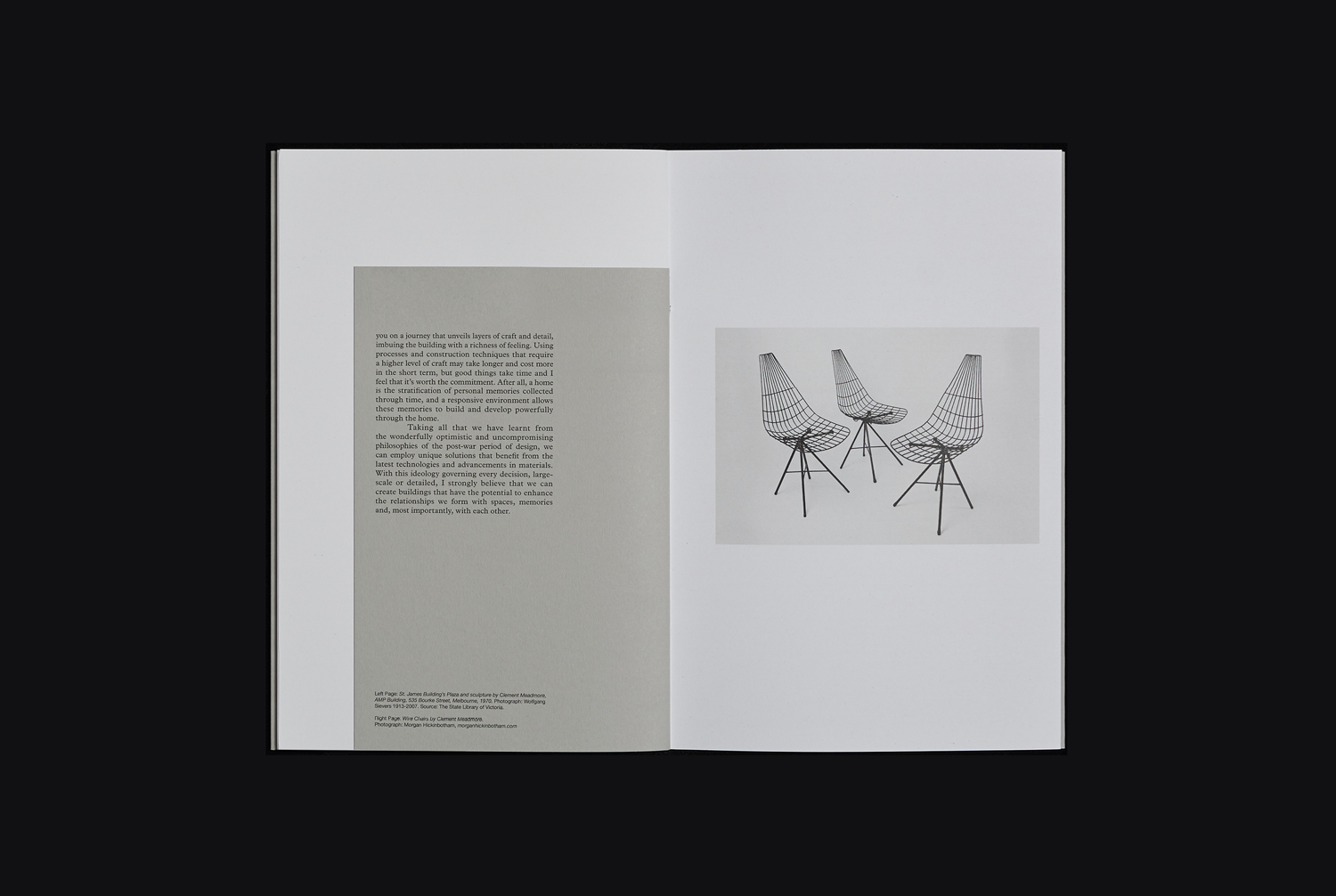
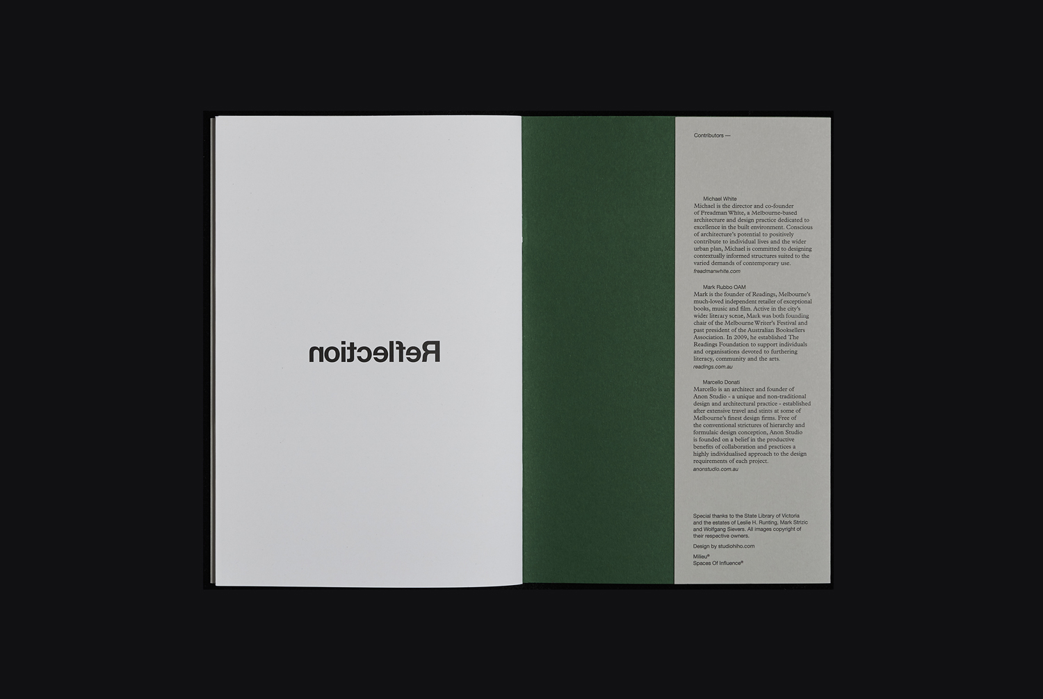
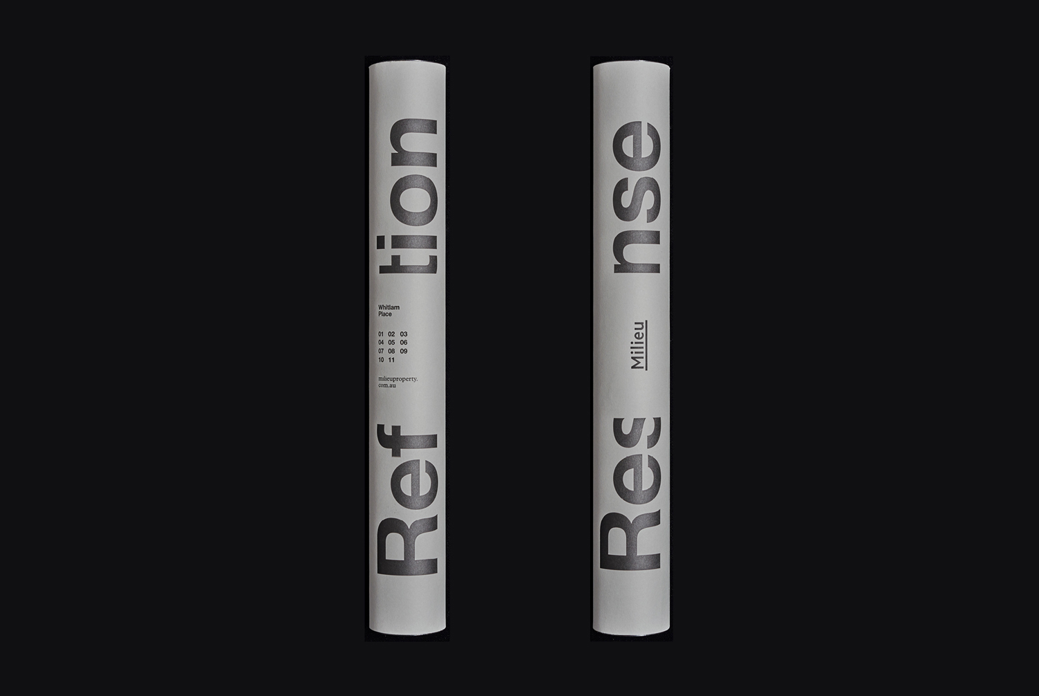
Whitlam Place is the product of a two-part design philosophy and strategic action of extended reflection and considered response. This is expressed by two documents, created by Melbourne-based design studio Studio Hi Ho, that made up part of a wider marketing campaign. The first document, Reflection, outlined the thinking, inspiration and rationale of the project through essay and image. The second, Response, presented the outcome through renders and a material expense rooted in the residencies quality, detail and richness of form. Although this project was completed in 2015, this is the first time it has been published online in its entirety.
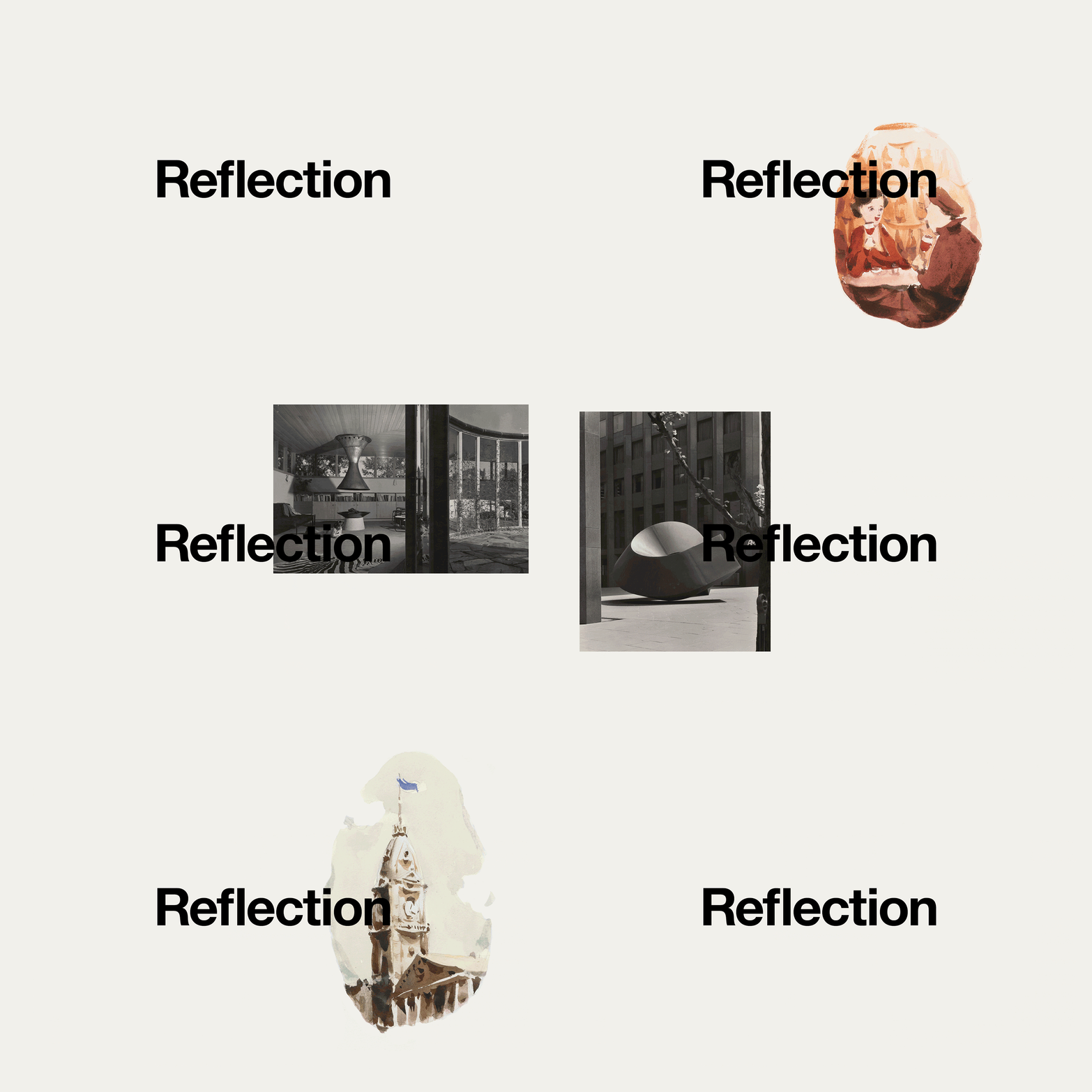
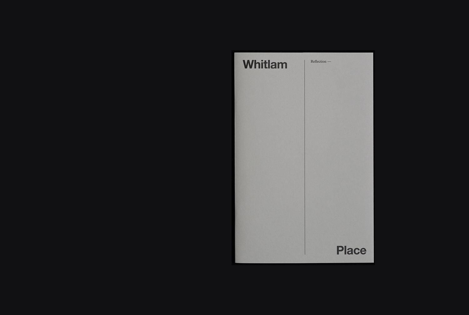
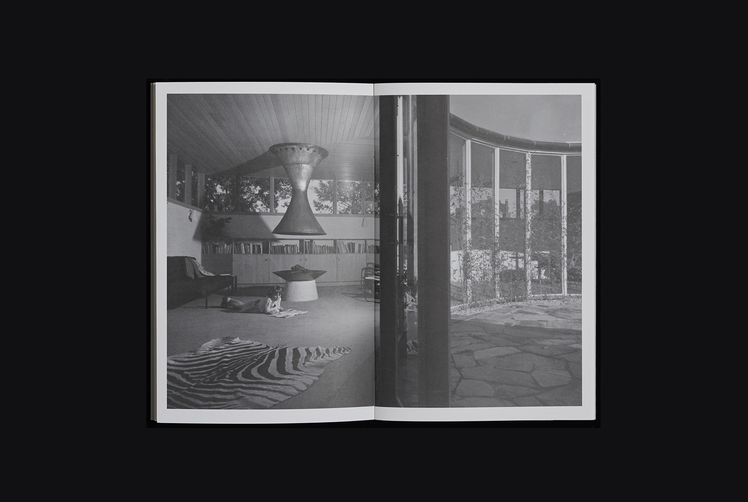
Although there is a compelling graphic and material component to work, the two-part nature of brochure—intellectual stimulus followed by an aesthetic pleasure—gives the work a strategic and conceptual weight. It draws value from process. A detail often marginalised by the immediacy of proposed outcome, the impact of renders and material samples, for example, or devolved into simple and accessible selling points. The value of process is emphasised here by describing it as period of extended reflection, and by articulating the thinking, inspiration and rationale for the project through thoughtful essay, archival imagery and original illustration, with the intention of engaging an intelligent and sophisticated target market. This contextual weight, and the equality of insight and outcome is the real highlight, and communicated effectively through graphic and material choices that serve to connect thought and action.
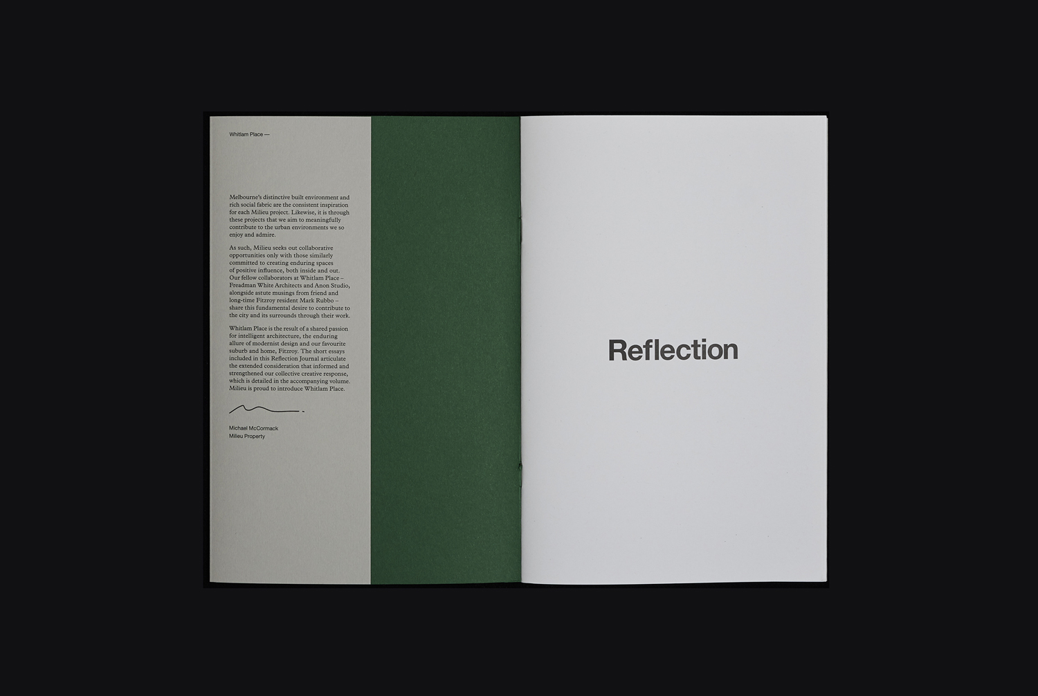
Where the words and images of Reflection offer a literal insight into thinking, inspiration and rationale through an interesting intersection of the academic (format, essay and archival image) and a storybook component (the personable qualities and content of illustration), typesetting, arrangement and colour provides a supporting visual subtext. It plays with the meeting of the urban skyline and local parks through colour, a thoughtfulness and reflection using space and the pacing of text, the intellectual and the visceral in the punctuation of images with words.
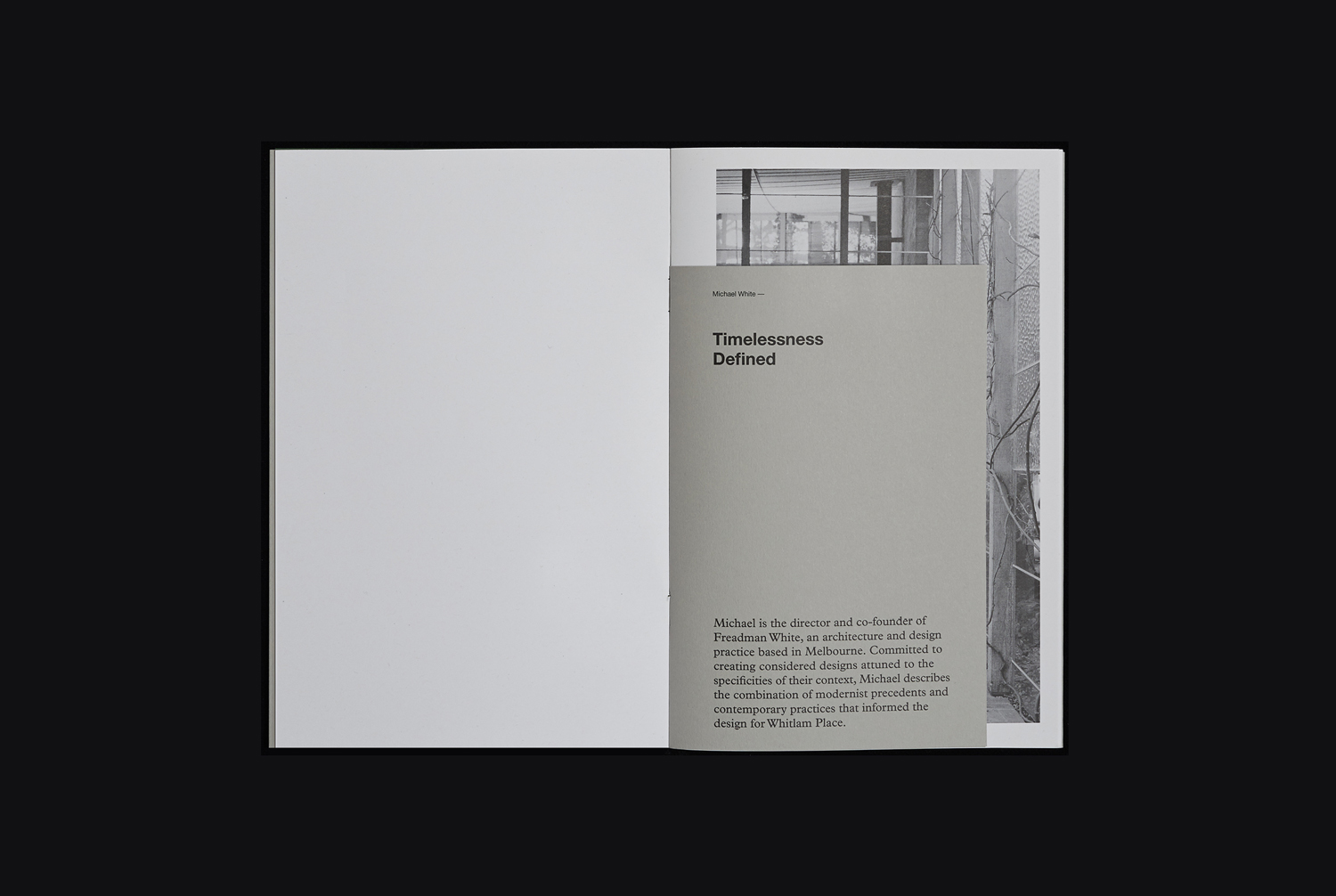
Other highlights include the contrast of black and white photography, and the personable qualities of watercolour. And the references to mid-century architectural modernism, art, craft and design culture that influence the architects, inform their contextual and historical sensitivities, and influence their response.
Again, there is a pleasant material and graphic quality to the work, but it is the insight into the thinking and rationale behind the residencies that has the greatest value. Design augments this, literally and more subtly.
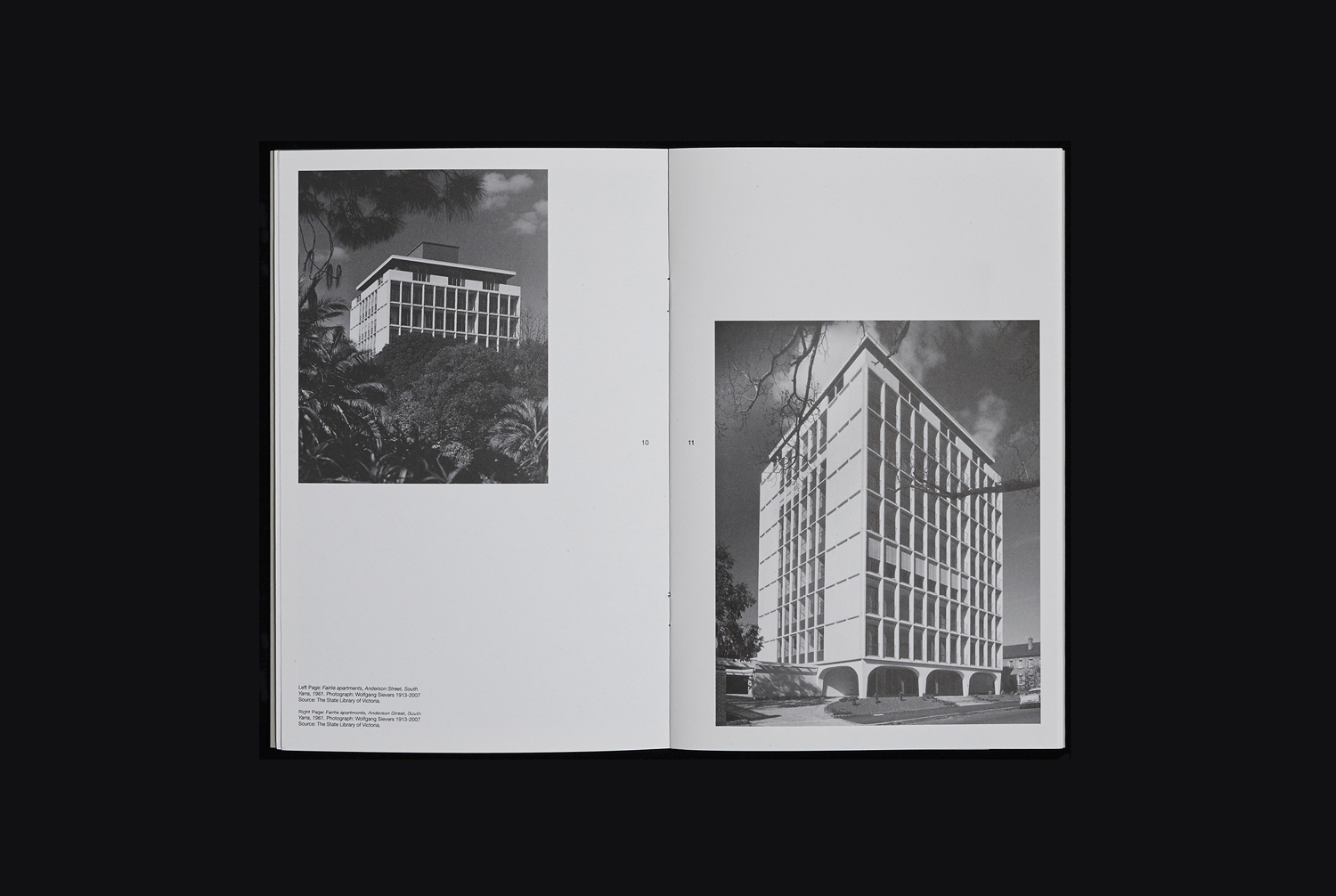
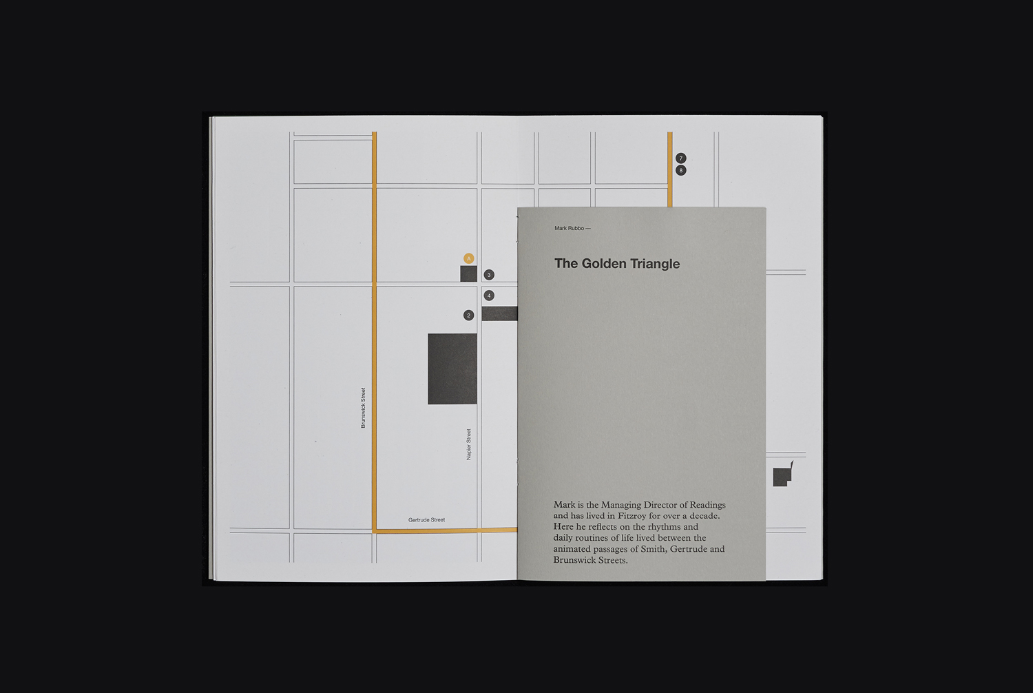
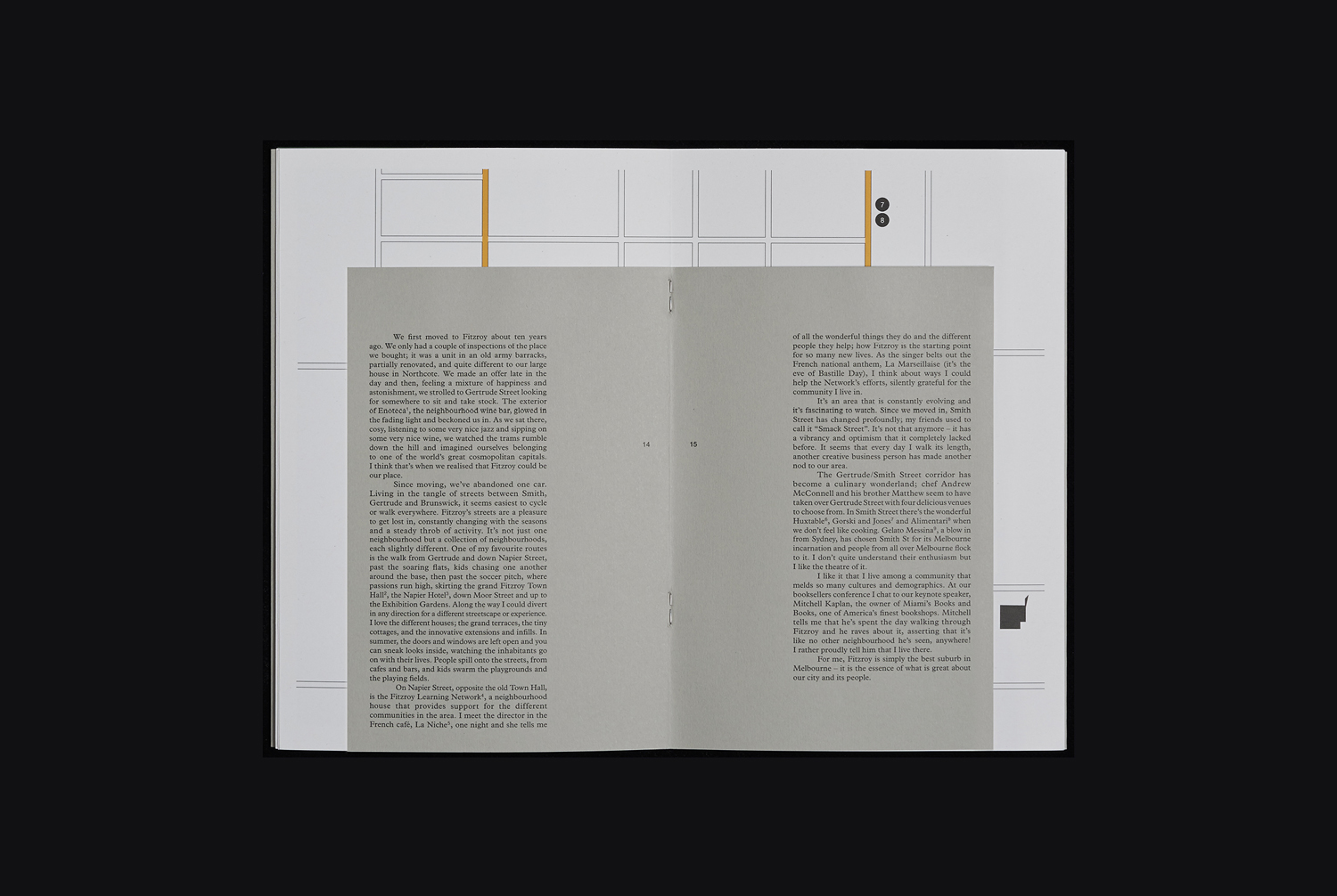
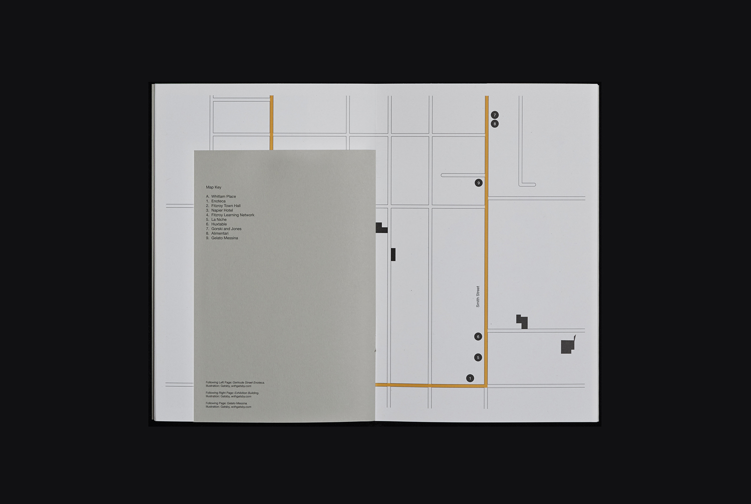
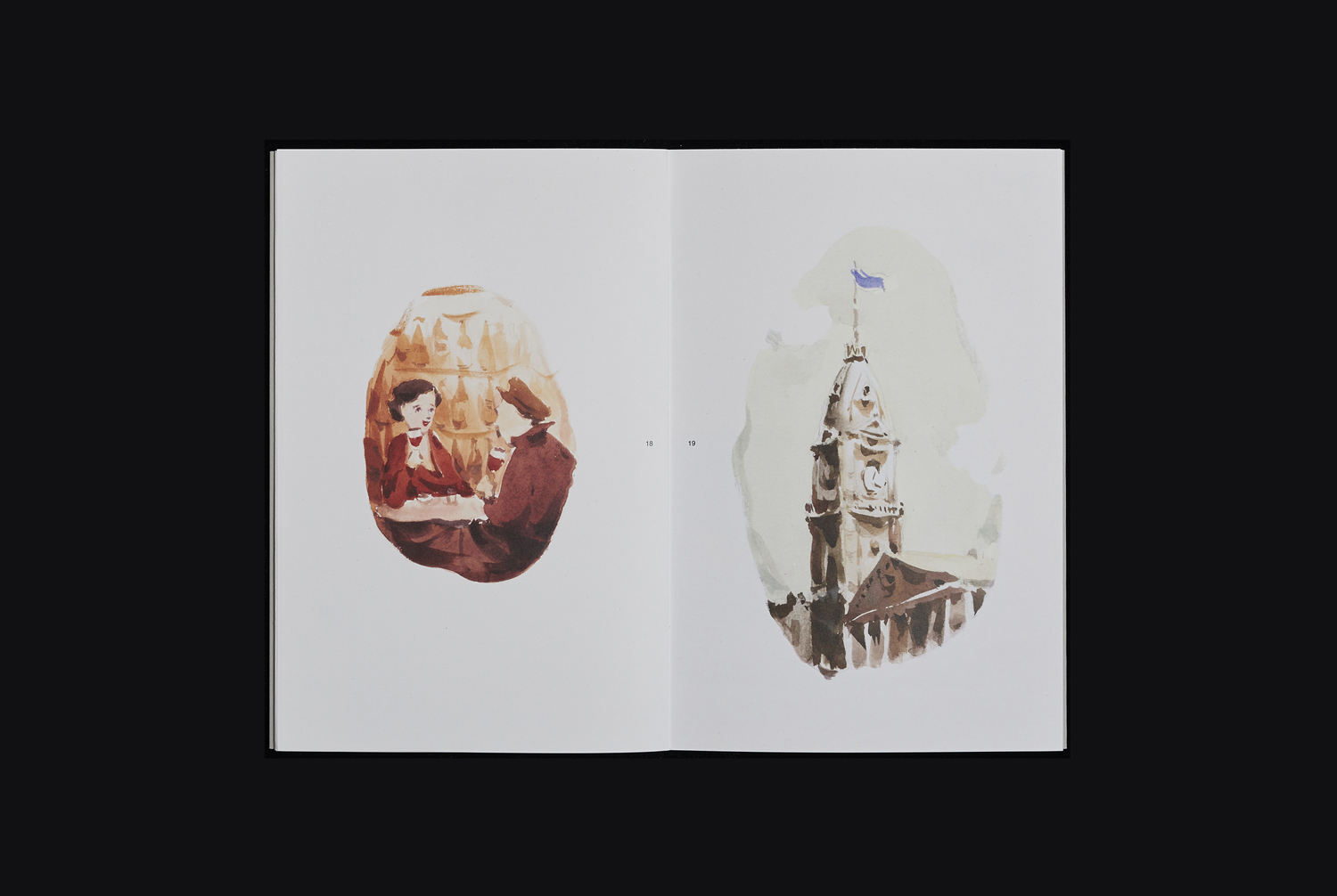
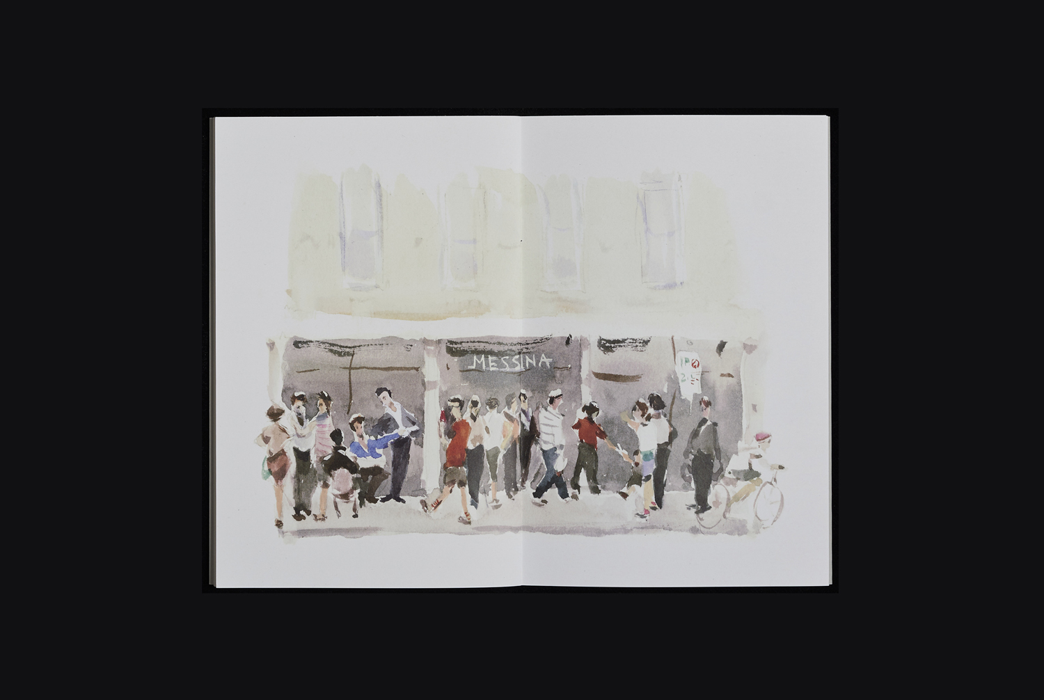
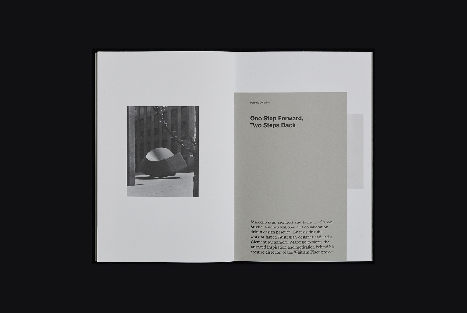
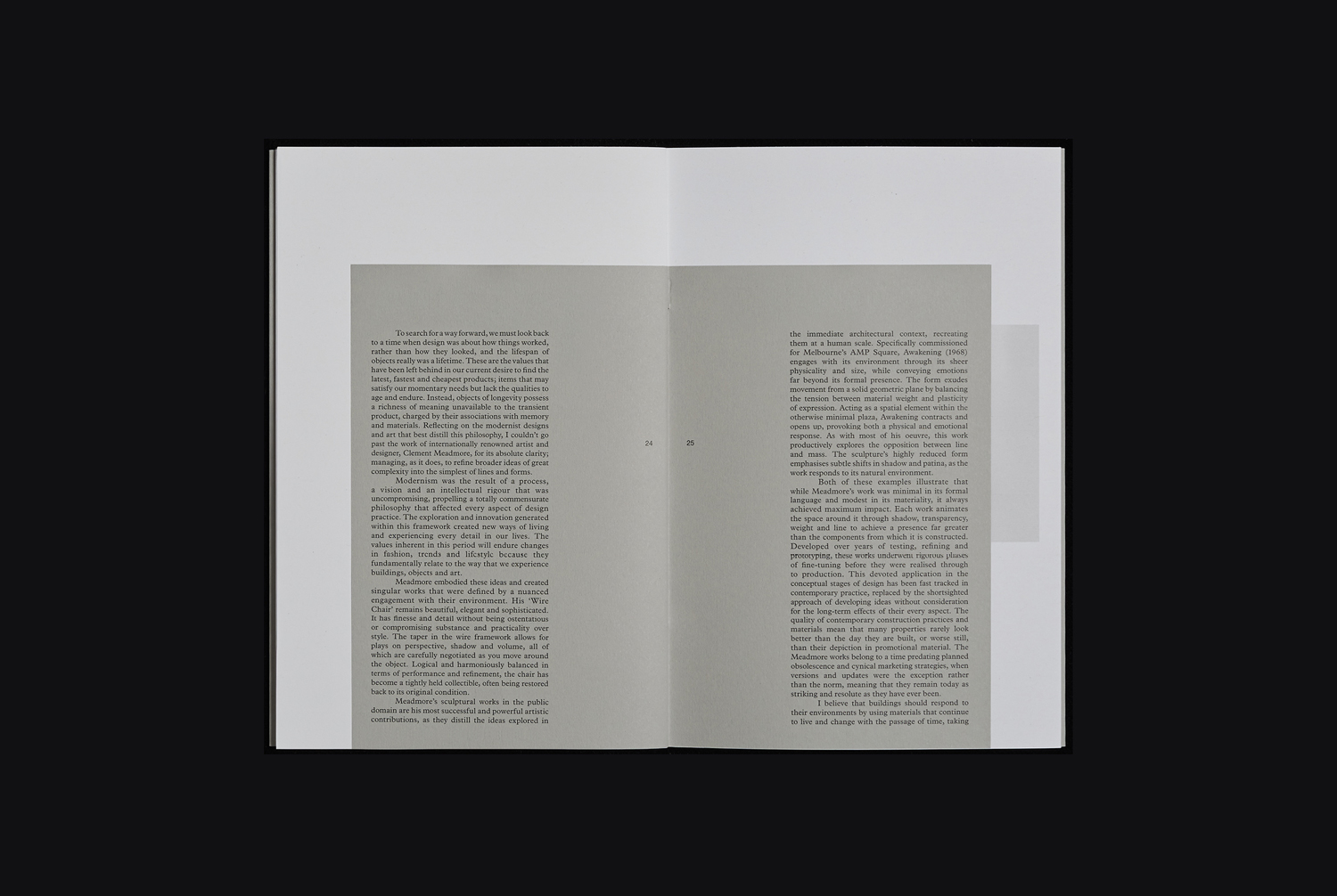

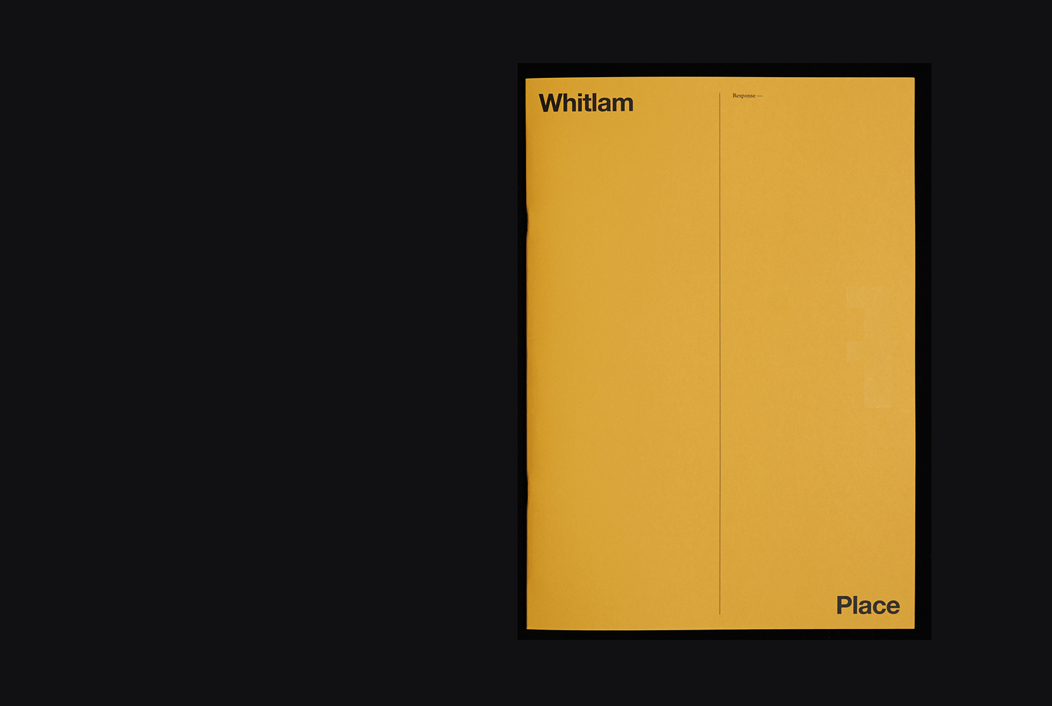
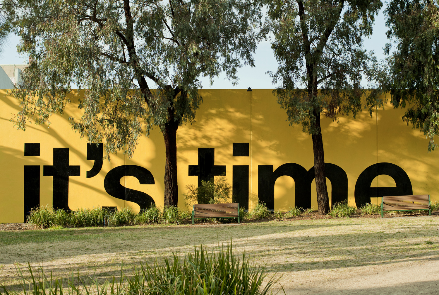
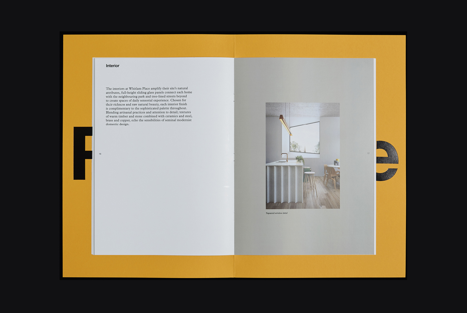
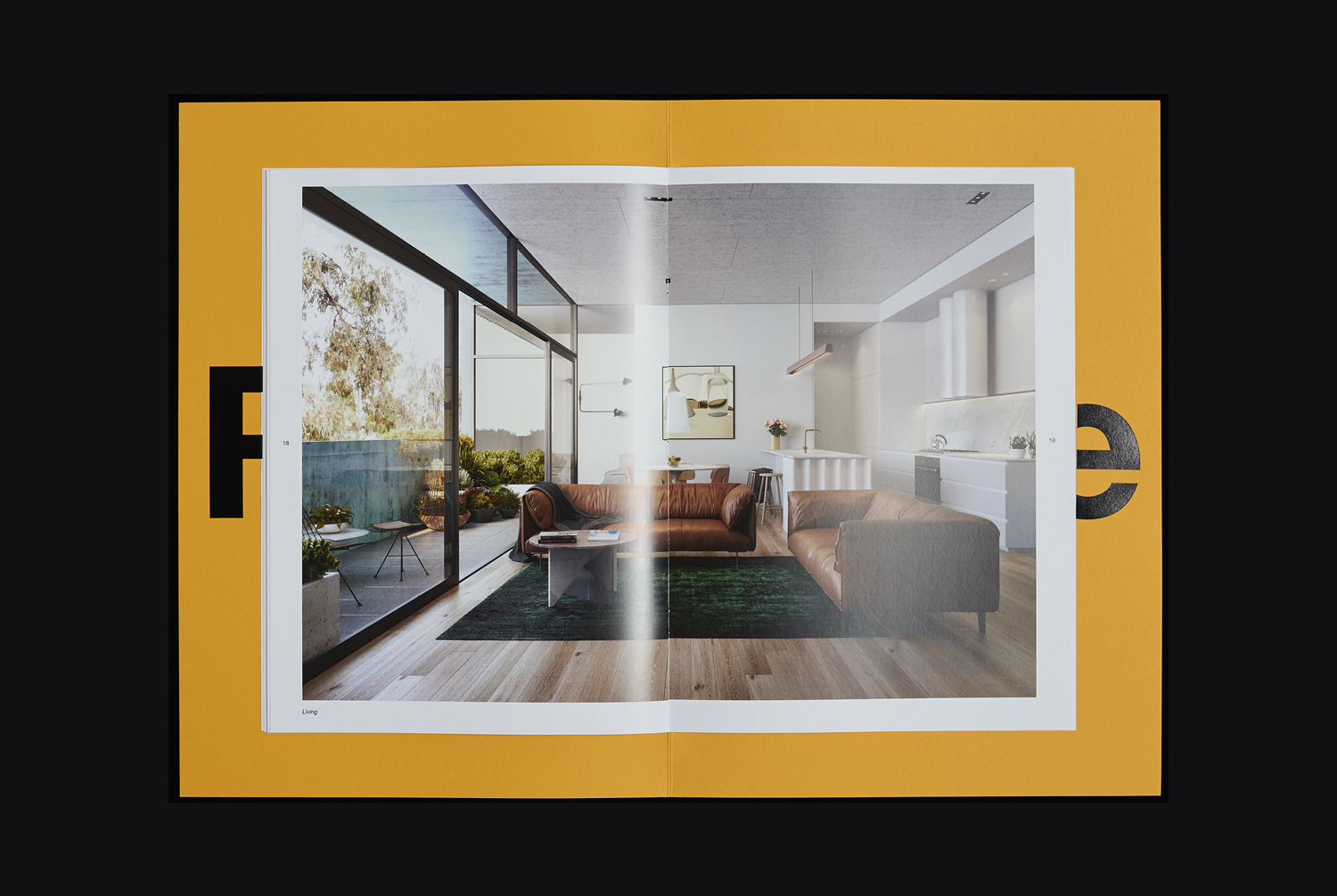
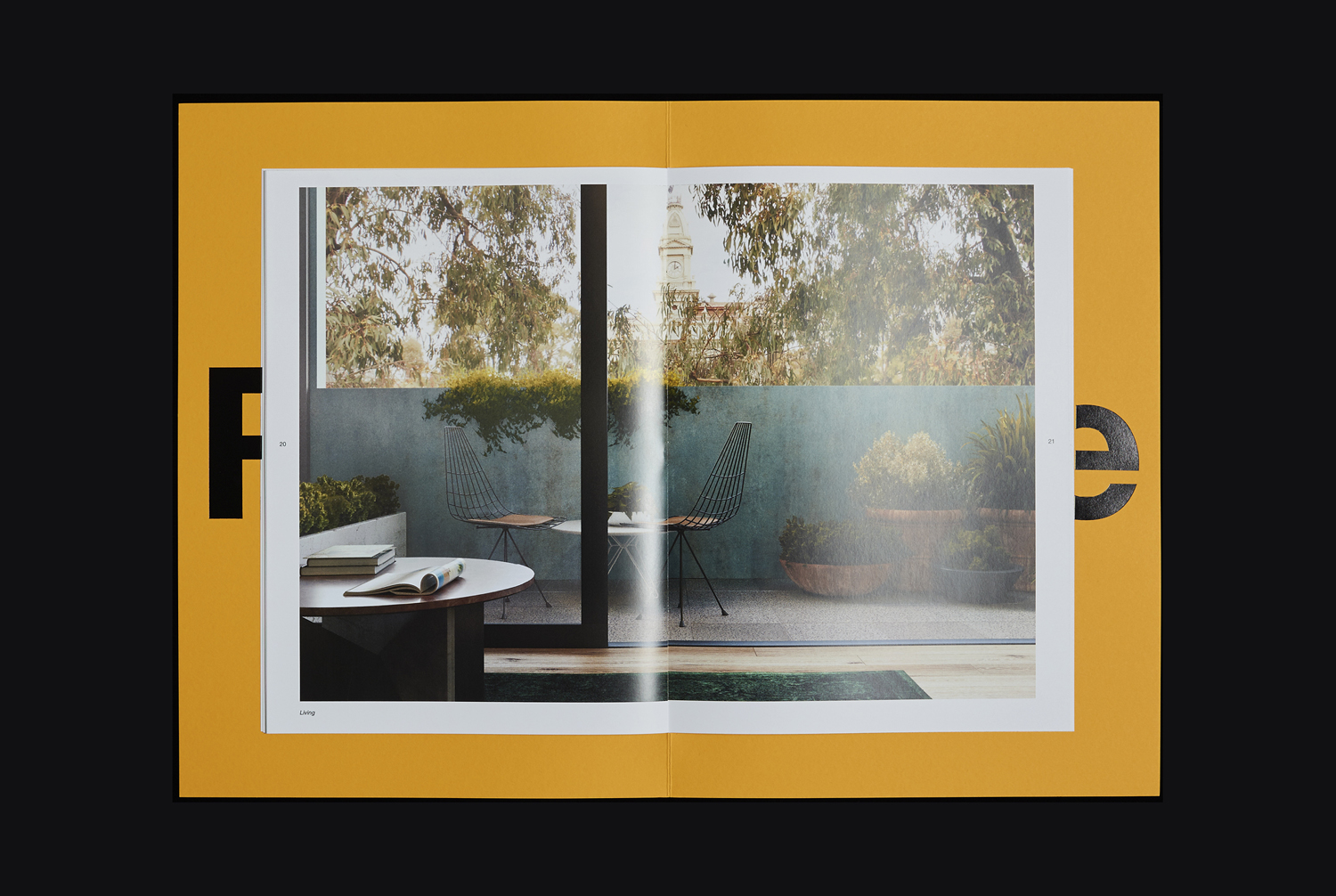
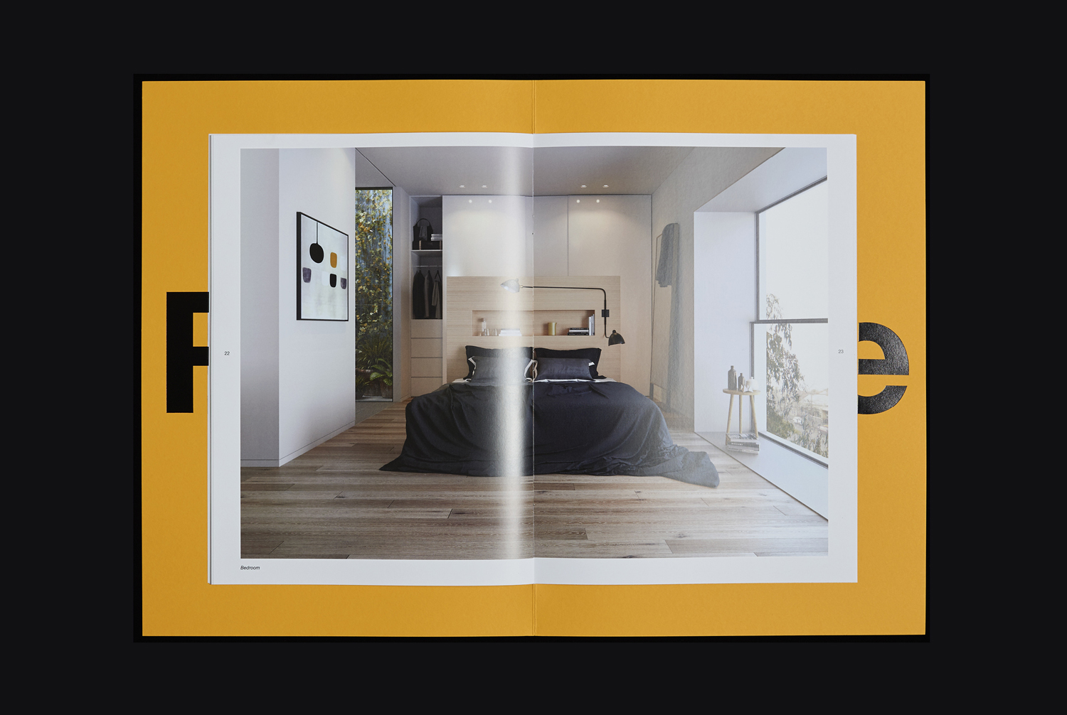
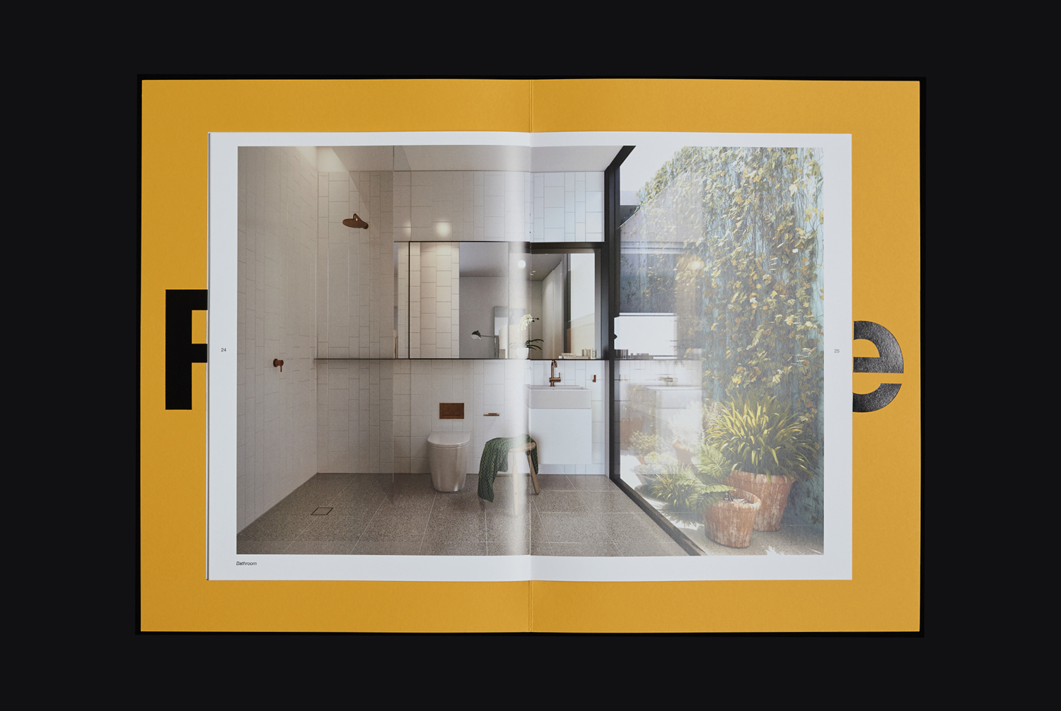
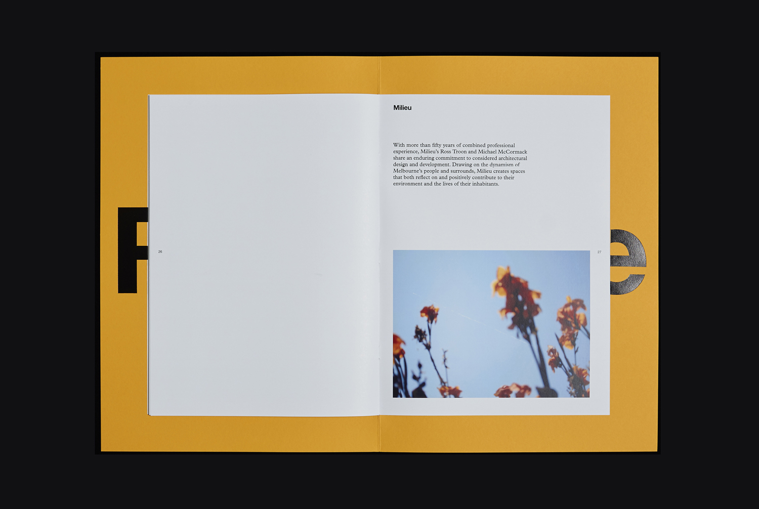
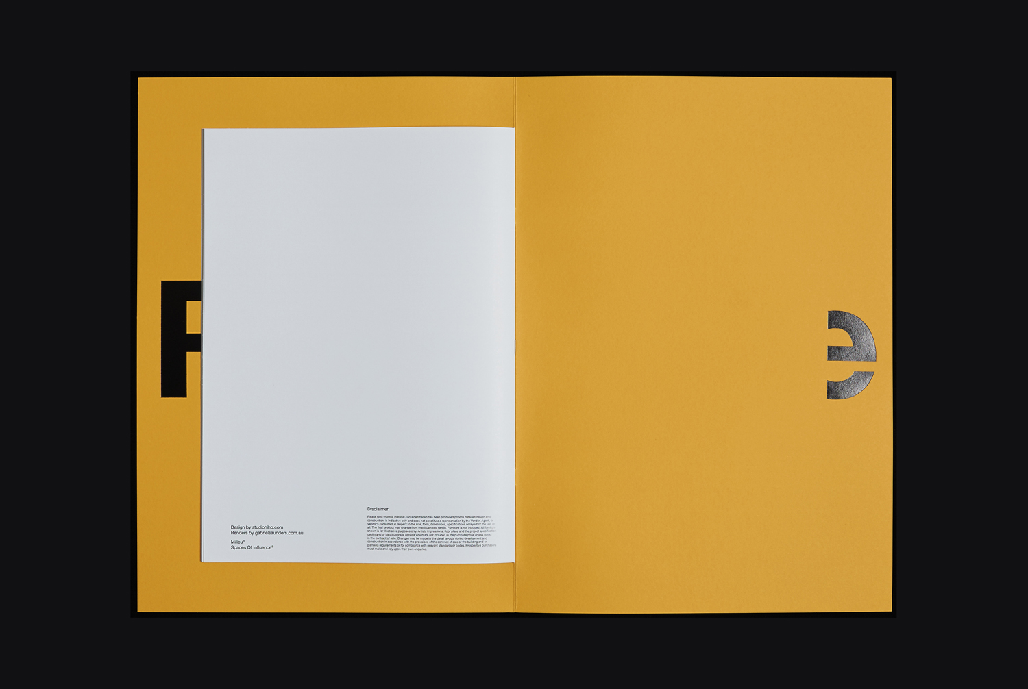
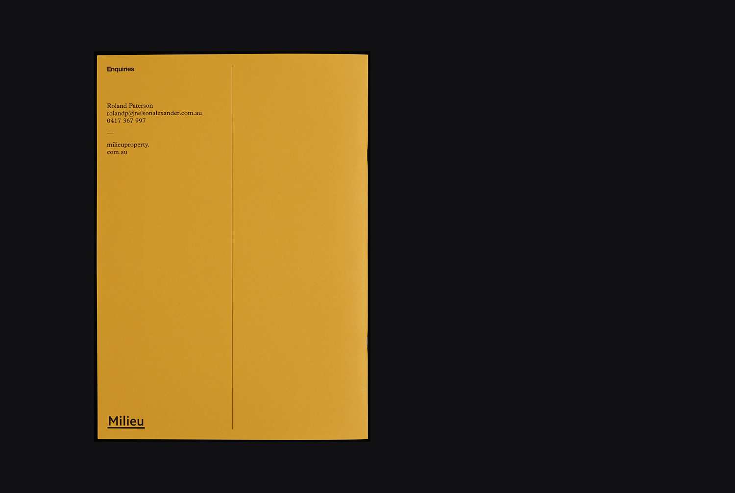
Response takes a stronger graphic and material approach. It builds on the insight and thinking of Reflections, and some of the visual language used to augment this, yet shares the impact of form and finish used throughout the residencies. While there is a written component, in contrast to Reflections, it leverages favours the immediacy of a bright yellow, large type, the proportions of paper, layout of image, and the juxtaposition of solid colour and detailed photography.
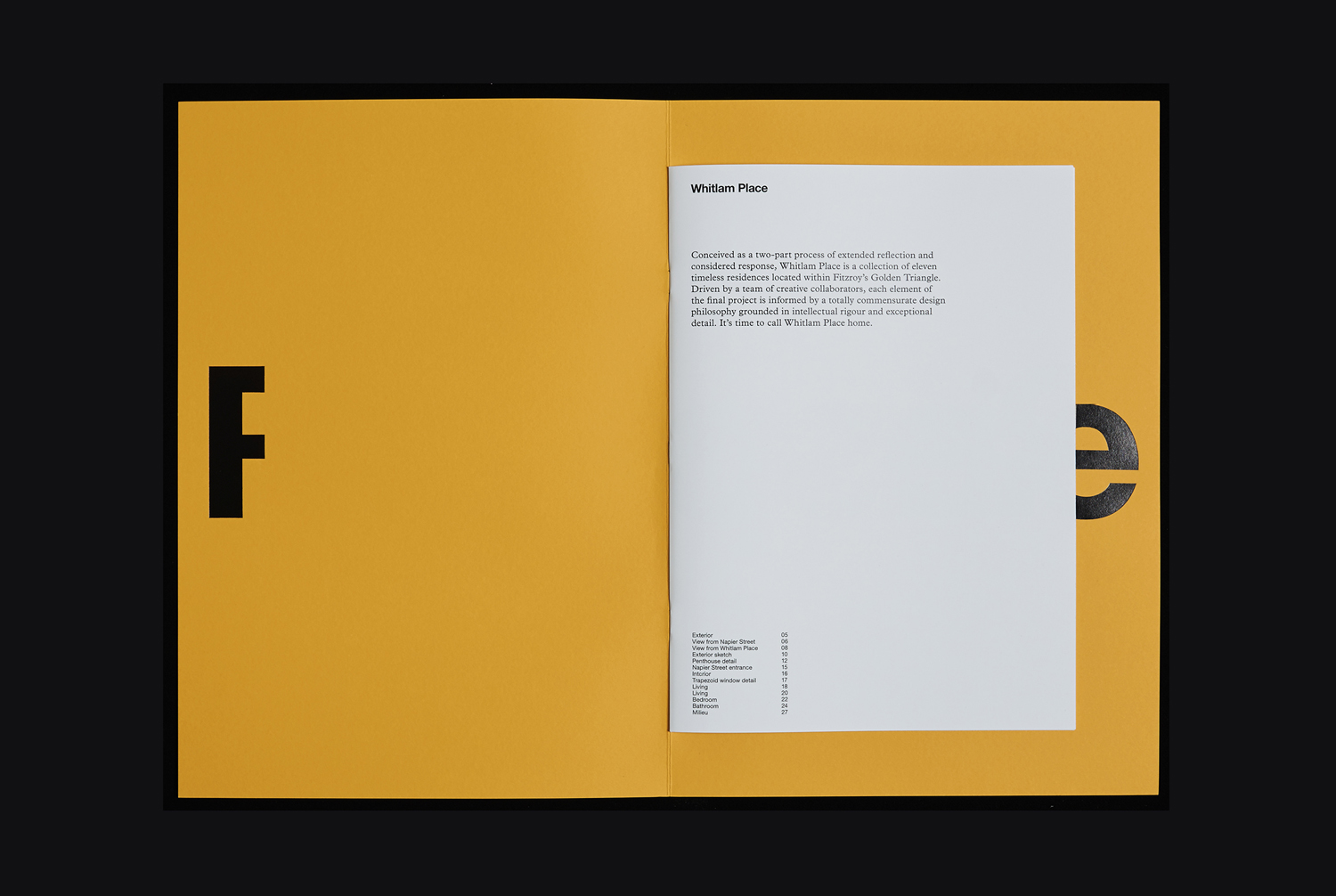
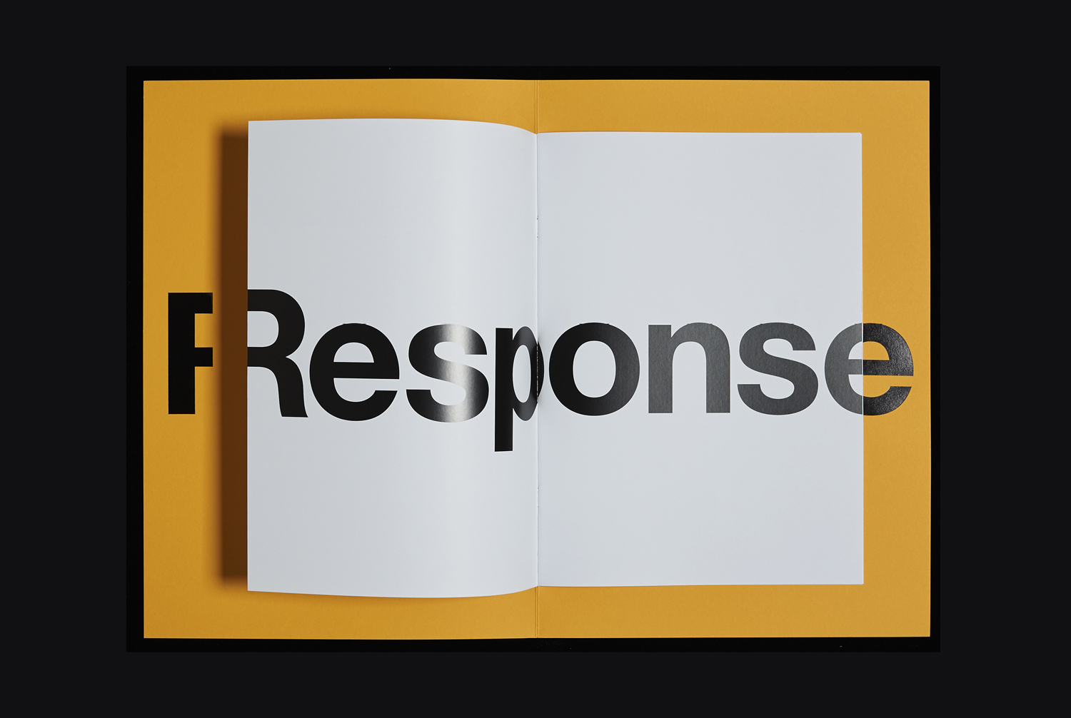
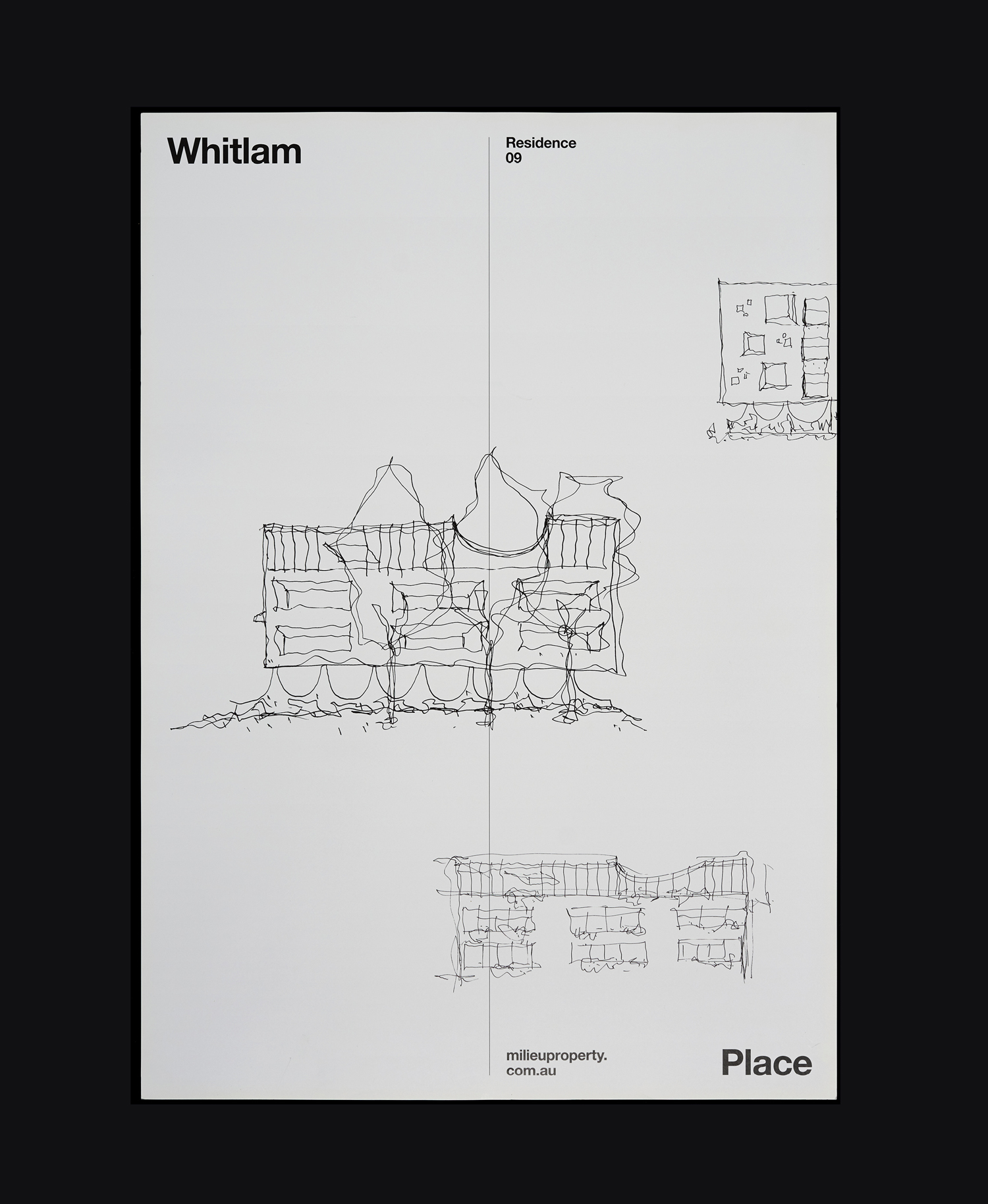
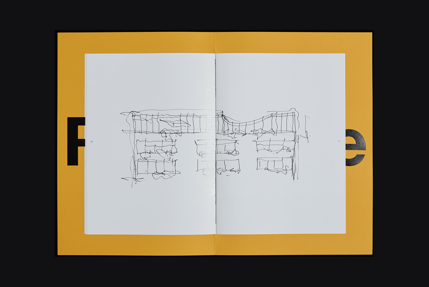
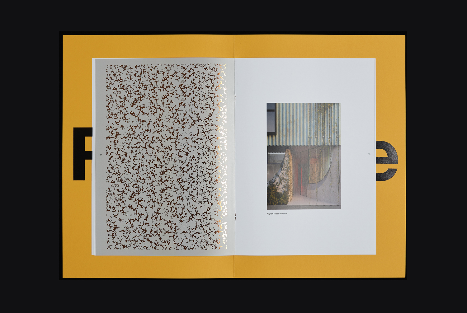
The mix of loose sketches and precise renders, the industriousness and impact of large black block foiled type across dyed yellow board, visual texture and the gloss of a gold block foil, as well as the oversized portfolio cover, effectively plays with art, craft and design. The material embellishments of Response are rooted in communicative intentions, moving them past the simply decorative, and carry over the thoughtfulness, written and graphic, of Reflections.
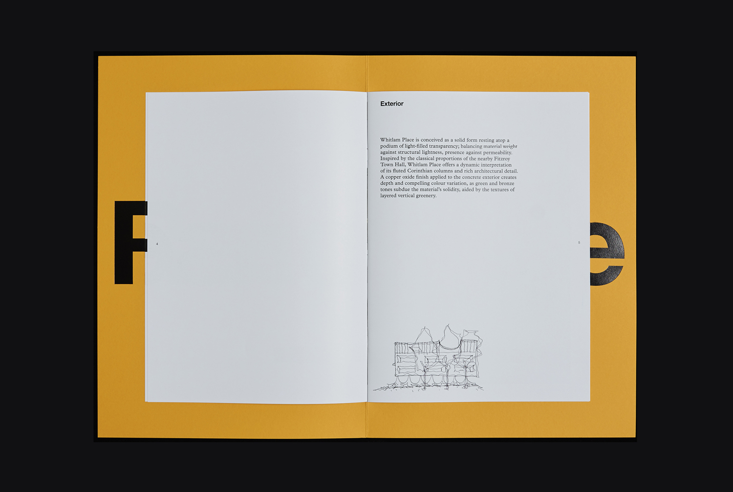
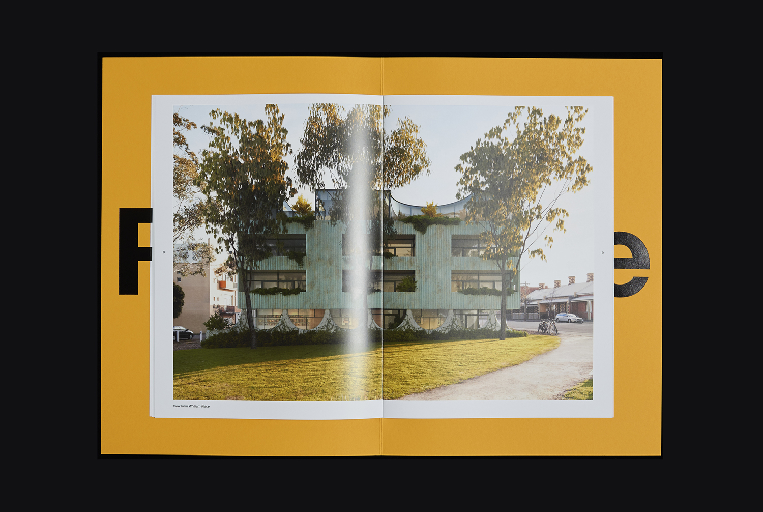
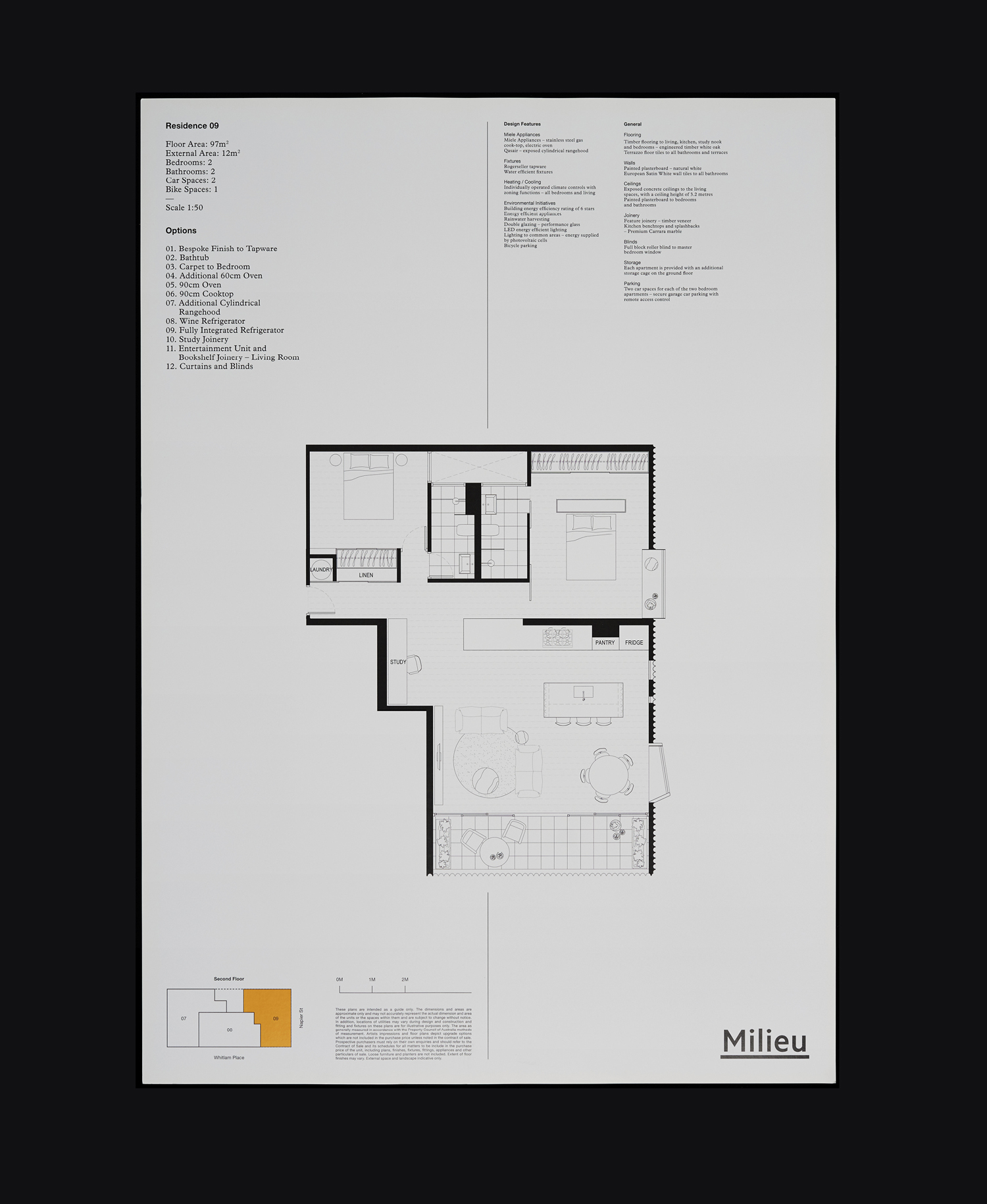
Floorplan
Reflections and Response are linked by recurring graphic devices and motifs. These include type and the arrangement and bisection of covers, a sense of material quality, restraint and thoughtfulness, and both effectively use page size and colour to break up the interior flow of each document alongside arrangement of image and the layout of text.
Size and proportion function to effectively divide the two, Reflections taking the size and format of a journal or magazine, and Response leveraging something more of a designer or artist portfolio. It is this visual language, the way it augments compelling content, the meeting of intellectual stimulus and aesthetic pleasure, and the equality given to process and outcome that really marks the work out as something special. More work by Studio Hi Ho on BP&O.
Design: Studio Hi Ho. Opinion: Richard Baird.
