Soto by Richards Partners
Opinion by Richard Baird Posted 9 January 2018

Southside Group and Colliers International worked with New Zealand based studio Richards Partners to develop a graphic identity for their new property development, located in between Auckland’s Meadowbank and Remuera, which is made up of 58 ‘Residences’ and 7 exclusive ‘Pavilions’ designed by architects Monk Mackenzie and Hare Interiors.
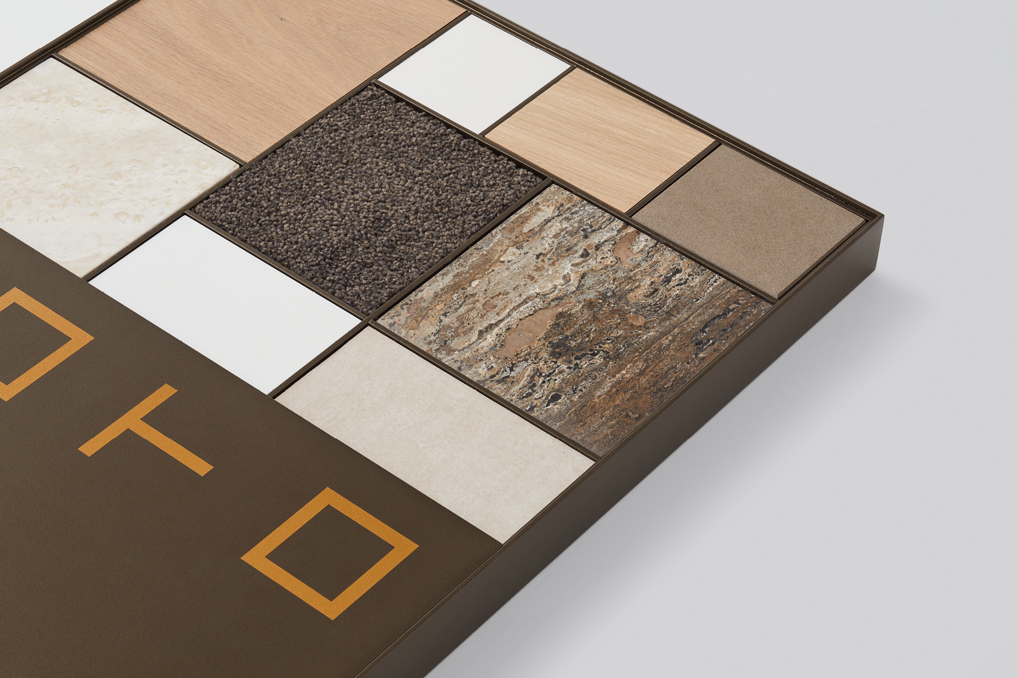
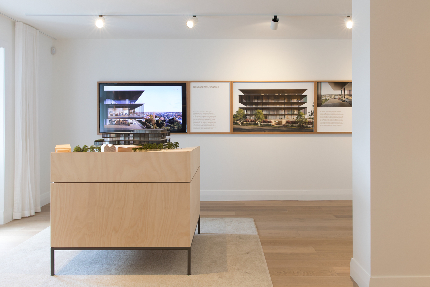
The Soto name and graphic identity designed by Richards Partners functions as a way to tell a story of ‘mindful apartment living’ and expresses the unique material qualities of the residencies and pavilions. This is aimed at market downsizing from traditional homes, and is described as a combination of Japanese zen elements with a focus on an elegant materiality. This connects property brochures, material sample packs, advertising, website, display suite and signage.
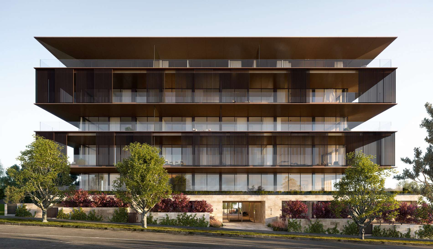
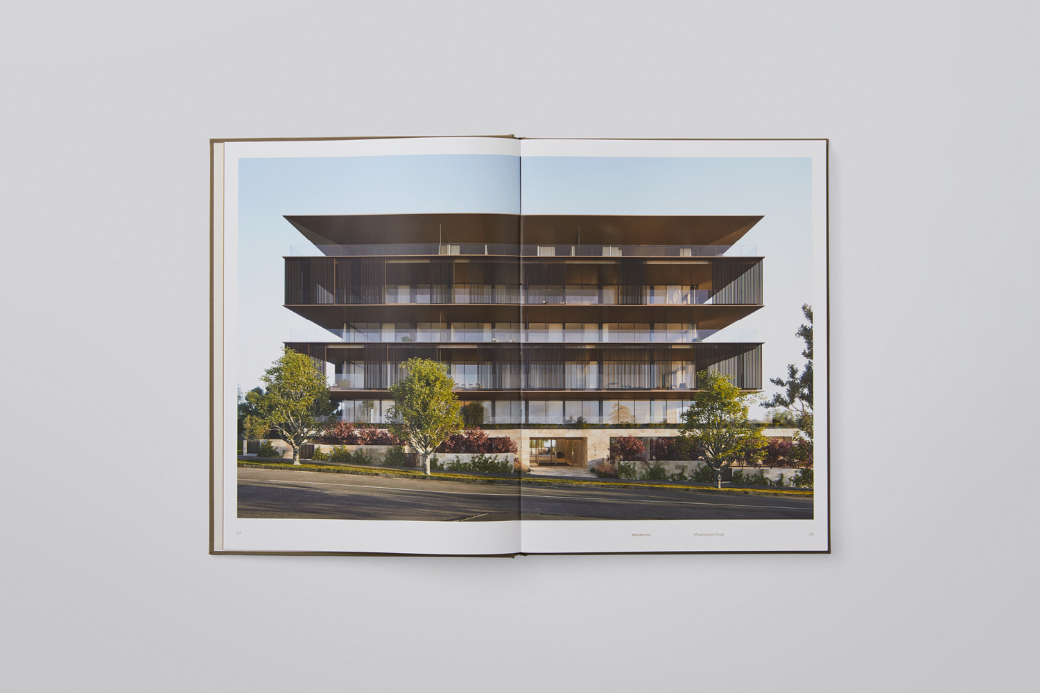
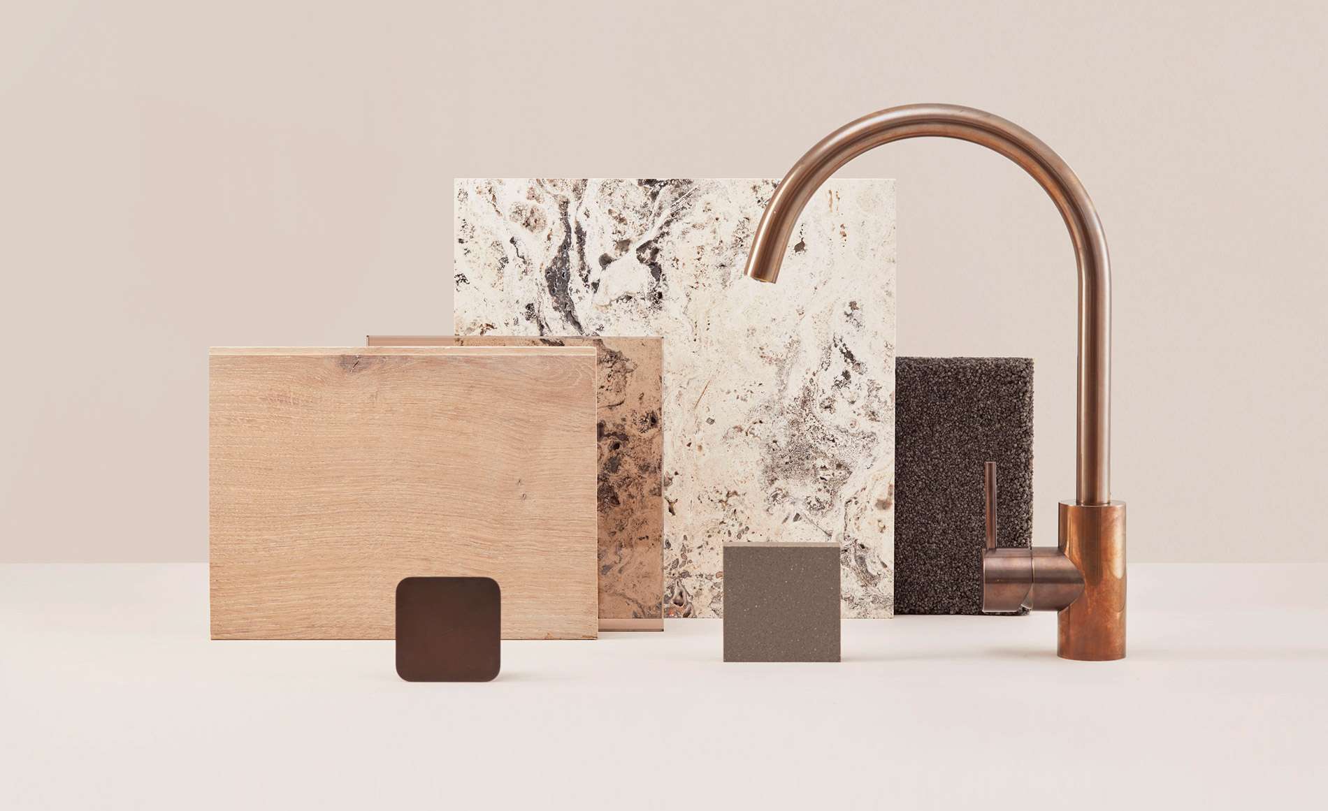
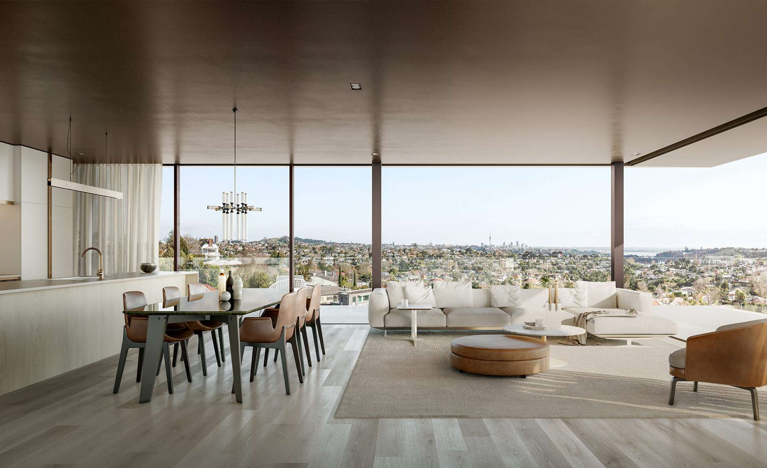
Monk Mackenzie’s architectural profile for the building features a strong horizontal grain. It reduces visual height and bulk of structure by creating what are described as alternating winter garden floors. Materially, German limestone and bronze detailing intends to provide simple architectural forms with a tactility, timelessness and aesthetic calm. This continues through to Hare Interior’s palette of a light and natural combination of stone, timber, tiles and deep pill carpet, and the bespoke cabinets of kitchen and bathrooms.
Zen is a rich and nuanced philosophy and practice. For Western audiences, it is often, and in some cases usefully, distilled down to some broader strokes; a mindfulness, intuition, peacefulness and the whole.
These have found themselves intertwined with Japanese traditional and evolving spacial considerations, material sensitivities and graphic conventions. A spacial awareness and compositional order and flow in architecture, interior design and landscaping. A material truth and minimalism in furniture. And the visual and graphic language of vertical type and the brush strokes of calligraphy and illustration.
Their proliferation into Western culture, both authentically and disingenuously, have made these harder to employ. Too much and you end up with pastiche or a sense of cynical appropriation, too little, and you lose the association, and its communicative intention.
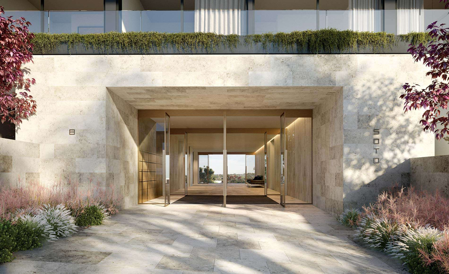
In the architecture and interior of Soto, Zen manifests itself in the whole; a continuity of concept, of form and finish, external structure and interior arrangement. In the seamless transition from paving into wall. A relationship formed between natural topology, plants and structure. The way you can see right through the building at its entrance, or how the surrounding landscape appears as a critical component to the completion of interior.
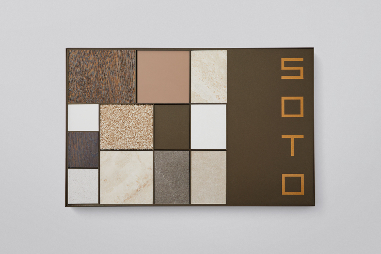
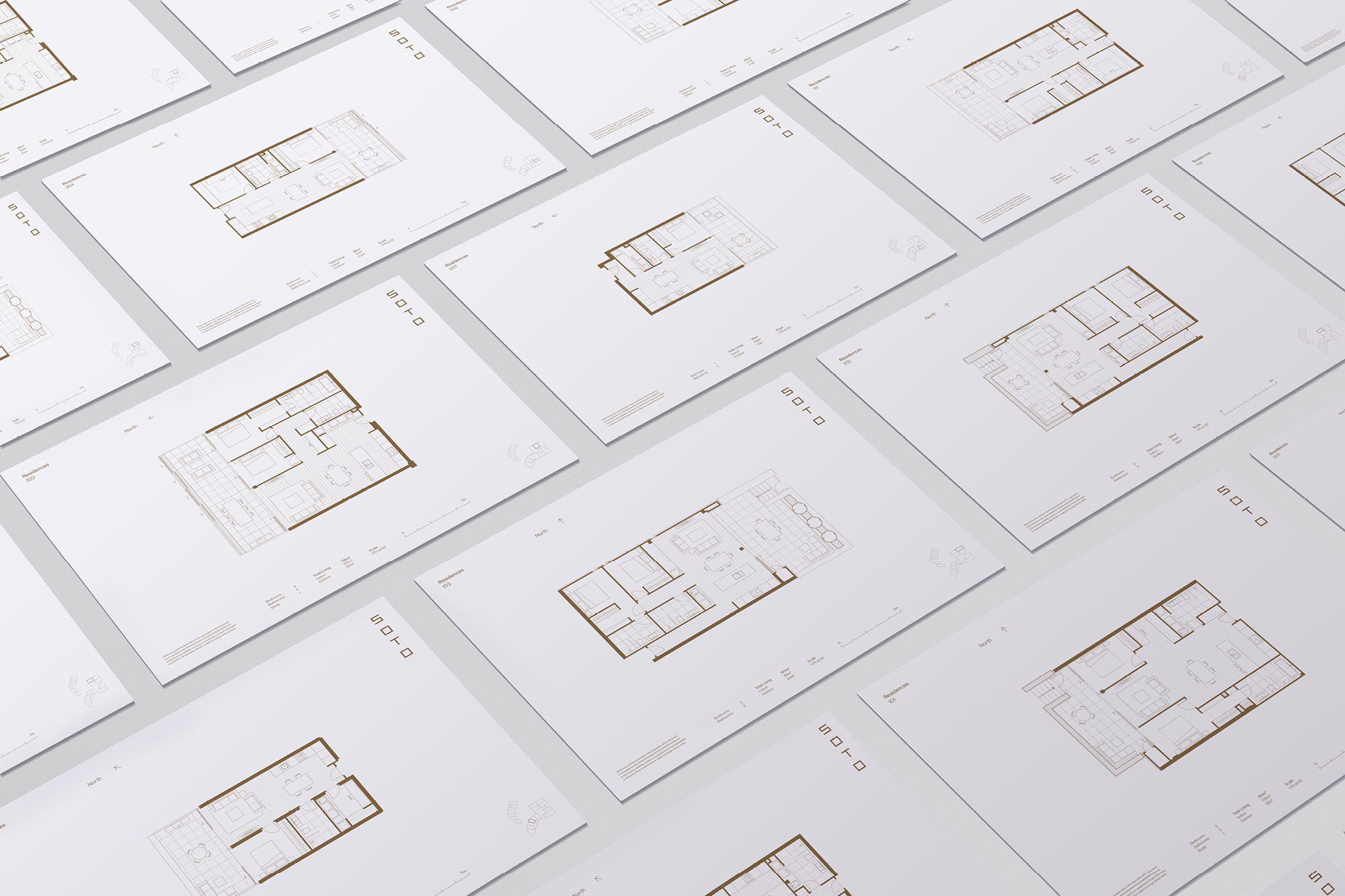
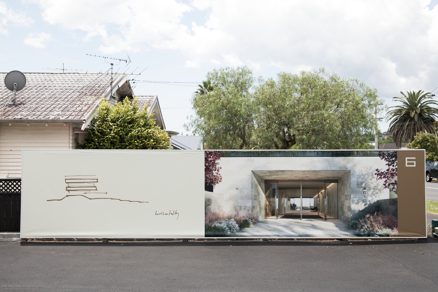
Within visual identity, it is in the vertical stacking, geometry and linear qualities of type. The extended horizontal composition of display suite presentation and hording. In the low contrast of materials and colour, the simple fleeting gesture of architectural sketch alongside resolved architectural form. And in the inlaying and arrangement of materials across the sample pack, which calls to mind the relationship of materials within a Japanese garden.
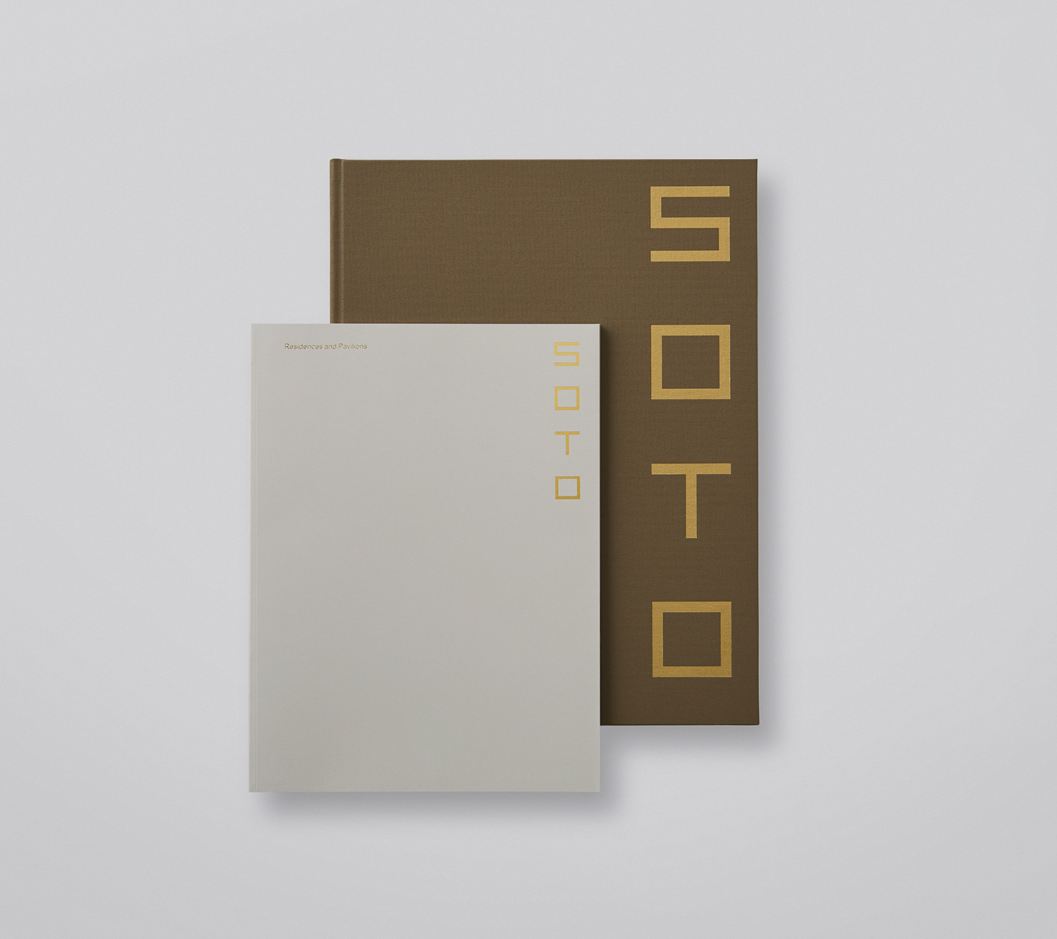
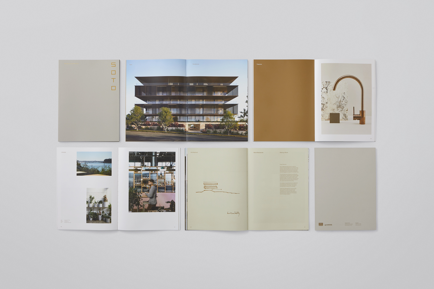
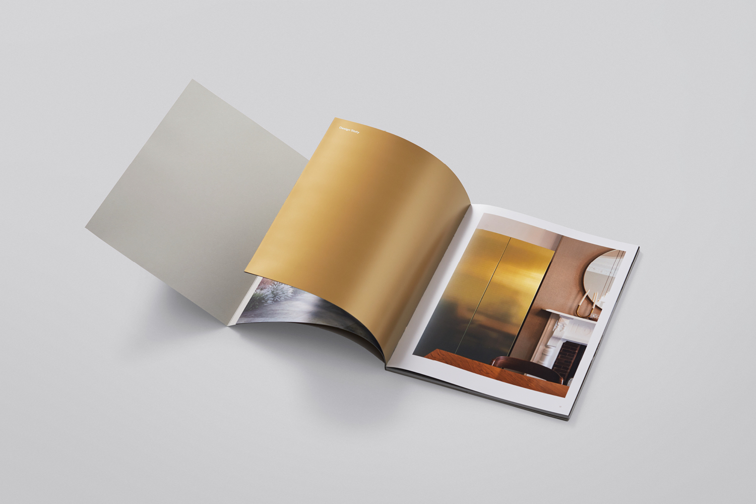
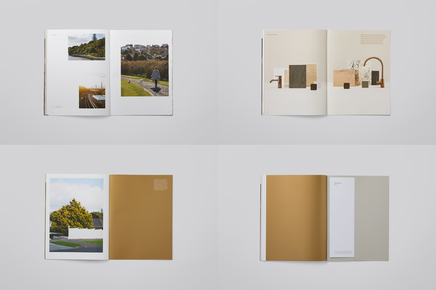
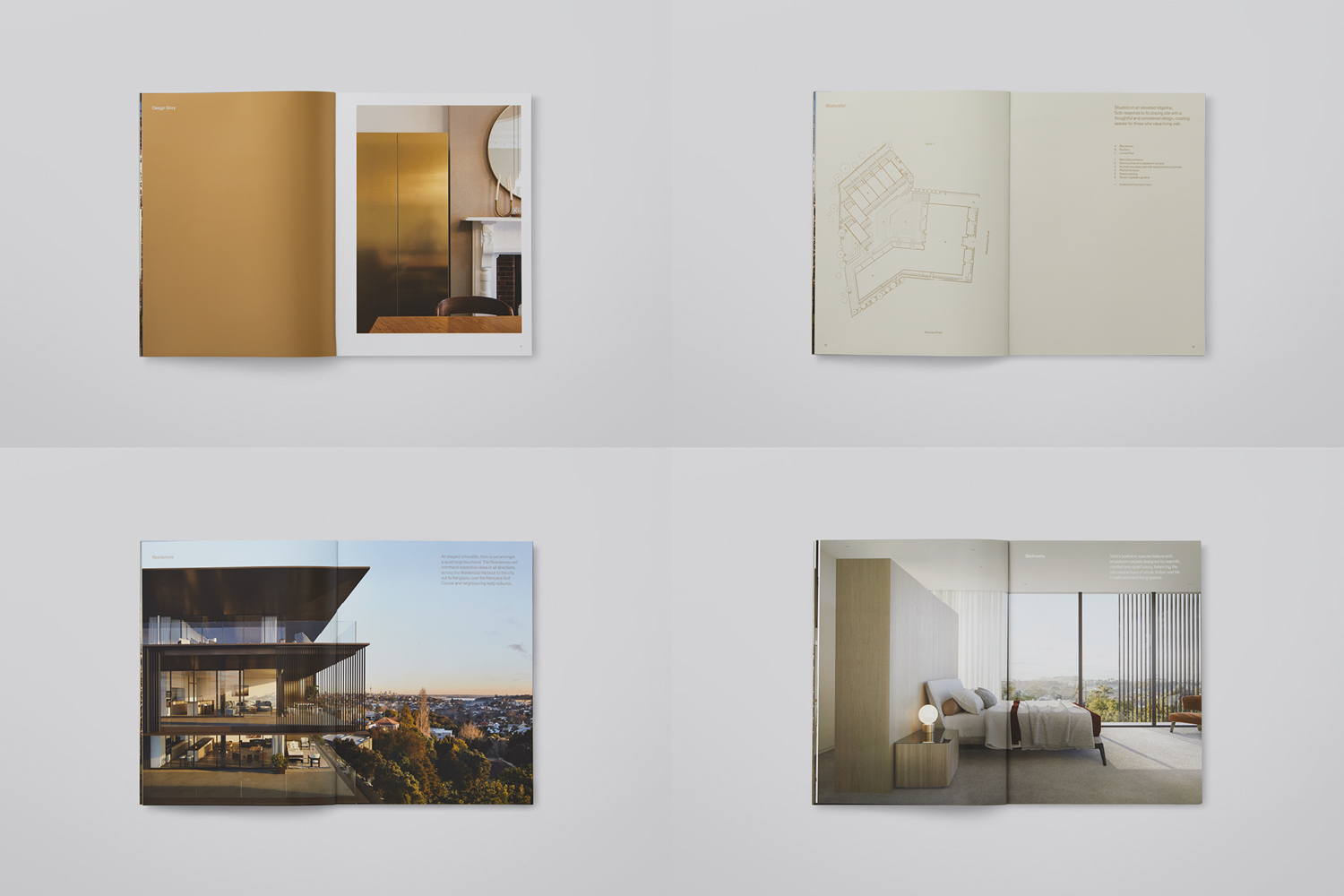
Brochure layouts play with western conventions in the mixing of bordered and full bleed images, and still life that brings focus to materials. There are, however, some pleasant details in the solid blocks of metallic ink, which draw out small material elements in interior photography, and a cover colour combination that calls to mind the wood frames and translucent paper of shōji. Richards Partners also turn the material samples into a distinctive component of graphic identity through form and arrangement, harmony and contrast.
The success of Soto lies in its use of inference, in the variation and resolution of its references, and the way these are employed and relate to architectural form and interior space. It is not about a singular and repeated asset, but a confluence and seamlessness of ideas, rooted in experience, not just the material outcome. More work by Richards Partners on BP&O.
Design: Richards Partners. Architecture: Monk Mackenzie. Interior Design: Hare Interiors. Opinion: Richard Baird.
