Tangent GC Hand Cream by Carl Nas Associates
Opinion by Richard Baird Posted 19 January 2018
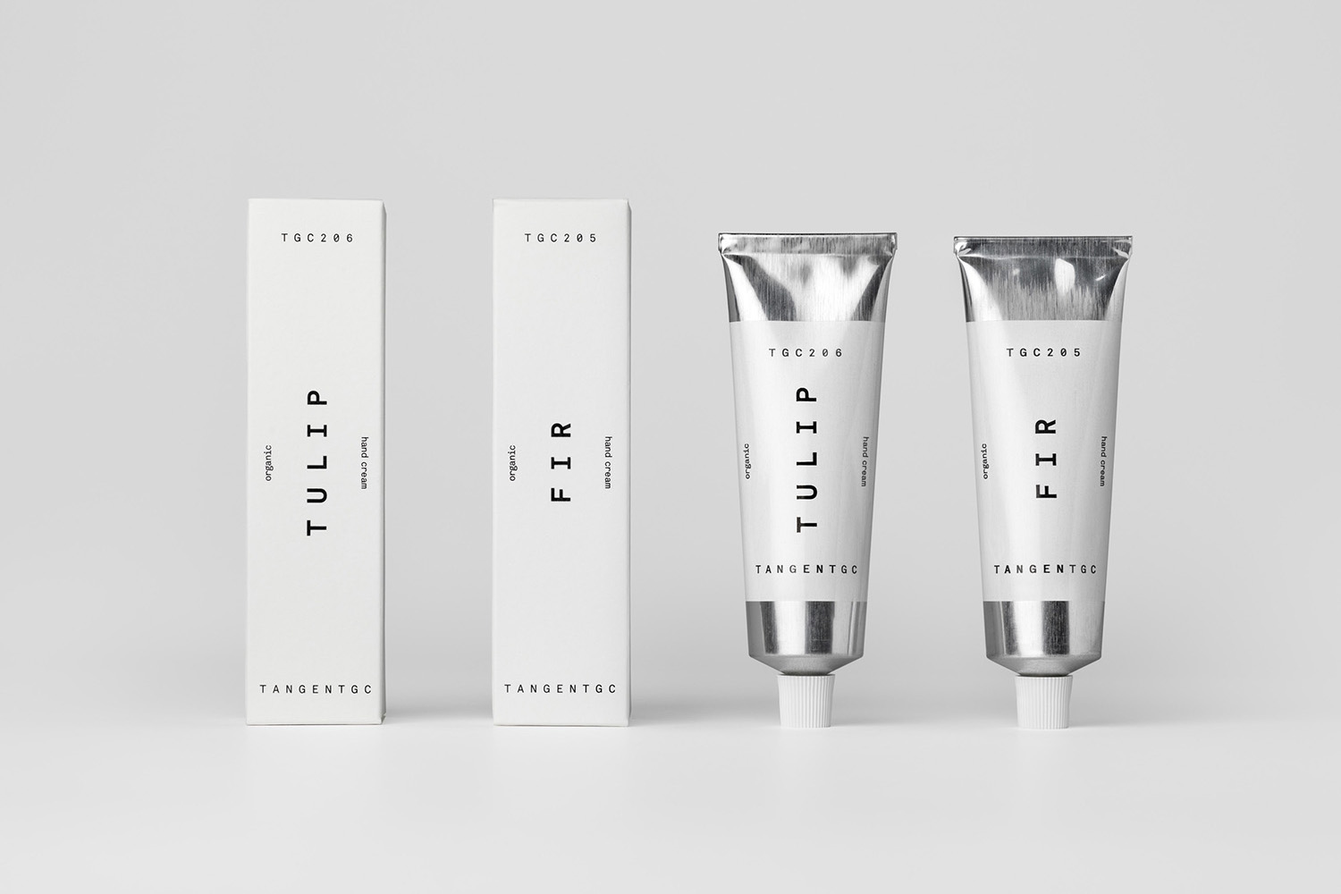
Tangent GC began as a Scandinavian organic garment and shoe care company developing products that intended to ensure longevity, and entered the organic skincare market in 2016. The company’s graphic identity, a simple typographical expression, designed by Essen International, delivered a sense of informational immediacy through the absence of superfluous stylistic detail and colour, yet divide content and drew out a distinction in the arrangement, orientation and typesetting of Akkurat Mono.
As Tangent GC ventured into the organic personal skincare market they worked with London based Carl Nas Associates to build out the visual language laid down by Essen International. This new phase saw the studio pair a similar approach to skincare packaging with a launch campaign of dynamic image (stills and animation) for the soap range which made a connection to the brand’s beginnings, visualising fragrance as swirling fabric.
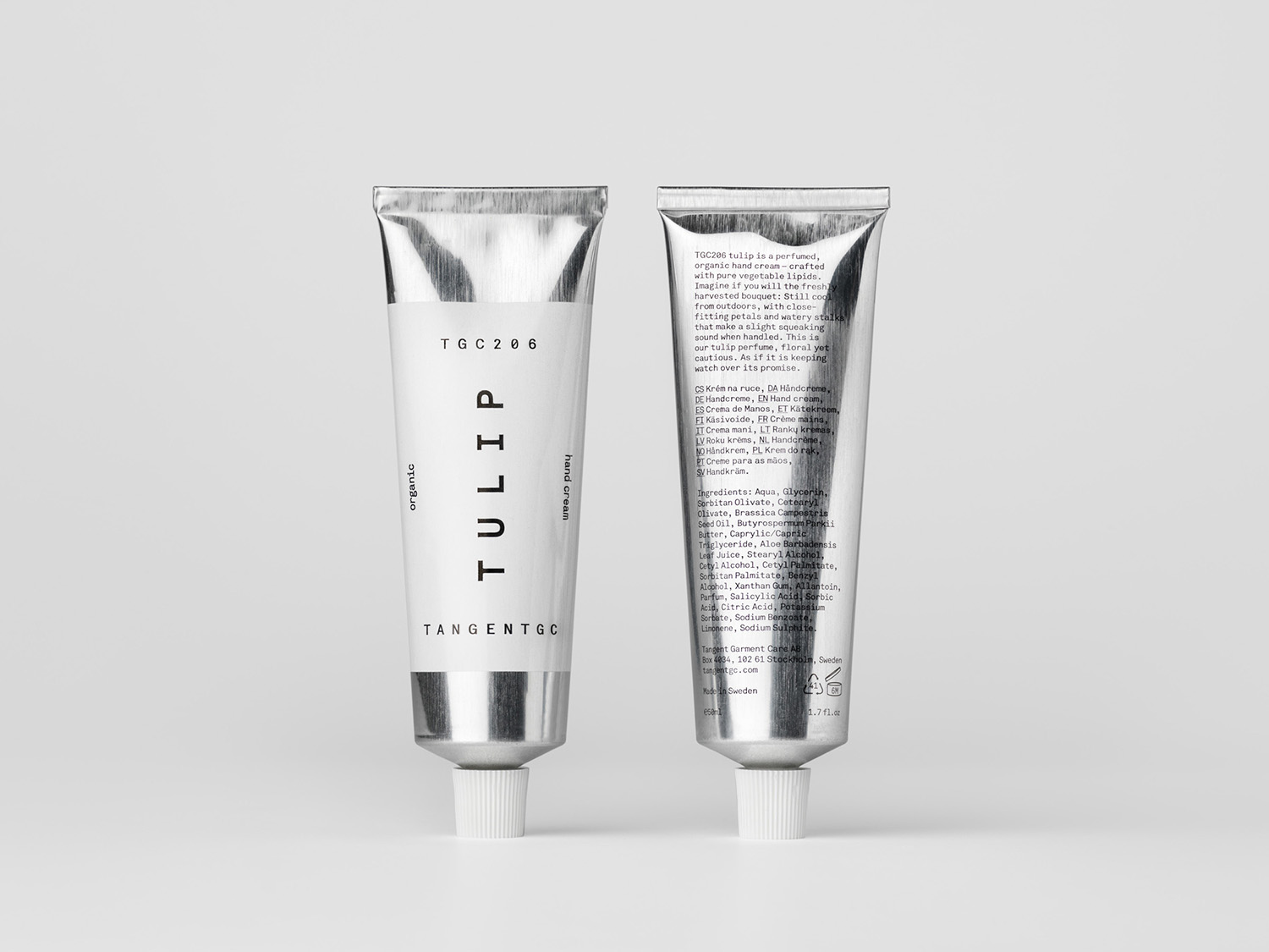
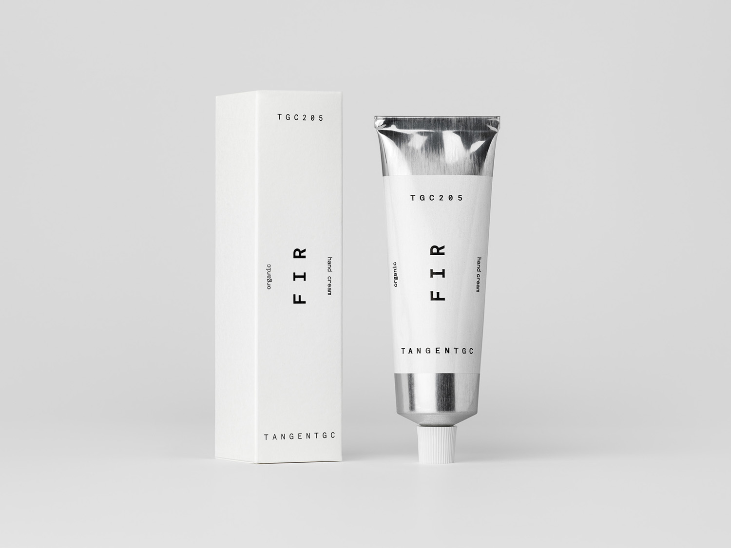
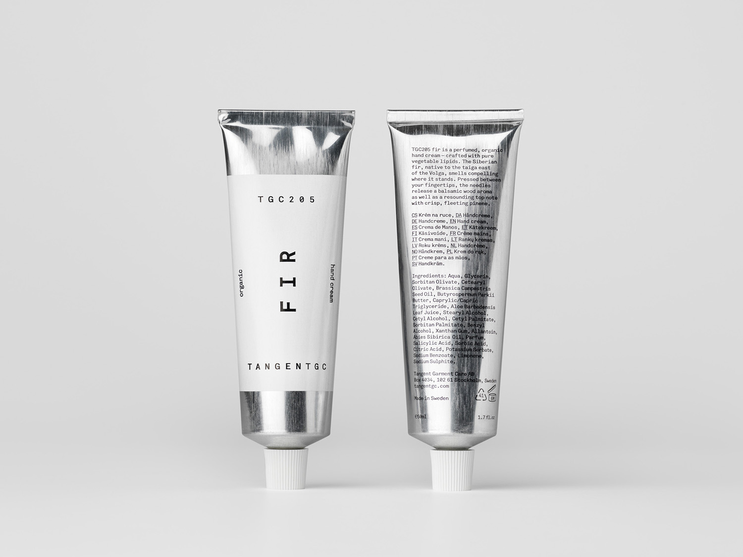
For Tangent GC’s latest product, a perfumed organic hand cream, Carl Nas Associates begin to introduce new form and material language through an exposed aluminium tube, and continue to play with contrast, creating a launch campaign that features warm and detailed illustration by celebrated airbrush artist Syd Brak, the man behind some of the 80’s best-loved Athena posters.
The combination of simple, monolinear and monospaced typographical forms, an abundance of space and the absence of colour effectively communicated the practicality and methodically researched effectiveness of Tangent GC’s garment and shoe care products and their use of natural ingredients. Although a clinical and reductive visual expression is by no means unique, within garment care it stood out. Moving into skincare, this is far more commonplace, although it endures as an intelligible and universal visual language. The approach to launch campaigns layer this with an interesting and contrasting detail, a chance to play with the aesthetic—improved surface quality of skin and a visual appeal—alongside the remedial, and establish brand character and a communicative variety amongst its ranges.
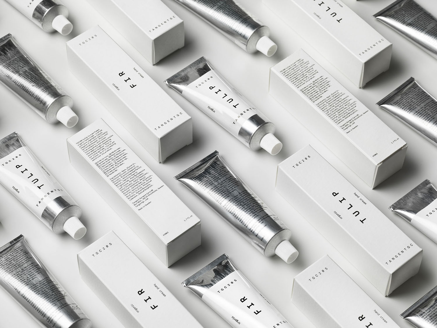
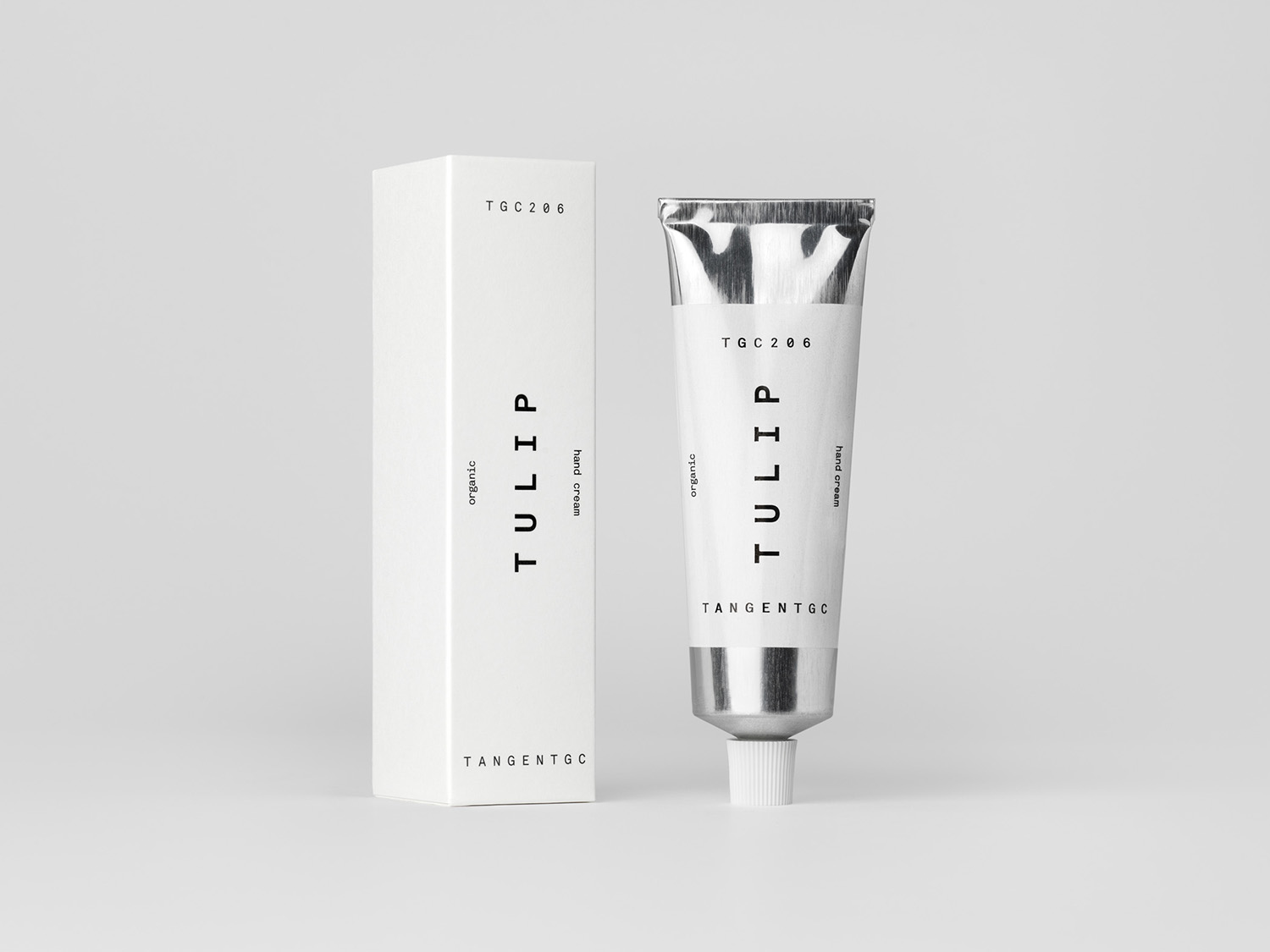
A fully recyclable aluminium tube and slim box begin to test the adaptability of the graphic system. The white band of the tube functions well to establish a continuity with the boxes and labels of previous ranges, whilst exposing and the leveraging the material associations of aluminium; science, clinical effectiveness, perhaps an element of art, more on that later. The orientation and arrangement of type sits well within this new context, displaying a flexibility across slimmer boxes and a tapered tube.
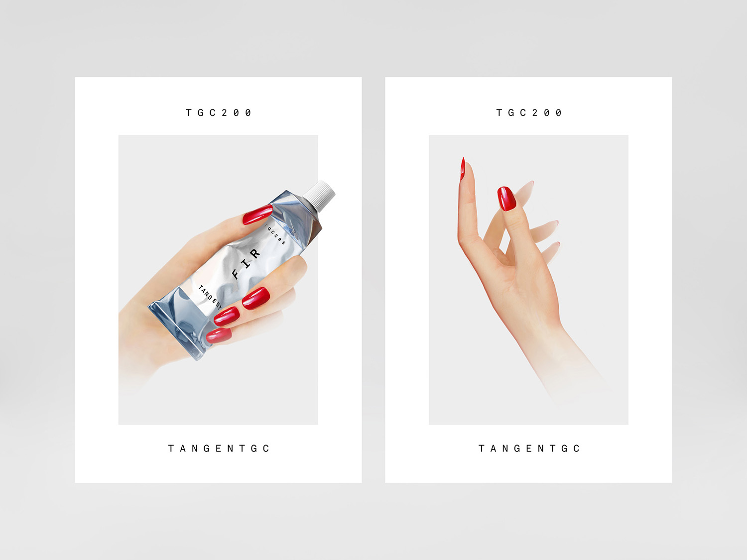
Much like the minimal graphic expression, the form and material language of the aluminium tube leverages some familiar and enduring visual cures. While this may conjur up a modern clinical utility and a remedial effectiveness it has its origins in art, and in the packaging of paint prior to the plastics revolution, which continues today. This art component is explored in an accompanying launch campaign, illustrated by Syd Brak, and more explicitly in the line “The Art Of Touch” used on the campaign page of the website.
Commissioning airbrush artist Syd Brak, famed for his work with fine art retailer Athena in the 1980s, rather than employing a convincing digital facsimile for the launch campaign—used at point of sale as posters, window displays and shop-in-shop—speaks of an authenticity, and going straight to the source. Although a hidden detail, it is principled, an action and expense undertaken by the studio in line with Tangent GC’s own activities.
There is a satisfying relationship between the sensory and visual nicety of smooth skin and the aesthetic qualities and imperceptible gradation of skilled airbrush technique. There is also a bit of knowing humour to this. While the glamour, sensuousness and visual impact of Syd Brak’s past work is dialled down in favour of something more naturalistic, it retains an intelligible nod to the past in the bright red lacquer of the nails and in the posture of the hand.
The format of campaign posters, as with the soap range, manages to hold together seemingly oppositional elements; mechanical type and a clearly systematised layout, and the individual, sensual and organic nature of illustration.
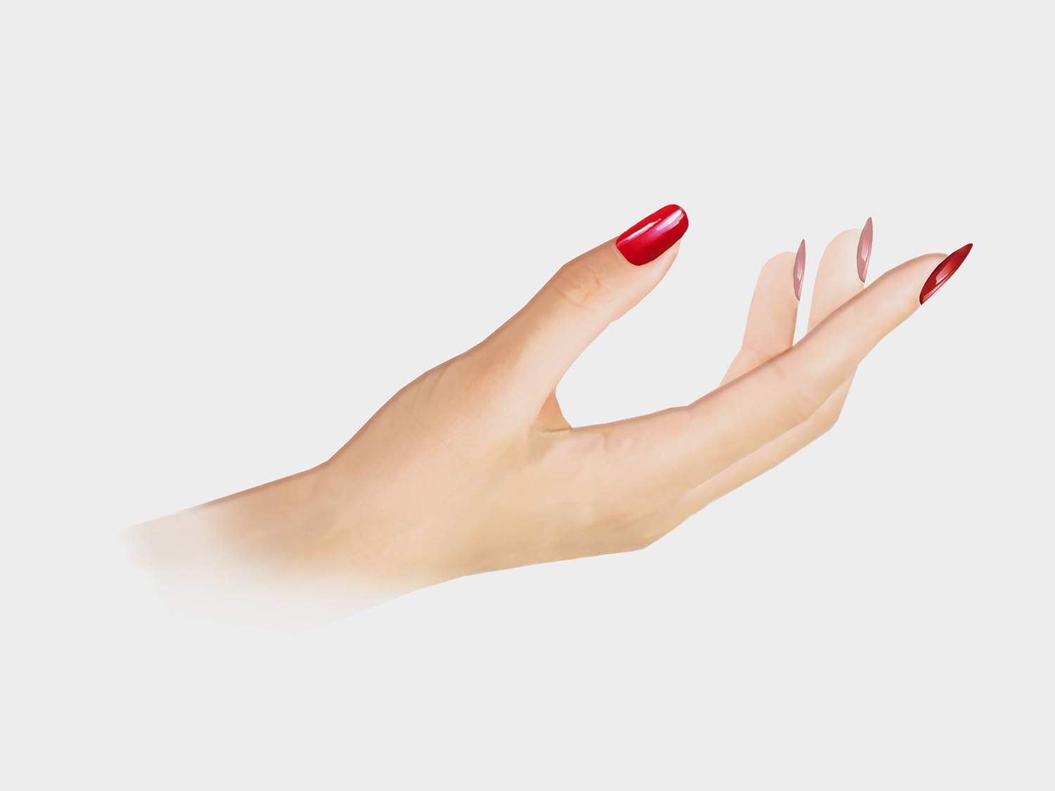
The approach to launch campaigns begins to mark Tangent GC out as having a bit more range, the chance to be playfully referential, sensory and experimental within the framework and consistency of type, space and layout. Here, there is the meeting of utility and clinical effectiveness, and the artful and the aesthetic. Although it sets a challenge for future launches, it is intriguing and distinct, and able to deliver unique stories and different visual expressions whilst maintaining a continuity.
Design: Carl Nas Associates. Opinion: Richard Baird. Fonts Used: Akkurat Mono Bold Beta.
