Di Beppe by Glasfurd & Walker
Opinion by Richard Baird Posted 8 February 2018
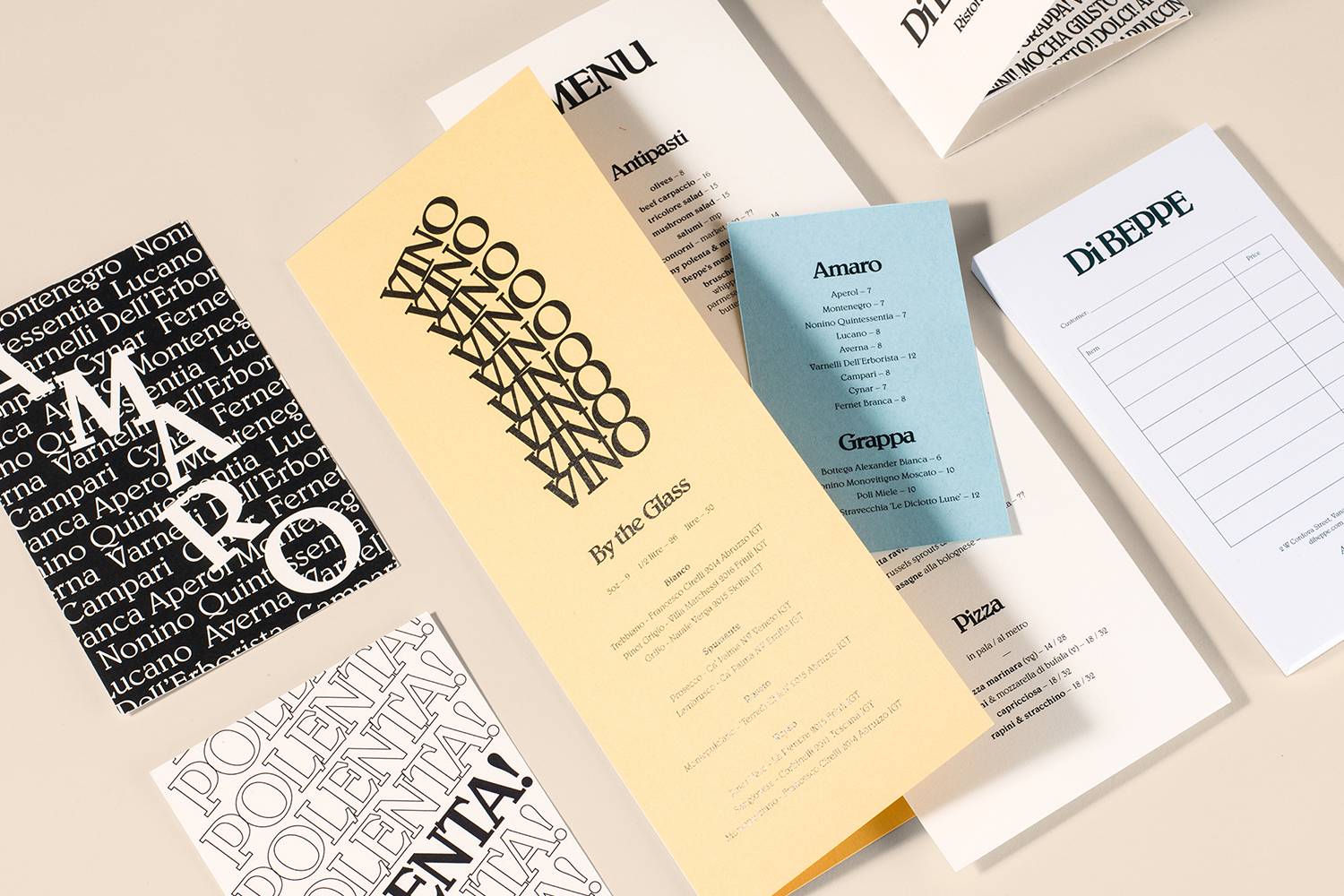
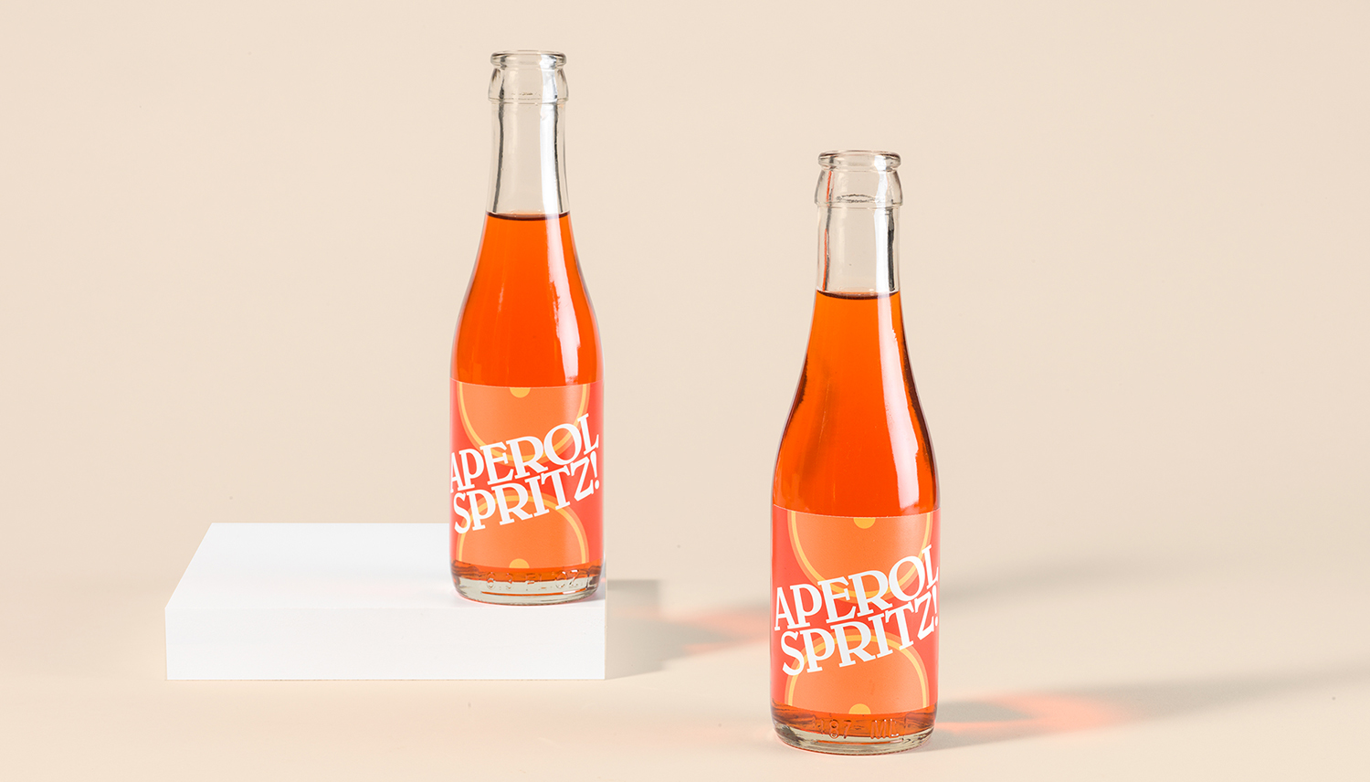
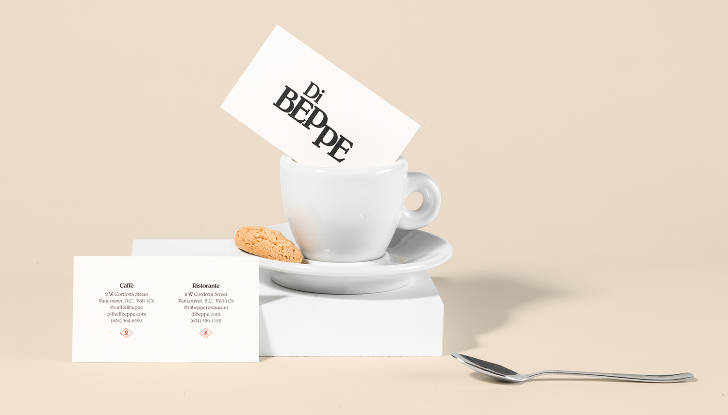
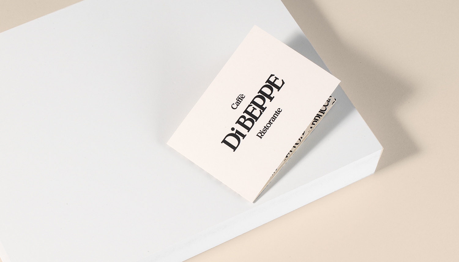
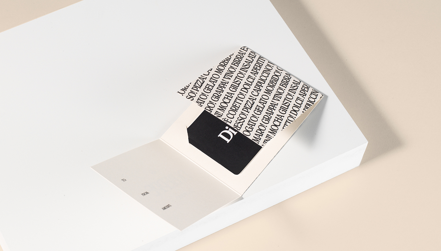
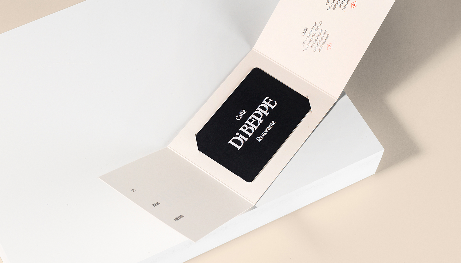
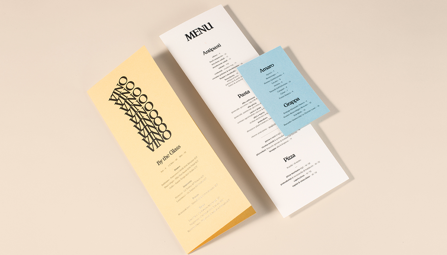
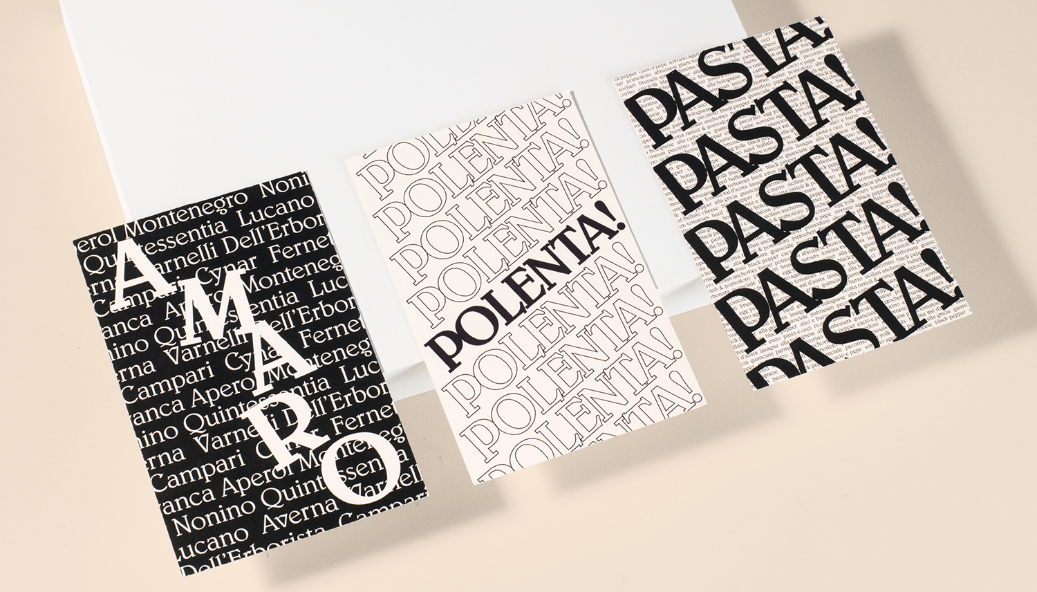
Di Beppe is a casual Italian caffé and ristorante, located in Vancouver’s Gastown neighbourhood, “inspired by the Italian immigrant’s desire to share a piece of home while living abroad”. Di Beppe is said to honour the sense of deep pride and self-assured nature associated within Italian culture through a classic and authentic Italian dining experience and in the design of its graphic identity, created by Canadian studio Glasfurd & Walker. Drawing on the typographic and iconic character of Italian cinema of the past, Di Beppe’s graphic identity has a confident and immediate visual voice, one that is enthusiastic and loud. This links a variety of assets. These include menus, bottle labels, posters, gift cards and postcards, as well as signage and website.
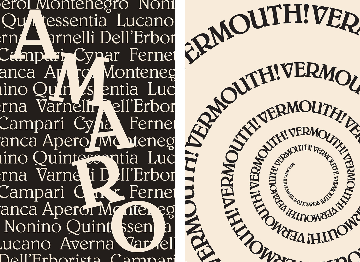
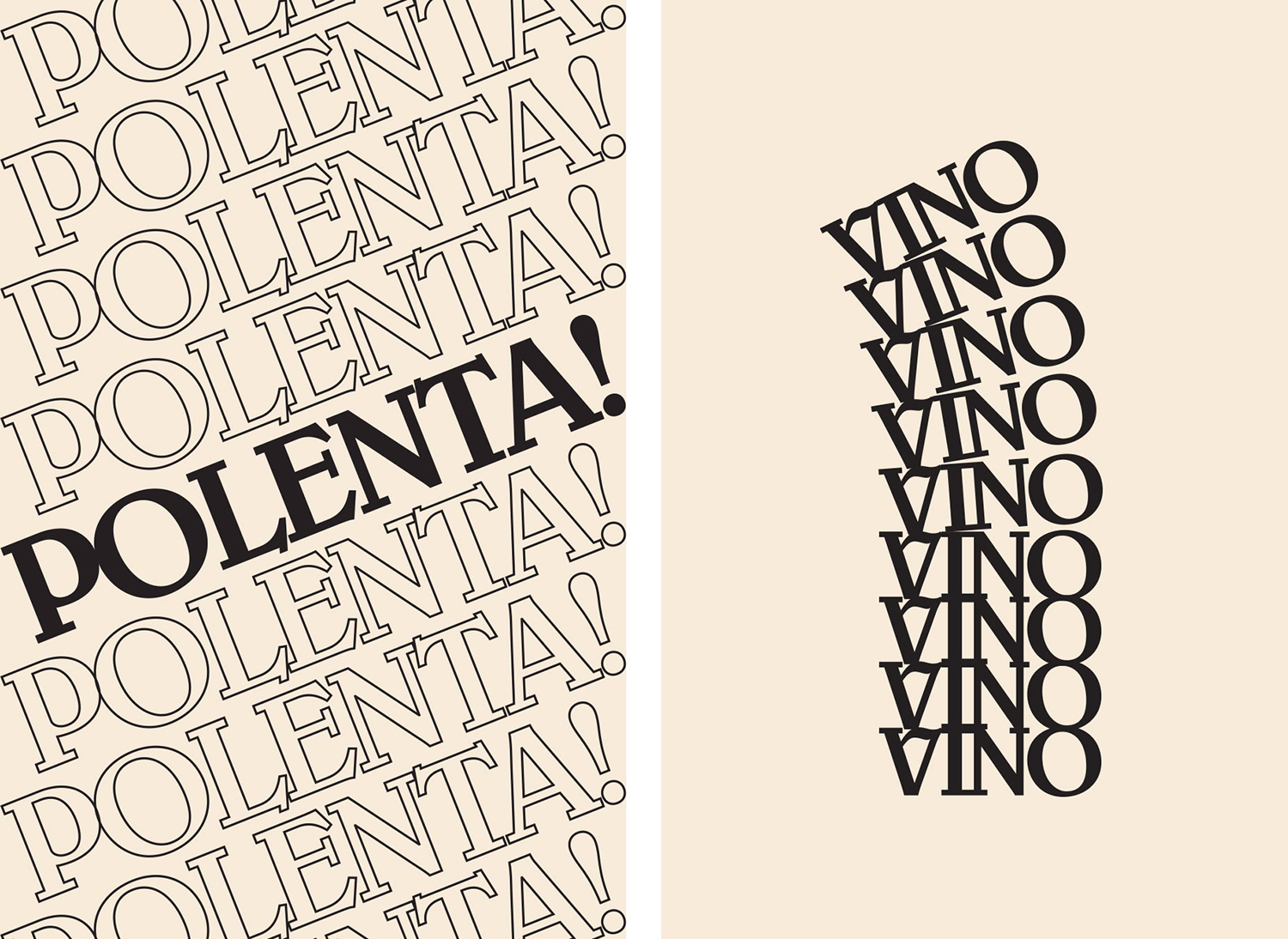
Di Beppe is described as a young Italian restaurant with an old Italian soul. This correlation between old and new comes through in two essential pairings, in colour and the approach to type. Glasfurd & Walker’s work is characterised by an unwavering consistency of typographical form, deploying Belwe Medium and Light throughout, yet there is personality and variety in arrangement, fill, outlines and overlays.
As someone who is currently enjoying a foray into Italian film of the late ’60s and early ’70s the referential qualities of the work are intelligible, although these could also be associated with international cinema as well, for those who are not, there remains a clear period sensibility, a cheerful, distinct and self-assured attitude in size and coverage, and a sense of the new within its consistency and systematic nature.
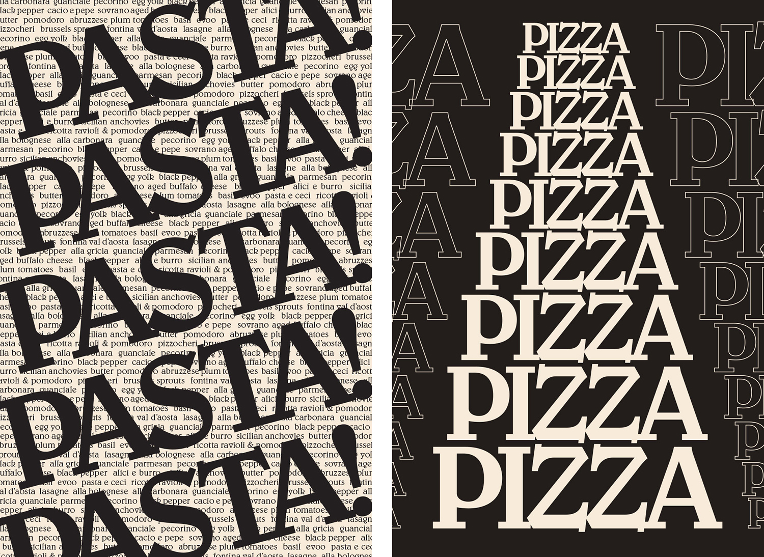
Designed in 1926 by German typographer and teacher Georg Belwe, type has an idiosyncratic character. Like graphic identity as a whole, it is a confluence of historical reference points, which are emphasised through size and repetition in print.
There is plenty of implied motion. This neatly ties graphic identity to an interior design peppered with ’60s motorsport motifs. Most of this motion comes from the repetition of words, in conjunction with size, proportion, angle and direction. It is a thoughtful link, and a natural intersection of two reference points whilst avoiding the blunt and familiar Italian cues. Few colours serve to hold this all together, while moments of typographic pattern, alongside areas of space and blocks of colour, deliver impact and contrast. It is, at times, intentionally busy, with an energy and loudness that feels fitting for a bustling Italian restaurant.
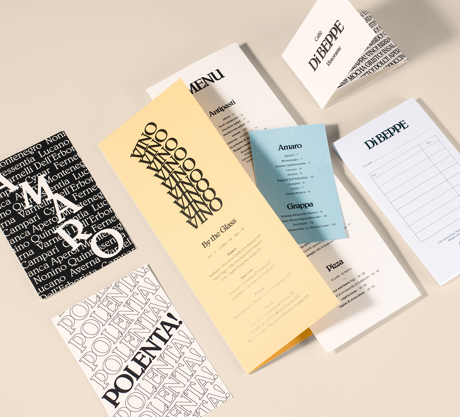
Motorsport and cinema are not uncommon references within the context of Italian cafes, restaurants and products, they provide a useful cultural meeting point, experiences that are universal. Language establishes a useful immediacy, avoiding the obvious and blunt tools of flags, colour and tired caricature, while form, arrangement and repetition ties together two disparate reference points in an unexpected and intelligent way. Through colour, form, and language Glasfurd & Walker manage to convey a sense of time and place, touch upon enduring pastimes and cultural pride, but also a modernity in its concept, confident implementation and consistency in print and online. More work by Glasfurd & Walker on BP&O.
Design: Glasfurd & Walker. Opinion: Richard Baird. Fonts: Belwe.
