The Best of BP&O — February 2018
Opinion by Richard Baird Posted 1 March 2018
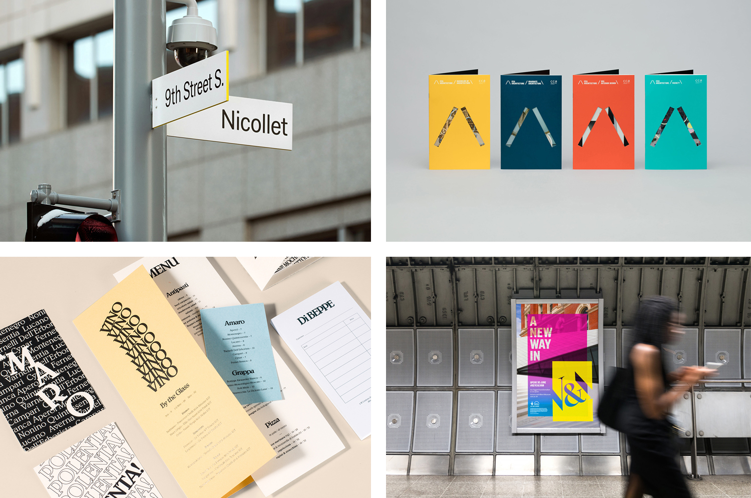
February’s highlights included Pentagram’s work for Chus x Chus, Two Times Elliott’s graphic identity for architecture and interior visualisation studio Tale London, and Spy’s work with the London School of Hygiene & Tropical Medicine. There were, however, five projects that stood out, and have made it into BP&O’s Best Of Series. These typically balance a strong singular concept, or an appropriate confluence of ideas, with a compelling visual character and clear communicative intention that appropriately plays with form, colour, type and layout, as well as material, texture, image and print finish.
BP&O, in this end of month review, tries to recognise both the smart use of small budgets—those that channel spending into the most appropriate assets—and those projects with a broad and holistic quality, establishing a continuity (conceptual and/or visual) across multiple touch points.
Throughout the month BP&O also continued to expand on its collections series as another way to jump through to older posts on the site. New additions to this were Inserts, Still Life and Swedish Design.
CCA Architecture by Manual, United States
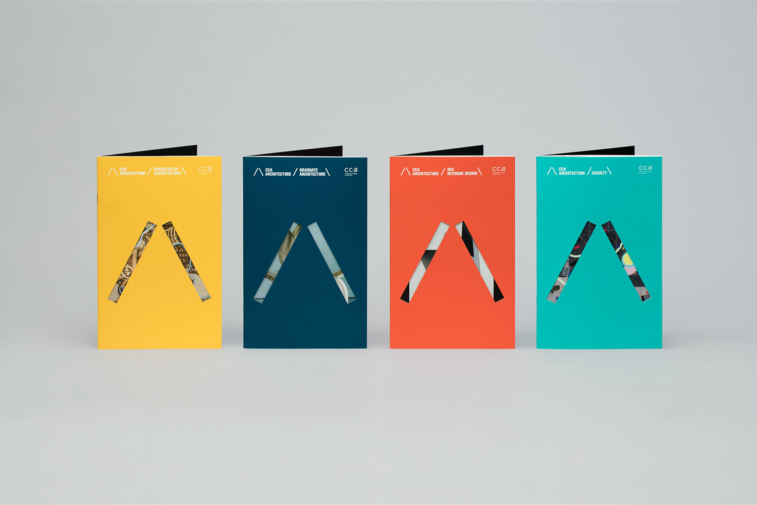
The Architecture Division of the California College of the Arts (CCA) is an internationally recognised leader in architecture and interior design education. Its programs, which focus on digital technologies and material systems, design research and urban agency, were developed to prepare students for creative practice where material innovation and formal experimentation meet social engagement and cultural collaboration. CCA Architecture strives to develop the next generation of architects and designers, those who will go on to shape the future of the built environment.
American studio Manual worked with the college to develop a unifying graphic identity for the division, to differentiate it within an art college, and strengthen its wide ranging communication materials, those that are aimed at prospective international students, faculty members and visiting lecturers. Using a simple /\ motif, and employing a variety in its implementation, Manual find an interesting balance between the structural, the material and the digital across brochures, posters and wayfinding.
See more of this project here
V&A Exhibition Road Quarter by dn&co., United Kingdom
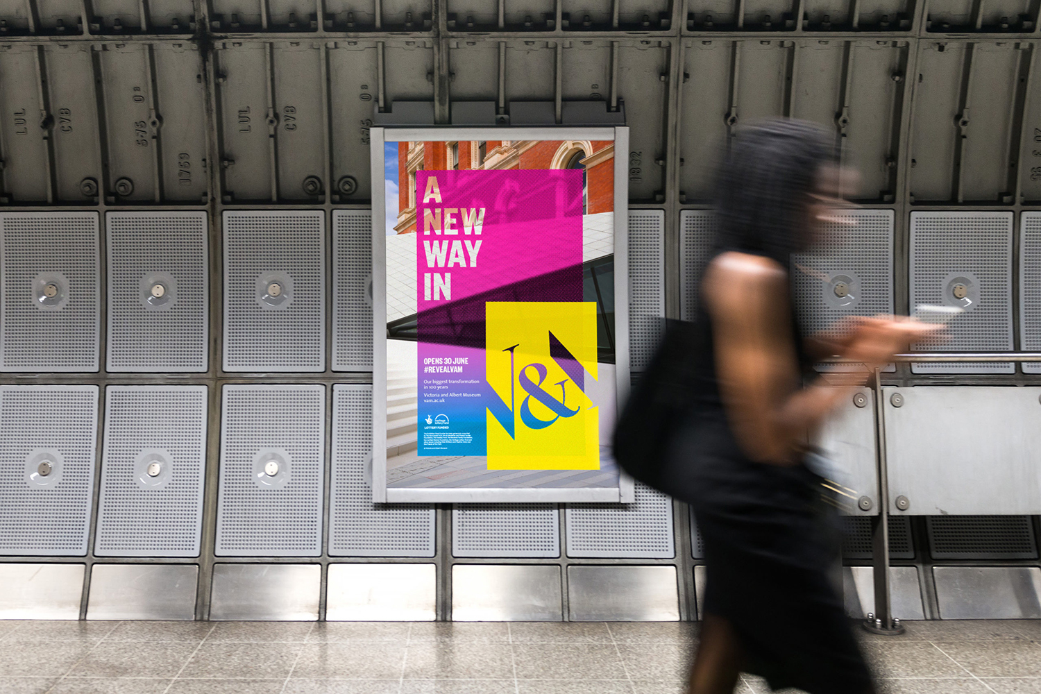
Exhibition Road Quarter is a gallery built under, and an extension of, The Victoria and Albert Museum, London, the world’s largest museum of decorative arts and design. Although the V&A is known for its commitment to innovation, its spaces within an early twentieth century Grade 1 listed building set limitations, with temporary spaces and retro-fitted interiors proving to be cramped and inflexible. Without the possibility of outward expansion, the V&A explored the subterranean, itself embracing innovation in architecture and engineering, to create new modern spaces with greater scale and opportunity, beneath. To celebrate the architecture of AL_A, and to tease and announce the grand opening, design studio dn&co. worked with the V&A to develop a campaign of posters and banners. These were unified by the line “A New Way In” and based around the concept of concealing and then revealing through layers.
See more of this project here
Di Beppe by Glasfurd & Walker, Canada
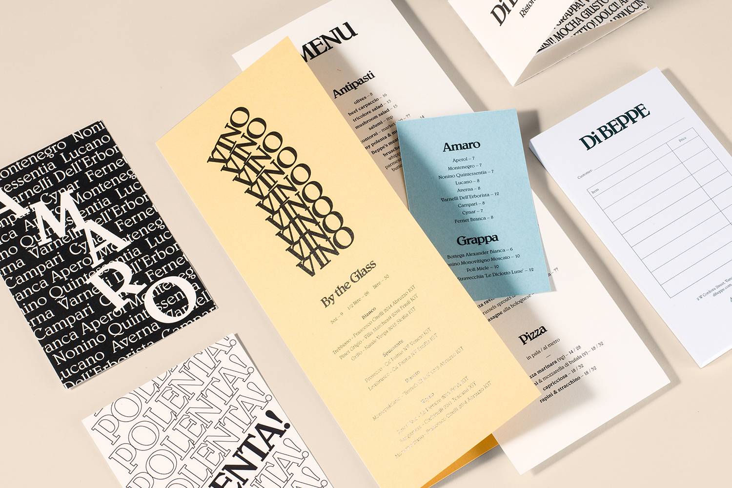
Di Beppe is a casual Italian caffé and ristorante, located in Vancouver’s Gastown neighbourhood, “inspired by the Italian immigrant’s desire to share a piece of home while living abroad”. Di Beppe is said to honour the sense of deep pride and self-assured nature associated within Italian culture through a classic and authentic Italian dining experience and in the design of its graphic identity, created by Canadian studio Glasfurd & Walker. Drawing on the typographic and iconic character of Italian cinema of the past, Di Beppe’s graphic identity has a confident and immediate visual voice, one that is enthusiastic and loud. This links a variety of assets. These include menus, bottle labels, posters, gift cards and postcards, as well as signage and website.
See more of this project here
Nicollet by Pentagram, United States
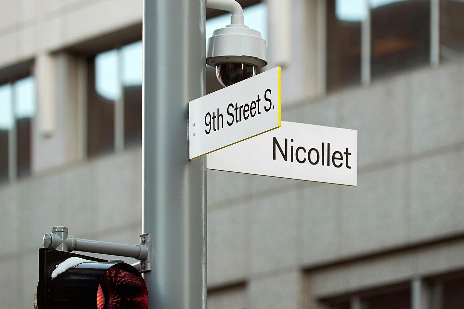
Nicollet Avenue runs between Loring Park and the Mississippi River and is described as the “Main Street” of downtown Minneapolis. It is a cultural and commercial centre, shopping and dining district, and home to flagship stores, major corporations, public transport hubs and landmarks. Nicollet Avenue also includes the Nicollet Mall, the first transit mall in the US, originally opened across eight blocks in 1967 and now covering twelve.
Following a major renovation to make the avenue more pedestrian friendly, and to coincide with its reopening and 50th anniversary, Pentagram’s Paula Scher and team developed a new graphic identity for Nicollet. This included a comprehensive system of signage, way-finding and environmental graphics which intend to capture the spirit of the street and its place within the city through typographic form, iconography, shape and colour.
See more of this project here
BBC Creative by Spin, United Kingdom

With the intention of being the most creative organisation in the world the BBC has developed its own in-house agency, BBC Creative, to develop cross-platform marketing materials such as trails and idents to engage with a global audience and bring to their attention the vast range of BBC programmes and services available. To express this unified vision and creative potential, BBC Creative worked with London based studio Spin to develop their graphic identity. Drawing on the iconic three blocks associated with the BBC, Spin introduce a fourth, a creative box and abstract C as a way to form a critical and essential relationship between the BBC and creative thinking in a concise and dynamic manner. This is deployed as small details across mugs and tote bags, all the way up to supergraphics that run across walls.
See more of this project here


