Broadgate by dn&co
Opinion by Richard Baird Posted 13 April 2018

Broadgate is the largest pedestrianised neighbourhood in Central London. It is adjacent to the busy transport hub of Liverpool Street station, surrounded by Shoreditch, Spitalfields, Old Street and the City, made up of a diverse community and uses that span innovation, finance, food, retail and contemporary cultural activities.
The area will receive a £1.5 billion investment to further its development as a world-class mixed-use destination. This will include 4.9 million sq ft of new and redefined workplaces, retail spaces, public areas and restaurants described by dn&co., the design studio behind Broadgate’s graphic identity, as embodying the community and feel of the historic piazza with the energy of modern London.
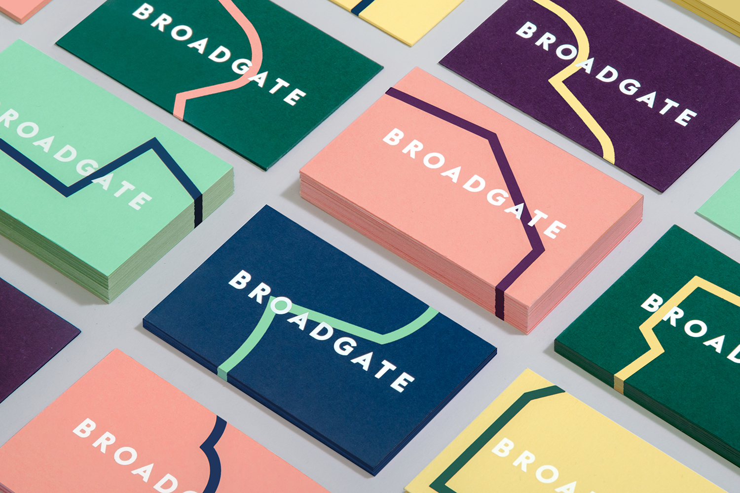
Broadgate connects and contains diverse areas, each with their own unique character, services and experiences, and will go on to include many more. Wrangling these into a singular coherent identity, one that is inclusive yet with a definitive identity and without the preconceptions of typical B2B communications was a critical part of the challenge. This was achieved through a generative and kinetic B; a dynamic and constantly shifting container and outline. This motif, alongside a contrasting dark and light colour palette and complementary type treatment, serve to unify posters, business cards, tote bags, website, installations, social media profiles and merchandise.
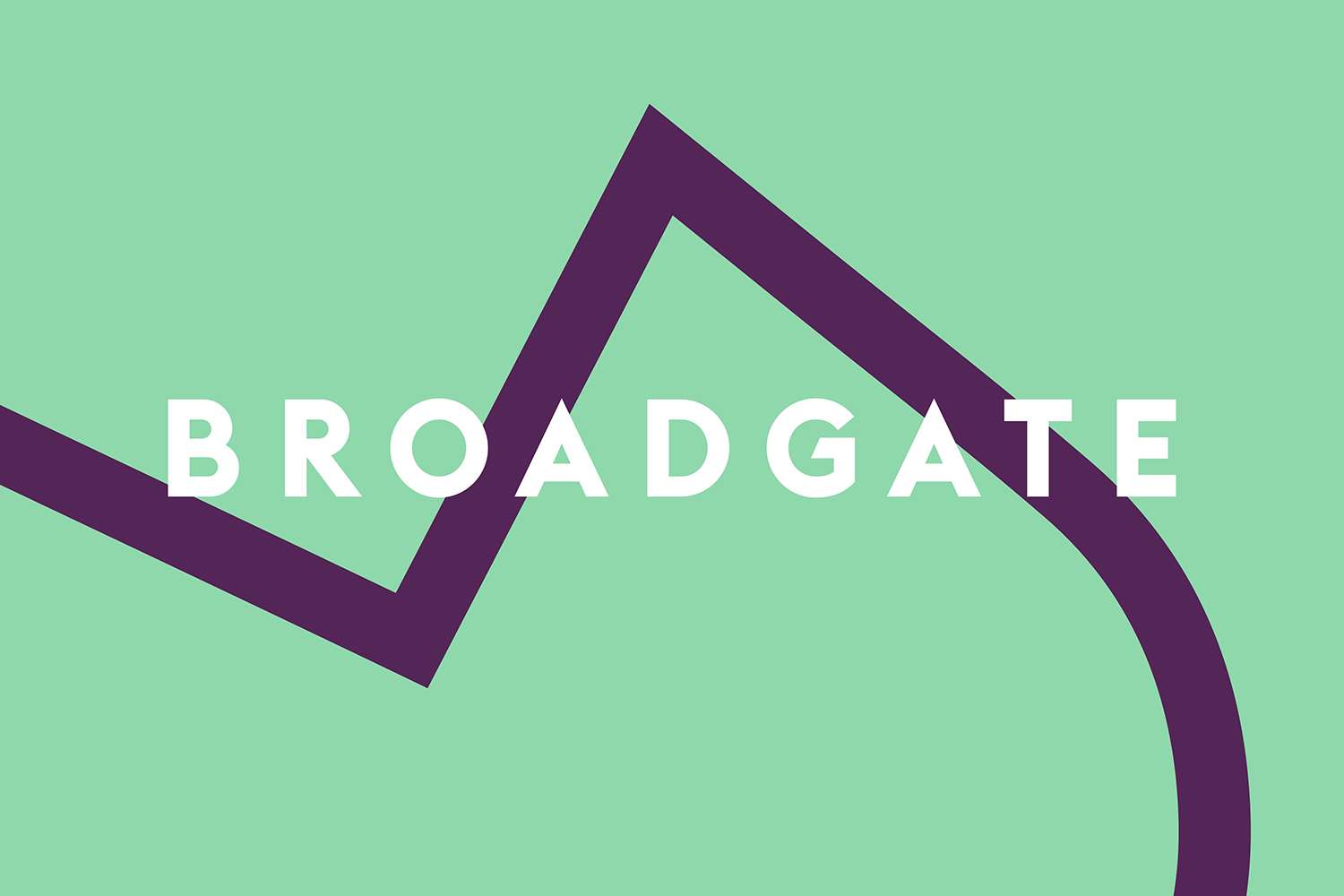
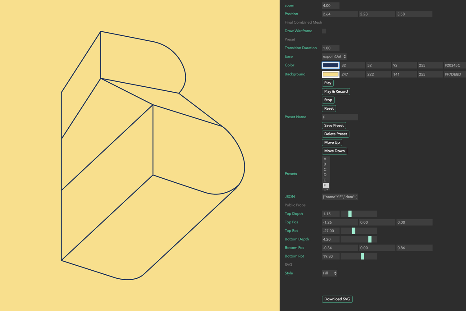
The kinetic B, its generative nature and outline serve as a quick shorthand for boundaries, much like a map might pick out state lines or counties. Its shifting and maleable form develop this into something more expressive and memorable with a built environment quality in its dimensionality. There is the implication of change, of adaptability, where regional and area boundaries are typically perceived as static, separating communities rather than being open to new people and, by extension, new ideas. It is a lot to get from a single motif, but is conceptually intelligible, current and functions to establish a clear continuity between a variety of digital and material assets. Logotype favours commonality in its lettershapes, monolinear lines, weight and spacing. Its placement, set over the boundary of the B, is a nice visual nod to exchange.

The proportions of the B and its many but cohesive variations make it ideal for social media avatars, yet the Broadgate logotype is forced into these tiny situations and becomes illegible at times. It is understandable that the area name be pushed but the content of a tweet or a Facebook post is a more contextually sensitive and richer way to do this.
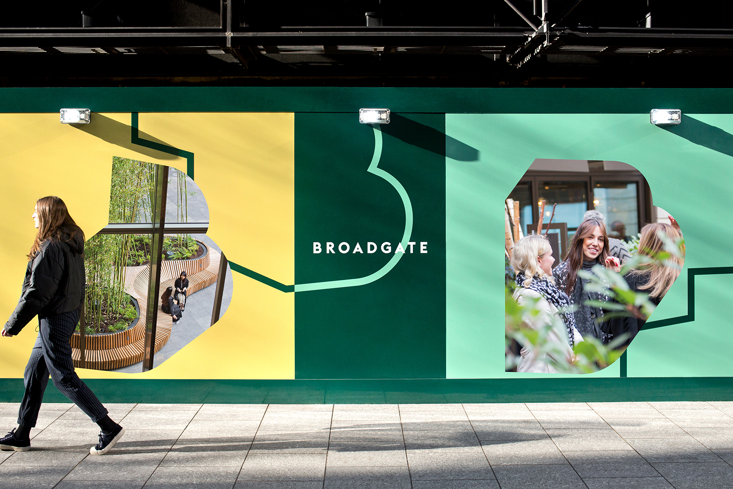
The B goes on to become a window and container for images, presumably scenes of the future. It is a familiar technique but as a secondary component, necessary for further expression and communication within a cohesive system, this works. Colour functions to draw the eye and offers contrast to these images. It punctuates an urban environment of grey with current and cheerful pastels, and slightly more corporate hues. This juxtaposition, the touching on business and public space, is far subtler than the boundaries of the B, but a thoughtful idea that leads to a distinctive colour set. These colours, much like type and logo, do feel of the moment, well-suited to a campaign, an announcement of the mixed-use and inclusive intentions of the area’s future, rather than a long-serving place identity.
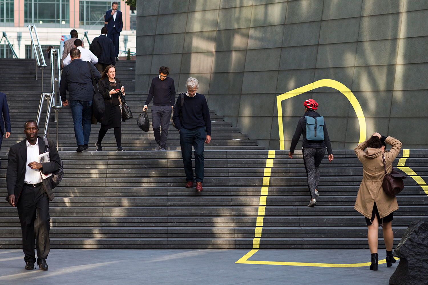
Although built around a few concise gestures there is plenty of variety. Highlights include the way lines run through business cards, the forming of paths to connect posters and run across hoarding, how the B intersects the physical environment and the energy of its animation online.
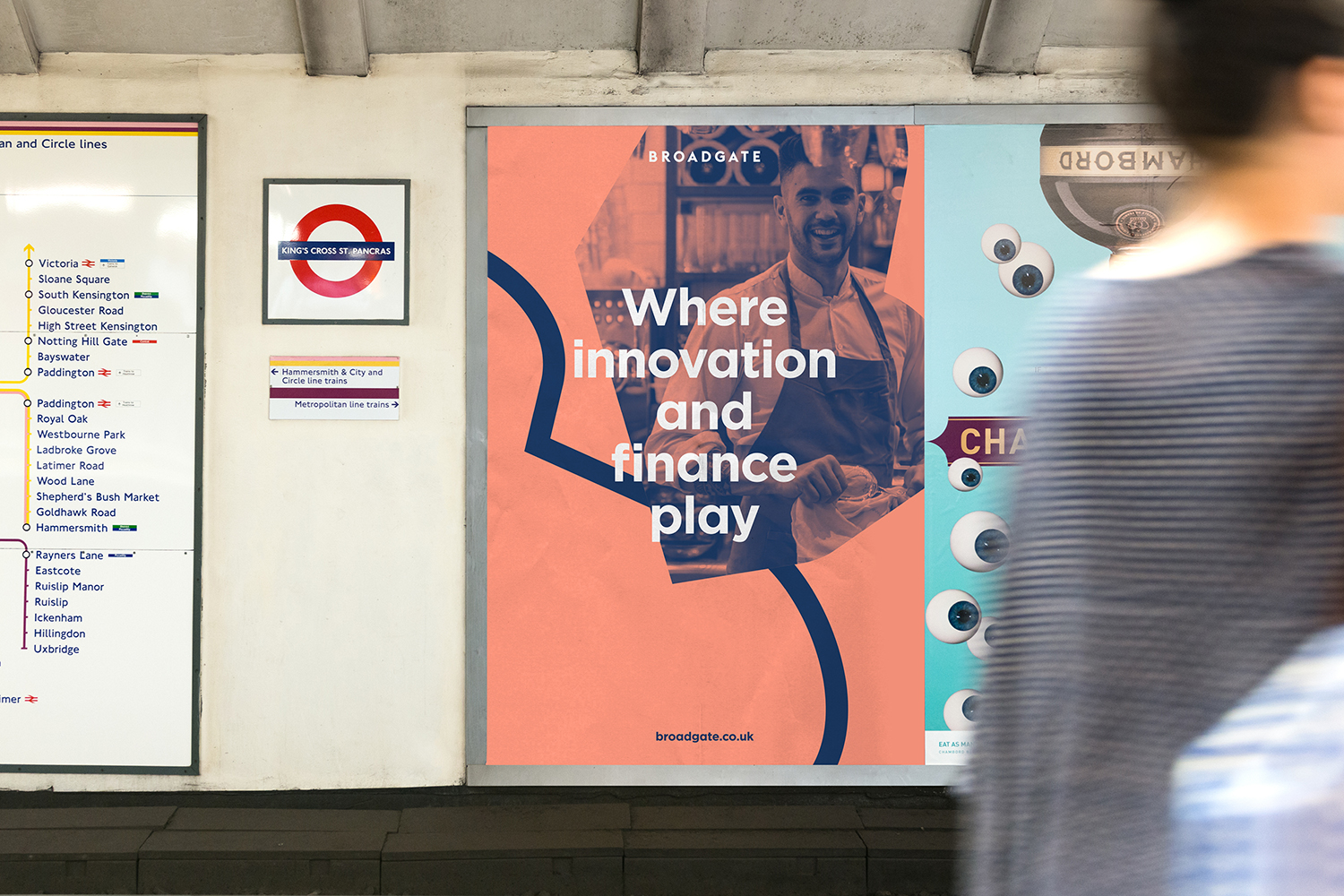
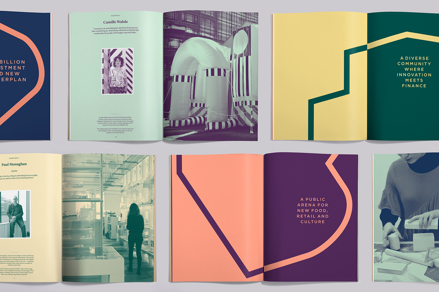
The project is strategically interesting in that it needs to connect with a broad group of people. To show new business and investors that there is a shared agenda and a concerted effort to develop the area. To outwardly express to visitors, residents and those considering working there that the future is exciting and appealing. Each of these groups is as distinct as the areas Broadgate contains. The response neither leans too far towards the corporate, the commercial, or the cultural. There is the potential for dissonance, but in its visual simplicity and universal concept, finds a comfortable intersection between each of these concerns. More from dn&co. on BP&O.
Design: dn&co. Opinion: Richard Baird. Fonts: Euclid.
