Platform 10: Live Feed by Pentagram
Opinion by Richard Baird Posted 27 April 2018
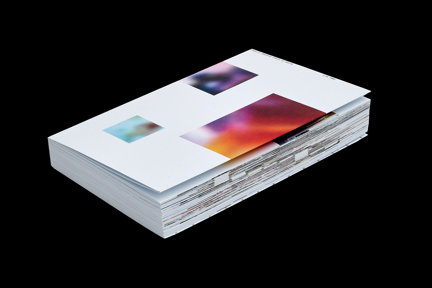
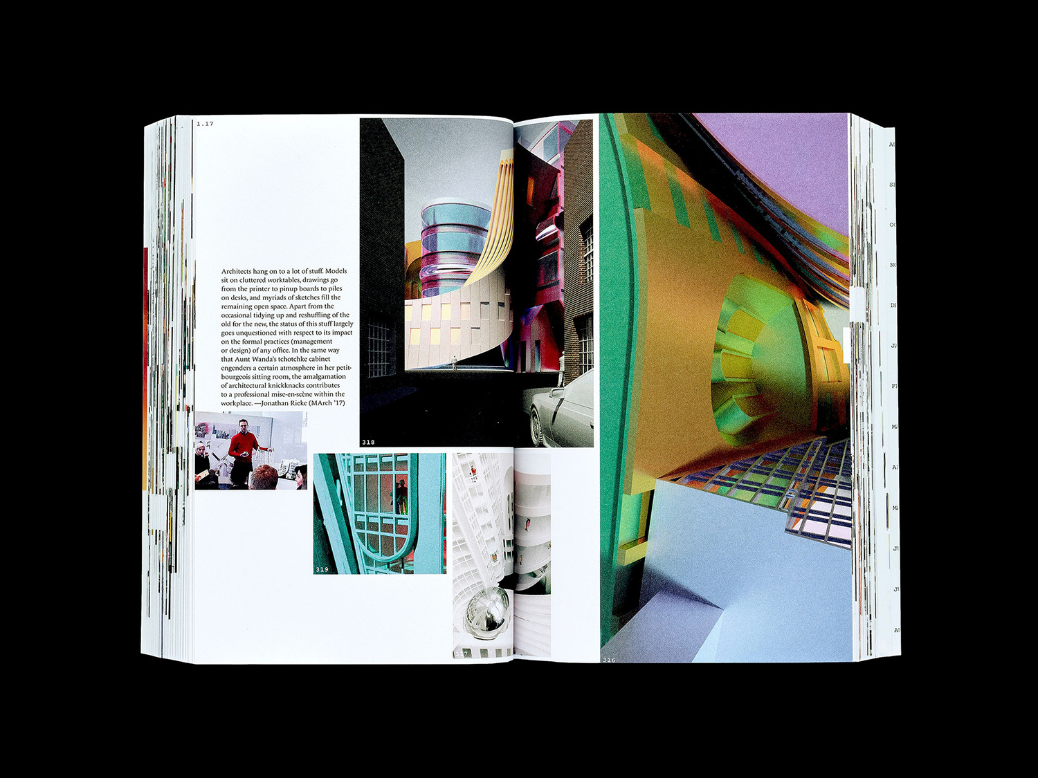
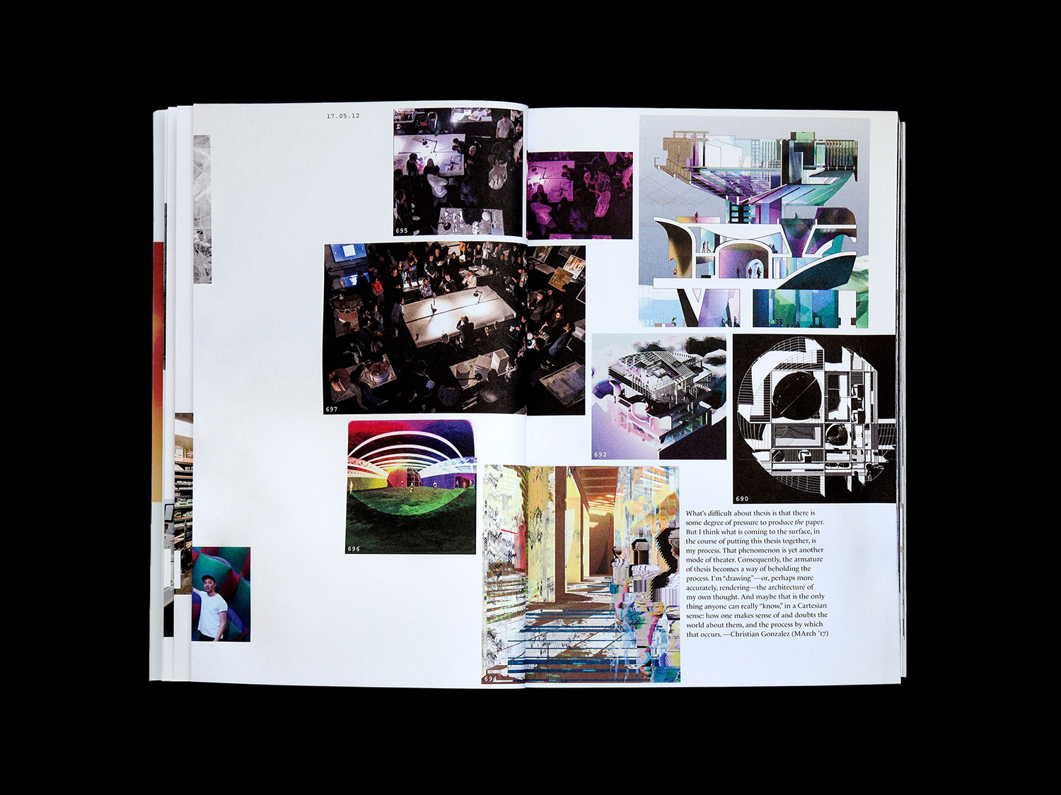
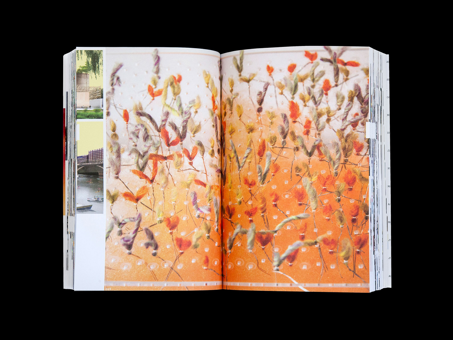
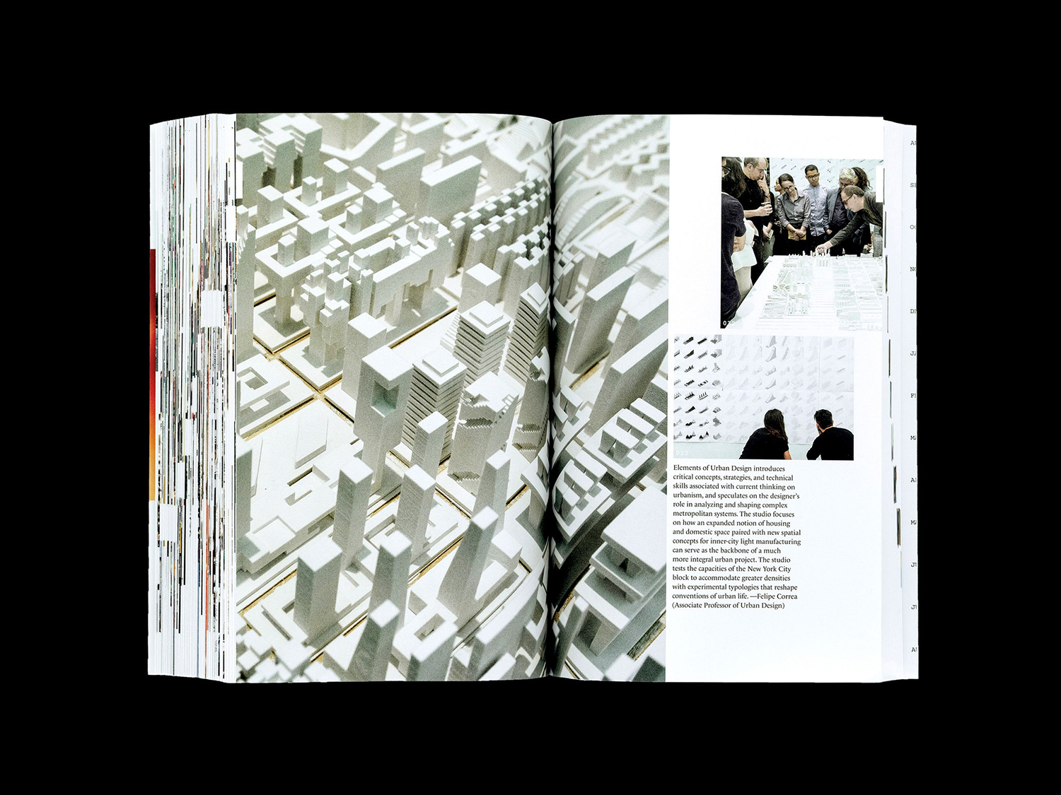
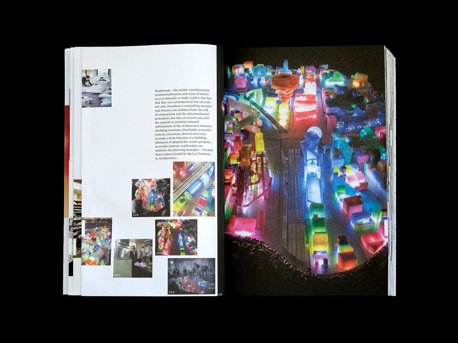
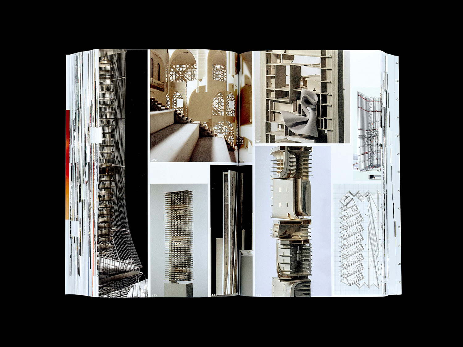
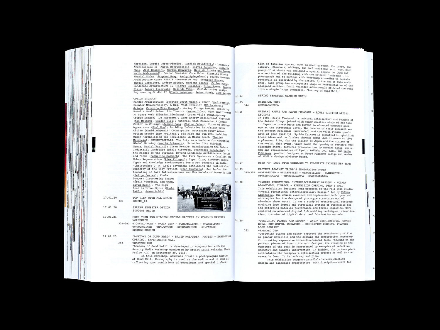
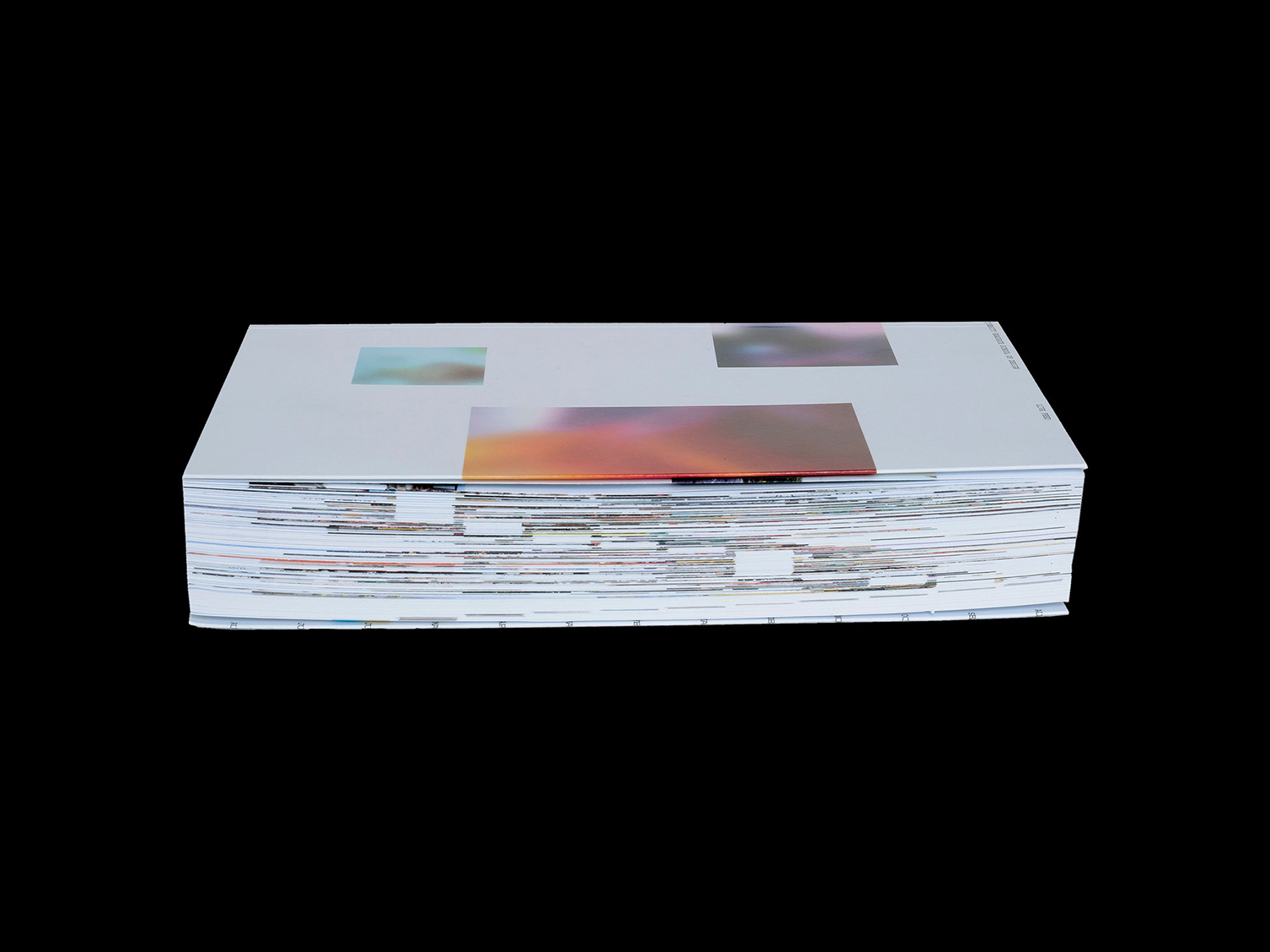
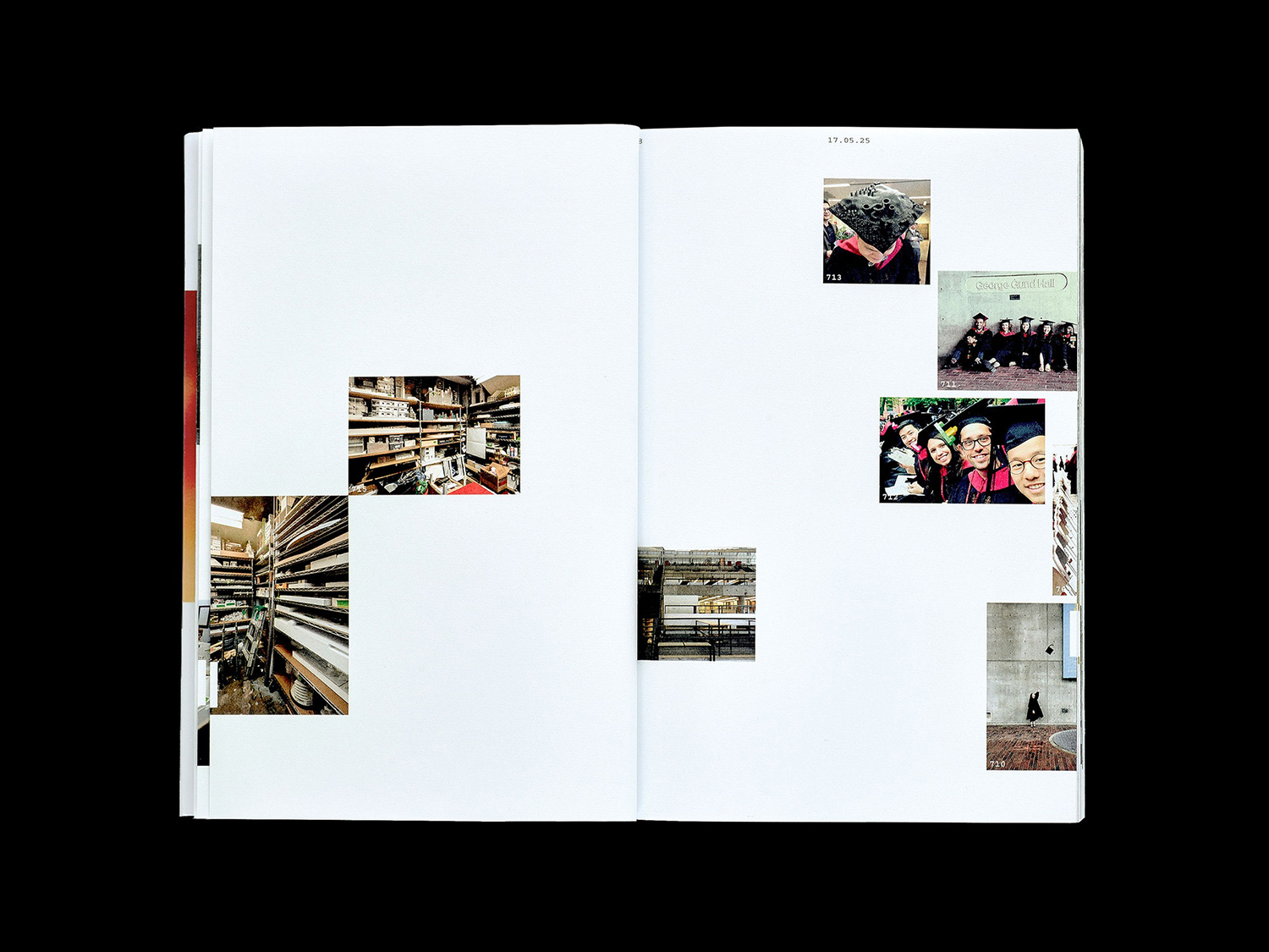
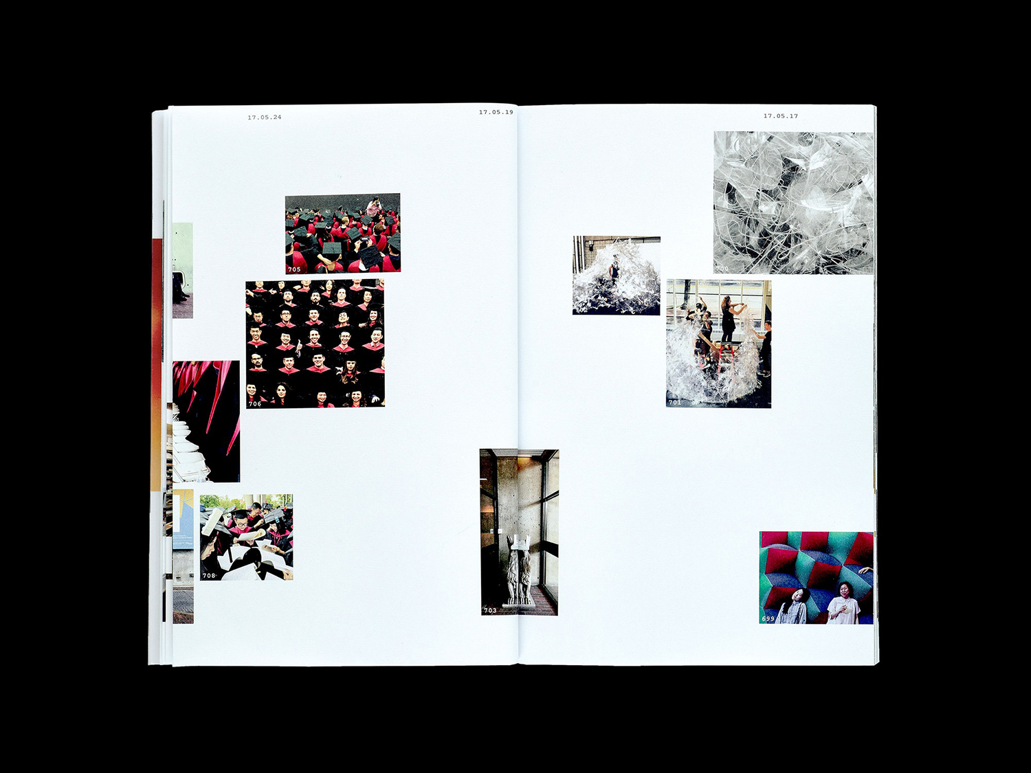
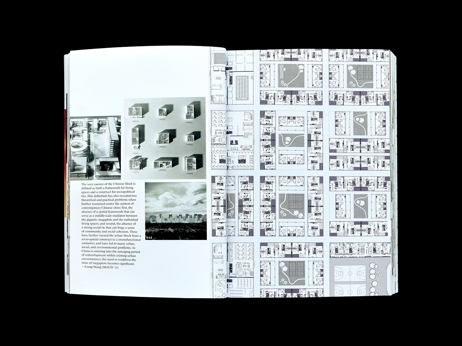
Platform 10 is the latest edition of the Harvard University Graduate School of Design’s annual abstract of student work, events, lectures and exhibitions. Under the theme “Live Feed” and inspired by social media feeds, Pentagram’s Natasha Jen and team have collated and formalised the 2016-2017 school year, in reverse chronological order, presenting this as a timeline of images drawn from a crowd-sourced database of 117,518 files. The pages of Platform 10 are bound by a French fold, giving the book the quality of a single continuous stream of paper, which is augmented by the sequencing and cropping of images, and the way that these occasionally disappear into the crease.
In the order and arrangement of images Platform 10: Live Feed brings to light the fluidity between place, production and people and, in its physical construct and within the limitations of the printed format, in its intersection of social media feed and crowd-sourced digital files, comments on the commonalities of old and new media, that while there is an abundance and occasional excess to the digital world, this remains as curated and mediated as the enduring format of the printed book.
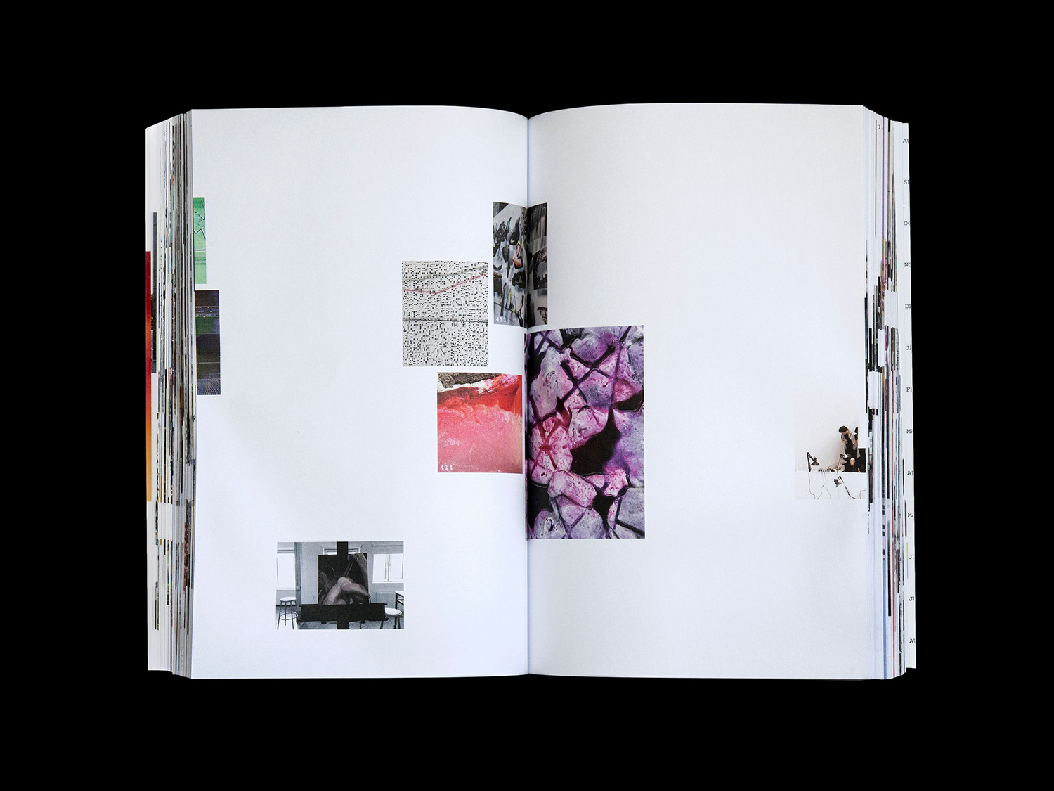
The above is largely subtext, the more immediate idea at play is time. This is expressed in the reverse chronological collation and presentation of images, and the impression of a single continuous stream of paper in fold and binding, emphasised by the cropping and full bleed of images. This latter detail goes on to create a beautiful surface across the depth of the book. Negative space and lines of colour build to create something that calls to mind a timeline, the compressed and abstracted overview you get on digital devices when you view by year, or the blocks of a calendar or flow chart. The intentionality of this is made acute by the clear top and bottom edges.

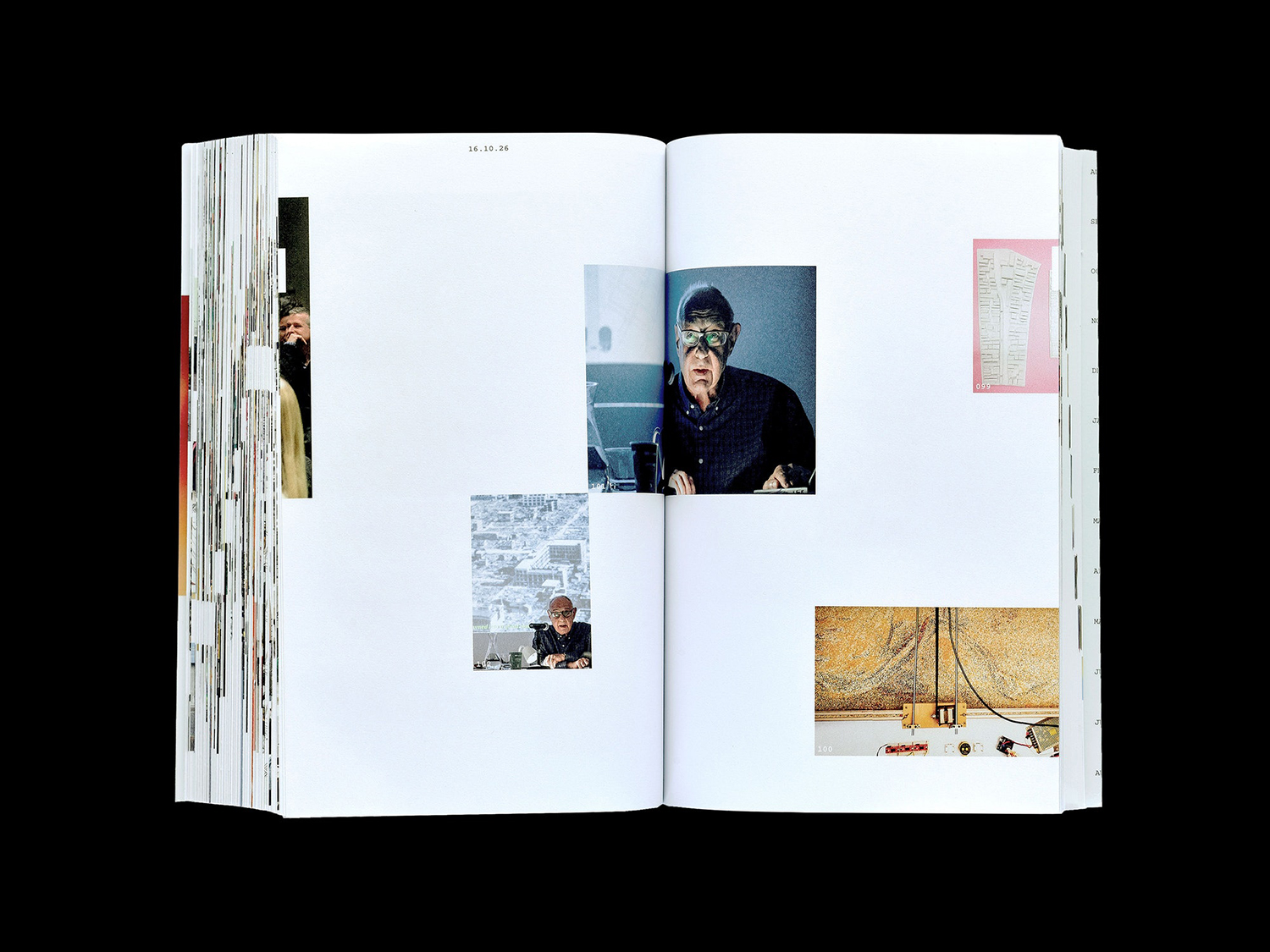
Layout is guided by a flexible grid system. The impression here is something close to college, a scrapbook of time and place, of immediacy, of as little design intervention as possible yet with a clear continuity of concept and in its execution that speaks of consideration not carelessness.
White space is a critical and essential component, not only elevating the colour, form and content of image but serving to visualise a moment in time when little happened. Time also becomes the tool for navigation, rather than traditional page numbering. This is a small detail but functions as a useful entry point into understanding the essential nature and conceptual foundation of the book, alongside naming, layout and image captions and text that end with a conventional chronology to create a loop.
Much of the content of the book brings to light the material experimentation of the Graduate School of Design. This materiality is explored in the division of content through substrate adjuncts and the continuity created in the fold and binding of paper but also its robustness.
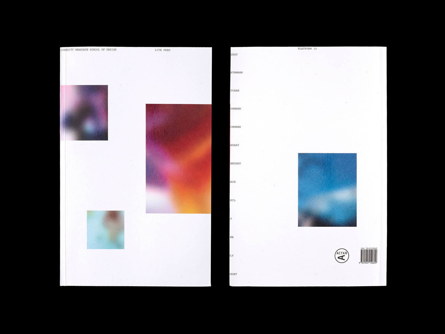
Cover does a good job of alluding to interior experience in its arrangement of images, although avoids the specificity and content bias of choosing three image through a blur, instead, using the relationship between image, colour and space to create an eye-catching graphic expression, and a type treatment (style and placement) that speaks of documentation.
There is a lovely tension between a pleasing material construction and the made and college quality of its layout, and a layered conceptual rigour, one that plays with the non-material; digital resource, social media and the passage time. It moves from the literal and immediate to the subtle and nuanced, building to something thoughtful, in service of content and targeted at those sensitive to the potential and multiplicity of material visual communications. More work by Pentagram on BP&O.
Design: Pentagram. Partner In Charge: Natasha Jen. Project Team: Joseph Han Ji Park, Derek Love, Ze Wang & Georgina McDonald. Opinion: Richard Baird.
