Lukas/Markus – Kalle Sanner by Lundgren+Lindqvist
Opinion by Richard Baird Posted 22 May 2018
Lukas/Markus is a decade-long photographic project by Kalle Sanner shot with a large format camera and exploring the mirrored and connected chapels of Saint Lukas and Saint Markus designed by architect Sven Brolid. The structure was built during the 1960s, a period when Swedish functionalism was at its height, and is located in the Western Cemetery of Gothenburg.
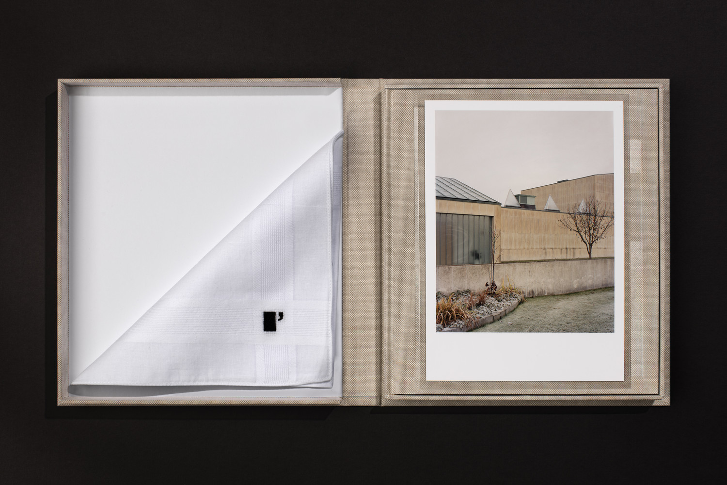
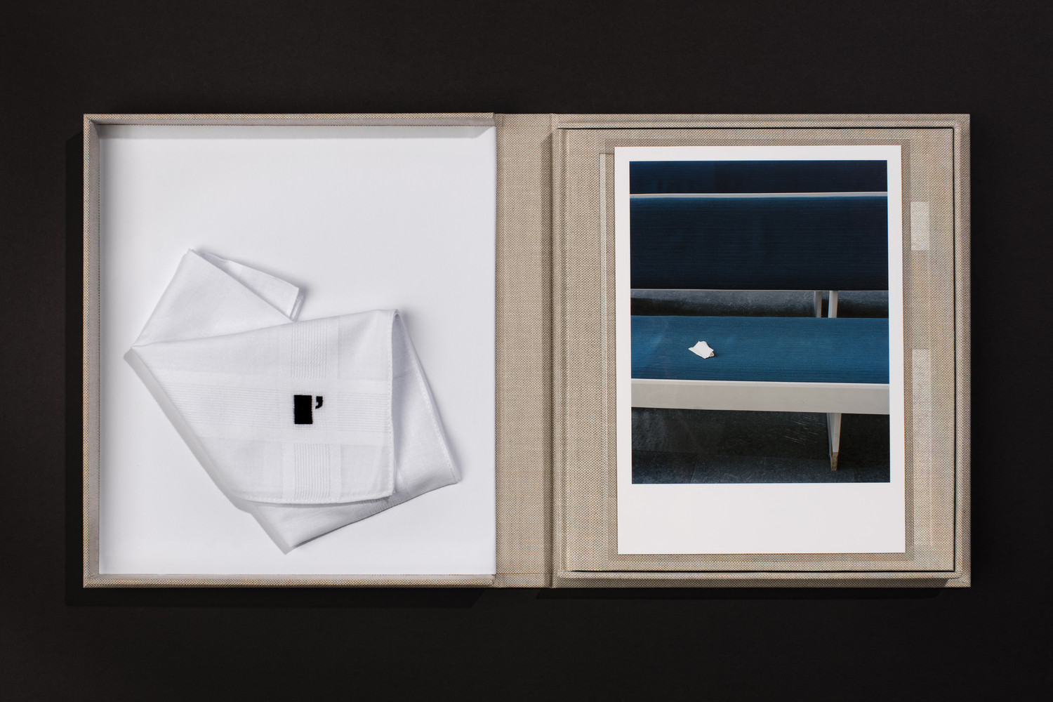
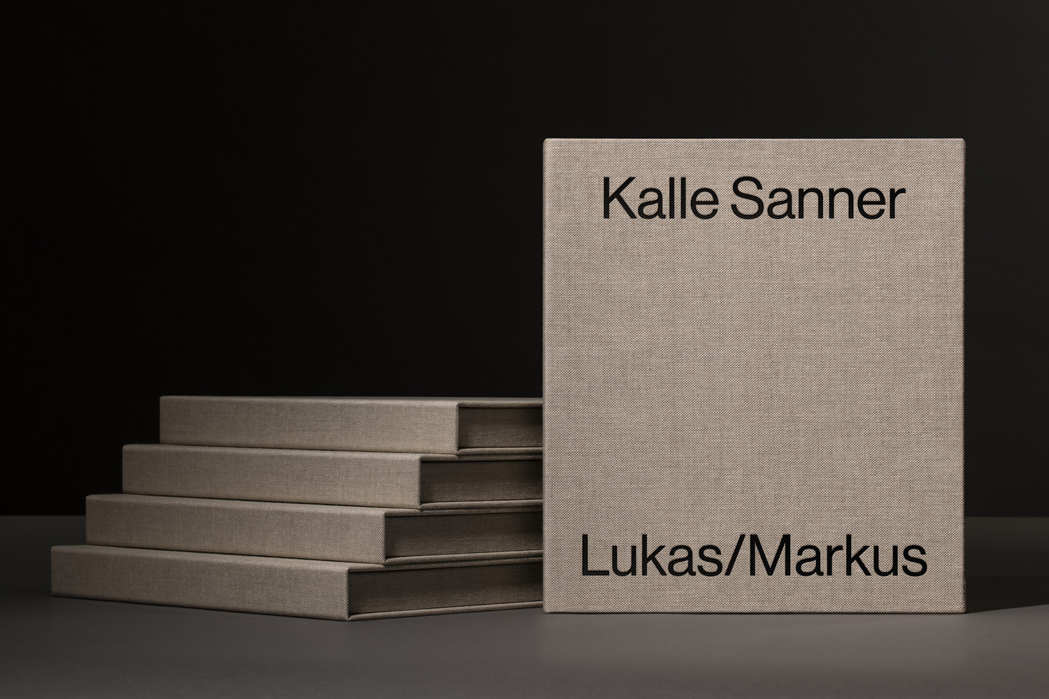
The book, released May 2018 and co-published by ll’Editions and Blackbook Publications, exists in two versions. The first is an 82 page cloth-bound hardcover trade edition that measures 200 x 223 mm and the second is a special edition housed within a handmade clamshell box that includes an embroidered handkerchief and one of three c-prints signed and numbered by the photographer. Both of these books were designed by Scandinavian studio Lundgren+Lindqvist.
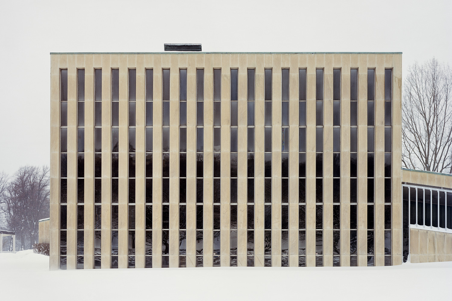
Kalle Sanner discovered and began photographing Saint Lukas and Saint Markus over ten years ago. Aside from the mirrored and connected nature of the chapels the structure is also characterised by a robust prominence, stark silhouette and contextual indifference to the sparsely built-up cemetery that surrounds it.
Drawn to the building’s position and harmonisation of materials, but without a clear idea of what form the project may take, Sanner remained open to the passage of time, the redefinition of space, and his evolving process of image making. Emerging and dissipating external influences, seasonality and an associated change in light brought a new material beauty to dominant structure and practical surfaces rooted in the Swedish functionalism of the 1960s.
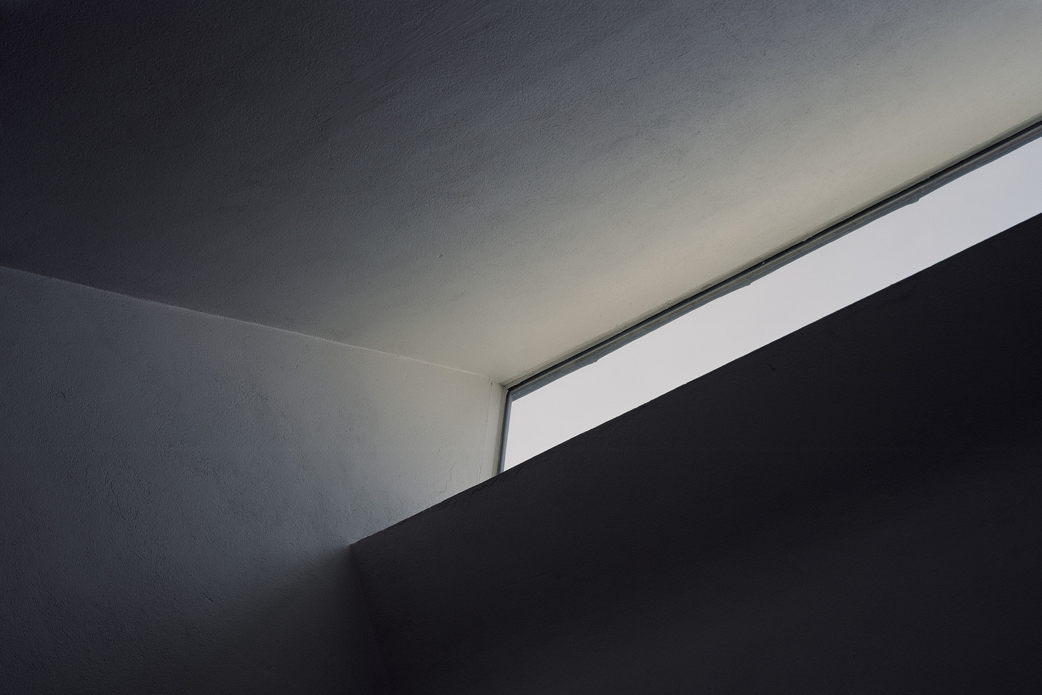
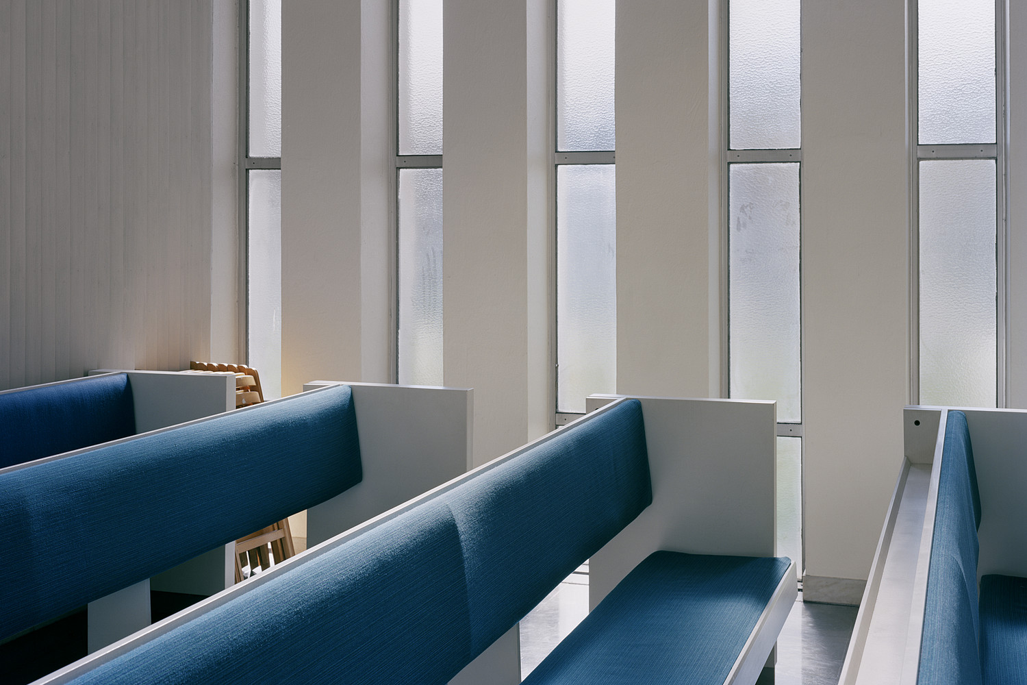
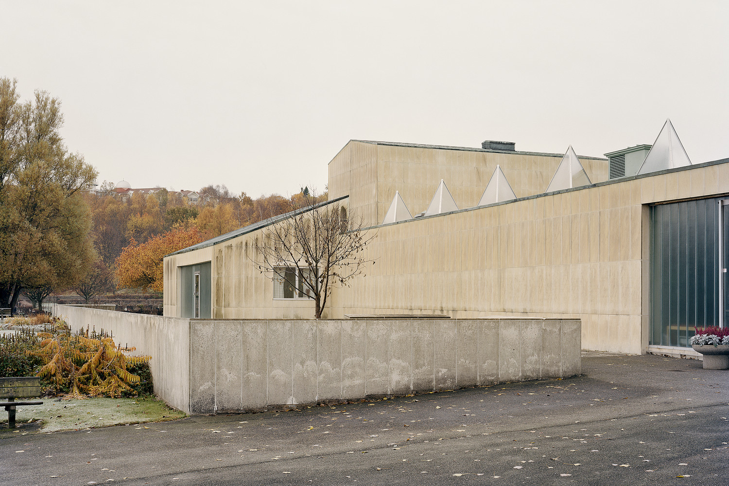
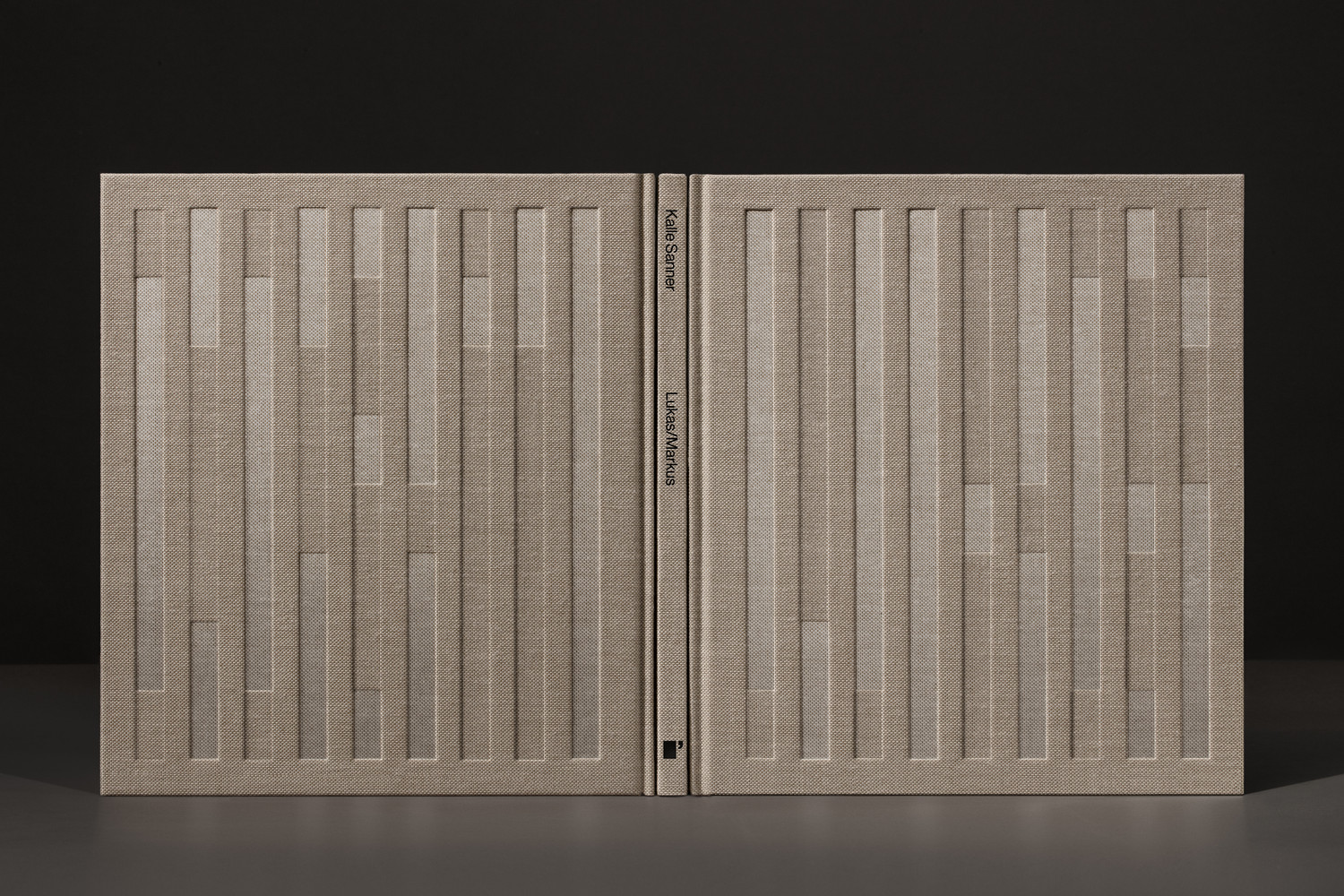
Lundgren+Lindqvist’s design effectively channels and plays with the essential qualities of Kalle Sanner’s project, the projection and implication of material permanence subverted by the passage of time. This passage of time is explored as an external factor, light hitting and intersecting structure (or book), and internally, the photographer’s own professional growth and personal relationship with his subject, as expressed by individual image and image as part of a sequence.
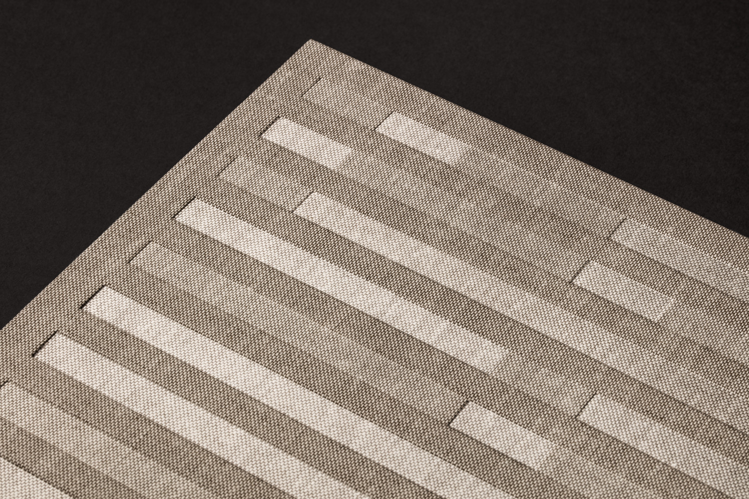
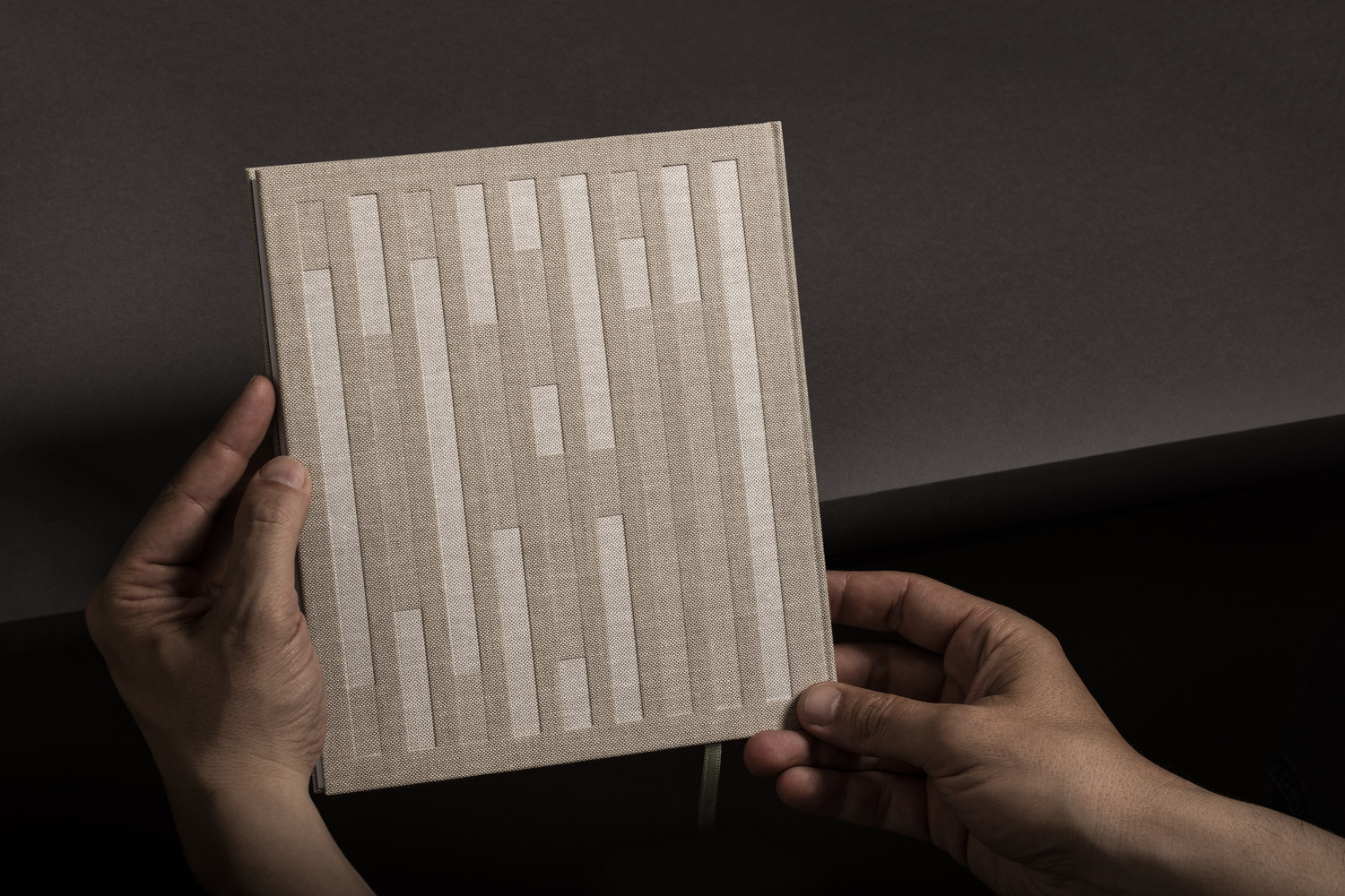
A cloth-bound hardcover, an embossing with a semi-transparent foil, details revealed when hit by light, form and proportionality, silk bookmark and the inclusion of an embroidered handkerchief weave together structural immediacy and a material connection with a conceptual nuance, subtle and literal contextual allusions and symbolism.
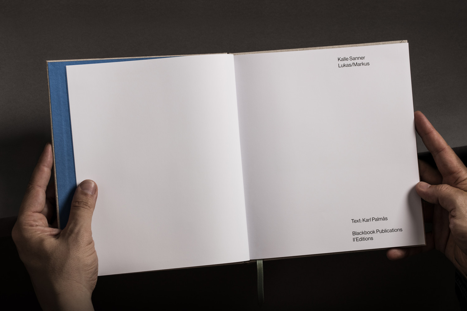
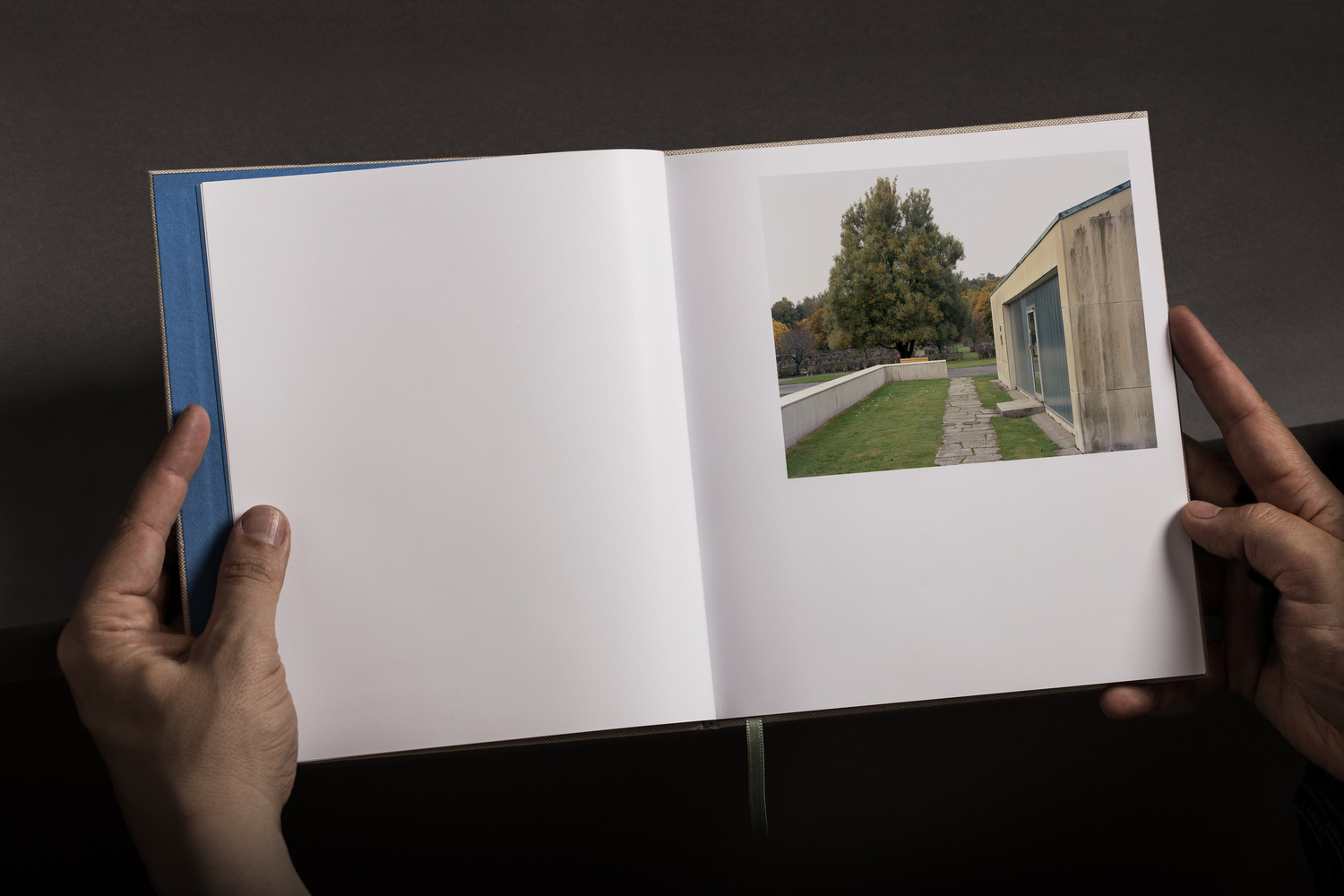
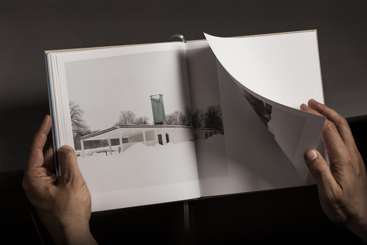
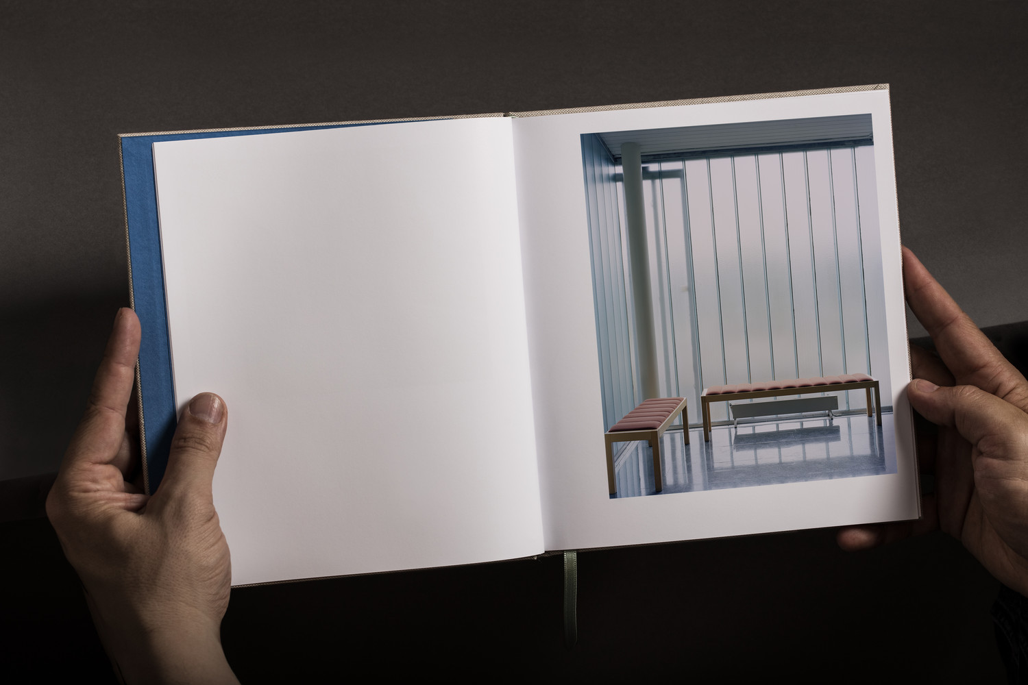
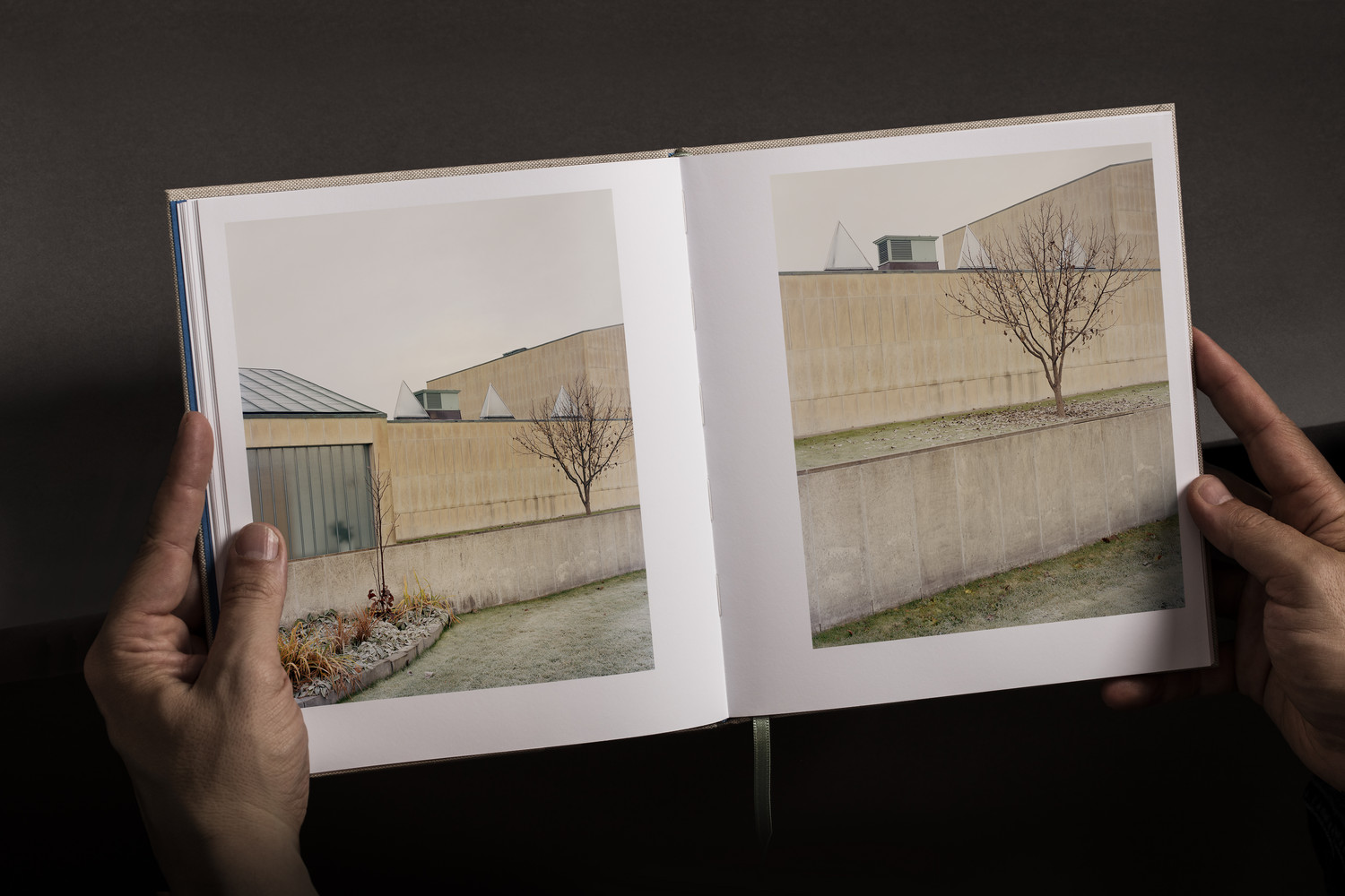
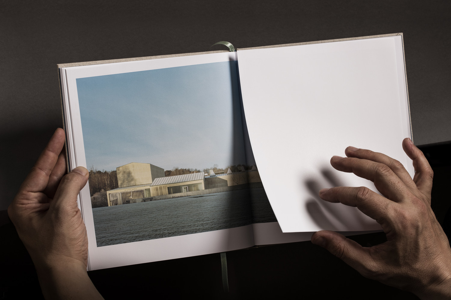
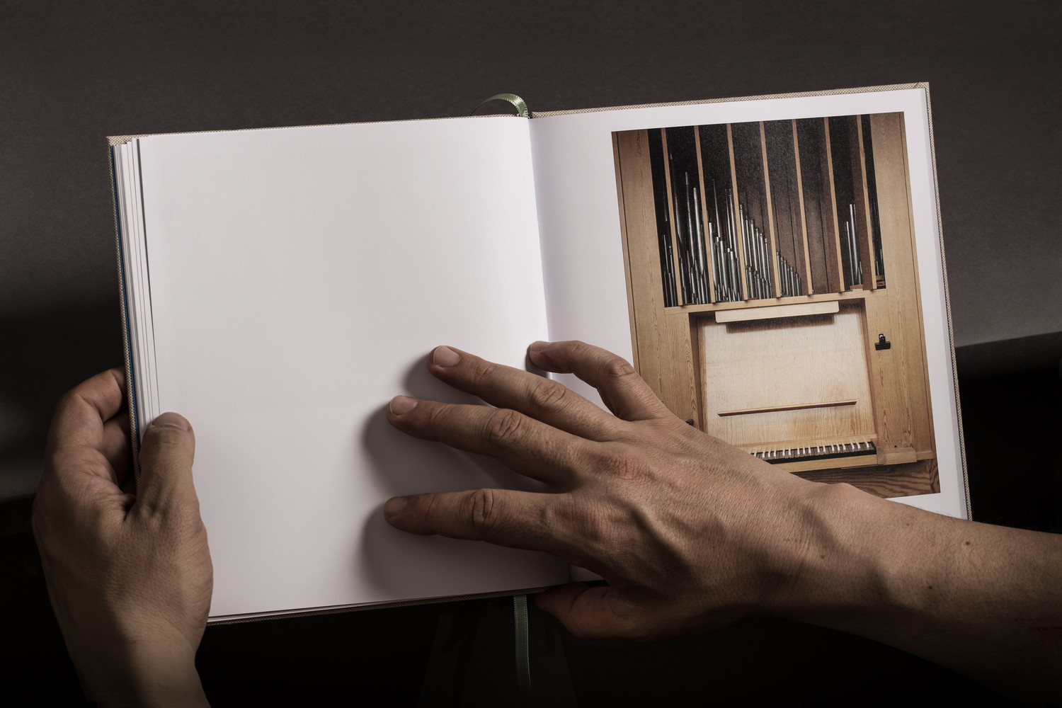
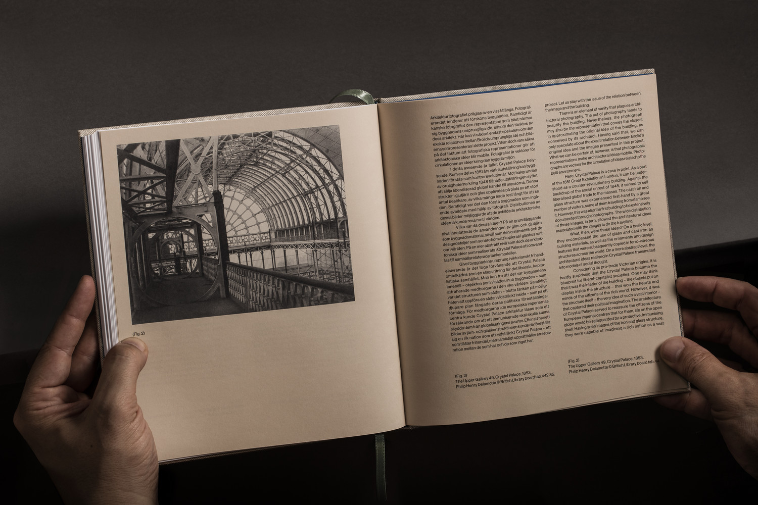
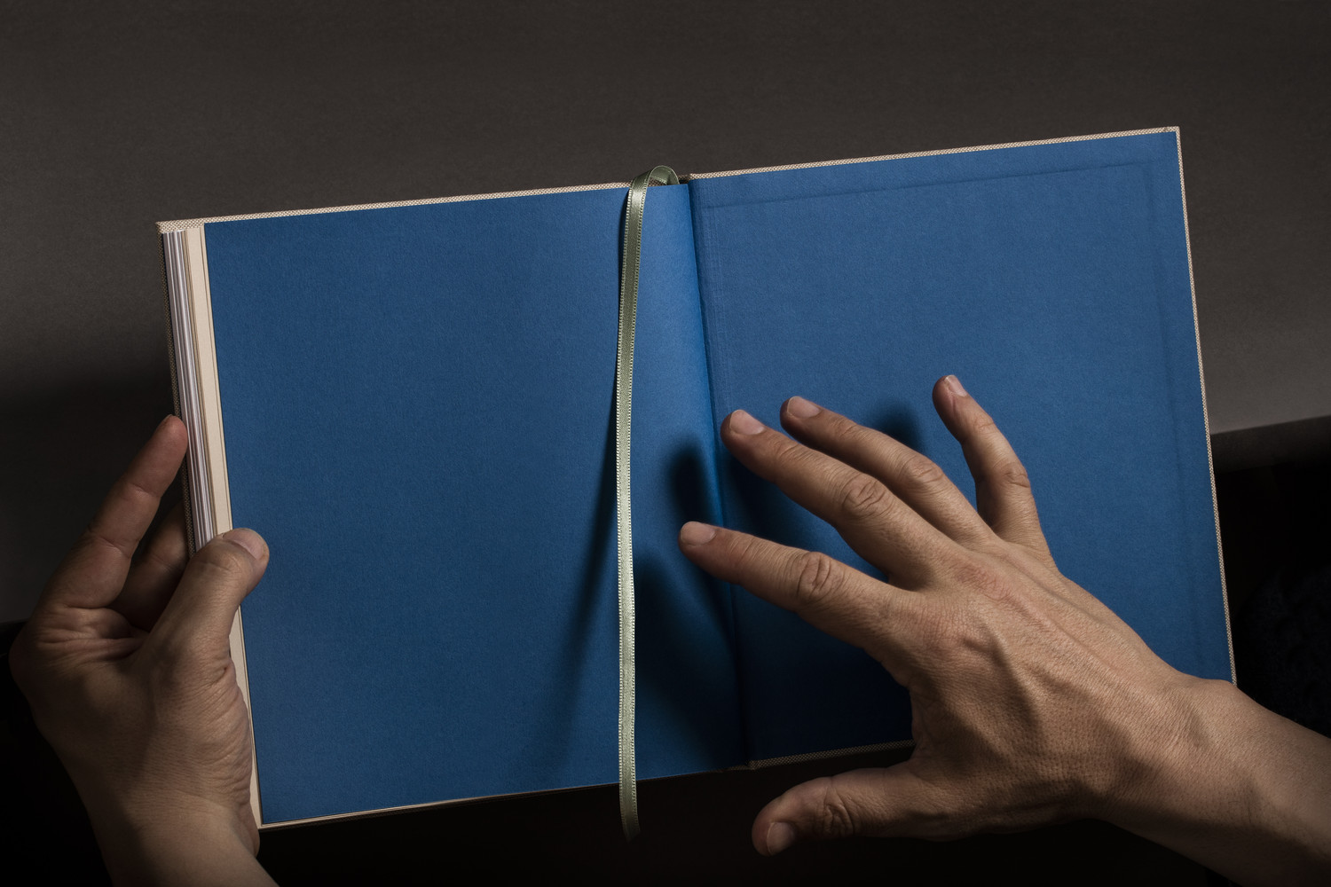
There is a pleasant mix between the literal and the subtle. Highlights include the aqua blue inside cover, a reference to the chapel’s interior textile details, the structural and architectural qualities intrinsic to the typesetting of essay, justified and with no paragraph spacing creating lovely moments of negative space, and the turquoise silk bookmark, inspired by the crematorium’s oxidized copper chimney.
There is a clear material quality throughout. There are the implications of modernity, functionalism and something closer to the sculptural in its mix of uncoated paper from Arctic Paper and Fedrigoni, double foldouts, head-band and endpaper from G.F Smith, embossed cloth cover and sand coloured paper, silk bookmark and the proportionality of book and box.
The inclusion of the handkerchief is a curious and unexpected detail. There is something deeply personal in its essential functionality and its monogrammed ornament, hugely emotional within the context of a chapel and cemetery, and conceptually neatly ties into the passage of time. More work by Lundgren+Lindqvist on BP&O.
Design: Lundgren+Lindqvist. Opinion: Richard Baird. Fonts: Neue Haas Grotesk
Specifications:
Printed by: Göteborgstryckeriet
Bound by: Förlagshuset Nordens Grafiska
Special Edition Boxes: Flodstrands Bokbinderi
Cover: Manifattura del Seveso s.p.a. CiaLinen 4020
First Insert: Arctic Volume White 150 g/m2
Second Insert: Fedrigoni Sirio Color Sabbia 115 g/m2
End Paper: G.F Smith Colorplan Adriatic 135 g/m2
Special Edition Prints: Baryta Photographique 310g
