Shakespeare In The Park 2018 by Pentagram
Opinion by Richard Baird Posted 30 May 2018
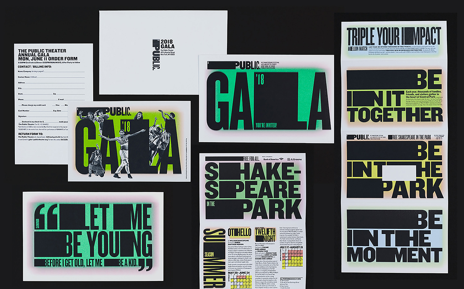
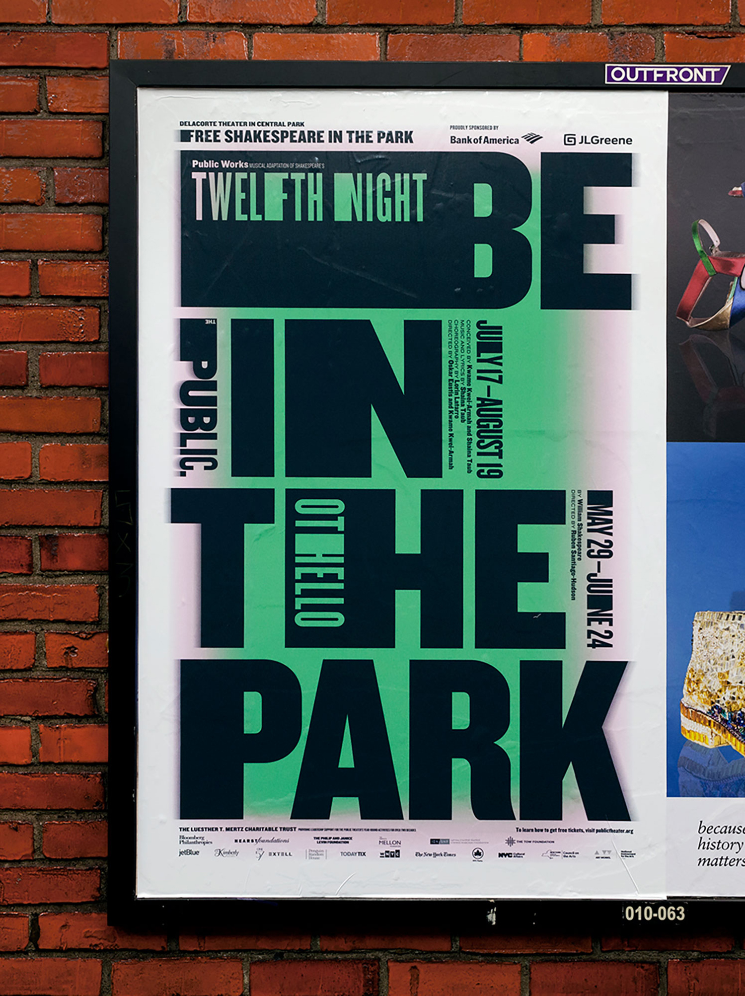
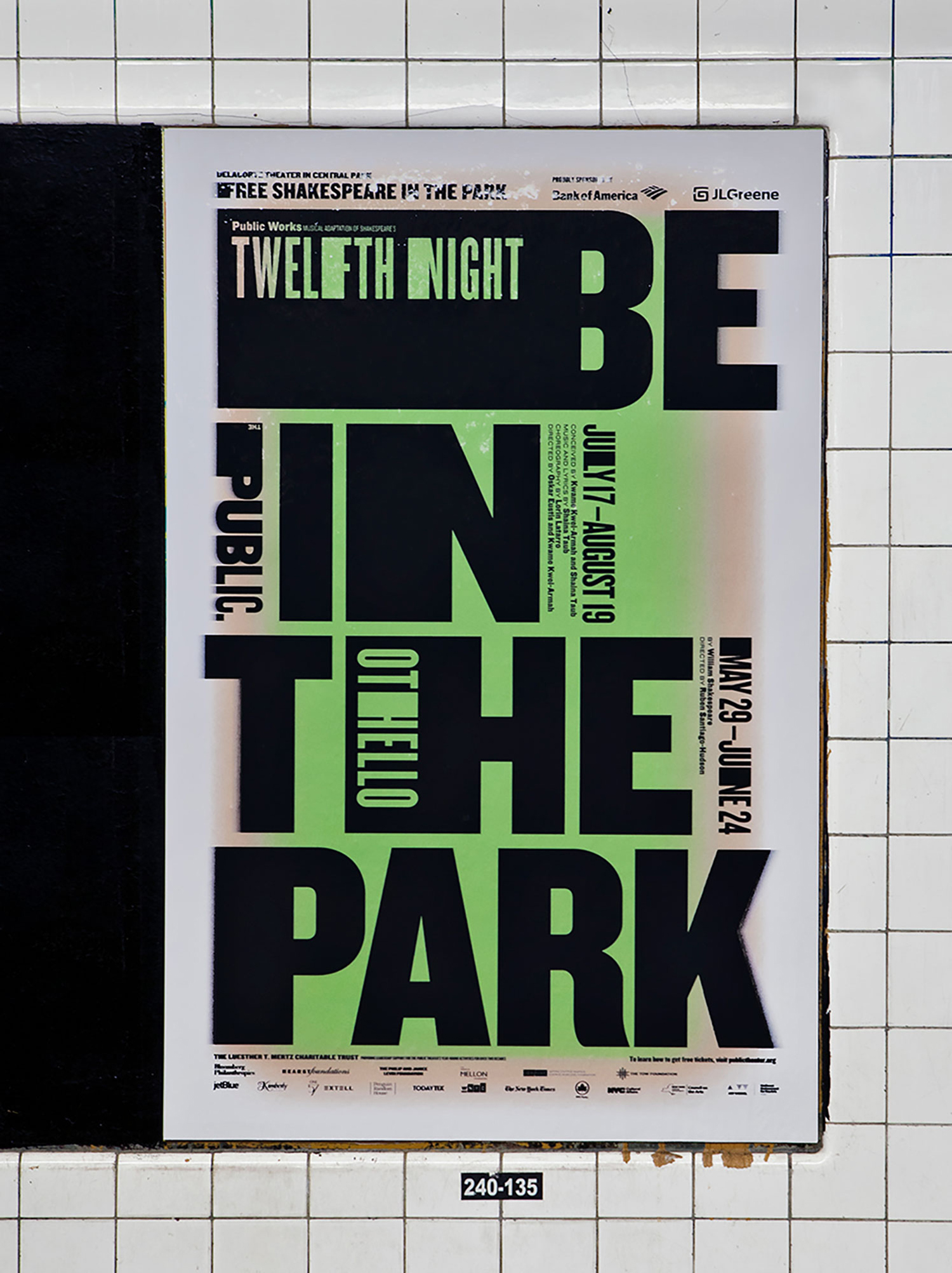
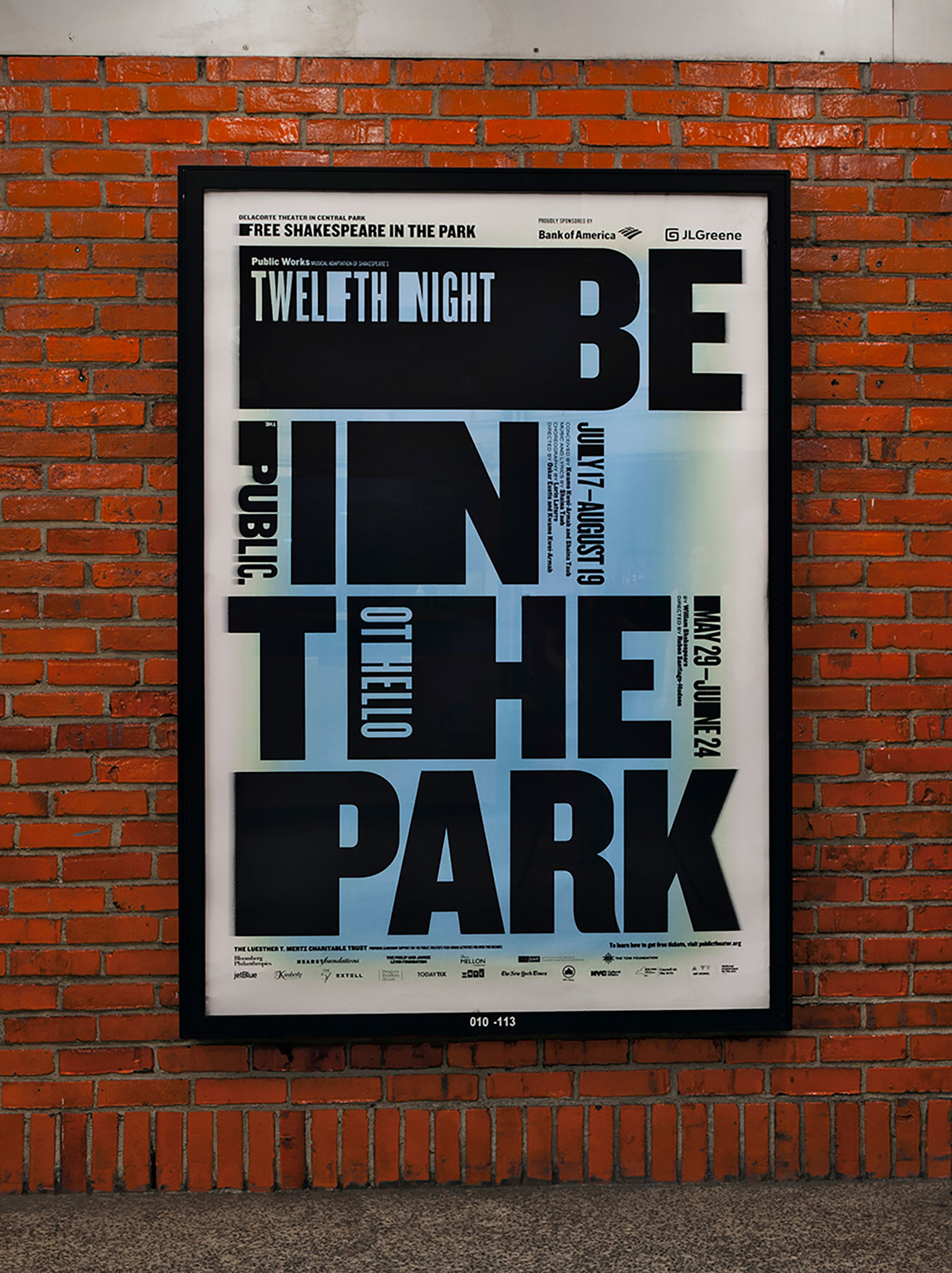
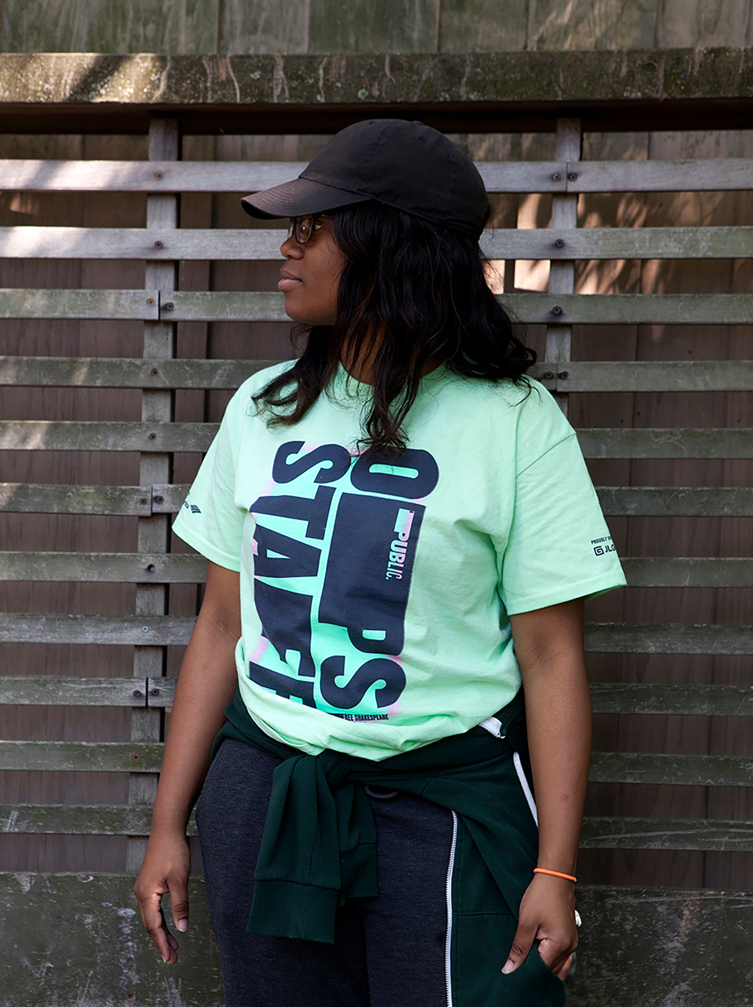
Shakespeare In The Park is an annual event and series of free performances presented by New York’s The Public Theatre that will take place at the Delacorte Theater in Central Park during May and throughout June. This year will see performances of Othello and Twelfth Night. These are being promoted by a campaign developed by Pentagram’s Paula Scher, with assets such as signage being designed and deployed by Public’s in-house team. This builds on the enduring identity Paula Scher designed for the theatre in 1994, revised in 2005 and 2008, maintaining its impact and dynamic qualities whilst working in a new and distinctive colour palette of bright gradients, contrasting solid blocks of black and a strong sense of the systematised and the architectural. Alongside the tagline “Be In The Park” this links signage, static and dynamic posters and billboards, t-shirts, tote bags and newspaper advertising.
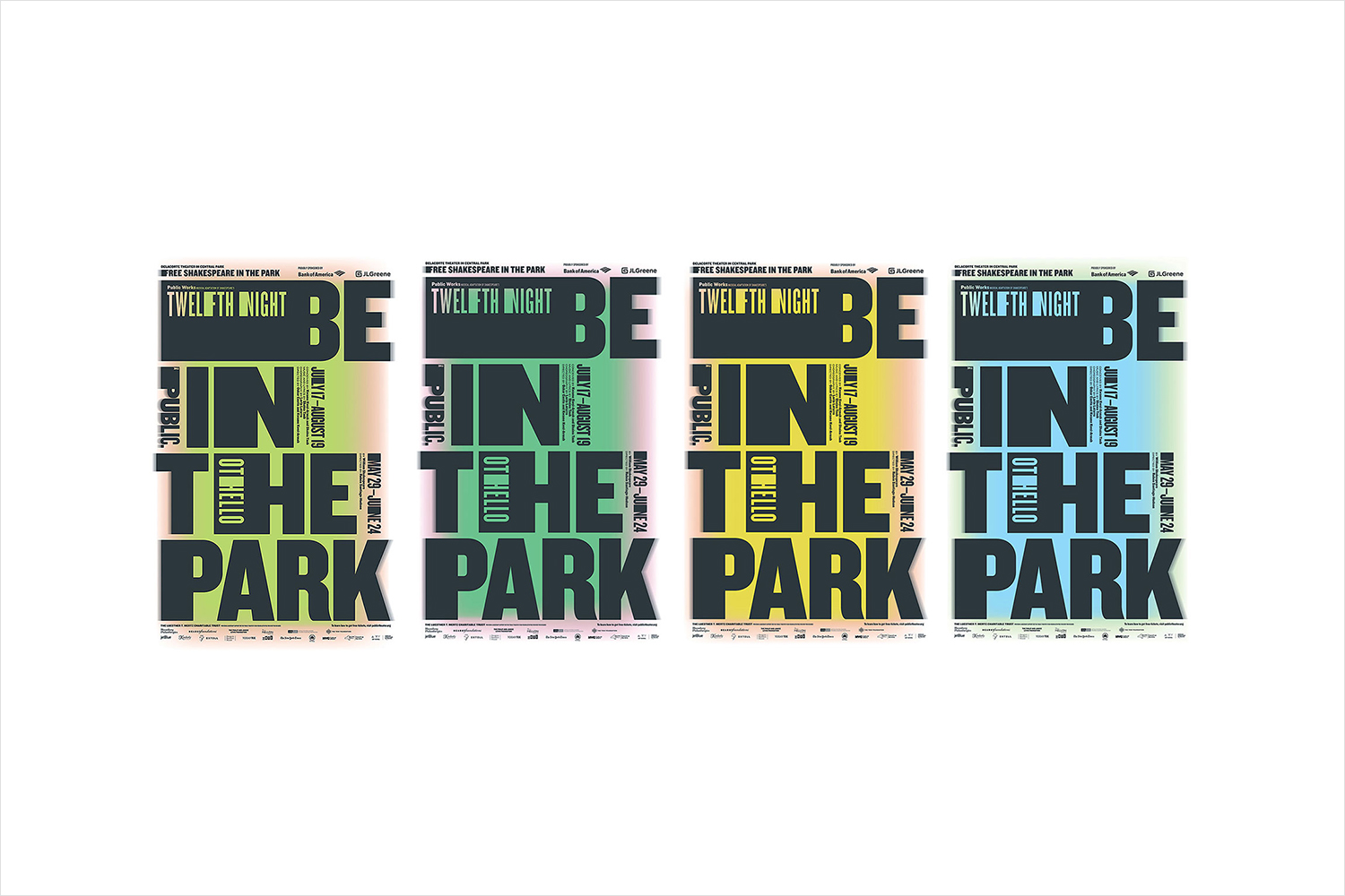
Paula Scher’s work for The Public Theatre has been widely documented, to some degree mythologised and has worked itself deep into the visual vernacular of New York street life. It has been revised twice and reimagined 24 times for various seasons and events, this gives it an unprecedented variety yet continuity in the face of ongoing imitation.
Campaign as brand, as part of an ongoing and evolving story, authored by a singular studio is a useful tool in which to be responsive to appropriation. It is an opportunity not often afforded to a design studio—where constraints make shortermism a very present condition within cultural institutions—to keep pushing the potential yet remaining true to the spirit of the theatre and its visual communications. This adaption is an essential and distinctive quality of Public. Although designed for Shakespeare In The Park 2018 this campaign also serves as a preview for the theatre’s graphic language for its 2018–2019 season.
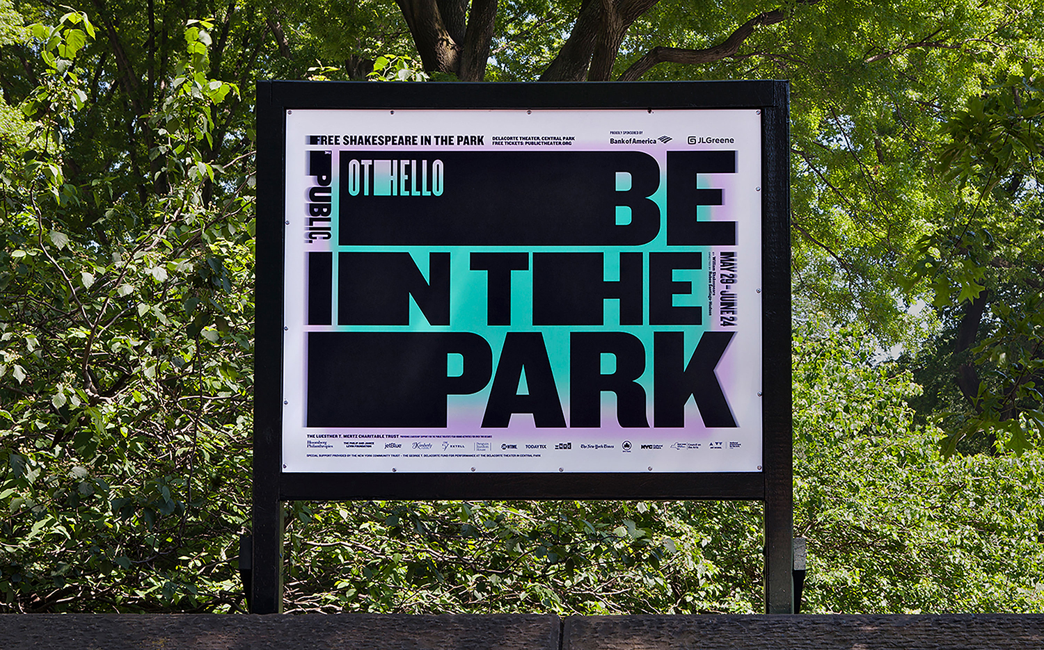
There is a critical and intelligible relationship between theatre, its campaigns and the primary medium of conveyance, large format posters and billboards, a fundamental relationship often overlooked by imitators. As such, the work demands to be considered within the context of an ongoing dialogue (reflection and response over many years) rather than as an isolated and singular piece of communication. The format affords the theatre a degree of leeway, the opportunity to challenge and push legibility, to be able to catch the eye and demand investigation in the absence of what is an increasingly endemic favour for simplicity or communicative directness. It is a chance to reassure through familiarity and continuity, but to also challenge with moments of unexpected difference and a contextual and historical sensitivity.
This difference comes in the form of extending vertical elements of Knockout horizontally, rather than mixing the extended and condensed, by introducing a series of fluorescent gradations and a more apparent systematised quality where previously it had had a more pop-look. The efficacy of this is in the contrast of the two; the lightness but immediacy of colour, particularly in both urbanised (grey, brick, steel) and natural context (the green of Central Park), and the weight of typographic shape and its voids of black ink.
As with the theatre’s long-serving identity, there is a strong sense of the architectural, of the enduring and iconic built environment that it inhabits, and in colour and gradation that feels very much of the moment.
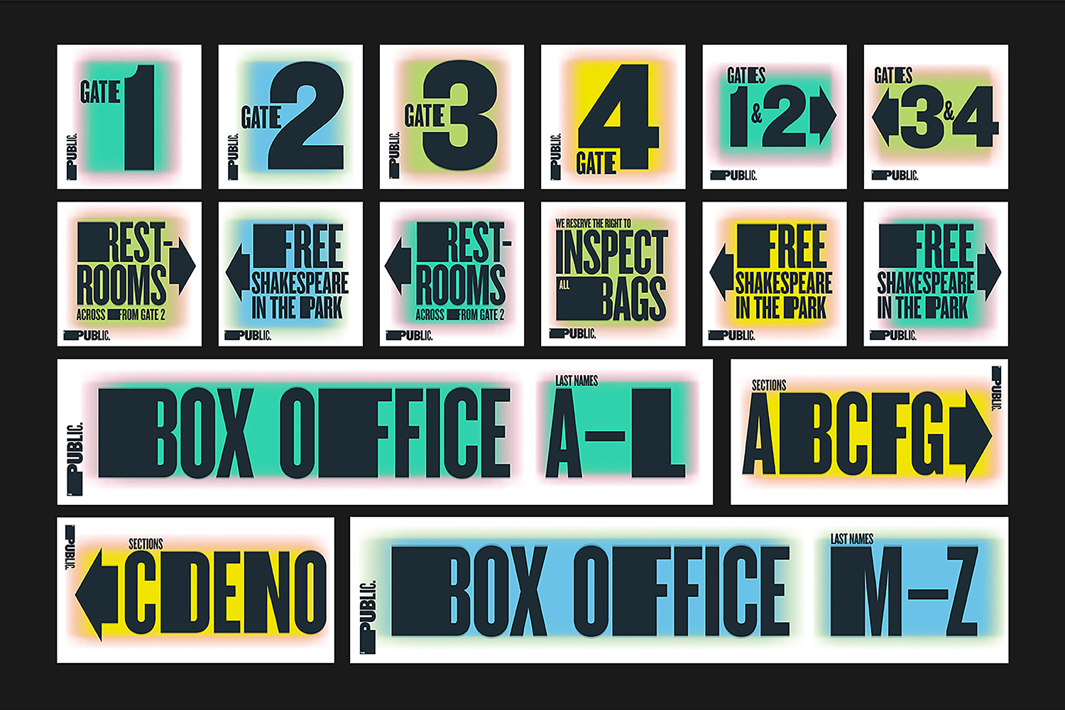
The curious character of type and evident grid system functions well in a multitude of situations. Where it does break slightly is in the gate numbering where there are fewer graphic components and a need for a fleeting moment of reassurance. Colour, however, serves to maintain a clear continuity throughout the site, its synthetic qualities standing out from those of the natural landscape. Public’s typographic identity was rooted in a graffiti-like juxtaposition of type, colour and gradation feel similarly grounded in this reference and individual expression.
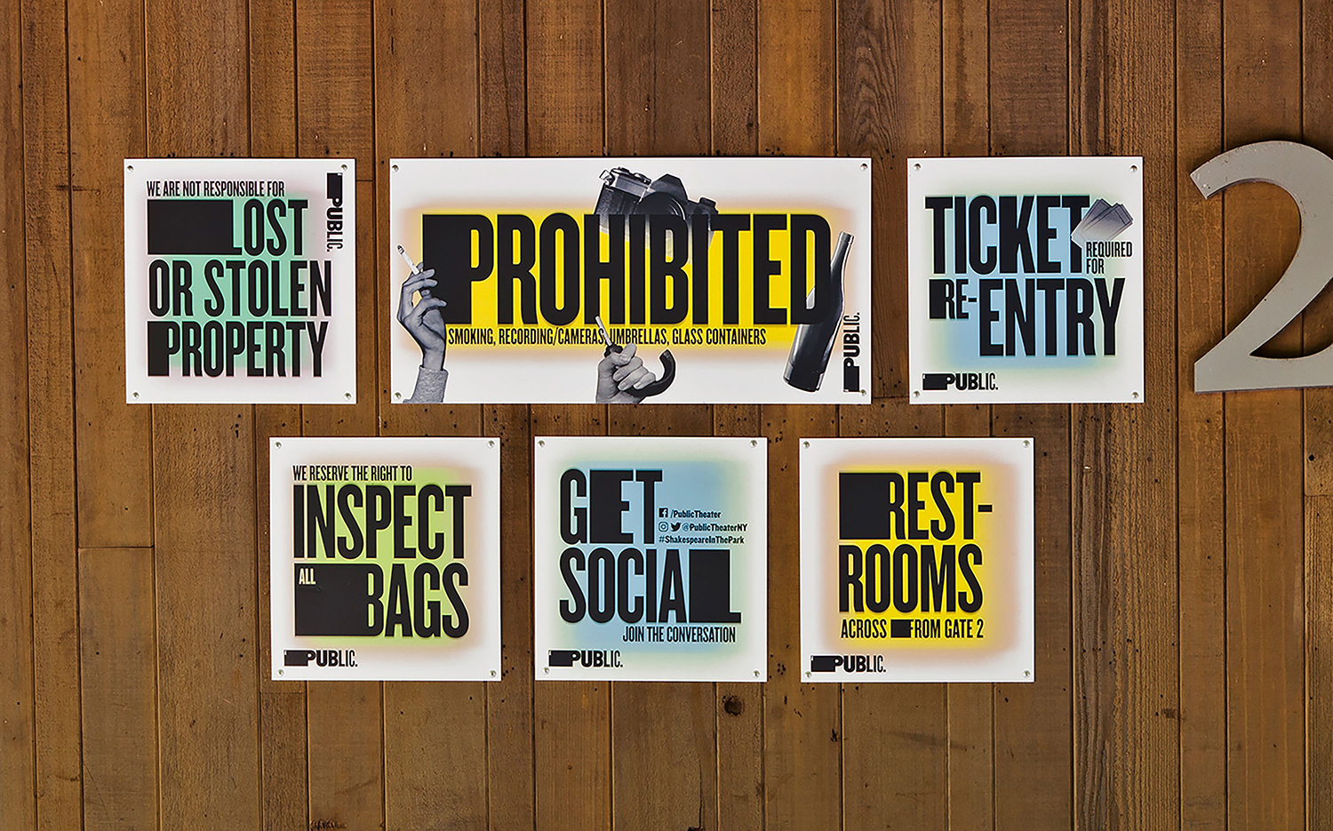
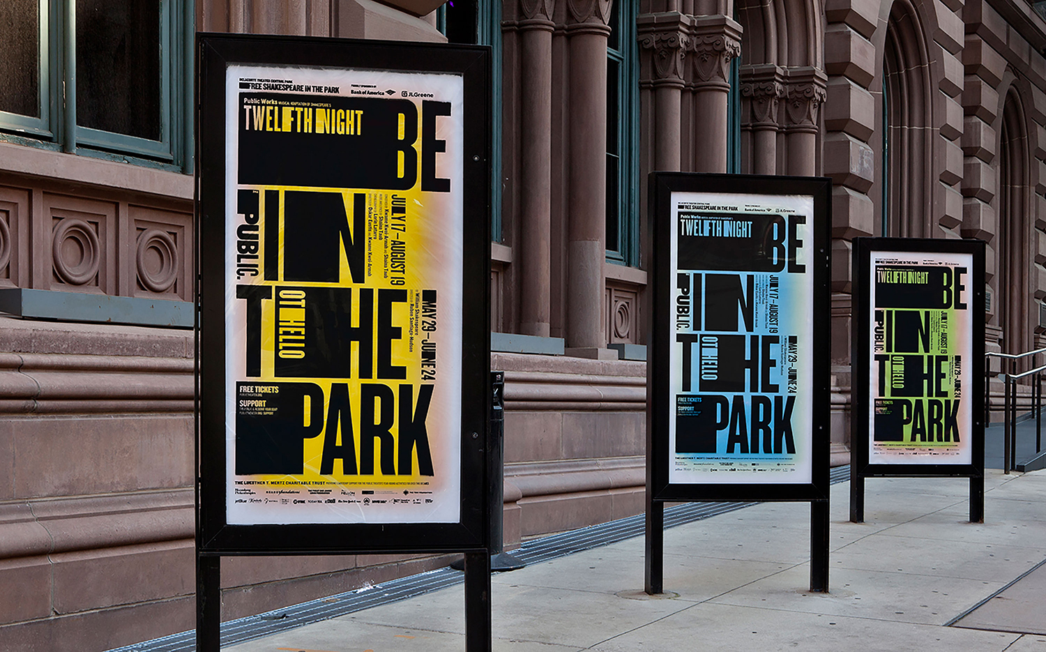
This result is a good example of timeliness (continued relevance through reinvention by way of campaign) over timelessness (does not exist). It can really only measured as part of an ongoing dialogue, an ability to be of the time and respond to place yet with a clear continuity (a sensitivity to past and a clear direction forward), as well as the making the most of its primary communication modes, their digital evolution and location whilst being flexible enough to stand out within more stringent contexts. More work by Pentagram on BP&O.
Design. Pentagram. Partner In Charge: Paula Scher. Project Team: Courtney Gooch. From Public Theatre: Tammy Shell, Katie Hodge & Gina Bella. Opinion: Richard Baird. Fonts: Knockout
