The Best of BP&O — June 2018
Opinion by Richard Baird Posted 2 July 2018
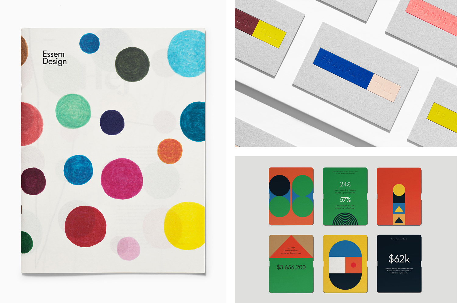
In June there were five projects that stood out and have made it into BP&O’s Best Of Series. Between them these typically balance a strong singular concept or an appropriate confluence of ideas with a compelling visual character and clear communicative intention that appropriately play with form, colour, type and layout, as well as material, texture, image and print finish.
BP&O, in this end of month review, tries to recognise both the smart use of small budgets—those that channel spending into the most appropriate assets—and those projects with a broad and holistic quality, establishing a continuity (conceptual and/or visual) across multiple touch points. Many of the projects share a concise aesthetic expression, yet there is nuance and strategic weight to these, so do click through and read more about each of these.
Throughout the month BP&O also continued to expand on its collections series as another way to jump through to older posts on the site. This included Events and Exhibitions.
Essem Design 2018 by Bedow
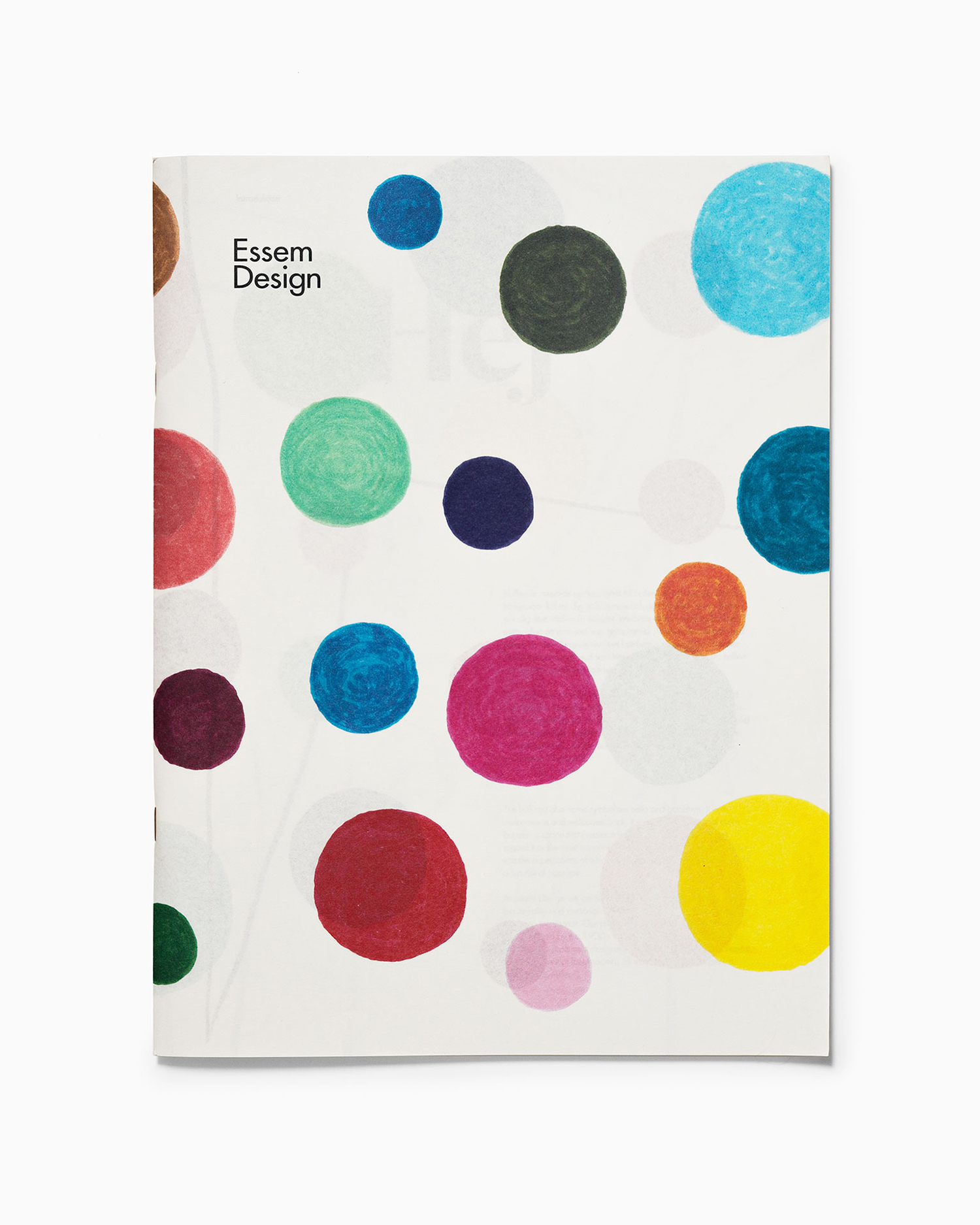
In 2014 Bedow worked with Essem Design, a Swedish manufacturer of artisanal hallway products and furniture, to develop a new graphic identity. This included logotype, adverts, catalogue, product sheet and stationery design. The concept was based around the simple gesture “Hej—Hej då”, hello and goodbye in Swedish and a reference to the most common phrase used in the hallway.
This verbal gesture was visualised using Commercial Type’s Dala Moa, paired with Futura, and played out across a brochure and stationery set of white and unbleached papers. The result balanced a playful and personable expression with the functional and crafted. This is expanded on and further explored throughout Essem Design’s 2018 product catalogue, also designed by Bedow, in the approach to art direction, colour, form and illustration.
See more of this project here
CareerTrackers by Garbett
CareerTrackers is an Australian nation-wide charitable organisation that addresses Indigenous disadvantage by developing professional career pathways, internship programs and links with private sector employers for Indigenous university students. It does this through a model adapted from an African-American internship program which has a proven legacy of 45 years. This is based on an approach that sees students intern with sponsoring companies with the intention of converting them into full-time employees following their university degree.
Sydney-based studio Garbett worked with CareerTrackers to develop a visual identity for the organisation’s report and Gala Awards evening which included banners, information cards and awards. These are united by a striking and modern yet referential coalescence of form and multi-colour, and an element of the structural.
See more of this project here
FranklinTill by Commission
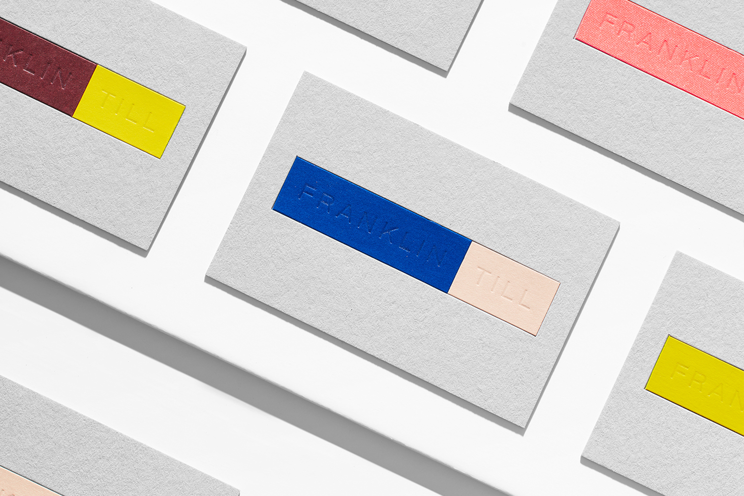
FranklinTill is a futures research agency working with lifestyle brands, design-orientated businesses and organisations in a variety of sectors to explore and implement design, material and colour innovation. Their services include conducting, analysing and communicating research and bringing this to life through strategic insights, publications and experiences.
FranklinTill’s clients essentially turn to them for insight into form, colour and material, and their innovative and sustainable outlook. This, in turn, informed the development of their new visual identity, created by London based Commission. This is characterised by a critical coalesce of form, colour and material composition that serve to link business cards, stationery set and pin badges. Online, colour and form is explored, absent the tactile qualities of print, through the abstraction and diffused quality of imagery.
See more of this project here
PopTech by Collins
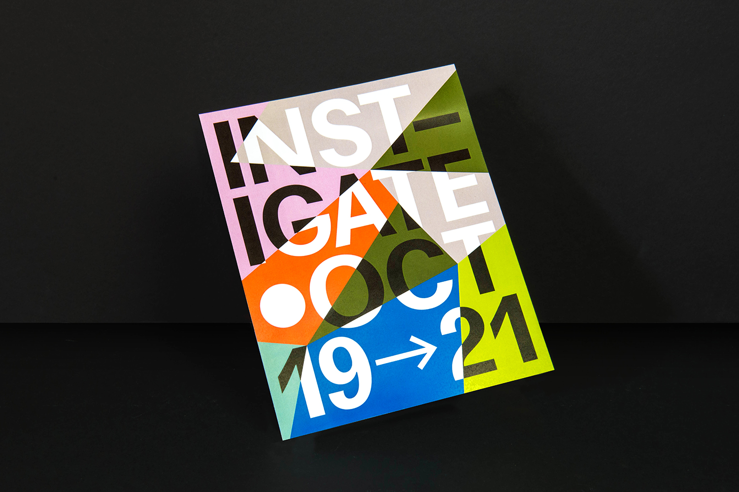
PopTech is an annual three-day conference that takes place in October in the American town of Camden, Maine. It is an occasion where people from across many different fields meet with the intention of discovering and exploring a shared potential that reaches far beyond individual aspirations and goes on to inspire positive collective action.
Attendees include scientists, technologists, humanitarians, designers, artists, innovators, academics, corporate and governmental leaders as well as those that defy conventional categorisation. The conference is made up of presentations, interactive sessions, dinners, chats and debates, movie screenings and music-making. Featured speakers have included tech pioneer Tim O’Riley, cultural philanthropist Stephanie Coontz and behavioural economist Dan Ariely.
New York based Collins worked with PopTech to design and creative direct the 2017 conference, to build this around the theme and potential to “Instigate”. This manifests itself visually in the intersection of form and colour, in the bisecting of type and the implications of convergence. This links a variety of assets that included posters, supergraphics, lanyards, motion graphics, video, bags and event brochures and programmes.
See more of this project here
The Clydeside Distillery by Manual
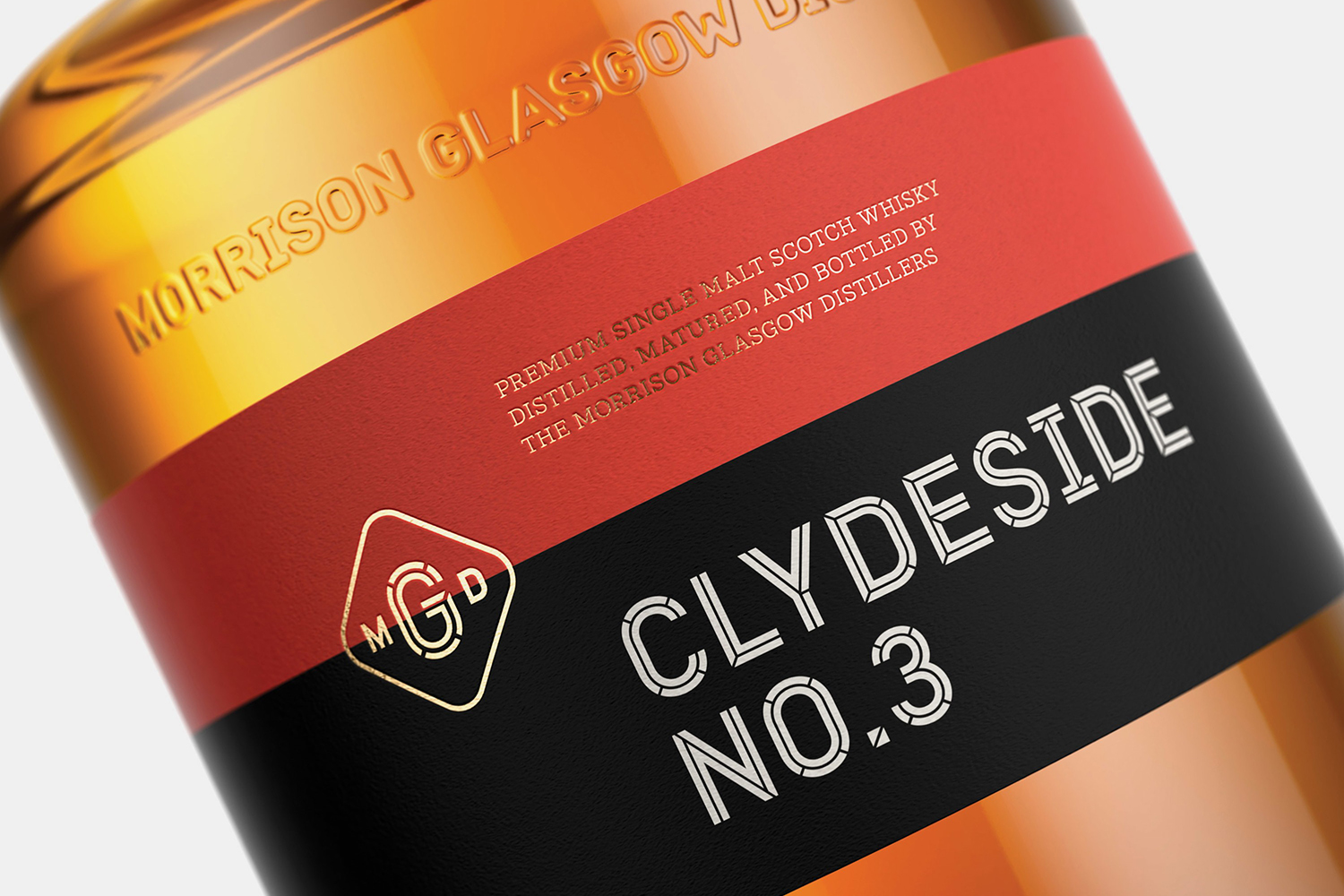
The Clydeside Distillery was set up in 2014 with the intention of reviving distilling in Glasgow and telling the story of Scottish Whisky through a visitor’s centre. The distillery was set up by the Morrison’s, a family with a century-long history within the Scottish Whisky industry as both owners and operators.
San Francisco based Manual travelled to Glasgow to work closely with founders, architects and experience designers over a three year period to develop a brand that would live up to and bring to light a rich city heritage of industry and export through a broad variety of visual communications and material experiences. This included logo and a custom typeface, packaging and signage.
See more of this project here

