David Collins Studio by Bibliothèque Design
Opinion by Richard Baird Posted 9 August 2018
David Collins Studio is an award-winning interior architecture practice working with brands, businesses and private clients who share their passion for detail, craft and refinement. These include Harrods, Nobu Berkeley, The Connaught Bar and those working within the hospitality, residential and retail sectors.
The studio’s work is described as being iconic, timeless and having a dramatic glamour rooted in a methodology that begins with an idea (this could be lateral and oblique to begin with) which then evolves into a palette of materials, colours and moods, often transforming the familiar into the exotic. This is expressed in the collaborative actions of Bibliothèque Design (brand identity) and Future Corp (digital art direction) to redesign graphic identity and website. This features a subtle intersection of typographic form (custom typeface), material and finish (stationery and business cards) and viewpoints (website).
The work has a beautiful material expression and evident design craft, yet the idea that forms the foundation of this and website (structure and interactivity) really supersedes this. At its heart is a dialogue and tension between classical beauty and modernity. This modernity manifests itself graphically in sans-serif letterforms. In method; a clarification of strategic and communicative intention–drawing on the beguile, intrigue and beauty of fashion, art and culture. In collaborative action between stakeholders (through workshops), studios and individuals. And online; in the interplay and conversation between two viewing modes. This gives David Collins Studio a voice that clarifies and expresses the aesthetic contrasts within their work using all available modes; the graphic, the material and the interactive.
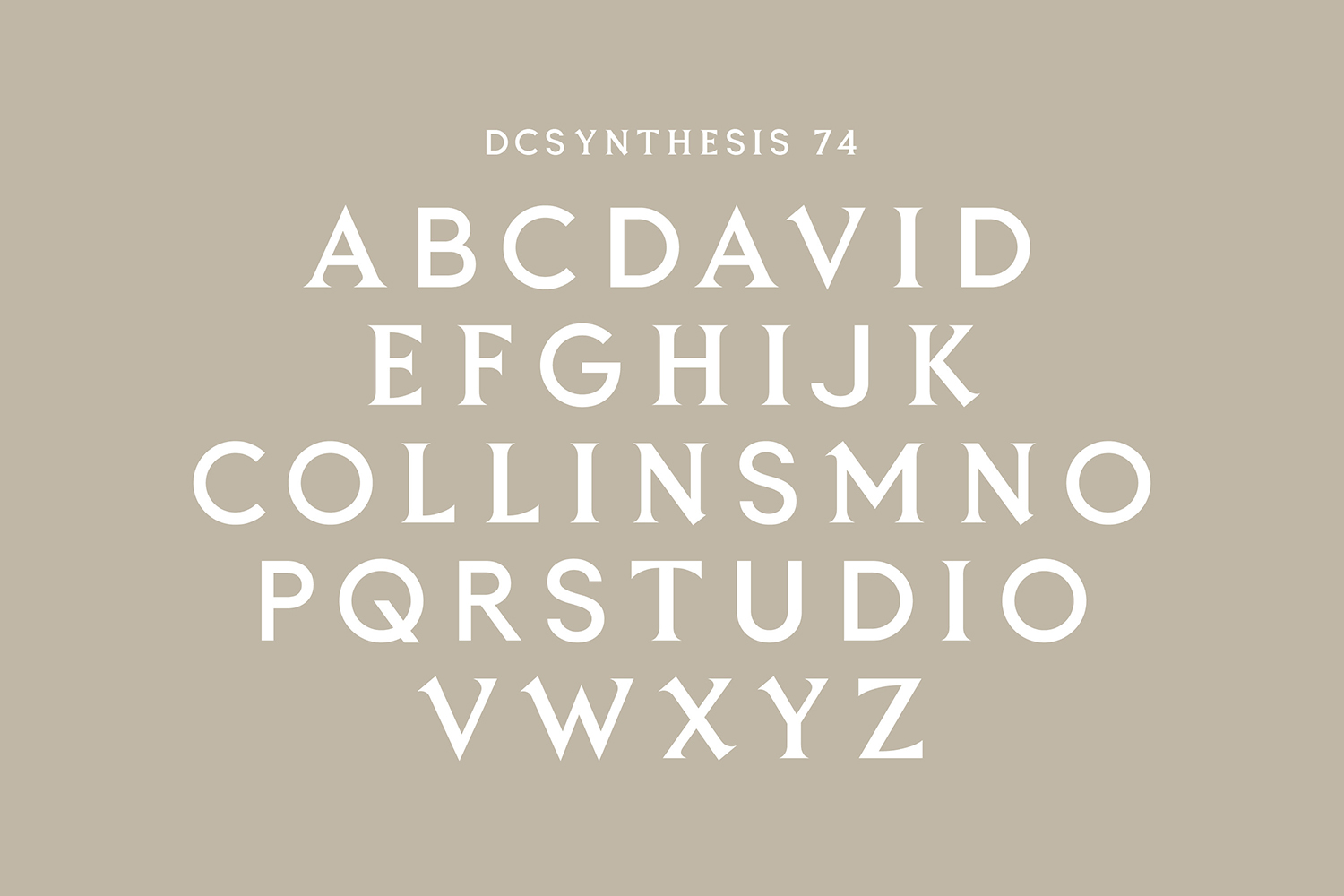
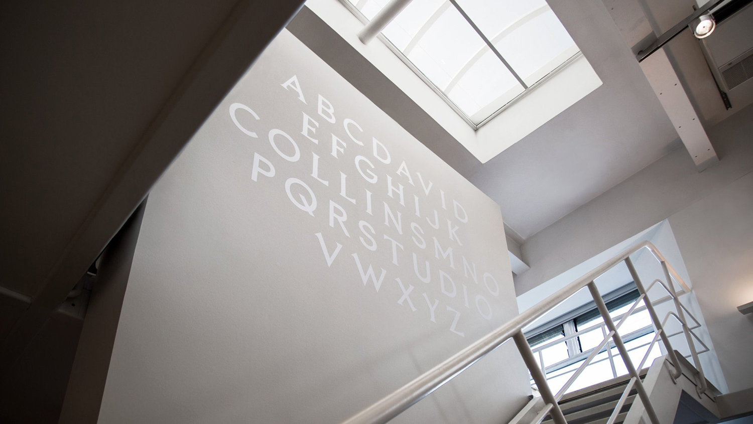
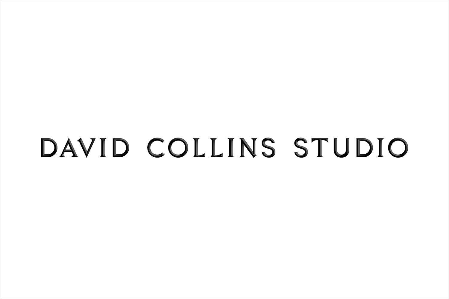
DCSynthesis 74, a custom typeface designed specifically for David Collins Studio, is perhaps the most literal articulation of contrast, tension and dialogue in the imposition of a monolinear and geometric sans-serif on the stoned carved flourishes of a classical serif.
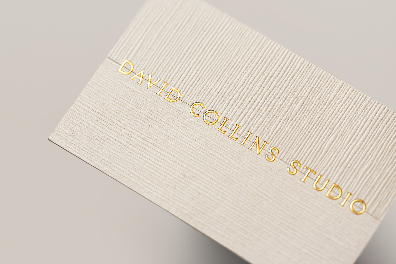
Where common thought might be to dial up and emphasise disparities, commonalities are formed through shape and weight. The result is one of subtlety, interplay, conversation and discovery rather than a jostling for attention, a stylistic abruptness and immediacy. Its application as a sculpted gold foil emboss develops this continuity between the two types of letterforms.
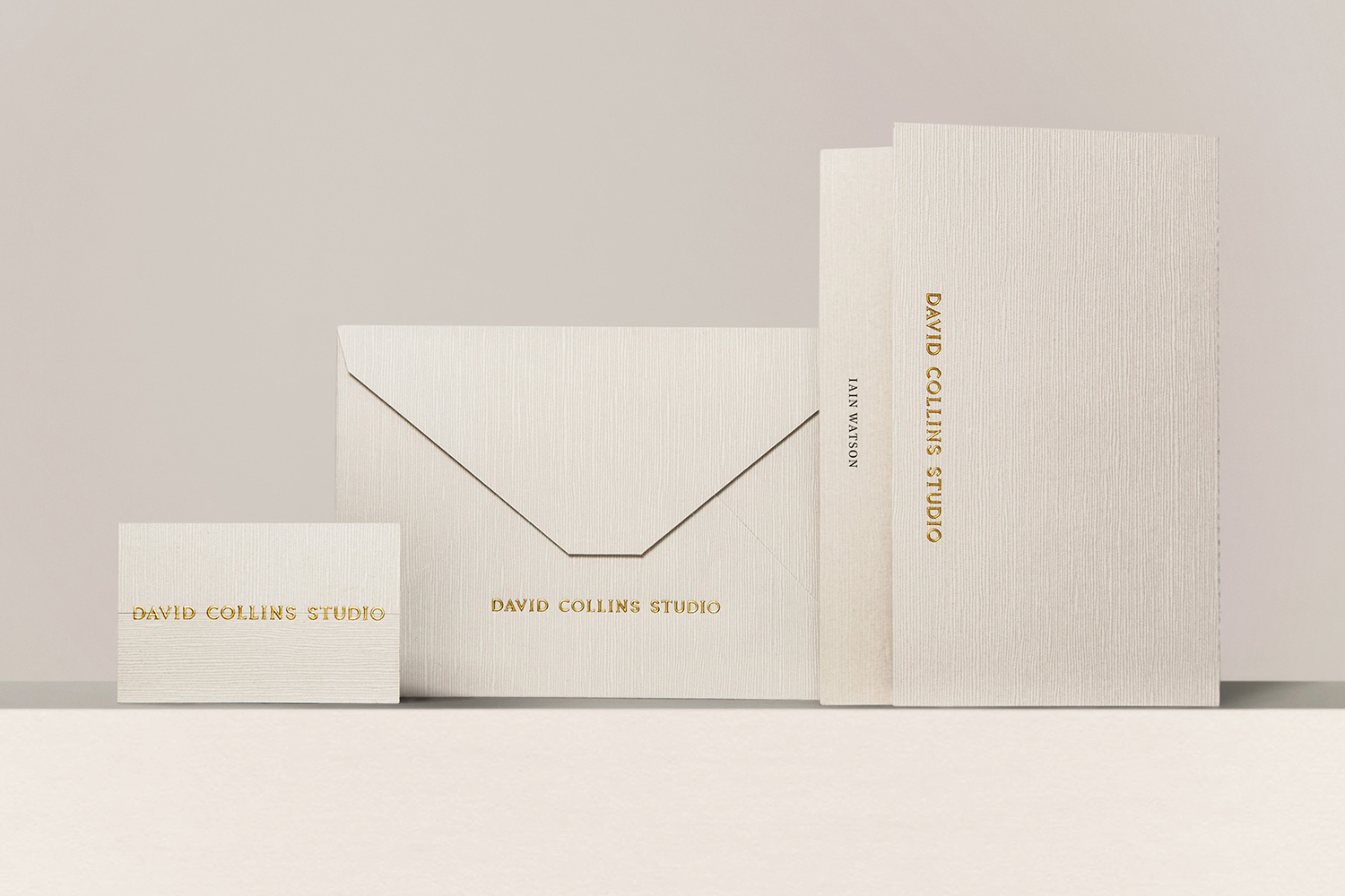
The stylistic and communicative subtleties of logotype and custom typeface is furthered by the approach to material choice. Rather than two colours or two textures, dialogue and contrast is expressed in the direction of a surface emboss. A threshold is created and then bridged by logotype. It is a small gesture but rooted in an idea, also present in the process of sourcing and construction, with papers from Japan and stationery featuring a paper marquetry technique hand-finished by Parisian printers Imprimerie du Marais.
These present the studio with the same dynamic and expressive approach as their own work; the juxtaposition and tension of the classical and modernist, delivered with a refinement and restraint, their ideas made material.

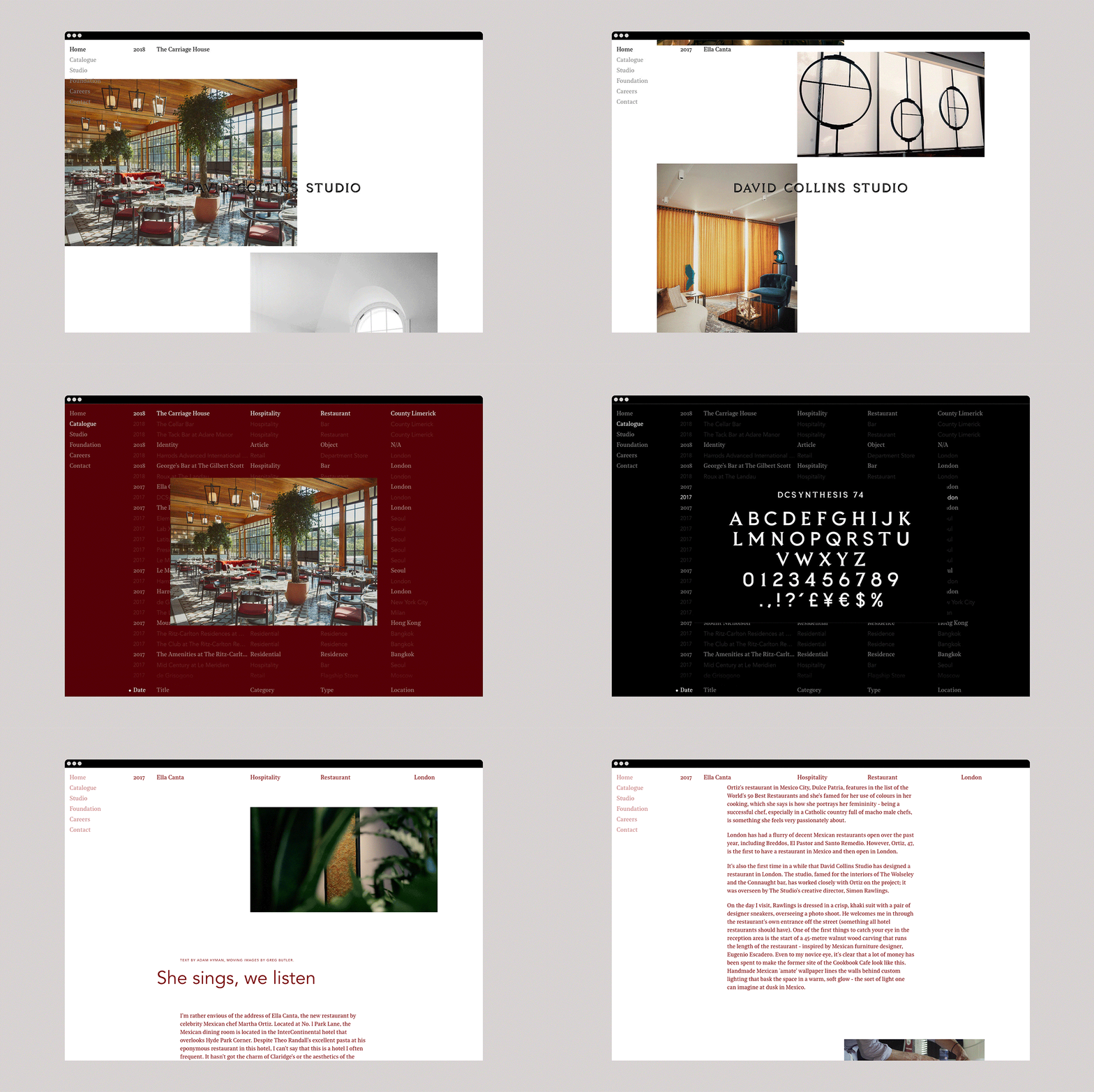
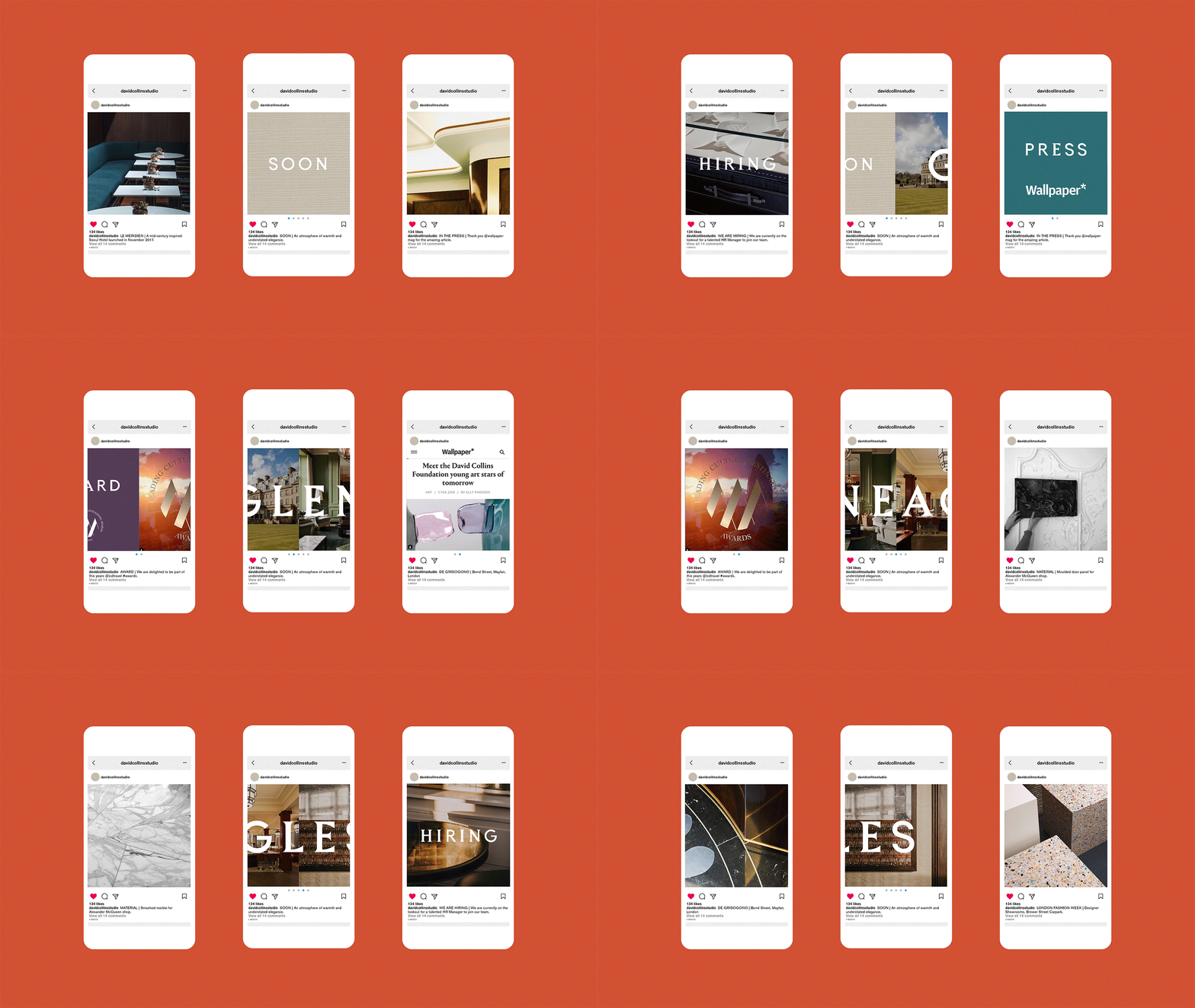
Website is given equal consideration. Much like the materiality of stationery, it is rooted in the idea of dialogue and contrast with the potential of two viewing modes. Firstly, a configurable and explorative index view described by Future Corp Founder Marc Kremers as deliberately pared down to an absolute minimum, with the user only able to scroll and tap through a seamless mix of intriguing projects. This is said to allow the user to appreciate, at a glance, the breadth and quality of work the Studio has produced over the last 33 years, and easily access individual projects via date, type, or location. Second, an editorial mode which is more linear, and opens the world of the studio to the interpretation of writers, photographers and artists, alongside imagery from the Studio’s archives.
As with the intersection of materials in print, or the classical and modern intersections within type, website essentially uses contrast to express something of the studio; that tension between the micro and the meta, inside objectivity and outside subjectivity. As much as BP&O loves the material, the potential for this dialogue, for dual modes of engaging with content as both a utility and question is the real highlight. More work by Bibliotheque on BP&O.
Brand Identity: Bibliothèque. Print: Imprimerie du Marais. Digital Art Direction: Future Corp. Opinion: Richard Baird.
