BP&O Collections — Time
Opinion by Richard Baird Posted 29 August 2018
A continually updated gallery of graphic identity design work, reviewed and published on BP&O, that features a distinctive temporal component. This could be the literal depiction of a clock face, static or animated, in the implication of the passage of time through cropped text, the bookending of time in the intersection of the visual languages of modernity and legacy, through a strong emphasis on chronological layout or the time-control exerted over a reader through generous letter and line spacing.
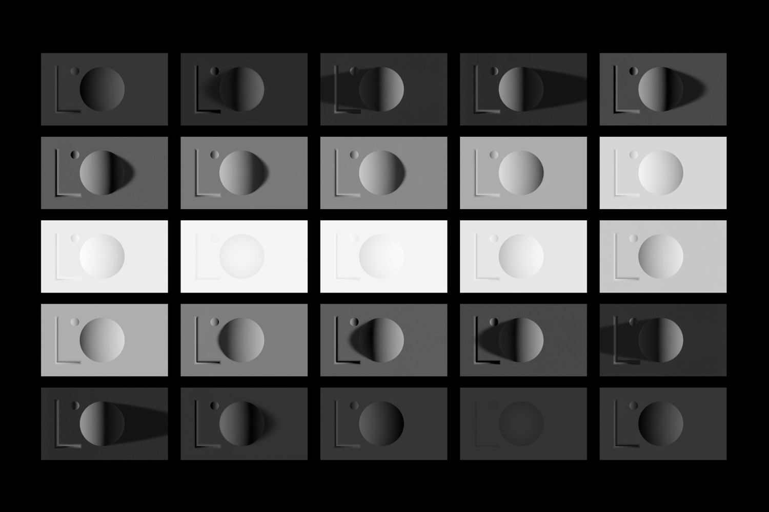
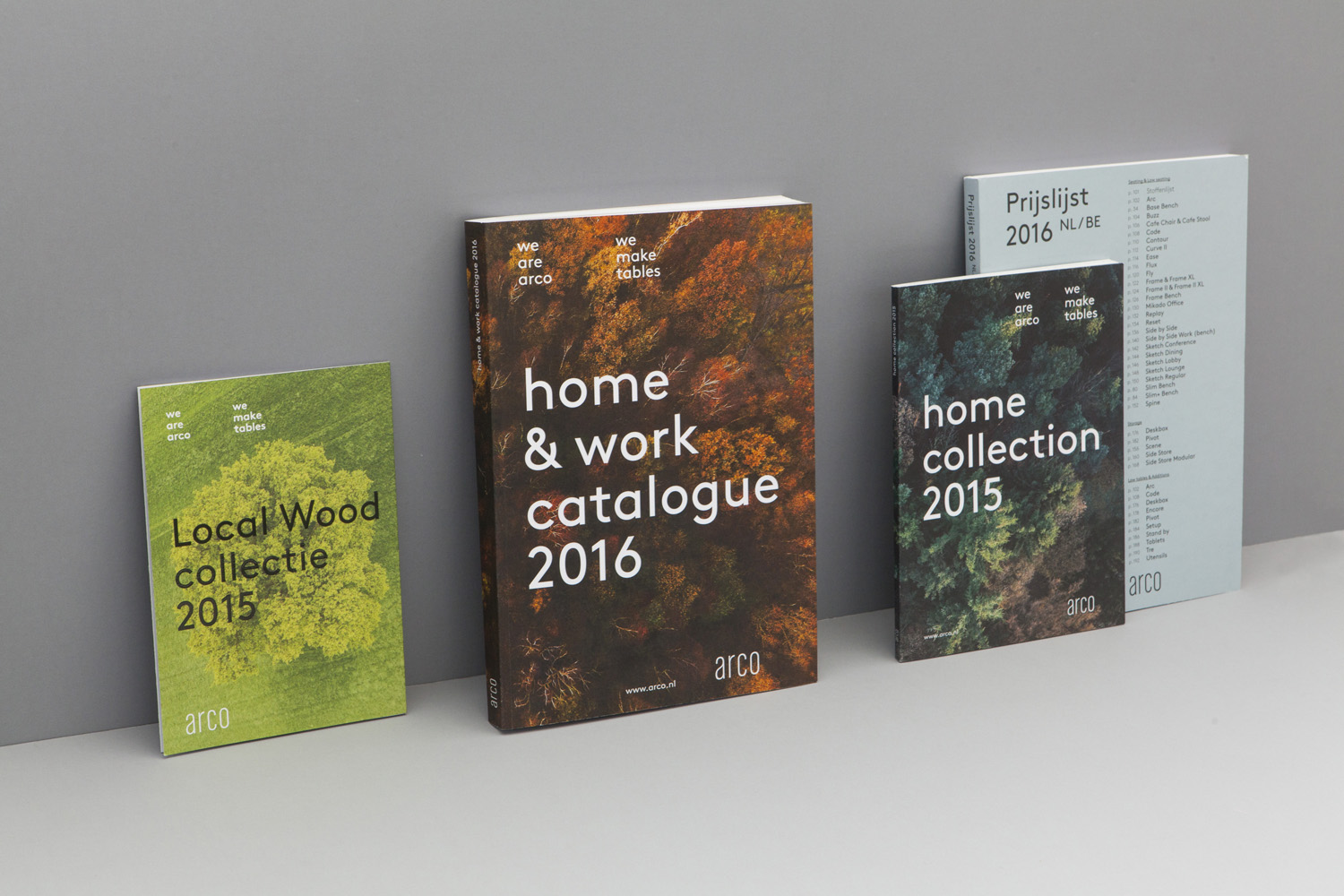
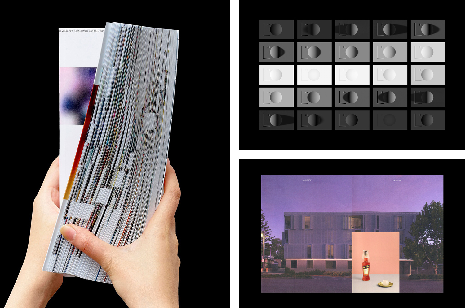
This post features work by Studio Hi Ho, Bedow and Pentagram, and covers a variety of projects, from exhibitions and gallery spaces to private dining experiences and property development. Highlights include the passage of time marked by DN&Co. using sequential posters that remove layers of detail over time. The critical relationship between time and light manifested photographically by Blok for Superkul, or implied materially by Triboro. And in the seasonality of imagery captured by Raw Color for furniture manufacture Arco.
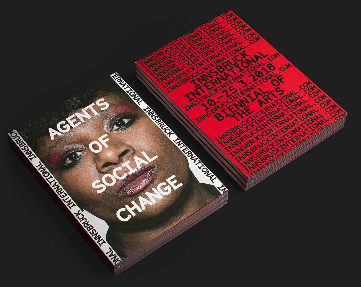
Innsbruck International, Biennial of the Arts Studio Mut
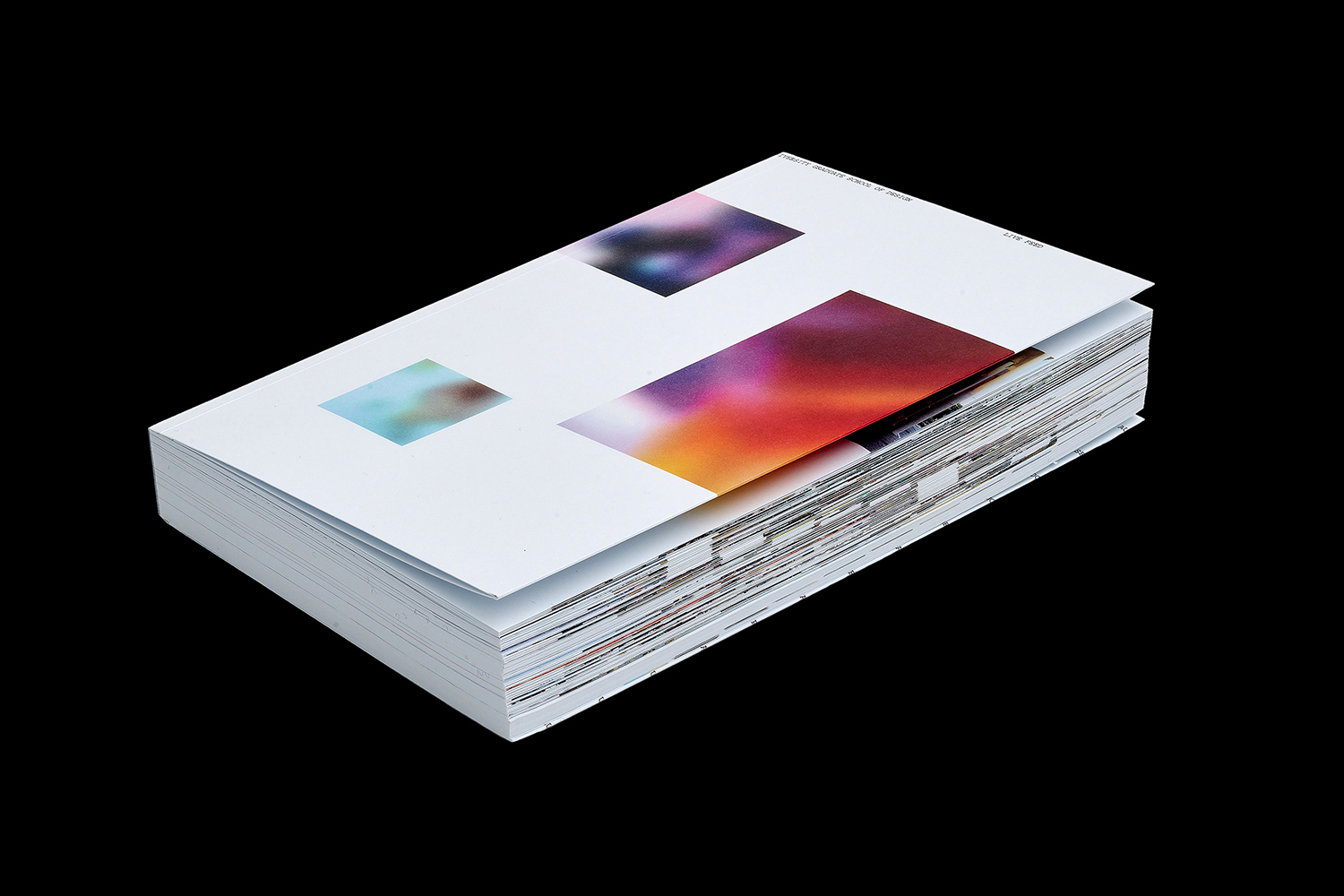
Platform 10: Live Feed by Pentagram
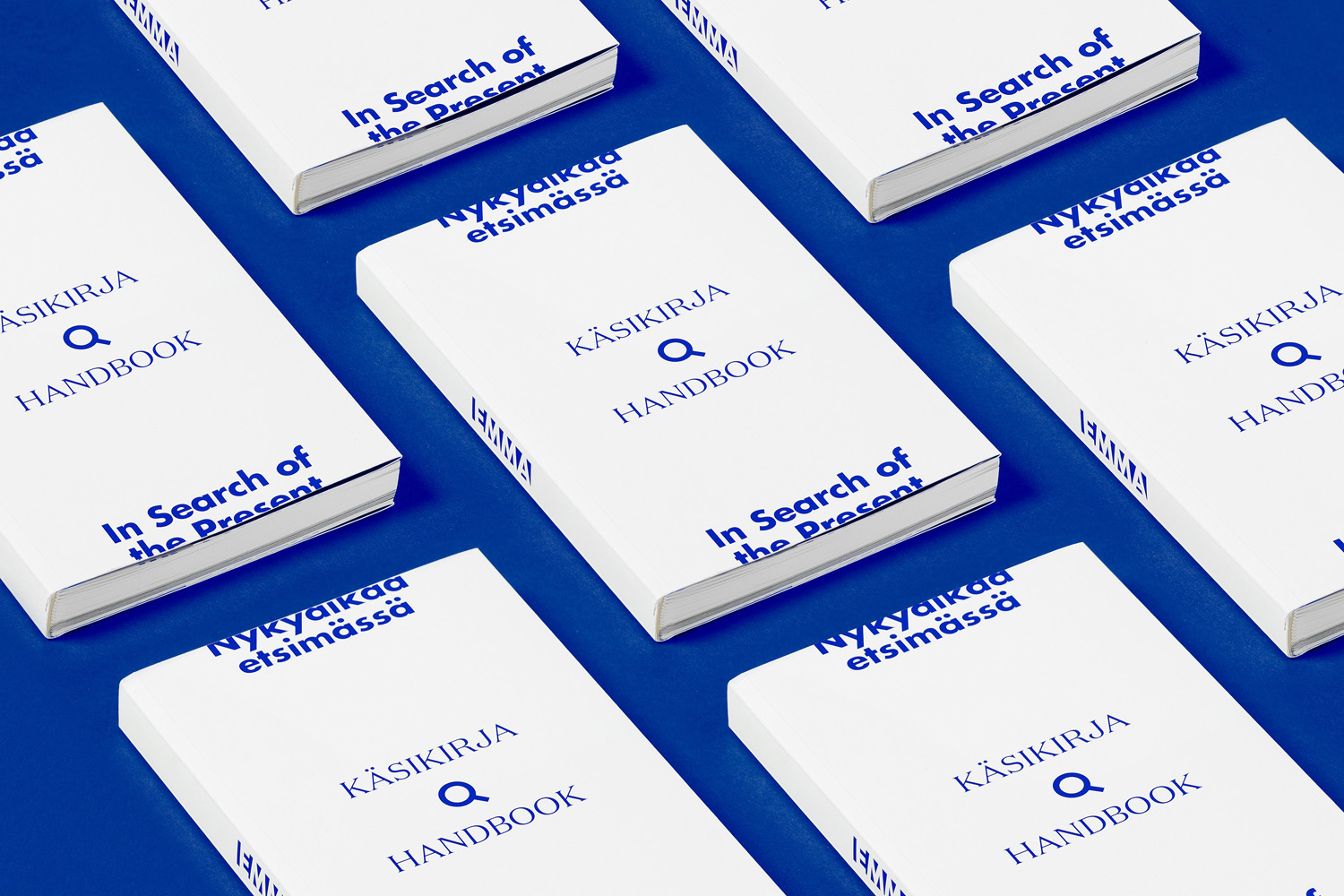
In Search Of The Present at EMMA by Werklig
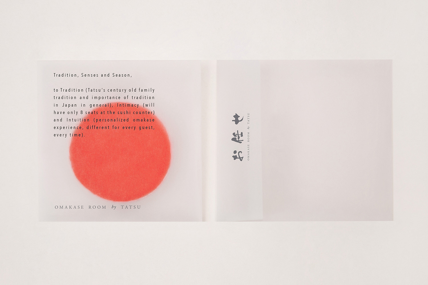
Omakase Room by Tatsu by Savvy
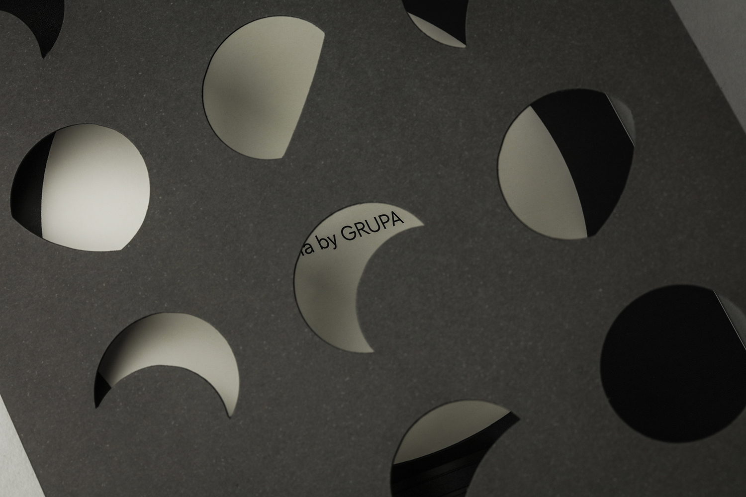
Baluna by Grupa by Bunch
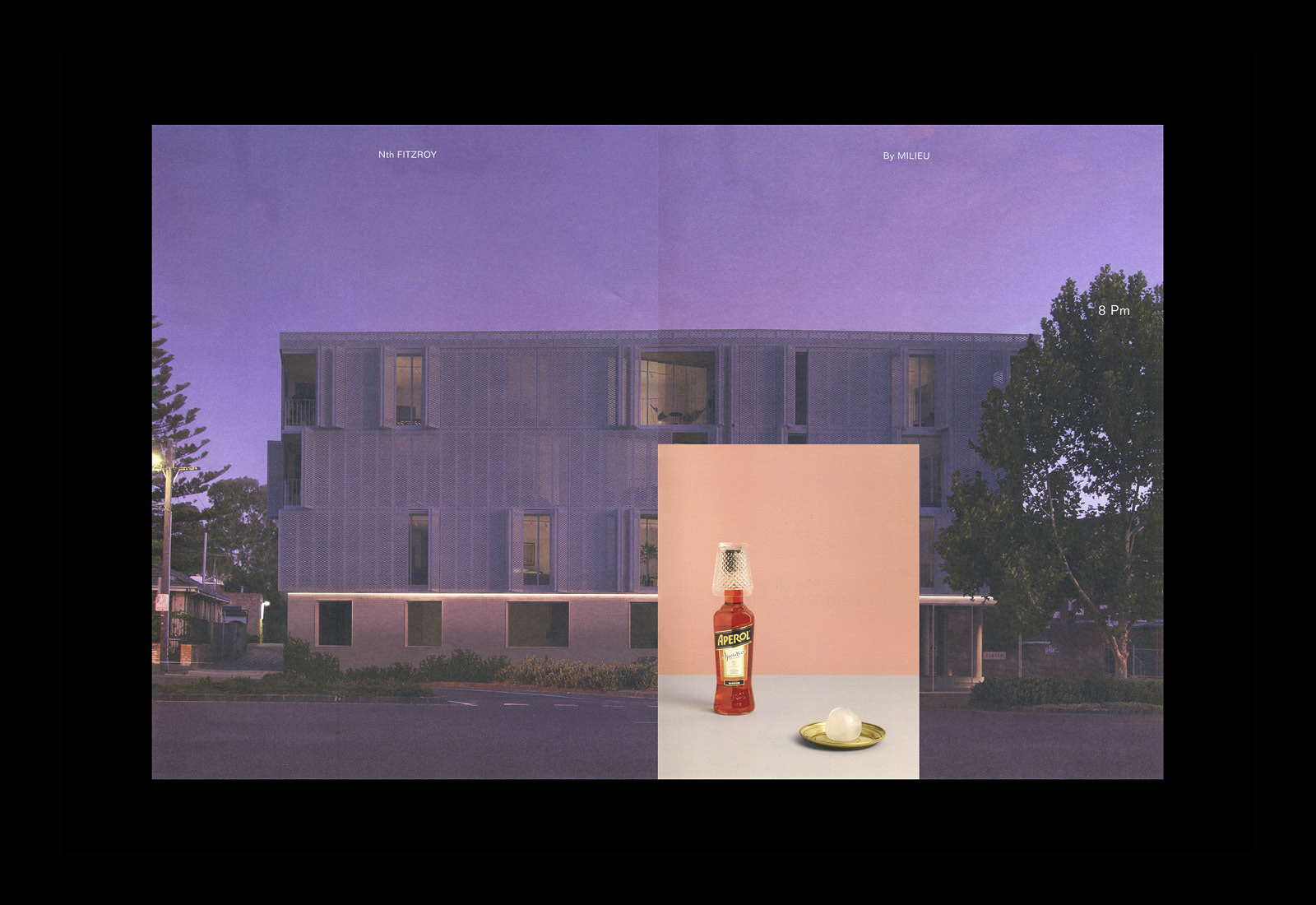
Nth Fitzroy by Studio Hi Ho
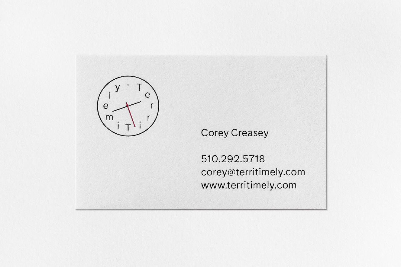
Terri Timely by Bedow
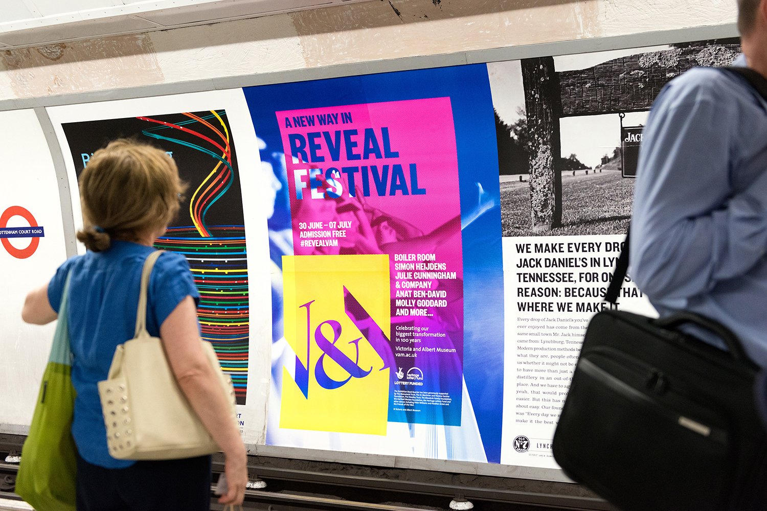
V&A Exhibition Road Quarter by dn&co.
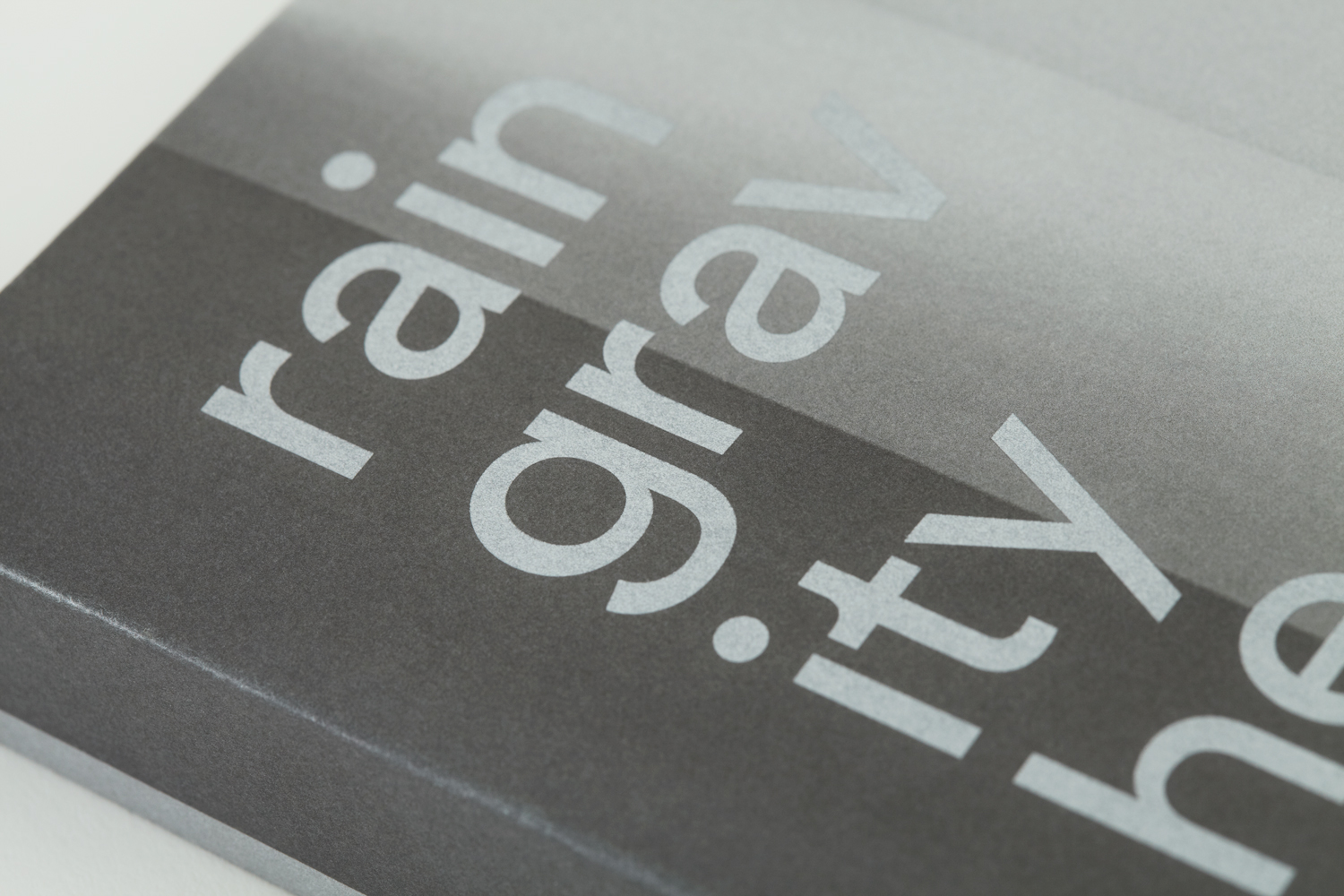
Rain, Gravity, Heat, Cold by Blok
L’Observatoire International by Triboro
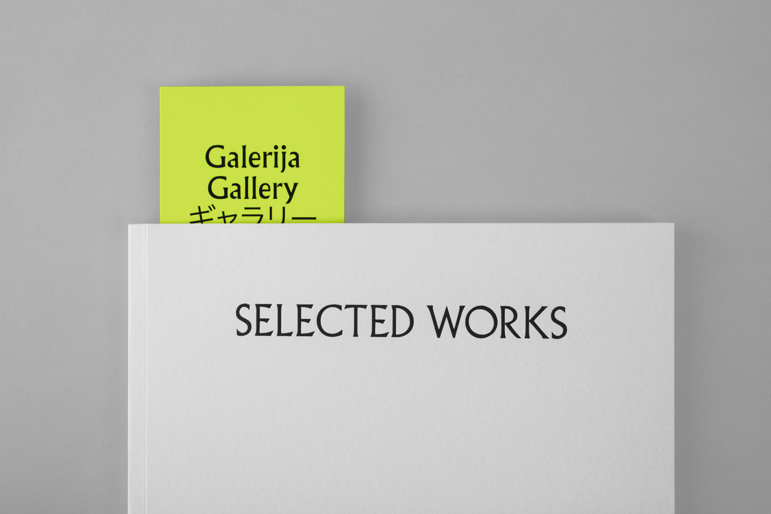
Galerija Kranjčar by Bunch
Arco by Raw Color
