DOIY Honom by Folch
Opinion by Richard Baird Posted 12 September 2018

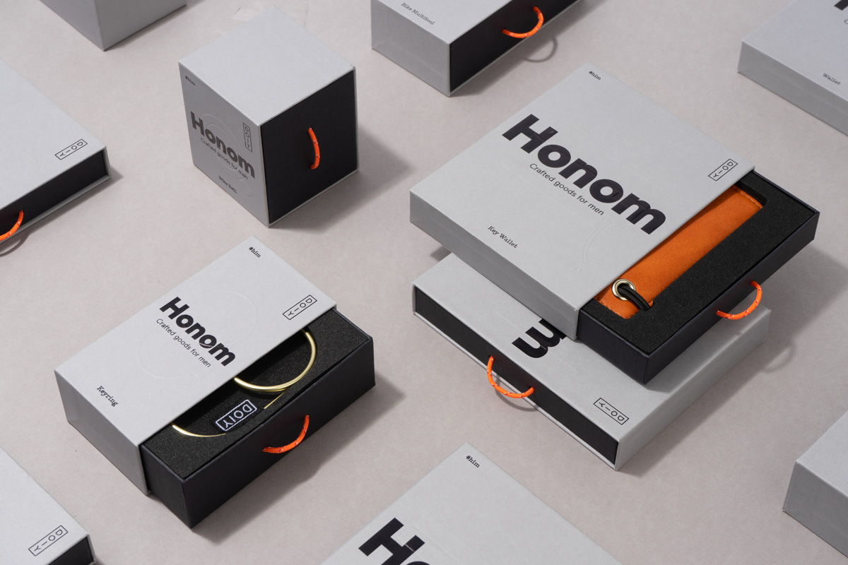
Honom is a new “male-oriented” range from Barcelona-based DOIY, a product design company creating objects that move between the practical, the ornamental and the more whimsical. Honom veers heavily towards the former with objects that include a wallet, multitool, bottle opener, keyring and bike bell. In their design, materials and build these find a balance between everyday utility and premium positioning. This is expressed by the packaging of the objects, created by Spanish design studio Folch, through a confluence of material and form language, type and technical drawings.
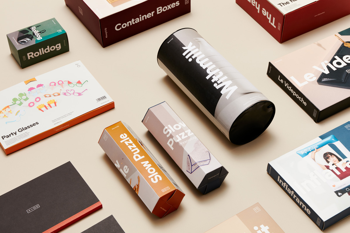
Honom sees DOIY move into a new target market, and in response, Folch, who also designed the packaging for earlier ranges, deviates from a visual language of product visibility, photography and colour towards that of a single material choice. This new range shares something in common with DOIY’s other ranges in the use of shape and heavy type yet, begins to explore the intersection of a more robust and urban visual language and that of modern luxury.
The packaging of the previous range leveraged and benefitted from the distinctive qualities of each individual product; their colour, form and materiality, bringing this out through cheerful product photography and styling by Folch, paper and set designer Raya Sader Bujana and photographer Leo García Mendez, or by way of packaging windows. This was augmented by a range of packaging structures modes of opening.
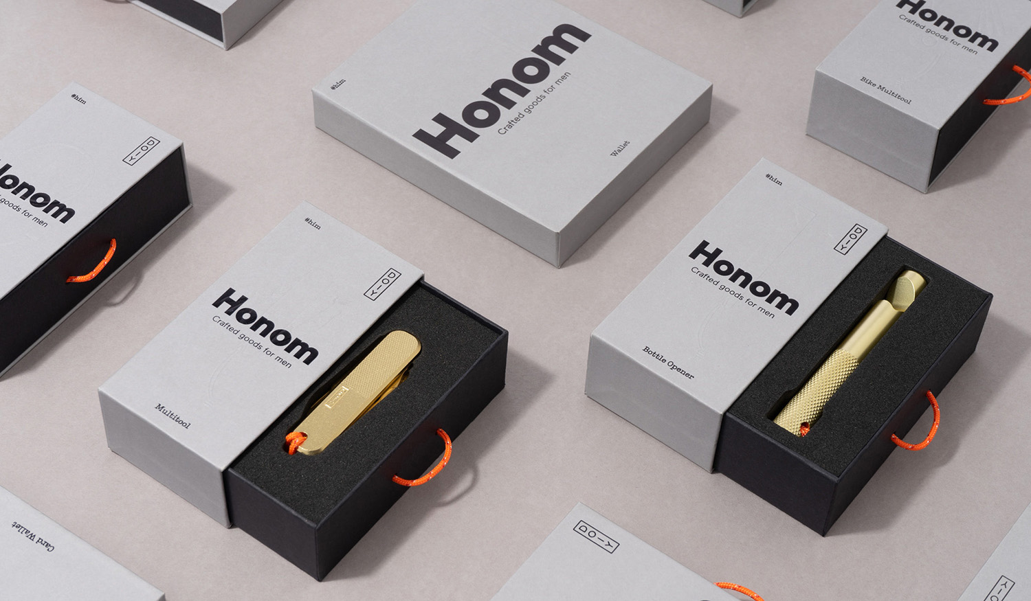
With Honom, Folch explores an alternative approach and communicative direction. Products are hidden within the opening mechanism of a draw. Their utility and form alluded to through technical drawings and implied using an actual-size blind embossing while their often single colour and materiality, as well as their hardwearing qualities are externalised and conveyed using packaging shape and volume, a single cool grey uncoated substrate.
The design craft central to the range is effectively mirrored in the crisp lines and intersections of boards and the precise construction and assembly of sleeve and tray. Other highlights include the pull-cable. The choice of colour and threaded detail calls to mind the robustness and utility of a climbing rope but also the cheerful colour of DOIY’s other ranges. The colour distinction between pull-cable, tray and box together w emphaise the mechanism for opening.
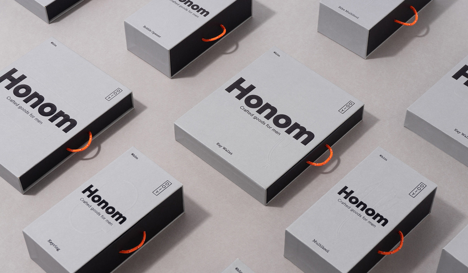
A critical question of whether the draws are sealed or free to open in-store remains ambiguous. Indeed, exterior packaging is eye-catching in shape and structure. It alludes to many of the material qualities, design and function of each product, however, in the action of pulling out the draw, in the framing and access to product does a complete experience emerge, a synergy of packaging and product.
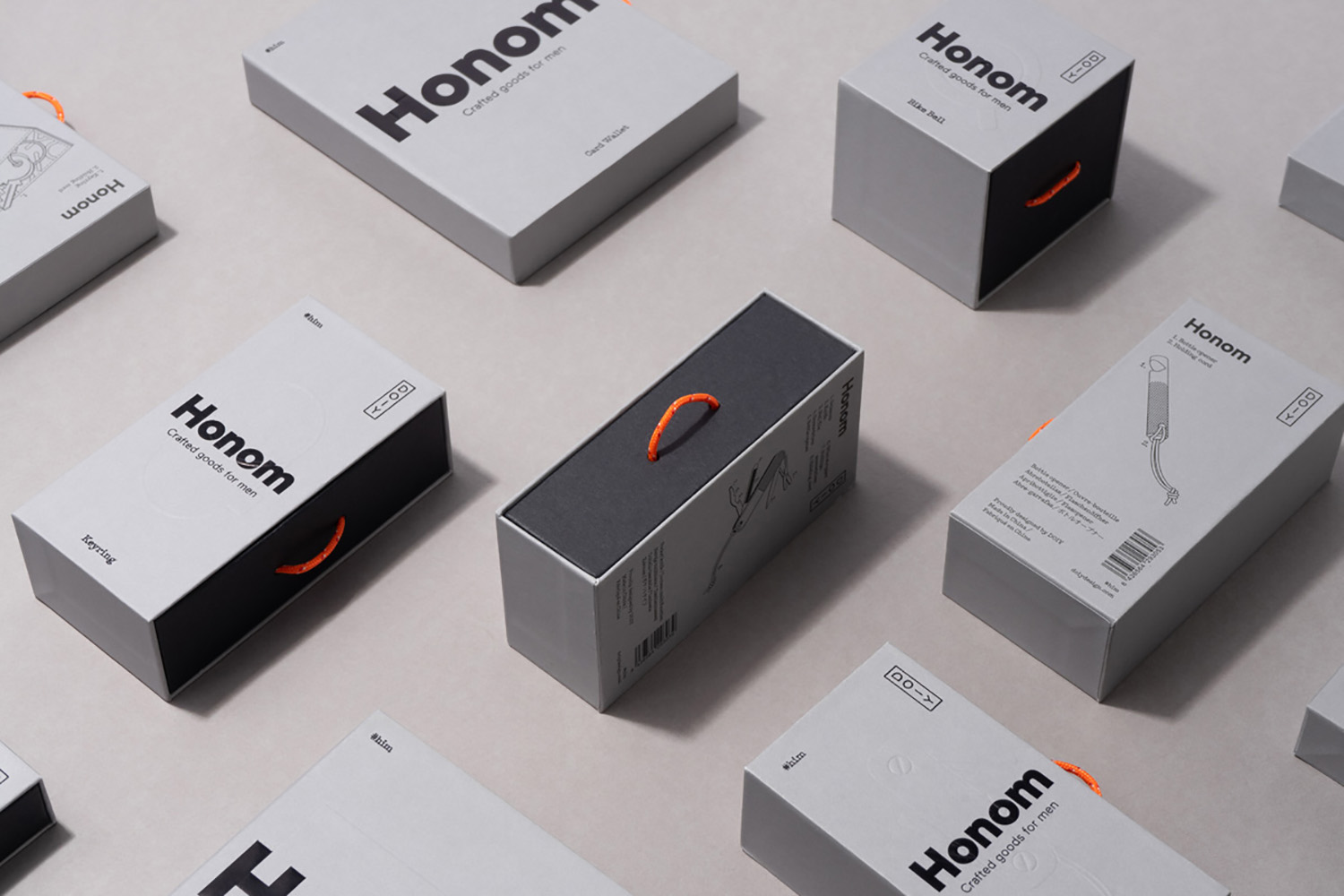
Graphic design brings over the weight and forms of the humanist sans-serif, pairing this with a mechanical typewriter face (and hashtags), the DOIY logotype and the light lines of technical drawings on the reverse. The graphic language is clear, and with a continuity established with previous ranges.
Exterior packaging is very much in line with utility; the volume of the box, the climbing associations of the pull-cable, the grey of the boards, the weight of type and technical drawings. Interior, in the use of foam to frame and hold object and the pull out draw, is very much in line with the interactive and material language of the high value. In these, a curious dichotomy emerges between robustness and preciousness. Yet these feel materially and graphically well-resolved, giving the packaging its distinction and communicative breadth. See more work by Folch on BP&O.
Design: Folch. Opinion: Richard Baird. Fonts Used: Maax.
