New Architecture in South Tyrol 2012—2018 by Studio Mut
Opinion by Richard Baird Posted 29 October 2018
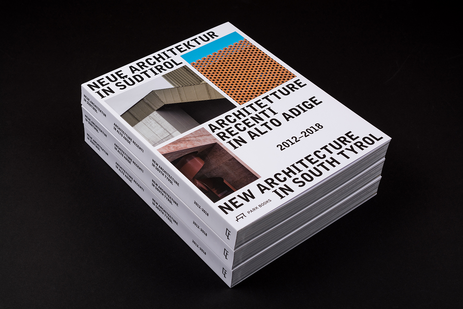
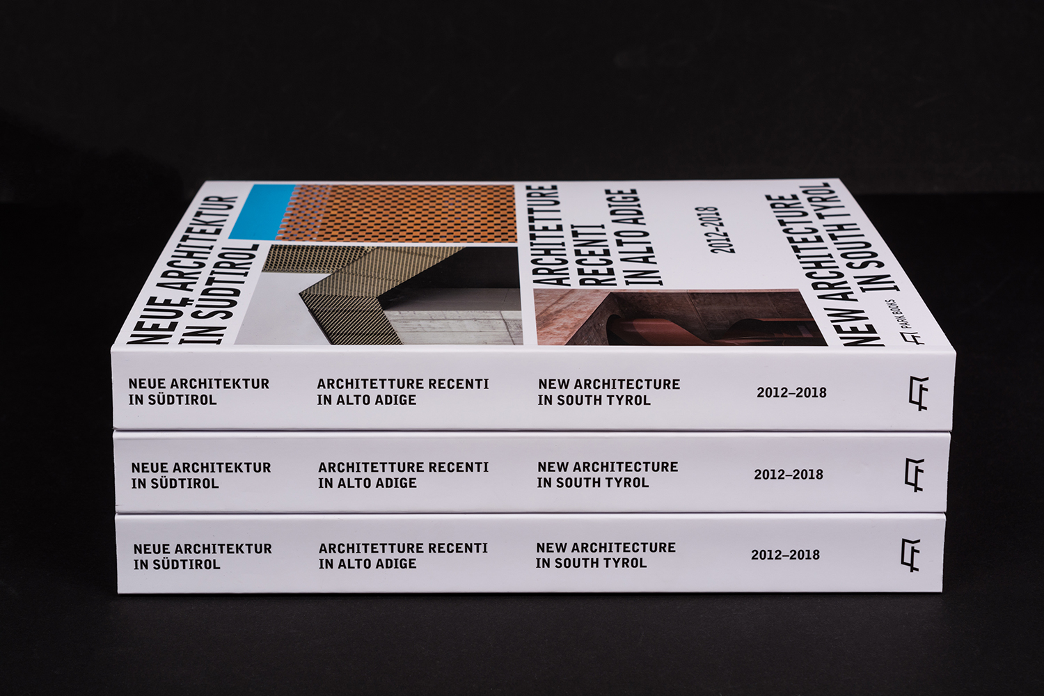
New Architecture in South Tyrol—a travelling exhibition and catalogue—brings to light the unique architectural boom happening in Alto Adige, also known as South Tyrol, the predominantly German-speaking northern-most province of Italy.
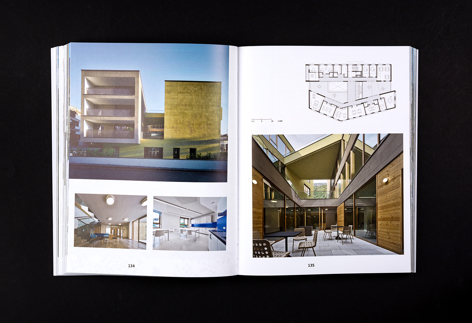
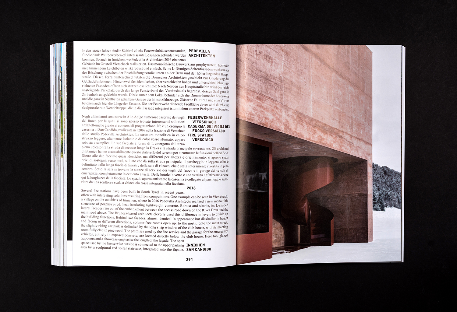
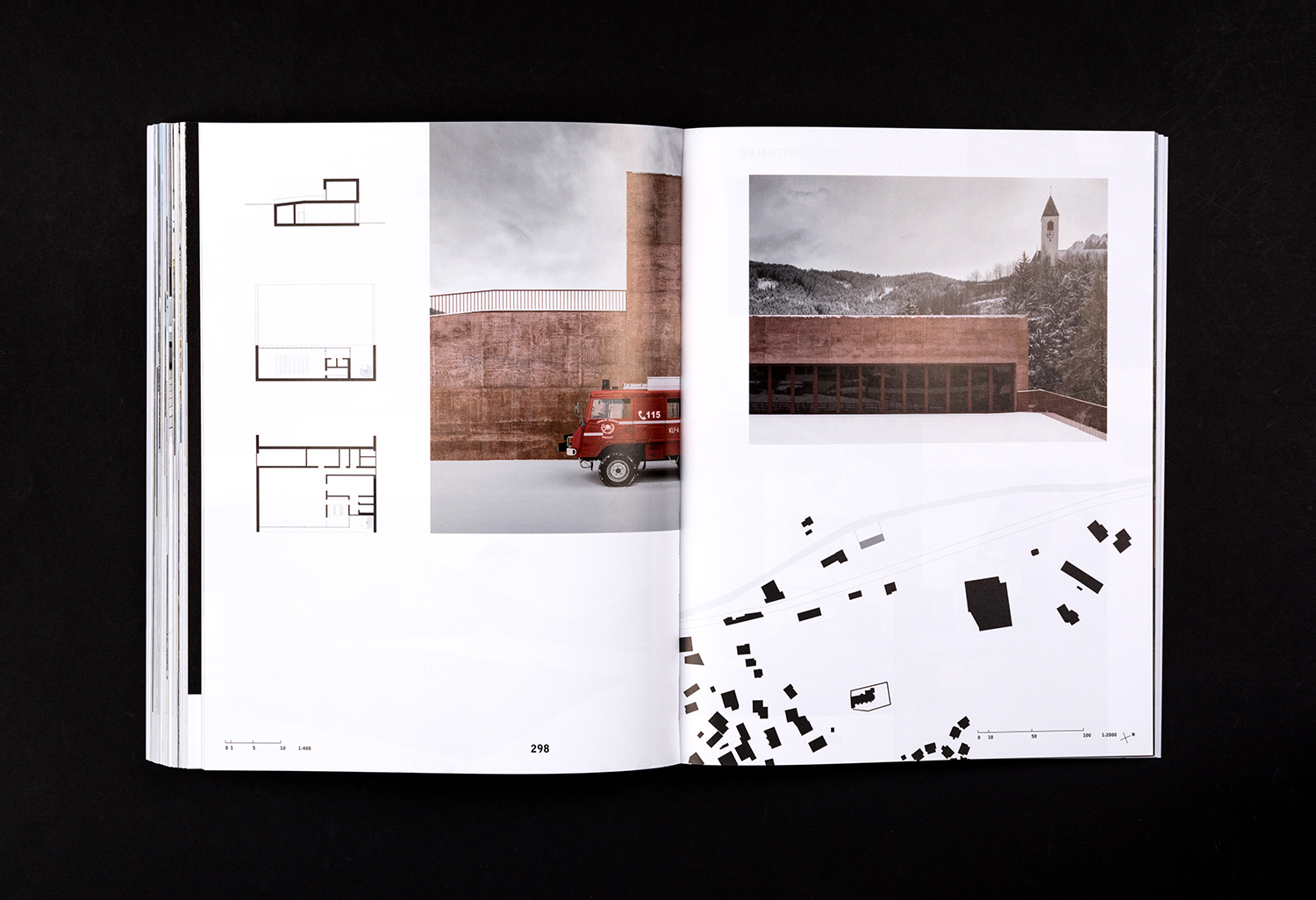
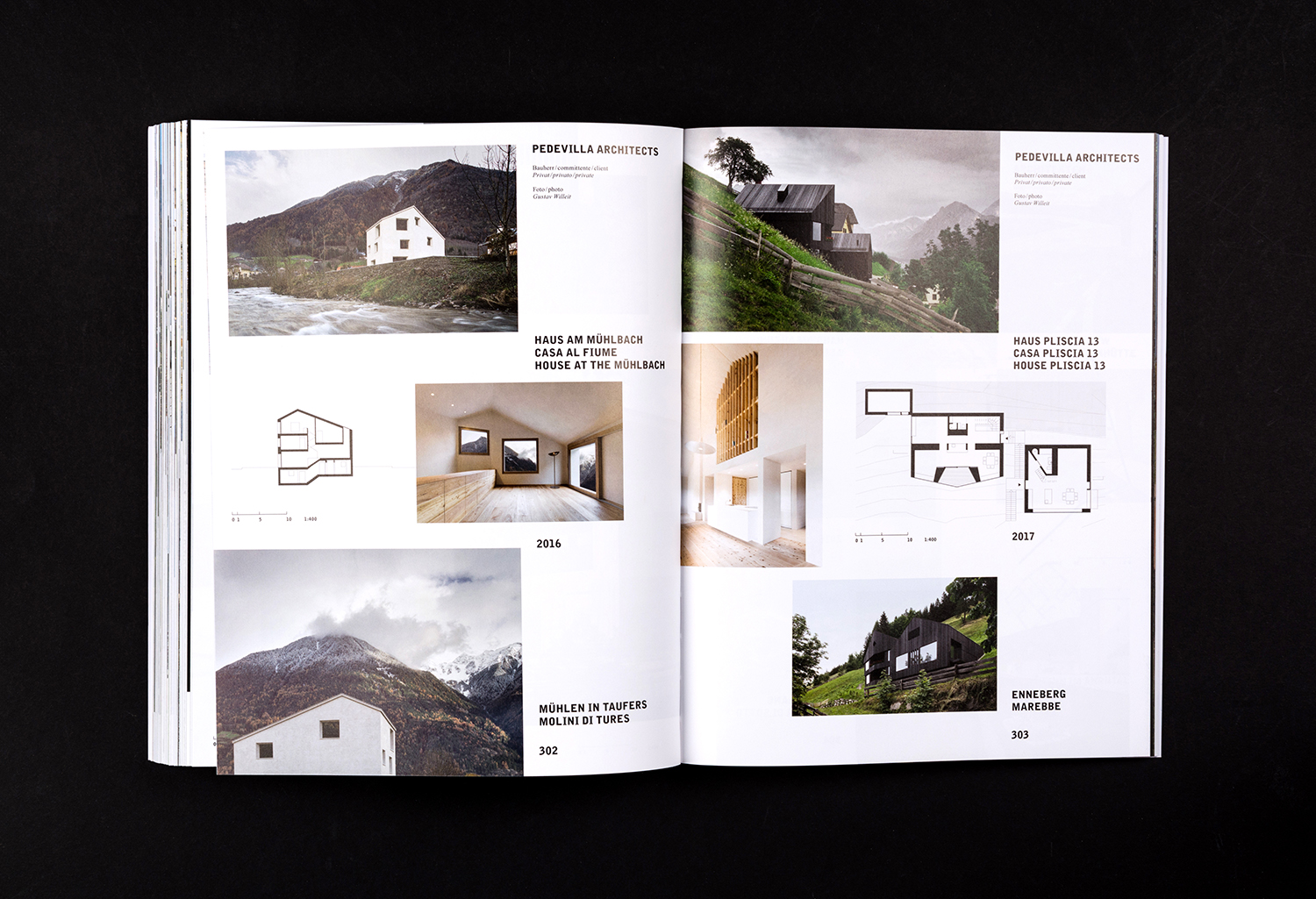
Selected by an international jury, the catalogue focuses on fifty-nine buildings from the region, realised between 2012–2018, and have gained local contemporary architects international recognition. These buildings are marked by their keen sense of locality and materialisation. This is documented throughout the exhibition catalogue by way of images and plans. Texts in English, German and Italian augment these, providing a comprehensive survey of recent architectural trends and developments in the region with the intention of facilitating international comparison.
The design of the exhibition catalogue, developed by Studio Mut, channels the architectural continuities present within the region and draws these out through the immediacy of imagery and technical drawings, and explored playfully in the balance of type and space. In this, the design of the catalogue captures the “lively and innovative architectural scene” rooted in a rich tradition of craftsmanship, and set within, and often in contrast to, an alpine context.
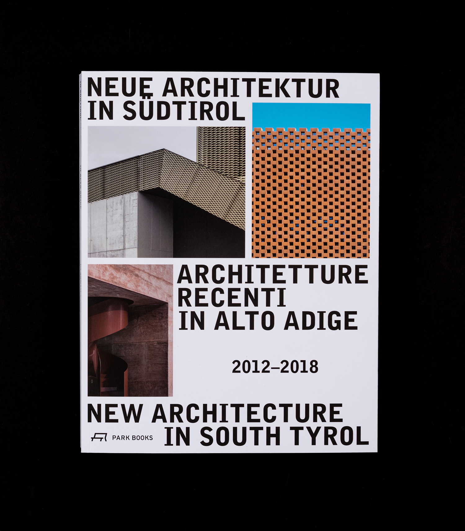
The catalogue functions as a mode in which to collate and migrate South Tyrol’s unique structural typology internationally, framing and presenting individual buildings, then collectivising them by their place within the region and by their commonalities, presented by way of essays.
As a catalogue, the publication leaves a lasting material impression within the context of an ephemeral exhibition and broadens its potential for the sharing thoughts (and displays a sensitivity to place) in its multilingual composition. This is a book as much as a catalogue. It is required to function in tandem with and in isolation from the exhibition. As such, it plays with the tools necessary to provoke enquiry or augment exhibition.
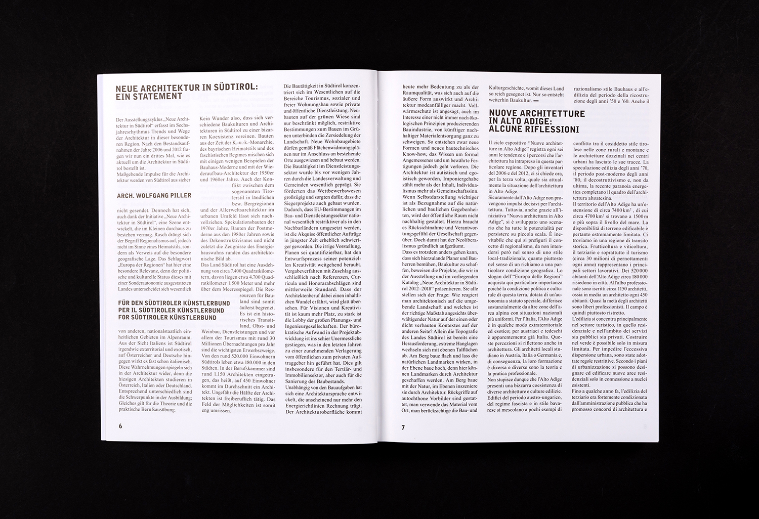
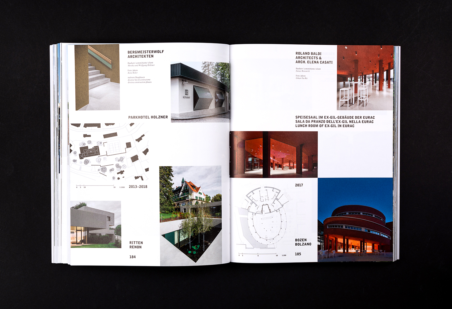
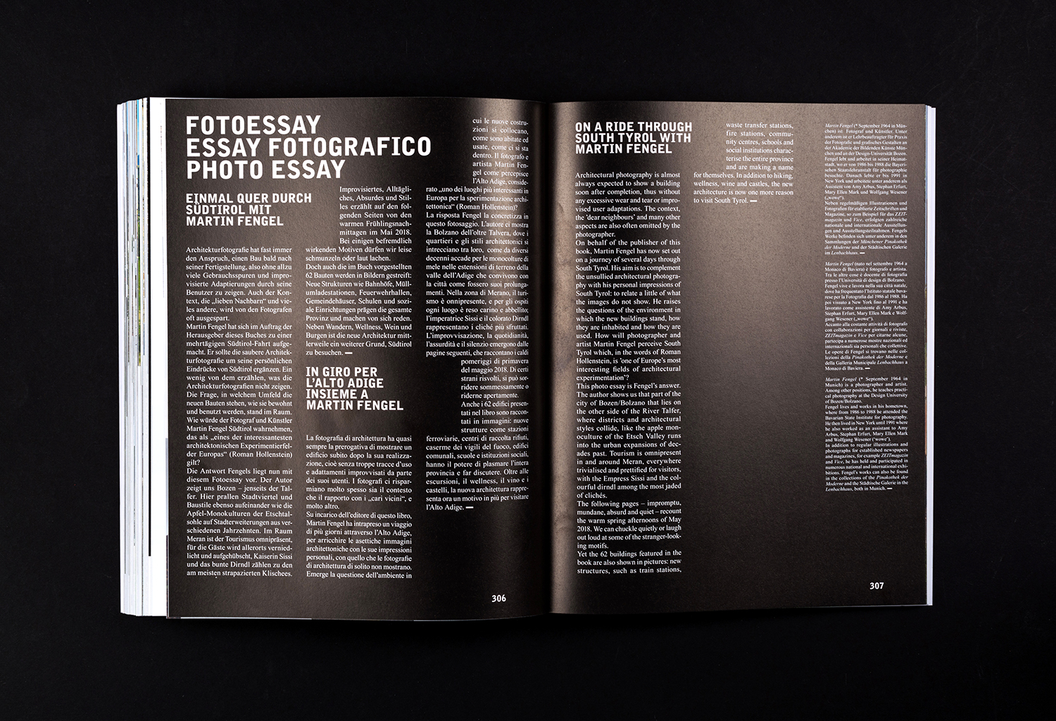
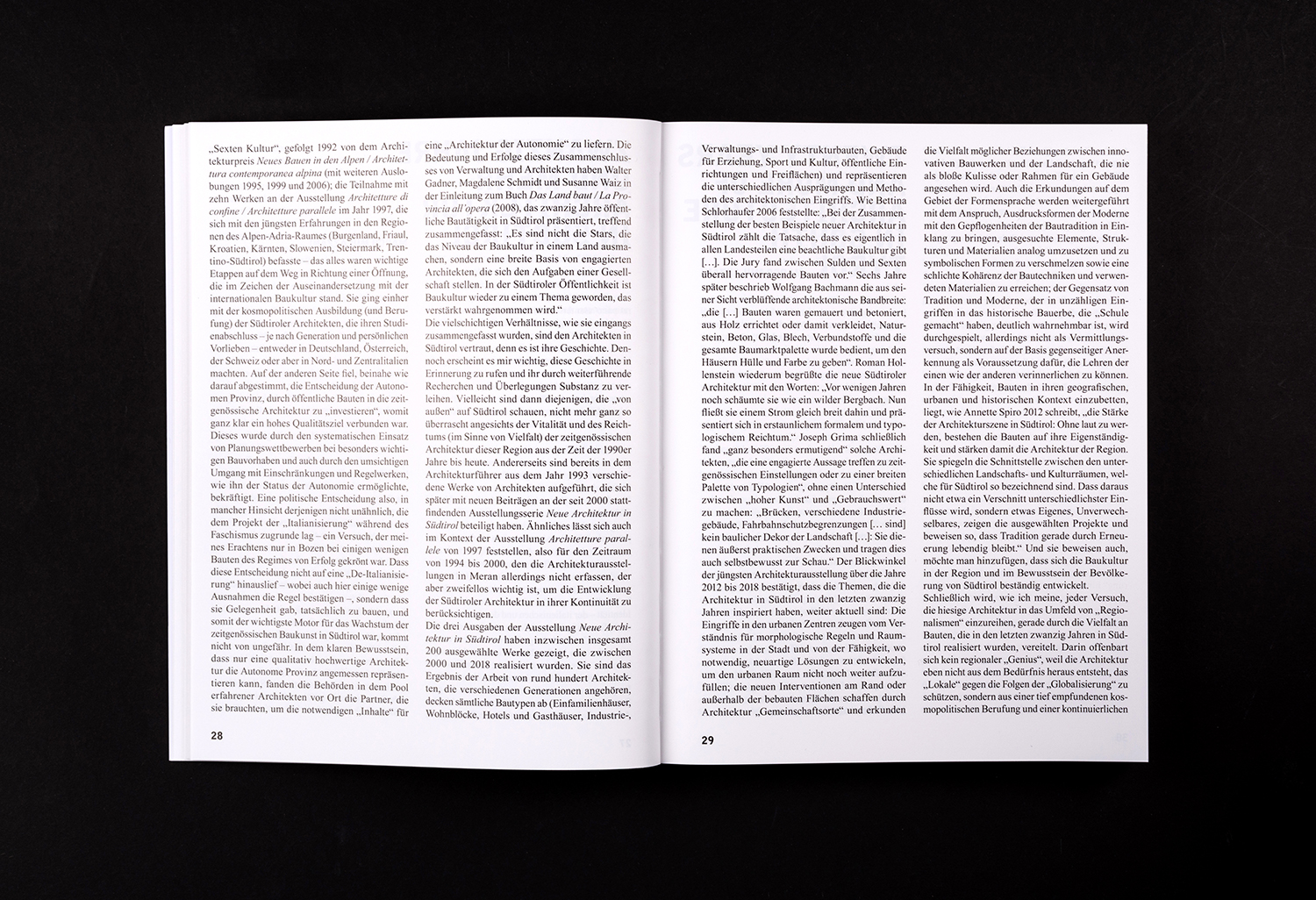
The catalogue moves between journal-like pages of multilingual body copy, the creative expression and communicative dialogue created by collage and the intimate, on-the-ground qualities of photo essay. These provide different entry points into the subject.
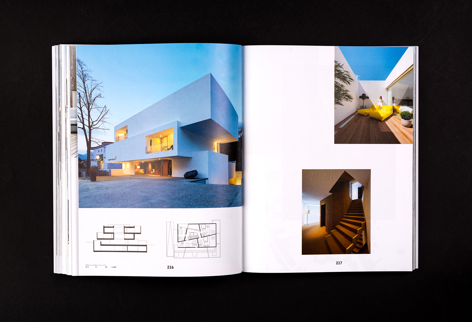
Content-wise, the catalogue balances the immediacy and aesthetic pleasure of image with the technicality of plans and the continuities, contexts and history afforded by in-depth text. Together, these explore the blurred thresholds between the traditional and modern, as well as a rural landscape in conversation with architectural structure. Cover manages to distil down and express this proposal and the multilingual and graphic tone of content through the confluence of type and image.
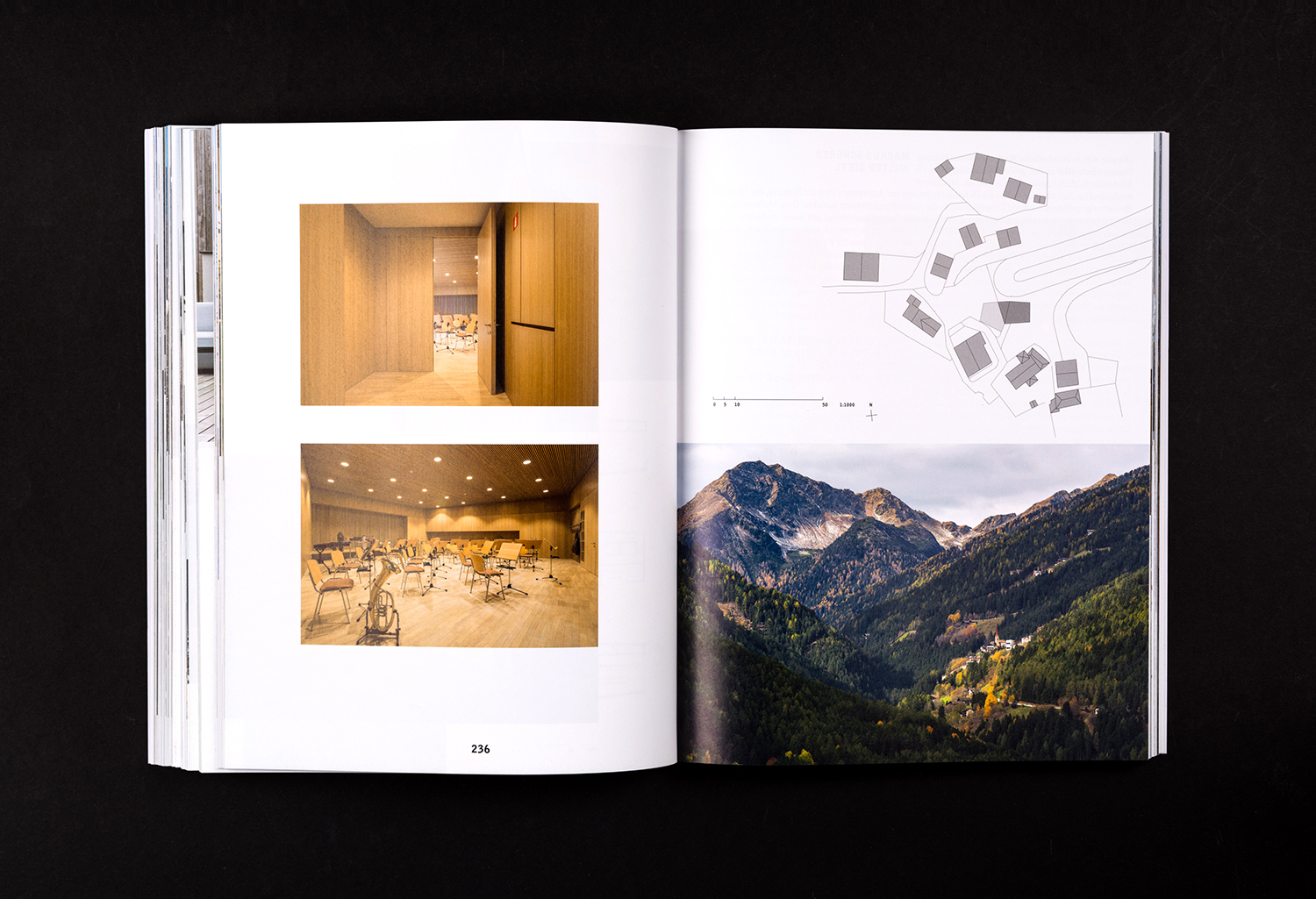
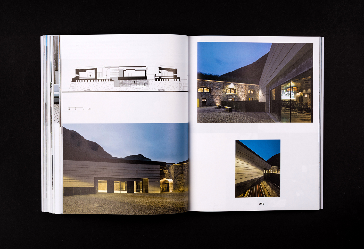
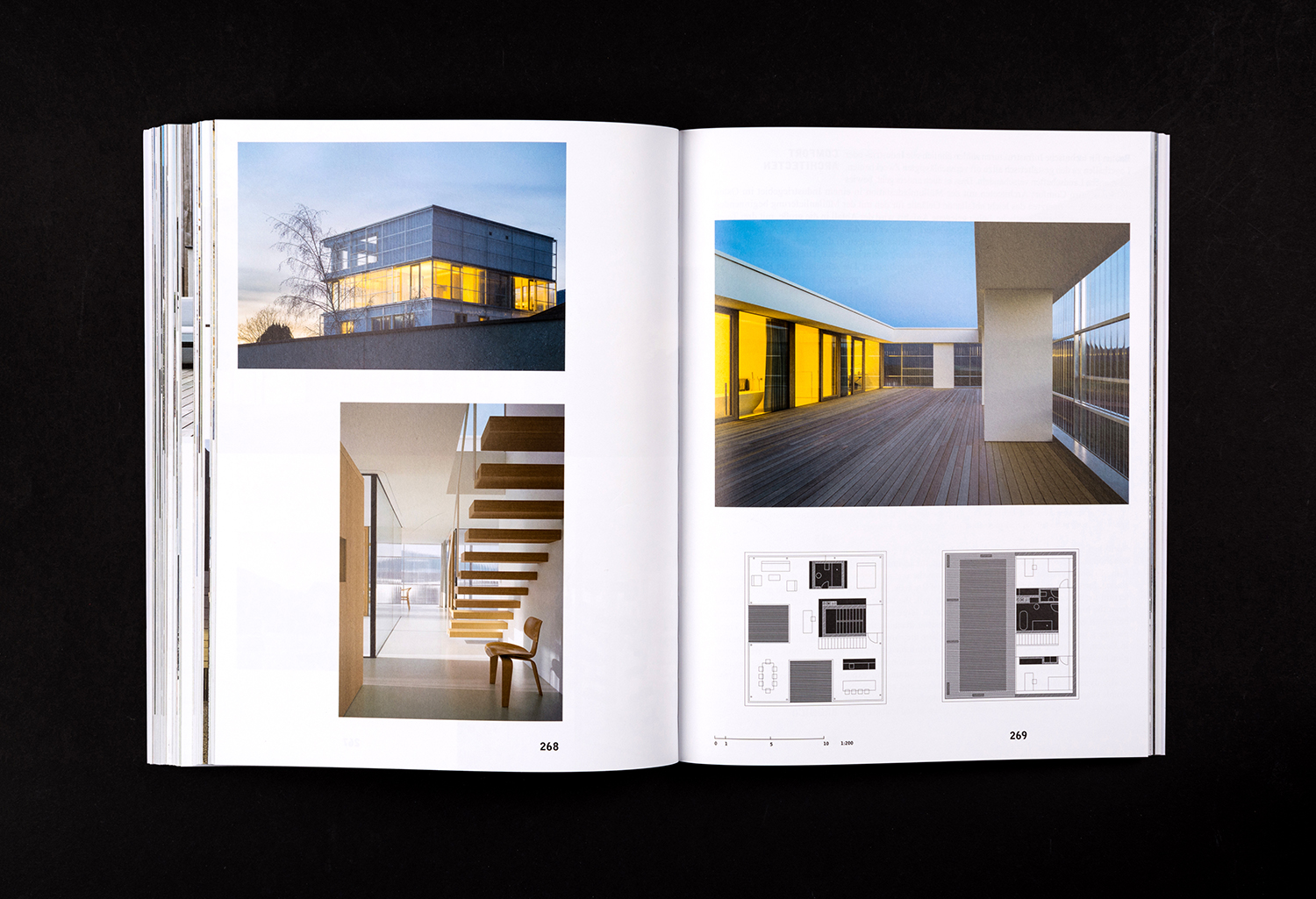
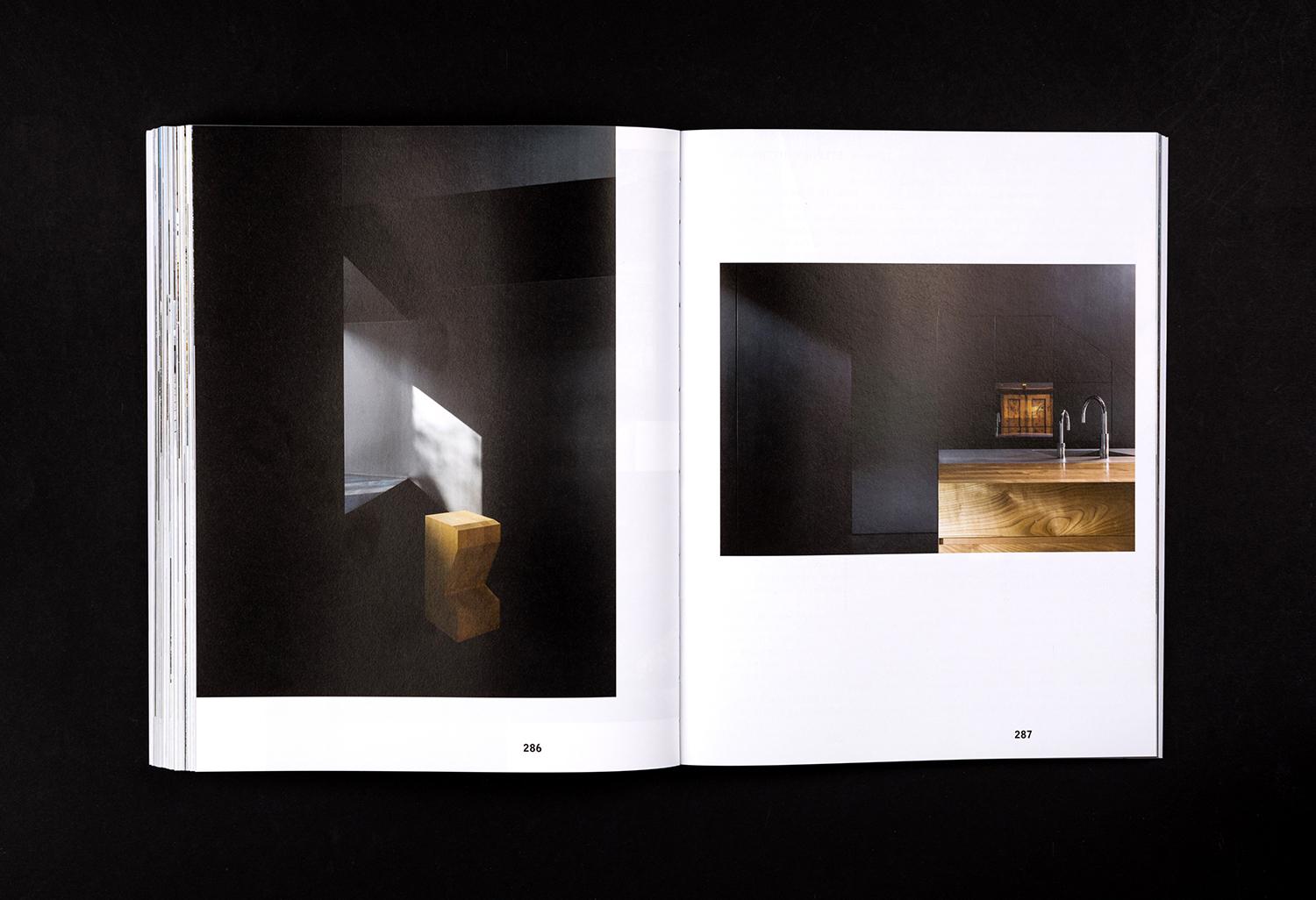
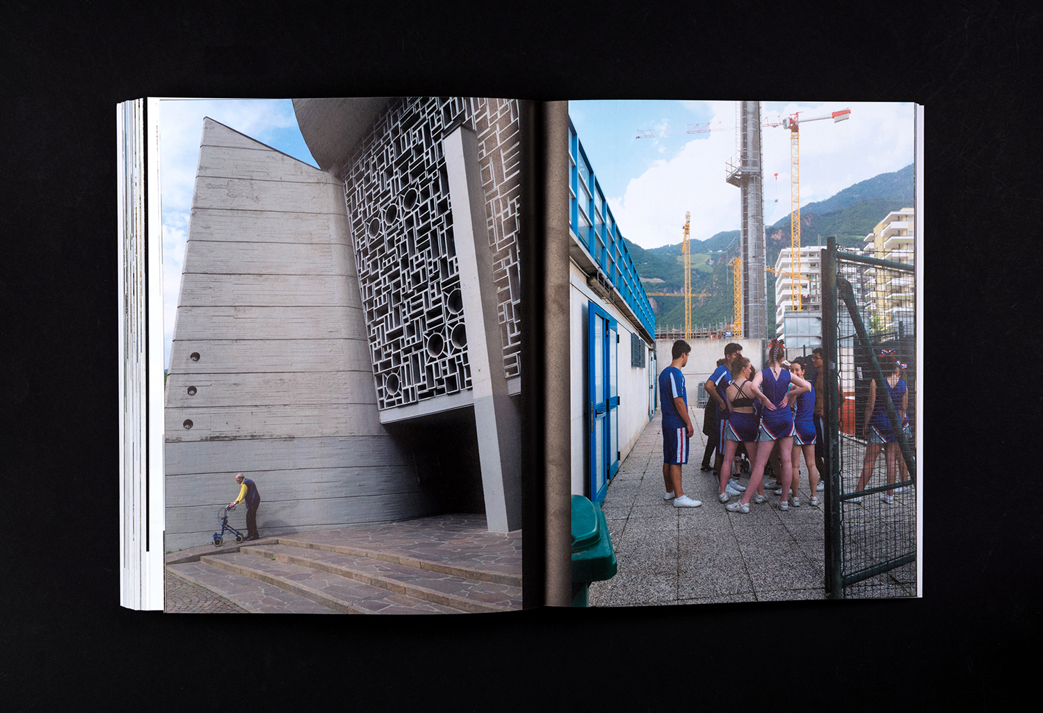
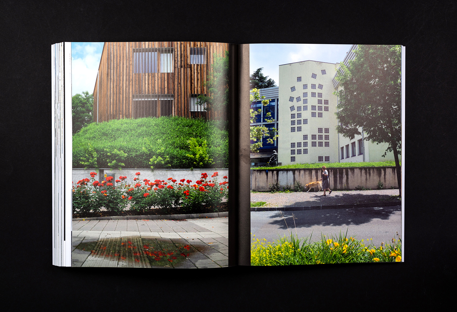
Further, in the cropping and arrangement of imagery, and with a strong focus on modern form constructed from local materials, the architectural becomes the graphic, drawing the eye in, developing a dialogue with type and white space. There is both the appeal and promise of formal architectural insight in conjunction with an emotive and visual pleasure.
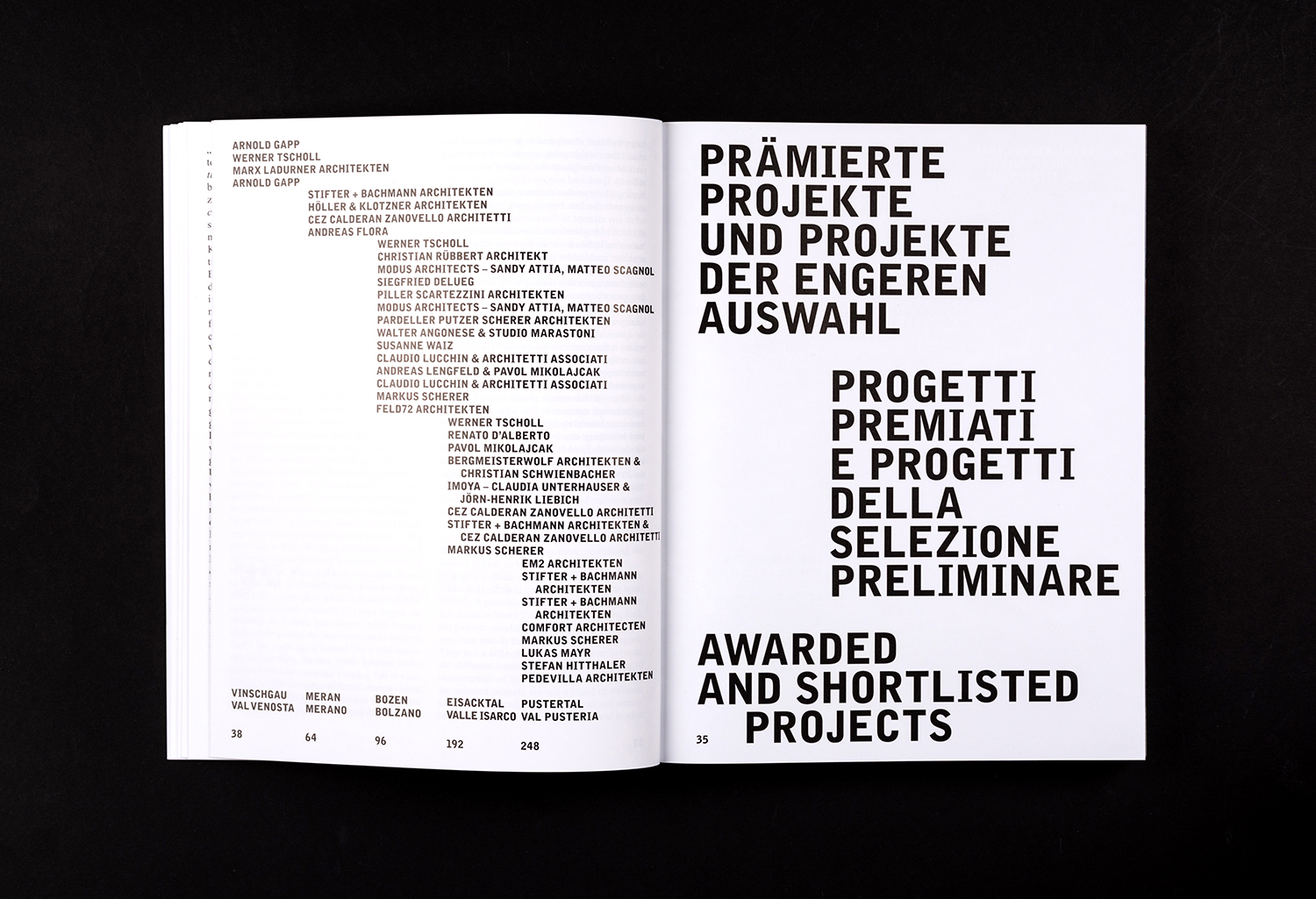
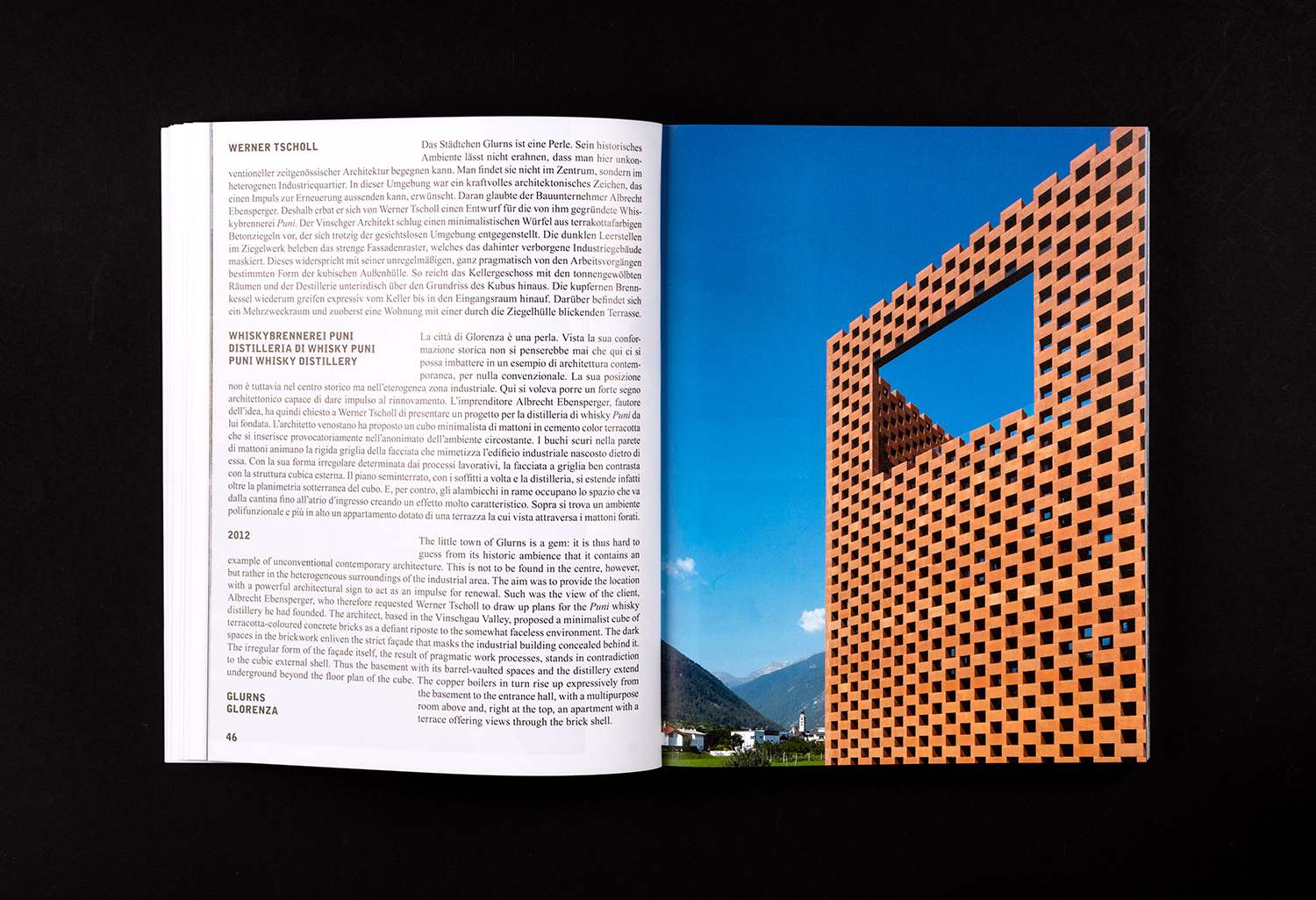
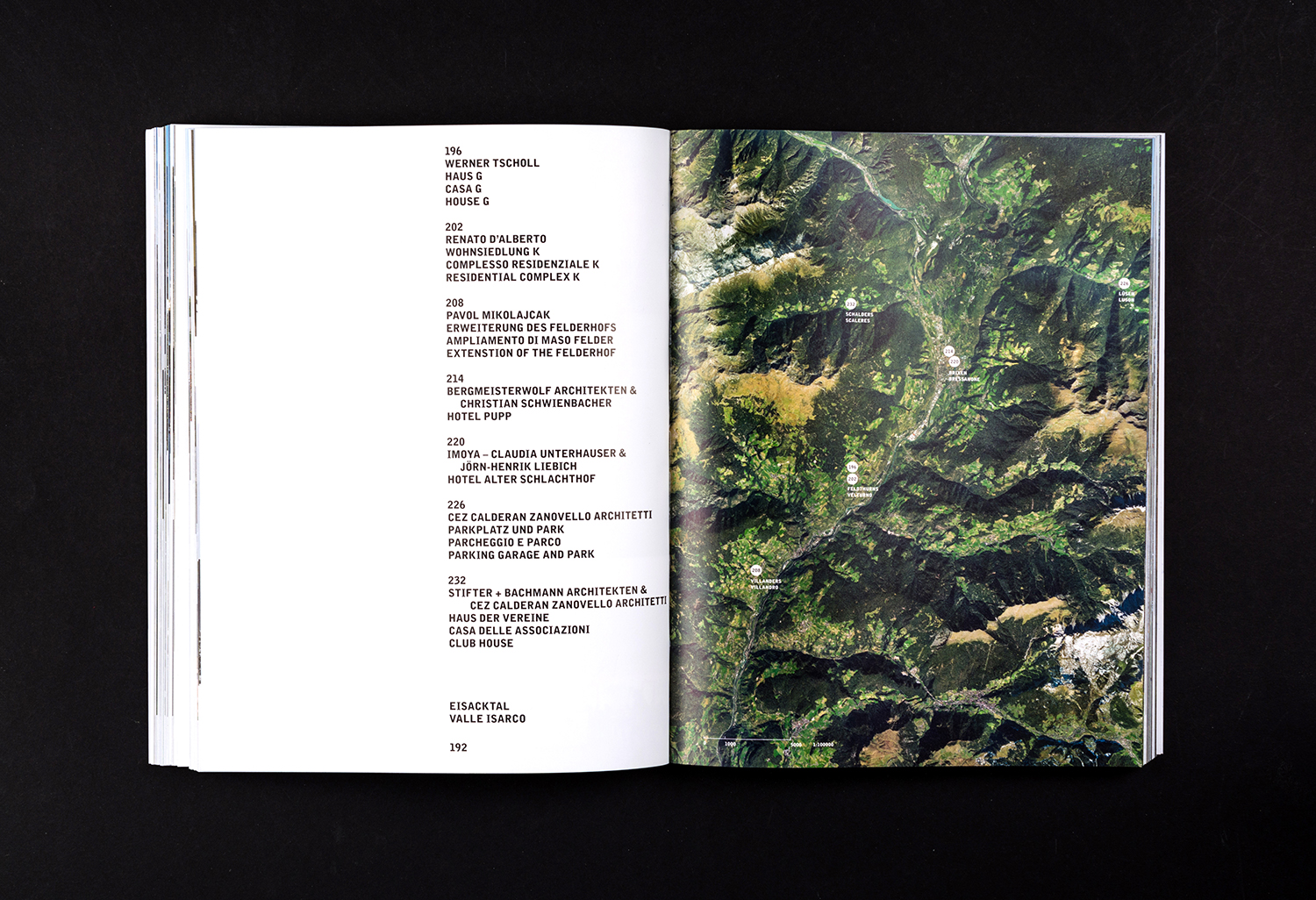
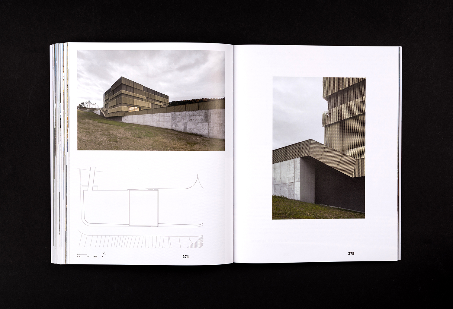
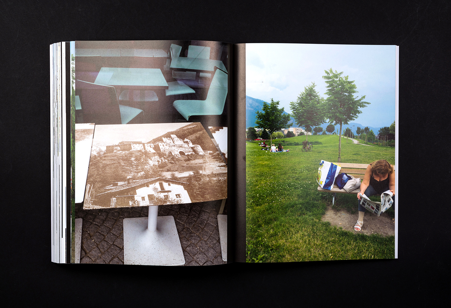
Much of the imagery serves to contextualise (in the wider shots), as much as aestheticising (in the close-ups and cropping). Place is a significant part of the narrative and clearly emerges as equal to the structure in the framing and composition of shots, in the symmetry and contrast between the colour, form and materiality of place and space. This informs design decisions, one of which includes page numbering and title positioning guided by the westerly, central or easterly locations of each project; an articulation of the wide but short border of the area.
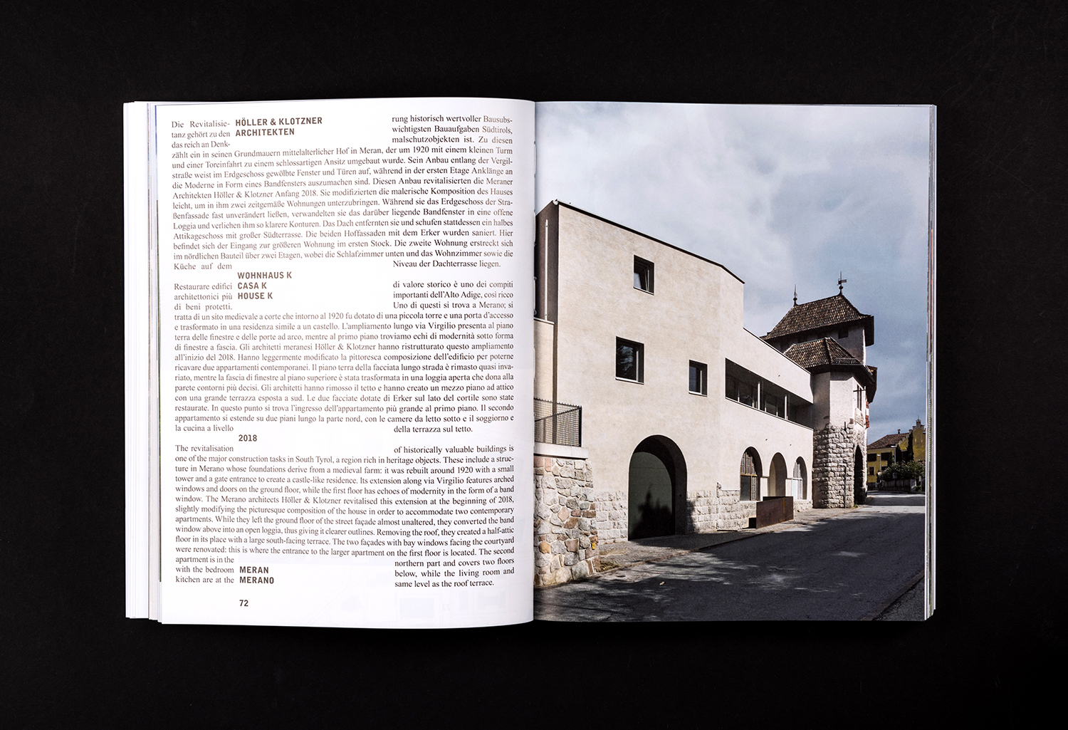
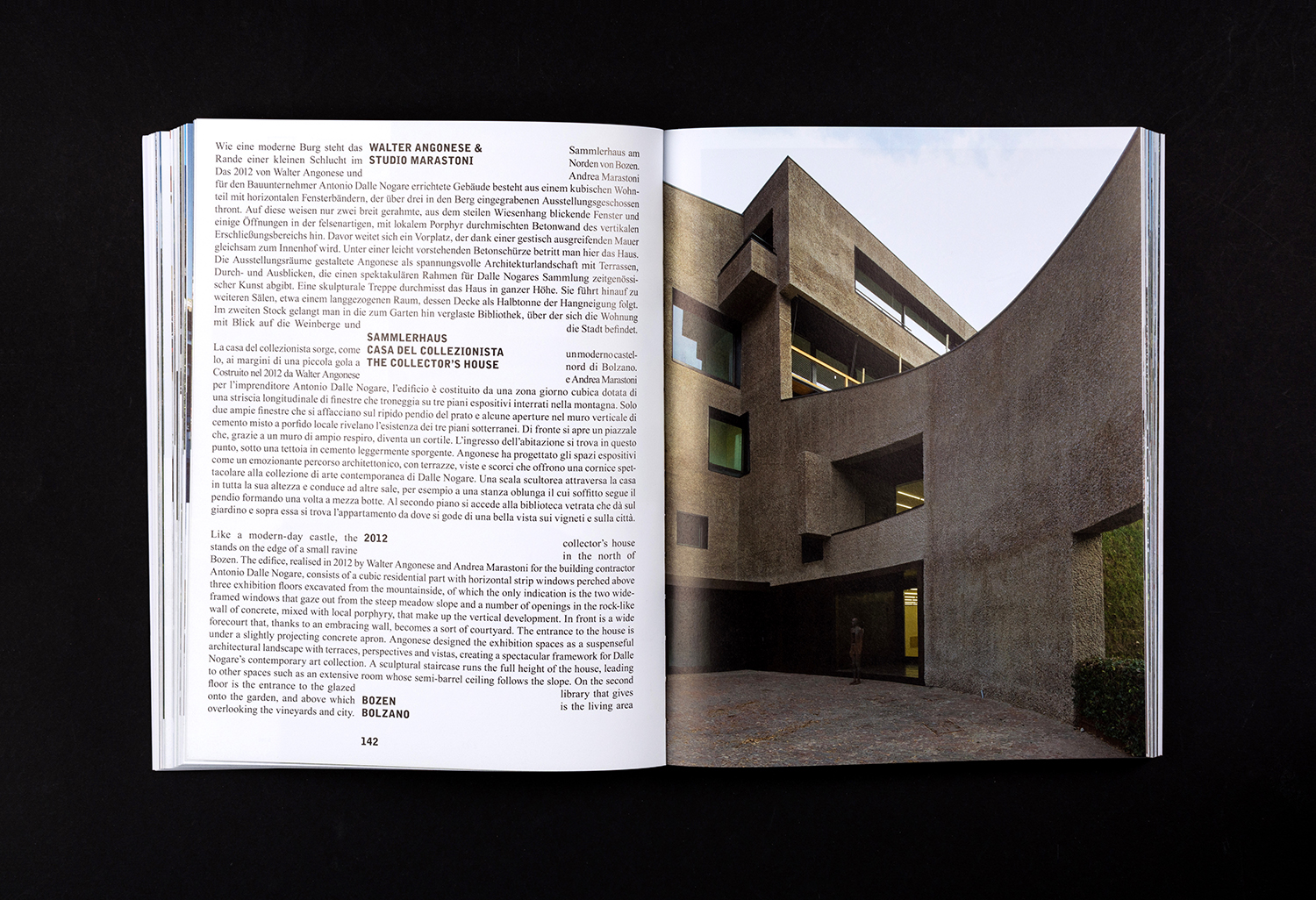
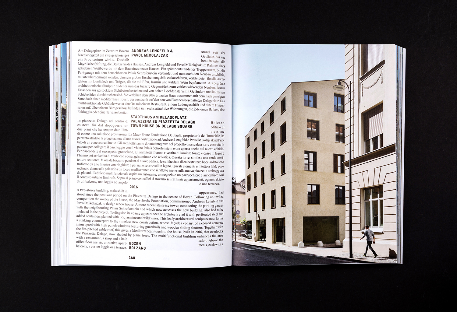
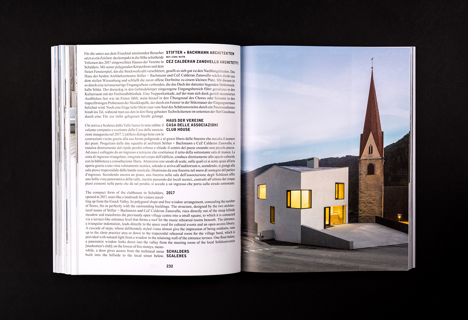
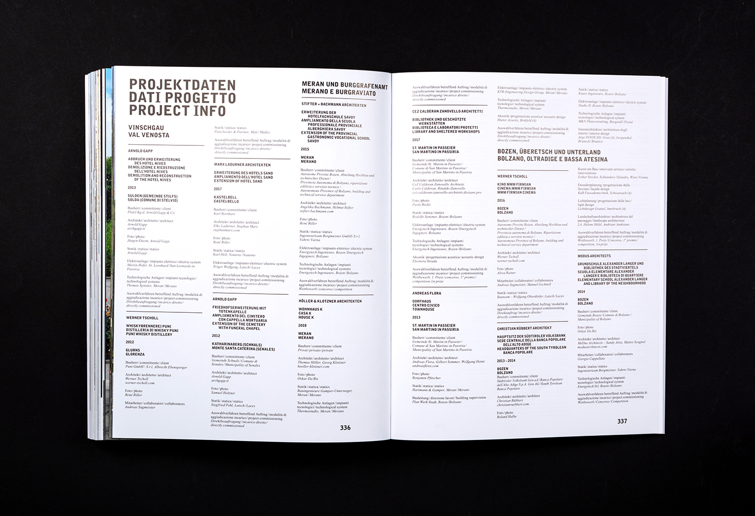
Just as there is a dialogue between structure and its surroundings within image, there is a relationship formed between image and text through typesetting. Large blocks of justified body copy becomes form, emphasised in the imposition of voids on text-mass, and a requirement for the reader to cross through space to continue reading. As such, space is pronounced and, in a way, read as part of text and central to the understanding of the theme of transitions.
This is further developed through techniques that include a spatial arrangement that controls pace and flow, the use of full bleed images to emphasise the space and boundaries of the page, and the interplay of text and space, a node to the architectural concerns of mass and void—many of the projects see geometric form imposing itself on rural environments, the modern and contained volume occupying open rural space.
Occasionally, type features stepping and stacking, a sense of the recurring form and the modular. This mirrors architectural commonalities, for example, the way in which some of the rural buildings and structures find themselves engaging with a hillside, and the way hillside can impose itself or emerges in interior architecture.
Typesetting subverts typographic expectations when it comes to ease of reading. The voids force adjustments to pace. They create shape in, around and of the texts. Just as there is often and jostling of local traditional architecture and new, or landscape and the built structure.
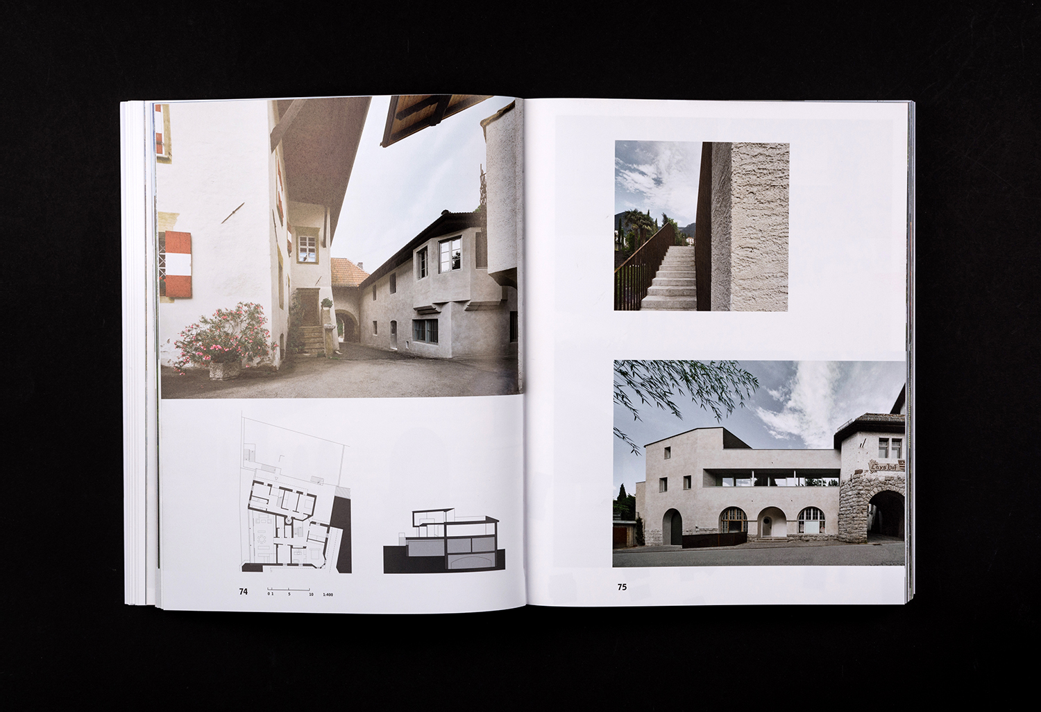
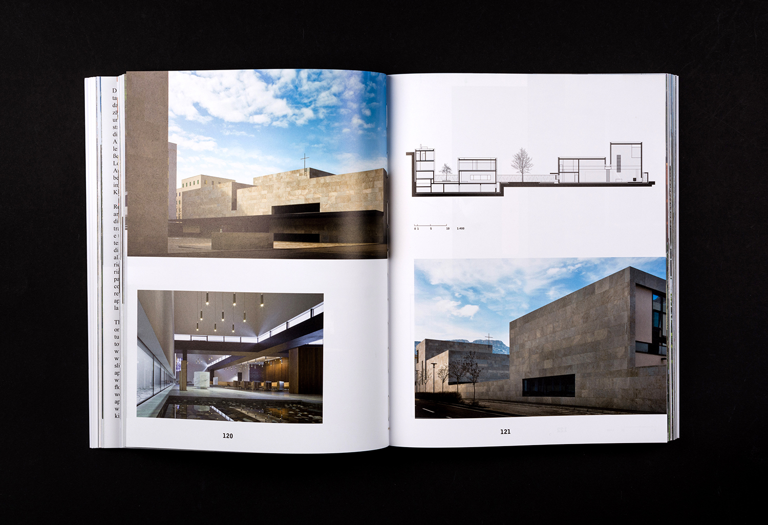
The architecture of South Tyrol, its dialogue with and imposition on rural environment and traditional structures, materials and techniques is a fascinating subject. Photography does a fantastic job at capturing this in an immediate and beautifully compelling way. There is a fomarlity to these, echoed in the typeface and typesetting of text, often pragmatic in its presentation of three languages, yet, there is also something of a playfulness in the relationship between text, image and space. This never supersedes content, but develops the essays beyond their literal reading. More work by Studio Mut on BP&O.
Design: Studio Mut. Opinion: Richard Baird.
