The Best of BP&O — October 2019
Opinion by Richard Baird Posted 4 November 2019

Five projects that stood out in October and have made it into BP&O’s Best Of Series. Between them, these typically balance a strong singular concept or an appropriate confluence of ideas with a compelling visual character and clear communicative intention that appropriately play with form, colour, type and layout, as well as material, texture, image and print finish.
BP&O, in this end of month review, tries to recognise both the smart use of small budgets—those that channel spending into the most appropriate assets—and those projects with a broad and holistic quality, establishing a continuity (conceptual and/or visual) across multiple touch points. Many of the projects share a concise aesthetic expression, yet there is nuance to these, so do click through and read more about each of these.
Lagotto by Studio Hi Ho

Lagotto is a new all-day café, wine bar and food store situated inside Nth Fitzroy, a residential property development project from Milieu located at the heart of Melbourne’s, inner north. Named after the truffle-hunting Italian dog breed, the café offers a relaxed European surrounding in which to enjoy an Italian menu with a “joyful vibrancy that avoids kitschiness or pastiche”. Studio Hi Ho, also responsible for the visual identity of the Nth Fitzroy development, was commissioned to put forward a proposal for Lagotto that would resonate with the distinctive interior design scheme, the local community’s tastes and Mediterranean migrant history. This was achieved through type pairing, materiality and playful illustration by Ted Parker.
See more of this project here

Daniel Jensen: Current Events by Bedow

Daniel Jensen is a Swedish artist whose work moves between paintings, sculptures and drawings and explores themes such as society and pop-culture, film, literature and nature. His latest book, designed by Bedow, features artworks that are figurative and abstract, unrelated and absent a narrative. With such compelling and intense imagery of colour and dynamic shape, Bedow developed a format that would hold these works with a calm and classic sensititivity, using type and space to frame the work.
See more of this project here
Napier Street by Studio Hi Ho

231 Napier Street is an eleven apartment building, now sold out, created by property developer Milieu, set with the culturally rich part of Fitzroy, Melbourne. It is their first collaboration with architect Edition Office—an innovative practice with a strong conceptual focus—and part of the developer’s ongoing enquiry into and interrogation of the dialogue between architecture and place. This interrogation forms the basis of 213 Napier Street’s brochure, designed by Studio Hi Ho; two books bound together, placed side-by-side delivering a juxtapositional concept of architectural structure and neighbourhood context expressed through the interplay of photography, text, surface and materiality.
See more of this project here
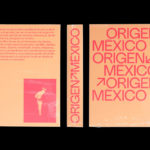
Origen México by Blok

Origen México is a encyclopaedic collection of cultural reference points from Mexico, and an expression of love for its land and identity, edited by Ámbar Editores and Paola Gonzalez Vargas. Written in Spanish it covers things such as, Barro negro pottery; the black clay pottery of Oaxaca, Barrancas del Cobre; the six canyons in the Sierra Madre Occidental and individuals such as pioneering filmmaker Alfonso Cuarón. In its breadth the book has a temporality; a relationship with time. One idea, place, person, piece of pottery or art directly or indirectly informs the another. Layers are built. The present is founded on, but would ultimately find it hard to recognise, all of the past, except that which immediately proceeded it. This is expressed through the materiality of the book, designed by Canadian studio Blok, using a light copy paper and show-through, the relationships and continuity formed with a consistent image treatment and the codifying visual language of consistent type, layout and an encyclopaedic format.
See more of this project here
One Wellington St Kilda by Studio Ongarato

One Wellington, a partnership between LAS Group and Qualitas, is a new property development located in the Melbourne suburb of St Kilda, not far from eclectic Fitzroy Street. The building’s architecture—designed by KPDO and comprised of 181 apartments across two buildings of 26 and 10 floors—features flowing curves inspired by its bayside location, highly-customisable interior options and unobstructed sky views. One Wellington is described as dramatic architectural expression on the skyline and an entry statement into St Kilda from the north.
Building on the highly-customisable and luxurious interior designs of KPDO, Studio Ongarato developed a visual identity and campaign directed towards a specific mindset and that draws on the multi-faceted sub-cultures of the area rather than a target market profile. This manifests itself, unusually, in a shifting tone throughout printed communications, moving from the sophisticated to the youthful, and from serious to humorous using photography, type, illustration and photography. Through this approach, Studio Ongarato’s campaign invites prospective residents to live ‘A life less ordinary’.
The One Wellington campaign identity is made up of a hardcover book, softcover booklets, posters, postcards and multi-format cards. Each unveils authentic stories from unexpected perspectives using a variety of creative techniques.
See more of this project here