Brigade Court by Jack Renwick Studio
Opinion by Richard Baird Posted 19 May 2020
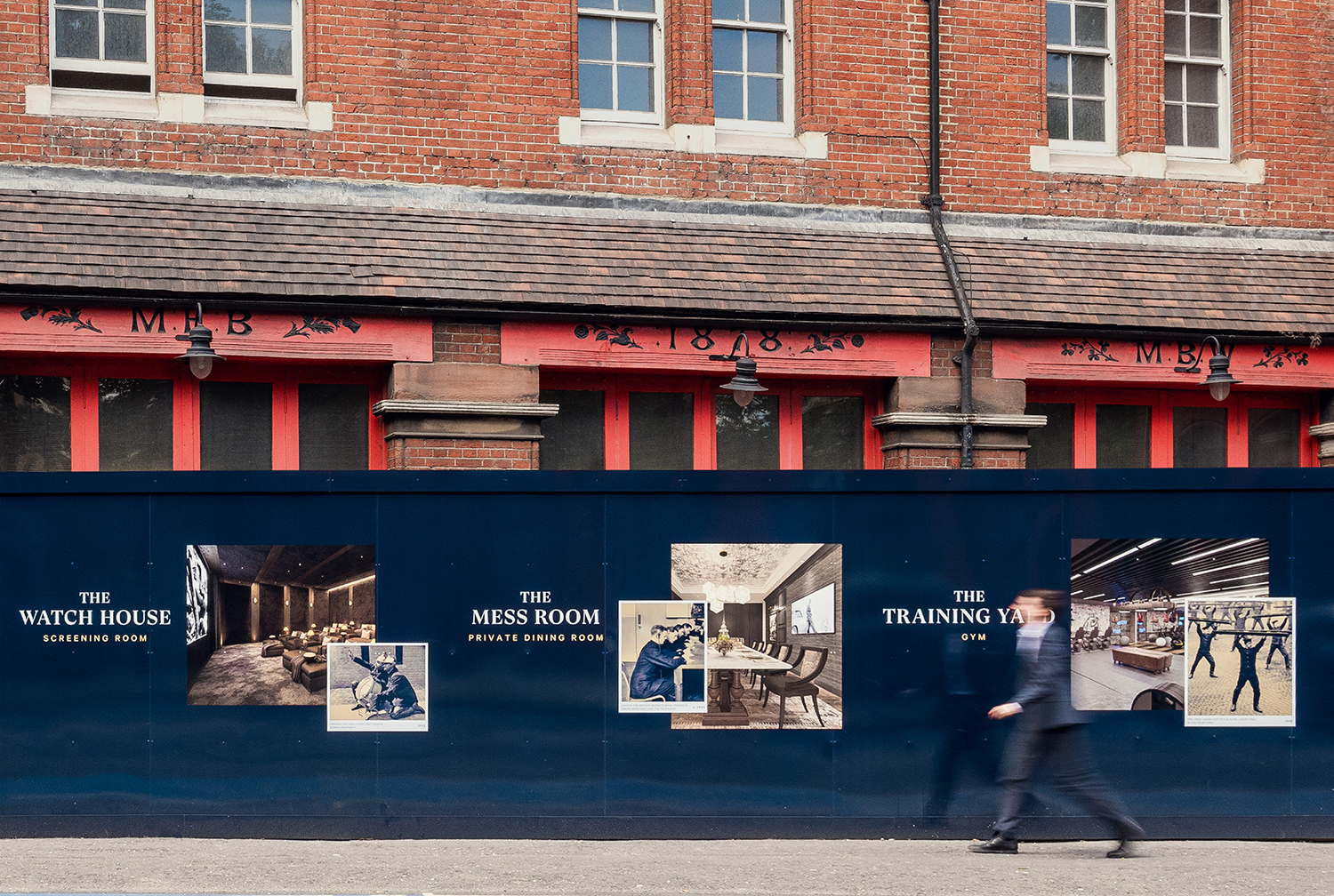
In The London Borough of Southwark sits the Grade II listed building and former headquarters of the London Fire Brigade, the city’s first fire station and a site currently under development. This will see it transformed into residential apartments with period conversations of the original Victorian building alongside a modern new-build. It is a one-of-kind property development that offers a unique intersection of historic and contemporary city living. London-based Jack Renwick Studio (JRS) were commissioned to develop the name, visual identity and communications for this new development, and were challenged with the task of appealing to both local and international markets.
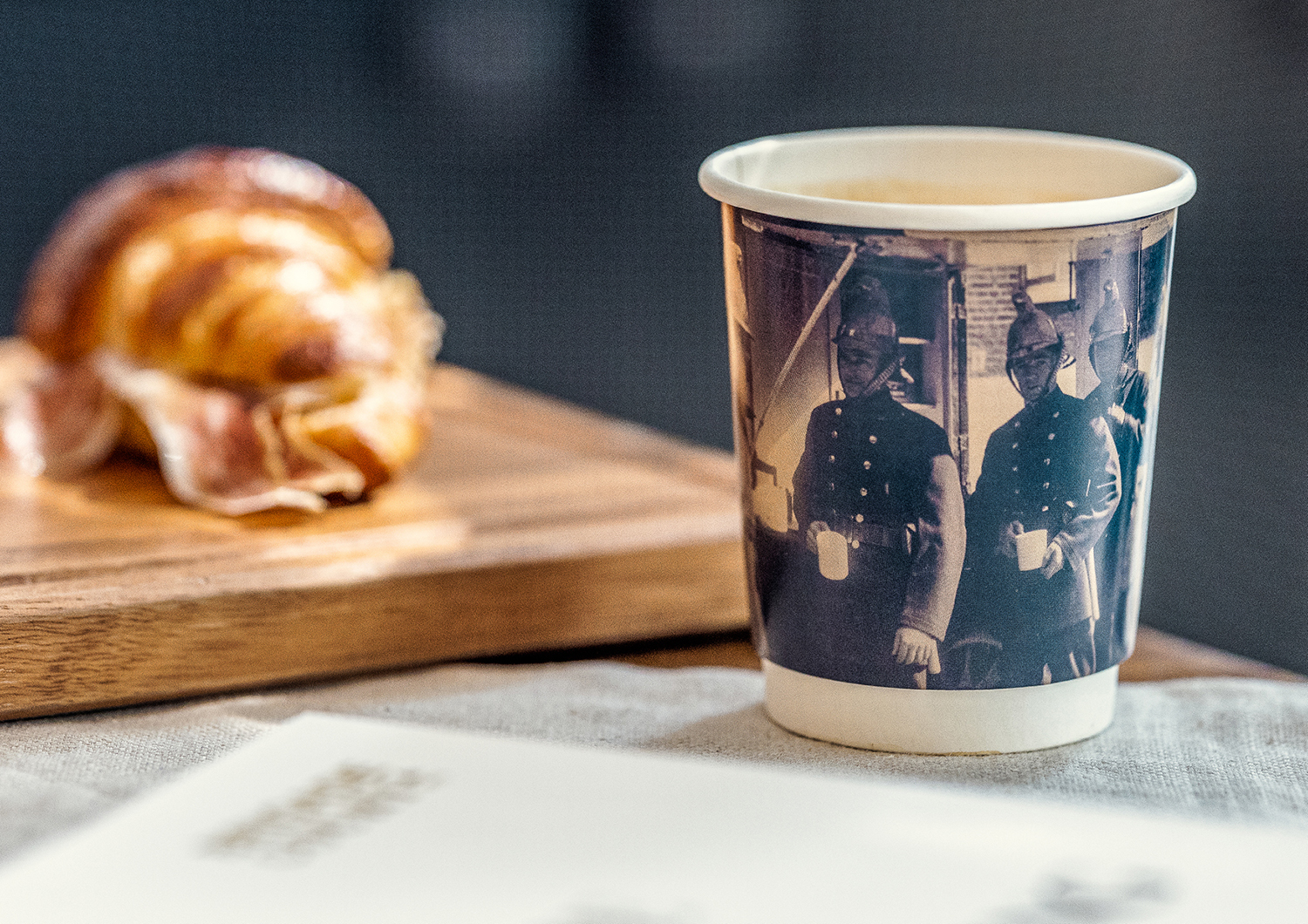
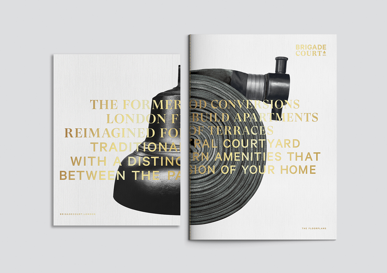
Under the concept “Traditionally Different”, JRS developed the name Brigade Court and a visual language of juxtapositions. These celebrate the distinctive contrasts that exist throughout the property. These juxtapositions move between the elegant and sophisticated materiality of the brochures, the intersection of modern and historic images, and then towards moments of playfulness throughout the property’s marketing suite, which also features a deli and cafe. The visual identity links a variety of different touch-points, from property and floor-plan brochures to custom framed photo-montages, coffee cups, menus and window decals.
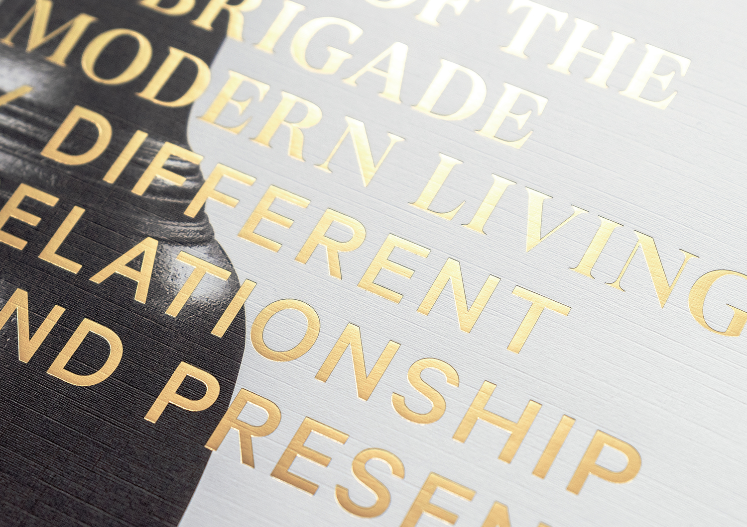
There are two distinct challenges fundamental to this project. The first is the historic building with restored Victorian period details and a new-build aspect that sits around this. Secondly, the necessity to appeal to both Londoners and international investment markets. The former meant finding a balance between architectural heritage and allowing this value to be transferred over to the new-build, and the latter required a balance between local community and international connections, historical internationally recognised locations and modern high-quality convenience. This plays out across the brochure by way of storytelling, the collation of images and how these are creatively paired and strategically positioned throughout the brochure.
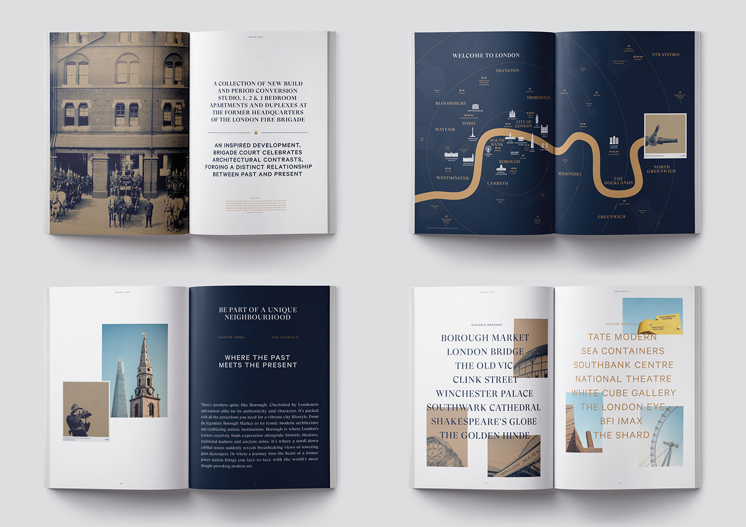
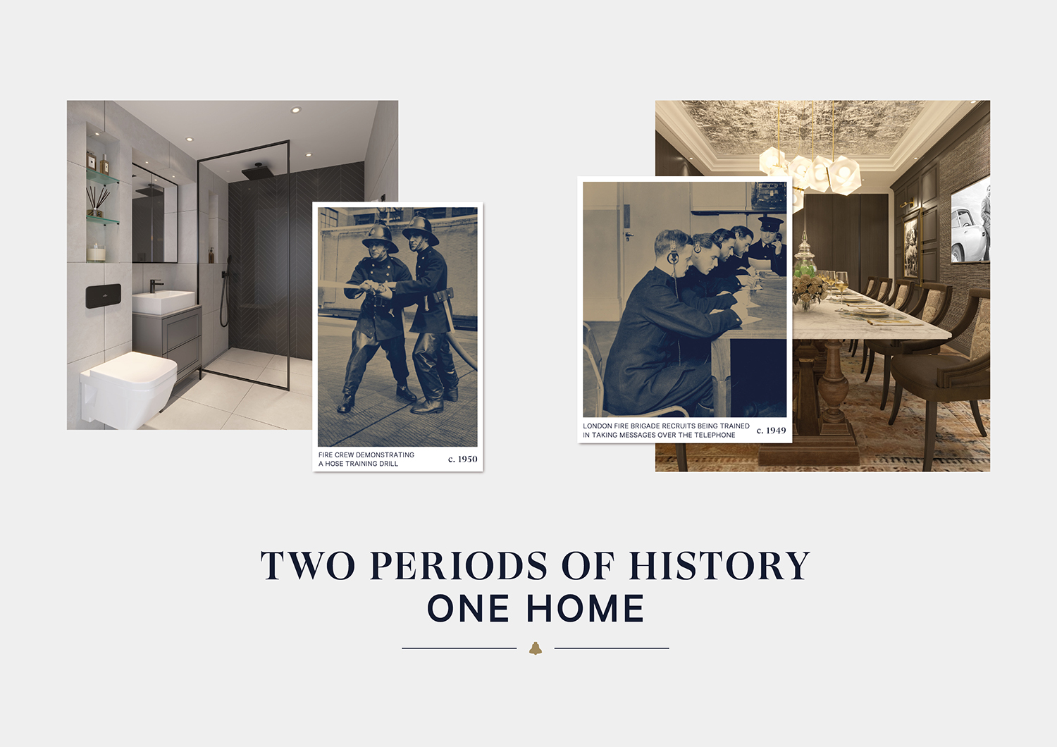
The historic nature of the development, as a former fire station and a place where firefighters lived and trained, offers a treasure trove of imagery and artefacts. “Traditionally Different” serves as a simple and smart concept from which all visual ideas, expressions and communications can flow. It is successful in that it gives a lot of room for creative interpretation over the long development period and across different surfaces. At its most foundational, it is about the juxtaposition of history and modern living, and participation in a continued legacy. This contrast, in its simplest gesture, emerges in the pairing of typefaces, GT Super from Grilli Type and Klim’s Calibre. Typographical contrast and pairing is not unusual, but given the context of the property and the concept, takes on further meaning and relevance. It is, however, the intersection of historical images (all of the actual fire station) and renders of modern living spaces that gives the work its character and distinction, and links a lot of diverse marketing materials.
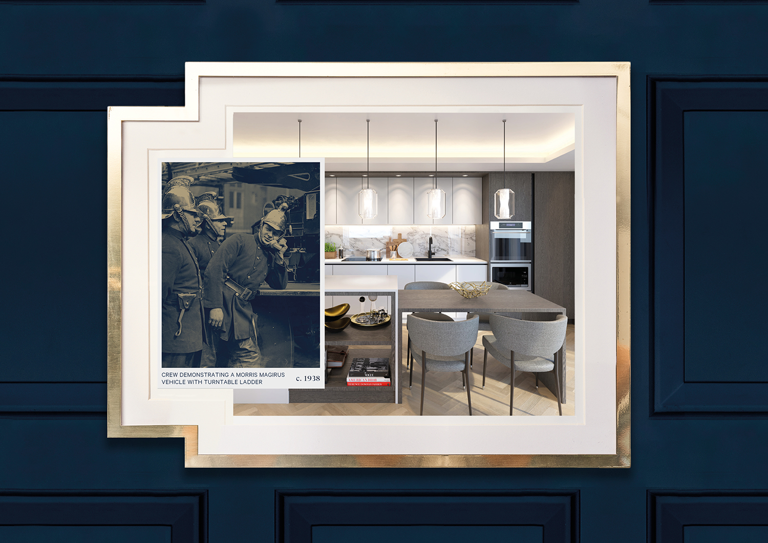
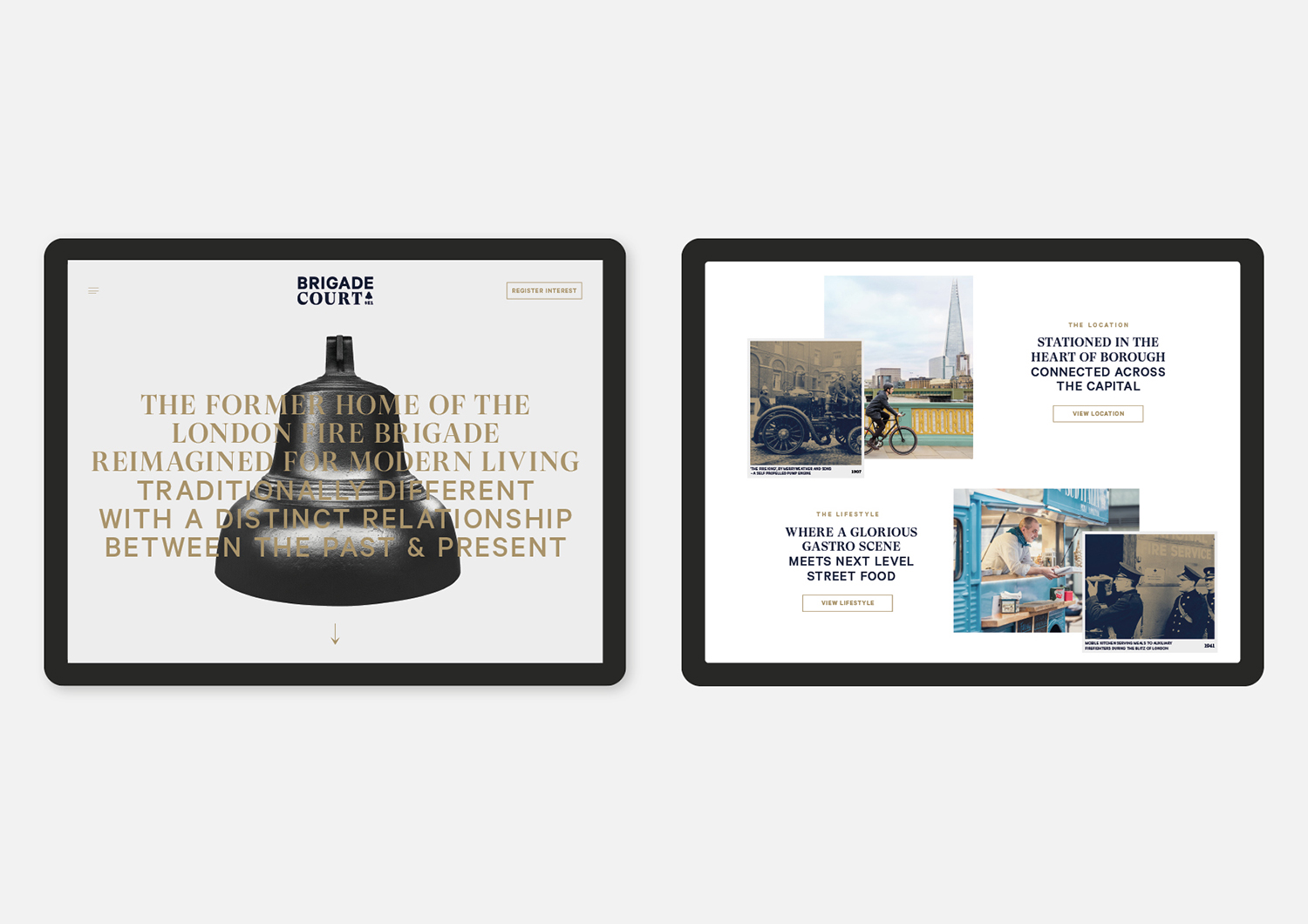
“Archival photographs of the original fire station and the firefighters align with images of the new apartments and local area – creating a series of collages that convey the site’s distinctive marriage of old and new, with a sense of local neighbourhood personality.” – Jack Renwick Studio
It is worth noting, not just the creativity and ease of many of the collages pairings, but the difficulties that come with working with a limited archival resource from different custodians and getting the right render angle and lighting, without incurring huge costs. Some play with a commonality of form, directly linking two images, while others take a more playful approach, such as a vintage fire fighting fire hose scene directed at the shower of a modern bathroom or a spot light pointed at a cinema room. It is this balance of formal historical imagery (on duty) and conviviality (off duty) that is perhaps the smartest juxtaposition, adding levity to images that feature people who are long gone. The small detail of borders and captions is a neat little trick to keep the two elements as stacked images, slightly separated, rather than placing the people directly into the spaces. Online transitions do this particularly well.
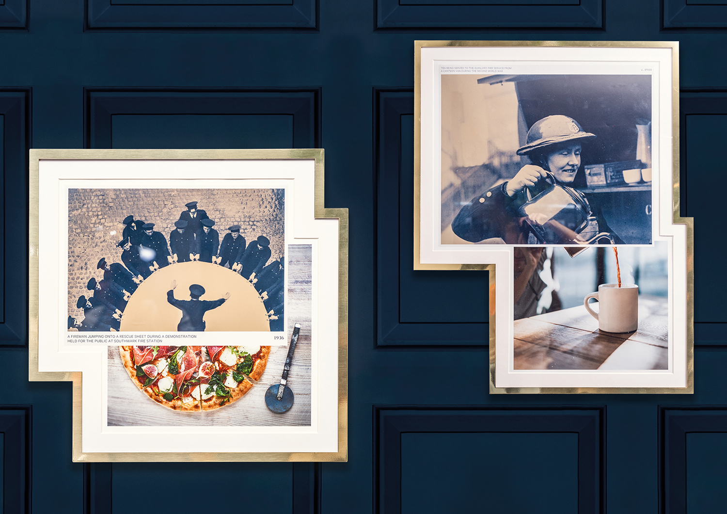
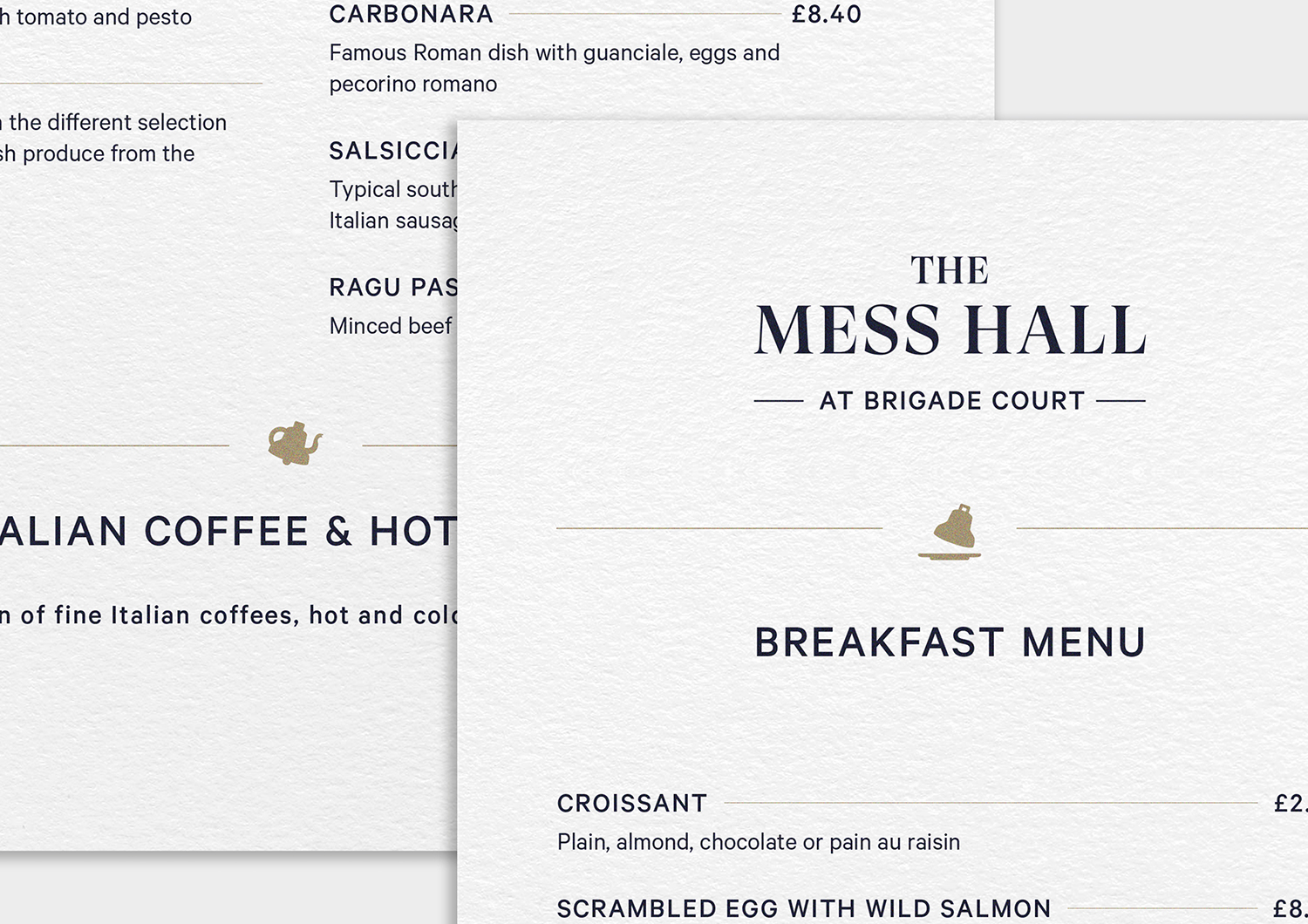
Other neat details include the custom-made picture frames for the images in the cafe, property and floor-plan brochures with split imagery across the front and back (creating a pleasant relationship between the two), and tiny little flourishes such as the fire bell as cloche and fire bell as tea pot across the cafe menus that are joyful whilst maintaining an elegance. This is supported by a colour palette inspired by traditional navy uniforms and brass helmets worn by the brigade in its early years, and the modern space and restraint of plenty of white.
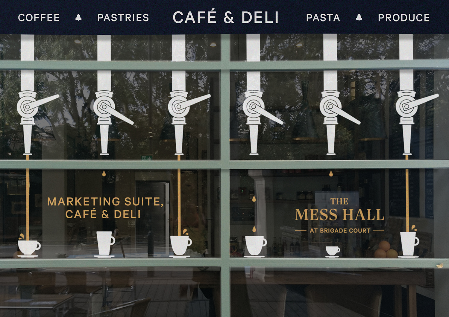
A nod must also be given to naming. Brigade Court, of course, draws on the structure’s origins and architecture, but this is developed further throughout on-site amenities available to new-build occupiers and those in the historic renovation. These include ‘The Training Yard’ and ‘The Watch House’ for the gym and cinema, respectively. This continues through to ‘The Mess Hall’ the marketing suite’s deli and cafe, an unusual marketing approach, but another space where the concept offers enough room for other ideas (the hoses as coffee dispensers are delightful) whilst maintaining continuity.
