Design for hotels
Hotel Park Ave NYC by Colt
Located on the corner of Park Avenue South and East 30th Street in Manhattan’s Midtown, Hotel Park Ave is the artist formerly known as the Mondrian Park Avenue. Its change in name is thanks to its change in owner: international hospitality company Lore Group announced its acquisition of the site and mooted its subsequent rebrand late last year, and to...

Post Post Hotel by Studio Bruch
If you’re reading BP&O, you’re more likely than most to be the type who knows their counters from their stems; their terminals from their tittles, and so on. In short, a TypeNerd – categorically one of the best kinds of nerd. And what do nerds like? Hyper specific ‘injokes’ that aren’t exactly striving to be funny, perhaps you might call...

Jackalope Hotels by Fabio Ongarato Design
Jackalope Hotels is a luxury hospitality experience developed by Melbourne-based Louis Li, a hotelier described as having a penchant for the avant-garde. The first Jackalope Hotel is situated in the heart of the Mornington Peninsula, Victoria, Australia. It is unique in its location, surrounded by the hotel’s vineyard, in its architecture and interior by Carr Design, and in its visual...

The Broadview Hotel by Blok
The Broadview Hotel is located within one of Toronto’s most recognisable architectural landmarks. This was built in 1891 by a wealthy businessman who recognised the strategic importance of the East End as the city was expanding. It has been home to a business centre, acted as a political and social hub, and used as a hotel, boarding room and more recently, a...

Sant Francesc by Mucho
Sant Francesc is a 5-star hotel located in the Placa Sant Francesc, beside the Church of the Templarios, within the city of Palma on the Spanish island of Mallorca. The hotel is set inside the walls of a restored historical landmark built in a neoclassical style during the 19th century and has 42 rooms and suites. Some of these rooms include wood-beamed ceilings, original frescos and...
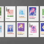
Casa Bonay by Mucho
Casa Bonay is a unique hotel destination in the neighbourhood of Eixample Dret, Barcelona, housed within a historic nineteenth century building with a neo-classical façade. Although the setting has a strong historical value, inside and out, the hotel experience makes a connection with the creative talent that populates the city today. This is achieved through collaboration with pioneering chefs, young designers, renowned furniture brands and...
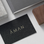
Aman by Construct
Aman is a collection of resorts, hotels and luxury residencies that offer access to a wide variety of remote and urban destinations. Its first resort, Amanpuri, was opened in Thailand in 1988. Since then it has expanded across the world, seeking out transformative experiences and awe-inspiring locations throughout Asia, Indonesia, China, Japan, the Americas, North Africa, Europe and the Mediterranean. Inspired by the earliest forms of alphabets...

Grand Ferdinand by Moodley
Grand Ferdinand is hotelier Florian Weitzer’s fifth hotel. It features a distinctive interior of green leather upholstery and Lobmeyr chandeliers, rooms with ornate and functional furnishings, and a restaurant that is said to serve the best French champagne and the grandest Viennese cuisine, all set within a landmark building located on Vienna’s Ringstraße. Grand Ferdinand has a philosophy that celebrates the past whilst moving forward. This meeting of tradition...
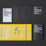
The Franklin Boutique Hotel by Band
The Franklin Boutique Hotel provides seven room accommodation at the heart of the city of Adelaide. Rooms feature interior detail such as white tiles, exposed utilities, chipboard panels, high quality finishes and original artwork from local artists, as well as modern conveniences that include en suite bathrooms, Nespresso machine, ipod dock radios, refrigerators and irons. Following a successful reinvention of the attached pub,...

Hotel Cycle by UMA
U2 is a cyclist-friendly retail and hospitality destination, located in the Japanese city of Onomichi, made up of shops, bakeries, restaurants and hotels. Design studio UMA were recently commissioned to develop a visual identity for U2’s Hotel Cycle as part of a larger brand identity project that covered a variety of spaces, packaging and signage within the complex. UMA’S brand identity solution...
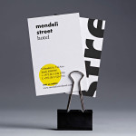
Mendeli Street Hotel by Koniak
Mendeli Street is a city-beach hotel, designed by BK Architects, that celebrates the modern spirit of Tel-Aviv. Design studio Koniak developed a brand identity for the hotel, which included a logotype, stationery set, key cards, door-hangers and website, that reflect its contemporary qualities and the bright sunny climate of its location....

Townhouse by Koniak
Townhouse is a hotel designed and ‘curated’ by The Kastiel Family and located at the heart of the Tel Aviv. Based around tactile material and print finish, a mixed typographical approach in conjunction with a simple sans-serif logo-type and monogram, Townhouse’s visual identity, created by boutique design studio Koniak, frames the traditional crafted luxury of the hotel’s interior fixtures and fittings with a...